A sustainable reporting dashboard is not just a visual layer for ESG data. It is an operating system for disclosure readiness, management oversight, and assurance control. If you are an IT manager, finance lead, ESG director, or operations owner, the real challenge is rarely the report design itself. The challenge is consolidating fragmented data, reconciling different frameworks, assigning clear ownership, and proving that every number has a defensible audit trail. A well-built dashboard solves this by creating one controlled environment for CSRD, ISSB, and GRI alignment—reducing duplicate work, speeding reporting cycles, and improving confidence in every disclosure.
All reports in this article are built with FineReport
[Insert Dashboard Demo Here: Executive ESG dashboard with CSRD, ISSB, and GRI status cards, emissions trend lines, disclosure completion gauges, and entity-level reporting status]
A strong sustainable reporting dashboard acts as a single source of truth for executives, controllers, sustainability teams, risk leaders, and internal auditors. Instead of maintaining separate spreadsheets for regulatory submissions, investor communication, and voluntary reporting, the organization works from one governed reporting structure. That matters because CSRD, ISSB, and GRI may differ in audience and emphasis, but they often depend on overlapping metrics, shared governance processes, and the same underlying source systems.
When teams build separate processes for each framework, they create parallel definitions, duplicate evidence requests, and conflicting KPI versions. That drives reporting fatigue and weakens control quality. By contrast, one aligned dashboard architecture allows a company to map one metric to multiple disclosure uses. For example, a greenhouse gas emissions dataset may support CSRD compliance, ISSB investor disclosure, and GRI impact communication—with different presentation layers but the same controlled data backbone.
The business value is immediate:
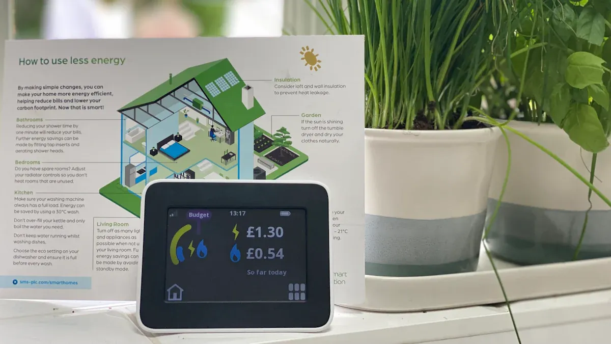
To make the dashboard useful, include a structured KPI layer that supports management and disclosure workflows.
[Insert Dashboard Demo Here: KPI scorecard panel with disclosure completion rate, assurance readiness score, missing evidence count, and overdue submissions by business unit]
Before you build any dashboard, define what the reporting system must actually support. The biggest implementation mistake is starting with charts before agreeing on disclosure logic. CSRD, ISSB, and GRI are not interchangeable. Each serves a different reporting objective, and your dashboard should reflect those distinctions while still reusing shared data wherever possible.
CSRD requires companies to report sustainability information with greater rigor, breadth, and assurance readiness than many legacy ESG programs were designed for. The dashboard must support double materiality, meaning the company reports both how sustainability issues affect enterprise value and how the company affects people and the environment.
That has direct implications for dashboard design. You need to capture:
In practice, the dashboard should not only present results but also show whether each CSRD-related datapoint is complete, approved, and traceable to source records.
ISSB is more focused on financially material sustainability risks and opportunities. That means your dashboard should help finance and investor-relations teams understand how sustainability topics connect to strategy, risk, governance, and financial performance.
For ISSB alignment, dashboard views should highlight:
A practical takeaway: if CSRD pushes breadth and stakeholder accountability, ISSB pushes decision-useful information for capital markets. Your dashboard needs both a compliance lens and an investor lens.
GRI is broader in stakeholder orientation and impact communication. It emphasizes the organization’s impacts on economy, environment, and society, not just financially material factors. For dashboard design, this means going beyond numeric KPI tables.
A GRI-supportive dashboard should help teams manage:
This is where many sustainable reporting initiatives fail. They over-focus on charts and under-design the narrative support needed for complete disclosures.
[Insert Dashboard Demo Here: Framework comparison matrix showing CSRD double materiality topics, ISSB financially material disclosures, and GRI stakeholder impact topics]
The dashboard is only as strong as the data model beneath it. If your metrics lack owners, boundaries, definitions, and approval logic, the dashboard becomes a polished front end on top of unreliable processes. A practical sustainable reporting workflow starts with disciplined data architecture.
Every KPI on the dashboard should have a documented reporting profile. At a minimum, define:
This step is critical because sustainability data often comes from multiple functions—HR, facilities, procurement, finance, legal, operations, and supply chain. Without defined ownership, deadlines slip and accountability disappears.
A crosswalk is the core efficiency mechanism in sustainable reporting. It links one metric or disclosure component to multiple frameworks so teams do not rebuild the same work three times.
For example, your crosswalk may connect:
A good dashboard should let users see each KPI once, then identify where it feeds specific framework outputs.
If the company expects internal review, external assurance, or board-level reliance, data quality controls must be embedded into the workflow. Do not leave them to year-end cleanup.
Set dashboard rules such as:
These controls turn sustainable reporting from an ad hoc disclosure exercise into a repeatable management process.
[Insert Dashboard Demo Here: Data workflow dashboard with owner assignment table, metric definition registry, approval status pipeline, and evidence attachment tracker]
A high-performing sustainable reporting dashboard should help the business manage issues during the year, not simply compile disclosures at the end. That means the dashboard needs multiple user views, each designed for a specific decision or control function.
Executives do not need raw data dumps. They need a concise summary of what matters, what is changing, and where intervention is required. Your top layer should highlight:
Keep this view highly scannable. Use trend lines, red-amber-green status indicators, and exception summaries rather than cluttered detail tables.
Operational users and assurance teams need depth. A useful drill-down layer should expose the full reporting chain behind each KPI, including:
This is where trust is built. If an auditor, finance reviewer, or sustainability lead can click from a summary metric down to its source and approval history, the dashboard becomes a control tool rather than a presentation tool.
Alerts are one of the most valuable features in sustainable reporting because the process involves many deadlines, dependencies, and non-financial inputs. Use indicators to flag:
This shifts the dashboard from passive monitoring to active workflow management.
[Insert Dashboard Demo Here: Executive summary with trend charts, drill-down detail pane, red-amber-green compliance alerts, and overdue task notifications]
A sustainable reporting dashboard will fail if the process design is weak. Technology does not solve unclear governance, undefined deadlines, or inconsistent data ownership. Implementation should be treated as a cross-functional operating model, supported by the right ESG Reporting Services approach, not as a one-time design sprint.
Different organizations need different tool stacks depending on complexity, entity count, assurance expectations, and system maturity.
A practical comparison:
Choose based on the reporting burden you expect in two to three years, not just the current cycle.
The best dashboards are backed by a formal reporting calendar. Set clear milestones for:
Then define governance roles across functions. At minimum, assign:
This avoids the common problem where everyone contributes data but no one owns quality.
Sustainable reporting standards are evolving. Your dashboard design should expect revision, not resist it. After each reporting cycle, review:
This is how organizations move from compliance scramble to reporting maturity.
As a consultant, I recommend these step-by-step practices for enterprise rollout:
Start with a disclosure inventory
Build the metric register before building visuals
Create one controlled crosswalk
Pilot with one entity group or material topic cluster
Embed review and assurance checkpoints into the platform
[Insert Dashboard Demo Here: Implementation roadmap dashboard with reporting calendar, governance owners, pilot status, and maturity model progression]
Many organizations create more complexity than necessary because they misunderstand the purpose of sustainable reporting. The dashboard is not supposed to mirror framework silos. It should unify reporting operations while preserving framework-specific outputs.
The most common mistakes include:
Building separate dashboards for each framework
This creates duplicate metrics, inconsistent definitions, and unnecessary reconciliation work.
Do it right: Build one aligned architecture with framework-specific reporting views.
Tracking too many indicators without materiality discipline
More metrics do not equal better reporting. Excess KPI volume overwhelms owners and weakens focus.
Do it right: Prioritize metrics tied to material topics, decision-making, and actual disclosure obligations.
Ignoring narrative disclosures, controls, and evidence
Many teams overinvest in charts and underinvest in assurance support.
Do it right: Pair every important KPI with methodology notes, evidence links, owner records, and approval status.
Treating the dashboard as a design project rather than a management system
A visually attractive dashboard cannot compensate for weak process design.
Do it right: Build reporting workflows, governance, and control logic into the operating model from day one.
[Insert Dashboard Demo Here: Dashboard exception view showing duplicate KPIs eliminated, materiality-based indicator filtering, evidence completeness checks, and governance workflow controls]
Building this manually is complex; use FineReport to utilize ready-made templates and automate this entire workflow. For teams managing CSRD, ISSB, and GRI alignment, FineReport helps turn fragmented reporting into a governed, auditable, and scalable dashboard environment.
With FineReport, organizations can:
This is especially valuable for enterprise teams that need more than basic BI. Sustainable reporting requires operational control, not just visualization. FineReport supports that by combining data integration, dashboard design, workflow structure, and reusable templates in a way that reduces manual effort and improves reporting confidence.

Get Ready-to-Use Dashboard Templates in Fine Gallery
If your current sustainable reporting process depends on spreadsheets, disconnected evidence folders, and last-minute reconciliation, now is the time to redesign the architecture. Start with one dashboard, one crosswalk, and one governed workflow—then scale from there.
A sustainable reporting dashboard is a controlled system that brings ESG data, disclosure status, approvals, and evidence into one place. It helps teams manage reporting for frameworks like CSRD, ISSB, and GRI with better visibility and traceability.
One dashboard can support all three by using a shared data model and mapping each KPI to multiple disclosure requirements. This reduces duplicate data collection while allowing different views for regulators, investors, and broader stakeholders.
The most useful KPIs usually include disclosure completion, submission timeliness, validation status, evidence coverage, control exceptions, and assurance readiness. These metrics help teams track both reporting progress and data quality.
Audit trail is important because companies need to show where each reported number came from, who approved it, and what evidence supports it. This improves confidence for management, auditors, and external assurance providers.
Companies should first define reporting scope, framework requirements, material topics, data owners, source systems, and approval workflows. Starting with disclosure logic before visualization leads to a more reliable and scalable dashboard.
The Author
Eric
Related Articles

EEO Reporting Requirements in 2026: What Employers Must Still Track if EEO-1 Reporting Ends
If you are leading HR, legal, compliance, or people analytics in 2026, the real question is not just whether the EEO 1 filing process survives. The real business issue is whether your organization can still prove fair, c
Yida Yin
Jan 01, 1970

ESG Reporting Technology Stack: How to Build a Reliable Data Pipeline for CSRD, GRI, and SEC Climate Disclosure
An effective $1 technology stack is not just a collection of software tools. It is the operating backbone that turns fragmented data from finance, HR, operations, procurement, energy systems, and suppliers into disclosur
Yida Yin
Jan 01, 1970
Workiva vs Persefoni vs FineReport: Which ESG Reporting Platform Fits Your Reporting Stack in 2026?
$1 is a flexible $1 and dashboard platform that helps organizations build customized $1 outputs on top of existing business data. Workiva vs Persefoni vs FineReport at a glance among ESG reporting platforms When comparin
Yida Yin
Jan 01, 1970


