A profitability dashboard is not a reporting accessory. It is a decision system. For founders, CFOs, finance managers, and department heads, its job is simple: show where profit is created, where it leaks, and what action should happen next.
If your current reporting still lives across spreadsheets, ERP exports, accounting reports, and ad hoc analysis, you already know the operational pain points:
Margin erosion is spotted too late
Teams argue over definitions instead of acting on numbers
Product, customer, and channel performance is hard to compare
Monthly reviews become backward-looking rather than decision-oriented
Leaders see totals, but not the drivers behind them
A strong profitability dashboard connects revenue, costs, margins, trends, and segment performance in one decision-ready view. Done well, it helps leaders answer questions like:
Which products, customers, or channels are truly profitable?
Where are costs rising faster than revenue?
Are margins improving, holding, or being diluted?
Which business units need intervention this month?
Where should we reallocate budget, pricing, or sales effort?
The best dashboards are built for the people who actually use them most: founders, CFOs, FP&A teams, finance controllers, operations directors, sales leaders, and department heads. Each of them needs the same truth, but at different levels of detail.
Click To Try The Dashboard
What a profitability dashboard should help you decide
Before choosing charts, define the decisions. This is where many teams fail. They design for visual appeal first and business action second.
A useful profitability dashboard should answer recurring business questions such as:
Are we generating enough profit overall?
Which segments contribute the most to profit?
Which segments generate revenue but destroy margin?
Are actual results tracking to budget and forecast?
What changed this month, and why?
Where should management intervene now?
This is why a profitability dashboard must go beyond a static profit and loss statement. It should unify:
Revenue performance
Cost structure
Margin quality
Trend movement
Variance against plan
Segment-level profitability
In practice, that means a finance leader can open one dashboard and move from company-wide gross margin down to customer-level profitability or SKU-level underperformance without needing a separate manual analysis.
Core KPIs every profitability dashboard should include
The fastest way to make a dashboard executive-ready is to anchor it around a clear KPI structure. Not every company needs the exact same metrics, but every profitability dashboard should include a core set of indicators that connect performance to action.
Revenue, cost, and margin metrics
These are the foundational measures that establish whether the business is profitable and where that profitability comes from.
Key Metrics (KPIs)
Total Revenue: Total income generated in a selected period.
Gross Profit: Revenue minus cost of goods sold or direct delivery costs.
Gross Margin %: Gross profit as a percentage of revenue; shows production or delivery efficiency.
Operating Profit: Profit remaining after operating expenses are deducted.
Net Profit: Final profit after all expenses, taxes, and non-operating items.
Net Margin %: Net profit as a share of revenue.
Contribution Margin: Revenue minus variable costs; useful for pricing and unit economics.
Revenue by Segment: Revenue broken out by product, service, customer, channel, region, or team.
Fixed Costs: Costs that remain relatively constant regardless of sales volume.
Variable Costs: Costs that change with output, sales, or service volume.
Cost-to-Revenue Ratio: Total costs divided by total revenue; highlights cost efficiency.
Customer Acquisition or Service Cost: Useful where profitability depends heavily on customer-level servicing or retention costs.
A dashboard should not stop at company totals. If gross margin looks healthy overall but one region or product line is dragging profitability down, executives need to see that immediately.
Trend and variance indicators
Profitability decisions rarely depend on one absolute number. They depend on movement, change, and deviation from expectation.
Key Metrics (KPIs)
Month-over-Month Change (MoM): Tracks short-term movement in revenue, cost, or margin.
Year-over-Year Change (YoY): Shows whether performance is improving relative to the same period last year.
Budget vs. Actual Variance: Compares current results to the approved plan.
Forecast vs. Actual Gap: Measures whether the business is outperforming or missing expected outcomes.
Margin Dilution Rate: Indicates whether margin is shrinking as revenue mix changes.
Cost Spike Alerts: Flags unusual increases in specific expense categories.
Profit Trend Line: Visual indicator of whether profitability is improving, flat, or deteriorating.
Early Warning Thresholds: Predefined alerts for underperformance, such as margin falling below target.
These indicators are what make a dashboard proactive rather than historical. A CFO does not just want to know that operating margin is 12%. They want to know it fell from 15%, missed budget by 2 points, and was driven by logistics costs in one business unit.
Segment-level profitability views
This is where dashboards become strategically valuable. Segment analysis reveals which parts of the business deserve investment, correction, or exit.
Key Metrics (KPIs)
Customer Profitability: Profit contribution by customer after direct and allocated costs.
Customer Cohort Margin: Profitability by acquisition month, contract year, or account vintage.
Product Line Profitability: Margin performance by category or portfolio group.
SKU-Level Profitability: Profitability by individual item, often used in retail, distribution, and manufacturing.
Channel Profitability: Profit by sales channel, marketplace, distributor, or direct route.
Regional Profitability: Margin by geography, branch, or location.
Team or Business Unit Profitability: Comparison across departments, managers, or P&L owners.
If you cannot compare profitability across segments, your dashboard may tell you what happened overall but not where to act.
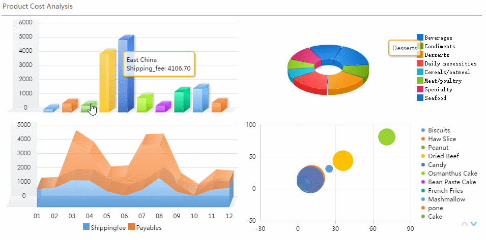
Profitability dashboard examples and template ideas to learn from
Good examples are useful because they show how different organizations structure the same profitability questions for different users. The layout should always match the decision context.
Executive and CFO-style dashboard layouts
An executive version of a profitability dashboard should provide a fast-read summary of financial health. Think of it as the dashboard used in weekly leadership reviews or monthly close meetings.
A strong CFO-style layout usually includes:
Top-row KPI cards for revenue, gross profit, operating profit, net profit, and margin %
Variance indicators against budget and prior period
A monthly trend view for revenue, costs, and profit
A segment comparison view by product, region, or business unit
Drill-down links into customer, category, or expense detail
This layout works best when leadership needs to answer immediate questions around profit, loss, cash pressure, and margin movement.
Profitability varies significantly by product, geography, or customer
Marketing, sales, and fulfillment costs influence margin
Budget, forecast, and actual tracking are central to management
Decision-makers need to drill into drivers, not just totals
Functional examples for different use cases
Different teams need different profitability views. The best dashboard ecosystems share the same metric logic while tailoring visuals to the user.
Customer-level profitability analysis
This use case is ideal for account prioritization, contract review, pricing strategy, and service model decisions.
A customer profitability view should help answer:
Which customers drive the most profit, not just the most revenue?
Which accounts consume excessive support, discounting, or delivery cost?
Which cohorts are becoming more profitable over time?
Which accounts should be repriced, renegotiated, or deprioritized?
This is especially valuable in B2B services, distribution, SaaS with service-heavy accounts, and manufacturing businesses with customized fulfillment costs.
Product and category profitability views
This layout supports merchandising, portfolio planning, pricing optimization, and discontinuation analysis.
It should highlight:
Revenue and margin by category
Contribution margin by product line
Low-margin SKUs with high cost-to-serve
High-volume items with declining margin
Products that look successful in sales but weak in profit
This is critical for retail, ecommerce, wholesale, and manufacturing teams managing broad catalogs.
Business unit reporting templates
For recurring monthly reviews, business unit leaders need a repeatable structure that shows:
Revenue vs. target
Gross and operating margin
Expense trends
Headcount or overhead burden
Variance commentary
Rank against peer units
These templates work well for multi-entity, multi-region, or divisional organizations that want standardized monthly performance reviews.
What to copy from strong templates
Not every template is worth copying. The best ones share a few design principles.
Clear KPI hierarchy
Strong templates place the most important financial outcomes first:
Revenue
Profit
Margin
Variance
Segment breakdown
This ordering matters because it mirrors how executives think. Start with the result, then reveal the drivers.
Consistent filters
Useful filters typically include:
Time period
Business unit
Region
Product category
Customer segment
Channel
When filters are consistent across all pages, users trust the dashboard and move faster.
Visuals that explain change
Totals alone are weak. Strong dashboard templates use visuals that answer “why”:
Variance bars
Waterfall charts
Trend lines with targets
Mix-shift comparisons
Annotated cost spikes
The goal is not to display more charts. It is to reduce the time between insight and decision.
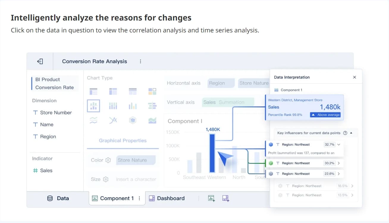
Drill-down paths without clutter
A dashboard should feel layered. The landing page gives the summary. Clicks reveal detail. Users should be able to move from total margin to region to customer to invoice-level detail without feeling lost.
How to build a dashboard that actually drives decisions
A profitability dashboard only works if it fits the way decisions are made in the business. Here is the practical implementation approach I recommend as a consultant.
Start with decision workflows, not visuals
List the decisions users make every week, month, and quarter. Then reverse-engineer the dashboard around them.
Examples:
Finance decides whether margin shortfalls need escalation
Sales leaders decide which accounts need pricing review
Operations decides where cost overruns require intervention
Product teams decide which categories deserve more investment
Leadership decides which business units are ahead or behind plan
For each recurring decision, define:
The question being asked
The KPI required
The threshold that signals action
The next step if the threshold is missed
If a chart does not support a real decision, remove it.
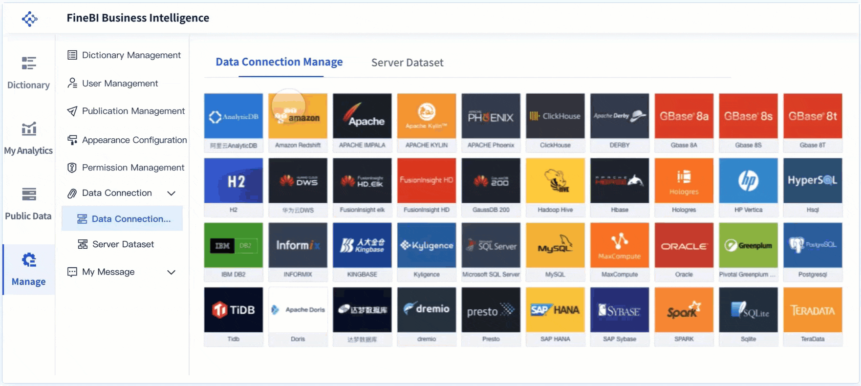
Choose data sources and calculation rules carefully
This is where trust is won or lost.
Your dashboard may need to pull from:
ERP systems
Accounting platforms
CRM systems
Billing tools
Sales systems
Inventory or order management systems
Marketing platforms where acquisition cost affects profitability
The key is alignment. If finance calculates gross profit one way and commercial teams use another, adoption breaks immediately.
Document assumptions clearly. If overhead is allocated by revenue share, labor hours, or units sold, stakeholders should know. The goal is not perfect theoretical accounting purity. The goal is trusted, repeatable decision support.
Design for clarity and action
A dashboard should be scannable in under a minute.
Best practice layout:
Top row: headline KPIs and variance indicators
Middle section: trend views and comparisons
Lower section: segment performance and drill-down tables
Side or top filters: time, unit, region, channel, product, customer
Design choices that improve usability:
Put the most important KPIs first
Use red/amber/green status sparingly and consistently
Add benchmarks, targets, and prior-period comparisons
Keep labels short and precise
Use annotations where a number needs context
Ensure meeting-room readability on desktop screens
4 best practices for implementation
1. Build a metric dictionary before building charts
Define each KPI, formula, owner, and source system. This prevents endless debates after launch.
2. Prototype with one executive workflow first
Start with the monthly finance or leadership review. Prove value there, then expand to business unit and analyst views.
3. Add alerts and thresholds early
Do not make users hunt for problems. Flag margin drops, cost spikes, and budget misses automatically.
4. Validate with real decisions, not opinions
During pilot reviews, ask users what decision they made faster because of the dashboard. That is the real success test.
Common mistakes that make profitability dashboards less useful
Many profitability dashboards fail for predictable reasons. The visuals are often not the real issue. The underlying logic and usability are.
Overloading the dashboard
Too many charts create noise. Executives should not need to decode fifteen visuals to understand margin performance.
Mixing inconsistent definitions
If profit, margin, or allocated cost definitions vary by department, confidence disappears. A dashboard with disputed metrics is operationally useless.
Reporting totals without segment detail
A total gross margin number is not enough. Leaders need to know which customers, products, or units drive the result.
Ignoring variance explanations
A dashboard that shows a decline without explaining likely drivers forces teams back into spreadsheet analysis.
Updating too slowly
If the business makes pricing, spend, or operational decisions weekly, a monthly-only dashboard quickly becomes irrelevant.
Failing on adoption
Some dashboards are viewed but not used. Common causes include:
Poor navigation
Too much complexity
No link to actual meeting workflows
Weak trust in the numbers
No training or guided examples
The test is simple: did the dashboard change behavior, or did it just change where reports are stored?
How to evaluate and improve your dashboard over time
Launch is not the finish line. The best dashboards evolve with the business.
Questions to ask after launch
Review the dashboard with stakeholders using practical questions:
Which decisions became faster after adoption?
Which decisions became more accurate or more confident?
Which KPIs are trusted immediately?
Which KPIs are frequently challenged?
Which views are rarely used?
Where do users still export data for manual analysis?
Which drill-downs are missing?
Which thresholds need refinement?
This review quickly separates true decision tools from passive reports.
Practical next steps for iteration
Treat dashboard improvement as an operating rhythm, not a one-time project.
Review usage patterns regularly
Look at which pages, filters, and drill paths are used most. High usage often signals value. Low usage may indicate confusion or irrelevance.
Refine KPIs and thresholds as the business changes
As product mix, pricing strategy, cost structure, or organizational design changes, your dashboard should adapt too. Yesterday’s best metrics may not fit today’s decision model.
Add examples and guided views
New users adopt dashboards faster when you provide:
Role-based landing views
Example review templates
Definitions for key metrics
Notes explaining how to interpret variances
Recommended next actions for common issues
This is especially important in enterprise environments where finance, operations, sales, and leadership all engage with the same profitability framework.
Turn the methodology into a scalable solution with FineBI
Building this manually is complex. You need to connect multiple data sources, standardize formulas, maintain refresh schedules, manage permissions, and keep views usable for different stakeholders. That is why many teams start with good intentions and end up back in spreadsheet maintenance.
Use FineBI to utilize ready-made templates and automate this entire workflow.
FineBI helps organizations operationalize the full profitability dashboard process by making it easier to:
Connect ERP, accounting, CRM, and sales data in one place
Build finance-ready dashboards with reusable templates
Standardize KPI definitions across teams
Automate refreshes and recurring reporting workflows
Create drill-down views for executives, finance, and department leaders
Scale from a single profit dashboard to broader enterprise performance analysis
For enterprise decision-makers, the value is not just dashboard creation. It is the ability to move from fragmented reporting to a trusted, repeatable profitability management system.
If your goal is to build a dashboard that leaders actually use to guide pricing, cost control, portfolio strategy, and operating reviews, FineBI is the practical way to accelerate delivery without sacrificing governance or depth.
FAQs
A strong profitability dashboard should combine revenue, costs, gross and net margins, trend analysis, budget versus actual variance, and segment-level views such as product, customer, channel, or region performance. It should help leaders move from a company summary to the drivers behind profit changes.
A profit and loss statement shows financial results for a period, while a profitability dashboard adds trends, alerts, comparisons, and drill-down analysis. This makes it more useful for identifying why profit changed and where action is needed.
The most important KPIs usually include total revenue, gross profit, gross margin percentage, operating profit, net profit, contribution margin, cost-to-revenue ratio, and budget versus actual variance. Many teams also track month-over-month and year-over-year changes to spot momentum early.
Most businesses should update it at least weekly, while fast-moving teams may need daily refreshes. The right frequency depends on how quickly pricing, costs, sales mix, or campaign spend can affect margins.
Profitability dashboards are most useful for founders, CFOs, FP and A teams, finance controllers, operations leaders, and sales or department heads. Each group uses the same core data, but with different levels of detail for strategic or operational decisions.
Product Trial
FineReport
Pixel-perfect reports · Interactive dashboards · Easy data entry · Digital twins