A customer dashboard is no longer a nice-to-have reporting layer. It is the operating view that helps revenue leaders, customer success teams, support managers, and executives make faster decisions from the same customer data. When account activity, support performance, product usage, satisfaction signals, and retention trends live in separate systems, teams react late, miss risks, and waste time reconciling reports instead of improving outcomes.
All dashboards in this article are built with FineBI.
A customer dashboard is a centralized visual workspace that turns scattered customer data into one usable, decision-ready view. Instead of switching between CRM records, support tools, survey platforms, spreadsheets, and product analytics, teams can track customer health, service activity, engagement patterns, and commercial opportunities in one place.
This matters because most customer problems are not isolated. A drop in product usage can lead to support spikes. Repeated unresolved tickets can damage renewal confidence. Low satisfaction can reduce expansion potential. Without shared visibility, each team sees only part of the story. With a customer dashboard, leaders can connect behavior, service performance, and business outcomes before issues become expensive.
For enterprise teams, shared visibility improves operational speed. Sales can identify expansion-ready accounts. Customer success can intervene earlier on churn risks. Support can manage backlog and SLA pressure in real time. Operations can standardize reporting. Executives can understand retention, growth, and service efficiency without waiting for manual updates.
A strong customer dashboard helps teams identify revenue signals early. This includes rising product adoption, increased stakeholder engagement, repeat feature requests, contract timing, and support patterns that indicate either account growth or account risk.
When sales and account teams can see live account health indicators, they stop treating all accounts equally. They can prioritize customers that show buying intent, protect at-risk renewals, and focus outreach where timing and value are strongest.
In practice, this means fewer missed upsell windows and more informed pipeline planning. Instead of waiting for quarterly review meetings, teams can act on what customers are doing now.
Retention rarely collapses without warning. Most churn is preceded by visible signals such as declining logins, lower feature adoption, repeated support escalations, unresolved issues, poor onboarding progress, or dropping satisfaction scores.
A customer dashboard makes these warning signs visible sooner and in context. Teams can build alerts for health-score declines, inactive strategic accounts, or repeated complaints by segment. That turns retention from reactive firefighting into proactive account management.
The business value is direct: earlier outreach leads to more recovery opportunities, better renewal conversations, and fewer avoidable losses.
Support performance has a major impact on customer experience and long-term value. A customer dashboard gives service managers an immediate view into response times, backlog trends, SLA attainment, reopen rates, escalation patterns, and resolution performance.
This visibility helps teams improve service delivery in two ways. First, they can identify operational bottlenecks quickly. Second, they can allocate people more effectively based on queue volume, ticket complexity, channel demand, and peak times.
When managers see demand patterns clearly, they can shift staffing, redesign workflows, and reduce delays before service quality drops.
One of the biggest hidden costs in customer operations is reporting fragmentation. Sales uses one report. Success uses another. Support has its own dashboard. Leadership sees summary slides assembled days later. That creates handoff friction, conflicting interpretations, and low accountability.
A customer dashboard creates a shared operating model. Revenue, success, support, and leadership all work from the same core facts. They can align around account health, risk levels, service performance, and customer value without arguing over whose spreadsheet is correct.
This reduces time spent reconciling data and improves time spent acting on it.
As businesses grow, consistency becomes harder. Different teams may follow different processes for escalation, follow-up, onboarding, renewal preparation, or service recovery. That leads to uneven customer experiences, especially across regions, business units, or account tiers.
A customer dashboard supports standardization. It gives teams a consistent view of what matters, who needs attention, and what next action should happen. This helps ensure the right follow-up, escalation, communication, and priority level happen at the right time.
Consistency builds trust. Customers notice when teams are informed, timely, and coordinated across the full journey.
Executives need clarity, not operational noise. A well-designed customer dashboard surfaces trends that matter to leadership: retention, churn risk, service cost pressure, satisfaction movement, customer segment performance, and efficiency gains or losses.
Visual reporting shortens time to insight because leaders can spot movement immediately. They do not need to decode raw exports or wait for analysts to stitch together multiple reports. With a dashboard, they can review performance, drill into problem segments, and ask sharper questions in less time.
For organizations with recurring revenue models, this is especially valuable because retention and service efficiency are leading indicators of future growth quality.
B2B customer portfolios are rarely simple. Teams often manage strategic accounts, renewals, complex buying groups, implementation risk, support dependencies, and high-value expansion opportunities all at once.
A customer dashboard helps B2B teams prioritize where effort creates the most value. Account-level visibility makes it easier to segment customers by contract value, lifecycle stage, product adoption, support burden, and renewal status. That allows teams to assign the right coverage model and resource level to each account group.
For account directors and customer success leaders, this means smarter resource allocation across a complex book of business.
Customer experience gaps usually show up in patterns, not isolated events. Maybe one customer segment struggles during onboarding. Maybe a support queue drives lower CSAT. Maybe one feature generates repeated complaints and escalations. A customer dashboard helps teams connect those signals.
By combining customer feedback, service interactions, and usage behavior, teams can pinpoint recurring friction points. They can then convert repeated issues into process changes, product fixes, training updates, or communication improvements.
This is where dashboards move beyond monitoring and become a mechanism for continuous improvement.
Manual customer reporting consumes time across operations, support, account management, and leadership. Teams export data from multiple tools, rebuild charts in spreadsheets, and send recurring updates that are outdated almost immediately.
A customer dashboard automates this work. Once connected to the right sources, it updates regularly and gives stakeholders self-service access to current metrics. Teams spend less time preparing reports and more time solving customer issues, coaching teams, and improving service quality.
For most organizations, this benefit alone creates a measurable ROI because it removes repetitive reporting overhead across multiple departments.
A high-performing customer dashboard should do more than display charts. It should support decisions across the full customer lifecycle, from acquisition to expansion to retention.
Below is a practical KPI framework that works for most businesses:
A customer dashboard becomes actionable when it includes the right structure, not just the right metrics.
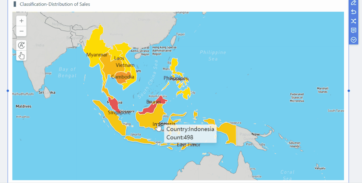 FineBI's Drill-down Capability
Consider a support director managing several queues across multiple channels. Ticket volume rises after a product update, but by the time weekly reporting arrives, the backlog is already harming response times and customer sentiment.
With a customer dashboard, the director sees queue growth, SLA breach risk, unresolved issue categories, and response-time deterioration in near real time. They reassign agents, escalate technical issues faster, and identify the product area driving the spike.
The result is not just faster response. It is a more resilient service operation with less guesswork.
A customer success manager notices a strategic account's health score has declined. The dashboard shows falling product usage, two unresolved support escalations, and lower executive engagement over the past month.
That combination is far more useful than any single metric. It helps the manager intervene with context: schedule a review, align support resolution, reinforce value, and rebuild stakeholder confidence before renewal risk intensifies.
This is how dashboards turn passive monitoring into proactive retention management.
Expansion rarely appears out of nowhere. It usually follows adoption growth, increased user activity, strong support outcomes, and engagement from additional stakeholders. A customer dashboard surfaces these conditions at the account and portfolio level.
Account teams can identify customers using more features, increasing seats, consuming more service capacity, or requesting adjacent capabilities. They can then prioritize expansion plays based on evidence instead of instinct.
For B2B teams with long sales cycles, that visibility improves timing and account planning quality.
Leadership teams need a concise but connected view of customer health across revenue, retention, experience, and operational efficiency. A customer dashboard gives them that single source of truth.
They can review churn exposure by segment, compare service trends across regions, identify where satisfaction is dropping, and assess whether efficiency is improving or deteriorating. Most importantly, they can connect customer outcomes to broader business performance.
For executive reviews, this reduces reporting lag and improves decision quality.
Every customer dashboard should make the most important signals easy to access. At minimum, teams should be able to see:
A practical approach is to combine top-line summary KPIs with deeper operational views. Executives need trend and forecast visibility. Managers need performance and exception visibility. Frontline teams need account and task visibility.
The best dashboards are not static reporting pages. They help teams decide what to do next.
Key features include:
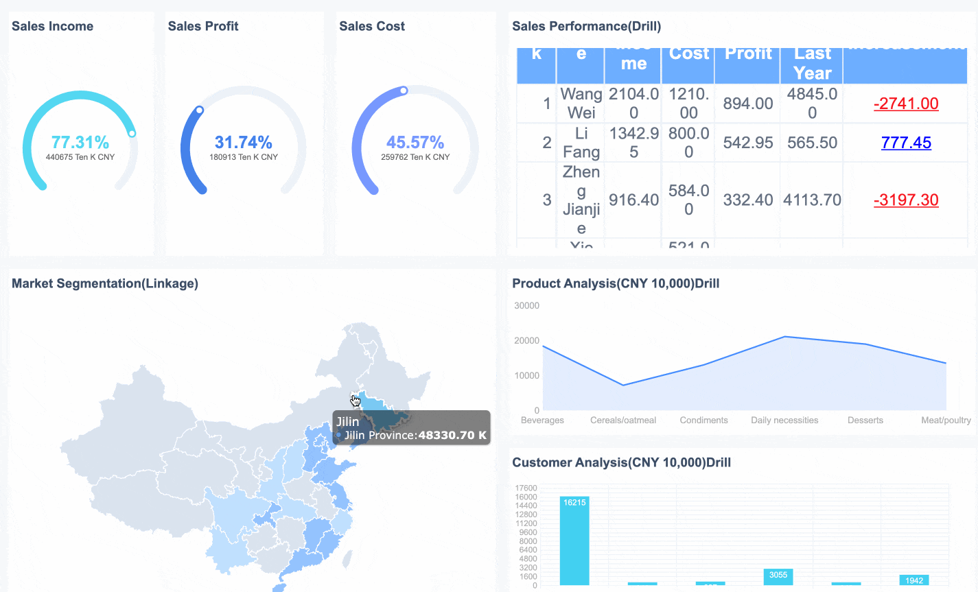 FineBI's Interactive Dashboard
This is where FineBI can be especially useful. FineBI supports interactive analysis, self-service exploration, and role-based dashboard delivery, which makes it easier for enterprise teams to operationalize customer data instead of merely visualizing it.
The most common dashboard mistake is overloading the screen with every possible metric. That lowers clarity and reduces trust. A better design philosophy is simple: prioritize relevance, actionability, and ease of navigation.
Effective design choices include:
When dashboards are easy to read, teams use them more often. Adoption is what turns a dashboard investment into a business result.
If you want your customer dashboard to drive real performance, focus on implementation discipline, not just visualization.
Begin by identifying the decisions your teams need to make weekly or daily. For example:
Then build dashboard sections around those decision points. This prevents bloated reporting and keeps the dashboard tied to business value.
Do not let revenue, support, and customer success define the same customer differently. Align on formulas, time windows, and ownership for key metrics such as health score, churn risk, SLA attainment, and retention.
This is essential for cross-functional trust. A dashboard only works as a shared operating layer if everyone believes the numbers mean the same thing.
To create a complete customer dashboard, connect the systems that shape real customer outcomes:
 Data Integration
Without this integration, teams only get partial insight and may act on incomplete signals.
Executives, support managers, and customer success teams should not all use the same screen. Create tailored views for each audience:
Role-based views increase relevance and reduce dashboard fatigue.
Launch is not the finish line. Establish a routine:
A dashboard becomes valuable when it is embedded in daily and weekly workflows.
The right customer dashboard approach depends on your business model, team structure, and customer journey complexity. A SaaS company with recurring revenue needs deep visibility into usage, renewals, and support experience. A services business may need stronger operational and satisfaction tracking. A B2B enterprise team may prioritize account segmentation, renewal forecasting, and strategic-account health.
Start by matching dashboard design to three realities:
You should also confirm the data sources needed to create a complete picture of customer activity and outcomes. In most cases, that includes CRM, support systems, product data, survey tools, and financial or subscription records.
Tool selection matters, but adoption matters more. Choose a platform that supports:
For organizations looking to standardize customer analytics across teams, FineBI is a strong fit because it supports unified dashboarding, visual exploration, and broad business adoption without forcing every request through a technical team.
The best next step is practical: define your top customer decisions, shortlist your must-have KPIs, connect your core systems, and pilot one dashboard for a high-impact team such as customer success, support operations, or executive leadership. Once adoption takes hold, expand from there.
A well-built customer dashboard does more than report on performance. It helps your business protect revenue, improve retention, reduce operational waste, and create a more consistent customer experience at scale.
A customer dashboard brings customer data from tools like CRM, support, surveys, and product analytics into one view. Teams use it to monitor account health, service performance, engagement, and revenue opportunities faster.
Common metrics include revenue trends, churn risk, product usage, CSAT or NPS, ticket backlog, response time, resolution time, and renewal status. The best mix depends on whether the dashboard is for executives, support, sales, or customer success.
It highlights early warning signs such as falling usage, unresolved tickets, low satisfaction, or missed onboarding milestones. This helps teams intervene sooner before renewal risk becomes a lost account.
Customer dashboards are useful for sales, customer success, support managers, operations teams, and executives. Each group can use the same core data with role-specific views to make quicker decisions.
Ideally, a customer dashboard should refresh in real time or at least daily so teams can react to changes quickly. Faster updates are especially important for support queues, account health, and revenue signals.

The Author
Yida Yin
FanRuan Industry Solutions Expert
Related Articles

How to Build a Portfolio Management Reporting Dashboard for Executive Decision-Making
A strong portfolio management reporting dashboard helps executives make faster, better decisions about where to invest, what to stop, which risks to address, and how to reallocate constrained resources. For PMO leaders,
Yida Yin
Jun 07, 2026

How to Build a Customer Experience Dashboard by Team: KPIs for Executives, Support, Product, and Marketing
A $1 should help different teams act on the same customer reality without forcing everyone to work from the same screen. Executives need a high level view of loyalty, churn risk, and revenue impact. Support leaders need
Yida Yin
Jun 02, 2026

Construction Dashboard Guide: Connect Schedule, Cost, and Field Progress Without Spreadsheet Chaos
A $1 is not just a reporting screen. It is the operating layer that helps project managers, operations leaders, and executives connect three things that usually live in separate files: schedule, cost, and field progress.
Yida Yin
May 29, 2026


