A dashboard lms is supposed to help training leaders, LMS administrators, instructors, and people managers make faster, better decisions. In practice, most dashboards do the opposite: they create noise, bury priorities, and turn learning data into passive reporting.
That failure is expensive. When decision-makers cannot quickly spot overdue compliance, at-risk learners, weak course performance, or team readiness gaps, training becomes reactive. Interventions happen late. Managers lose trust in the numbers. And executives start questioning whether the LMS is delivering measurable business value at all.
If you are responsible for learning operations, enablement, compliance, or workforce development, the goal is not to build a prettier dashboard. The goal is to build a decision system that tells each user what matters, why it matters, and what should happen next.
Click To Try The Dashboard
Why most dashboard LMS setups fail
Most dashboard failures are not technical failures. They are design and governance failures.
Confusing activity data with decision-ready insight
Many LMS dashboards show logins, clicks, page views, and attendance events as if more data automatically means more clarity. It does not.
Activity data is only useful when it answers an operational question such as:
Which learners are falling behind right now?
Which teams are at compliance risk this month?
Which course step is creating abandonment?
Which manager needs to intervene today?
A dashboard lms that only shows volume metrics creates visibility without action.
Tracking too many metrics without tying them to business or learning outcomes
A common pattern is metric overload: completion rates, enrollments, quiz averages, total sessions, time spent, badges earned, and dozens of secondary stats all on one screen.
The problem is not that these metrics are wrong. The problem is that they are often disconnected from the outcomes leaders actually care about, such as:
compliance completion by deadline
speed to proficiency
readiness for role changes
reduction in support burden
performance improvement after training
If a metric does not support a real decision, it does not belong in the primary view.
Designing views for administrators instead of the people who need to act
Many LMS dashboards are built from the perspective of the system owner. That leads to admin-heavy interfaces full of configuration summaries, system counts, and broad reports.
But the people who need to act are usually different:
instructors need to see who is stuck and why
managers need to know who is not ready
learners need to know what is due next
executives need to see risk, trend, and impact
When one dashboard tries to serve everyone equally, it serves no one well.
Treating the dashboard as a reporting layer rather than a decision system
A reporting layer tells users what happened. A decision system helps them prioritize what to do next.
That distinction is the difference between a dashboard that gets opened once a month and one that becomes part of daily management routines.
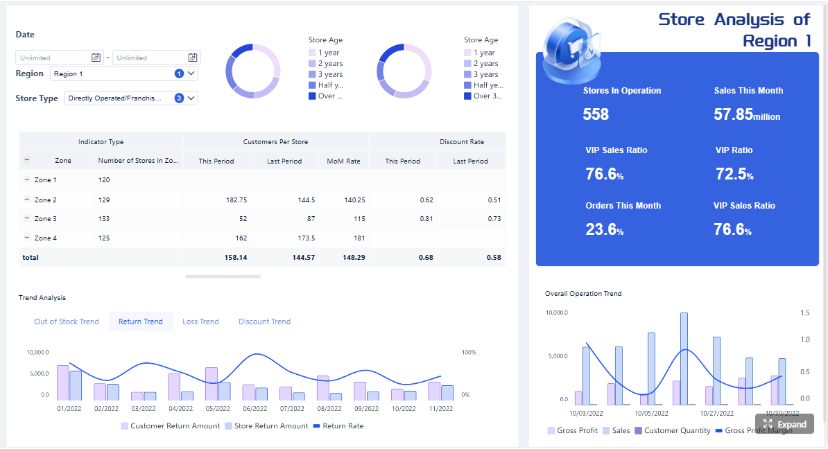
Manager view: team readiness, overdue training, certification status, coaching triggers
Learner view: due items, progress, required actions, upcoming deadlines
Keep each view focused on the decisions that role can actually make
This is the discipline most teams skip.
For example, a learner cannot act on organization-wide adoption trends. An executive does not need granular session-level click behavior. A manager should not need to parse admin configuration summaries.
Common dashboard patterns and examples worth learning from
You do not need to reinvent the dashboard from scratch. Strong models already exist across education, corporate learning, and cloud LMS platforms. The key is to borrow patterns, not copy layouts blindly.
Teacher-facing dashboards that prioritize intervention and classroom visibility
Instructor and teacher dashboard models often work well because they are built around immediate action.
Useful patterns include:
learner status markers
missing assignment alerts
performance trend summaries
participation snapshots
one-click access to individual learner details
These models work because they prioritize intervention over presentation.
Corporate LMS dashboards that emphasize compliance, skills, and team readiness
In enterprise settings, the most valuable dashboards usually focus on risk and operational readiness.
Typical strengths include:
mandatory training completion by team
certification expiration monitoring
readiness by role or location
manager accountability views
clean escalation logic for overdue requirements
This is especially important in regulated industries, distributed workforces, and frontline training environments.
Plugin and cloud platform dashboards that balance flexibility with simplicity
Many organizations use LMS plugins, extensions, or configurable cloud tools. These can be effective if they avoid over-customization.
The best implementations usually provide:
a small KPI set on the homepage
drill-down reporting beneath it
configurable filters by cohort or team
cards and alerts for urgent exceptions
simple navigation across views
Too much configurability often leads to dashboard sprawl. Governance matters more than feature count.
What to borrow from strong instructor and teacher dashboard models
Clear learner status indicators and at-risk flags
The best teacher-style dashboards make learner risk visible in seconds.
Borrow patterns like:
red-amber-green status signals
late, missing, or stalled indicators
risk scores based on milestone progress
grouped lists of learners needing attention now
These visual cues accelerate action.
Assignment, assessment, and participation trends in one place
Instructors should not have to open three separate tools to understand learner health.
Combine:
assignment completion
assessment performance
participation trend
recent changes in activity
intervention history
That creates context for smarter follow-up.
What to borrow from platform gallery and benchmark examples
Effective visual hierarchy, limited KPI sets, and clean comparisons
Strong dashboard design is often less about the visuals themselves and more about restraint.
Borrow these principles:
place the most important KPI cards first
compare against target, prior period, or benchmark
avoid crowded chart grids
show one clear message per visual
highlight exceptions before totals
A dashboard lms should feel immediately interpretable.
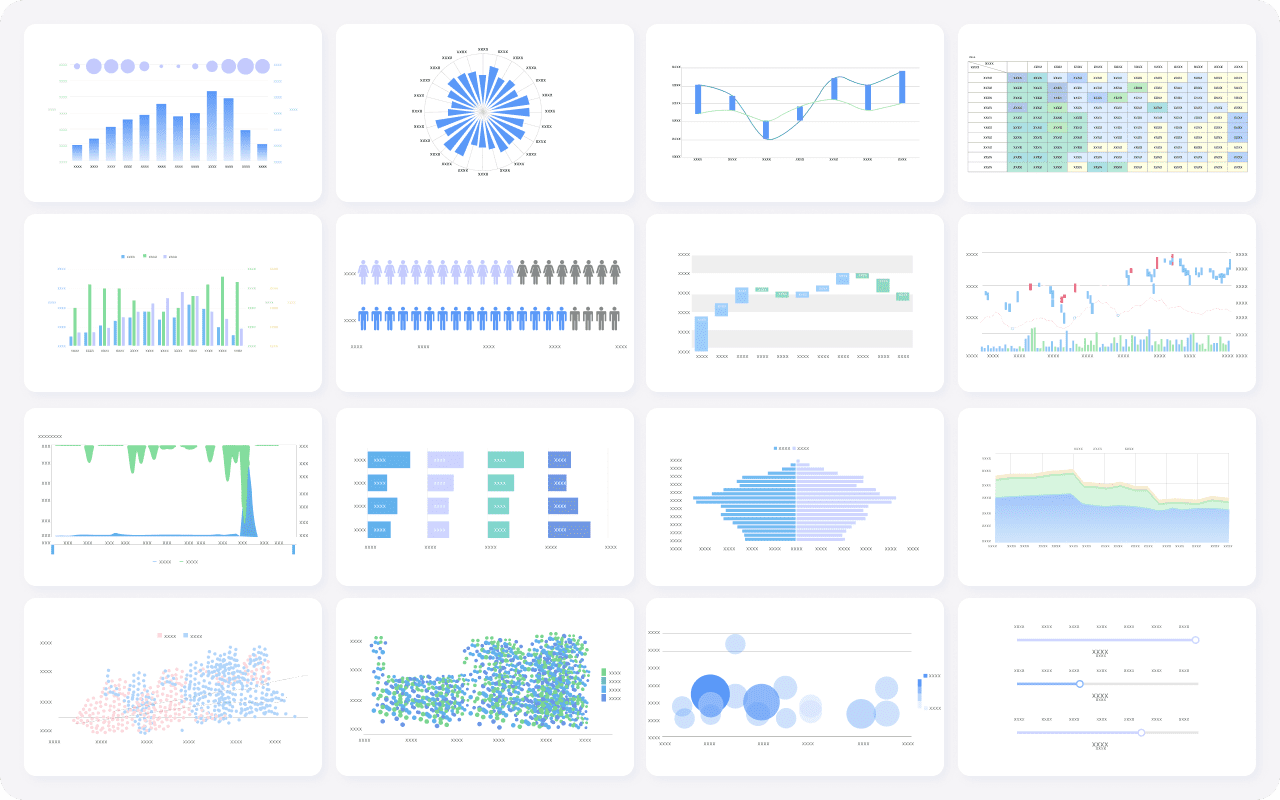
Use of cards, trend lines, and cohort filters to speed interpretation
Some of the most effective dashboard components are also the simplest:
KPI cards for current state
trend lines for direction over time
cohort filters for segmentation
tables with drill-down for case handling
alert banners for urgent exceptions
This mix supports both executive scanning and operational action.
Mistakes to avoid when launching or redesigning your LMS dashboard
Even technically polished dashboards fail if the rollout strategy is weak.
Copying another platform's layout without matching your training goals
A dashboard design that works for a school, coaching business, or course marketplace may fail in enterprise compliance or workforce readiness contexts.
Always adapt the structure to your own use cases:
compliance-heavy environments need deadline and certification visibility
onboarding programs need time-to-readiness views
instructor-led settings need classroom and assignment tracking
operational teams need manager follow-up signals
Use external examples as inspiration, not templates.
Overloading the home screen with charts nobody owns
Every chart should have a clear owner.
If no one is responsible for acting on a metric, it should not dominate the dashboard homepage.
A useful rule: if a chart has no owner, no threshold, and no follow-up process, demote it to a secondary report.
Hiding data definitions and creating mistrust in the numbers
Nothing destroys adoption faster than unclear metric logic.
Users need to know:
how completion is defined
what counts as active engagement
how cohorts are assigned
which date range is being applied
whether the dashboard is real-time or delayed
Transparent definitions create confidence and reduce rework.
Skipping user feedback after rollout
Many teams treat launch as the finish line. It is not.
The real test begins after users rely on the dashboard in live workflows. If managers still export spreadsheets, if instructors still maintain shadow trackers, or if executives still request side reports, the dashboard is not yet solving the core problem.
A simple rollout plan
A disciplined rollout improves both adoption and dashboard quality.
Prototype with one team or use case first
Start with a focused scenario, such as:
compliance tracking for one division
instructor intervention for one course family
onboarding readiness for one business unit
This reduces complexity and makes feedback actionable.
Validate whether the dashboard changes decisions and follow-up actions
Measure behavior change, not just dashboard views.
Ask:
Did managers intervene earlier?
Did instructors contact at-risk learners faster?
Were overdue items reduced?
Did fewer users request manual reports?
That is how you validate decision impact.
Refine metrics, views, and alerts before wider deployment
Expect multiple iterations.
Typical refinements include:
removing low-value metrics
adjusting alert thresholds
simplifying filters
clarifying KPI definitions
improving drill-down navigation
The best dashboard lms implementations evolve through operational use.
How to know your dashboard is actually improving decisions
A dashboard is successful when it changes behavior in measurable ways.
Faster identification of at-risk learners and overdue training
If your dashboard works, teams should spot risk earlier and act sooner.
Look for:
shorter time from risk signal to intervention
earlier manager escalation
fewer missed mandatory deadlines
better visibility into stalled learners
More targeted manager and instructor interventions
Interventions should become more precise, not just more frequent.
That means:
the right learners are contacted sooner
coaching is based on real evidence
reminders are focused on genuine risk
managers can prioritize high-impact follow-up
Better course updates based on evidence instead of assumptions
Your content team should be able to identify exactly where course design is failing.
Signs of progress include:
faster updates to weak modules
fewer repeated support issues
improved pass rates after revisions
lower abandonment in previously high-friction sections
Clearer links between training activity and business outcomes
At the enterprise level, this is where trust is won.
You should be able to show clearer relationships between training and outcomes such as:
stronger compliance readiness
improved onboarding speed
broader certification coverage
reduced operational errors tied to training gaps
more consistent team readiness across departments
Questions to review every quarter
A dashboard lms should be governed continuously, not left untouched after launch.
Which metrics led to action, and which were ignored?
Metrics that do not drive action should be removed, reframed, or moved to secondary reporting.
Which users still need separate reports because the dashboard falls short?
This is one of the strongest indicators of a design gap. If users still rely on spreadsheets or custom exports, the dashboard is not fully aligned to their decisions.
What decisions became faster, better, or more consistent?
This is the ultimate success test.
Good dashboards improve:
speed of intervention
quality of manager follow-up
confidence in training governance
consistency across teams and regions
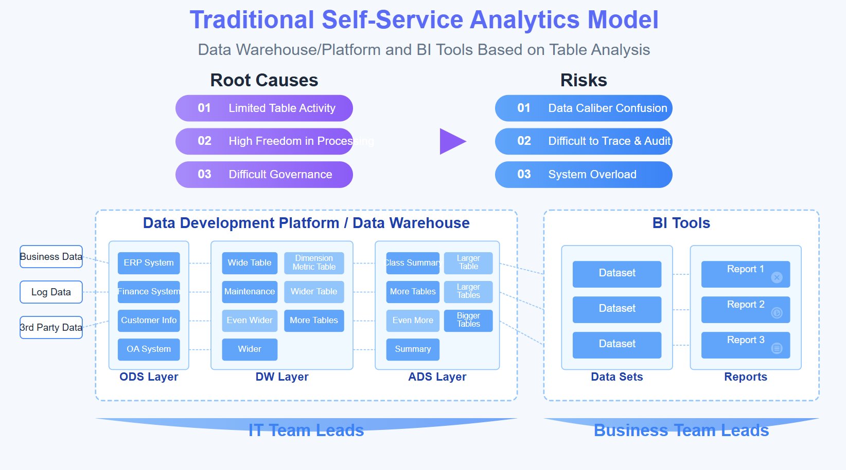
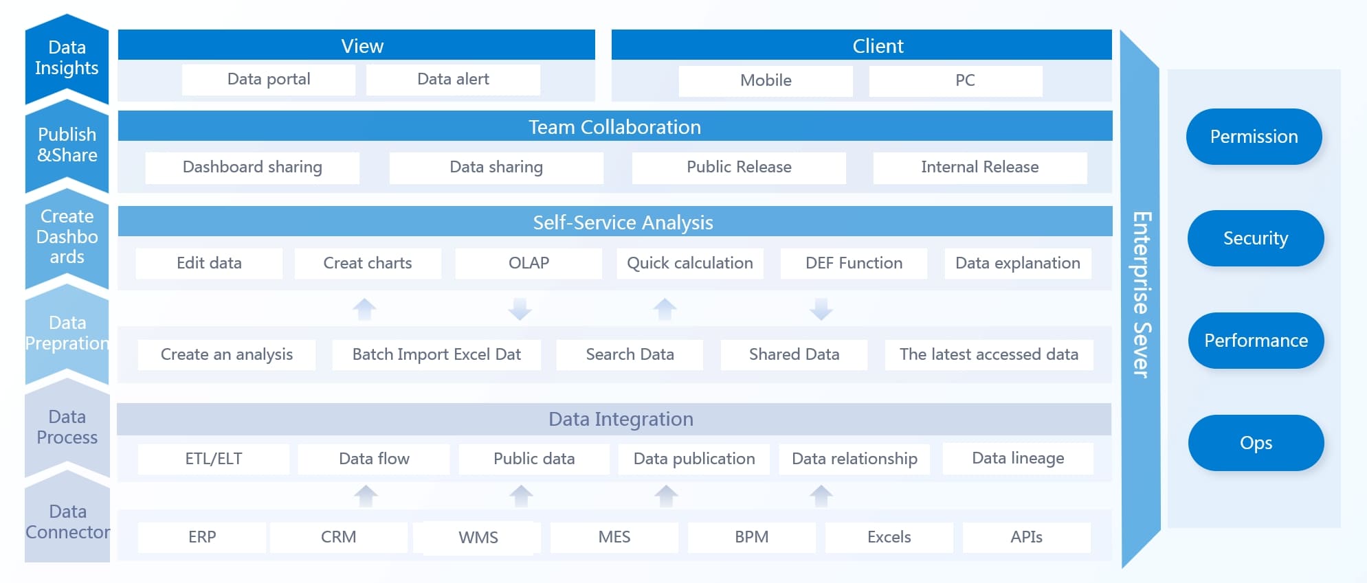
Build it manually if you must—use FineBI if you want it to scale
Building a truly effective dashboard lms manually is harder than most organizations expect. You need reliable LMS data pipelines, consistent KPI definitions, role-based access logic, alerting rules, drill-down workflows, visual hierarchy standards, and a governance model that keeps the whole system trustworthy over time.
That is why many LMS dashboard projects stall between reporting and real decision support.
A better path is to use FineBI to accelerate the work. Instead of stitching together fragmented reports and custom views from scratch, you can use ready-made templates, build role-based dashboards faster, and automate the workflow from data integration to decision-ready visualization.
drill from executive summaries into learner or course detail
reduce dependence on manual exports and spreadsheet reporting
The strategic advantage is simple: building this manually is complex; use FineBI to utilize ready-made templates and automate this entire workflow.
If your current LMS dashboard is generating more reports than decisions, that is your signal to redesign the system around action. Start with the decisions, narrow the KPIs, build role-specific views, and use FineBI to operationalize the model at scale.
FAQs
A useful LMS dashboard helps each role see priorities, risks, and the next best action instead of just showing raw activity data. It should make overdue training, learner risk, and content issues obvious at a glance.
Most fail because they track too many disconnected metrics, serve everyone with the same view, and focus on reporting instead of action. The result is data visibility without clear decisions.
Prioritize metrics tied to real outcomes like compliance by deadline, speed to proficiency, certification risk, course drop-off, and team readiness. If a metric does not support a decision, it should not dominate the main dashboard.
A standard report explains what happened in the past, while a decision dashboard highlights what needs attention now. The best dashboards also suggest what managers, instructors, or admins should do next.
Learners, managers, instructors, administrators, and executives should each see different dashboard views based on their responsibilities. Role-based dashboards reduce noise and make it easier for each user to act quickly.
Product Trial
FineReport
Pixel-perfect reports · Interactive dashboards · Easy data entry · Digital twins