A well-designed human resources dashboard should do more than display HR data. It should help leaders see what matters, understand why it matters, and decide what to do next.
That sounds obvious. In practice, many HR dashboards fail because they try to show everything at once: hiring volume, turnover, engagement, diversity, absence, compensation, training, performance, and workforce planning, all on one crowded screen. The result is noise, not insight.
For HR leaders, HRBPs, people managers, and executives, the real goal is simpler: build a dashboard that supports fast, confident, repeatable decision-making.
This guide explains seven proven best practices to help you design a human resources dashboard that is clear, credible, and useful in real business settings.
What a human resources dashboard should do for HR teams
At its core, a human resources dashboard turns workforce data into decisions. It takes information that usually lives across HRIS, ATS, payroll, engagement tools, and spreadsheets, then organizes it into a view that helps teams act.
A strong dashboard serves three different but related purposes:
Report activity: What happened?
Monitor performance: Are we on track?
Prompt action: What should we do now?
These are not the same thing.
A reporting view may show that 42 people were hired last month. A performance view may show that time to hire is above target in two business units. An action-oriented view goes further and signals where recruiter capacity, candidate quality, or approval bottlenecks need intervention.
That distinction matters because HR reporting often stops too early. It describes the workforce but does not guide the business.
Clarity and trust also matter more than chart volume. Executives rarely ask for more visuals; they ask for faster answers. If users cannot quickly understand what they are seeing, or if they doubt the numbers, adoption drops. Once trust is lost, even a visually impressive dashboard becomes background decoration.
After defining the role of the dashboard, the next step is to design it around decisions.
All dashboard demos in this blog created by FineBI.
Human Resources Dashboard Best practice 1: Start with decisions, not data
The most effective dashboard projects do not begin with available fields. They begin with business decisions.
Identify the core questions leaders, managers, and HR partners need answered
Different users need different answers:
Executives want to know whether workforce trends threaten growth, cost, risk, or execution.
People managers want to know where team issues are emerging and which actions are within their control.
HR business partners want to identify root causes, compare business units, and guide interventions.
Specialists in talent acquisition, total rewards, or employee experience need more operational depth.
A practical design method is to map every metric to three things:
Metric
Decision Supported
Owner
Review Cadence
Time to hire
Whether hiring process needs redesign or added recruiter support
TA Lead
Weekly
Voluntary turnover
Whether retention action is needed in a team or function
HRBP + Business Leader
Monthly
Engagement score
Whether manager coaching or team action plans are required
HRBP + Managers
Quarterly
Internal mobility rate
Whether career pathways are working
Talent Leader
Monthly/Quarterly
Absenteeism rate
Whether workload, wellbeing, or compliance issues are rising
HR Operations + Managers
Monthly
This approach forces discipline. If a metric has no clear decision, no owner, and no review cycle, it likely does not belong on the main dashboard.
It is equally important to remove visuals that do not support a next step. Many HR dashboards include charts simply because the data exists. But a chart without an operational implication adds cognitive load. Good design is often about subtraction.
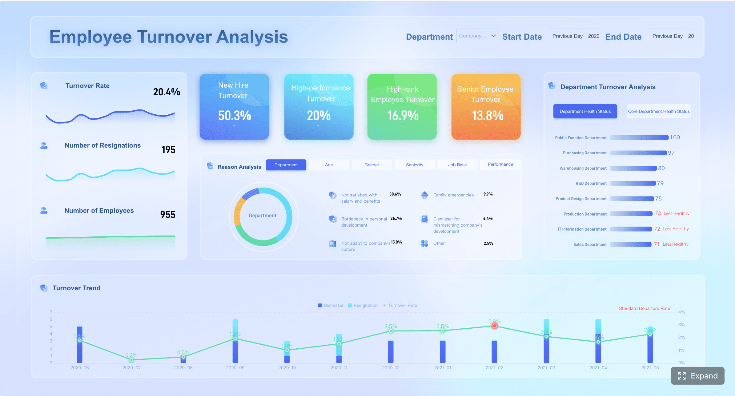
Human Resources Dashboard Best practice 2: Focus on the metrics that matter most
An overloaded dashboard weakens signal quality. A focused dashboard improves actionability.
Choose a balanced set of hiring, retention, engagement, diversity, and workforce planning metrics
A useful human resources dashboard typically combines a balanced mix of workforce indicators instead of over-indexing on one area.
A practical metric set often includes:
Hiring: requisition volume, time to hire, source quality, offer acceptance rate
Retention: voluntary turnover, regrettable attrition, early attrition, retention by manager or function
Diversity and inclusion: representation by level, hiring mix, promotion equity, attrition by demographic group
Workforce planning: headcount, vacancy rate, span of control, internal mobility, critical role coverage
The key is balance between lagging indicators and leading indicators.
Lagging indicators tell you what already happened, such as annual turnover.
Leading indicators help you anticipate what may happen next, such as declining engagement in high-risk teams, slow offer acceptance, or falling internal mobility.
Using both provides a more complete picture. If you only track lagging metrics, you detect problems too late. If you only track leading metrics, you may overreact to short-term signals.
Consistency in metric definition is equally critical. For example, “turnover rate” often means different things across HR, finance, and business teams. Does it include internal transfers? Seasonal workers? Involuntary exits? If definitions vary, comparison becomes misleading.
A short metric dictionary embedded into the dashboard experience can prevent confusion:
Human Resources Dashboard Best practice 3: Make the dashboard easy to scan and interpret
Good dashboard design reduces effort. A user should understand the main message in seconds, not minutes.
Use a clear layout, strong hierarchy, and simple comparisons
A clear layout typically follows a top-to-bottom logic:
Top row: essential KPI summary
Middle section: trends and comparisons
Lower section: detail by region, business unit, manager, or demographic segment
Group related metrics into logical sections such as:
Talent acquisition
Employee experience
Headcount and workforce structure
Retention and mobility
Diversity and inclusion
This structure helps users navigate quickly and reduces mental switching.
Strong hierarchy matters too. Not all metrics deserve equal visual weight. The most decision-relevant KPIs should appear first, with larger size, stronger contrast, and direct context such as target or variance.
Effective dashboards also rely on simple comparisons:
Current period vs target
Current period vs prior period
Business unit vs company average
Segment vs benchmark threshold
These comparisons make change visible. Without comparison, a number often has no meaning.
Design principles that improve scanability
Use trend indicators clearly
A single KPI card becomes more useful when paired with a sparkline, target marker, or period-over-period variance.
Highlight exceptions
The fastest dashboards direct attention to what changed materially. Examples include:
turnover above threshold
sharp drop in offer acceptance
headcount gap in a critical function
engagement decline concentrated under one manager group
Keep visual forms simple
For most HR use cases, these chart types work best:
Line charts for trends
Bar charts for category comparison
Stacked bars for composition
Tables with conditional formatting for operational review
Scatter plots for relationships when the audience is analytical
Avoid decorative visuals, unnecessary gauges, 3D effects, and inconsistent color palettes. Color should convey meaning, not style preference. For example:
Green: on target
Amber: watch
Red: action required
Blue/gray: neutral context
If every chart uses a different color logic, users hesitate. Hesitation slows decisions.
Human Resources Dashboard Best practice 4: Build trust with accurate, well-governed HR data
No human resources dashboard can succeed without trust in the underlying data.
HR data is especially sensitive because it influences hiring plans, manager accountability, employee experience, diversity goals, and sometimes legal exposure. That makes governance a design requirement, not a back-end detail.
A trustworthy dashboard should clearly communicate:
Data sources: HRIS, ATS, payroll, LMS, survey platform, service desk
Refresh timing: real-time, daily, weekly, or monthly
Metric definitions: especially for high-stakes measures
Ownership: who validates and maintains the data
When data quality is imperfect, do not hide it. Flag issues early. For example:
incomplete demographic fields
missing termination reasons
delayed requisition status updates
duplicate employee records after system migration
Transparent data caveats are better than false precision. Business users can work with qualified data. They lose confidence when they discover errors after making a decision.
Privacy is equally important. HR dashboards must protect sensitive employee information through:
Role-based access control
Row-level security
Masking or aggregation for small populations
Restricted access to compensation or personal identifiers
Audit trails for sensitive views
In many organizations, the right answer is not one dashboard for everyone, but one governed data model serving different views by role.
Human Resources Dashboard Best practice 5: Turn HR reporting into action
A dashboard becomes valuable when it changes behavior, not when it simply gets viewed.
Add context, benchmarks, and recommended follow-up steps
Most HR numbers need context. A 12% voluntary turnover rate may be alarming in one business and normal in another. A 45-day time to hire may be strong for niche technical roles and weak for frontline hiring.
That is why an action-oriented human resources dashboard should compare performance against something meaningful:
target
prior period
seasonal pattern
business unit average
role family benchmark
strategic threshold
A useful action layer can be designed like this:
Metric
Current
Comparison
Signal
Suggested Follow-Up
Voluntary turnover
14.2%
Target 10%
Red
Review manager-level hotspots and exit themes
Offer acceptance
71%
Prior quarter 79%
Amber
Audit compensation competitiveness and offer speed
Early attrition
8.5%
Company average 5.1%
Red
Check onboarding quality and job fit by source
Engagement score
74
Prior survey 78
Amber
Launch manager action planning in low-scoring teams
Filters should also be used carefully. They are essential for exploration, but too many filters can make a dashboard confusing. Limit them to the dimensions users actually need, such as:
time period
business unit
location
department
manager hierarchy
job family
Commentary space is often overlooked, but it is highly effective. Numbers alone rarely tell the full story. HR leaders should be able to annotate key movements with short explanations:
why the metric changed
whether the shift is expected or concerning
what action has been assigned
when the issue will be reviewed again
This turns passive reporting into an operating tool.
Human Resources Dashboard Best practice 6: Design for different users and real-world workflows
One of the fastest ways to reduce dashboard value is to assume all users need the same view.
Different HR stakeholders consume information differently:
Executives need concise summaries, exceptions, and business implications
Managers need team-level visibility and clear actions within their span of control
HR specialists need operational detail and drill-down analysis
HRBPs need a cross-functional view that connects talent, experience, and workforce risk
This means the best human resources dashboard strategy often includes layered views rather than a single universal page.
Process detail, pipeline, service levels, exceptions
Real-world workflow design matters just as much as content design. Ask how the dashboard will actually be used:
in weekly recruiting reviews
during monthly business reviews
in quarterly talent discussions
in workforce planning cycles
in manager check-ins
through exception alerts between meetings
Mobile and presentation readability also deserve attention. If leaders review dashboards in meetings or on mobile devices, labels, KPI cards, and trend signals must remain legible without heavy interaction.
A dashboard that works only on a desktop analyst screen will underperform in executive settings.
Human Resources Dashboard Best practice 7: Improve the dashboard over time
A dashboard is not a one-time deliverable. It is a management product.
Business priorities shift. Hiring slows or accelerates. Retention risk moves from one function to another. New regulations emerge. Organizational structures change. If the dashboard does not evolve, relevance fades.
The best improvement process includes three feedback loops:
Usability feedback
Can users find what they need quickly? Which charts confuse them? Where do they hesitate?
Usefulness feedback
Which metrics consistently influence decisions? Which ones get ignored?
Question-gap feedback
What critical questions still require spreadsheet follow-up or analyst support?
You should also retire low-value metrics. Many dashboards become bloated because no one removes anything. A mature dashboard design process includes quarterly or semiannual review of:
metric relevance
interaction patterns
stale filters
broken drill paths
duplicate views
dashboard load time
security logic
Importantly, measure success beyond views. A dashboard with high traffic but low action is not necessarily effective.
Track indicators such as:
percentage of reviews using the dashboard
action completion after flagged issues
reduction in manual reporting effort
decision cycle time
number of recurring questions resolved by self-service use
That is how you know the dashboard is driving operational value.
Common human resources dashboard examples and what they teach you
Different HR dashboard types solve different business problems. Reviewing common patterns helps clarify what to include and what to leave out.
Recruiting dashboard
A recruiting-focused human resources dashboard should emphasize pipeline health and hiring efficiency.
What it teaches: recruiting dashboards work best when they connect speed with quality. Fast hiring alone is not a win if bad hires rise or offer acceptance falls.
Retention and turnover dashboard
This dashboard should go beyond total attrition and focus on the exits that matter most.
Key elements often include:
voluntary turnover
regrettable attrition
attrition by tenure band
manager or department hotspots
exit reasons
early attrition
retention trend by role family or location
What it teaches: not all turnover is equally important. The dashboard should separate structural noise from business-critical loss.
Workforce overview dashboard
This is usually the executive starting point. It summarizes overall workforce health in one place.
Common elements include:
total headcount
active vs inactive employees
hiring and exits
demographics
absenteeism
internal movement
span of control
location or business unit breakdown
What it teaches: summary dashboards should prioritize breadth with disciplined simplicity. They are best used to identify where deeper analysis is needed.
Benefits and employee services dashboard
This dashboard helps HR operations teams monitor employee support programs in a simple, compliant format.
Common elements include:
benefits enrollment patterns
usage of employee services
case volume and resolution time
leave trends
wellness program participation
support channel performance
What it teaches: operational HR dashboards must balance service visibility with privacy and compliance. Aggregated views often matter more than individual-level detail.
How to evaluate your human resources dashboard before launch
Before launch, review the dashboard as a business tool, not just a reporting artifact.
Start with a simple checklist:
Does every chart answer a real business question?
Is each metric tied to a decision, owner, and review cadence?
Can a first-time user explain the top insights in under a minute?
Are definitions of turnover, headcount, hiring, and diversity metrics validated?
Are permissions, role access, and privacy rules tested?
Is data refresh reliable and visible?
Do trends, targets, and exceptions stand out clearly?
Does the dashboard help users decide what action to take next?
A useful final test is to run a short simulation with real stakeholders. Ask an executive, a people manager, and an HRBP to use the dashboard for the same scenario, such as rising attrition in one function. Observe where they struggle, what they misinterpret, and what questions remain unanswered.
If the dashboard creates clarity, confidence, and action, it is ready.
For organizations that want to move from static HR reporting to governed, interactive, and business-ready analytics, FineBI is a practical option to evaluate. It helps teams unify HR data from multiple sources, build role-based dashboards, support self-service analysis, and deliver clearer reporting experiences for executives, managers, and HR specialists. That is especially valuable when your goal is not just to visualize HR metrics, but to operationalize them across reviews, workflows, and decisions.
In other words, the right platform should support all seven best practices above: decision-first design, focused metrics, clean layout, trusted data, action-oriented analysis, role-based delivery, and continuous improvement. FineBI fits naturally into that model by giving HR teams a scalable way to build a human resources dashboard that is both analytically robust and easy for business users to adopt.
A strong human resources dashboard should include a small set of high-value metrics tied to decisions, such as headcount, hiring, turnover, engagement, diversity, and workforce planning. The best mix combines current performance with early warning signals so teams can act sooner.
Start with the decisions each audience needs to make, then choose only the metrics that support those decisions. Keep the layout simple, definitions consistent, and insights easy to scan in seconds.
Executive views usually focus on workforce trends that affect growth, cost, risk, and execution. Common priorities include headcount, time to hire, voluntary turnover, engagement, and critical diversity or mobility indicators.
An HR report mainly summarizes what happened, while an HR dashboard helps users monitor performance and spot where action is needed. Dashboards are built for fast interpretation, not just recordkeeping.
Use clear metric definitions, align data sources across systems, and assign ownership for each KPI. Trust improves when users know exactly how numbers are calculated and how often they are reviewed.
Product Trial
FineReport
Pixel-perfect reports · Interactive dashboards · Easy data entry · Digital twins