A customer service metrics dashboard should help support leaders make faster operational decisions, reduce service risk, and improve customer outcomes without waiting for static weekly reports. If you manage a support team, you already know the pain points: rising ticket volume, uneven agent workload, SLA misses, unclear ownership, and executive pressure to prove that service quality supports retention. A well-designed dashboard turns those issues into visible, measurable signals so teams can act before customer experience declines.
All reports in this article are built with FineReport.
What a customer service metrics dashboard should help you answer
A strong dashboard is not just a reporting layer. It is a decision system. It should tell support leaders what is happening now, why it is happening, and where intervention matters most.
For most organizations, the dashboard should answer four categories of questions:
Are we keeping up with demand?
Are we responding and resolving issues fast enough?
Are customers actually satisfied with the experience?
Are service problems exposing bigger process, product, or retention risks?
Define the decisions a dashboard should support
Different roles need different levels of visibility.
Support leaders
Support directors and heads of customer service need answers to strategic questions such as:
Is support capacity aligned with volume growth?
Which queues are creating the most operational risk?
Are service trends affecting renewals, churn, or brand loyalty?
Which channels or issue categories require process redesign?
Team managers
Managers need dashboards that support day-to-day control:
Which queues are breaching SLA today?
Where is backlog growing?
Which agents are overloaded or underutilized?
Which issue types need coaching or escalation?
Frontline teams
Agents and team leads need simpler, highly actionable views:
What should be prioritized now?
Which tickets are aging?
Which customers are waiting longest?
Where can first-contact resolution be improved?
Separate operational visibility from executive reporting and long-term planning
One common mistake is forcing one dashboard to serve every audience. That rarely works.
A practical customer service metrics dashboard model separates three layers:
Operational views should focus on active workload, SLA exposure, and response bottlenecks. Executive views should focus on trend direction, service quality, and customer impact. Planning views should show longer patterns, seasonality, and structural inefficiencies.
Identify the difference between tracking activity, efficiency, quality, and customer outcomes
To build a useful dashboard, classify metrics correctly.
Activity metrics show how much work exists, such as ticket volume.
Efficiency metrics show how quickly or productively work is handled, such as average resolution time.
Quality metrics show whether support was handled well, such as first contact resolution.
Customer outcome metrics show the business effect on the customer relationship, such as CSAT or loyalty indicators.
If your dashboard only tracks activity, you may know the workload but not whether support is effective. If it only tracks satisfaction, you may miss operational issues before they become customer-facing problems. Balance is essential.
Clarify when a simple scorecard is enough and when you need a full dashboard
A scorecard is enough when:
You only need a handful of monthly metrics
The audience is executive only
The process is stable and low-volume
There is little need for drill-down by queue, channel, priority, or agent
A full dashboard is necessary when:
Support volume changes daily
You operate across multiple channels
SLA compliance matters
Managers need to identify bottlenecks quickly
You need segmentation by team, region, product, or customer tier
In enterprise environments, a scorecard often becomes the top layer of a broader dashboard system.
The 12 KPIs that matter most in a customer service metrics dashboard and when to use each one
The best customer service dashboards do not try to track everything. They focus on a core set of KPIs that support action.
Key Metrics (KPIs)
First Response Time: The average time between ticket creation and the first agent reply. Best for measuring responsiveness.
Average Resolution Time: The average time to fully resolve a ticket. Best for assessing end-to-end service efficiency.
SLA Attainment: The percentage of tickets resolved or responded to within committed service levels. Best for compliance and risk control.
Ticket Volume: The number of incoming tickets over a period. Best for capacity planning and demand monitoring.
Backlog: The count of unresolved tickets, often segmented by age or priority. Best for queue health.
Agent Utilization / Tickets Handled per Agent: A productivity view of workload and throughput per agent. Best for staffing and balancing work.
CSAT: Customer satisfaction score collected after interactions. Best for measuring service experience quality.
NPS or Customer Loyalty Proxy: A broader signal of advocacy or relationship health. Best for linking service to retention and brand impact.
First Contact Resolution: The percentage of issues solved in the first interaction. Best for measuring efficiency and customer convenience.
Reopen Rate: The percentage of resolved tickets reopened later. Best for identifying weak resolutions.
Escalation Rate: The percentage of tickets transferred to higher support tiers or management. Best for spotting complexity or skill gaps.
Self-Service Deflection Rate: The share of customer issues solved through help centers or knowledge bases without agent involvement. Best for cost control and scale.
Speed and responsiveness metrics
Speed metrics matter because customers notice delay before they notice process quality. These metrics are critical for operational control.
First response time
This measures how quickly a customer gets the first reply after opening a case.
Use it when:
You manage email, chat, or ticket-based support
You want to improve perceived responsiveness
You need to monitor queue coverage by channel or shift
Watch out for one issue: a fast first response can hide poor resolution quality. It should never stand alone.
Average resolution time
This tracks total time from ticket creation to resolution.
Use it when:
You want to understand end-to-end support efficiency
You need to compare teams or issue categories
You want to identify process bottlenecks and staffing constraints
Segment it by priority, product, and issue type. A single average across all cases can be misleading.
SLA attainment
This measures the percentage of tickets meeting service commitments.
Use it when:
You support enterprise customers
You have contractual obligations
You need a risk indicator for service delivery
For B2B support, SLA attainment often deserves prominent placement because missed commitments can impact renewals and customer trust.
Volume and productivity metrics
These metrics show whether your support operation can absorb demand efficiently.
Ticket volume
Ticket volume reveals support demand over time.
Use it when:
You need staffing forecasts
You want to detect spikes after releases or incidents
You need channel-level workload visibility
Track volume by day, week, channel, product, and customer segment for a more useful planning view.
Backlog
Backlog is the number of unresolved tickets waiting for action or closure.
Use it when:
You need early warning on queue health
You want to reduce customer wait times
You want to monitor aging tickets by severity
Backlog should always be paired with aging. A backlog of 500 recent tickets is very different from a backlog of 500 overdue priority cases.
Agent utilization or tickets handled per agent
This shows how much work each agent handles over time.
Use it when:
You want to balance workload
You need productivity baselines
You are assessing staffing gaps
Be careful not to reduce performance management to raw volume. The most complex work often produces lower ticket counts but higher customer value.
Quality and customer outcome metrics
Fast support is not enough if it leads to poor customer experience or repeat contacts.
CSAT
Customer Satisfaction Score measures how satisfied customers were with the service interaction.
Use it when:
You need direct feedback on service quality
You want to compare channels, agents, or categories
You need a board-friendly customer experience indicator
CSAT is best viewed with response rate and segmentation. Low survey participation can distort the picture.
NPS or customer loyalty proxy
NPS is broader than service alone, but it still matters in a customer service dashboard when support quality strongly influences retention.
Use it when:
Support is part of account health
You serve subscription customers
You want to connect service experience to loyalty risk
If NPS is not practical at support level, use a loyalty proxy such as renewal-risk accounts with repeated escalations or unresolved cases.
First contact resolution
This measures the percentage of issues resolved during the first interaction.
Use it when:
You want to reduce back-and-forth communication
You want to improve customer effort
You want to identify agent training opportunities
FCR is especially useful in chat, phone, and service desk environments where quick issue closure matters.
Retention and process health metrics
These metrics reveal whether support is solving problems sustainably.
Reopen rate
Reopen rate shows how often resolved cases come back.
Use it when:
You want to monitor resolution quality
You suspect premature closures
You need an early indicator of customer frustration
A rising reopen rate often means agents are optimizing for closure speed instead of problem resolution.
Escalation rate
This measures the percentage of tickets passed to a specialist, senior team member, or manager.
Use it when:
You want to identify skill gaps
You need to monitor complexity by product area
You want to control service delays from handoffs
Not all escalations are bad. In technical B2B support, some escalation is normal. The trend matters more than the number alone.
Self-service deflection rate
This measures how many issues are solved through self-service resources without agent involvement.
Use it when:
You want to scale support without adding headcount
You run a knowledge base or help center
You need to identify documentation gaps
For mature support teams, deflection rate is a high-value metric because it connects service efficiency with digital enablement.
How to choose the right KPIs for your support customer service metrics dashboard model
The right KPI mix depends on your business model, support structure, and maturity level. There is no universal dashboard template that works for every team.
Match metrics to your business stage, channel mix, and support complexity
Early-stage teams may only need:
Ticket volume
First response time
Backlog
CSAT
More mature organizations often need:
SLA attainment
FCR
Reopen rate
Escalation rate
Deflection rate
Segment-level and account-level breakdowns
Your channel mix matters too. Chat-heavy teams often prioritize response speed and concurrency. Email-heavy teams often focus more on backlog aging and resolution time. Service desk teams often need incident severity, escalation paths, and SLA breach visibility.
Prioritize different KPIs for B2B, high-touch, transactional, and service desk environments
B2B support
Prioritize:
SLA attainment
Escalation rate
Account-level backlog
FCR
Renewal-risk service flags
High-touch support
Prioritize:
Resolution time
Reopen rate
CSAT
Loyalty proxy
Escalation quality
Transactional support
Prioritize:
Ticket volume
First response time
Backlog
Productivity per agent
Self-service deflection rate
Service desk environments
Prioritize:
SLA attainment
Incident backlog by severity
Resolution time by priority
Escalation rate
Reopen rate
Avoid vanity metrics that look good but do not drive action
Avoid overemphasizing metrics that create visibility but little operational value, such as:
Total tickets resolved without issue complexity context
Team-wide average response time without channel segmentation
A metric belongs on the dashboard only if someone can act on it.
Build a balanced dashboard that combines speed, quality, cost, and customer impact
A balanced customer service metrics dashboard usually includes:
Speed: first response time, resolution time, SLA attainment
Workload: ticket volume, backlog, productivity
Quality: FCR, reopen rate, escalation rate
Customer impact: CSAT, NPS or loyalty proxy, deflection rate
This mix gives support teams a more complete picture than any single metric family.
Step-by-step guide to building a customer service metrics dashboard
Building the dashboard should start with business decisions, not visuals. The strongest implementations begin with use cases, align metric definitions, and then design dashboards around review routines.
Start with use cases and stakeholders
List the recurring decisions your dashboard must support every week and month.
Examples:
Should we reassign agents across queues today?
Which issue categories need process changes this month?
Are SLA misses concentrated in one region or shift?
Which accounts are at service risk before renewal?
Is self-service reducing repetitive ticket demand?
Then map dashboard needs by audience:
Real-time monitoring: team leads, supervisors, operations managers
Trend reporting: support managers, directors, analysts
4. Review trends and distributions, not just averages
Averages hide operational problems.
Pair average resolution time with median and percentile views
Pair backlog totals with aging bands
Pair CSAT averages with volume and response rate
Segment metrics by channel, issue type, region, and customer tier
This is where many teams uncover the real cause of service inconsistency.
5. Tie every KPI to an owner and a meeting cadence
The dashboard should fit your management rhythm.
Review real-time queue health daily
Review manager performance weekly
Review strategic trends monthly
Assign action owners for every exception
Track whether dashboard insights led to process changes
A dashboard that is not reviewed systematically becomes background noise.
At this stage, many enterprise teams benefit from a reporting platform that can combine ticketing data, SLA logic, service segmentation, and role-based distribution in one place. FineReport is a strong fit when you need flexible dashboard design, multi-source integration, drill-down reporting, and controlled access for operational and executive users.
This is the operational command center for most support environments.
B2B and service desk dashboard example
For B2B support and service desk operations, dashboards should connect service metrics with account or incident impact.
Core elements:
SLA attainment by account or priority
P1/P2 incident queue
escalations by product or account
account-level backlog
reopen rate for strategic customers
renewal-risk or service-risk indicators
Use visualizations such as:
account scorecards
priority incident boards
SLA breach trend by contract tier
escalation flow tables
risk dashboards tied to customer segments
These dashboards are especially valuable where support quality affects contract renewals, expansion, or enterprise trust.
Common customer service metrics dashboard mistakes and how to avoid them
Even good teams build dashboards that underperform. Most failures are not technical. They are design and governance problems.
Tracking too many KPIs without tying them to decisions or owners
The result is clutter and low adoption.
How to avoid it:
Limit the core dashboard to metrics that trigger action
assign owners for each KPI
move low-priority metrics to secondary drill-down views
Mixing channel data without normalizing definitions and expectations
Email, chat, phone, and self-service follow different service patterns. Combining them blindly distorts performance.
How to avoid it:
define channel-specific targets
separate channel views when needed
normalize logic before rolling up totals
Reporting averages without showing distributions, trends, or segment breakdowns
An average may look healthy while one queue is failing badly.
How to avoid it:
use aging buckets, percentiles, and trend charts
segment by issue type, priority, product, and customer tier
include comparison periods
Failing to revisit dashboard design as support operations mature
A dashboard that worked at 10 agents often breaks at 100.
How to avoid it:
review dashboard relevance quarterly
retire metrics that no longer drive action
add planning and predictive views as operations grow
evolve from simple scorecard to layered dashboard architecture
Final recommendation: build for action, not just visibility
A high-performing customer service metrics dashboard does more than display support data. It helps enterprise teams reduce service risk, improve manager response time, coach agents effectively, and connect support performance to customer retention.
If you want your dashboard to work in the real world, follow this order:
Define the decisions it must support
Select a balanced set of 12 meaningful KPIs
Build role-based views for executives, managers, and teams
Standardize your metric definitions
Add thresholds, owners, and review cadences
That is how dashboards stop being passive reports and start becoming operational systems.
For organizations that need enterprise-grade flexibility, FineReport can help you build customer service dashboards that combine real-time monitoring, cross-source data integration, drill-down analytics, and executive-ready reporting in one environment.
Get Ready-to-Use Dashboard Templates in Fine Gallery
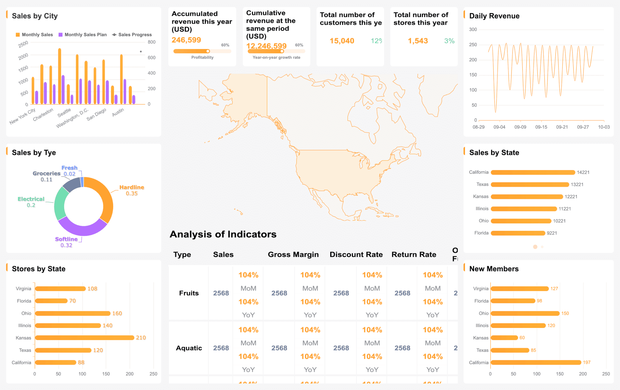
A useful dashboard should show a balanced mix of workload, speed, quality, and customer outcome metrics. Common examples include ticket volume, backlog, first response time, resolution time, SLA attainment, CSAT, and agent workload.
The most important KPIs usually include first response time, average resolution time, SLA attainment, ticket volume, backlog, first contact resolution, and CSAT. The right mix depends on whether the dashboard is meant for daily operations, executive reporting, or longer-term planning.
Operational dashboards should refresh in real time or near real time so managers can react to queue changes quickly. Executive and planning dashboards can often update daily, weekly, or monthly depending on the decisions they support.
Start by defining the decisions the dashboard needs to support, then choose a small set of actionable KPIs for each audience. Keep the layout simple, separate operational views from executive views, and allow drill-down by queue, channel, priority, or agent when needed.
A scorecard works when you only need a few stable, high-level metrics for periodic review. A full dashboard is better when support volume shifts often, SLA risk is important, or teams need deeper visibility into bottlenecks and workload.
Product Trial
FineReport
Pixel-perfect reports · Interactive dashboards · Easy data entry · Digital twins