A data quality dashboard is the control center for monitoring whether business-critical data is complete, accurate, consistent, timely, valid, and unique enough to support decisions without constant manual verification. For IT managers, analytics leaders, operations directors, and compliance owners, the business value is simple: faster issue detection, lower reporting risk, fewer downstream surprises, and stronger trust in dashboards, AI models, and executive reporting.
All dashboards in this article are built with FineBI.
What a data quality dashboard is and why it matters
A data quality dashboard gives teams a shared, visual view of data health across pipelines, systems, domains, and business processes. Instead of waiting for users to complain that a report looks wrong, teams can proactively track quality signals such as null rates, reconciliation errors, schema violations, duplicate records, stale datasets, and failed validation checks.
In practice, the best dashboards do more than display red-yellow-green status. They help teams answer operational questions quickly:
Where are the biggest data quality failures right now?
Which systems or owners are responsible?
What business process is exposed?
How severe is the impact?
Is quality improving or getting worse over time?
A clear data quality dashboard helps teams spot issues faster, prioritize fixes based on business impact, and build confidence in reporting. When leadership sees quality trends tied to missed SLAs, reconciliation delays, or compliance exposure, data quality stops being a technical side project and becomes an operational priority.
Who uses a data quality dashboard
A strong data quality dashboard serves multiple stakeholders:
Analytics teams use it to validate trusted inputs for BI, forecasting, and self-service reporting.
Operations teams use it to identify process breakdowns causing data delays or mismatches.
Compliance and risk teams use it to monitor audit-sensitive fields and reporting controls.
Data engineers and stewards use it to investigate failed tests, ownership, and remediation workflows.
Executives use summary views to understand risk exposure, business impact, and improvement progress.
Key Metrics (KPIs)
A high-performing data quality dashboard usually includes these KPI categories:
Completeness rate: Percentage of required fields populated.
Accuracy rate: Degree to which data matches a trusted source or expected business truth.
Consistency score: Alignment of values across systems, tables, and business rules.
Timeliness or freshness: How current the data is versus expected update windows or SLAs.
Validity rate: Share of records conforming to format, range, and rule constraints.
Uniqueness rate: Percentage of records free from duplicate keys or duplicate entities.
Reconciliation exception count: Number of mismatches between source and target systems.
Failed rule count: Total quality tests breached in a reporting period.
Critical data element health: Quality status of the fields with highest business or regulatory impact.
Issue remediation time: Average time taken to resolve a detected quality incident.
Severity distribution: Breakdown of issues by critical, high, medium, and low impact.
Data source risk score: Composite rating of quality performance by system or domain.
9 Data quality dashboard examples by industry
A useful way to design a data quality dashboard is to start with industry-specific use cases. While the core dimensions remain similar, the metrics, ownership model, and business consequences differ sharply by sector.
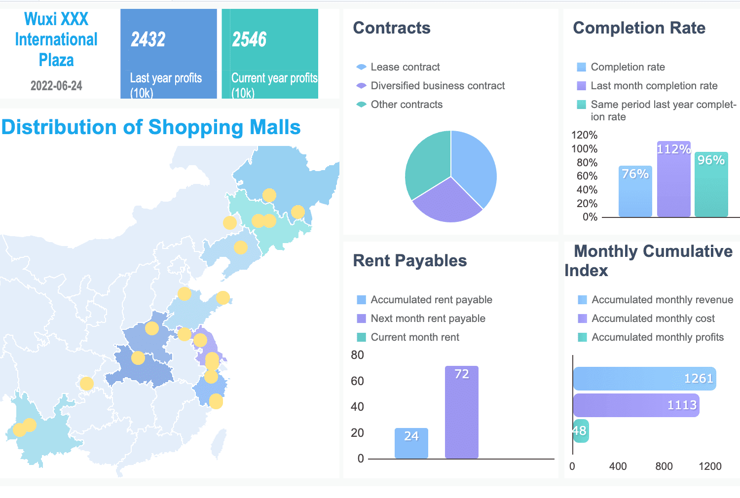
Finance dashboard example
In finance, a data quality dashboard should focus on control, traceability, and reporting integrity. Common metrics include missing values in transaction records, reconciliation breaks between ledgers and warehouses, duplicate customer records, reference data mismatches, and late data loads that threaten reporting deadlines.
Critical data element quality score for audit-sensitive fields
This dashboard supports audit readiness, improves regulatory reporting discipline, and gives risk teams better visibility into the quality of the data behind capital, liquidity, fraud, and exposure reporting.
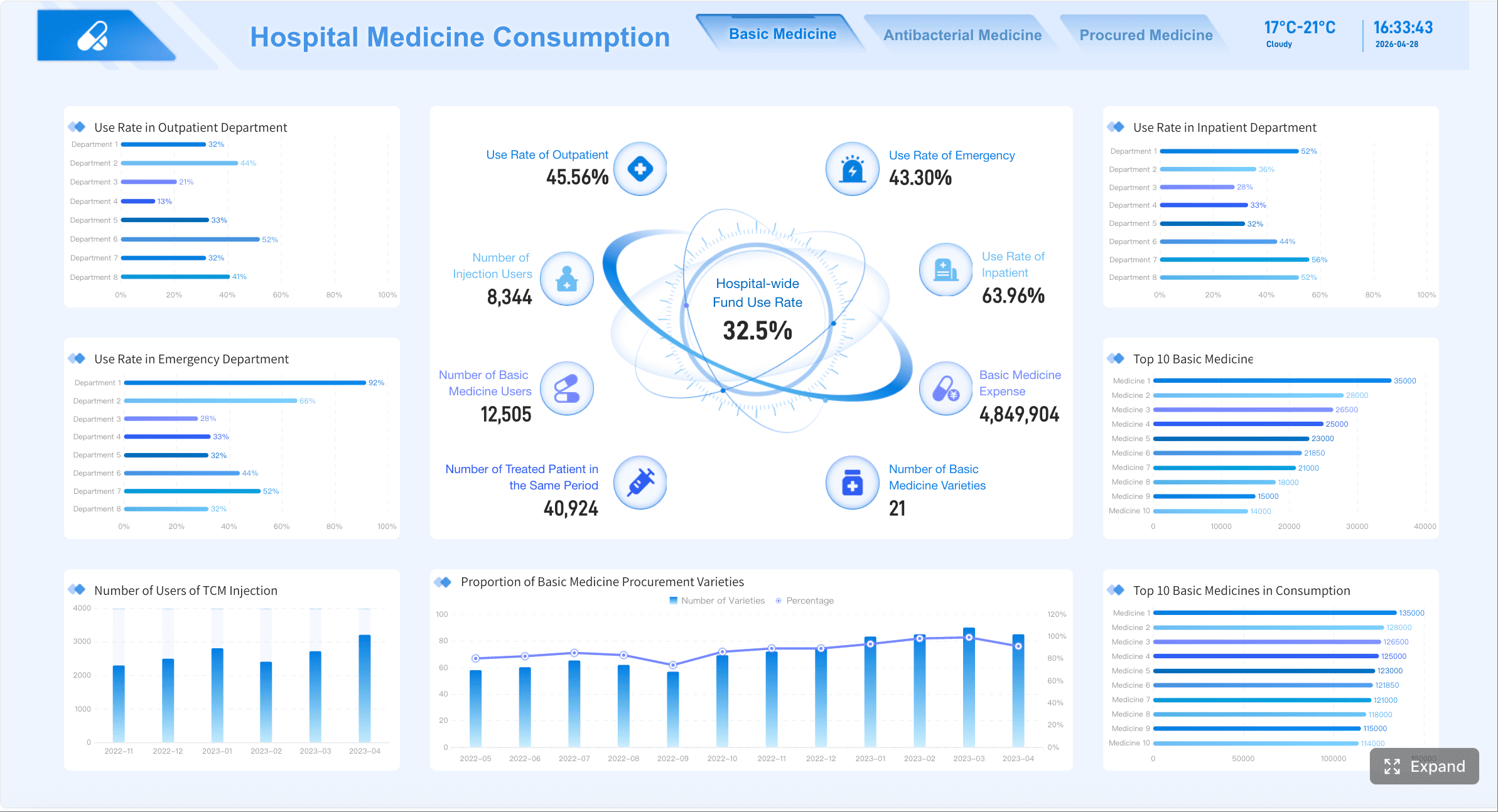
Healthcare dashboard example
Healthcare data quality dashboards prioritize patient safety, coding reliability, and standards conformance. Teams often monitor patient record completeness, diagnosis and procedure coding accuracy, terminology consistency, encounter data validity, and conformance to healthcare data models.
Useful healthcare metrics include:
Missing patient demographics or encounter details
Invalid diagnosis or procedure code rate
Terminology consistency across systems
Conformance failures by table or field
Duplicate patient records
Data freshness for clinical reporting datasets
Healthcare organizations often align checks to established data quality frameworks and may use open-source validation approaches for standardized models. For example, teams working with standardized observational healthcare data frequently use community-based validation logic and repeatable rule sets to test conformance, plausibility, and completeness at scale.
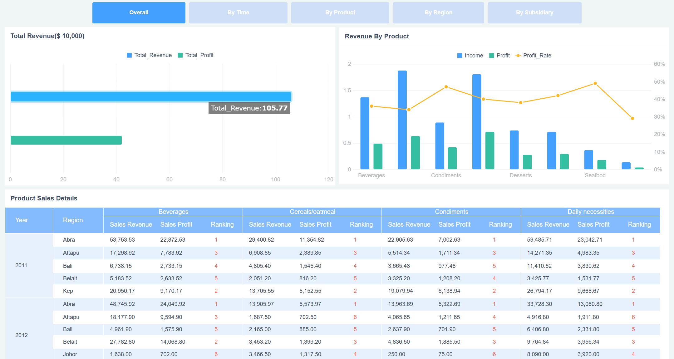
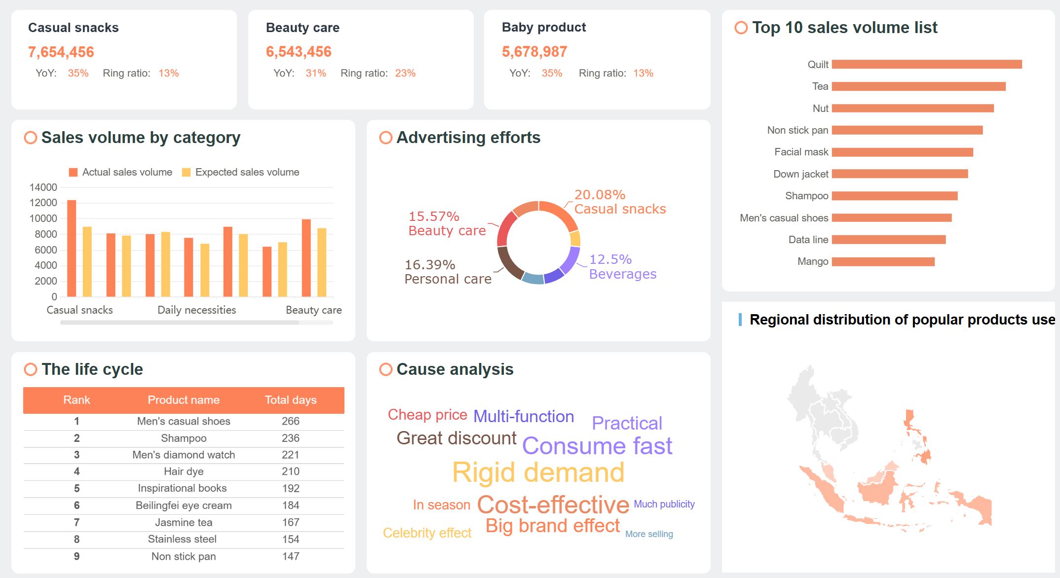
Retail dashboard example
Retail dashboards need to surface quality issues that interrupt merchandising, inventory planning, and customer experience. High-value metrics include product data errors, inventory mismatches between systems, pricing inconsistencies, duplicate customer profiles, and stale catalog updates.
Merchandising and supply chain teams rely on alerts to reduce operational friction. If the dashboard flags a spike in missing product dimensions or inconsistent pricing, teams can resolve problems before they affect search relevance, fulfillment, or margin reporting.
SaaS dashboard example
In SaaS businesses, a data quality dashboard should connect data health directly to revenue operations and product analytics trust. Common dashboard metrics include event tracking gaps, CRM sync failures, billing data issues, account lifecycle inconsistencies, and customer duplication across GTM systems.
Key SaaS measures often include:
Event tracking completeness
CRM and marketing automation sync failures
Billing record accuracy issues
Account and subscription lifecycle mismatches
Duplicate account or contact records
Freshness of product usage data
These signals matter because poor-quality SaaS data distorts pipeline reporting, weakens customer health scoring, and undermines trust in product analytics used for roadmap and retention decisions.
Manufacturing dashboard example
Manufacturing environments need data quality dashboards that protect throughput, traceability, and quality assurance. Typical metrics include sensor data gaps, batch record completeness, master data consistency, work order mismatches, and delayed shop-floor updates.
Common dashboard views include:
Sensor feed freshness and null spikes
Batch and lot traceability completeness
Material master inconsistencies
Work order and ERP reconciliation exceptions
Downtime caused by data issues
Quality inspection record validity
This helps plant operations and quality teams prevent planning errors, improve root-cause analysis, and maintain traceability for recalls or compliance.
Insurance dashboard example
Insurance organizations rely on clean policy, claims, and customer data. A strong data quality dashboard tracks missing policy fields, duplicate insured parties, claims processing inconsistencies, broker feed failures, and delayed updates affecting reserving or fraud detection.
Reconciliation of premium, claims, and payment data
Exception trends affecting underwriting or fraud models
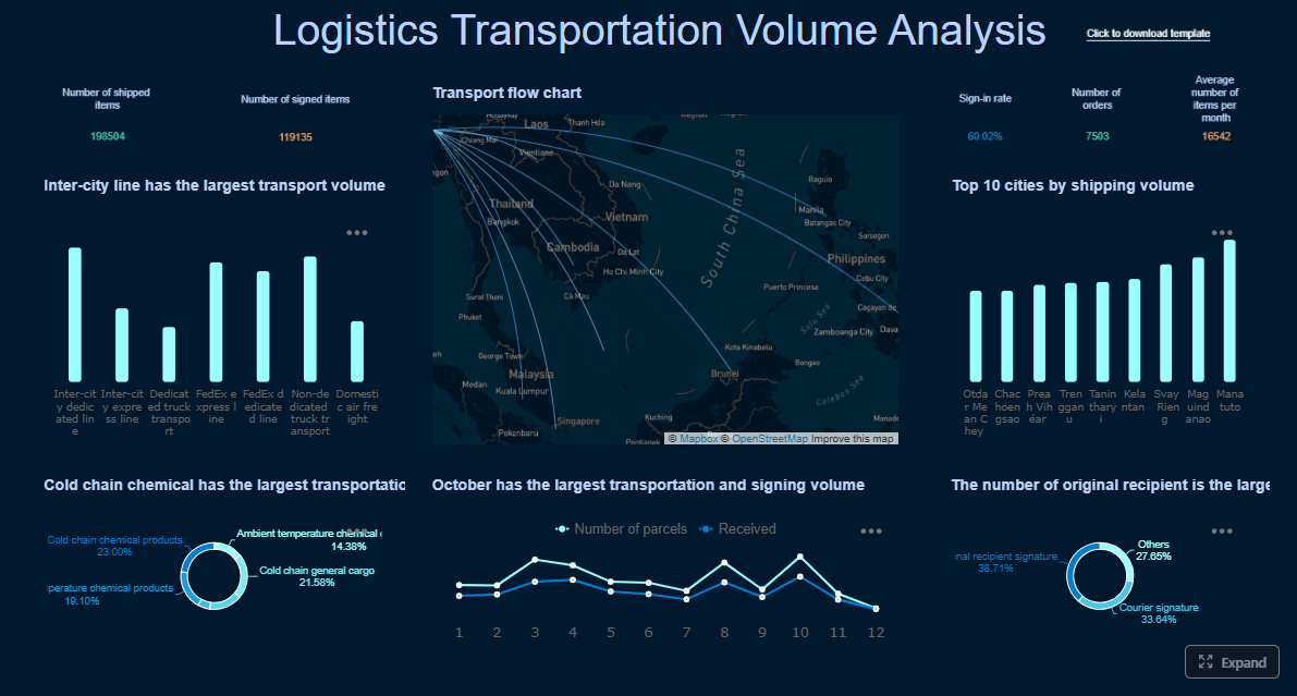
Logistics dashboard example
Logistics dashboards should highlight shipment record accuracy, delayed tracking updates, duplicate orders, route data inconsistencies, and exception codes across warehouses and carriers.
Important views include:
Shipment milestone freshness
Missing proof-of-delivery fields
Carrier event consistency
Duplicate shipment IDs
Address validity
Inventory and order reconciliation issues
These metrics reduce handoff friction and improve trust in OTIF, service, and network planning analytics.
Telecom dashboard example
Telecom data quality dashboards often focus on subscriber records, usage event accuracy, billing integrity, network inventory consistency, and service activation timeliness.
This dashboard helps revenue assurance, service operations, and customer support teams act before quality issues become billing disputes or service failures.
Public sector dashboard example
Government and public sector teams need dashboards that make submitted data auditable, explainable, and easy to correct. Typical metrics include missing required submission fields, invalid code values, duplicate entity records, cross-system mismatches, and aging unresolved issues.
Useful views include:
Submission completeness by agency or district
Validation failure counts by rule
Duplicate records by entity type
Timeliness against submission windows
Audit trail of issue ownership and resolution
Exception trends by program
This kind of dashboard supports transparency, reduces manual follow-up, and improves confidence in official reporting.
Cross-industry patterns from the 9 examples
Across industries, the same foundation appears repeatedly:
Completeness
Accuracy
Consistency
Timeliness
Validity
Uniqueness
What changes is the business context. Finance emphasizes auditability. Healthcare emphasizes conformance and coding quality. Retail emphasizes product and inventory alignment. SaaS emphasizes event reliability and GTM synchronization.
The best data quality dashboard examples are easy to scan because they share several design choices:
A top-row KPI summary for fast status checks
Severity-based alerting
Clear ownership by domain, source, or team
Drill-down paths from summary to failed records
Trend views that distinguish one-off incidents from recurring patterns
Business-impact framing, not just technical defect counts
A guide to the six types of data quality dashboard
Not every data quality dashboard should serve the same purpose. In most enterprises, you need several dashboard types working together.
Operational dashboard
An operational dashboard is built for daily issue detection and fast response. It focuses on what failed, when it failed, who owns it, and what must happen next.
This is the dashboard data stewards, data engineers, and operations teams check every day.
Analytical dashboard
An analytical dashboard reveals trends, recurring root causes, and quality patterns over time. Rather than asking what is broken now, it asks what keeps breaking and why.
Useful analytical views include:
Trend of failed checks over weeks or months
Root cause categories by frequency
Seasonal spikes in data issues
Dataset risk trends
Mean time to detect and resolve
Repeat incidents by source system
This helps leaders prioritize structural fixes instead of repeatedly firefighting symptoms.
Executive dashboard
An executive dashboard translates data quality into business impact. It should summarize risk exposure, improvement progress, and areas needing investment.
Common executive metrics include:
Enterprise quality score
Critical data element status
Regulatory or operational risk exposure
High-severity incident trend
SLA compliance
Financial or operational impact of unresolved issues
Executives do not need every failed rule. They need a concise view of whether data quality is putting revenue, compliance, customer experience, or decision-making at risk.
Domain-specific dashboards
Domain-specific dashboards are tailored to finance, healthcare, retail, SaaS, and other functions. These dashboards differ by metric definitions, owner groups, thresholds, and business workflows.
For example:
Finance: reconciliation breaks, late filings, critical reporting field quality
Healthcare: terminology conformance, coding quality, patient record completeness
A critical data element dashboard narrows focus to the fields that matter most to compliance, revenue, customer service, or strategic reporting. This approach is especially effective when teams cannot monitor everything equally well.
Typical features:
Health score for high-impact fields only
Thresholds tuned to business criticality
Escalation rules for failures
Historical trend by CDE
Ownership by steward or business function
Workflow or remediation dashboard
A workflow dashboard tracks how quality issues move from detection to resolution. It is less about measurement alone and more about accountability.
Key views include:
Open tickets by owner
Aging unresolved issues
Resolution time by team
Repeat issue rate
Status by remediation stage
False positive rate of rules
This type of dashboard is essential if your organization wants measurable improvement, not just visibility.
How to create a data quality dashboard
Creating a data quality dashboard requires more than connecting a few tables and adding traffic-light colors. The goal is to build a system that helps teams move from issue detection to resolution with minimal ambiguity.
Choose the right metrics and rules
Start by selecting KPI categories that align with both technical integrity and business impact:
Completeness
Accuracy
Validity
Freshness
Consistency
Uniqueness
Then tie each metric to a real business process, SLA, or downstream decision. For example:
KPI
Business Link
Example Threshold
Completeness
Customer onboarding
Required fields > 98% populated
Freshness
Daily executive reporting
Data loaded by 6:00 AM
Uniqueness
Customer 360
Duplicate rate < 0.5%
Accuracy
Finance close
Reconciliation exceptions = 0 for critical fields
Validity
Claims processing
Invalid code rate < 1%
A metric without business context becomes background noise. A metric tied to a reporting deadline, customer process, or compliance requirement gets attention.
Design for action, not just visibility
Dashboards fail when they are visually polished but operationally vague. To make the dashboard actionable, include:
Thresholds and pass/fail logic
Severity levels
Named owners
Drill-down paths
Links to workflows or ticket queues
Record-level exception detail where appropriate
Also balance the needs of two audiences:
Leaders need summary KPIs, trend lines, and business impact.
Data stewards and engineers need issue detail, root-cause clues, and system-level drill-downs.
A practical design pattern is a three-layer structure:
Executive summary page
Domain or source-system monitoring page
Detailed investigation page
Connect data sources, testing, and governance
A trustworthy data quality dashboard should bring together several inputs into one reporting layer:
Profiling results
Rule-based test outcomes
Pipeline monitoring signals
Incident logs
Metadata and ownership records
SLA definitions
Data lineage context where available
You should also document the governance foundation behind the dashboard:
Rule definitions
Threshold logic
Critical data element list
Escalation paths
Review cadence
Ownership model
Without governance, the dashboard itself becomes another untrusted artifact.
Best practices for implementation
Here is a practical, consultant-style rollout approach that works well in enterprises:
1. Start with one high-impact use case
Pick a business process where bad data already hurts performance, such as finance close, patient intake, pricing, or sales pipeline reporting. Prove value before scaling.
2. Define a minimum viable KPI set
Do not launch with 50 metrics. Start with a tight set of high-value indicators such as completeness, freshness, duplicates, and failed reconciliations.
3. Assign owners before go-live
Every KPI, source, and alert should have a named owner. If no owner exists, the dashboard will expose problems without creating accountability.
4. Build drill-downs into failed records or causes
A dashboard should not stop at “quality is down.” Teams need to see where the problem sits, which records are affected, and what changed.
5. Review false positives and resolution time monthly
If rules trigger too many false alarms, users will ignore the dashboard. Measure remediation time and tune thresholds regularly.
Tools, frameworks, and best practices of a data quality dashboard to improve data trust in 2026
In 2026, the strongest data quality dashboard programs combine observability, governance, metadata, and self-service BI. The winning approach is not simply more tests. It is better visibility, clearer accountability, and faster remediation.
Open-source and standards-based options
Open-source and standards-based methods are especially useful when teams need transparency, reproducibility, and community-backed checks.
Examples include:
Healthcare-oriented validation approaches aligned to common data models and structured quality frameworks
Rule libraries that evaluate conformance, plausibility, and completeness
Standards-based checks for terminology, schema, and code validity
Reusable dashboard patterns for issue tracking, KPI scoring, and threshold monitoring
These approaches are valuable when organizations want auditable logic, peer-reviewed methods, or lower-friction experimentation before committing to broader enterprise tooling.
Best practices for long-term adoption
To improve data trust over time, follow these long-term best practices:
Start small and expand intentionally: Begin with a compact set of high-impact metrics, then add rules by use case and stakeholder need.
Track remediation, not just detection: Measure mean time to resolve, repeat issue rates, and owner backlog.
Review false positives regularly: Overly sensitive rules reduce trust in the dashboard itself.
Align reporting to business outcomes: Show how better data quality improves reporting accuracy, customer experience, compliance posture, and operational speed.
Use consistent definitions: Standardize how completeness, freshness, and validity are calculated across domains.
Create role-based views: Executives, data stewards, analysts, and engineers should not all see the same dashboard layout.
Embed ownership and review cadence: Data quality improves when governance routines are visible and repeatable.
Why FineBI works well for a data quality dashboard
For enterprises building a scalable data quality dashboard, FineBI is a strong fit because it supports the key capabilities teams need:
Unified dashboarding across multiple systems and domains
Flexible KPI scorecards, trends, drill-downs, and exception analysis
Role-based views for executives, analysts, and operational teams
Fast visual development for scenario-based use cases
Interactive filtering to isolate issues by system, domain, severity, and owner
That means you can move from disconnected quality spreadsheets and static reports to a governed, interactive reporting layer that actually supports action.
Final takeaway
A data quality dashboard is not just a reporting artifact. It is an operational system for making data trust visible, measurable, and accountable. The most effective dashboards connect classic quality dimensions like completeness, accuracy, consistency, freshness, validity, and uniqueness to the workflows and business outcomes that matter most.
If you want better reporting confidence, fewer downstream incidents, and clearer ownership across teams, start with one high-impact use case, define a compact KPI set, and build your dashboard for action from day one.
A strong data quality dashboard usually includes completeness, accuracy, consistency, timeliness, validity, and uniqueness metrics, plus failed checks, severity, ownership, and trend views. It should also let users drill into sources, domains, or business processes causing the issues.
Data engineers, analysts, operations teams, compliance owners, and executives all use it for different decisions. Technical teams investigate root causes, while business leaders track risk, SLA impact, and improvement progress.
Start by defining the most important data domains, critical data elements, owners, and quality rules tied to business risk. Then choose the right KPIs, design summary and drill-down views, and connect alerts or workflows so issues can be fixed quickly.
The most common KPIs are completeness rate, accuracy rate, freshness, validity rate, duplicate rate, reconciliation exceptions, failed rule count, and remediation time. The best mix depends on the industry, reporting requirements, and business impact of bad data.
Every industry depends on trusted data, but the consequences differ by use case, from audit exposure in finance to patient safety in healthcare. An industry-specific dashboard helps teams focus on the quality issues that matter most to compliance, operations, and decision-making.
Product Trial
FineReport
Pixel-perfect reports · Interactive dashboards · Easy data entry · Digital twins