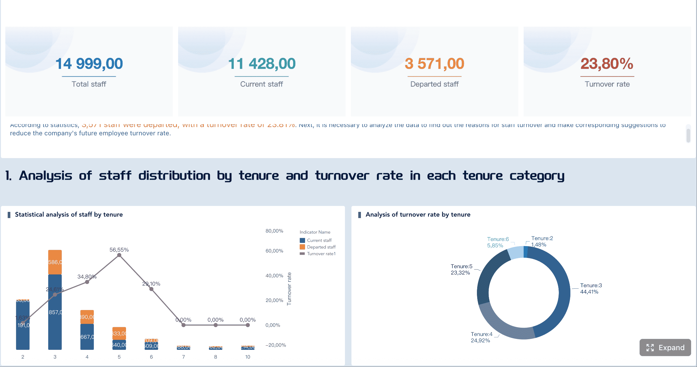
A strong payroll dashboard does more than summarize pay runs. It turns raw timesheets, pay rules, and employee records into a reliable operating view of labor cost. For HR, payroll, and finance leaders, that visibility matters because labor is often the largest controllable expense in the business.
When payroll reporting is built on spreadsheets, disconnected exports, and manual reconciliation, errors multiply quickly. Overtime gets missed, department allocations drift, and period-end close takes longer than it should. The better approach is to design a payroll dashboard as a governed reporting system: one that starts with approved hours, applies business logic consistently, and gives stakeholders a shared version of the truth.
This guide walks through a practical 7-step approach to building a payroll dashboard from timesheets so your team can improve accuracy, reduce manual effort, and make better labor cost decisions.
Start with the business question your payroll dashboard must answer
Before building visuals, define the job the dashboard must do. The primary goal is not “show payroll data.” It is to convert raw timesheets into accurate labor cost visibility that payroll, HR, and finance can use with confidence.
A useful payroll dashboard should help answer questions such as:
Are approved hours flowing correctly into payroll?
Which departments are driving labor cost increases?
Where is overtime rising beyond policy or budget?
Do payroll totals reconcile with approved timesheets for the pay period?
Which employees, teams, or locations require exception review?
This step is critical because dashboard design follows decision design. If the business cannot agree on the decisions the dashboard should support, the reporting layer will become cluttered and hard to trust.
Typical decision areas include:
Decision area
What the payroll dashboard should show
Overtime control
Overtime hours, overtime pay, trend by team, exception thresholds
Department cost tracking
Labor cost by department, location, cost center, and manager
Pay-period reconciliation
Approved hours vs payable hours vs payroll output
Budget variance
Actual labor cost vs plan by function or business unit
You also need to map the source systems involved. In most organizations, the payroll dashboard draws from several operational systems:
Time tracking system for timesheets, shifts, approvals, and edits
Payroll system for earnings, deductions, taxes, and net pay
HRIS for employee status, job title, manager, department, and location
Finance or ERP system for cost centers, budget, and ledger alignment
Pay rule tables for overtime, shift differentials, holiday treatment, and employer burden logic
The final alignment point is audience. In practice, the most valuable payroll dashboard serves both HR and finance stakeholders. HR needs visibility into policy exceptions, attendance patterns, and employee-level issues. Finance needs cost trends, departmental allocations, and pay-period reconciliation. If these groups use different definitions for hours or labor cost, the dashboard will fail politically even if it works technically.
Design the payroll dashboard data model before building reports
Most payroll reporting problems are not visual design problems. They are data model problems. If employee records, time entries, pay rules, and payroll outputs are not connected through a clean model, every downstream metric becomes fragile.
Map the key tables and fields
Start by identifying the core tables that the payroll dashboard must combine:
Employee master
Timesheet transactions
Pay period calendar
Earnings detail
Deductions
Taxes
Department and cost center hierarchy
Rate tables or compensation records
At this stage, standardization matters more than visualization. A payroll dashboard becomes unreliable when identifiers do not line up across systems. For example:
Employee ID in HRIS does not match worker ID in payroll
Department codes differ between finance and HR
Job codes are free text in timesheets but structured in payroll
Location names vary by spelling or abbreviation
Your goal is to create consistent join keys so hours, rates, earnings, and allocations can be linked without manual cleanup during every pay cycle.
Define the calculation logic for labor cost reporting
The next step is to define the metrics clearly before they are built into the payroll dashboard.
Separate the major components of labor cost:
Regular hours
Overtime hours
Bonus or supplemental earnings
Employee taxes and deductions
Employer taxes and burden
Benefits allocations where relevant
This is where many teams make a costly mistake: they mix payroll output with managerial labor cost analysis without defining the difference.
If the dashboard is intended for finance review, fully loaded labor cost is usually more useful than net pay. If it is intended for payroll operations, gross-to-net reconciliation may be the priority. The best payroll dashboard often includes both, but labels them precisely.
Validation should not be an afterthought. It should be part of the payroll dashboard design from day one.
Set rules that flag common issues automatically:
Missing timesheets
Duplicate time entries
Timesheet hours exceeding policy thresholds
Mismatched pay rates between systems
Unassigned departments or cost centers
Payroll totals that do not reconcile with approved hours
A practical method is to maintain a reconciliation checklist for every pay period:
Confirm all expected employees are present.
Confirm all approved timesheets are loaded.
Compare approved hours to payable hours.
Compare calculated payroll totals to payroll system output.
Review exception records for rate, code, and allocation mismatches.
This governance layer is what turns a dashboard into a trusted management tool rather than a reporting experiment.
Build the reporting pipeline from timesheets to payroll dashboard metrics
Once the model and rules are clear, build the reporting pipeline that transforms raw operational data into consistent payroll dashboard metrics.
Clean and normalize timesheet data
Timesheet data is rarely analysis-ready. It often contains inconsistent job codes, mixed date formats, incomplete hour types, and late adjustments.
Standardization tasks usually include:
Converting date fields into a unified calendar structure
Mapping inconsistent job and department codes
Normalizing hour categories such as regular, overtime, leave, and holiday
Removing or flagging duplicate entries
Identifying records edited after approval
You also need explicit handling for edge cases, including:
Late submissions after payroll cutoff
Split shifts across departments or locations
Retroactive corrections
Shift swaps
Leave entries overlapping worked hours
Without this cleansing step, the payroll dashboard may look polished while producing incorrect totals.
Transform approved hours into payroll measures
After normalization, convert approved hours into business-ready payroll measures.
This transformation generally includes:
Aggregating hours by employee, team, department, location, and pay period
Applying rate logic based on compensation type and effective dates
Splitting regular and overtime hours
Calculating payable hours
Computing gross labor cost and, where needed, employer burden
A simple transformation framework is helpful:
Input
Transformation
Output metric
Approved regular hours
Multiply by standard rate
Regular pay
Approved overtime hours
Multiply by overtime rate
Overtime pay
Bonus records
Add supplemental earnings
Total supplemental pay
Employer tax rules
Apply burden logic
Employer tax cost
Benefits allocations
Add employer benefit cost
Fully loaded labor cost
The payroll dashboard should not rely on ad hoc formulas embedded separately in multiple charts. Build reusable metrics once, then expose them consistently across all views.
Create a reporting layer your teams can trust
The final pipeline step is to store business-ready metrics in a reporting layer optimized for recurring use.
This layer should include:
Clean dimension tables for employee, department, location, and pay period
Governed metric definitions
Historical snapshots where payroll logic changes over time
Audit-friendly timestamps and data refresh status
Documentation for assumptions and calculation logic
Trust is built when users can answer a simple question: Where did this number come from?
That means every important payroll dashboard metric should be explainable:
What source system did it come from?
What filters are applied?
What business rule transformed it?
Is it based on approved hours, payable hours, or final payroll results?
Choose the views and templates that make the payroll dashboard useful
A payroll dashboard is only effective if the layout matches how leaders review labor data. Too much detail on the first page creates noise. Too little detail forces users back into exports.
Include the core dashboard views
Most organizations should start with five core views in the payroll dashboard:
Payroll summary
Total gross pay
Total net pay
Total employer cost
Headcount paid
Total hours
Labor cost by department
Department-level spend
Cost center allocation
Variance against budget
Cost per employee or cost per hour
Overtime trend analysis
Overtime hours by pay period
Overtime pay by team or manager
High-risk locations or roles
Threshold breaches
Headcount and workforce mix
Employee vs contractor split
Active paid employees by department
Full-time vs part-time composition
Location-based distribution
Variance and exception review
Pay-period comparisons
Outlier employees
Missing approvals
Retro pay or correction volumes
A well-designed payroll dashboard also includes drill-down capability. Executives may start at summary level, but payroll analysts and HR partners need to drill into employee-level exceptions and pay-period details quickly.
Use examples and templates to speed up adoption
Templates are useful, but only if they reflect your operating model. A common mistake is copying a generic payroll dashboard layout that looks modern but does not answer your actual reporting questions.
When reviewing sample layouts, compare them against your internal requirements:
Do they support gross-to-net reconciliation?
Can they handle department and cost center analysis?
Is overtime shown as both hours and cost?
Are employee-level exceptions easy to audit?
Can finance compare actual labor cost to budget?
A practical evaluation checklist looks like this:
Template feature
Keep
Modify
Remove
Payroll totals KPI cards
Yes
Employee-level detail table
Yes
Add exception flags
Trend charts by month only
Add pay-period view
Decorative charts with no action value
Yes
Department cost matrix
Yes
Add budget variance
Use templates to accelerate layout decisions, not to define reporting logic. Business logic should always come first.
Validate the payroll dashboard with HR and finance before rollout
Even a technically accurate payroll dashboard can fail if users do not trust the outputs or cannot navigate the analysis path easily.
Test accuracy against real payroll cycles
The safest validation method is to test the dashboard against completed payroll runs.
For each historical pay cycle, reconcile:
Approved timesheet hours
Payable hours
Gross pay
Deductions
Taxes
Net pay
Department allocations
Make sure edge cases are covered, especially:
Paid leave
Holiday pay
Retro pay
Corrections and reversals
Shift premiums
Off-cycle payroll runs
A sample validation workflow:
Completed Payroll Cycle
   ↓
Load approved timesheets
   ↓
Apply payroll logic
   ↓
Compare dashboard totals to final payroll register
   ↓
Investigate variances
   ↓
Adjust rules or mappings
   ↓
Approve for production use
Testing with real cycles exposes issues that a sample dataset will never reveal. This is especially important when payroll policies differ by location, union rule, or compensation type.
Confirm usability for cross-functional teams
Accuracy alone is not enough. The payroll dashboard must also work for different user groups.
Finance teams typically need:
Trend analysis across periods
Department and cost center views
Budget variance
Fully loaded labor cost
HR and payroll teams typically need:
Employee-level exceptions
Missing time approvals
Leave and attendance impacts
Policy compliance checks
Usability testing should focus on:
Filter clarity
Consistent labels
Sensible drill-down paths
Role-based default views
Fast access to exception records
If users need training just to understand what a metric means, the dashboard is too complex. Keep labels explicit and business-oriented.
Maintain, scale, and evaluate payroll dashboard tools over time
A payroll dashboard is not a one-time build. It is an operational reporting product that must evolve with policy, systems, and organizational structure.
Set an operating process for ongoing accuracy
To keep payroll reporting reliable, establish a clear operating model.
That operating model should define:
Data refresh schedules
Ownership for metric definitions
Exception review responsibilities
Change control for pay rules
Version history for mapping updates
Periodic validation against payroll output
A simple governance framework:
Area
Owner
Frequency
Timesheet data refresh
Data/BI team
Daily or per pay cycle
Payroll reconciliation
Payroll team
Each pay cycle
Labor cost review
Finance
Monthly
Pay rule updates
Payroll/HR
As policies change
Dashboard enhancement requests
BI governance group
Monthly or quarterly
This discipline helps prevent a common problem: the dashboard remains live, but the logic behind it slowly becomes outdated.
Compare build-vs-buy options for dashboard software
At scale, many teams reach a decision point: should they keep building the payroll dashboard within their current BI stack, or move to a more packaged solution?
The answer depends on complexity, internal capability, and reporting requirements.
A custom build may be the better choice when:
You already have a mature BI environment
Payroll logic is highly specific
You need deep integration with finance and operational data
Your team wants full control over modeling and governance
A packaged solution may be the better choice when:
Reporting needs are standard
Internal BI resources are limited
Implementation speed matters more than customization
You need employee-facing or payroll-native workflows
For many mid-sized and enterprise teams, a modern BI platform offers the best balance: enough flexibility to model payroll correctly, plus enough usability to deliver trusted dashboards across HR and finance.
This is where FineBI is a practical option to evaluate. If your organization needs to build a governed payroll dashboard from timesheets, payroll outputs, HR data, and finance dimensions, FineBI can help you centralize the model, standardize calculations, and deliver interactive analysis for different business roles. It is especially useful when you want to move beyond static reports and give HR and finance a shared, drillable view of labor cost, overtime, headcount, and variance. Instead of maintaining fragmented spreadsheets or waiting on ad hoc report requests, teams can use FineBI to create repeatable payroll reporting workflows with stronger control and faster decision support.
The key is to evaluate tools only after your reporting requirements are clear. Software should support your payroll reporting design, not define it for you.
A high-performing payroll dashboard is not built by starting with charts. It is built by starting with business questions, disciplined data modeling, governed calculations, and validation against real payroll cycles. Get those fundamentals right, and your dashboard becomes far more than a report. It becomes a decision system for controlling labor cost with confidence.
FAQs
It should combine approved hours, pay rules, employee records, payroll results, and department or cost center data. The most useful views cover total labor cost, overtime, departmental spending, and pay-period reconciliation.
Start with approved timesheet data, then apply standardized pay rules, rates, and burden logic through a clean data model. Accuracy depends on consistent join keys and clearly defined formulas for each payroll metric.
Most errors come from mismatched employee IDs, inconsistent department codes, missing approvals, or mixed definitions of hours and labor cost. Manual spreadsheet work also increases the risk of reconciliation mistakes.
It highlights overtime hours, overtime pay, and labor cost trends by team, role, or location. With regular refreshes, leaders can spot exceptions early and act before payroll costs exceed plan.
Payroll, HR, finance, and department managers all benefit from it when they need a shared view of labor cost and payroll accuracy. The dashboard works best when these groups agree on the same definitions and reporting logic.
Product Trial
FineReport
Pixel-perfect reports · Interactive dashboards · Easy data entry · Digital twins