An email metrics dashboard is the operating console that helps marketing leaders, CRM managers, lifecycle teams, and revenue operations stakeholders see campaign health, engagement quality, and business impact in one place. If you are still exporting ESP reports, merging CRM data manually, and debating which metric matters most in weekly meetings, you already know the problem: reporting is slow, fragmented, and hard to act on. A strong dashboard fixes that by turning email data into fast decisions for ecommerce growth, SaaS lifecycle optimization, and B2B pipeline generation.
What an email metrics dashboard is and why it matters
An email metrics dashboard is a centralized visual view of the KPIs that determine whether your email program is healthy, efficient, and profitable. In plain language, it is the place where you can answer three questions quickly:
Are our emails reaching the inbox?
Are people engaging with them?
Are they driving revenue, pipeline, or retention?
That matters because email performance is rarely a single-platform story. The email service provider shows sends and clicks. Your CRM shows lead stages and sales outcomes. Your website analytics captures sessions and conversions. Your commerce or product system reveals purchases, trial activation, and renewals. A proper dashboard combines these signals so teams can stop reacting to isolated numbers and start managing email as a business channel.
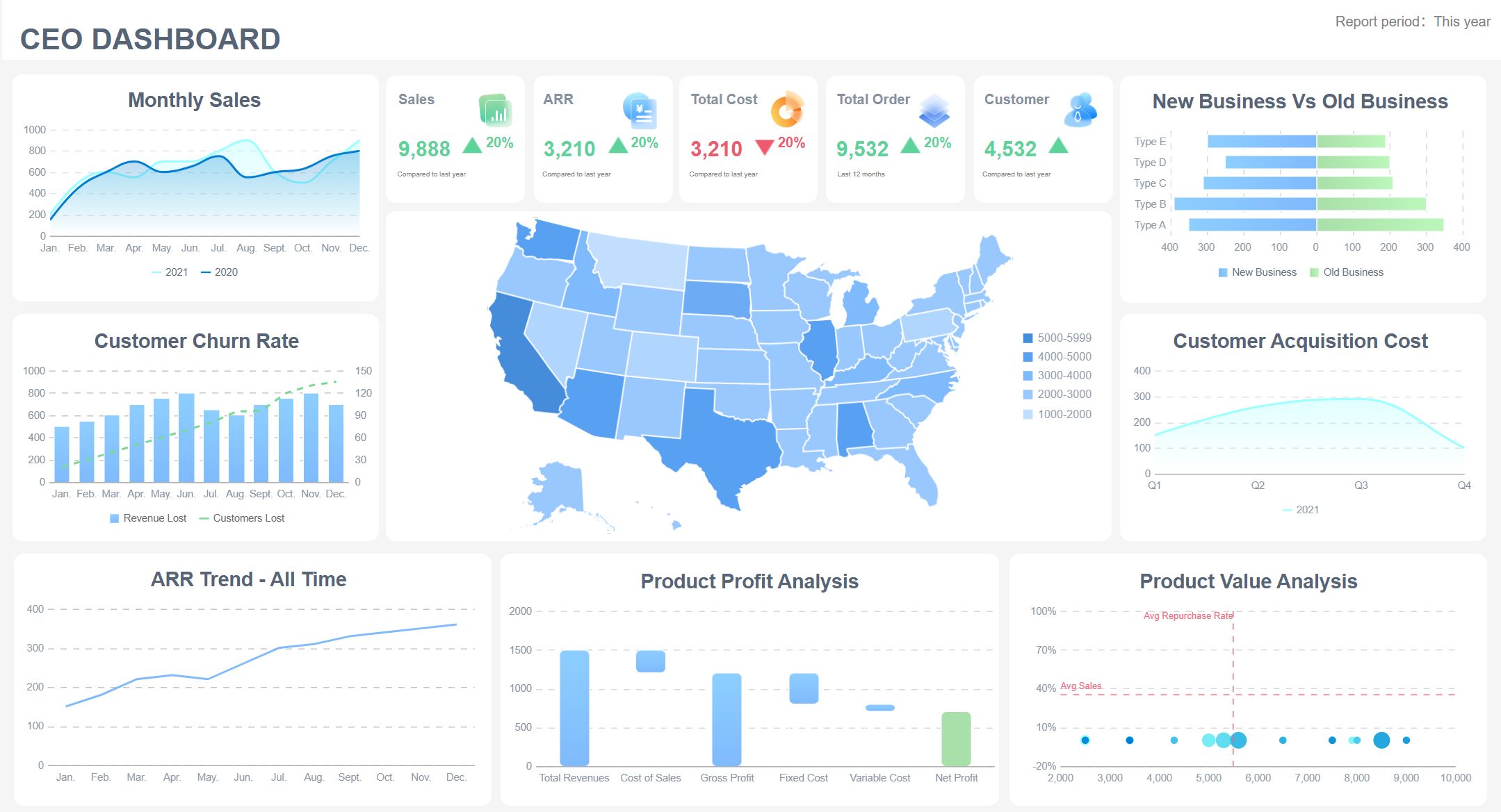
All dashboards in this article are built with FineBI.
A good dashboard also shortens the distance between reporting and action. Instead of reviewing a campaign after the opportunity has passed, teams can spot issues early:
rising bounce rates that threaten deliverability
low click-to-open rates that suggest weak content
poor trial activation after onboarding emails
shrinking repeat purchase rates after promotional sends
low MQL-to-SQL progression from nurture programs
Reporting view vs. email analysis dashboard vs. decision-focused dashboard
These terms are often used interchangeably, but they are not the same.
General reporting view
Usually shows basic campaign results
Often limited to one platform, such as your ESP
Good for checking sends, opens, and clicks
Weak for cross-functional decision-making
Email analysis dashboard
Goes deeper into trends, segments, cohorts, and campaign comparisons
Useful for diagnosing what happened and why
Often includes time series, device patterns, audience splits, and deliverability insights
Decision-focused dashboard
Built around business outcomes, not just marketing activity
Prioritizes the metrics that support action
Tailored by audience: executives, campaign managers, lifecycle teams, or sales leadership
Connects engagement to revenue, retention, or pipeline impact
The strongest dashboards combine all three layers, but they emphasize the last one. That is what enterprise teams need: not more charts, but better decisions.
The 15 essential KPIs to include in an email metrics dashboard
Not every team should track every metric with the same weight. But there is a core set of KPIs that most high-performing email programs need. The goal is to create a dashboard that covers deliverability, engagement, conversion, retention, and business impact.
Key Metrics (KPIs)
Delivery Rate: The percentage of sent emails that successfully reach recipient mail servers. A baseline health metric for inbox access.
Bounce Rate: The percentage of emails that fail to deliver. High bounce rates may indicate poor list hygiene or sender issues.
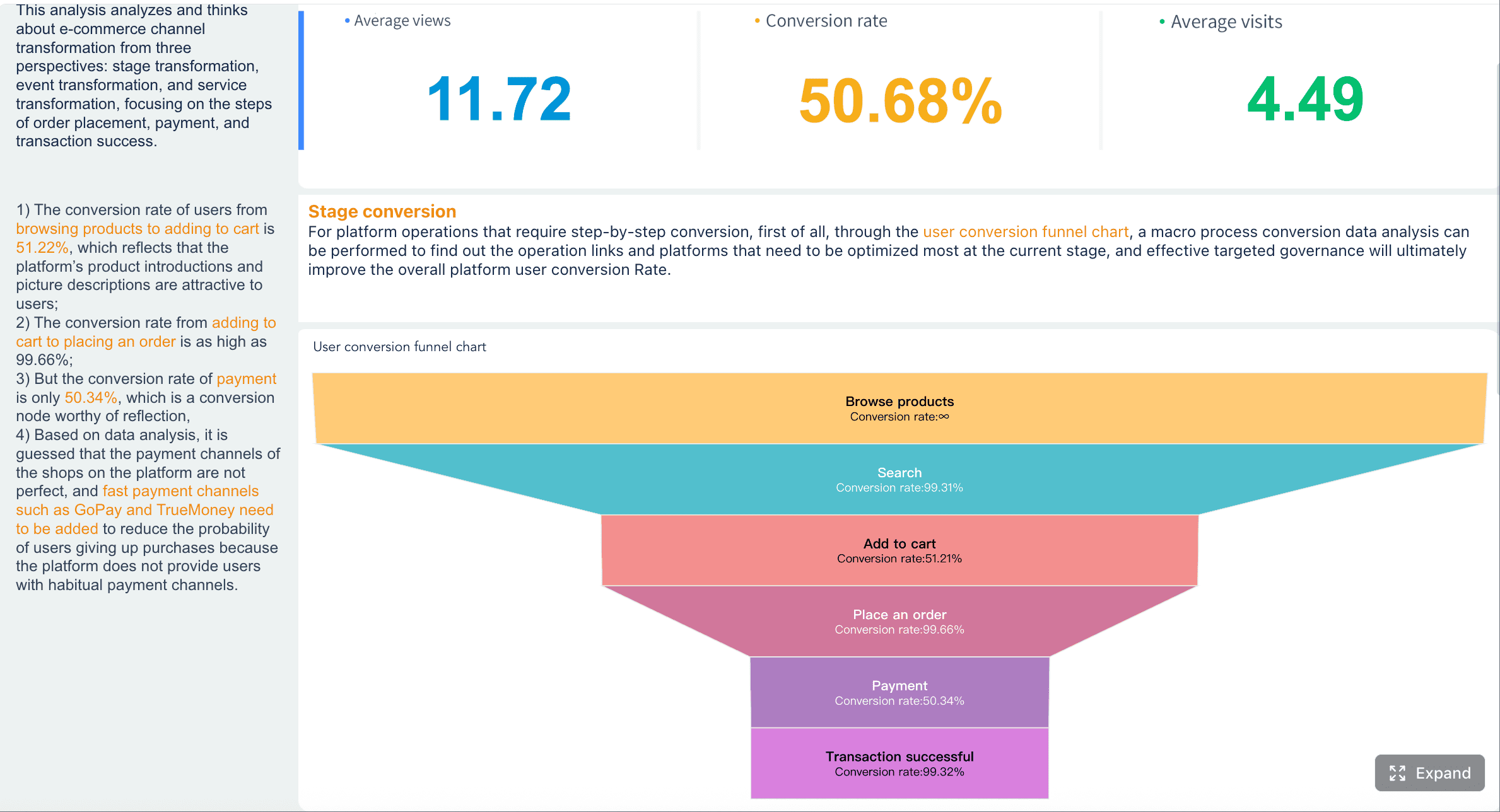
Open Rate: The percentage of delivered emails that are opened. Useful as a directional engagement signal, though privacy changes make it imperfect.
Click-Through Rate (CTR): The percentage of delivered emails that generate at least one click. A stronger indicator of actual engagement than opens.
Click-to-Open Rate (CTOR): The percentage of opens that convert into clicks. Helps assess message relevance, creative quality, and CTA strength.
Unsubscribe Rate: The percentage of recipients who opt out after an email. Signals audience fit, frequency issues, or content fatigue.
Conversion Rate: The percentage of recipients who complete a target action, such as purchase, signup, booking, or download.
Revenue Per Email (RPE): Revenue attributed to the campaign divided by emails sent or delivered. Essential for measuring economic efficiency.
List Growth Rate: Net subscriber growth over time after accounting for new subscribers, unsubscribes, and invalid addresses.
Churn Indicators: Measures of list decay, inactivity, unsubscribes, and non-engaged segments that weaken future campaign performance.
Spam Complaint Rate: The percentage of recipients who mark messages as spam. Critical for deliverability and sender reputation management.
Sender Reputation Signals: Composite indicators such as inbox placement trends, domain health, hard bounces, and complaint patterns.
Lead Quality / Demo Requests / Pipeline Contribution: For B2B, measures whether email is generating qualified demand and influencing pipeline.
Trial-to-Paid / Feature Adoption Signals: For SaaS, tracks whether lifecycle emails move users toward activation, adoption, upgrade, and retention.
AOV / Repeat Purchase Rate / Campaign-Attributed Revenue: For ecommerce, reveals whether email drives not just orders, but profitable customer behavior.
Delivery rate and bounce rate
These are your first warning lights. If delivery weakens, every downstream metric becomes misleading. A campaign can have great content and still fail because it never reached the inbox.
What to watch:
Delivery rate trend over time
Hard vs. soft bounce patterns
Bounce spikes by segment, domain, or acquisition source
Open rate and click-through rate
Open rate still has directional value for subject line testing, brand familiarity, and send timing, but it should not be your primary decision metric. CTR gives a more reliable view of whether recipients found your message compelling enough to act.
What to watch:
Open and CTR by audience segment
CTR by campaign type
trend changes after subject line, content, or send-time changes
Click-to-open rate and unsubscribe rate
CTOR helps separate message quality from subject line performance. If opens are decent but CTOR is weak, the issue is likely inside the email. Unsubscribe rate shows whether your messaging is wearing out the audience.
What to watch:
CTOR by template or content format
Unsubscribes after promotional bursts
audience fatigue in heavily contacted segments
Conversion rate and revenue per email
These are the metrics that move dashboards from marketing visibility to business accountability. If email contributes to revenue, bookings, signups, or qualified leads, these KPIs should be prominent.
What to watch:
conversion by campaign objective
RPE by segment, automation, or lifecycle stage
revenue concentration by email type
List growth rate and churn indicators
A growing list is not enough if engagement quality is collapsing. Track growth alongside churn to understand whether your database is getting healthier or noisier.
What to watch:
New subscriber sources
inactive subscriber cohorts
re-engagement performance
net list growth after attrition
Spam complaint rate and sender reputation signals
These metrics protect long-term performance. You can recover from a weak campaign. Recovering from damaged sender reputation is much harder.
What to watch:
complaint rate by campaign and segment
domain-level issues
inbox placement changes
suppression list growth
Lead quality, demo requests, and pipeline contribution for B2B
B2B teams should never stop at click metrics. The real question is whether email helps generate sales-ready demand.
What to watch:
form fills from nurture emails
demo requests by sequence
MQL to SQL movement
influenced pipeline and closed-won value
Trial-to-paid and feature adoption signals for SaaS lifecycle emails
For SaaS, email is often part of onboarding, product education, activation, and retention. That means engagement data must connect to product usage.
What to watch:
activation milestone completion
onboarding sequence engagement
feature adoption after educational emails
conversion from trial to paid
Average order value, repeat purchase rate, and campaign-attributed revenue for ecommerce
Ecommerce teams need to go beyond campaign revenue snapshots. Strong email programs also improve customer value over time.
What to watch:
AOV by campaign type
abandoned cart recovery revenue
repeat purchase behavior
revenue contribution from promotions vs. lifecycle flows
How to group KPIs by funnel stage
A high-performing email metrics dashboard becomes easier to read when metrics are grouped by funnel stage. This helps different teams understand where performance is strong and where leakage occurs.
Awareness view
Use this section to understand initial reach and visibility.
Core metrics:
delivery rate
bounce rate
open rate
sender reputation signals
Engagement view
This shows whether recipients are interacting with the message.
Core metrics:
CTR
CTOR
time-to-click patterns
unsubscribes by campaign or segment
Conversion view
This captures whether engagement turns into action.
Core metrics:
conversion rate
form fills
demo requests
checkout completion
trial activation
Retention view
This is where lifecycle and CRM teams monitor ongoing value.
Core metrics:
repeat purchase rate
feature adoption
inactive subscriber trend
churn indicators
retention email performance
Revenue view
This answers the executive question: what business result did email drive?
Core metrics:
revenue per email
campaign-attributed revenue
pipeline contribution
average order value
trial-to-paid conversion
Which metrics are leading vs. lagging indicators
This distinction matters because not all KPIs serve the same purpose.
Leading indicators
These help predict future performance and surface issues early.
If these start to decline, future conversion and revenue will usually follow.
Lagging indicators
These confirm the eventual business outcome.
conversion rate
revenue per email
campaign-attributed revenue
pipeline contribution
trial-to-paid conversion
repeat purchase rate
closed-won influence
A practical dashboard includes both. Leading indicators tell you where to intervene now. Lagging indicators tell you whether those interventions worked.
Email Metrics Dashboard templates by use case: ecommerce, SaaS, and B2B lead generation
A template should reflect the business model, buying journey, and stakeholder audience. The most common dashboard failure is copying a generic layout that does not match how the company makes money.
Ecommerce dashboard template
An ecommerce email dashboard should focus on revenue efficiency, promotional impact, and customer value. Unlike SaaS or B2B, the feedback loop is often shorter, which means the dashboard should support rapid optimization.
Recommended sections:
Deliverability overview
Campaign engagement
Promotional performance
Automation flow performance
Revenue and retention outcomes
Core ecommerce metrics:
campaign-attributed revenue
revenue per email
average order value
click-through rate
cart recovery rate
repeat purchase rate
product/category performance
discount-driven conversion
SaaS dashboard template
A SaaS email dashboard should connect email engagement to product behavior. Opens and clicks matter, but activation and retention matter more.
Recommended sections:
Acquisition and signup email performance
Trial onboarding engagement
Product education and feature adoption
Upgrade conversion
Retention and churn signals
Core SaaS metrics:
trial signup conversion
activation milestone completion
email CTR by lifecycle stage
feature adoption after nurture sends
trial-to-paid conversion
upgrade rate
retention and expansion influence
B2B lead generation dashboard template
A B2B dashboard should support marketing, SDR, sales ops, and revenue leadership. That means it must connect campaign response to lead progression and pipeline impact.
Recommended sections:
Top-of-funnel lead capture
Nurture engagement
MQL to SQL progression
Meeting bookings and demo requests
Pipeline influence and revenue contribution
Core B2B metrics:
form conversion rate
content download engagement
demo requests
MQL volume
SQL progression
meeting booking rate
opportunity influence
pipeline contribution
How to choose the right dashboard layout
The right layout depends on who uses the dashboard and how often decisions are made.
A practical rule: if a user cannot identify the top three actions to take within 30 seconds, the dashboard is too complex.
Benefits and best practices for building a useful email metrics dashboard
The main business benefit of an email metrics dashboard is speed. But for enterprise teams, the deeper value is alignment. When marketing, sales, ecommerce, product, and leadership all look at the same definitions and outcomes, reporting becomes operationally useful.
Biggest benefits
Faster reporting: Reduce manual exports and spreadsheet consolidation.
Clearer accountability: Tie email performance to real owners, teams, and outcomes.
Better optimization decisions: Spot weak points in deliverability, content, segmentation, or conversion flow.
Cross-functional visibility: Connect ESP data with CRM, website, product, and revenue systems.
Higher trust in reporting: Standardized metrics reduce debate over what the numbers mean.
Best practices for KPI selection
Choose KPIs based on decisions, not curiosity. A metric belongs on the dashboard only if someone can act on it.
Best-practice approach:
Define the business objective first.
Map the funnel stages that influence that objective.
Select a small set of leading and lagging KPIs.
Add segmentation only where it changes action.
Keep benchmark targets visible.
Best practices for benchmarks and targets
Benchmarks should come from your own history first, then industry context second. Teams often chase external benchmark numbers that do not match their audience, list quality, or buying cycle.
Use three benchmark layers:
historical baseline
target threshold
alert threshold
This makes the dashboard useful not just for observation, but for intervention.
Best practices for readability
A dashboard should feel operational, not decorative.
Keep it readable by:
using clear metric names
defining date ranges explicitly
separating campaign, automation, and lifecycle views
adding filters for channel, segment, and campaign type
showing both trends and current values
limiting color to exceptions, targets, and alerts
Common mistakes to avoid
Tracking too many metrics on one page
Mixing ecommerce, SaaS, and B2B goals in a single executive view
Treating open rate as the primary KPI
Ignoring deliverability and sender reputation
Failing to define attribution rules
Using inconsistent date windows across data sources
Building a dashboard that reports activity but not outcomes
Actionable best practices: how to implement an email metrics dashboard
Below is the consultant-level approach I recommend for rolling out a dashboard that teams will actually use.
1. Start with one decision use case, not one giant dashboard
Pick the highest-value scenario first:
ecommerce promotional optimization
SaaS onboarding improvement
B2B nurture-to-demo conversion
Build for that use case before expanding. This keeps scope tight and increases adoption.
2. Standardize metric definitions before visualizing anything
Agree on the exact formula and source for each KPI:
what counts as delivered
how conversion is attributed
whether revenue is click-through only or includes view-through
how MQL, SQL, and pipeline influence are defined
This step prevents endless reporting disputes later.
3. Integrate the right systems and create a clean data model
Model the data so campaign IDs, audience segments, and date logic align across systems. This is where BI platforms become far more scalable than static spreadsheets.
4. Design separate views for executives and operators
Executives need a concise scorecard. Operators need drill-down capability. Trying to satisfy both with one page usually fails.
Recommended structure:
Page 1: executive summary
Page 2: deliverability and engagement analysis
Page 3: conversion and business outcome view
Page 4: segment, campaign, and cohort drill-down
5. Set a review cadence and action rules
A dashboard is only as valuable as the process around it.
Example operating rhythm:
Daily: campaign monitoring and alerts
Weekly: trend review and optimization decisions
Monthly: strategic review, benchmark updates, and KPI refinement
After the best practices section, this is often the right moment to move from concept to implementation with a modern BI platform.
Examples, tools, and templates to speed up email metrics dashboard making
Strong dashboard examples, regardless of platform, usually share the same structural traits:
a clear primary objective
limited KPI count per view
meaningful segmentation
visual hierarchy that prioritizes action
integration with source systems beyond the ESP
What strong email marketing dashboard examples have in common
Executive views
focus on revenue, pipeline, retention, and sender health
use KPI cards, trends, and exception alerts
avoid tactical clutter
Campaign views
compare sends, opens, clicks, CTOR, conversions, and unsubscribes
support sorting by campaign type, segment, and date
highlight winners and outliers quickly
Lifecycle views
track journeys across onboarding, nurture, re-engagement, and retention
show drop-off between steps
connect message engagement to downstream behavior
Spreadsheet vs. BI tool vs. ESP-native vs. CRM-connected templates
For organizations serious about scaling reporting, a BI platform is usually the most sustainable choice. It lets teams unify campaign data, CRM outcomes, product behavior, and commerce results into one governed environment. FineBI is especially well-suited when you need self-service exploration, shareable dashboards, and executive-ready visualizations without forcing every change through technical teams.
When Gmail and Microsoft 365 analytics tools complement dashboard reporting
Gmail and Microsoft 365 analytics tools can add value in adjacent use cases, especially when teams also need visibility into mailbox operations such as response times, shared inbox workload, or SLA adherence. These tools are helpful for service and customer-facing teams, but they do not replace a proper email metrics dashboard for marketing performance.
Use them as complements when you need:
response-time analytics for sales or support inboxes
shared mailbox workload tracking
internal email productivity visibility
Do not confuse those operational inbox metrics with campaign analytics. They serve different decision workflows.
Simple checklist for launching, reviewing, and improving the dashboard over time
Use this checklist to avoid a dashboard that looks finished but never becomes useful.
refine segmentation by lifecycle stage or acquisition source
retire vanity metrics
expand drill-downs only when they support action
Final recommendation
If your team manages ecommerce promotions, SaaS lifecycle journeys, or B2B lead nurture at any meaningful scale, an email metrics dashboard is no longer optional. It is the system that connects campaign activity to business outcomes. The right dashboard helps you detect deliverability issues early, optimize engagement intelligently, and prove revenue or pipeline impact with confidence.
Start with a focused use case, choose KPIs that support decisions, and build a layout that matches the people who will actually use it. If you want a faster path to a governed, enterprise-ready dashboard experience, FineBI gives teams the flexibility to unify email, CRM, product, and revenue data in one place.
An email metrics dashboard brings campaign, CRM, website, and revenue data into one view so teams can monitor performance and act faster. It helps answer whether emails are reaching inboxes, generating engagement, and driving business results.
The most important KPIs usually cover deliverability, engagement, and outcomes, such as delivery rate, bounce rate, open rate, CTR, CTOR, unsubscribe rate, conversion rate, and revenue per email. Teams can also add list growth, spam complaints, and pipeline or retention metrics based on their goals.
You need to combine data from your ESP with CRM, web analytics, and ecommerce or product systems. This lets you track what happens after the click, including purchases, trial activation, lead progression, and attributed revenue.
Open rate is only a directional signal and can be distorted by privacy features and tracking limitations. A better dashboard also looks at clicks, conversions, unsubscribes, complaints, and revenue to show real business impact.
Ecommerce teams should emphasize revenue per email, repeat purchases, and average order value, while SaaS teams should focus on activation, feature adoption, and trial-to-paid movement. B2B teams usually prioritize lead quality, demo requests, pipeline contribution, and stage conversion.
Product Trial
FineReport
Pixel-perfect reports · Interactive dashboards · Easy data entry · Digital twins