A construction dashboard is not just a reporting screen. It is the operating layer that helps project managers, operations leaders, and executives connect three things that usually live in separate files: schedule, cost, and field progress. When those streams stay disconnected, teams react late, argue over whose numbers are right, and lose time rebuilding reports instead of solving problems on site.
All dashboards in this article are built with FineBI.
A construction dashboard is a centralized visual interface that combines project data into a live, usable view for decision-making. Instead of chasing updates across Excel files, accounting exports, schedule software, and daily logs, teams can monitor performance from one source of truth.
In practical terms, a construction dashboard helps answer questions like:
Are we ahead or behind schedule?
Are committed costs trending above budget?
Which areas or trades are falling behind in field production?
What risks need attention before the next weekly meeting?
Which projects in the portfolio need leadership intervention?
The value is simple: faster decisions, fewer reporting delays, and better alignment between office teams and field teams.
What a construction dashboard should actually connect
Most reporting failures in construction do not happen because teams lack data. They happen because the data is fragmented. A useful construction dashboard must connect the three operating streams that drive project performance.
Define the three core streams: schedule, cost, and field progress
A strong construction dashboard should connect:
Schedule data: baseline dates, current forecast dates, milestone status, critical path, look-ahead tasks, and constraints
Cost data: budget, committed cost, actual cost, approved and pending change orders, contingency, forecast at completion, and cash flow
Field progress data: percent complete, installed quantities, labor hours, production rates, issue logs, punch items, and safety observations
When these streams are connected, teams can see relationships instead of isolated metrics. For example, a delayed procurement package is no longer just a schedule issue. It becomes a visible cost risk, productivity risk, and milestone risk.
Explain why disconnected reports create delays, rework, and blind spots
When schedule, cost, and field reporting live in different tools with different update cycles, the result is operational drag:
Schedule updates reflect last week, while cost reports reflect last month
Percent complete is interpreted differently by PMs, supers, and finance
Teams spend meetings reconciling numbers instead of deciding actions
Executives get polished summaries too late to influence outcomes
Root causes remain hidden because data cannot be traced across systems
This is where spreadsheet chaos usually shows up. One team owns the “master” file, another keeps a separate tracker, and field updates arrive through photos, chats, and manual logs. By the time the report is assembled, the real situation has already changed.
Clarify who uses the dashboard: project managers, executives, and site teams
A construction dashboard should serve different roles without forcing everyone into the same view.
User role
What they need to see
Typical decisions
Project managers
Schedule status, cost variance, change orders, open issues, production trends
The dashboard should not be one giant page for everyone. It should be one data model with role-based views.
Set the goal: one shared view that supports faster decisions without spreadsheet overload
The goal of a construction dashboard is not to display everything. It is to create one shared operational view that turns raw project data into clear action.
That means:
one definition of progress
one logic for cost status
one cadence for updates
one place to spot exceptions
one drill-down path to investigate root cause
If your team still exports multiple spreadsheets to prepare a weekly meeting, the dashboard has not solved the real problem yet.
Why teams use a construction dashboard instead of spreadsheets
Spreadsheets still have a place in construction, especially for early planning, quick estimates, or template-based tracking. But they break down when reporting must stay current across multiple projects, users, and data sources.
Compare static spreadsheet reporting with live, role-based visibility
Spreadsheets are static. A construction dashboard is dynamic.
With spreadsheets, users typically:
copy and paste updates from multiple systems
email new versions to stakeholders
rely on manual formulas and hidden logic
rebuild charts every reporting cycle
With a dashboard, teams can:
connect live or scheduled data feeds
filter by project, region, trade, or phase
give each role a tailored view
drill from executive summary to transaction detail
That shift matters because construction decisions are time-sensitive. Delayed visibility often means delayed action.
Drill-down capability
Show how a dashboard reduces manual updates, version confusion, and reporting lag
A well-designed construction dashboard reduces administrative waste in three ways:
Manual updates fall sharply because recurring reporting is automated.
Version confusion drops because stakeholders access the same dashboard instead of different file versions.
Reporting lag shrinks because data refreshes on a defined cadence rather than waiting for someone to rebuild the report.
This is especially important for enterprise contractors managing multiple active jobs. Even small reporting inefficiencies scale into major hidden costs.
Identify the decisions a dashboard should support each week and each month
A dashboard should be built around decisions, not vanity charts.
Weekly decisions:
Which activities are at risk in the next 2 to 6 weeks?
Which trades or areas are underperforming?
Which blockers require escalation?
Are current labor levels aligned with planned production?
Are change orders or commitments creating near-term cost pressure?
Monthly decisions:
Is the project forecast at completion still realistic?
Which projects need executive intervention?
Is contingency being consumed faster than expected?
Are margins eroding on certain project types, regions, or subcontract packages?
How should capital, labor, or equipment be reallocated across the portfolio?
Outline the minimum data quality needed before automation becomes useful
Automation only works when foundational data is usable. Before scaling a construction dashboard, make sure the basics are true:
If one project uses “mechanical rough-in” while another uses “M rough” and a third uses “HVAC RI,” the dashboard will expose inconsistency, not solve it.
The core metrics every construction dashboard should track
A construction dashboard should focus on metrics that trigger action. Too many dashboards fail because they mix operational KPIs with nice-to-know visuals that nobody uses.
Key Metrics (KPIs)
Below are the essential KPIs that most construction teams should track.
Planned vs. actual progress: Compares scheduled completion against real progress achieved.
Milestone status: Shows whether key dates are on track, delayed, or at risk.
Critical path risk: Identifies activities with direct impact on project completion date.
Look-ahead task readiness: Measures how many near-term tasks are constraint-free and executable.
Constraint aging: Tracks unresolved blockers such as RFIs, permits, materials, or access issues.
Budget vs. committed cost: Compares approved budget to subcontract and purchase commitments.
Actual cost to date: Shows spending already incurred and posted.
Cost variance: Measures gap between budgeted and actual or forecasted spend.
Change order exposure: Tracks approved, pending, and disputed change order value.
Contingency usage: Shows how much risk reserve has been consumed.
Forecast at completion: Estimates final total cost based on current performance.
Cash flow visibility: Displays monthly planned versus actual cash movement.
Percent complete by area, trade, or phase: Breaks physical progress into manageable production views.
Labor productivity: Measures output per labor hour or crew day.
Installed quantities: Tracks completed units such as linear feet, square meters, or equipment counts.
Daily or weekly output: Shows short-cycle production trends for field control.
Safety observations: Monitors reporting volume, corrective actions, and leading indicators.
Issue log status: Tracks open, aging, and overdue field or coordination issues.
Punch list trend: Shows closeout readiness and quality completion performance.
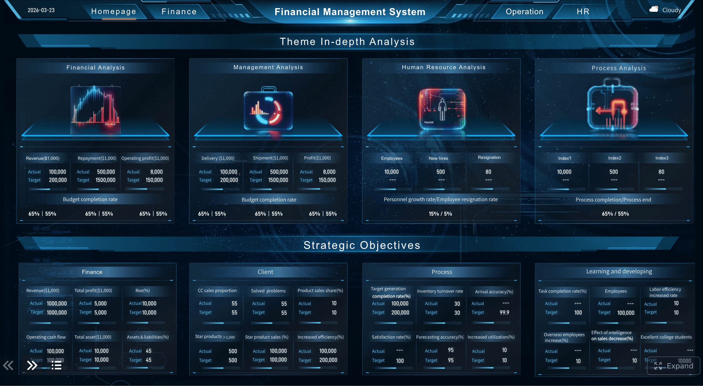
Project Overview Dashboard
Schedule health
Schedule health metrics tell you whether the job is moving according to plan and where recovery action is needed.
Planned vs. actual progress
This is the foundation. A dashboard should show whether actual work completed matches what was planned for the period. The best version goes beyond one project-wide percentage and lets users view progress by:
area
phase
trade
subcontractor
work package
This makes underperformance visible early.
Milestone status and critical path risk
Milestones matter because they anchor external commitments: turnover dates, inspections, utility energization, phased handovers, tenant access, and payment events. A construction dashboard should clearly flag:
on-track milestones
delayed milestones
milestones with negative float or rising risk
critical path tasks slipping in look-ahead windows
Gantt-style milestone tracker
Look-ahead tasks and constraint tracking
Weekly execution improves when the dashboard includes 2-week, 4-week, or 6-week look-ahead views. Pair those with constraint tracking so teams can see not just what is planned, but what is actually ready.
Typical constraints include:
missing submittal approval
unresolved RFI
permit pending
material not delivered
access unavailable
crew not assigned
A dashboard that shows look-ahead readiness is far more useful than one that only reports historical delay.
Cost and financial control
Construction dashboards must connect financial reporting to field reality. A project can look green on schedule but still bleed margin through procurement, rework, or uncontrolled change.
Budget vs. committed cost vs. actual cost
These three numbers should always be visible together:
Budget: what was planned and approved
Committed cost: what has been contractually obligated
This is where many spreadsheet reports fail. They show budget versus actual but miss commitments, which hides future overrun risk.
Change orders, contingency use, and cost variance
A practical cost section should track:
approved change order value
pending change order value
disputed or rejected changes
contingency consumed and remaining
cost variance by cost code, trade, or phase
This allows PMs and executives to distinguish between healthy change recovery and uncontrolled margin erosion.
Forecast at completion and cash flow visibility
Forecast at completion is one of the most important enterprise metrics because it tells leadership whether current trends will finish within tolerance. Cash flow visibility matters for both project finance and portfolio planning.
Field production and jobsite performance
If the dashboard stops at finance and schedule, it is incomplete. Construction performance is won or lost in the field.
Percent complete by area, trade, or phase
Project-level percent complete is too blunt on its own. Teams need to see physical progress in a way that reflects how work is executed. Useful breakdowns include:
by building or zone
by floor
by utility corridor or chainage
by trade package
by handover phase
This supports more precise intervention.
Labor productivity, installed quantities, and daily output
Field production metrics help explain why schedule and cost are moving. Good dashboards show:
labor hours versus installed quantity
daily or weekly output trends
productivity by crew, trade, or subcontractor
comparison against plan or benchmark
This is where operations leaders can separate a reporting problem from an execution problem.
Safety observations, issue logs, and punch list trends
Safety and issue data should not sit in separate systems with no connection to production and turnover. A construction dashboard should highlight:
safety observation volume and closure rate
recurring issue categories
aging coordination issues
punch list growth versus closure trend
closeout readiness by area or phase
These signals often predict delays before the schedule shows them.
How to design a construction dashboard that turns project data into useful insights
A dashboard becomes valuable when it is designed around decisions, thresholds, and drill-down paths. Design should reduce noise, not add it.
Start with decisions first, then map the data needed to support them
The best way to design a construction dashboard is to ask:
What decisions must this role make every week?
What evidence do they need to make those decisions confidently?
For example, if a PM needs to decide whether to accelerate a trade package, the dashboard must connect milestone risk, current production, open constraints, and cost impact. If those metrics live on separate pages with no drill path, the dashboard is decorative, not operational.
Separate executive views from project-level operational views
Executives need exception-based visibility. Project teams need detail and control.
A strong design typically includes:
Executive portfolio dashboard: project health roll-up, top risks, forecast trends, exception alerts
Project performance dashboard: schedule, cost, production, issues, and change control in one operational view
Field operations dashboard: look-ahead commitments, constraints, daily production, safety, and closeout items
Do not overload leadership with field detail, and do not starve site teams of the operational data they need.
Use simple visuals, consistent definitions, and clear thresholds for action
A construction dashboard should be easy to scan in seconds. Prioritize:
trend lines over decorative graphics
red/amber/green logic with defined rules
labels that match how the team already talks
consistent definitions across every project
limited metrics per page
For example, if “percent complete” means earned value in one dashboard and subjective status in another, trust collapses immediately.
Build drill-down paths so users can move from summary to root cause quickly
Every summary metric should lead to explanation. If a portfolio dashboard shows one project in red, users should be able to drill into:
This is where BI tools such as FineBI become valuable. They allow teams to connect multiple data sources, build role-based dashboards, and create fast drill-down analysis without locking reporting into static spreadsheet workflows.
Practical construction dashboard examples for building and infrastructure construction
Different construction environments need different dashboard views. Below are practical scenarios that reflect how enterprise teams actually use dashboards.
Executive portfolio view
An executive portfolio dashboard should roll up the health of multiple projects into one screen. It should highlight exceptions, not bury leadership in detail.
A useful executive view usually includes:
portfolio total budget and forecast
project count by status
schedule variance across active jobs
top projects by cost risk
contingency burn by project
delayed milestones needing leadership attention
filters by region, business unit, client, or project type
The key purpose is prioritization. Leaders need to know where intervention is required now.
Project performance dashboard example
A project performance dashboard should help one project team run a weekly review without hunting across separate files.
This lets the team connect symptoms to causes. If progress is lagging in one zone, users can immediately check open constraints, crew output, and cost impact.
Infrastructure construction reporting needs
Infrastructure projects often require a different dashboard structure than vertical building projects. Timelines are longer, phasing is more complex, and location matters more.
Infrastructure construction dashboards often need to include:
location-based progress tracking
segment or chainage completion
permit and stakeholder approval status
utility conflict tracking
phased handover readiness
environmental or access constraints
package-based contractor performance
For roads, rail, utilities, or large civil works, location intelligence can be critical. Progress by map, corridor, or handover segment is often more useful than by floor or room.
How to implement your construction dashboard without creating a new reporting burden
Implementation fails when teams add a dashboard on top of broken reporting instead of simplifying the reporting model. The goal is less manual work, not one more thing to maintain.
Start with a simple rollout
Start small and prove value fast.
Choose one project, one update cadence, and one owner for each data source
A proven rollout model is:
Select one active project with engaged stakeholders.
Define one reporting cadence, such as daily field refresh and weekly PM review.
Assign one owner for each source: schedule, cost, field progress, issues, and safety.
Review adoption after the first few cycles and refine.
This approach reduces risk and exposes data gaps early.
Standardize naming, status rules, and progress measurement before scaling
Before scaling across projects, align on:
cost code structure
milestone naming
trade and area hierarchy
status definitions
constraint categories
progress measurement rules
Without this governance layer, the dashboard becomes a visualization of inconsistency.
Use templates and governance wisely
Templates are useful, but they should be starting points, not fixed answers.
Begin with free construction dashboard templates as a starting structure
Free construction dashboard templates can help teams organize initial thinking around schedule, cost, and field KPIs. They are helpful for deciding what belongs on the first version of the dashboard.
But templates alone usually fall short when:
projects require live refreshes
multiple systems must be connected
executives need roll-up views
users need secure role-based access
teams need drill-down analysis
That is the point where a BI-driven construction dashboard becomes more scalable than spreadsheet templates.
Adapt templates to match reporting habits, contract type, and project complexity
A lump-sum building project, a GMP healthcare project, and a multi-phase infrastructure contract should not be forced into identical reporting layouts. Adapt the dashboard structure to fit:
contract model
payment model
phase complexity
stakeholder requirements
field reporting maturity
Review dashboard usefulness regularly and remove metrics nobody acts on
This is one of the most important best practices. If a metric appears on the dashboard for months and never triggers a discussion or action, remove it. A dashboard should earn its space.
Best practices to build a construction dashboard that teams will actually use
Below are practical implementation recommendations from a consulting perspective.
1. Define the management questions before building charts
Start with business questions, not visuals. Examples:
Which milestones are most at risk this month?
Which cost packages are trending over budget?
Which trade or zone is dragging production?
What blockers must be removed this week?
Once these are clear, choose metrics and visuals that answer them directly.
2. Create one trusted metric dictionary
Document how each KPI is defined, calculated, refreshed, and interpreted. This should include:
percent complete logic
cost variance formula
milestone risk thresholds
change order status categories
issue aging rules
Trust rises when teams know the dashboard logic is stable.
3. Automate only after process discipline exists
Do not automate bad habits. First stabilize how schedule, cost, and field progress are updated. Then automate the flow into the dashboard. Otherwise, you simply accelerate inconsistency.
4. Build exception-focused alerts
Executives and PMs should not need to inspect every chart manually. Configure views that surface:
milestones delayed beyond threshold
cost variance above tolerance
constraints aging past target
low productivity by trade
punch list closure falling behind handover plan
5. Design for drill-down, not just presentation
The real value of a construction dashboard is not the summary. It is the ability to move from “red status” to “why” in seconds. Make sure every key KPI can be investigated by project, area, trade, time, or responsible party.
Final thoughts: the best construction dashboard reduces friction, not just reporting time
The best construction dashboard does more than replace spreadsheets. It aligns schedule, cost, and field progress so teams can act earlier, communicate more clearly, and manage risk with confidence.
If you are evaluating your next step, use this checklist:
Can users see schedule, cost, and field progress together?
Are KPIs consistent across projects and roles?
Can teams drill down from summary to root cause?
Does the dashboard reduce manual reporting effort?
Is it helping weekly and monthly decisions happen faster?
If the answer is no, the issue is not just your reporting format. It is the operating model behind it.
FineBI is a strong fit for construction teams that need to connect fragmented project data, build role-based dashboards, and scale from one pilot project to enterprise reporting without staying trapped in spreadsheet-heavy workflows.
A construction dashboard gives teams one shared view of schedule, cost, and field progress so they can spot issues faster and make decisions without rebuilding reports in spreadsheets. It is used to monitor project health, track KPIs, and investigate delays or overruns.
A useful construction dashboard should include schedule status, budget versus actual cost, percent complete, change orders, field issues, labor or production metrics, and key risks. The goal is to connect these metrics in one live view instead of showing them in isolation.
A dashboard reduces manual copying, version confusion, and delayed reporting by pulling data into a centralized view. Unlike spreadsheets, it can support role-based access, filtering, and faster drill-down into root causes.
Project managers, executives, and site teams all benefit from a construction dashboard, but each group usually needs a different view. PMs focus on exceptions and coordination, executives watch portfolio risk, and field teams track look-aheads, blockers, and daily progress.
Construction dashboard data should be updated on a consistent cadence that matches operational decisions, often daily or near real time for active projects. The most important thing is that schedule, cost, and field data follow clear definitions and refresh cycles so teams trust the numbers.
Product Trial
FineReport
Pixel-perfect reports · Interactive dashboards · Easy data entry · Digital twins
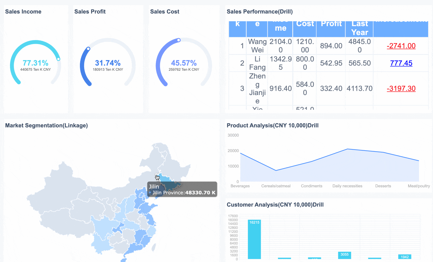 Drill-down capability
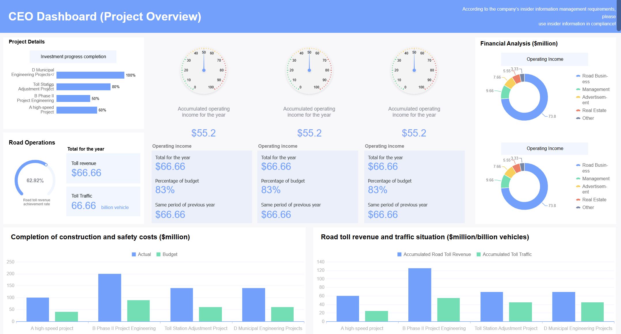 Project Overview Dashboard
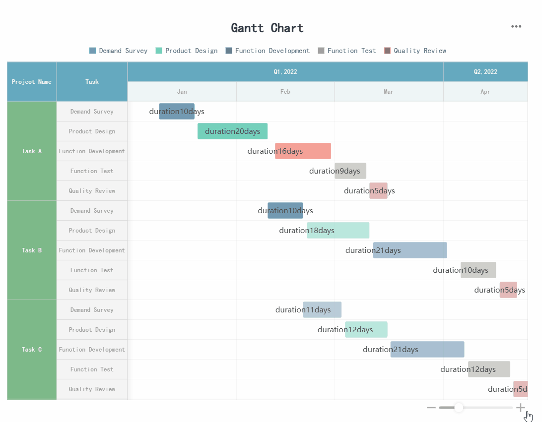 Gantt-style milestone tracker