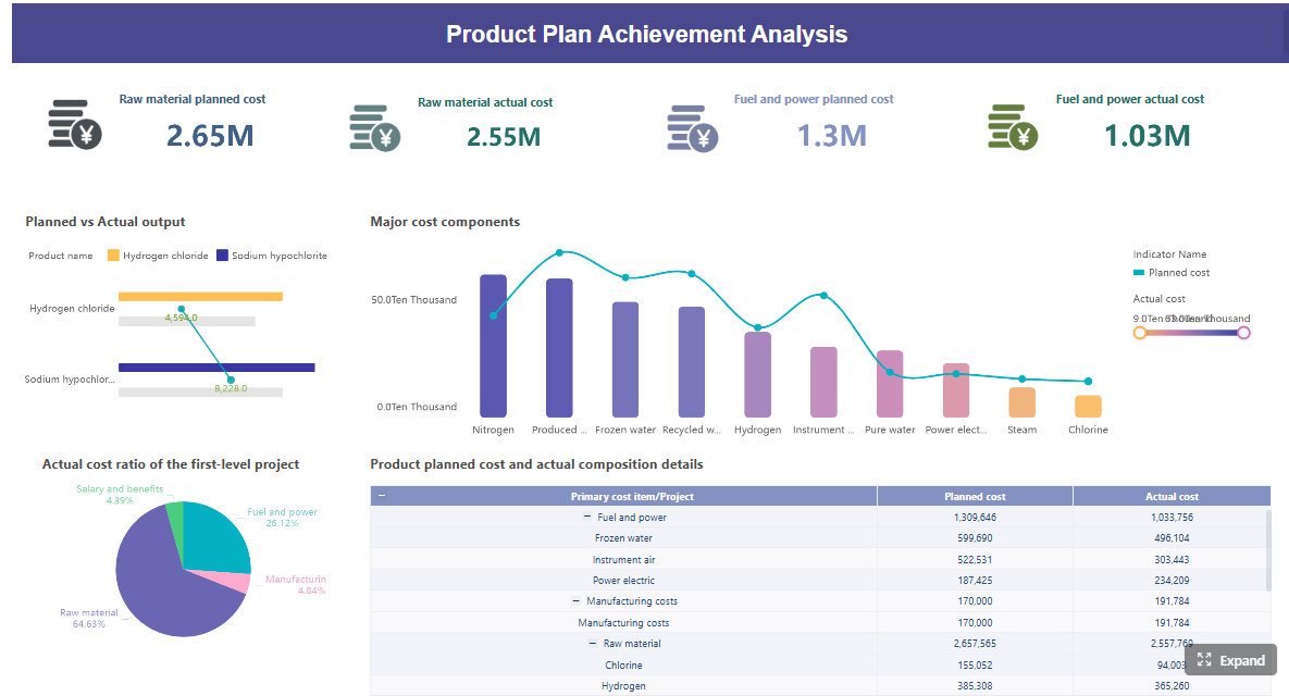
A predictive maintenance dashboard helps enterprise teams spot equipment risk before it turns into downtime, scrap, safety exposure, or missed production targets. For plant leaders, reliability engineers, and maintenance managers, the value is simple: turn scattered machine signals into one operational view that supports faster, better maintenance decisions.
Without that visibility, teams fall into familiar traps. Operations sees output losses but not root causes. Maintenance sees work orders but not early condition changes. Reliability sees trends but struggles to operationalize them across plants and asset classes. A well-designed dashboard closes that gap by combining sensor data, maintenance history, and risk logic into a shared system of action.
Just as important, predictive maintenance is not the same as either reactive or preventive maintenance:
Reactive monitoring waits for failure or obvious symptoms before intervention.
Preventive schedules follow calendar- or usage-based service intervals whether the asset needs it or not.
Predictive decision-making uses real-time and historical data to estimate degradation, identify anomalies, and trigger maintenance based on actual risk.
For enterprise environments with large fleets, distributed facilities, and strict uptime requirements, that shift is not cosmetic. It changes how teams prioritize labor, parts, shutdown windows, and capital planning.
Click To Try The Dashboard
What a Predictive Maintenance Dashboard Helps Enterprise Teams See Early
A predictive maintenance dashboard translates raw machine data into early warning signals. Instead of asking, “What failed?” teams can ask, “What is drifting out of normal behavior, how urgent is it, and what action should we take now?”
That matters because asset failure rarely happens in one moment. In most industrial settings, breakdowns are preceded by a sequence of smaller indicators: rising vibration, slight temperature deviation, unstable pressure, more frequent minor stoppages, or repeated technician interventions. A dashboard makes these signals visible before the cost curve spikes.
For enterprise teams, shared visibility is essential. Predictive maintenance only works when different functions can operate from the same truth:
Operations needs to understand production risk and planned intervention timing.
Maintenance needs clear priorities, backlog visibility, and response workflows.
Plant leadership needs KPI-level visibility tied to uptime, cost, and service performance.
Core Elements of an Effective Predictive Maintenance Dashboard
A high-performing predictive maintenance dashboard should include these core elements:
Asset-level health visibility: A fast way to see which machines need attention first.
Condition-based monitoring: Continuous tracking of variables such as vibration, temperature, pressure, and flow.
Failure risk indicators: Signals that estimate deterioration and likely time to failure.
Maintenance workflow integration: Connection to CMMS or EAM systems so insights lead to work orders.
Role-based views: Different layouts for executives, engineers, and technicians.
Alert prioritization: Risk-ranked notifications instead of undifferentiated alarms.
Trend and history context: Time-series visibility to distinguish noise from real degradation.
Response ownership: Clear escalation rules, responsible teams, and action status.
Key Metrics (KPIs)
These KPIs form the backbone of a predictive maintenance dashboard:
Asset Health Score: A composite indicator that summarizes current machine condition using sensor, operational, and maintenance data.
Remaining Useful Life (RUL): The estimated operating time before a component or asset is likely to fail.
Vibration Trend: A measure of abnormal movement or oscillation that can signal imbalance, looseness, or bearing wear.
Temperature Deviation: The difference between expected and actual thermal behavior under comparable operating conditions.
Pressure and Flow Stability: A consistency check on process performance that reveals restrictions, leaks, or declining efficiency.
Unplanned Downtime Frequency: The rate of unexpected stoppages over a defined period.
MTBF: Mean Time Between Failures, used to measure reliability over time.
MTTR: Mean Time To Repair, used to measure maintenance response and recovery speed.
Alert Accuracy: The percentage of alerts that lead to valid findings or useful intervention.
False Positive Rate: The share of alerts that generate unnecessary review or technician activity.
Work Order Backlog by Risk: Open maintenance tasks grouped by operational criticality and urgency.
The 9 Metrics Enterprise Teams Should Monitor Before Equipment Fails
1. Asset health score
An asset health score gives enterprise teams a practical way to rank equipment condition across hundreds or thousands of assets. Instead of forcing users to inspect dozens of raw variables, the dashboard combines relevant signals into a unified index.
This score typically pulls from:
Sensor behavior
Maintenance history
Asset age or usage intensity
Failure patterns
Open work order risk
For large equipment fleets, this is one of the most useful dashboard elements because it helps teams answer one question quickly: Which assets deserve attention first?
A strong health score should also be transparent. Users need to drill into why the score dropped, not just see a red status.
2. Remaining useful life
Remaining useful life (RUL) estimates how long a component can continue operating before likely failure. This is one of the most valuable metrics for maintenance planning because it shifts teams from generic service intervals to risk-based intervention timing.
In practice, RUL helps enterprises:
Schedule maintenance during planned outages
Align labor and spare parts availability
Avoid premature replacement
Reduce emergency work
For example, if a pump bearing shows a shortening RUL trend, the maintenance team can prepare the part, bundle the repair with other work, and avoid an unplanned line stop.
3. Vibration and condition trends
Vibration trends are often the earliest indicator of mechanical degradation in rotating equipment. Abnormal patterns can signal:
Bearing wear
Shaft misalignment
Imbalance
Looseness
Resonance issues
The dashboard should not only display current readings, but also trend lines, deviation from baseline, and asset-to-asset comparisons. That lets reliability teams see whether a spike is a one-time event or the start of a worsening condition.
For motors, pumps, fans, compressors, and gearboxes, vibration is frequently a frontline predictive signal. When trended correctly, it gives teams time to act before failure becomes visible in output loss or operator complaints.
4. Temperature deviation
Temperature deviation is more useful than raw temperature alone. The key question is not whether an asset is hot, but whether it is running hotter than expected for its operating context.
Heat changes often indicate:
Lubrication problems
Overload conditions
Friction increase
Electrical stress
Cooling system inefficiency
A predictive maintenance dashboard should compare actual temperature against expected operating range, historical baseline, and ambient conditions where relevant. That approach reduces false alarms and improves confidence in alerts.
5. Pressure and flow stability
For pumps, pipelines, hydraulic systems, and process equipment, pressure and flow stability provide direct insight into system performance. When either begins to fluctuate outside normal operating bands, teams may be seeing early signs of:
Blockages
Leaks
Valve issues
Seal degradation
Reduced pumping efficiency
This metric matters because many process failures begin as performance inconsistency rather than full stoppage. A dashboard that highlights variance, trend drift, and threshold breaches can help operations and maintenance intervene before quality, throughput, or safety are impacted.
Unplanned downtime frequency shows how often assets fail unexpectedly. It is one of the clearest indicators of whether your maintenance strategy is actually working.
If a predictive maintenance dashboard is effective, this number should move down over time. If it stays flat or rises, teams should investigate:
Poor alert quality
Missed interventions
Incomplete root cause resolution
Asset classes with chronic reliability issues
Gaps in operator response or maintenance execution
This KPI is especially useful at the plant and business-unit level because it translates maintenance performance into an operational language executives understand immediately.
7. Mean time between failures and mean time to repair
MTBF and MTTR should be viewed together.
MTBF measures how long an asset typically runs between failures.
MTTR measures how long it takes to restore the asset after failure occurs.
Together, they show both sides of reliability performance:
Are assets failing too often?
When they do fail, are teams recovering quickly enough?
A predictive maintenance dashboard should trend these metrics by asset class, production line, site, and criticality level. That allows enterprise teams to distinguish chronic failure patterns from workflow inefficiencies in repair execution.
8. Alert accuracy and false positives
Predictive maintenance fails when technicians stop trusting the alerts. That is why alert accuracy and false positives deserve a place on the dashboard.
High false-positive rates create three expensive problems:
Technician fatigue
Wasted labor hours
Lower adoption of the system
To maintain credibility, teams need to evaluate whether alerts are:
Based on meaningful anomalies
Properly tuned to operating conditions
Linked to real maintenance findings
Prioritized by confidence and business impact
This KPI set helps reliability and analytics teams refine the dashboard over time so it becomes a trusted operational tool, not just another alarm screen.
9. Work order backlog by risk level
A maintenance backlog is not automatically bad. The real issue is whether high-risk work is waiting too long. That is why a predictive maintenance dashboard should show work order backlog by risk level, not just total count.
This allows teams to prioritize open work based on:
Failure consequence
Safety exposure
Production criticality
Confidence of degradation signal
Parts or labor constraints
For enterprise organizations, this metric is vital because it connects predictive insights to execution reality. If high-risk work orders keep accumulating, the problem is no longer just asset health. It becomes a planning, staffing, or governance issue.
How to Build a Real-Time Dashboard That Supports Action
Building a predictive maintenance dashboard is not primarily a visualization task. It is an operational design task. The dashboard must help the business detect risk, assign ownership, and trigger timely intervention.
Connect sensor, CMMS, and historian data
The first requirement is data integration. Most enterprises already have relevant data, but it lives in different systems:
IoT and sensor platforms
SCADA or historian systems
CMMS or EAM platforms
Production systems
Manual inspection records
To make the dashboard useful, bring these data sources together so users can connect machine condition with maintenance history and operational context. A vibration spike without asset criticality or work order history is incomplete. A work order count without real-time condition data is also incomplete.
The goal is one operational picture, not disconnected reports.
Set thresholds, anomaly logic, and escalation rules
Raw readings do not create value on their own. The dashboard must translate data into decisions through:
Static thresholds for known safe operating ranges
Dynamic baselines based on asset behavior
Anomaly detection logic for unusual patterns
Escalation rules based on severity and confidence
Ownership paths for response
This is where many projects stall. Teams collect large volumes of data but never convert them into practical maintenance logic. The best dashboards make it obvious what happened, why it matters, who owns it, and what should happen next.
Design views for plant leaders, reliability engineers, and technicians
Different users need different levels of detail. One dashboard can support all audiences, but not through a single generic screen.
Plant leaders need:
Uptime and downtime impact
High-risk assets
Backlog and response trends
Site-level reliability performance
Reliability engineers need:
Trend analysis
Failure mode patterns
Alert precision
Baseline and anomaly comparisons
Technicians need:
Current asset condition
Open alerts by priority
Work order context
Actionable next steps
A predictive maintenance dashboard becomes far more effective when each user sees the same truth through a role-appropriate lens.
Review and refine the dashboard over time
No predictive maintenance dashboard should be treated as finished after launch. Equipment behavior changes. Thresholds drift. Production conditions evolve. Teams learn which alerts are useful and which ones add noise.
A mature review process should examine:
Alert outcomes
Missed failure events
False positives
User adoption patterns
KPI relevance by asset class
This iterative improvement cycle is what separates a pilot dashboard from a durable enterprise capability.
4 Best Practices for Implementation
Here are four practical steps I recommend in enterprise deployments:
Start with a critical asset group, not the whole plant
Choose one asset family with meaningful downtime cost and good sensor availability. Prove business value before scaling.
Define response rules before building visuals
Decide who acts on which alert, within what time frame, and through which workflow. Dashboard design should follow operating model design.
Use a risk model, not just threshold alarms
Combine asset criticality, anomaly confidence, and production impact so teams focus on what matters most.
Track adoption as seriously as technical accuracy
If planners, engineers, and technicians do not use the dashboard in daily routines, the analytics will not change outcomes.
Common Dashboard Design Mistakes Enterprise Teams Should Avoid
Tracking too many metrics without context
A common mistake is trying to visualize every available variable. That creates clutter, slows decisions, and dilutes attention from the few signals that actually drive action.
The better approach is to focus on metrics that answer operational questions:
Which assets are at highest risk?
What changed?
How urgent is it?
What should we do next?
A predictive maintenance dashboard should simplify complexity, not display it indiscriminately.
Treating every alert as equally urgent
Not all anomalies carry the same business consequence. A slight drift on a noncritical auxiliary asset should not compete visually with a high-confidence failure signal on a bottleneck machine.
Alert prioritization should reflect:
Asset criticality
Safety implications
Production impact
Failure likelihood
Confidence of the model or rule
Without this ranking, teams either overreact to noise or miss the alerts that matter most.
Ignoring user adoption and workflow fit
Many dashboards fail not because the data is wrong, but because they do not fit how maintenance work actually gets done. If the dashboard lives outside daily planning meetings, shift handoffs, engineering reviews, or technician workflows, it becomes passive reporting.
To drive adoption:
Integrate with existing maintenance routines
Make drill-downs fast and intuitive
Tie alerts to work orders and ownership
Show users how the dashboard helps them act, not just observe
Enterprise teams should judge dashboard quality by decision impact, not visual polish alone.
How to Use Dashboard Insights to Prevent Failures and Improve Reliability
A predictive maintenance dashboard only delivers value when insights become action. The goal is not better monitoring. The goal is fewer failures, lower maintenance waste, and higher asset reliability.
Turn insights into maintenance priorities
Use dashboard trends and risk signals to decide:
Which assets need inspection first
Which components should be replaced during planned downtime
Which work orders should be escalated
Which failures are likely to repeat without root cause correction
This helps maintenance teams shift from reactive firefighting to controlled intervention.
Align reliability goals with business outcomes
Reliability metrics should connect directly to business performance. The strongest enterprise programs tie predictive maintenance dashboard outputs to outcomes such as:
Higher uptime
Lower emergency repair cost
Better throughput
Improved safety performance
Reduced service interruptions
More efficient spare parts planning
When leadership sees that connection, predictive maintenance becomes a business discipline, not just a maintenance initiative.
Measure success after rollout
After deployment, measure whether the dashboard is improving operational performance. Useful post-rollout indicators include:
Reduction in emergency repairs
Fewer repeat failures
Lower unplanned downtime frequency
Improved MTBF
Faster MTTR
Higher alert precision
Lower backlog risk exposure
Those are the metrics that prove the dashboard is influencing real decisions.
From Methodology to Execution: Use FineBI to Operationalize the Entire Workflow
Building a predictive maintenance dashboard manually is complex. Enterprise teams must integrate sensor streams, historian data, CMMS records, anomaly logic, KPI models, role-based views, and alert workflows. Doing all of that from scratch often creates long development cycles, inconsistent definitions, and fragile dashboards that are hard to scale.
This is where FineBI becomes the practical choice.
With FineBI, enterprises can use ready-made templates and automate the full predictive maintenance dashboard workflow—from data connection and transformation to visual modeling, alert-oriented views, and cross-functional sharing. Instead of assembling a custom stack for every plant or asset group, teams can standardize faster and scale with less friction.
If your team is trying to operationalize predictive maintenance at enterprise scale, the challenge is not just seeing the data. It is turning that data into repeatable action. Building this manually is complex; use FineBI to utilize ready-made templates and automate this entire workflow.
FAQs
A predictive maintenance dashboard is a shared view that combines sensor data, maintenance history, and risk indicators to show which assets may fail soon. It helps teams act before issues turn into downtime or safety problems.
The most useful metrics usually include asset health score, remaining useful life, vibration trend, temperature deviation, pressure or flow stability, MTBF, MTTR, unplanned downtime frequency, and work order backlog by risk. Together, they show condition, urgency, and maintenance response readiness.
Predictive maintenance uses real-time and historical data to estimate failure risk and trigger action when conditions change. Preventive maintenance follows fixed time- or usage-based schedules whether the asset actually needs service or not.
It surfaces early warning signals such as rising vibration, abnormal heat, or repeated alerts before a breakdown happens. That gives maintenance teams time to schedule work, secure parts, and intervene during lower-impact windows.
A strong dashboard typically pulls from IoT or machine sensors, SCADA or operational systems, CMMS or EAM records, maintenance logs, and asset master data. Combining these sources gives better context for anomaly detection and maintenance prioritization.
Product Trial
FineReport
Pixel-perfect reports · Interactive dashboards · Easy data entry · Digital twins