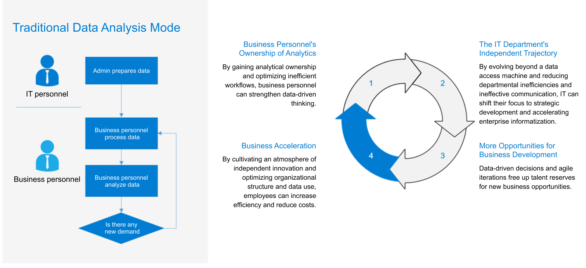
The best dashboard for executives is not the one with the most charts. It is the one that helps leadership teams understand performance, spot risk, and make decisions in minutes instead of waiting for another round of reports. For CIOs, CFOs, COOs, business unit leaders, and strategy teams, the real challenge is not dashboard creation. It is turning fragmented data into a trusted decision system.
When executive dashboards fail, the symptoms are predictable: too many metrics, inconsistent definitions, delayed updates, and visuals that look polished but do not drive action. A strong executive dashboard fixes those issues by combining clarity, relevance, and governance into a single view of business performance.
Click To Try The Dashboard
What Makes the Best Dashboard for Executive Decision-Making
Executives do not need raw operational noise. They need immediate answers to questions like:
Are we on track against strategic goals?
Where is performance deviating from plan?
What risk requires intervention now?
Which business drivers are improving or deteriorating?
What decision should we make next?
The best dashboard delivers those answers quickly.
A well-built executive dashboard reduces reporting delays by replacing static slide decks and spreadsheet stitching with live, trusted KPI views. Instead of waiting for analysts to compile weekly reports, leaders can access current performance, compare against targets, and drill into the reason behind a variance.
There is also an important distinction between dashboard types:
Executive KPI dashboards summarize strategic outcomes, trends, exceptions, and business drivers that influence leadership decisions.
Trying to force both use cases into one page usually creates clutter. Executives need summary and escalation logic. Operators need detail and task visibility.
Core traits of the best dashboard
The most effective executive dashboards share four traits:
Relevance: Every KPI maps to a strategic objective, recurring decision, or material business risk.
Simplicity: The layout is easy to scan in seconds, with no unnecessary visual complexity.
Context: Metrics include targets, thresholds, trends, and comparison periods so leaders can interpret performance correctly.
Trust: Data definitions, ownership, and refresh cadence are standardized and transparent.
Key Metrics (KPIs) executives should expect
The exact mix varies by company, but the best dashboard typically includes a structured KPI set across performance, risk, and momentum.
Revenue performance: Tracks actual revenue versus target, budget, or forecast.
Profitability: Measures margin, EBITDA, or operating profit to show financial efficiency.
Cash and liquidity: Highlights cash position, burn rate, working capital, or runway.
Growth rate: Shows quarter-over-quarter or year-over-year growth trends.
Pipeline or demand health: Indicates future revenue potential using qualified pipeline, lead volume, or bookings.
Customer retention: Measures churn, renewal rate, or net revenue retention.
Operational efficiency: Monitors cycle time, throughput, utilization, cost per unit, or productivity.
Service reliability: Tracks SLA attainment, uptime, backlog, or incident volume.
How to Choose the Right KPI Strategy Before You Build
The dashboard is only as good as the KPI strategy underneath it. Many organizations jump into visualization too early and end up with executive views that are visually clean but strategically weak.
Start with the decisions executives make most often
A practical KPI strategy starts with the actual decisions leaders make repeatedly. That means identifying the business questions that appear in executive meetings, board reviews, and weekly operating cadences.
Ask questions such as:
Which areas most often require executive intervention?
What risks can materially affect revenue, cost, customer retention, or compliance?
Which growth priorities must be reviewed every week or month?
What decisions depend on fast visibility rather than deep analysis?
Map those questions directly to KPIs. This avoids vanity metrics and keeps the dashboard decision-oriented.
For example:
If the recurring decision is whether to increase sales capacity, the dashboard should emphasize pipeline quality, win rate, sales cycle, and quota attainment.
If the key concern is margin protection, then pricing realization, cost variance, gross margin, and inventory exposure become more important.
If the issue is service performance, backlog growth, SLA risk, and incident trends should be prominent.
Select metrics that balance performance, risk, and trend visibility
Executives need both current-state outcomes and early warning signals. That means mixing lagging and leading indicators.
Use both leading and lagging indicators
Lagging indicators show results already achieved, such as revenue, profit, churn, or cash flow.
Leading indicators signal what is likely to happen next, such as pipeline growth, conversion rate, hiring capacity, ticket backlog, or customer engagement.
A dashboard built only on lagging indicators tells leaders what happened. A dashboard with both leading and lagging indicators helps them act early.
Add thresholds, targets, and time comparisons
Raw numbers rarely tell the whole story. To make executive reporting actionable, each KPI should include:
Target: What success looks like
Threshold: What level requires attention
Comparison period: Whether performance is improving or worsening over time
Variance indicator: The gap between actual and target or forecast
This context is what transforms a chart into a decision tool.
Define ownership, refresh cadence, and data sources
One of the fastest ways to lose executive trust is to present conflicting numbers from different teams. Before you build, define governance clearly.
KPI governance essentials
Metric owner: The person or function accountable for definition and quality
Refresh cadence: Real-time, hourly, daily, weekly, or monthly depending on business need
Source systems: ERP, CRM, finance, HR, operations, support, or data warehouse
Calculation logic: Agreed formulas and business rules
Exception handling: How missing, late, or disputed data is managed
Standardized definitions reduce rework, improve meeting quality, and eliminate the common problem of discussing the numbers instead of discussing the business.
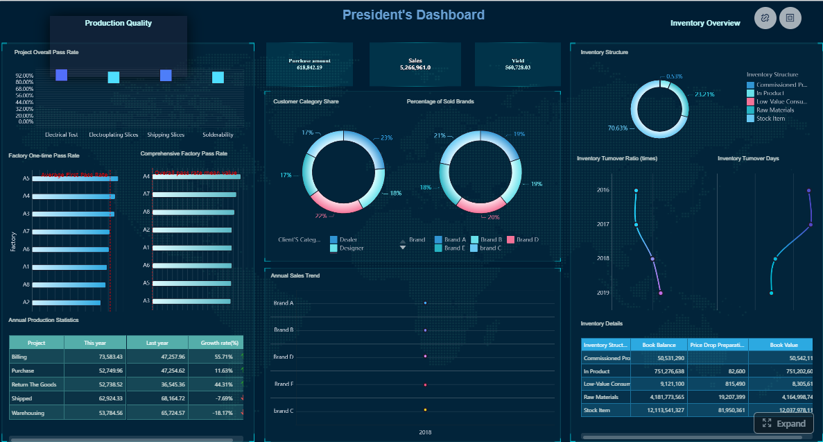
Dashboard Layouts, Templates, and Design Patterns That Improve Readability
Layout quality has a direct impact on decision speed. The best dashboard is designed around executive scanning behavior: top-to-bottom, left-to-right, with immediate emphasis on outcomes, changes, and exceptions.
Use proven executive dashboard structures
A reliable executive layout usually includes four sections.
1. Summary KPI strip
Place the most important 5 to 8 metrics at the top. These should represent the overall health of the business and align with executive priorities.
Examples include:
Revenue vs target
Gross margin
Cash position
Net retention
Pipeline coverage
Forecast accuracy
2. Trend section
Use line charts or compact trend visuals to show whether the business is improving, stable, or deteriorating over time. Executives need to see momentum, not just snapshots.
3. Exceptions and alerts
Dedicate space to what is off-plan. This could include red-status KPIs, major variances, missed SLAs, cost spikes, or regions underperforming target.
4. Business drivers and drill-downs
Show the factors behind the top-level outcome. For example:
Revenue by region, segment, or product
Margin by channel
Backlog by team
Churn by customer tier
This structure supports both quick interpretation and deeper follow-up.
Single-page summary vs role-specific views
Use a single-page summary when leadership needs a unified, recurring review view. This works well for weekly executive meetings, monthly operating reviews, and company-level scorecards.
Use role-specific views when different executives require different slices of the same business. A CFO may need liquidity and variance detail, while a COO needs service, throughput, and fulfillment metrics. The best approach is often a summary page plus targeted drill-down pages for each function.
Learn from real dashboard examples and visual inspiration
Many teams look at public dashboard examples for inspiration, and that can be useful. But effective executives do not reward beauty alone. They reward speed and clarity.
Common patterns seen in high-performing dashboard examples include:
Clear hierarchy with one obvious starting point
Restricted color use, typically emphasizing only exceptions
Consistent labeling and number formatting
Minimal chart variety to reduce cognitive load
Simple comparisons against target, prior period, and forecast
Borrow the underlying design logic, not the exact visuals. A layout that works for a SaaS sales team may fail completely for a manufacturing operations review.
Customize templates without overloading the page
Templates are valuable because they reduce setup time and encourage consistent structure. But they must be adapted carefully.
Best practices for template customization:
Keep only the sections tied to actual executive decisions
Limit KPI count to what can be reviewed quickly
Use whitespace to separate concepts clearly
Favor charts that answer one question well
Avoid decorative elements that compete with the data
A good template should accelerate alignment, not create visual debt.
Best Dashboard Software and Tools to Consider in 2026
Choosing dashboard software is a strategic decision. The platform affects speed of deployment, governance maturity, user adoption, and total reporting effort.
Compare platform capabilities before committing
For executive reporting, focus on capabilities that directly impact usability and trust.
Core evaluation criteria
Ease of use: Can business users create and adjust dashboards without heavy dependency on technical teams?
Data integration: Does the platform connect smoothly to ERP, CRM, spreadsheets, cloud apps, and warehouses?
Governance: Can you control definitions, permissions, and version consistency?
Performance: Will dashboards load fast even with large data volumes and multiple users?
Mobile access: Can executives review critical performance securely on mobile devices?
Interactivity: Does the tool support drill-down analysis beyond top-line summaries?
Template availability: Are there ready-made executive dashboard templates that reduce implementation time?
Collaboration and sharing: Can teams distribute insights, annotate performance, and support meeting workflows?
The best dashboard software should support both executive summaries and the underlying analysis path. If leaders cannot investigate why a number changed, they will quickly fall back to manual reporting.
Match software choice to team maturity and reporting complexity
They can be useful for pilot dashboards or small business environments, but may create scaling issues if executive reporting becomes more complex.
Enterprise platforms for scale
These are better when:
Data comes from many systems
Security and permissions matter
Multiple departments need standardized KPIs
Executive dashboards require deep drill-downs
Performance and governance are non-negotiable
For enterprise decision-making, scalability and consistency usually matter more than novelty.
Review criteria that matter most for executive reporting
When comparing tools, ask:
Can executives get answers within seconds?
Can analysts and business users collaborate efficiently?
Can KPI definitions be standardized across functions?
Can the same platform support both summary dashboards and self-service analysis?
Can the organization reduce manual reporting effort materially?
Those questions are more valuable than generic feature lists.
How to Build, Test, and Improve Your Executive Dashboard
The fastest path to a strong dashboard is to build around one high-value decision workflow, validate with real leadership use, and improve continuously.
Build a first version around one critical decision workflow
Do not try to build the entire enterprise dashboard universe in one phase. Start with the most important executive workflow.
Examples include:
Weekly revenue and pipeline review
Monthly financial performance review
Service risk and operations escalation meeting
Strategic growth or transformation tracking
Then build the dashboard around that workflow.
A practical implementation approach
Define the decision use case
Identify the exact meeting, owners, and decisions the dashboard must support.
Select a minimal KPI set
Choose only the metrics required to answer the core business questions.
Validate source data and definitions
Resolve data conflicts before design work scales.
Design the summary layout first
Focus on scan speed, exception visibility, and trend interpretation.
Add drill-downs for explanation
Support follow-up analysis without cluttering the summary page.
This method creates usable dashboards faster and avoids the common trap of endless requirement gathering.
Validate with executive feedback and real meeting use
A dashboard is successful only if executives can use it live, under time pressure, in actual reviews.
Test the first version with questions like:
Can leaders identify the business status in under 10 seconds?
Can they explain what changed versus last period?
Can they pinpoint where intervention is needed?
Can they move from summary to root cause without leaving the workflow?
Watch what happens in a real meeting. If leaders ask what a label means, the design is unclear. If they ask for a spreadsheet export to understand the issue, the dashboard is incomplete. If they ignore half the charts, remove them.
Create an ongoing optimization process
Executive dashboards should evolve as the business evolves. Establish a lightweight review loop.
Track post-launch performance
Measure whether the dashboard is actually improving decision-making:
Adoption rate: How often leaders access the dashboard
Decision speed: How quickly meetings move from review to action
Reporting efficiency: Reduction in manual report preparation time
Data trust: Fewer metric disputes and reconciliation cycles
Actionability: Increase in decisions tied directly to KPI changes
These are the operational outcomes that justify dashboard investment.
Designing the best dashboard manually is possible, but it is rarely efficient. You need to align KPI logic, connect multiple systems, manage permissions, standardize definitions, build templates, and maintain performance as usage grows. For most organizations, that becomes a slow and expensive reporting project.
This is where FineBI becomes the practical choice.
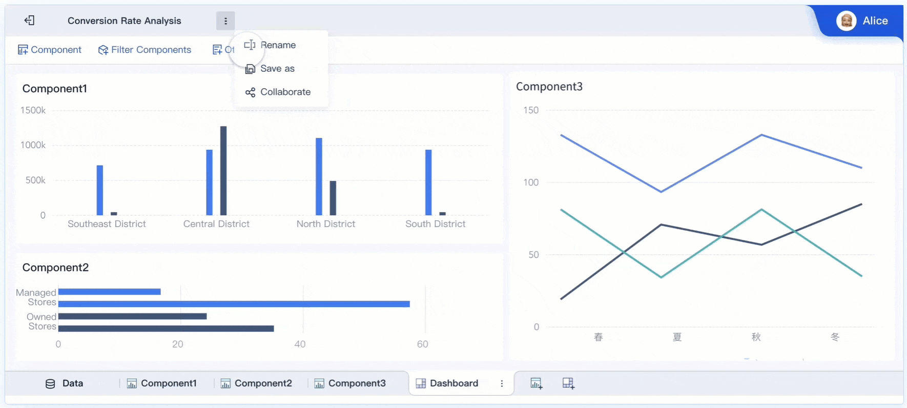
FineBI helps teams move from dashboard strategy to execution with far less friction. Instead of building everything from scratch, organizations can use ready-made templates, reusable components, and automated workflows to create executive dashboards faster and with stronger consistency.
Accelerates deployment with reusable dashboard templates for executive reporting
Connects data sources efficiently so finance, sales, operations, and service metrics can live in one environment
Supports self-service analysis so executives get summary views while analysts can drill deeper
Improves governance through standardized metrics, controlled access, and consistent reporting logic
Reduces manual reporting work by automating data refresh and dashboard delivery
If your goal is to create the best dashboard for faster executive decisions, the methodology is clear: start with decisions, define KPIs carefully, use proven layouts, and iterate with real user feedback. But building this manually is complex; use FineBI to utilize ready-made templates and automate this entire workflow.
That combination, more than visual polish alone, is what turns a dashboard into an executive decision engine.
FAQs
The best dashboard helps leaders understand performance, risk, and priorities quickly without forcing them to sort through operational detail. It should focus on strategic KPIs, clear context, and trusted data.
An executive dashboard usually includes revenue, profitability, cash, growth, pipeline health, customer retention, operational efficiency, service reliability, risk indicators, and strategic initiative progress. The right mix depends on the decisions executives need to make most often.
An executive dashboard summarizes outcomes, trends, and exceptions that affect leadership decisions. An operational dashboard is built for day-to-day monitoring of tasks, workflows, and team activity.
Start with the recurring business decisions leaders make in meetings and reviews, then map each decision to a small set of meaningful KPIs. Include both leading and lagging indicators so executives can see current results and potential future issues.
They usually fail because they include too many metrics, inconsistent definitions, delayed updates, or visuals that look impressive but do not support action. A strong dashboard stays simple, aligned to strategy, and governed by clear data standards.
Product Trial
FineReport
Pixel-perfect reports · Interactive dashboards · Easy data entry · Digital twins