Power BI drill through is a report navigation feature that lets users move from a summary visual to a separate detail page that is automatically filtered to the item they selected. If you are building reports for executives, analysts, or operational teams, drill through helps you keep overview pages clean while still giving users access to deeper analysis when they need it.
In practice, that means a user can start on a high-level chart like sales by region, right-click a specific region, and open a detail page showing only that region’s stores, transactions, products, or customers. This makes the report easier to use because you do not have to squeeze every possible detail onto one crowded page.
For report designers, the main question is not just how power bi drill through works, but when it is the right interaction compared with drill down, bookmarks, buttons, or slicer-driven exploration. This guide covers the mechanics, common use cases, setup steps, best practices, and the difference between Power BI drill through vs drill down.
Quick Comparison Table
Before getting into setup details, here is the simplest way to distinguish drill through from related report interactions:
| Interaction | What it does | Best for | User experience | Typical example |
|---|---|---|---|---|
| Drill through | Opens a separate page filtered to the selected context | Focused detail analysis | Move from one page to another | Click a region and open a region details page |
| Drill down | Moves through hierarchy levels inside the same visual | Category hierarchy exploration | Stay in one chart | Year > Quarter > Month |
| Filters/Slicers | Changes visible data across one or more visuals | Flexible report-wide exploration | Stay on the same page | Filter to one product line |
| Buttons/Bookmarks | Navigates to predefined views or states | Guided storytelling | Controlled navigation | Switch between summary and operational views |
Power BI Drill Through Explained: what it is and how it works

Power BI drill through is designed for contextual navigation. Instead of forcing users to manually search for details, it carries the context of their selection from a source visual to a destination page.
For example, if a user selects West Region in a chart, Power BI can open a detail page already filtered to West Region. The value that was selected becomes part of the page’s filter context.
What drill through means in simple terms
Think of drill through as a jump from summary to detail.
A standard dashboard page usually answers questions like:
- Which region is behind target?
- Which product category is growing fastest?
- Which customer segment has the highest margin?
A drillthrough page answers the next question:
- Why is this region underperforming?
- Which products are driving the category trend?
- Which customer accounts are affecting the result?
This separation is useful because the summary page stays clean and executive-friendly, while the destination page can contain more tables, trends, breakdowns, and supporting visuals.
How drill through works in a report
Three parts matter most:
-
Source visual
This is the chart, table, or matrix where the user makes a selection. -
Drill through target page
This is the detail page designed to receive the selected context. -
Drill through filter field
This is the field placed in the drillthrough setup area on the destination page. It tells Power BI which context should be passed when users navigate.
When these match correctly, the user can trigger drill through from a data point and open a page filtered to that value.
The role of drill through filters, target pages, and passed context
The core idea behind drill through is context passing.
If the destination page is configured with a field such as:
- Region
- Product
- Customer
- Store
- Category
then any source visual containing that same field can pass the selected value into the target page.
This lets you create pages such as:
- Region Details
- Customer Analysis
- Product Performance
- Store Transactions
The target page should be built around one analysis goal. If it tries to answer too many unrelated questions, users can lose the benefit of focused navigation.
Where drill through fits in report navigation and data exploration
Drill through sits between high-level dashboard consumption and deeper investigative analysis.
It is most helpful when users:
- Start with KPIs or summary charts
- Identify an exception, outlier, or trend
- Need structured detail for that specific item
- Want supporting visuals on a dedicated page
It is less about free-form browsing and more about giving users a clear path from signal to explanation.
When to use power bi drill through in reports
Use power bi drill through when the main page should stay simple, but users still need access to richer detail for selected items.
This is common in real business reporting because different audiences consume different levels of information:
- Executives want overview metrics and major trends
- Managers want team, region, or product detail
- Analysts want transaction-level explanations
- Operations teams want records they can act on
Drill through works well when one report needs to serve all of them without overwhelming the landing page.
Common use cases for drill through
Typical use cases include:
- Moving from a high-level KPI to customer detail
- Opening product-level analysis from a category chart
- Reviewing store detail from a regional summary
- Jumping from executive dashboards to operational records
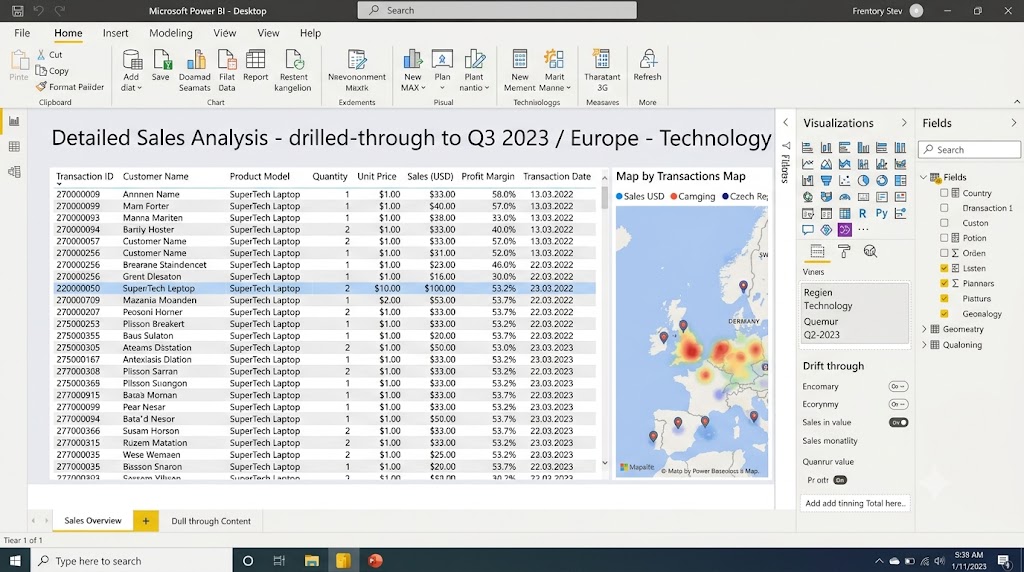
- Opening filtered transaction tables from exception charts
For example, a monthly executive page might show revenue, gross margin, and return rate. If the return rate spikes in one category, the user can drill through to a page focused only on that category and inspect customer orders, return reasons, locations, and timelines.
When drill through adds clarity instead of overcrowding a single page
Many report builders make the mistake of trying to place:
- summary KPIs
- trend charts
- customer detail
- product analysis
- transaction records
- operational tables
all on one page.
That usually creates visual clutter and makes the report harder to scan.
Drill through is better when:
- the detail needed is too granular for the main page
- the destination page needs multiple supporting visuals
- users only need deep detail occasionally
- the source page serves a broader audience than the detail page
In other words, use drill through to protect the usability of the main report.
When drill through may not be the best choice
Drill through is not always the right interaction.
It may be a poor fit when:
- users need to explore a simple hierarchy in one chart
- the detail page adds little value beyond the source visual
- the report audience does not understand hidden navigation paths
- users need to compare many categories side by side, not one at a time
In those cases, drill down or a better on-page filtering experience may work better.
Typical report scenarios that benefit from drill through
Sales performance by region to store-level detail
A regional performance dashboard may show revenue, margin, target attainment, and year-over-year trends by region. Drill through can open a store detail page showing:
- store rankings
- monthly sales trend
- average basket size
- local inventory status
- underperforming SKUs
This is a classic use case because store-level analysis would clutter the summary page.
Executive overview to operational transaction records
An executive page may highlight late shipments, overdue receivables, or high return rates. Drill through can send users to a transaction page containing:
- invoice IDs
- shipment dates
- responsible teams
- aging categories
- exception records
This gives leadership a way to move from indicator to operational follow-up without switching reports.
Category summaries to customer or product analysis pages
A merchandising or e-commerce team may start with category-level metrics like revenue, sell-through, and discount rate. From there, drill through can open a page focused on:
- top customers in that category
- product profitability
- item-level conversion trends
- return patterns
How to make a drillthrough page in Power BI
The setup process for a drillthrough page is straightforward, but good implementation depends on both technical setup and page design.
At a high level, you need to:
- Create a destination page
- Add the drill through field
- Design the page visuals for detail analysis
- Test the interaction from the source visual
- Make navigation clear for end users
Basic setup process
Start by creating a new report page and naming it clearly, such as:
- Product Details
- Customer Detail
- Region Analysis
- Store Transactions
Then add the field you want to use for drill through to the page’s drillthrough field area. This is the field Power BI will use to receive context from the source page.
After that, build the page with visuals that are meaningful when filtered to a single item or a narrow selection. Good drillthrough visuals often include:
- KPI cards
- tables or matrices
- trend charts
- breakdown charts
- supporting slicers
- exception lists
How users trigger drill through
In the standard experience, users usually trigger drill through by:
- right-clicking a data point in a visual
- selecting Drill through
- choosing the target page
This works from visuals that include the same relevant field used on the destination page.
For example:
- Source chart: Sales by Region
- Drill through field: Region
- Destination page: Region Detail
If the selected chart point contains a region value, Power BI can pass that context into the Region Detail page.
What filtering behavior to expect
When drill through is configured correctly, the destination page opens already filtered to the selected context.
That means:
- visuals on the destination page show only the selected item’s data
- titles and cards can reflect the chosen entity
- tables can display only relevant transaction records
- users can continue exploring inside the narrowed context
If the page seems unfiltered or partially filtered, the issue often comes from field mismatches, model relationships, or visuals that do not respond as expected to the page context.
Add a back button and make the page easy to recognize
A good drillthrough page should feel intentional, not accidental.
Helpful design choices include:
- a clear page title like Customer Detail
- a dynamic subtitle like Showing results for: East Region
- a visible back button
- a layout that clearly differs from the summary page
- focused supporting visuals rather than a random collection of charts
If users land on a detail page and are unsure where they are, adoption drops quickly.
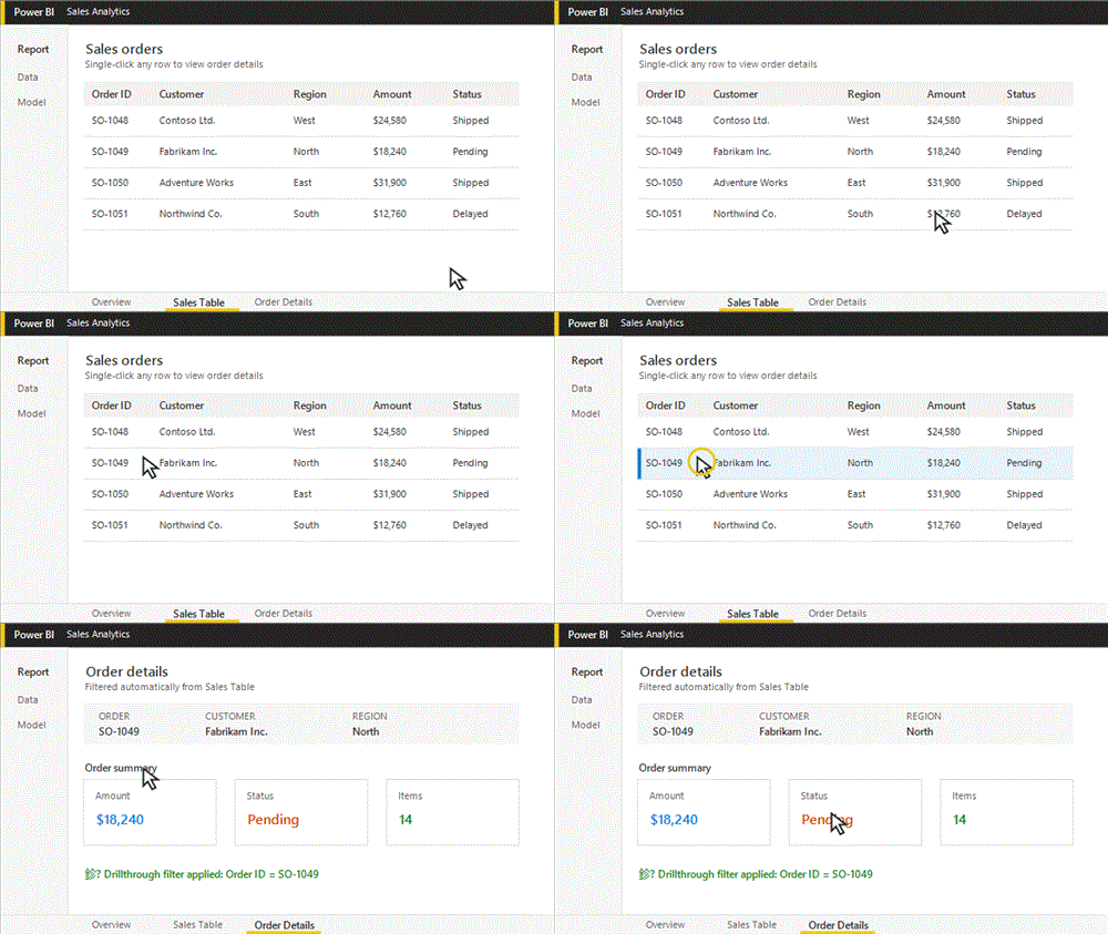
Table drillthrough to another page with single click
Many users ask whether a table or matrix can send them to another page with a single click instead of the standard right-click drill through pattern.
The important distinction is this:
- Standard drill through usually uses right-click context navigation
- Single-click navigation patterns often rely on buttons, page navigation, or carefully designed clickable elements
In practical report design, a table or matrix is often a strong source visual for drill through because it already contains detailed row context such as:
- customer name
- store ID
- invoice number
- product category
- sales rep
That makes it natural to send users to a focused detail page.
Single-click behavior can improve usability when:
- the audience is less technical
- the report is used in presentations or operational workflows
- users are unlikely to discover right-click actions on their own
However, the tradeoff is that single-click navigation patterns need more deliberate design to avoid accidental navigation or confusion around what is being filtered.
When a table or matrix is a good source visual
Tables and matrices are especially effective when:
- users need to review ranked lists before investigating one record
- the next step is a dedicated detail page
- the selected row represents a business entity with many related metrics
- operational users think in terms of records, not only charts
A matrix of stores, products, customers, or regions often makes drillthrough behavior easier to understand than a highly abstract visual.
Best practices for including drill through pages
A strong drillthrough experience is not just functional. It is easy to understand and useful on first use.
Keep page purpose focused on one analysis goal
Each drillthrough page should answer one main question.
Examples:
- Why is this region under target?
- What is happening with this customer account?
- Which products drive this category result?
If the page tries to support several unrelated purposes, it loses clarity.
Use clear titles that reflect the selected context
Generic titles like Detail Page or Page 4 create friction.
Better examples include:
- Product Performance Detail
- Customer Order History
- Regional Sales Analysis
If possible, show the selected value in a title or subtitle so users know what they are viewing.
Include key detail visuals without overwhelming the page
The destination page should be richer than the source page, but still selective.
Commonly useful elements include:
- one or two KPI cards
- a trend chart
- a ranked breakdown chart
- a detail table
- one small set of filters
That is usually enough to support investigation without recreating the same clutter you avoided on the summary page.
Make navigation obvious so end users know drill through is available
One of the biggest usability problems with drill through is discoverability.
Users often do not know it exists unless you signal it clearly.
Useful cues include:
- tooltip text such as “Right-click for details”
- visual instructions on the page
- drillthrough buttons
- icons near visuals
- onboarding notes for first-time users
Power BI drill through vs drill down
The difference between Power BI drill through vs drill down is simple, but it matters a lot in report design.
What drill down means
Drill down moves through levels of a hierarchy within the same visual.
For example, a column chart might let users move through:
- Year
- Quarter
- Month
or
- Region
- State
- City
- Store
The visual changes level, but the user stays on the same page and within the same chart.
What drill through means
Drill through opens a separate page that is filtered to the selected context.
Instead of staying inside one visual, the user moves to a dedicated page with more supporting visuals and detail.
For example:
- From a category chart to a product detail page
- From a region chart to a store analysis page
- From a customer summary to order history
The practical difference in analysis flow
Drill down is best for progressive hierarchy exploration.
Drill through is best for deep contextual analysis.
Use drill down when users want to ask:
- What is under this category?
- How does this break into the next level?
Use drill through when users want to ask:
- Why is this specific item performing this way?
- What detailed evidence supports this result?
Choosing the right interaction for your report
Use drill down for layered category exploration inside one chart
Drill down is ideal when your audience needs a natural hierarchy path and can stay in one visual.
Examples:
- Revenue by Year > Quarter > Month
- Sales by Region > State > City
- Cost by Department > Team
This keeps the experience quick and compact.
Use drill through for dedicated detail pages and richer supporting visuals
Use drill through when one selected item deserves its own page and supporting context.
Examples:
- Customer summary to customer history
- Region performance to store operations
- Product line summary to SKU-level profitability
This is better when users need tables, KPIs, trends, and exceptions together.
Combine both when users need quick hierarchy analysis before reviewing full detail
Some of the best Power BI reports use both interactions together.
For instance, a manager might:
- Drill down from Region to State in a chart
- Identify an underperforming state
- Drill through to a state detail page
- Review stores, customers, and transactions
That creates a natural path from broad exploration to focused investigation.
Power BI drill through: common issues, limitations, and user adoption tips
Even when the setup is simple, drill through can fail in practice if the report is not tested from the user’s perspective.
The most common problems are not just technical. They are often design and usability issues.
Frequent setup mistakes
Common mistakes include:
- using a drillthrough field that does not exist in the source visual
- using mismatched fields across pages
- expecting aggregated measures to behave like row-level categories
- designing the detail page without a clear analytical purpose
- forgetting to make navigation and context visible
A technically valid drillthrough page can still confuse users if the destination page looks disconnected from the source page.
Missing filter context problems
If drill through does not behave as expected, one likely reason is incomplete filter context.
For drill through to work well:
- the source visual must contain the relevant field
- the destination page must be configured to receive that field
- relationships in the model must allow filtering to propagate correctly
- visuals on the detail page must respond to the filter context
If any of those are weak, users may see blank visuals, partial filtering, or unexpected totals.
How to test the experience from the end-user perspective
Do not just test drill through as the report author. Test it as a business user would.
Ask:
- Is it obvious that this visual supports drill through?
- Does the destination page open with the expected data?
- Is the page title clear?
- Can users tell what value they selected?
- Is the back path obvious?
- Does the destination page answer the natural follow-up question?
This type of testing often reveals more issues than a purely technical check.
Tips for signaling the feature with tooltips, instructions, buttons, or visual cues
Because many users do not naturally right-click inside dashboards, drill through often needs guidance.
Strong adoption cues include:
- helper text like Right-click a region to view details
- a button labeled View Detail
- tooltips that explain available interactions
- subtle icons near key visuals
- brief onboarding on the landing page
The goal is to reduce uncertainty and make the next action feel obvious.
Troubleshooting drill through behavior
What to check when the drill through option does not appear
If the drill through option is missing, check these first:
- the destination page has a drillthrough field configured
- the source visual contains the same relevant field
- the source selection is not too aggregated to pass meaningful context
- the selected data point actually supports drill through
This is usually a field alignment issue, not a visual formatting issue.
How page filters and visual interactions can affect results
Even when navigation works, filters may seem wrong because of:
- page-level filters
- report-level filters
- slicers
- model relationships
- visual interaction settings
If the destination page shows surprising values, inspect all filtering layers, not just the drillthrough field itself.
Why some community-reported issues happen and how to avoid them
Many user complaints about drill through come from one of three causes:
-
Users do not know the feature exists
The report hides the interaction too well. -
The destination page is not actually useful
It opens, but does not provide meaningful detail. -
The filtering logic is inconsistent
Similar-looking visuals pass different context or produce unexpected results.
The solution is usually better report design, better naming, and stricter testing rather than adding more visuals.
Practical recommendations for building better drill through experiences
If you want power bi drill through to work well in a real business report, focus on these practical rules:
-
Design the summary page for scanning, not completeness
Use drill through to protect clarity. Let the main page highlight signals, and let detail pages explain them. -
Create one clear question for each destination page
A good drillthrough page has a defined purpose, such as product diagnosis, customer history, or regional operations review. -
Make the selected context unmistakable
Show the chosen region, customer, product, or store in the title area so users know exactly what they are viewing. -
Teach the interaction inside the report
Never assume users know to right-click. Use tooltips, notes, or buttons to guide them. -
Test with realistic user paths
Start from the overview page, navigate like an end user, and confirm that each drillthrough page answers the next business question clearly.
When teams should also consider FineBI + Dora
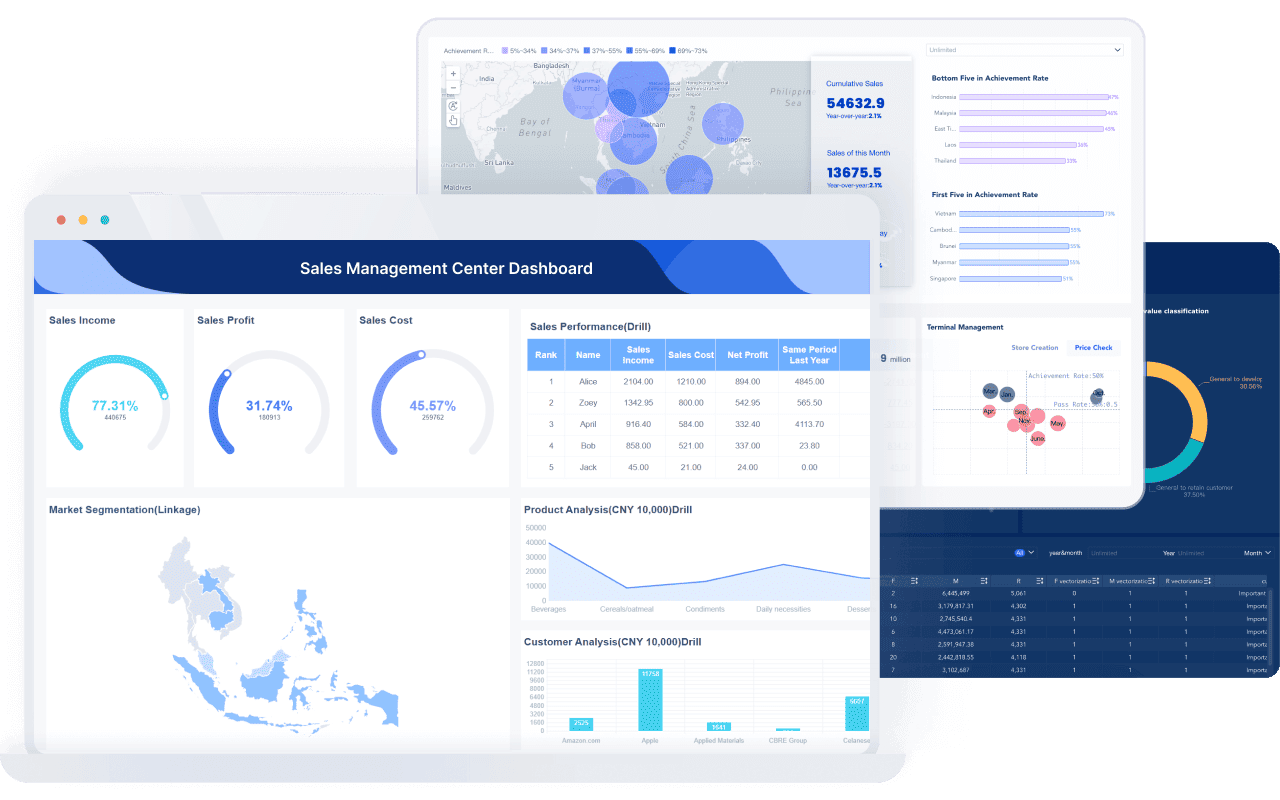
Tools like Power BI and Tableau are widely used in the BI market, but teams that need a more business-user-friendly, self-service BI platform may also consider FineBI.
FineBI is designed for self-service analytics and interactive dashboard creation, with a focus on helping business teams explore data through drag-and-drop analysis, dashboard sharing, and guided data discovery. For organizations that want to reduce dependence on specialist report builders and make dashboard use more approachable for business users, that positioning can be relevant.
Where this becomes especially important is not just in dashboard creation, but in what happens after dashboards are built.
Dora is FanRuan’s enterprise Data Agent platform. It acts as an AI assistant and digital employee layer on top of FineBI and existing enterprise data assets. Rather than replacing BI, Dora builds on a trusted semantic and dashboard foundation so users can move from static dashboard viewing to more governed, action-oriented analysis.
Together, FineBI + Dora supports a more agentic BI workflow:
- natural-language requests
- trusted semantic understanding
- governed query or skill execution
- answers, charts, summaries, actions, and follow-up
That means organizations can move beyond “open dashboard, click filters, inspect visuals” toward scenarios where an enterprise AI assistant helps users ask, analyze, generate, push, alert, and follow up.
Examples of this approach can include:
- a Data Analyst digital employee helping users investigate KPI changes
- a Report Researcher summarizing what changed across dashboards
- a Daily Briefing Secretary pushing digest-style insights
- a Risk Alert Officer highlighting exceptions that need attention

FineBI provides the trusted dashboard and metric foundation. Dora turns that foundation into a governed AI workflow for enterprise use.
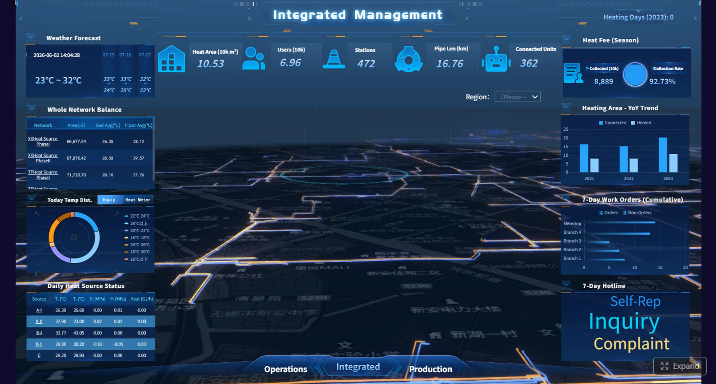
Get Ready-to-Use Dashboard Templates in Fine Gallery
Final thoughts on power bi drill through
Power BI drill through is one of the most practical ways to balance clean executive reporting with deeper analytical detail. It helps users move from a summary visual to a focused destination page without overloading the report’s main pages.
Used well, it improves:
- report clarity
- navigation
- analytical depth
- user decision-making
The key is to treat drill through as a designed user journey, not just a technical feature. Build summary pages for fast scanning, create destination pages with one clear analytical purpose, and make the interaction easy to discover.
If your team is also evaluating broader BI usability, self-service dashboard adoption, or how AI assistants can work on top of governed enterprise data, FineBI + Dora is another path worth exploring.
FAQs
Power BI drill through is a feature that lets users open a separate report page filtered to the item they selected in a summary visual. It helps connect high-level dashboards to detailed analysis without cluttering the main page.