A well-designed business management dashboard gives leaders a single, reliable view of performance across the company. Instead of reviewing disconnected spreadsheets, static reports, and fragmented updates from different departments, management teams can monitor progress, spot risks early, and act with more confidence.
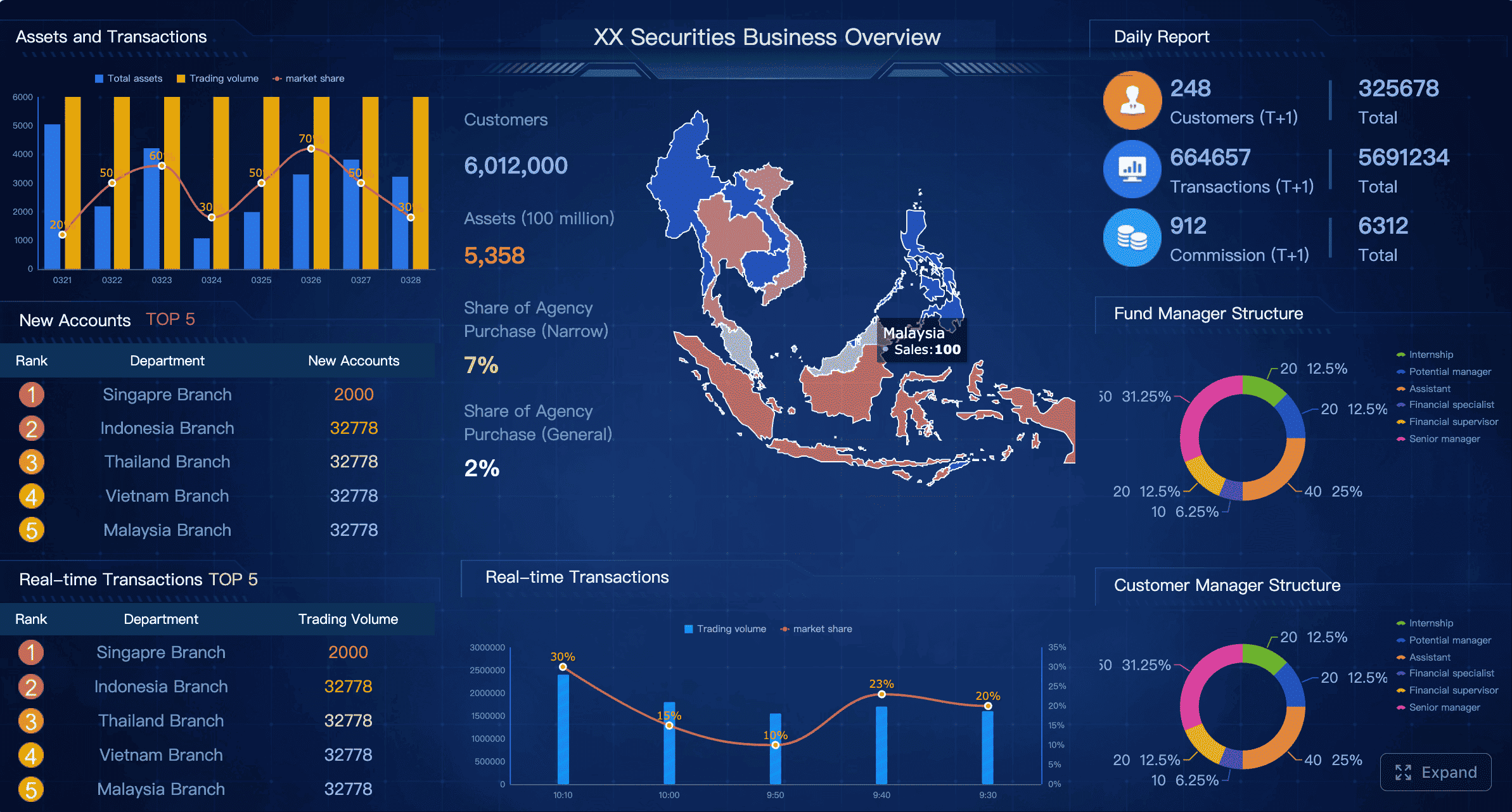
Figure 1: A business management dashboard example created with FineBI
What a business management dashboard is and why it matters
A business management dashboard is a visual reporting interface that brings together the most important metrics, trends, and exceptions needed to manage the business. Its purpose is not simply to display data. It is to support day-to-day management, improve coordination across functions, and help executives make faster, better-informed decisions.
In practical terms, a dashboard translates strategy into a working management system. It connects goals, KPIs, targets, actual results, and actions in one shared view. When leaders open the dashboard, they should immediately understand three things:
What is happening
Why it is happening
What action is needed next
This is why dashboards matter. Most organizations do not suffer from a lack of data; they suffer from a lack of clarity. Sales, finance, operations, customer service, and HR often maintain separate reporting logic and reporting cycles. A strong dashboard solves that fragmentation by turning business performance into a common language.
A dashboard also improves alignment. If department heads, managers, and executives all work from different versions of the truth, decisions become slower and accountability becomes weaker. A shared business management dashboard creates a consistent operating picture that helps teams focus on the same priorities.
Figure 2: A dashboard helps business alignment
Operational, tactical, and executive reporting are different
Not every dashboard should serve the same audience. One common mistake is trying to satisfy all reporting needs in a single screen. In reality, management reporting usually falls into three levels:
Operational reporting focuses on daily execution, such as backlog volume, service response times, order fulfillment, or production output.
Tactical reporting supports mid-level management decisions, such as weekly performance trends, team productivity, campaign effectiveness, or budget versus actual by department.
Executive reporting gives senior leaders a high-level summary of company health, strategic progress, major risks, and cross-functional dependencies.
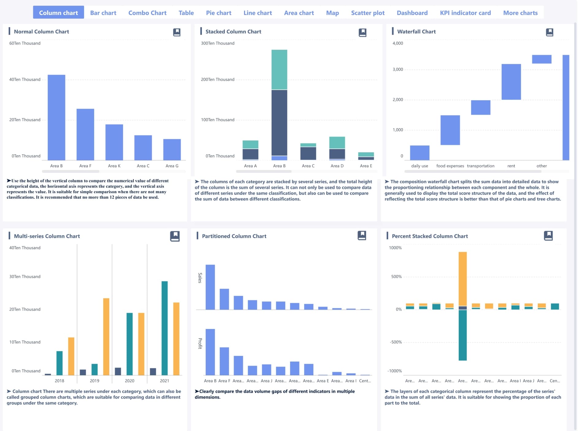
Figure 3: A business management dashboard example created with FineBI
A business management dashboard may combine elements from all three, but it should do so intentionally. For example, an executive summary dashboard may show top-line revenue, operating margin, customer churn, and delivery risk, while allowing drill-down into departmental details when needed.
This is also where a modern BI platform becomes important. Tools such as FineBI help organizations build role-based dashboards that preserve one data model while offering different views for executives, managers, and teams. That approach keeps definitions consistent without forcing every user into the same reporting layout.
Set goals and choose the right KPI framework for the business management dashboard
A dashboard is only as useful as the management logic behind it. Before selecting charts or building pages, define what the dashboard is supposed to help the business achieve.
Start with business goals and decisions
The right starting point is not “What data do we have?” but “What decisions do we need to make?” A business management dashboard should be built around recurring management questions, such as:
Are we on track to hit revenue and margin targets this quarter?
Which teams or regions are underperforming?
Where are delivery bottlenecks increasing risk?
Is customer retention improving or declining?
Are costs rising faster than output?
These questions should be mapped to clear business goals and ownership. For each goal, define:
The decision the dashboard should support
The person or team responsible
The measurable outcome
The review frequency
For example:
Goal: Improve quarterly profitability
Decision: Reallocate spending or adjust pricing in underperforming segments
Owner: CFO and business unit heads
Outcome: Higher gross margin and lower cost variance
Review cadence: Weekly and monthly
This process keeps the dashboard focused on management action rather than passive observation.
Select KPIs that show performance clearly
Once goals are defined, select KPIs that reveal whether the business is moving in the right direction. A strong business management dashboard usually includes both:
Leading indicators, which signal future performance
Lagging indicators, which confirm achieved results
For example:
Growth KPIs
Pipeline coverage
Lead-to-opportunity conversion
Revenue growth rate
New customer acquisition
Efficiency KPIs
Cycle time
Cost per order
Utilization rate
Productivity per employee or team
Risk KPIs
SLA breach rate
Inventory stockout rate
Budget variance
Churn risk score
Customer health KPIs
Retention rate
Net revenue retention
CSAT or NPS
Average resolution time
The key is restraint. Too many metrics reduce clarity and slow decision-making. A focused management dashboard often works better with a small set of high-value KPIs than with a crowded page of every available metric.
A useful rule is to ask whether each KPI answers one of these questions:
Does it reflect progress toward a business goal?
Does it help someone make a decision?
Does it indicate where action is required?
If the answer is no, it likely does not belong on the main dashboard.
Define data sources and refresh rules
Before design begins, document the data foundation behind every KPI. This step prevents the common problem of dashboards that look polished but are not trusted.
For each metric, define:
Source system
Refresh frequency
Calculation logic
Metric owner
Data quality checks
Exception handling rules
Typical source systems may include:
ERP for revenue, cost, and inventory
CRM for pipeline and sales activity
Finance systems for budget and actuals
HRIS for headcount and capacity
Service platforms for tickets and support KPIs
Project tools for delivery progress
Refresh rules should align with business needs. A production or customer support dashboard may require near real-time updates, while strategic financial measures may only need daily or weekly refreshes.
This is another area where FineBI can support governance. By centralizing metric logic and connecting multiple enterprise systems, FineBI helps teams reduce duplicate calculations and improve consistency across reports, dashboards, and self-service analysis.
Design the business management dashboard layout for clarity
After goals and KPIs are defined, layout becomes the mechanism that determines whether users can understand the dashboard quickly. Good layout design reduces cognitive load and supports scanning.
Organize the page by priority
A business management dashboard should guide attention from summary to detail. A proven structure is:
Top section: Headline KPIs and status indicators
Middle section: Trend analysis and key comparisons
Bottom section: Detailed breakdowns, root-cause views, and drill-down tables
This hierarchy matches how executives and managers read dashboards. They typically begin by asking whether performance is on track, then move to trends, then investigate drivers.
Avoid decorative visuals that add visual weight without improving interpretation. A dashboard is a management tool, not a presentation poster.
Consistency is equally important. Keep these elements standardized across the dashboard:
Date ranges
Color logic
Units of measure
Label format
Definitions of favorable and unfavorable movement
For example, if red indicates underperformance in one section and a neutral category in another, users will lose trust in the design. Similarly, if one chart shows monthly values and the next shows rolling 30-day values without explanation, comparisons become misleading.
Make the dashboard easy to scan
Management dashboards are usually scanned in seconds before they are studied in detail. Visual design should support that behavior.
The most important techniques include:
Using whitespace to separate logical groups
Creating a clear visual hierarchy
Limiting the number of accent colors
Highlighting exceptions rather than everything
Reducing unnecessary labels and borders
Clarity improves when only a few elements compete for attention. If every KPI is bold, color-coded, and highlighted, then nothing stands out.
A practical approach is to use neutral tones for most visuals and reserve stronger colors for exception states such as:
Below target
Critical threshold exceeded
Sharp decline versus prior period
SLA breach or overdue status
With tools like FineBI, design teams can also build reusable dashboard components and style standards. This is particularly useful for organizations that need multiple role-based dashboards while maintaining a coherent visual system.
Build alert rules and decision workflows for the business management dashboard
A dashboard becomes far more valuable when it not only displays metrics but also helps teams respond to change. Alert rules transform passive reporting into active management.
Set thresholds that trigger action
An effective business management dashboard defines what “normal,” “warning,” and “critical” look like for each KPI. Thresholds can be based on:
Strategic targets
Historical performance ranges
Contractual service levels
Capacity limits
Statistical anomalies
For example:
Revenue below 95% of monthly target = warning
Gross margin below 90% of target = critical
Ticket backlog above 120% of normal range = warning
Customer churn above 3% in a month = critical
The goal is not to alert on every fluctuation. The goal is to identify conditions that require a specific response.
Some alerts should appear visually on the dashboard, such as red status badges or exception panels. Others should trigger direct notifications through email, messaging tools, or workflow systems when speed matters.
Assign owners and response steps
Alerts without ownership do not improve performance. Every major KPI on the dashboard should have a documented owner and an expected response process.
Define for each alert:
Who investigates
What action they take
How quickly they respond
When escalation occurs
How resolution is recorded
For instance:
Alert: Order fulfillment delay above threshold
Owner: Operations manager
Response time: Within 2 hours
Action: Check warehouse backlog, labor availability, and shipping constraints
Escalation: Notify supply chain director if unresolved within 24 hours
This structure turns the business management dashboard into part of the operating model, not just a monitoring layer.
Review alert quality over time
Alert logic should evolve. If teams receive too many low-value notifications, they begin to ignore them. If thresholds are too loose, major issues go unnoticed until they become expensive.
Review alert performance regularly by asking:
Which alerts are frequently ignored?
Which alerts lead to meaningful action?
Are thresholds too sensitive or too broad?
Do alerts help teams respond faster?
Is the same issue recurring without root-cause resolution?
The best alert systems balance visibility with trust. Teams should feel that when a dashboard flags an issue, it genuinely deserves attention.
FineBI can be especially useful here because it allows organizations to combine visual monitoring with automated warning rules and cross-department sharing, improving both responsiveness and management transparency.
Learn from business management dashboard examples and common patterns
Looking at common dashboard patterns helps teams avoid reinventing the structure from scratch. The best business management dashboard examples usually share a few characteristics: focused scope, clear ownership, actionable thresholds, and consistent visual logic.
Common dashboard types and use cases
Different management scenarios require different dashboard designs.
Executive dashboard
Built for senior leadership, this view focuses on company-wide KPIs such as revenue, margin, cash position, strategic initiatives, customer retention, and major operational risks.
Use it when leaders need a concise overview across departments.
Operational dashboard
Built for daily management, this dashboard tracks process health in near real time, such as production throughput, backlog, fulfillment speed, service response, or uptime.
Use it when frontline teams need immediate visibility and rapid intervention.
Sales dashboard
Focused on pipeline, conversion, win rate, quota attainment, revenue by segment, and forecast confidence.
Use it when sales leaders need to manage both current attainment and future revenue risk.
Use it when delivery performance directly affects customer satisfaction, cost, or strategic outcomes.
In some organizations, one master business management dashboard is enough. In others, a role-based set of connected views works better. If user needs differ significantly, it is usually more effective to maintain a summary dashboard plus targeted functional dashboards.
Example layouts and reusable components
Many strong dashboards use the same reusable building blocks. Examples include:
KPI summary row: Top-level metrics with target, actual, and variance
Trend panel: Multi-period line charts showing movement over time
Variance section: Budget versus actual or target versus actual views
Breakdown matrix: Performance by region, team, business unit, or product
Drill-down table: Detailed records for investigation
Exception list: Open alerts, unresolved issues, or repeated misses
A reusable layout might look like this:
Example 1: Executive business management dashboard
Top row: Revenue, EBITDA, operating cash flow, churn, on-time delivery
Bottom row: Opportunities at risk, lost deal reasons, territory table
Reusable templates speed up implementation, but they should remain flexible. Good design systems create consistency without forcing every department into the same reporting model.
Common mistakes to avoid
Many business management dashboard projects fail not because of technology, but because of design and governance mistakes.
The most common issues include:
Too many KPIs on one page
No clear owner for each metric
Inconsistent definitions across departments
Outdated or stale data
Missing context for numbers
Attractive visuals that hide the actual message
No action path when performance declines
Another frequent problem is mixing strategic and operational metrics without clear separation. A CEO does not usually need row-level ticket details on the main view, just as a frontline team may not need a broad strategic scorecard as their default screen.
The best dashboards make performance changes easy to see, easy to explain, and easy to act on.
Launch, test, and improve the business management dashboard over time
A dashboard is not finished when it is published. Real value appears after rollout, when teams begin using it in recurring decisions and operational reviews.
Validate with real users before rollout
Before launching a business management dashboard broadly, test it with the actual people who will use it. This includes executives, department heads, analysts, and frontline managers where relevant.
Validation should answer practical questions:
Can users identify key insights within a minute?
Can they tell what is on track and what is off track?
Do they understand how metrics are calculated?
Can they find the right next step when something is wrong?
Are any visuals confusing or unnecessary?
A good test method is scenario-based review. Ask users to complete realistic tasks, such as:
Find the largest area of budget variance
Identify which region is driving churn
Spot the KPI that needs immediate escalation
Explain why forecast confidence has declined
If users struggle, the issue is often layout, labeling, or metric selection rather than training alone.
Track adoption and business impact
After rollout, measure whether the dashboard is actually being used and whether it improves management behavior.
Key adoption indicators include:
Number of active users
Frequency of dashboard access
Time spent by role
Most-viewed sections
Drill-down behavior
Alert acknowledgment and resolution rate
Business impact measures are even more important:
Faster decision cycles
Improved exception handling
Better forecast accuracy
Higher accountability by owner
Reduced reporting effort
Better alignment between teams
Dashboards should evolve with the business. As priorities, team structures, and market conditions change, the KPI set and layout should be reviewed. Quarterly or semiannual governance reviews are often enough to keep the dashboard relevant without causing constant redesign.
For organizations aiming to scale dashboard management, FineBI offers an effective path: centralized data governance, self-service analysis for business users, flexible dashboard design, and easier reuse across departments. This combination is especially valuable when the company wants one consistent business management dashboard framework but different role-based views for different levels of decision-making.
Creating a strong business management dashboard requires more than selecting a few charts and connecting data sources. The most effective dashboards are built on a clear management foundation:
When these elements come together, the dashboard becomes a working control system for the business. It helps leaders align teams, monitor what matters, reduce reporting friction, and respond to issues before they become larger problems.
A dashboard should not merely report the business. It should help manage it.
FAQs
It should include a focused set of KPIs tied to business goals, targets, trends, and exceptions that require action. Most dashboards also show ownership, review cadence, and drill-down paths so leaders can move from summary to cause quickly.
Start with the decisions leaders need to make, then select metrics that show progress, risk, or required action. A good mix usually includes both leading indicators and lagging indicators rather than every available metric.
Operational dashboards track daily execution, tactical dashboards support mid-level management decisions, and executive dashboards summarize overall business health and strategic progress. They can connect to the same data model, but each should be designed for a different audience and review frequency.
It creates a shared view of performance across departments so leaders can spot bottlenecks, compare actuals to targets, and act faster. By reducing fragmented reporting, it improves alignment and accountability across the business.
The update frequency depends on the decisions it supports. Operational metrics may need near real-time or daily updates, while tactical and executive views are often reviewed weekly or monthly.
Product Trial
FineReport
Pixel-perfect reports · Interactive dashboards · Easy data entry · Digital twins

 Figure 2: A dashboard helps business alignment