A Data Analysis Portfolio is not judged like a school assignment. It is judged like a hiring shortcut. Recruiters, hiring managers, and analytics leads use it to answer one question fast: Can this person solve business problems with data in a way our team can trust? If your portfolio is hard to scan, too academic, visually messy, or unclear about impact, it will likely be skipped within minutes. A strong portfolio does not need dozens of projects. It needs proof of judgment, relevance, communication, and execution.
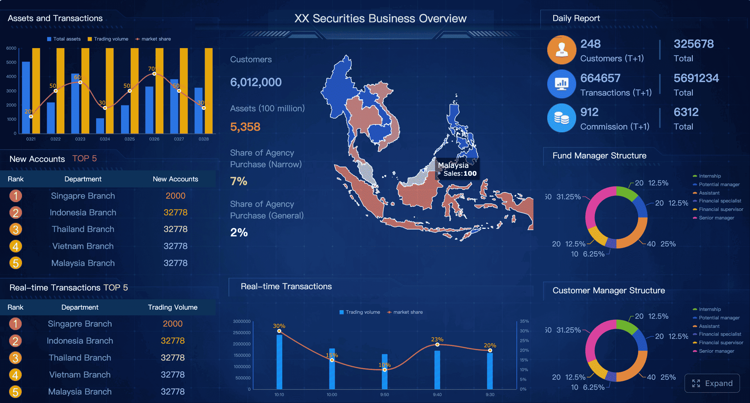
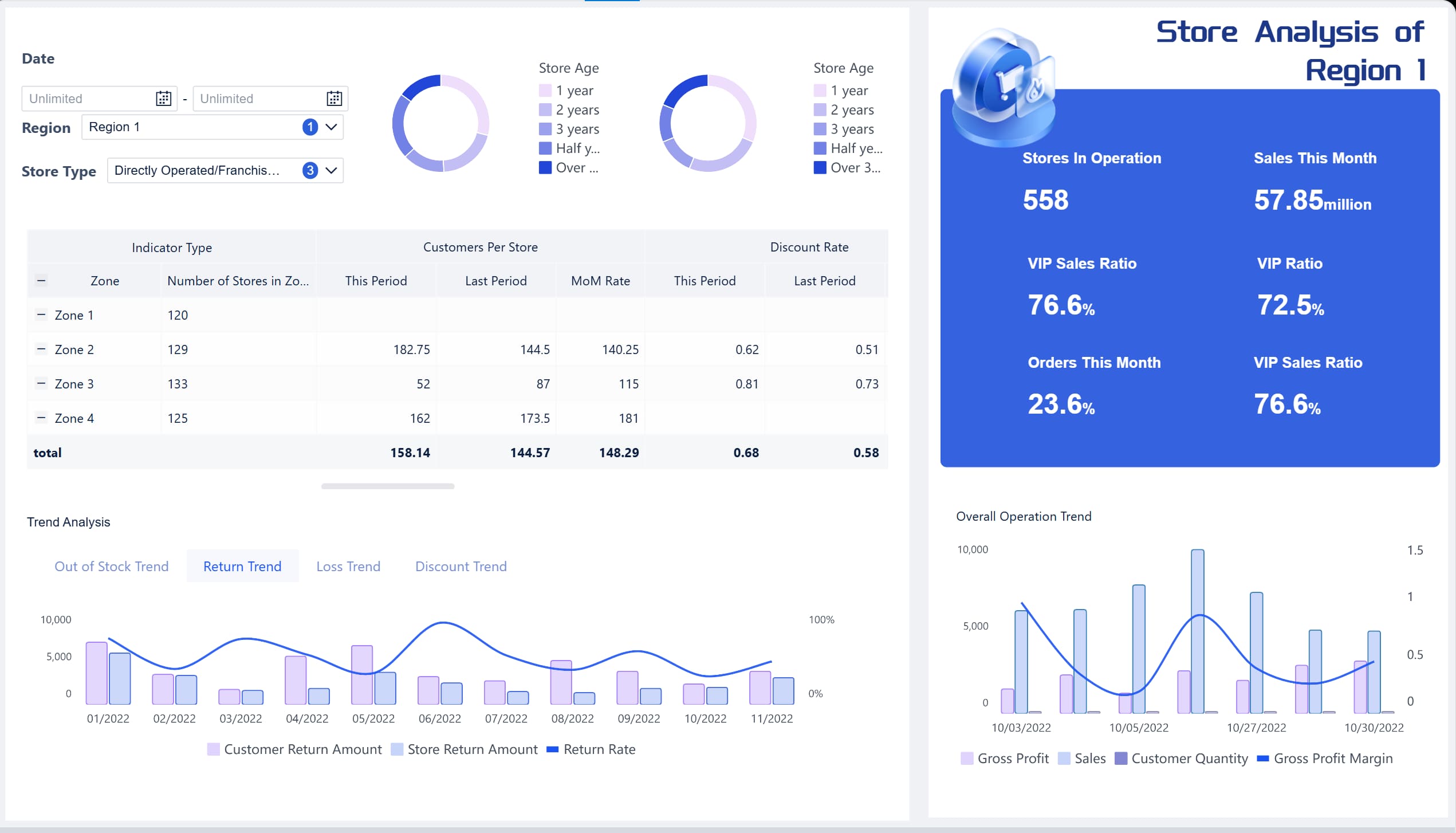
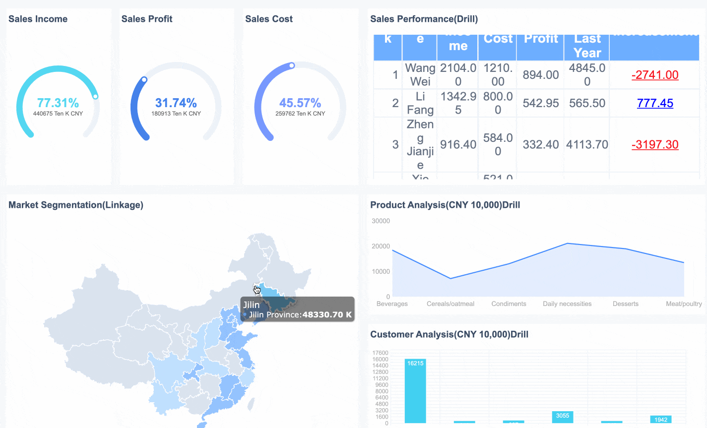
All dashboards in this article are built with FineBI.
Why Your Data Analysis Portfolio Gets Judged So Quickly
Recruiters rarely read portfolios from top to bottom on the first pass. They scan. They look for immediate signals: role fit, project quality, business relevance, clarity of thinking, and whether the work feels close to what the company actually needs. If those signals appear quickly, you earn more attention. If not, even strong technical work can be overlooked.
A portfolio that looks busy is not the same as one that proves job readiness. Many candidates include too many notebooks, screenshots, certificates, and tool logos. That can create noise instead of confidence. A job-ready Data Analysis Portfolio shows how you approached a real question, used appropriate methods, communicated the result clearly, and tied the analysis to a decision or outcome.
The easiest way to evaluate your own portfolio is to use a simple 10-point rubric before you apply. Score each criterion from 0 to 2:
0 = missing or weak
1 = present but average
2 = strong and recruiter-friendly
That gives you a practical score out of 20. More importantly, it exposes where a recruiter may lose trust in the first few minutes.
The 10 Criteria Recruiters Use to Score a Data Analysis Portfolio
1. Clear problem framing
Strong portfolios start with the business problem, not the code. Recruiters want to know what question you were trying to answer, who cared about it, and why it mattered. If a project opens with only a dataset description, you are making the reader work too hard.
A good project page should quickly answer:
What was the business question?
Who was the stakeholder?
What decision depended on the analysis?
Why did this problem matter?
For example, “I analyzed customer churn” is weak. “I analyzed churn patterns for a subscription business to identify which customer segments were most likely to cancel and where retention efforts should be focused” is much stronger.
2. Relevant datasets and realistic scope
Recruiters prefer projects that feel like business work, even if you used public data. The dataset does not need to come from a real employer, but the scenario should resemble one. Projects about pricing, churn, retention, demand forecasting, sales performance, customer segmentation, supply chain efficiency, or operations are usually easier to connect to hiring needs than abstract exercises.
Scope also matters. A project that tries to predict everything often feels less credible than one focused on a narrow, realistic question. Good analysts know how to define boundaries.
Key Metrics (KPIs) recruiters often expect to see in a strong portfolio project:
Business objective: The decision the analysis supports.
Primary KPI: The main metric being improved, monitored, or explained.
Baseline value: The starting performance before insight or intervention.
Trend indicator: How performance changes over time.
Segment comparison: Differences across customer, product, region, or channel groups.
Variance or anomaly measure: Where actual results diverge from expected results.
Data quality indicator: Missing values, duplicates, or coverage issues that affect trust.
Recommendation metric: The number tied to the proposed action, such as expected uplift, savings, or risk reduction.
Validation measure: A way to confirm the result is reasonable, such as error rate, confidence interval, or cross-check against known benchmarks.
Recruiters do not expect every portfolio project to be advanced, but they do expect sound thinking. That means your write-up should show how you cleaned the data, explored patterns, chose methods, tested assumptions, and validated results.
You do not need to over-explain every line of code. You do need to show that your conclusions were earned. Good methodology signals maturity. It tells employers you are not just generating charts and calling it analysis.
Why you chose one analytical approach over another
4. Strong storytelling with visuals
A recruiter should be able to understand your main takeaway in seconds. That is why visuals matter so much. Your charts should reduce complexity, not add more of it. If your dashboard is crowded, inconsistent, or overloaded with decorative elements, it weakens the perceived quality of the work.
Strong storytelling usually follows a simple structure:
What happened?
Why did it happen?
What should be done next?
This is also where BI tools become especially valuable. Well-designed dashboards help you present KPI trends, segment performance, and drill-down views in a way that makes business findings easier to absorb. If you build portfolio dashboards, prioritize readability and decision support over flashy design.
Even for entry-level candidates, recruiters want signs of impact. If you cannot show real implemented results, show what decision your analysis supports and how success would be measured. The point is to connect your work to outcomes.
Strong examples include:
Estimated revenue opportunities
Cost reduction potential
Retention improvement targets
Time saved through automation
Risk areas identified for further action
A portfolio without impact reads like a technical exercise. A portfolio with impact reads like work.
6. Clean code and reproducibility
Messy code creates hiring risk. Recruiters may not read every query or notebook cell, but technical reviewers often do. If your project files are disorganized, undocumented, or impossible to rerun, that lowers confidence quickly.
Your code should be:
Clearly named
Logically structured
Commented where needed
Paired with a short README
Easy to reproduce with data source notes and setup guidance
For SQL projects, include query purpose and expected output. For notebooks, remove unnecessary cells and narrative clutter. For dashboards, explain filters, calculation logic, and refresh assumptions.
7. Tool relevance for target roles
A Data Analysis Portfolio should match the job you want, not just the tools you happened to learn. If you are applying for BI analyst roles, dashboards, KPI design, SQL, Excel, and stakeholder-style reporting deserve more space. If you are applying for product or growth analyst roles, cohort analysis, funnel analysis, experimentation, and behavioral metrics may matter more.
The key is not to show everything. The key is to show the right stack in a credible business context.
8. Communication for non-technical audiences
Many analysts lose recruiter interest because they write for other analysts, not for hiring teams. Your project summary should be understandable to a recruiter, a hiring manager, and a business stakeholder. That means using plain language for findings, concise takeaways, and limited jargon unless it is necessary.
A strong communication test is this: can someone understand your recommendation without opening the notebook?
If not, simplify the project page with:
A one-paragraph summary
Three key findings
One recommended action
One sentence on business impact
9. Professional presentation and navigation
A strong portfolio feels easy. A weak one feels like work. Broken links, inconsistent formatting, cluttered pages, hard-to-find projects, and slow-loading visuals all increase friction. Recruiters notice that.
Good presentation includes:
A clear homepage or landing page
Consistent project structure
Logical navigation
Working links
Minimal visual clutter
Mobile-friendly design where possible
Think of your portfolio as a product experience. If it is hard to use, that becomes part of the evaluation.
10. Evidence of range without losing focus
Recruiters want enough variety to trust your versatility, but not so much variety that they cannot tell what role you want. A portfolio with five unrelated projects and no positioning can feel unfocused.
The best approach is to show range inside a clear lane. For example:
1 dashboard project
1 SQL analysis project
1 Python or R project
1 business case study
1 domain-specific project aligned to your target industry
That balance shows capability without diluting your story.
How to Score Your Data Analysis Portfolio Before You Apply
Before sending applications, run a fast self-review. Do not ask, “Do I like my portfolio?” Ask, “Would a recruiter understand why I am hireable within three minutes?”
Create a fast self-review checklist
Score each of the 10 criteria from 0 to 2. Then total your score.
A practical scoring guide:
0–8: Major rebuild needed
9–14: Good foundation, but weak recruiter conversion
15–17: Strong and interview-ready
18–20: Highly competitive if aligned to the right roles
As you score, flag any section that creates confusion. Confusion is expensive in hiring. Recruiters usually do not pause to figure out what you meant.
Spot the biggest red flags
The fastest way to improve your Data Analysis Portfolio is to remove obvious trust breakers. Common red flags include:
Weak or missing project summaries
No stated business problem
Missing outcomes or recommendations
Broken GitHub or dashboard links
Screenshots with no explanation
Cluttered visuals
Unclear tool usage
No documentation
Too many similar projects
No clear role positioning
If three or four of these are present, a recruiter may assume the underlying work is also weak.
Prioritize the highest-impact fixes
Do not start with cosmetic design changes. Start with the fixes most likely to improve recruiter perception immediately:
Rewrite project summaries with business framing.
Add measurable outcomes or decision implications.
Clean up navigation and remove weak projects.
Improve chart clarity and dashboard readability.
Add documentation and reproducibility notes.
These changes often matter more than adding a new project.
What Strong Data Analysis Portfolio Examples Commonly Get Right
High-performing portfolios are rarely successful because they are fancy. They work because they are clear, relevant, and easy to trust.
Borrow structure, not copycat content
Study strong public portfolios to understand how they frame projects, summarize methods, and present findings. Pay attention to layout and logic, not just visual style. The goal is not to imitate someone else’s topic. It is to adopt patterns that help busy reviewers understand your value faster.
Useful structures often include:
Problem
Data
Method
Findings
Recommendation
Tools used
Link to code or dashboard
Compare beginner and job-ready project pages
Beginner portfolios often show output. Job-ready portfolios show judgment.
Here is the difference:
Beginner page
Job-ready page
Starts with dataset description
Starts with business question
Lists tools only
Explains why tools were chosen
Shows charts without interpretation
Connects charts to decisions
Includes code but little context
Includes context, method, and outcome
Focuses on completion
Focuses on business value
This is why the same technical project can feel average or impressive depending on how it is presented.
Turn inspiration into your own template
Build one repeatable structure for every project. That reduces inconsistency and makes your portfolio easier to scan.
A practical project template:
Title
Business question
Stakeholder or use case
Dataset and scope
Method
Key findings
Business recommendation
Tools used
Link to code/dashboard
Limitations or next steps
If you publish dashboards, it helps to present them in a format that supports business storytelling. Platforms like FineBI can be useful when you want to turn analysis into interactive, executive-friendly dashboard pages rather than static screenshots alone.
Then remove projects that do not support that direction. A smaller, sharper Data Analysis Portfolio is usually stronger than a large unfocused one.
Ask of each project:
Does it match my target role?
Does it show a business question?
Does it include a clear result?
Would I want to discuss it in an interview?
If the answer is no, cut it or rewrite it.
Day 3–4: rewrite project summaries for business relevance
Now update every project page so the first screen does the heavy lifting. Each summary should include:
The problem
The stakeholder
The method
The result
The decision or recommendation
This is often the single highest-return improvement you can make.
Day 5–6: upgrade visuals, documentation, and navigation
Next, improve usability. Simplify charts. Standardize layouts. Fix broken links. Clean notebook flow. Add README files. Make your dashboards easier to interpret.
If you present dashboards as part of your portfolio, ensure they answer a decision-maker’s question clearly. Interactive BI layouts are especially effective when they highlight KPI changes, segmentation, trends, and action paths in one place.
Best practices for implementation:
Lead every project with the business question. Never make the recruiter hunt for context.
Design visuals for speed, not decoration. Use charts that answer one clear question each.
Document your analytical decisions. Show what you cleaned, tested, and validated.
Map tools to hiring needs. Prioritize SQL, spreadsheets, Python, and BI tools based on target roles.
Build one repeatable case-study format. Consistency improves trust and scanability.
Day 7: run the rubric again before submitting applications
Rescore the full portfolio using the same 10 criteria. Your goal is not perfection. Your goal is to remove doubt. If a page still feels vague, crowded, or irrelevant, fix that before applying.
A final submission checklist:
All links work
Every project has a clear business question
Every project has a concise summary
Visuals are readable in seconds
Tools are aligned to target jobs
Outcomes or recommendations are visible
Navigation is clean
No weak filler projects remain
Final Takeaway: Your Data Analysis Portfolio Should Make Hiring Easier
A recruiter is not looking for the most complicated project. They are looking for evidence that you can think clearly, work with data responsibly, communicate insights, and support business decisions. That is what a strong Data Analysis Portfolio proves.
If you want to score yours fast, use this rule: clarity first, relevance second, impact third. When those three are visible, everything else gets easier.
And if your portfolio includes dashboards, make them recruiter-friendly, stakeholder-ready, and easy to explore. Interactive BI presentation can be a real advantage when it helps your work look closer to real business analysis and less like a static class submission.
A strong data analysis portfolio should include real-world projects, a clear business problem, data sources, analysis methodology, visualizations, key findings, and actionable recommendations. Recruiters also value links to dashboards, GitHub repositories, and documentation that demonstrate your analytical process.
Most hiring managers recommend including 3–5 high-quality projects rather than a large number of unfinished or repetitive analyses. A focused portfolio with diverse projects in areas such as SQL, dashboards, business analysis, and data visualization is usually more effective than a large collection of similar work.
Yes. Many successful candidates build portfolios using public datasets from sources such as Kaggle, government open-data portals, or industry datasets. Employers care more about your ability to solve business problems with data than whether the project came from a professional role.
Popular beginner-friendly portfolio projects include sales performance analysis, customer segmentation, marketing campaign analysis, e-commerce dashboards, financial reporting, and customer churn analysis. These projects demonstrate practical business skills that are relevant to many analyst roles.
Yes. GitHub is one of the most common platforms for showcasing analytical projects, SQL queries, Python notebooks, and project documentation. Many recruiters and hiring managers review GitHub repositories to evaluate coding practices, project organization, and reproducibility.
Product Trial
FineReport
Pixel-perfect reports · Interactive dashboards · Easy data entry · Digital twins