A fundraising dashboard is not just a reporting screen. It is a decision system. For executive directors, development leaders, finance teams, and board members, the real value is simple: it shows what is happening, why it is happening, and what to do next.
If your team still relies on scattered spreadsheets, CRM exports, and last-minute board packets, the result is predictable: slow decisions, inconsistent numbers, and too much time spent explaining data instead of improving fundraising performance. A strong dashboard fixes that by turning raw activity into clear signals for campaign optimization, donor strategy, and executive oversight.
The best fundraising dashboards do three things well:
Consolidate critical fundraising data into one trusted view
Surface actionable KPIs tied to real decisions
Present role-based insights so each stakeholder sees what matters most
All dashboards in this article are created by FineBI
What a fundraising dashboard should help leaders decide
A fundraising dashboard should start with decisions, not charts. Before choosing metrics, define the business questions the dashboard must answer every week, month, and quarter.
For most nonprofits, the dashboard should support decisions such as:
Which campaigns deserve more budget or staff attention
Whether fundraising is on pace to hit annual goals
Which donor segments need retention or reactivation efforts
Whether pipeline coverage is strong enough for upcoming targets
How cash received, pledges, and recognized revenue compare
What story leaders should bring to the board
This is where many organizations go wrong. They build a dashboard to monitor activity, but not to guide action. Activity-only views show opens, calls, events, and gifts. Decision-ready views connect those signals to outcomes like underperforming campaigns, slipping donor retention, delayed pledge fulfillment, or a major gift pipeline gap.
Who uses the fundraising dashboard most often
Different users need different levels of detail. A dashboard that works for everyone usually has multiple layers.
Executive directors need a high-level performance summary, trend direction, and top risks
Development leads need campaign, channel, and donor segment performance
Finance teams need gift reconciliation, revenue recognition context, and pledge visibility
Board members need concise, credible views of progress against goals and strategic priorities
Gift officers and campaign managers need operational detail to act quickly
A good fundraising dashboard should make it easy for each audience to move from question to answer without digging through raw reports.
Monitoring activity versus guiding action
A dashboard becomes useful when every key metric points to a next step.
For example:
If donor retention drops, the next action may be a lapsed donor outreach campaign
If event conversion rises but average gift size falls, the next action may be to refine ask strategy
If campaign ROI is strong in one channel and weak in another, the next action may be budget reallocation
If pledge fulfillment slows, the next action may be follow-up workflows and finance coordination
That distinction matters. Monitoring tells you what happened. A decision-driven fundraising dashboard tells you what to do about it.
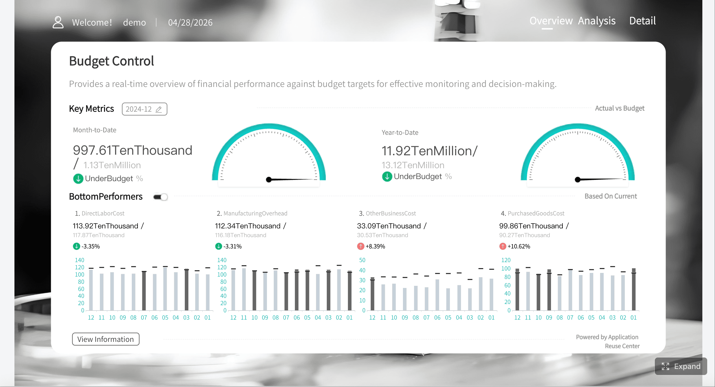
Core KPIs to include in a fundraising dashboard
The most effective fundraising dashboard balances strategic outcomes with operational drivers. Leaders need to see revenue performance, donor health, campaign effectiveness, and the operational indicators that explain changes.
Revenue, pipeline, and campaign performance metrics
These are the KPIs that answer the most immediate executive question: are we raising enough, and where is it coming from?
Key Metrics (KPIs)
Total Raised: The total amount received during the selected period. This is the primary topline fundraising indicator.
Goal Progress: Percentage of fundraising target achieved. Useful for board updates and campaign pacing.
Pledge Fulfillment Rate: Share of pledged revenue that has been collected. Important for cash planning and follow-up.
Average Gift Size: Total donation value divided by number of gifts. Helps assess donor quality and ask effectiveness.
Campaign ROI: Net return from a fundraising campaign relative to cost. Critical for budget allocation.
Revenue by Channel: Funds raised by email, events, direct mail, digital ads, phone, major gifts, or corporate partnerships.
Pipeline Value: Total potential value of open opportunities or expected gifts. Essential for forecasting.
Pipeline Coverage Ratio: Pipeline value compared with upcoming fundraising targets. Indicates whether future goals are realistically supported.
Win Rate on Opportunities: Percentage of cultivation opportunities that convert into gifts. Helpful for major gift strategy.
Forecast vs Actual: Compares expected fundraising performance with actual results to identify variance early.
A strong dashboard should let leaders compare these metrics by:
Campaign
Channel
Donor segment
Time period
Team or fundraiser
Without comparisons, numbers lack context. With comparisons, leaders can spot where performance is improving or declining.
Short-term fundraising spikes can hide long-term donor weakness. That is why donor health metrics belong in every fundraising dashboard.
Key Metrics (KPIs)
New Donors: Number of first-time donors in the selected period. Indicates acquisition strength.
Repeat Donors: Donors who gave again within the measurement window. Reflects relationship depth.
Donor Retention Rate: Percentage of prior-period donors who gave again. One of the most important sustainability metrics.
Reactivation Rate: Percentage of lapsed donors who returned. Helps evaluate win-back efforts.
Donor Lifetime Value (LTV): Total expected revenue from a donor over time. Useful for acquisition and stewardship strategy.
Recurring Donor Count: Number of active monthly or recurring supporters. Indicates stability of future revenue.
Average Revenue per Donor: Total raised divided by donor count. Helps assess segment quality.
Lapsed Donor Volume: Count of previously active donors who have stopped giving. A key early warning indicator.
Upgrade Rate: Percentage of donors increasing gift amount over time. Useful for stewardship planning.
These KPIs reveal whether growth is durable or overly dependent on one-time gifts, a single event, or a small group of major donors. If donor acquisition is strong but retention is weak, the organization may appear healthy while future revenue erodes underneath.
Engagement and operational health indicators
Fundraising outcomes do not exist in isolation. Leaders also need a concise set of metrics that explain why results are moving.
Event Conversion Rate: Percentage of attendees or registrants who become donors. Useful for event ROI analysis.
Meeting Activity: Number of donor meetings, cultivation touches, or follow-ups completed by fundraisers.
Grant Status: Open, submitted, awarded, and declined grants. Important for institutional fundraising visibility.
Gift Processing Speed: Average time between donation receipt and entry, acknowledgment, or reconciliation.
Acknowledgment Timeliness: How quickly donors receive thank-you communications. Supports donor experience and retention.
Task Completion Rate: Percentage of fundraising actions completed on time. Indicates process discipline.
Major Gift Stage Velocity: Time spent in each prospect stage. Helps identify pipeline bottlenecks.
Data Exception Count: Number of records with missing campaign tags, donor IDs, or gift classification issues.
This section should stay compact. The goal is not to overwhelm leaders with operational detail. The goal is to show a few indicators that explain performance changes and highlight where intervention is needed.
Data sources and integrations that make the fundraising dashboard reliable
A fundraising dashboard is only as trustworthy as the data behind it. If teams pull donor records from one system, revenue from another, and campaign labels from a third with no standard definitions, leaders will stop trusting the dashboard quickly.
Reliability requires integration, ownership, and governance.
CRM, donation platform, finance, and marketing systems
Most nonprofits need to combine data from multiple systems to create a complete fundraising dashboard.
Typical sources include:
Donor CRM for constituent records, giving history, opportunities, and fundraiser actions
Online donation platforms for digital gifts, recurring donations, and checkout conversion data
Accounting or ERP systems for reconciled revenue, fund accounting, and recognition timing
Email marketing platforms for campaign sends, opens, clicks, and response rates
Event systems for registrations, attendance, and event-generated donations
Grant management tools for application pipeline and award tracking
Spreadsheets or manual logs for legacy campaigns, board pledges, or offline inputs
The critical step is defining the source of truth for each business object:
Gifts: Which system is authoritative for gift amount and payment status?
Donors: Which system owns donor identity and deduplication?
Campaigns: Which system defines official campaign names and hierarchy?
Revenue recognition: Which system determines what counts in financial reporting?
If this is not settled before the dashboard is built, your team will spend more time debating numbers than acting on them.
Data quality rules, governance, and refresh cadence
Dashboards fail less often because of visualization issues and more often because of inconsistent definitions and poor data hygiene.
Before building views, standardize the following:
Campaign naming conventions
Source and channel tagging
Gift classifications such as one-time, recurring, pledge, in-kind, grant, or event revenue
Fiscal year and reporting period logic
Donor segment definitions
Opportunity stage definitions
Revenue recognition rules
Then assign ownership.
Core governance elements
Metric owner: The person accountable for each KPI definition
Data steward: The team responsible for fixing source data issues
Refresh cadence: Daily, hourly, weekly, or monthly update schedule based on use case
Validation process: Reconciliation checks between CRM, finance, and dashboard outputs
Access rules: Role-based permissions for executives, fundraisers, and board members
Leaders trust dashboards when they know three things:
The definitions are stable
The refresh timing is clear
The numbers match financial reality closely enough for decision-making
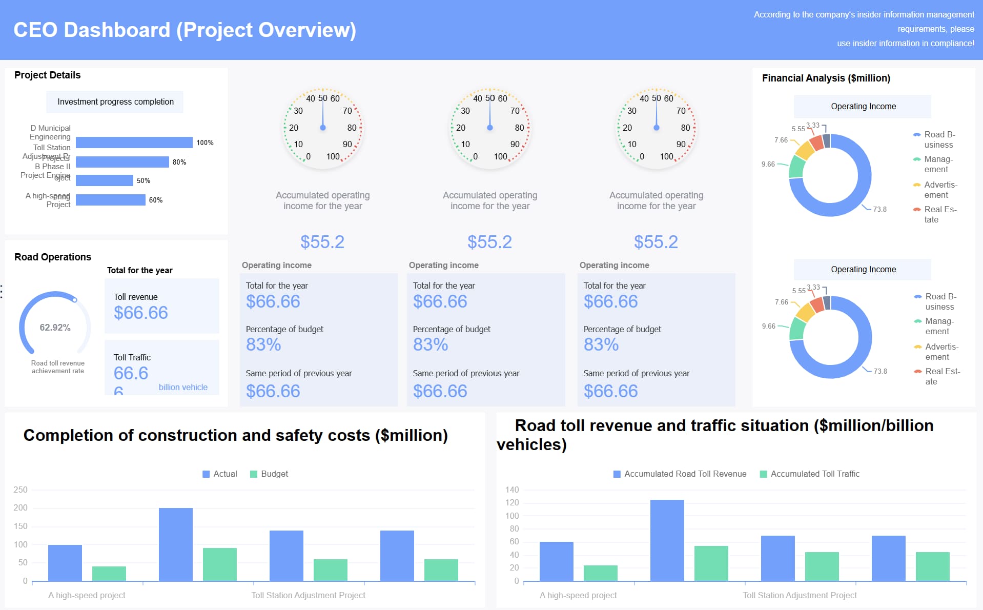
How to design executive views that surface decisions fast
Executives do not need more charts. They need fewer screens, stronger context, and faster answers.
A high-performing fundraising dashboard design prioritizes signal over volume. That means role-based views, sharp comparisons, and clear alerts.
Build role-based views for executives, fundraisers, and boards
One dashboard can support multiple audiences if the views are intentionally structured.
Executive view
Keep the executive summary focused on a handful of high-impact indicators:
Total raised versus target
Forecast versus actual
Donor retention trend
Top campaign performance
Pipeline sufficiency
Key risks and anomalies
This view should answer, in less than a minute, whether fundraising is on track and where leadership attention is needed.
Fundraiser or development lead view
This layer should go deeper into:
Campaign and channel performance
Portfolio activity and prospect movement
Donor segment trends
Follow-up backlog
Appeal performance
Event and grant conversion details
This is where managers diagnose issues and assign corrective actions.
Board view
Board members need clarity, not operational complexity. A board-ready fundraising dashboard should include:
Goal progress
Year-over-year comparison
Major campaign highlights
Donor health indicators
Brief explanatory notes on variance
Avoid exposing too much tactical noise in this view. Boards should leave with confidence in the strategy, not confusion about system detail.
Use comparison, context, and alerts instead of clutter
A fundraising dashboard becomes far more effective when every KPI includes context. Raw totals rarely drive action on their own.
Use these design principles:
Performance versus target: Shows whether current results are ahead or behind plan
Prior-period comparison: Reveals trend changes over time
Forecast comparison: Helps leaders anticipate shortfalls before quarter-end
Segment comparison: Exposes strength or weakness by donor type, region, or channel
Simple alerts: Flags exceptions like missed targets, unusual declines, or data issues
Concise annotations: Adds brief business explanation without forcing users into another meeting
Examples of useful dashboard alerts:
Retention rate fell below threshold for two consecutive months
Event registrations rose, but donation conversion dropped sharply
Pledge fulfillment is behind expected schedule
Major gift pipeline coverage is insufficient for next quarter goal
Gift processing SLA exceeded target for more than three days
Good design makes these issues visible instantly. Great design pairs them with a likely action owner.
A step-by-step framework to build and launch your fundraising dashboard
Building a fundraising dashboard should be treated as an operating model project, not just a reporting task. The process should move from decisions to metrics, then data, then user adoption.
Start with questions, then map metrics to actions
This is the most important implementation step.
Start by listing the top decisions leaders make regularly, such as:
Should we shift budget across campaigns?
Are we retaining enough donors to sustain growth?
Which major gift opportunities need intervention?
Are we on pace for quarterly and annual goals?
What should go into the next board update?
Then map each decision to one or two KPIs that support direct action.
Consultant-style best practices
Prioritize weekly leadership decisions first
Build around the questions leaders ask most often. If a metric does not influence a decision, it does not belong in version one.
Limit the executive layer to a small KPI set
Most executive views should contain no more than 8 to 12 primary signals. More than that reduces clarity and slows action.
Define each metric before building visuals
Agree on formulas, date logic, source systems, and owners before creating charts. This prevents rework and trust issues later.
Connect every KPI to a next step
For each metric, document what action should happen if it moves up, down, or outside threshold.
Separate strategic and operational views
Executives need summary and exceptions. Managers need drill-down detail. Do not combine both into one crowded page.
A useful rule: remove any metric that looks interesting but does not lead to a clear operational or strategic response.
Prototype, test with users, and improve over time
Do not wait for a perfect dashboard. Build a lean first version, test it in real meetings, and refine based on what users actually use.
Recommended launch process
Create a minimum viable dashboard
Include only the most essential executive KPIs, one campaign view, and one donor trend view.
Review with stakeholders in live decision settings
Use it in weekly development meetings and monthly leadership reviews. Watch where users hesitate or ask for clarification.
Document metric definitions clearly
Add short in-dashboard notes or hover definitions so users interpret each KPI consistently.
Train users by role
Executives need quick orientation. Fundraisers need deeper training on filters, drill-downs, and action workflows.
Iterate on cadence
Improve monthly based on actual business use, not generic feature requests.
The goal is not just dashboard adoption. The goal is behavioral adoption: leaders using the fundraising dashboard as the default way to review performance and make decisions.
Common mistakes to avoid and an example fundraising dashboard structure
Most dashboard problems are not technical. They come from overdesign, vague metric logic, and poor integration discipline.
Frequent pitfalls in non-profit fundraising reporting
Avoid these common mistakes:
Too many metrics: A crowded dashboard forces users to hunt for meaning
Inconsistent definitions: If finance and development define revenue differently, trust breaks down
Lagging-only indicators: Historical totals alone do not help leaders intervene early
Disconnected data sources: Manual merges create delay and reconciliation headaches
No role-based design: Executive and operational needs are different
No thresholds or alerts: Users see data but do not know when action is required
Manual reporting habits: If teams still build slides and spreadsheets outside the dashboard, adoption suffers
No data notes: Missing context leads to misinterpretation, especially for board audiences
A fundraising dashboard should reduce reporting effort, not create another layer of manual work.
Example layout for a decision-ready dashboard
A practical structure for a high-value fundraising dashboard looks like this:
1. Executive summary
Include:
Total raised
Goal progress
Forecast versus actual
Donor retention rate
Pipeline coverage
Top three alerts
This section supports quick executive review and monthly leadership meetings.
2. Campaign performance view
Include:
Revenue by campaign
ROI by channel
Conversion trends
Appeal performance
Event outcomes
This section supports optimization of budget, staff time, and messaging.
3. Donor trends view
Include:
New versus repeat donors
Retention and reactivation
Recurring donor growth
Average gift trend
Lifetime value by segment
This section supports sustainable growth planning.
4. Pipeline and major gifts view
Include:
Open opportunity value
Stage distribution
Expected close dates
Win rate
Stalled opportunities
This section supports gift officer coaching and forecast management.
5. Operational and data notes
Include:
Gift processing time
Acknowledgment SLA
Refresh timestamp
Reconciliation status
Key definitions or exceptions
This section protects trust in the dashboard and helps explain anomalies.
One well-designed fundraising dashboard can support:
Monthly executive reviews
Board reporting
Campaign optimization
Daily development management
That is the standard to aim for: one trusted system, multiple decision layers, minimal manual reporting.
Build it faster and smarter with FineBI
You can build a fundraising dashboard manually with custom integrations, spreadsheet logic, and separate visualization tools. But in practice, that approach becomes complex fast. Definitions drift, refreshes fail, governance weakens, and teams revert to manual reporting.
Building this manually is complex; use FineBI to utilize ready-made templates and automate this entire workflow.
Utilize ready-made templates and automate this entire workflow with FineBI
FineBI helps nonprofits and fundraising teams move from fragmented reporting to a governed, decision-ready analytics model by enabling you to:
Connect CRM, donation, finance, and marketing data in one environment
Standardize KPI logic and business definitions across teams
Create role-based executive, fundraiser, and board views
Automate refreshes, alerts, and recurring reporting workflows
Use ready-made dashboard templates to accelerate deployment
For organizations that need a fundraising dashboard leaders will actually use, FineBI reduces the time spent stitching reports together and increases the speed of decision-making. That is the real return: fewer reporting delays, stronger data trust, and faster action on donor, campaign, and revenue performance.
If your team is still assembling fundraising reports by hand, now is the right time to replace reactive reporting with a dashboard system designed for executive decisions. FineBI gives you the structure, automation, and visualization layer to make that shift practical.
A strong fundraising dashboard should include core KPIs like total raised, goal progress, donor retention, average gift size, campaign ROI, pipeline value, and forecast versus actual results. It should also show trends by campaign, channel, donor segment, and time period so leaders can act on the data.
A fundraising dashboard helps leaders quickly see what is working, what is slipping, and where action is needed. Instead of reviewing scattered reports, they can use one trusted view to adjust campaigns, donor outreach, budgets, and board communications.
Executive directors, development teams, finance staff, board members, and gift officers all benefit from a fundraising dashboard. The most effective setup uses role-based views so each group sees the level of detail they need.
Most fundraising dashboards pull data from a nonprofit CRM, donation platforms, event systems, email tools, spreadsheets, and accounting or finance systems. Connecting these sources creates a more complete picture of gifts received, pledges, campaign performance, and donor activity.
Ideally, a fundraising dashboard should update daily or near real time for active campaigns and executive monitoring. At minimum, it should refresh often enough to support weekly reviews, monthly reporting, and accurate board updates.
Product Trial
FineReport
Pixel-perfect reports · Interactive dashboards · Easy data entry · Digital twins
 Fundraising dashboard created with
 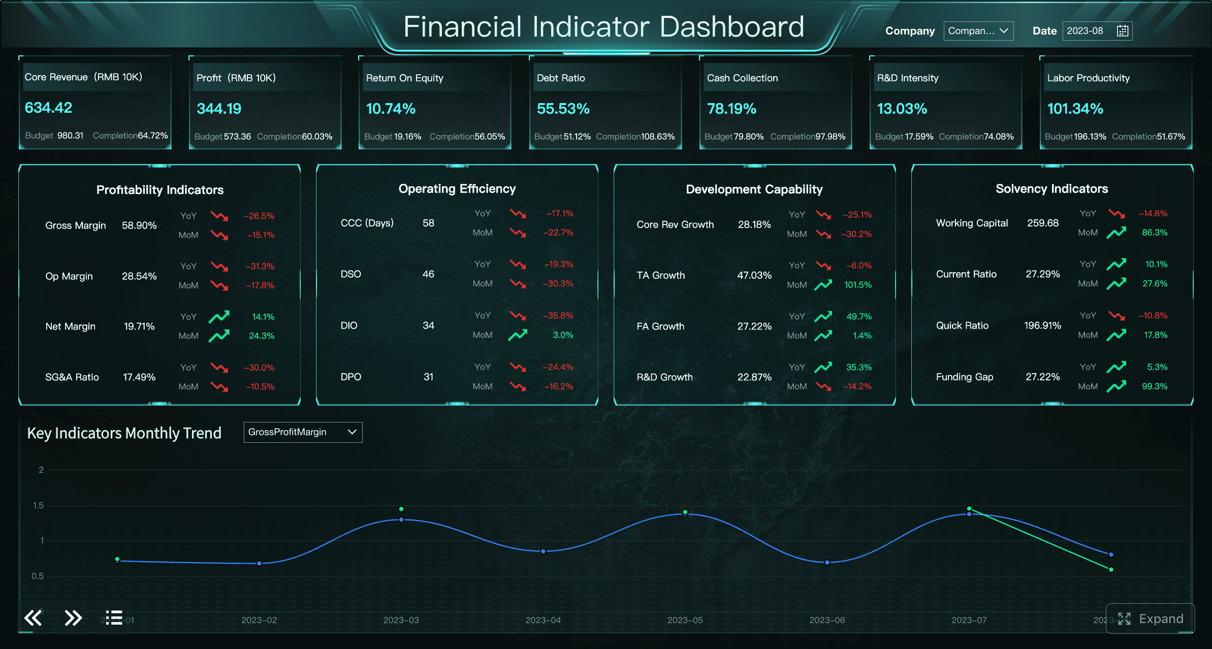 Fundraising dashboard created with


