Enterprise leaders do not need more reports. They need fewer, sharper signals that reduce time-to-decision across revenue, operations, finance, risk, and customer performance.
That is what executive dashboard best practices are designed to solve. In large organizations, leadership teams are often buried in fragmented scorecards, inconsistent KPI definitions, and meeting decks built by different functions. The result is predictable: slower decisions, competing interpretations, and delayed action when the business needs speed most.
An executive dashboard should fix that. It should give CEOs, CFOs, COOs, CROs, and board stakeholders a trusted, high-level view of enterprise health that helps them identify what changed, why it matters, and where intervention is required.
Unlike operational dashboards, which track daily execution, or analytical reports, which support deeper investigation, executive dashboards exist for high-stakes, cross-functional decision-making. Their job is to shorten the distance between signal, decision, and action.
This guide provides a practical framework built around seven rules. Use it to design executive dashboards that leaders actually trust, use, and act on.
All dashboards in this article are created by FineBI
What executive dashboard best practices solve for enterprise leaders
An executive dashboard is a strategic management interface. It consolidates the few business indicators that matter most to senior leadership and presents them in a format optimized for rapid scanning and informed action.
For enterprise leaders, the value is not visual polish. The value is operational leverage.
A strong dashboard helps leadership teams answer questions like:
Are we on track against quarterly and annual targets?
Where are the biggest performance gaps or risk exposures?
Which issue needs executive attention now?
What trade-offs are emerging across growth, cost, service, and capacity?
Which leader owns the next action?
Strategic dashboards differ from other reporting tools in important ways:
Executive dashboards focus on enterprise performance, priorities, and exceptions.
Operational dashboards monitor real-time activity, workflow status, and frontline execution.
Analytical dashboards support investigation, root-cause analysis, and forecasting with more depth.
When these categories get mixed together, executive users are forced to sift through noise. Good executive dashboard design prevents that by surfacing the minimum information required for leadership action.
Key Metrics (KPIs) enterprise leaders should track on an executive dashboard
Below is a structured KPI framework that works well for executive audiences. The exact mix will vary by business model, but every metric should link to a real decision.
Revenue Growth
Tracks topline expansion over time.
Used to assess market momentum, commercial performance, and strategic progress.
Profitability / Margin
Shows whether growth is economically healthy.
Helps leaders balance expansion with cost discipline.
Forecast vs. Target
Compares expected outcomes to plan.
Signals whether intervention is needed before the reporting period ends.
Cash Flow / Liquidity
Measures financial resilience and flexibility.
Critical for capital allocation and risk planning.
Customer Retention / Churn
Indicates customer health and future revenue stability.
Often an early warning sign for product, service, or market issues.
Pipeline Health / Bookings
Shows strength of future revenue generation.
Supports go-to-market decisions and resource planning.
Operational Efficiency
Measures throughput, cycle time, utilization, or service performance.
Helps leaders identify constraints and cost pressure.
Risk / Compliance Exceptions
Surfaces policy breaches, exposure levels, or control failures.
Enables faster escalation and governance oversight.
People / Capacity Metrics
Tracks attrition, hiring gaps, productivity, or critical role coverage.
Supports workforce planning and execution readiness.
Strategic Initiative Status
Monitors key transformation programs or enterprise priorities.
The seven rules below show how to turn these metrics into a dashboard that drives faster leadership decisions.
Executive dashboard best practices rule 1: Start with the decisions leaders need to make
Most dashboards fail before design begins. The root cause is simple: they start with available data instead of executive decisions.
A dashboard should not answer, “What can we show?” It should answer, “What must leadership decide?”
Identify the recurring executive decisions that matter most
Start by identifying the high-value decisions executives make repeatedly. In most enterprises, these decisions cluster around five areas:
Revenue and growth allocation
Cost control and margin protection
Risk mitigation and compliance response
Customer retention and experience improvement
Capacity, investment, and execution trade-offs
Limit the dashboard to decisions that are both recurring and material. For each one, define:
Decision owner: Who makes it?
Decision cadence: Weekly, monthly, quarterly, or event-driven?
Decision trigger: What change prompts action?
Information need: What metrics and context are required?
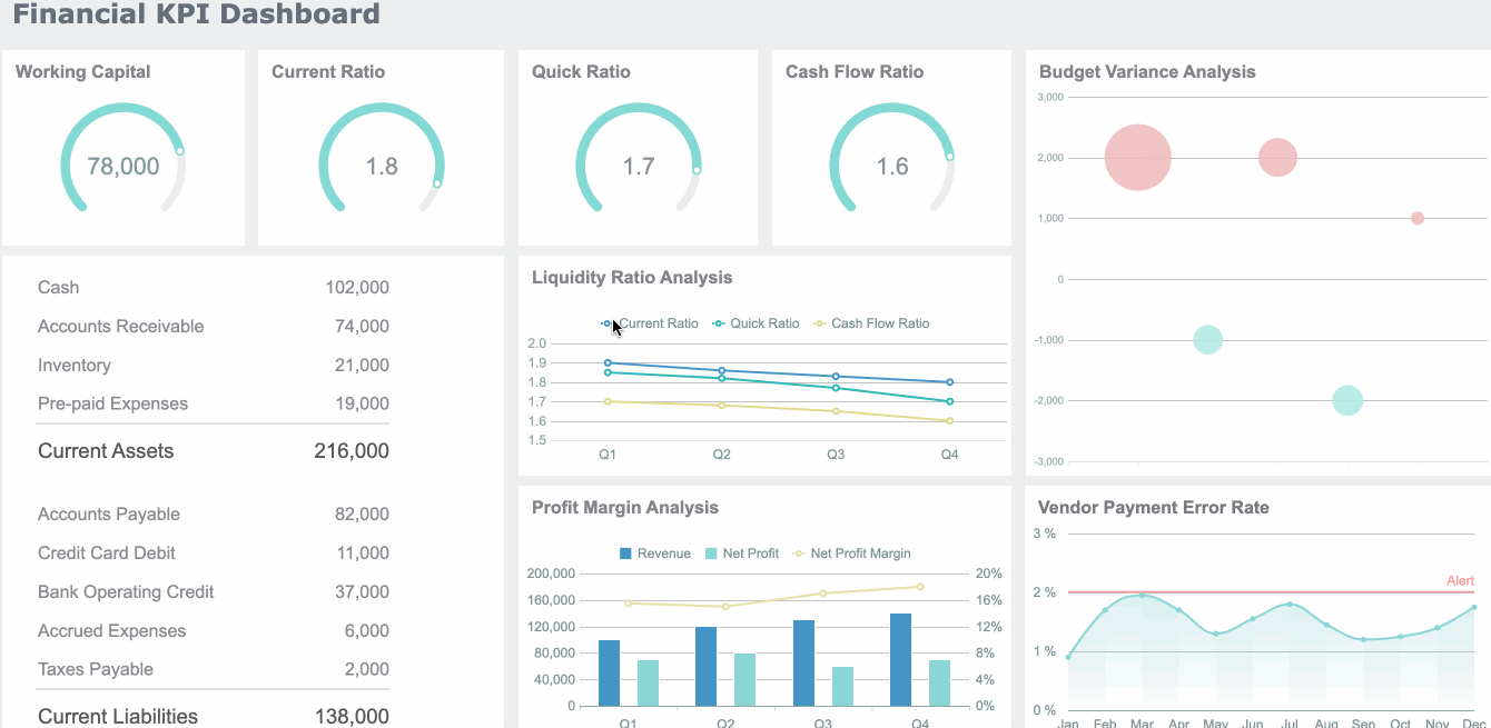
Executive Dashboard Best Practices Dashboard created with FineBI
For example, a CFO may need a weekly decision view for margin pressure, while a CEO may need a monthly cross-functional view of strategic target variance.
Map dashboard metrics to decision moments
Once decisions are clear, map each metric to the moment it matters.
A practical model is to separate metrics into three layers:
Must-have KPIs
The core indicators that directly support executive decisions.
Context metrics
Supporting data that explains movement or confirms significance.
Drill-down data
Deeper detail used only after a top-level issue is identified.
This keeps the main dashboard focused while preserving analytical depth when needed.
Use scenario-based design to shape different views:
Weekly operating review
Emphasize performance variance, exceptions, short-term forecast, and accountability.
Quarterly planning
Emphasize trends, target attainment, scenario comparison, and investment trade-offs.
If a metric cannot support a real decision moment, it probably does not belong on the executive dashboard.
Executive dashboard best practices rule 2: Design for clarity, speed, and focus
Executives consume information differently from analysts. They scan, compare, prioritize, and decide. A dashboard that requires explanation is already too slow.
Reduce visual noise and emphasize what needs attention
A common enterprise mistake is treating the dashboard like a storage space for every important metric. The result is clutter, slower comprehension, and decision fatigue.
Better design principles include:
Highlight exceptions instead of showing every stable measure equally
Use whitespace to separate themes and improve scanability
Keep chart types simple and familiar
Use color sparingly for status, risk, and change
Standardize labels, units, and date ranges
Executives do not need decorative visuals. They need immediate clarity on where performance is off-track and what the impact may be.
Strong dashboards emphasize:
Trend changes
Threshold breaches
Variance to target
Material business impact
Clear ownership
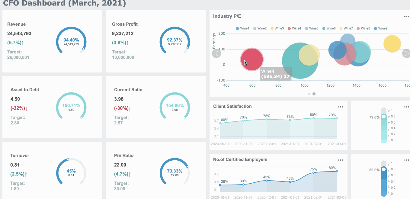
Executive Dashboard Best Practices Dashboard created with FineBI
Make the dashboard easy to interpret at a glance
The dashboard should be organized by business priority, not by source system or department structure.
That means leaders should see:
The most important enterprise outcome first
The biggest exception or risk next
The supporting context underneath
A clear path into deeper detail if needed
Use comparisons to make metrics meaningful instantly:
Current vs. target
Current vs. prior period
Actual vs. forecast
Performance vs. benchmark
Risk level vs. threshold
Add time context to every number. A raw figure without a date, comparison point, or trend direction creates unnecessary interpretation work.
A useful rule: if an executive must ask, “Is this good or bad?” the dashboard is incomplete.
Executive dashboard best practices rule 3: Choose KPIs that reflect enterprise performance
The KPI set determines whether the dashboard becomes a strategic tool or just another reporting layer.
Build a balanced executive view across functions
Enterprise leaders need a concise but balanced view across the business. That usually means combining indicators from four dimensions:
The key is not to show every function equally. The goal is to show the few metrics that explain enterprise performance and reveal cross-functional trade-offs.
For example:
Revenue growth may be rising while margin declines
Customer acquisition may improve while retention weakens
Productivity may increase while employee attrition worsens
Cost reduction may create service risk
That interconnected view is what makes executive dashboards strategically useful.
Avoid common KPI selection mistakes
Poor KPI selection is one of the fastest ways to destroy executive trust.
Avoid these errors:
Vanity metrics
Metrics that look positive but do not influence decisions.
Duplicated measures
Multiple versions of the same KPI shown in different formats.
No ownership
Indicators with no accountable executive or function.
Weak actionability
Numbers that cannot trigger a response.
Too many KPIs
An overloaded dashboard that dilutes focus.
A good enterprise dashboard is selective. If a KPI cannot trigger discussion, escalation, or action, remove it.
Executive dashboard best practices rule 4: Make dashboards trustworthy and decision-ready
Speed without trust is dangerous. Executives will not rely on dashboards that show conflicting numbers, unclear definitions, or stale data.
Strengthen data quality, governance, and ownership
Who is accountable for accuracy and business meaning.
Thresholds
What constitutes normal, warning, or critical status.
This sounds simple, but it is where many enterprise dashboard initiatives fail. Leaders lose confidence quickly when finance, operations, and sales show different versions of the truth.
Fix data quality issues before exposing the dashboard to executives. An elegant interface cannot compensate for broken metric logic.
Add context that supports fast, smart business decisions
Executives do not just need metrics. They need context.
Useful context layers include:
Benchmarks against peers, regions, or business units
Forecast views showing likely period-end outcomes
Narrative notes explaining unusual movement
Threshold indicators showing severity
Historical trend lines for perspective
Context prevents overreaction to normal fluctuation and underreaction to meaningful change.
For example, a 3% decline may be irrelevant in one metric and critical in another. The dashboard should make that distinction obvious through targets, thresholds, and business commentary.
A simple but important practice: always show the last refresh date and time. Leaders need to know whether they are making decisions on current data or on a lagged snapshot.
Executive dashboard best practices rule 5: Use proven dashboard patterns for different leadership needs
Not every executive needs the same dashboard. A CEO, CFO, COO, CRO, and board member share some top-level interests, but their decision frames differ.
Match dashboard formats to real executive scenarios
Use dashboard patterns based on role and meeting context.
Align the KPI set to strategy and decision routines
Add enterprise-specific thresholds, targets, and ownership
Validate with real executives in real review settings
A dashboard that looks polished but does not support actual leadership decisions will not be adopted. Strategic relevance matters more than design trendiness.
Executive dashboard best practices rule 6: Support action with alerts, drill-downs, and meeting workflows
An executive dashboard should not stop at awareness. It should be the first step of action.
Turn the dashboard into the first step of business action
Top-level indicators should connect directly to the next level of understanding.
That means every important KPI should have a drill path into:
Root causes
Business unit or region breakdowns
Responsible owner
Related operational drivers
Next-step actions
This prevents the dashboard from becoming a dead-end summary.
Alerts are equally important. Executives should not have to discover major issues only during scheduled reviews. Use thresholds and automated alerts to surface meaningful changes early.
Effective alert design includes:
Clear severity levels
Specific trigger definitions
Named owner
Recommended next action
Link to supporting detail
Align dashboard use with leadership routines
Dashboard adoption improves when it is embedded in the operating rhythm of the business.
Design different views for:
Weekly operating reviews
Focus on exceptions, short-term trends, and accountable actions
Monthly performance meetings
Focus on target attainment, function performance, and corrective actions
Quarterly strategy sessions
Focus on strategic outcomes, forecasts, major trade-offs, and investment choices
Do not treat the dashboard as a passive display. Pair it with workflow discipline:
Capture meeting decisions
Record follow-up items
Assign accountability
Track status of prior actions
This is where dashboards become management systems rather than reporting artifacts.
Executive dashboard best practices rule 7: Improve the dashboard continuously
Executive dashboards should evolve with the business. A dashboard that was effective last year may be poorly aligned today.
Measure whether the dashboard speeds up decision-making
If your goal is faster decisions, measure it directly.
Useful effectiveness metrics include:
Adoption rate
How often executives access or reference the dashboard
Time to insight
How quickly leaders identify issues or opportunities
Meeting efficiency
Whether leadership reviews are shorter and more focused
Decision velocity
How quickly issues move from signal to action
Trust score
Whether users question metric accuracy or interpretation
Action conversion
How often dashboard insights produce assigned next steps
These indicators reveal whether the dashboard is improving leadership performance or just adding another reporting layer.
Evolve the dashboard as business priorities change
Best practice is to review the dashboard regularly and ask:
Which metrics are heavily used?
Which metrics are ignored?
Which metrics are frequently challenged?
Which strategic priorities are not represented?
Which views no longer match leadership routines?
Retire stale indicators. Add new metrics when priorities shift. Revisit layout, thresholds, and narrative cues. Continuous refinement is not optional if the dashboard is meant to remain decision-ready.
Common pitfalls to avoid when building executive dashboards
Even well-funded enterprise dashboard projects fail when basic design and governance principles are ignored.
Watch for these common mistakes:
Overloading the screen
Too many metrics and too much detail reduce scan speed and clarity.
Mixing strategic and operational reporting
Raw activity data crowds out executive-level priorities.
Ignoring metric definitions
Conflicting logic destroys trust.
No ownership
Metrics without accountable owners rarely drive action.
Designing for completeness instead of speed
Executive dashboards should optimize decision-making, not documentation.
No context
Numbers without targets, comparisons, or trends are hard to interpret.
Static reporting mindset
Dashboards should evolve as business priorities change.
If leadership repeatedly asks for offline explanations, side spreadsheets, or alternate versions, that is a sign the dashboard is failing its purpose.
Final checklist for executive dashboard best practices
Confirm the dashboard is tied to specific executive decisions
Validate that every KPI supports a leadership action or escalation path
Ensure each metric has a definition, owner, source, and refresh cadence
Organize the layout by business priority, not department structure
Use targets, comparisons, and trend context for every major KPI
Highlight exceptions, risks, and material changes clearly
Add drill-down paths to root causes and responsible teams
Align dashboard views to weekly, monthly, and quarterly leadership routines
Track adoption, trust, and decision-speed outcomes
Review and refine the dashboard as strategy and market conditions evolve
Building this manually is complex; use FineBI to automate the workflow
The methodology is straightforward. The execution is not.
Building an enterprise-ready executive dashboard manually means reconciling data from multiple systems, standardizing KPI definitions, designing role-specific views, setting thresholds, maintaining refresh logic, and continuously updating the dashboard as priorities shift. That is a heavy lift for any internal BI or analytics team.
This is where FineBI becomes the practical solution.
With FineBI, enterprises can use ready-made templates and automate this entire workflow. Instead of starting from scratch, leadership teams can build executive dashboards faster with:
Utilize ready-made templates and automate this entire workflow with FineBI
Prebuilt dashboard templates for executive and functional reporting
Interactive drill-downs and alert-driven monitoring
Role-based views for CEOs, CFOs, COOs, CROs, and board stakeholders
Faster iteration as business priorities change
For enterprise leaders, the real advantage is not just visualization. It is speed, trust, and repeatability. Building this manually is complex; use FineBI to utilize ready-made templates and automate this entire workflow.
If your current executive dashboard is still a patchwork of spreadsheets, slides, and inconsistent reports, now is the time to replace it with a decision system that leadership can rely on.
An executive dashboard is built for high-level, cross-functional decisions and focuses on strategic KPIs, exceptions, and business health. An operational dashboard is more detailed and supports day-to-day execution.
Most executive dashboards should track a small set of metrics tied directly to leadership decisions, such as revenue growth, margin, forecast versus target, cash flow, customer retention, operational efficiency, and risk exposure. The right mix depends on the business model and executive audience.
It should show only the few metrics leaders need to scan quickly and act on confidently. Too many KPIs create noise, slow interpretation, and reduce trust in the dashboard.
They usually fail when they start with available data instead of the decisions executives need to make. Other common problems include inconsistent KPI definitions, cluttered layouts, stale data, and too much operational detail.
The update cadence should match the decision cadence, which may be weekly, monthly, quarterly, or event-driven. Whatever the timing, leaders should always be able to see how fresh the data is before acting on it.
Product Trial
FineReport
Pixel-perfect reports · Interactive dashboards · Easy data entry · Digital twins

 Executive Dashboard Best Practices Dashboard created with
 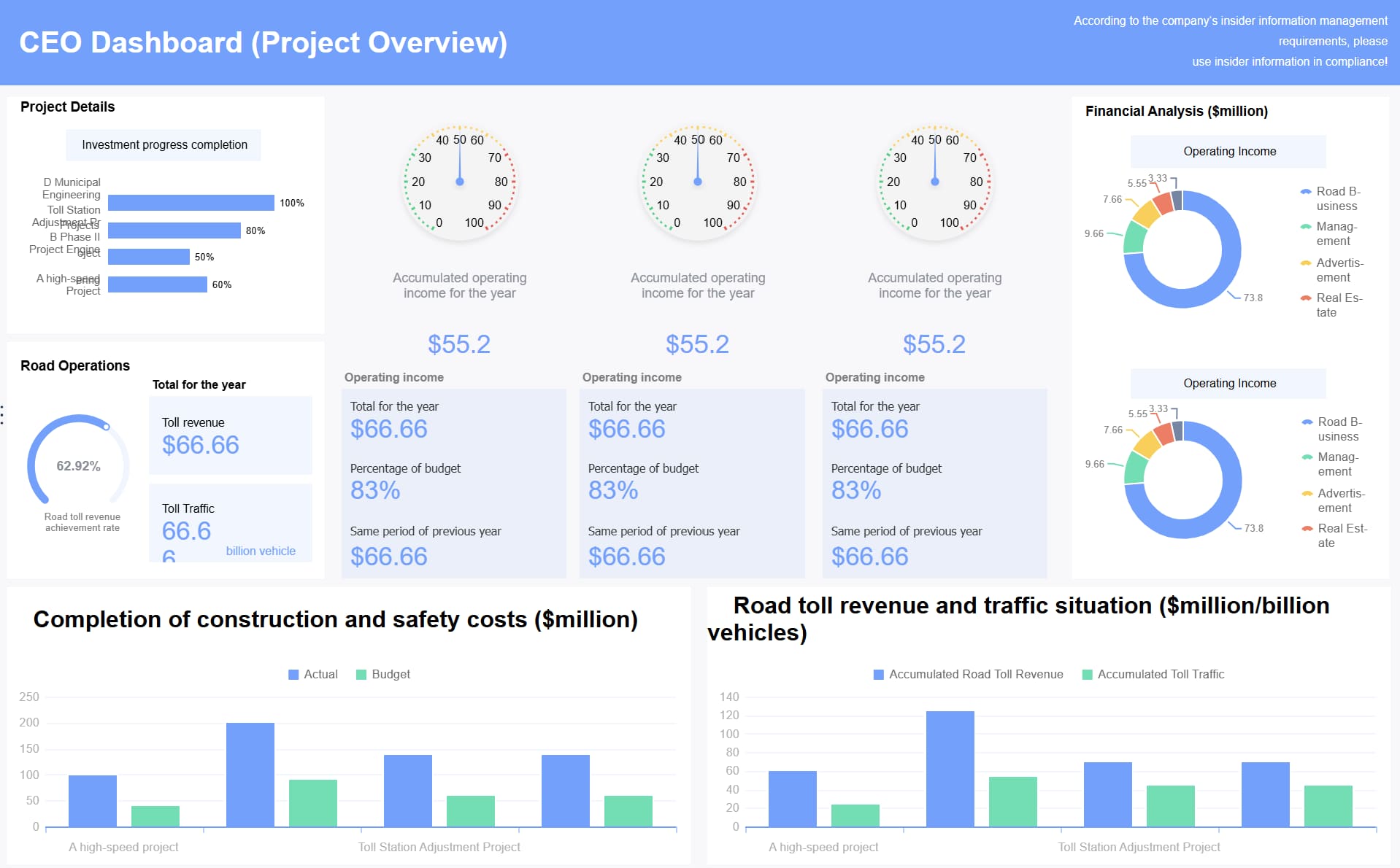 Executive Dashboard Best Practices Dashboard created with