If you are responsible for reporting performance across teams, you do not need more data—you need faster clarity. The right metrics dashboard helps sales leaders spot pipeline risk, marketing managers identify wasted spend, operations directors catch bottlenecks, finance teams control cash, and HR leaders monitor workforce health before issues escalate.
For enterprise decision-makers, dashboard design is not just a reporting exercise. It directly affects forecasting accuracy, response time, accountability, and cross-functional alignment. Reviewing strong metrics dashboard examples is one of the fastest ways to understand which KPIs matter, how to organize them, and how to make dashboards useful for daily decisions instead of passive reporting.
A well-built dashboard should answer three questions immediately:
What is happening now?
Is performance on track?
What action should we take next?
All dashboards in this article are created by FineBI
A metrics dashboard is a visual reporting interface that displays the most important performance indicators for a team, process, or business unit. Its purpose is simple: help users monitor results quickly and act with confidence.
For busy managers, dashboards reduce the friction of pulling reports from multiple systems. Instead of hunting through spreadsheets, users can review current performance, compare trends, and identify exceptions from one place.
Dashboard examples are especially useful because they help teams evaluate:
Layout structure: how metrics are grouped and prioritized
KPI selection: which indicators are essential for a department
Reporting goals: whether the dashboard supports monitoring, analysis, or executive review
Visualization style: which chart types make trends and risks easier to understand
Decision flow: how users move from high-level summary to detailed drill-down
Core elements every metrics dashboard should include
Below are the essential building blocks most high-performing dashboards share:
Primary KPI cards: Headline metrics such as revenue, conversion rate, cash balance, or turnover rate
Trend indicators: Comparisons against previous periods to show movement over time
Target vs. actual views: Goal tracking to reveal underperformance or overachievement
Segment filters: Controls for region, team, channel, department, or time period
Exception alerts: Visual cues that highlight risks, misses, delays, or anomalies
Drill-down paths: Supporting detail that explains why a KPI changed
Data freshness indicators: Timestamps that show whether the dashboard is current and reliable
Key Metrics (KPIs)
When evaluating metrics dashboard examples, these KPI characteristics matter as much as the metrics themselves:
Relevance: The metric must align with a real business decision.
Actionability: Users should know what to do when the number changes.
Consistency: Definitions, formulas, and date ranges must be standardized.
Timeliness: Data should be refreshed at the cadence the business needs.
Comparability: Metrics should support comparisons against goals, prior periods, or benchmarks.
Ownership: Every KPI should have a responsible team or stakeholder.
Context: A number without trend, target, or segmentation is rarely useful.
Operational dashboards vs. strategic dashboards vs. executive summaries
Not all dashboards serve the same purpose. One of the biggest mistakes organizations make is using the same reporting style for every audience.
Operational dashboards
Operational dashboards track day-to-day activity. They are used by frontline managers and team leads who need near-real-time visibility into workflows, outputs, queues, and service levels.
Examples include:
Daily sales activity
Campaign performance by channel
Manufacturing throughput
Accounts receivable aging
Recruiting pipeline stages
Strategic dashboards
Strategic dashboards focus on medium- to long-term performance against business goals. They are commonly used by department heads who need to monitor trends, resource allocation, and target attainment.
Examples include:
Quarterly revenue growth
Customer acquisition cost trends
Gross margin by product line
Retention by business unit
Hiring plan progress
Executive summary dashboards
Executive dashboards provide high-level snapshots for senior leadership. These dashboards emphasize a concise set of enterprise KPIs across departments and are designed for rapid review.
Examples include:
Revenue vs. target
Pipeline coverage
Marketing-sourced opportunities
EBITDA trend
Employee turnover
Operational service levels
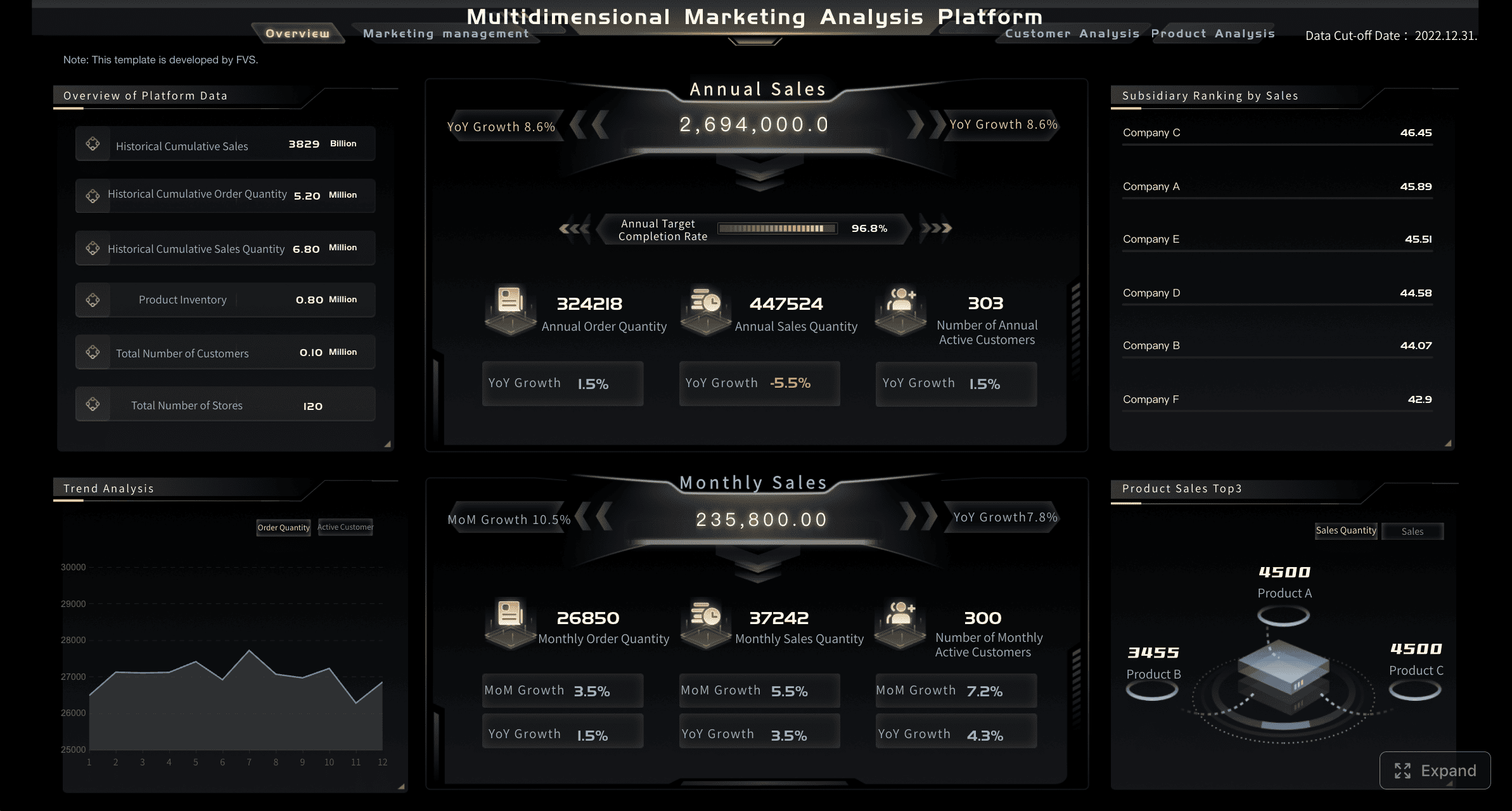
12 metrics dashboard examples by department
The best metrics dashboard examples are tied to the actual decisions each function makes. Below are 12 practical dashboard scenarios across five departments, along with the metrics that make them effective.
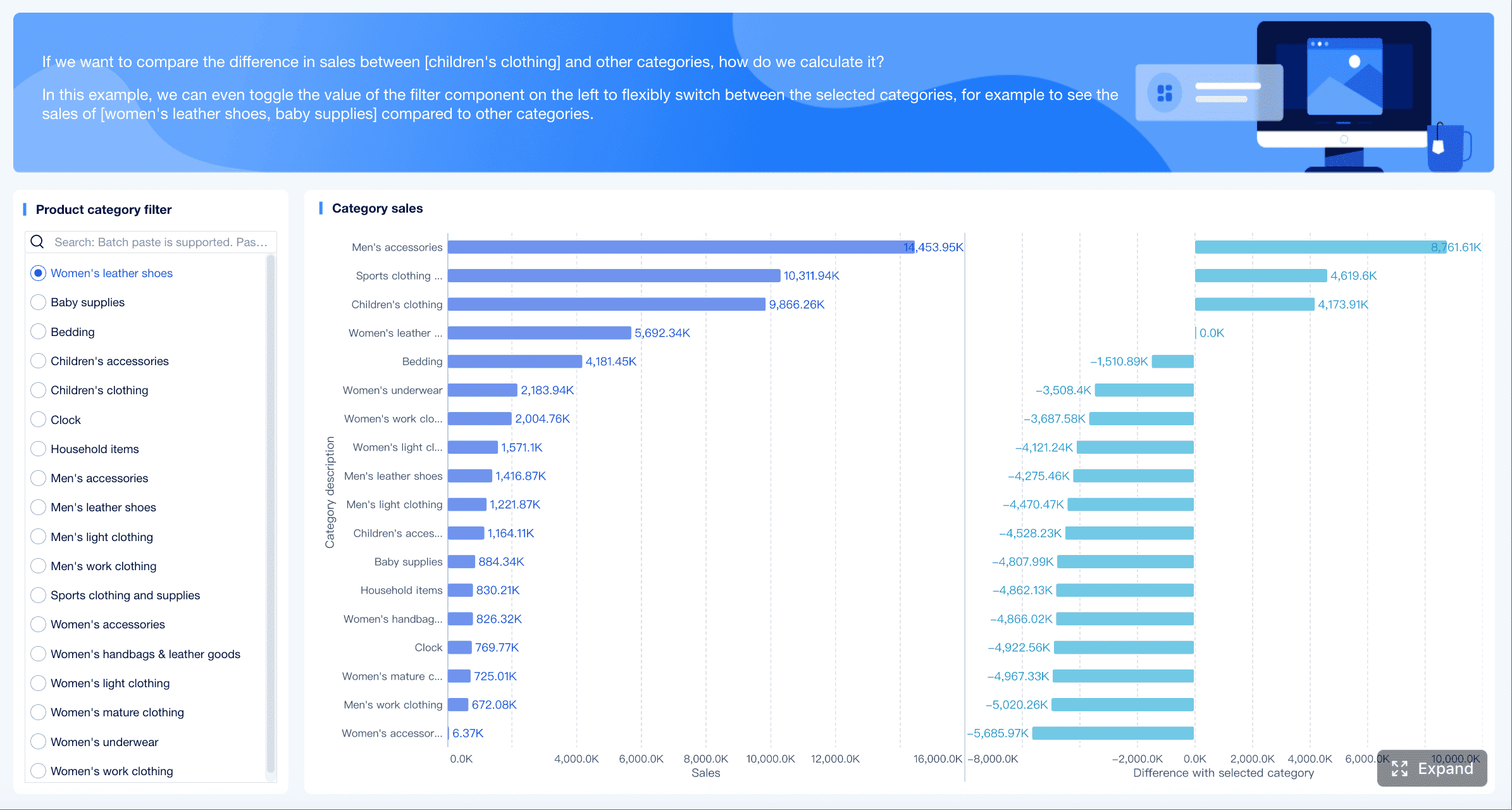
Sales dashboard examples
Sales dashboards should help leaders answer three questions fast: Are we going to hit target? Where is pipeline risk? Which reps or segments need intervention?
1. Sales performance dashboard
This dashboard gives sales managers a high-level view of team results against quota. It is ideal for weekly pipeline reviews and monthly business reporting.
A strong layout puts headline KPI cards across the top, followed by pipeline funnel charts, rep ranking tables, and revenue trend lines by month or quarter. This allows leaders to spot whether weak bookings are caused by poor conversion, low deal value, or delayed close timing.
2. Sales conversion and rep productivity dashboard
This dashboard focuses on sales execution. It is especially useful for regional managers and revenue operations teams that need to evaluate activity quality and conversion efficiency.
Common metrics include:
Lead-to-close conversion
Opportunity-to-win conversion
Meetings booked
Demo-to-proposal rate
Follow-up speed
Rep activity volume
Pipeline created per rep
The best version of this dashboard combines individual performance with team benchmarks. It should make it easy to compare top reps against underperformers and identify coaching opportunities.
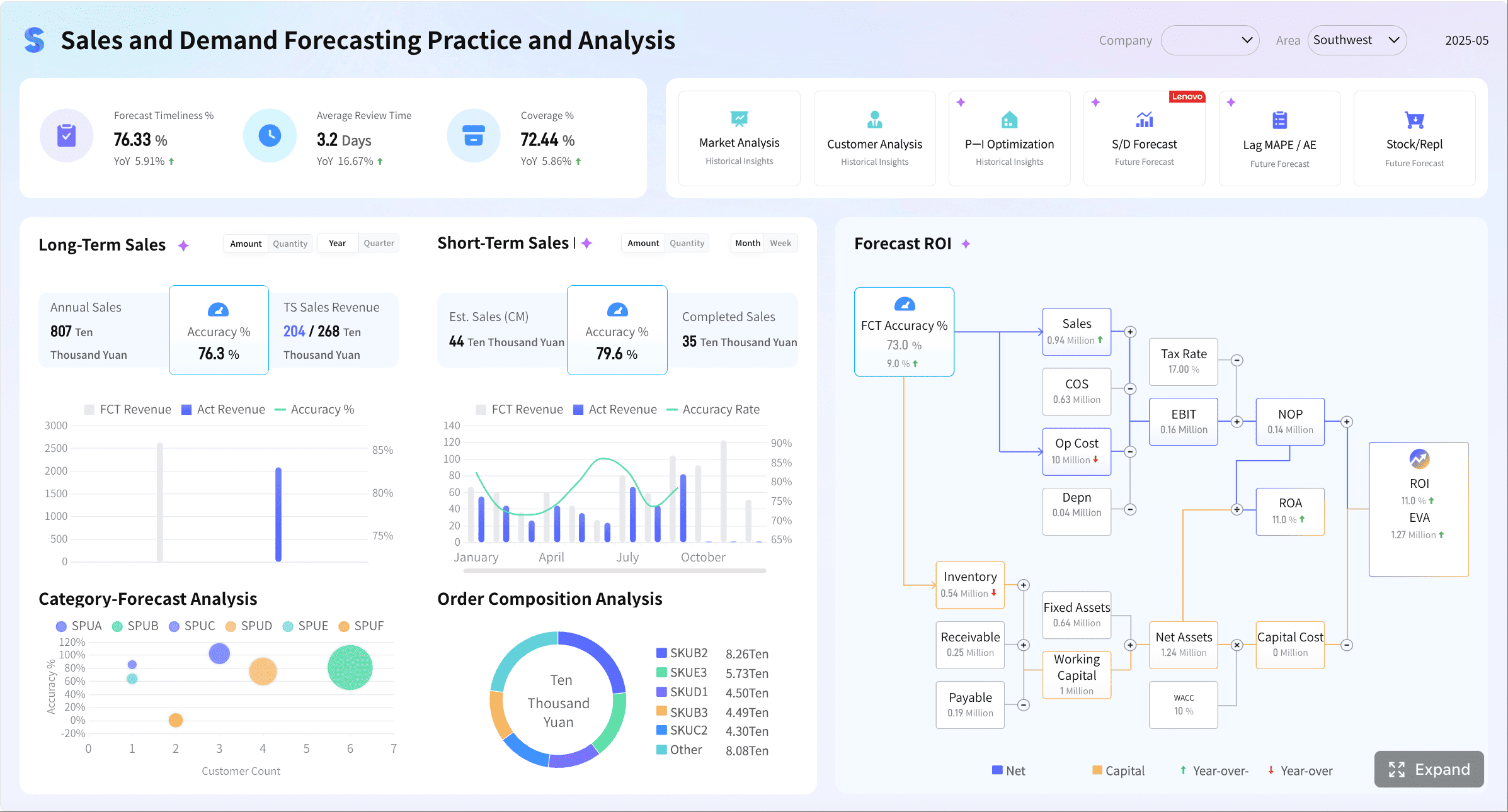
3. Sales forecast and pipeline health dashboard
Forecast dashboards are critical for executive planning. They show whether current pipeline is sufficient to support future revenue goals.
Useful KPIs include:
Forecasted revenue
Commit vs. best-case pipeline
Pipeline coverage ratio
Stage aging
Deal slippage
Open opportunities by close month
Forecast variance
This dashboard works best when it highlights risk visually. For example, stage-aging heatmaps and coverage charts can quickly show whether pipeline is thin in a specific segment or period.
Marketing dashboards must connect activity to outcomes. If they only report volume metrics, they fail the business. Good marketing dashboards reveal which channels, campaigns, and content investments are producing qualified pipeline and revenue impact.
4. Digital marketing performance dashboard
This is the standard dashboard for marketing managers running multi-channel acquisition programs.
Core metrics include:
Website traffic
Sessions by source
Conversion rate
Cost per lead
Return on ad spend
Form submissions
Bounce rate
Landing page performance
A practical design uses traffic and conversion KPI cards at the top, channel breakdown charts in the middle, and campaign tables underneath for deeper analysis.
This dashboard should clearly show both efficiency and outcome. A channel that drives low-cost traffic but weak conversion should not be treated the same as one that creates fewer but higher-value opportunities.
6. Content and attribution dashboard
Content teams often struggle to prove business impact. This dashboard bridges that gap by tying content consumption to downstream actions.
Recommended metrics include:
Top-performing pages
Content downloads
Time on page
Assisted conversions
Organic traffic growth
Attribution trends
Content-influenced pipeline
Engagement by asset type
A strong version groups content metrics by funnel stage so teams can distinguish awareness assets from conversion-driving assets.
Operations dashboard examples
Operations dashboards are built for control. They should reveal whether the business is running on time, at expected quality, and with efficient use of capacity.
7. Production and process efficiency dashboard
This dashboard helps operations managers monitor output and identify workflow constraints.
Core metrics include:
Output volume
Cycle time
Capacity utilization
Throughput
Defect rate
Rework rate
Downtime
Process efficiency trend
The layout should move from summary to diagnosis: KPI cards first, then trend charts, then bottleneck views by line, shift, team, or facility.
8. Service level and fulfillment dashboard
For logistics, service operations, and fulfillment teams, this dashboard shows whether customer commitments are being met.
Key metrics include:
On-time delivery
Order cycle time
Backlog volume
Service level attainment
Fill rate
Order accuracy
Escalation count
Resource allocation
This dashboard becomes especially valuable when it includes exception alerts for missed SLAs, delayed orders, and resource shortages.
9. Workflow bottleneck dashboard
This dashboard is designed to surface operational friction. It is useful in complex environments where delays happen across multiple stages or handoffs.
Track metrics such as:
Queue time
Stage duration
Work-in-progress volume
Bottleneck frequency
Utilization by team
Exception rate
First-pass yield
Process variance
For process improvement initiatives, this dashboard can become the operational backbone for continuous improvement reviews.
Finance dashboard examples
Finance dashboards must do more than present accounting outputs. They should support cash control, cost management, margin analysis, and planning confidence.
10. Financial performance dashboard
This dashboard gives finance leaders a consolidated view of business health.
Common KPIs include:
Cash flow
Revenue
Gross margin
Operating expenses
Net profit
Budget vs. actuals
Profitability trends
EBITDA or operating income
A strong dashboard compares actual performance against budget and prior periods, helping leaders identify where margin pressure or overspending is emerging.
11. Cash management and working capital dashboard
This dashboard is especially useful for CFOs, controllers, and FP&A teams that need tighter liquidity visibility.
Important metrics include:
Cash balance
Accounts receivable aging
Accounts payable aging
Days sales outstanding
Days payable outstanding
Burn rate
Forecast variance
Working capital trend
The best design emphasizes timing. Aging charts, inflow-outflow trends, and forecast variance indicators help finance teams detect liquidity risk before it becomes urgent.
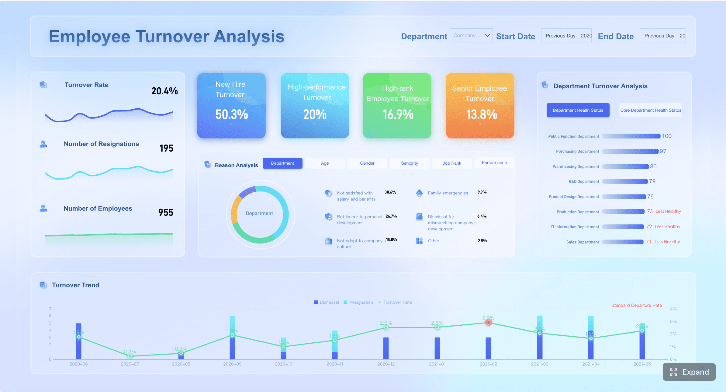
HR dashboard examples
HR dashboards should connect people metrics to workforce stability, hiring efficiency, and organizational performance. The goal is not just visibility—it is early intervention.
12. Workforce and talent dashboard
This dashboard supports HR leaders, department managers, and executives who need a broad view of hiring, retention, and employee health.
This dashboard works best when it balances current workforce status with trend analysis. For example, a stable headcount number may hide rising voluntary turnover in critical departments.
How to choose the right KPIs for each department
Many dashboards fail because they start with available data instead of business purpose. The right KPI set should be determined by the decisions the dashboard is meant to support.
Start with business goals
Begin with the team’s objectives, not the reporting tool. Every metric on the dashboard should map to a real decision, operational target, or strategic outcome.
For example:
Sales teams need KPIs tied to bookings, conversion, and forecast confidence
Marketing teams need KPIs tied to lead quality, efficiency, and pipeline impact
Operations teams need KPIs tied to throughput, quality, and service reliability
Finance teams need KPIs tied to cash, margin, and variance management
HR teams need KPIs tied to hiring, retention, and workforce engagement
A simple test: if a metric changes tomorrow, would the team know what action to take? If not, it may not belong on the dashboard.
Focus on actionable measures
Not every metric deserves top-level visibility. Prioritize KPIs that reveal trends, exceptions, and next steps.
Vanity metrics often look impressive but create little value. High traffic without conversion context, large pipelines without stage quality, or high training volume without completion and impact are common examples.
Keep definitions consistent
Consistency is where dashboard trust is won or lost. If different teams calculate the same metric differently, the dashboard becomes political instead of useful.
Choosing charts that hide key changes: Some visualizations look polished but obscure trends or exceptions.
Copying one dashboard format across departments: Sales, finance, HR, and operations have fundamentally different workflows and information needs.
As a consultant, one of the most important recommendations I give organizations is this: design dashboards around decisions, not departments alone. The same department may need one dashboard for frontline execution and another for executive review.
How to turn dashboard examples into your own template
Once you review enough metrics dashboard examples, the next step is translating ideas into a working template your teams will actually use.
1. Identify the audience and reporting cadence
Start by clarifying who will use the dashboard and how often:
Daily operational monitoring
Weekly team management
Monthly strategic review
Quarterly executive reporting
This determines the level of detail, data freshness, and chart structure required.
2. Select a focused KPI set
Choose a small number of core KPIs and a few supporting metrics for drill-down analysis. In most cases, the top section of the dashboard should include only the most business-critical indicators.
A practical rule is:
5 to 8 primary KPIs
3 to 5 supporting trend views
1 to 3 drill-down tables or segmented analyses
This keeps the dashboard focused while still allowing investigation.
3. Sketch the layout before building
Before opening a BI tool, map the dashboard on paper or in a wireframe. This helps stakeholders agree on information flow early.
Include:
KPI card placement
Trend chart position
Filter locations
Drill-down sections
Alerts or exception indicators
4. Validate with real users
Do not assume the first version is correct. Review the draft with actual users and ask practical questions:
Can they identify the most important metrics in five seconds?
Can they explain what each KPI means?
Can they spot an issue quickly?
Do they know what action to take from the dashboard?
Usage feedback is often more valuable than design opinions.
5. Refine based on adoption and outcomes
The best dashboards evolve. Remove unused widgets, simplify confusing views, and adjust KPIs as business priorities change.
A dashboard should be treated like an operating asset, not a one-time reporting project.
Building departmental dashboards at scale with FineBI
Reviewing metrics dashboard examples is the right first step, but building production-ready dashboards manually across sales, marketing, operations, finance, and HR is far more complex than most teams expect. You need data integration, KPI standardization, role-based access, refresh automation, governance, and reusable templates that work across business units.
This is where FineBI becomes the practical solution.
Instead of creating every dashboard from scratch, teams can use FineBI to utilize ready-made templates and automate this entire workflow. That matters for enterprises that want faster deployment without sacrificing consistency or trust.
Utilize ready-made templates and automate this entire workflow with FineBI
Connect data from multiple business systems in one place
Standardize KPI logic across departments
Build interactive dashboards for both operational and executive use
Reuse dashboard templates to accelerate rollout
Enable self-service analysis without overwhelming business users
Automate refresh cycles and reduce manual reporting effort
For decision-makers, the real value is not just better-looking dashboards. It is faster insight, stronger alignment, and less reporting friction across the organization.
If your team is still managing fragmented reports in spreadsheets or rebuilding dashboards from the ground up for every department, the smarter path is clear: use proven metrics dashboard examples as your blueprint, then deploy them at scale with FineBI to shorten implementation time and improve reporting maturity.
A strong metrics dashboard should include core KPI cards, trend comparisons, target versus actual views, filters, exception alerts, drill-down paths, and data freshness indicators. These elements help users quickly see performance, identify issues, and decide what to do next.
Select KPIs that align with the team's decisions, goals, and daily responsibilities. The best metrics are relevant, actionable, consistent, timely, and easy to compare against targets or past performance.
Operational dashboards focus on day-to-day activity and near-real-time tracking, while strategic dashboards monitor progress toward longer-term goals. Executive dashboards provide a concise cross-functional summary for senior leaders who need fast visibility into overall business performance.
Dashboard examples help teams understand how to organize KPIs, choose effective visual layouts, and match reporting design to business goals. They also make it easier to see which metrics deserve priority for each department.
A well-designed dashboard brings important data into one place so teams can spot trends, compare results, and respond faster. It improves clarity, accountability, and alignment between sales, marketing, operations, finance, and HR.
Product Trial
FineReport
Pixel-perfect reports · Interactive dashboards · Easy data entry · Digital twins