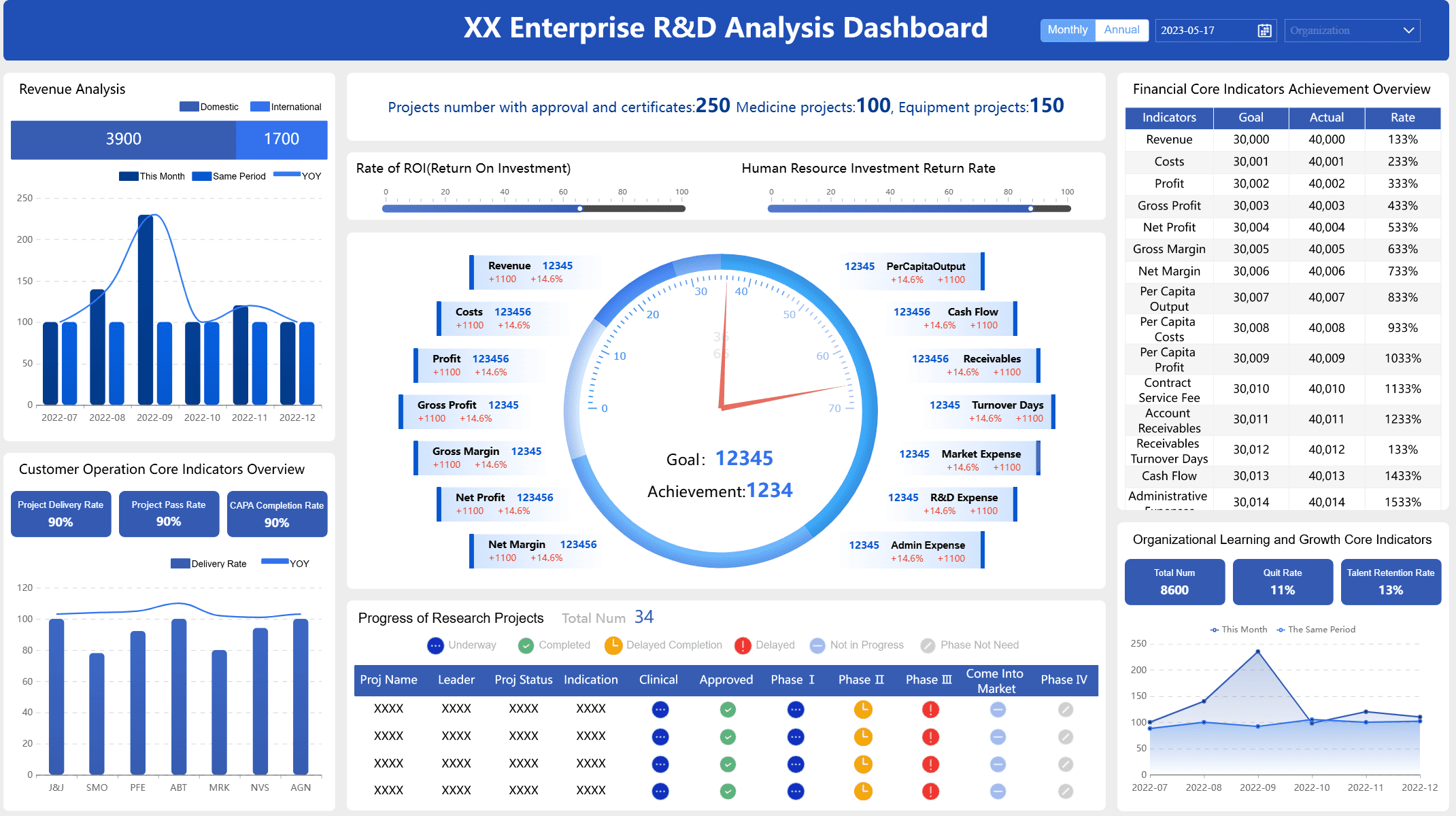
A function dashboard lets you watch your health data and find key patterns. You can see how things change over time and learn new things. This helps you make smarter choices. A healthcare network saw fewer users logging in. They used their dashboard to find out why. They fixed the problem by training their staff. More people joined after that and service got better. FineBI gives businesses tools like this. These tools make data simple to see and use.
Medical dashboard created by FineBI(click to engage)
A function dashboard helps you keep track of your health. It puts all your health data in one place. This makes it easy to spot patterns and make good choices. The dashboard has special features that make it different from other tools. Here is a table that shows what makes it unique:
Feature
Description
Enhanced patient-physician communication
You can share your health info with your doctor. This helps you and your doctor decide together.
Combination of PROMs
The dashboard uses both disease-specific and general surveys. This gives you a full view of health.
Visualization of data
You can see your health data change over time. This helps you and your doctor notice trends.
Inclusion of various patient information
The dashboard shows important events and details about you. This gives a complete picture of health.
You and your care team can learn from your health data. The dashboard makes it simple to see big changes. FineBI is a business tool that works in a similar way. It brings data together, makes charts, and finds useful facts. Both tools help turn data into helpful information.
User Experience and Accessibility
You want a dashboard that is simple and fits your needs. The function dashboard shows only the most important health data. You can change how it looks to match what you want. This helps you focus and not get confused. The design helps you find answers and act fast.
You can set up the dashboard for your daily habits.
The design makes it easy to find what you need.
Security keeps your health data safe, so you can trust the tool.
Accessibility is important for everyone. The function dashboard has features that help all users. Here is a table that shows these features:
Feature
Description
High-Contrast Color Combinations
Text and pictures are easy to see, even with color vision problems.
Pattern Fills
You can tell data apart without needing to see colors.
Accessibility Mode
The dashboard works well with screen readers and other tools.
Keyboard Navigation
You can use the dashboard with just a keyboard.
Accessible Exports
You can export your health data in ways that work with assistive tech.
Structured PDF Exports
PDF files have clear tables and labels for screen readers.
FineBI also cares about user experience and accessibility. It lets teams share dashboards, send reports, and work together. Both tools help you learn from data, whether for health or business.
How the Function Dashboard Works
Data Integration and Visualization
You want all your health data in one spot. The function dashboard brings data together from many places. You can link your health plans, pharmacy records, government health stats, wearable devices, and lab results. This helps you see everything about your health.
Data from devices like Oura, Fitbit, and Apple Health.
Lab Test Results
Results from medical tests by your doctor.
The function dashboard uses smart features to connect data. It gathers info from wearables and works with labs. You can add extra services, like full-body imaging. This mix of data helps you get good analysis and strong insights.
You see your health data with easy-to-read visuals. The dashboard uses interactive dashboards, heatmaps, time charts, network graphs, and maps. These tools make hard info simple to understand. You can find trends and patterns fast. This makes your experience better and helps you trust the results.
FineBI does similar things for business users. You connect data from many places, process it, and build dashboards with drag-and-drop tools. You can look at data visually and share ideas with your team. This way helps you analyze better and trust your results.
Tracking Health Metrics Over Time
You want to know how your health changes. The function dashboard tracks your health over time. It checks what you look at most and changes the layout for you. It shows different info at different times, so you always see what matters. The dashboard changes your challenges as you improve.
Method
What It Does
Check use patterns
Change layout based on what users look at most
Time-based changes
Show different info at different times
Adjust to progress
Change challenges based on how users do
You get advice made just for you. The dashboard uses AI to give tips based on your health data. It can find health problems early and set goals for you. As your health changes, the dashboard updates. This keeps your analysis new and helpful.
FineBI also tracks business data over time. You can see trends, compare times, and change your actions. The platform helps you keep your analysis fresh and trust your results. This gives you a better experience and helps you make smart choices.
Personalized Insights and Protocols
You need advice that fits your life. The function dashboard gives you personal tips and protocols. It uses your data to suggest ways to get healthier. The dashboard checks itself often. It looks for mistakes and problems, then makes changes to help you more.
Recommendation
Description
Iterative Evaluation
Keep checking dashboard performance to find problems and mistakes.
Health Equity Consideration
Make sure dashboards help everyone get care and fix bias in health data.
Usability Data Collection
Get feedback from users to make the dashboard easier to use.
Iterative Design Process
Keep improving the dashboard to make it better for everyone.
You can trust the advice you get. The dashboard works to give everyone good care. It collects feedback to make the user experience better. The design process keeps going. Developers always work to improve the dashboard for you and others.
FineBI does this for business analysis too. You find out who needs the insights and what actions they should take. You check your data sources for quality and accuracy. You use the right tools to turn data into action. You make dashboards that help users act. This makes the experience better and keeps results accurate.
Tip: Always share feedback about your dashboard. Your thoughts help developers make the tool better and more accurate for everyone.
Function Dashboard Benefits
Empowerment and Proactive Health Management
You can take control of your health with the function dashboard. The dashboard gives you clear recommendations and helps you make an action plan. You see your health data in one place, which makes it easier to spot changes and act fast. The dashboard supports you with features that help you stay on top of your health care. You get reminders, secure messaging, and educational content that fits your needs. The table below shows how these features work for you:
Feature
Description
Recommendations
Suggests next steps based on your data, like logging meals or talking to a coach.
Follow-ups
Gives direct links for appointments or test results.
Secure Messaging
Lets you talk to your care team without leaving the dashboard.
Educational Content
Shares videos and articles about your health metrics, like blood pressure.
Coaching Options
Connects you to support when your health trends need attention, either by a person or AI.
FineBI helps business users in a similar way. You can see all your business data, get recommendations, and build an action plan for your team. This approach improves the quality of recommendations and helps you reach your goals.
Actionable Insights for Better Decisions
You get health insights that help you make better choices. The dashboard gives you real-time data and recommendations that fit your needs. You can set up the dashboard to match your health care plan. The dashboard shows you trends and gives you feedback right away. Here are some ways the dashboard helps you:
You see alerts when you need to check something or take action.
You get recommendations that match your health goals.
You can view data in different ways, like maps or graphs, to fit your style.
The dashboard helps you build an action plan that is easy to follow.
Studies show that dashboards with clear recommendations increase your chances of following healthy habits. When you get health insights with guidance, you feel more confident and ready to act. The quality of insights and the quality of recommendations both improve your health outcomes.
Real-Time Monitoring and Alerts
You stay safe with real-time monitoring and alerts. The dashboard watches your health data and sends you notifications when something changes. You get alerts by email, SMS, or in the app. This helps you act fast and avoid problems. The table below shows how these features work:
Feature
Description
Alerts & Notifications
Sends alerts for important health events based on your key metrics.
Proactive Monitoring
Lets you act right away if your health data shows a sudden change.
Real-world studies show that dashboards help lower missed doses, reduce health risks, and improve patient safety. You can see trends, track your progress, and make better decisions. FineBI offers similar benefits for business users, helping teams spot problems and act quickly. You get a clear view of your data, which makes your action plan stronger and your health care safer.
Usability and Data Security of Function Dashboard
Ease of Use and Support
You want a dashboard that is simple to use. It does not matter if you know a lot about computers. The function dashboard has a clear design and easy tools. You see your health info right away. You can find patterns without looking through too much stuff. The dashboard follows WCAG 2.1 rules. This means you get good color contrast, keyboard shortcuts, and screen reader help. These features help people with vision or movement problems.
Usability Feature
Description
WCAG 2.1 Standards
Makes sure colors are easy to see and you can use a keyboard or screen reader.
Color Blindness Considerations
Uses patterns, labels, or icons with colors to make things clear.
Screen Reader Compatibility
Helps screen readers work better with ARIA labels.
Keyboard Navigation
Lets you use every feature with only a keyboard.
You get help while you check your health. The dashboard gives you warnings and tells you what to do next. You see short summaries and what each number means. Legends help you read charts and graphs. Drill-down lets you look at more details if you want. The design stops you from feeling lost and helps you stay on track.
A dashboard that is easy to use helps everyone. When you can work with your data, you feel sure and interested.
Data Privacy and Permission Control
You trust the dashboard to keep your info safe. The platform uses strong privacy steps to protect your health data. It only takes what it needs for your care. Your name stays hidden by using anonymization and grouping. The dashboard tells you how it uses your info, so you always know what happens.
Data Minimization: Only takes what is needed.
Anonymization: Keeps your name private.
Transparent Policies: Tells you how your data is used.
Privacy Audits: Checks for weak spots.
Role-Based Access Control: Limits who can see your info.
Encryption: Protects your data when stored or sent.
Multi-Factor Authentication: Adds extra safety steps.
Real-Time Monitoring: Watches for strange activity.
The dashboard uses permission controls to keep your health info safe. Each person gets only the access they need. This stops people who should not see your info. It also tracks what users do for safety. You can trust your info stays private and protected.
Benefit
Description
Access Control
Gives users only what they need to see.
Compliance
Makes it easier to follow health data rules and laws.
Security
Stops people who should not see your info with permissions.
FineBI uses the same safety and easy-to-use features for business data. Both tools help you feel safe and supported as you manage your info.
You can use a function dashboard to make health tracking simple. Visual graphs and color-coding help you see your health data clearly. The dashboard gives you feedback that you can act on right away. You get a design that fits your needs, so you find what matters most.
See how Dora turns trusted BI data into chat-based answers, scheduled briefings, and automated follow-up — built for real enterprise workflows, not just chat.
FAQ
What is a function dashboard?
You use a function dashboard to see your health data in one place. It helps you track changes, spot trends, and make better choices about your well-being.
Can I connect my wearable devices to the dashboard?
Yes, you can link devices like Fitbit or Apple Health. This lets you see all your activity and health stats together for a complete view.
How does the dashboard keep my information safe?
The dashboard uses strong security steps. You get features like encryption, permission controls, and privacy audits. Only people you allow can see your data.
Can I share my dashboard with my doctor?
You can share your dashboard with your doctor or care team. This helps everyone understand your progress and make better plans for your care.
What if I need help using the dashboard?
You get support through guides, tips, and help centers. If you have questions, you can contact support for answers.