An executive dashboard template should help leadership teams make faster, better decisions—not just display more data. For CIOs, CFOs, COOs, strategy leaders, and operations directors, the real problem is rarely a lack of numbers. It is a lack of alignment on which numbers matter, what they mean, and what action should follow.
Too many enterprise dashboards fail before launch because teams start with available data, favorite charts, or department requests. The result is predictable: cluttered executive views, inconsistent KPI definitions, duplicate reporting, and endless follow-up meetings to explain what the dashboard was supposed to clarify.
If you are building an executive dashboard for enterprise leadership, the right starting point is not design. It is decision support. The dashboard must tell leaders where performance stands, what is changing, where risk is emerging, and what decisions are needed now.
All dashboards in this article are created by FineBI
What an executive dashboard template should help leaders decide
A strong executive dashboard template exists to answer a small set of high-value business questions. Before selecting metrics or visual design, define the decisions the dashboard must improve.
For enterprise leadership, those decisions usually fall into three categories: strategic direction, operational intervention, and governance oversight. If the dashboard does not directly support one of these, it probably does not belong in the executive view.
Core elements an executive dashboard must define first
Decision purpose: The dashboard should clarify what leadership needs to decide, approve, escalate, or monitor.
Audience: Define whether the primary user is the CEO, board, CFO, business unit leader, or executive committee.
Review cadence: Determine whether the dashboard is reviewed daily, weekly, monthly, or quarterly.
Action path: Specify what should happen when a KPI misses target or a threshold is breached.
Level of detail: Separate executive summary metrics from drill-down diagnostics for functional teams.
Governance model: Assign ownership for each KPI, each data source, and each escalation path.
An executive dashboard template should also align with how leaders already operate. Board reporting needs high-level outcomes, trends, and risk context. Operational oversight needs the few performance drivers that explain why results changed. Strategic planning needs progress against goals, initiatives, and assumptions.
This means one enterprise dashboard is rarely one screen for every purpose. More often, the best template uses a layered structure: a concise executive summary page followed by role-based drill-down views.
Key Metrics (KPIs) leaders should define before design
Revenue growth: Measures top-line expansion over a defined period.
Profitability: Tracks margin performance, operating income, or EBITDA to show earnings quality.
Cash flow: Indicates liquidity health and the organization’s ability to fund operations and investments.
Forecast accuracy: Compares actuals to plan to expose planning reliability.
Customer health: Uses retention, churn, NPS, CSAT, or renewal indicators to reflect demand stability.
Operational efficiency: Measures throughput, utilization, cycle time, or cost-to-serve.
Strategic goal progress: Shows status against enterprise objectives or OKRs.
Risk exposure: Highlights compliance issues, project delays, control failures, or threshold breaches.
Data freshness: Confirms whether the KPI is current enough to support action.
Core sections every executive dashboard template should include
A practical executive dashboard template should be built around a few predictable sections. These sections allow leadership to move quickly from status to interpretation to action.
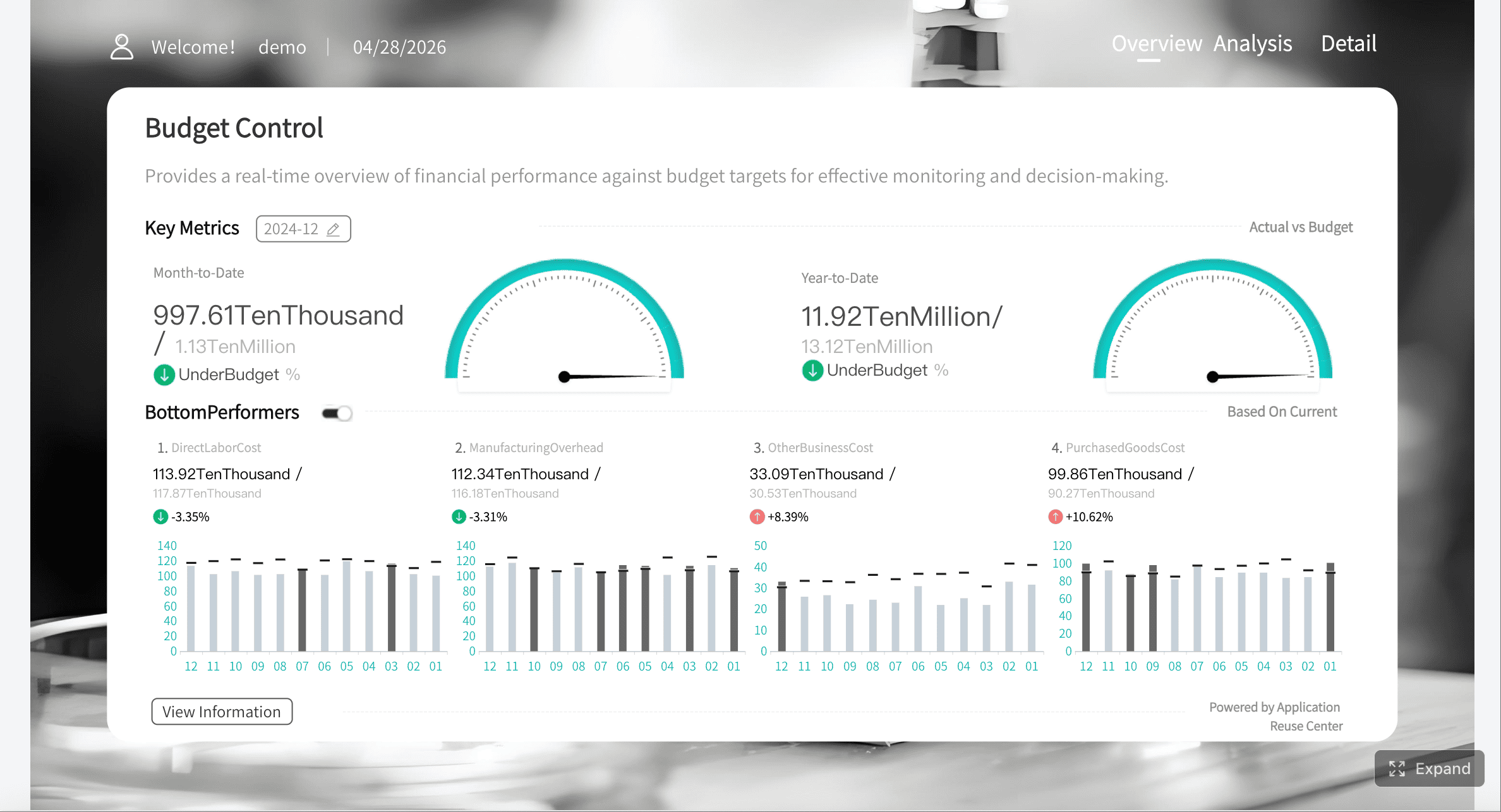
Strategic goals and company-wide KPIs
This section is the executive headline. It should present a limited set of enterprise outcomes tied to growth, profitability, customer strength, and operating performance. For most organizations, five to ten metrics are enough.
Each KPI should answer three questions instantly:
Where are we now?
Are we above or below target?
Is performance improving or worsening?
The visual structure matters here. Executives need target markers, current values, and trend direction at a glance. They do not need decorative charts or large tables in the first view.
A useful pattern is to group KPIs by strategic theme rather than by source system. For example:
Growth
Financial health
Customer outcomes
Operational execution
Strategic initiatives
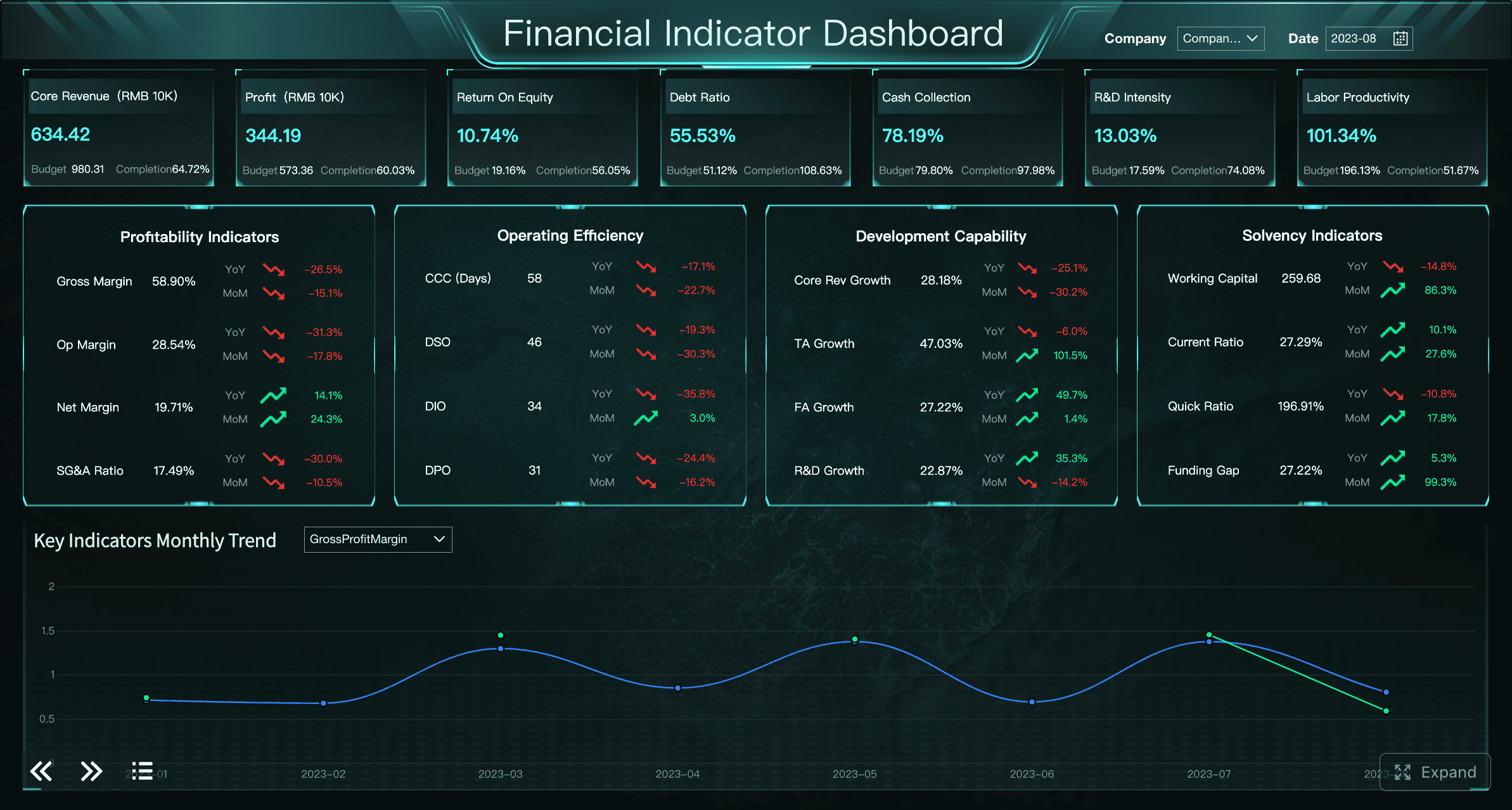
Financial and operational performance
This section should summarize the business drivers behind results. Revenue alone is not enough. Leaders need the small number of metrics that explain what changed.
Financial summaries often include:
Revenue
Gross margin
Operating margin
Cash flow
Budget vs actual
Forecast variance
Operational summaries often include:
Capacity utilization
On-time delivery
Cycle time
Productivity
Backlog
Cost efficiency
The consultant’s rule here is simple: show the drivers, not just the outcomes. If margin drops, the dashboard should help executives see whether the cause is pricing pressure, product mix, labor cost, supply variance, or fulfillment inefficiency.
Risk signals, exceptions, and decisions needed
This is the section many dashboard teams underbuild, even though it is often the most valuable to executives.
An executive dashboard template should not just report performance. It should surface what needs attention now. That means highlighting:
Red flags
Threshold breaches
Outlier trends
Delayed initiatives
Compliance issues
Cross-functional blockers
More importantly, each exception should include context for action:
Owner
Timeline
Recommended decision
Impact if not addressed
This reduces the classic enterprise failure mode where dashboards expose a problem but trigger another round of meetings just to determine who owns the issue.
How to choose the right metrics before building
Choosing metrics is where most executive dashboard projects succeed or fail. Enterprise teams often overload dashboards because they confuse data availability with business relevance.
Start with decisions, not data availability
The best executive dashboard template starts by asking: What decisions should leaders make better with this view?
That question changes everything. It forces the team to prioritize metrics that influence resource allocation, risk response, strategic adjustments, and performance intervention.
Avoid selecting metrics simply because they are easy to extract from source systems. Easy data is often low-value data. Vanity metrics create noise, make dashboards harder to scan, and dilute executive attention.
A strong filtering test is this: if a metric moves significantly, would leadership change a priority, funding decision, operating plan, or escalation path? If the answer is no, remove it from the executive layer.
Balance lagging results with leading indicators
Enterprise leaders need to see both what happened and what is likely to happen next.
Lagging indicators show outcomes already realized, such as revenue, margin, churn, or EBITDA. Leading indicators show whether those outcomes are likely to improve or deteriorate, such as pipeline quality, renewal risk, backlog growth, defect rate, employee capacity, or delivery slippage.
The right mix helps leaders intervene earlier. A dashboard full of lagging metrics tells executives they have a problem after the quarter is already lost. A dashboard with carefully chosen leading indicators creates room to act.
Keep this balanced but tight. Too many forward-looking signals can become speculative. Too many backward-looking metrics become historical reporting.
Set rules for definitions and refresh cadence
Executive trust depends on consistency. If finance, sales, and operations define the same KPI differently, the dashboard becomes a political artifact instead of a decision tool.
Before design and development, standardize:
KPI definitions
Time periods
Calculation logic
Source systems
Target-setting rules
Refresh frequency
Refresh cadence should match business rhythm. Some metrics need daily updates. Others are better reviewed weekly or monthly because the underlying data is slower, noisier, or more reliable after close processes.
A mature executive dashboard template should make freshness visible. If a metric is three days behind, leaders should know.
Common executive dashboard examples and patterns to learn from
Leaders do not need to start from a blank page. Reviewing common executive dashboard examples helps teams identify useful design patterns without copying layouts that do not fit their operating model.
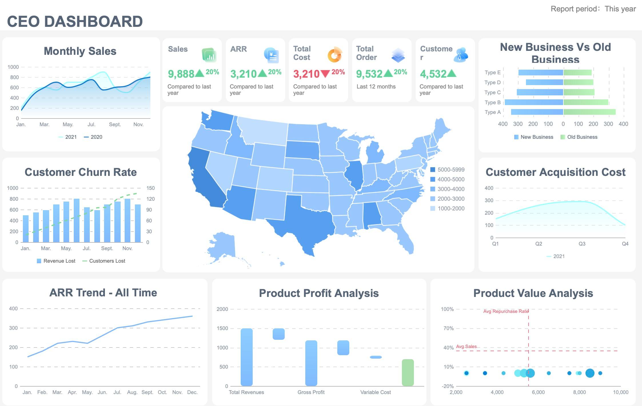
CEO and board-level overview dashboards
A CEO or board dashboard should be concise, directional, and strategic. It should show the state of the business across performance, progress, and risk in one view.
The best pattern here is a top-line overview with:
Enterprise KPIs
Trend indicators
Strategic initiative status
High-priority risks
Key decisions pending
Board-level reporting should emphasize trend visibility and exceptions over operational detail. Directors typically do not need workflow metrics or department-level breakdowns in the first screen. They need confidence that leadership is monitoring the right issues and acting on the right signals.
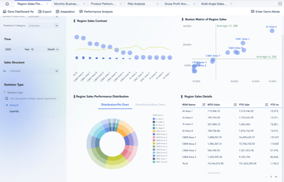
Functional executive dashboards for finance, sales, and operations
Once the enterprise summary is defined, supporting dashboards can be tailored by function while preserving common structure and definitions.
Examples include:
Finance executive dashboard: Revenue, margin, cash, forecast variance, working capital, capital allocation.
Operations executive dashboard: Throughput, quality, utilization, backlog, cost per unit, on-time delivery.
The important principle is consistency. Functional views should roll up into the same enterprise logic so leaders can compare across teams without debating methodology.
Template libraries and free starter options
Free templates and sample dashboards can be useful starting points, especially for layout ideas, KPI grouping, and visual hierarchy. But enterprise teams should treat them as scaffolding, not final design.
Many free dashboard templates are built for generic reporting, not executive decision-making. They often contain too many charts, broad KPI mixes, or no governance structure for ownership and escalation.
When reviewing template libraries, evaluate them against enterprise requirements:
Does the template prioritize decisions over raw reporting?
Does it separate executive summary from deeper analysis?
Does it show target, trend, and exception clearly?
Does it support ownership, alerts, and governance?
Can it scale across business units and source systems?
Mistakes to avoid when designing for enterprise leadership
Executive dashboards fail for predictable reasons. Most are not technical failures. They are design and governance failures.
Common mistakes include:
Overloading the screen with too many KPIs, filters, or charts
Executives should scan the first view in seconds, not hunt through visual clutter.
Mixing strategic indicators with deep operational detail in the same first view
Keep the first layer strategic. Push diagnostic detail to drill-down pages.
Hiding assumptions, data quality issues, or metric ownership
If a number is estimated, delayed, or disputed, the dashboard should make that visible.
Building the dashboard before agreeing on audience, purpose, and governance
This is the fastest route to rework, stakeholder conflict, and low adoption.
Creating a dashboard that reports status but not action
The executive view should clarify what needs attention, who owns it, and what decision is pending.
A practical pre-build checklist for stakeholders
Before implementation starts, stakeholders should align on the operating model behind the dashboard. This saves months of redesign and significantly improves adoption after launch.
Governance for metric ownership and change requests
Success measures after launch
Those success measures should include more than usage. Enterprise teams should also track:
Executive adoption rate
Time to insight
Decision speed
Number of follow-up clarification meetings
Confidence in KPI consistency
Escalation response time
Turn the framework into a scalable executive dashboard with FineBI
Building an enterprise-grade executive dashboard template manually is possible, but it is rarely simple. Teams must standardize metrics, connect multiple data sources, design executive-friendly layouts, manage drill-down logic, govern access, and keep refresh cycles reliable. That complexity grows quickly across business units.
This is where the practical solution matters. Building this manually is complex; use FineBI to utilize ready-made templates and automate this entire workflow.
Utilize ready-made templates and automate this entire workflow with FineBI
FineBI helps enterprise teams move from dashboard planning to governed execution faster by enabling:
Ready-made dashboard templates for executive reporting
Interactive drill-down for finance, sales, and operations
Automated refresh and scheduled distribution
Role-based permissions for secure executive access
Faster deployment without rebuilding every dashboard from scratch
For leadership teams, the benefit is not just nicer reporting. It is a more reliable decision system. With FineBI, organizations can create executive dashboards that are consistent, scalable, and action-oriented—without spending months stitching together spreadsheets, BI logic, and custom layouts manually.
If your stakeholders are still in the planning stage, start with the checklist above. If you are already feeling the complexity of building across departments and source systems, FineBI is the faster path to an executive dashboard that leaders will actually use.
It should define the decisions the dashboard needs to support, who will use it, how often it will be reviewed, and what actions follow when a KPI misses target. These choices should come before chart design or data selection.
Executive dashboards should focus on a small set of enterprise KPIs such as revenue growth, profitability, cash flow, forecast accuracy, customer health, operational efficiency, strategic goal progress, and risk exposure. The exact mix should reflect leadership priorities and business strategy.
Most executive dashboards work best with about five to ten top-line metrics on the summary view. Too many KPIs create clutter and make it harder for leaders to spot risk, trend changes, and required actions quickly.
An executive dashboard gives leaders a high-level view of performance, targets, trends, and risks across the business. An operational dashboard goes deeper into process details and team-level diagnostics used for day-to-day management.
They often fail because teams start with available data or favorite visuals instead of decision needs. Weak KPI definitions, unclear ownership, and missing governance also make dashboards harder to trust and use.
Product Trial
FineReport
Pixel-perfect reports · Interactive dashboards · Easy data entry · Digital twins