A teams call queue dashboard is not just a reporting screen. It is an operational control layer that helps supervisors, contact center managers, and IT leaders see queue pressure early, respond faster, and protect service levels before customer experience declines.
If you are working with raw Teams call queue data alone, you already know the problem: the data exists, but it does not answer urgent business questions quickly enough. Teams may be handling high call volumes, rising abandonment, or uneven staffing across shifts, yet decision-makers still waste time stitching together spreadsheets and reports. A well-designed dashboard fixes that by turning queue activity into immediate, decision-ready insight.
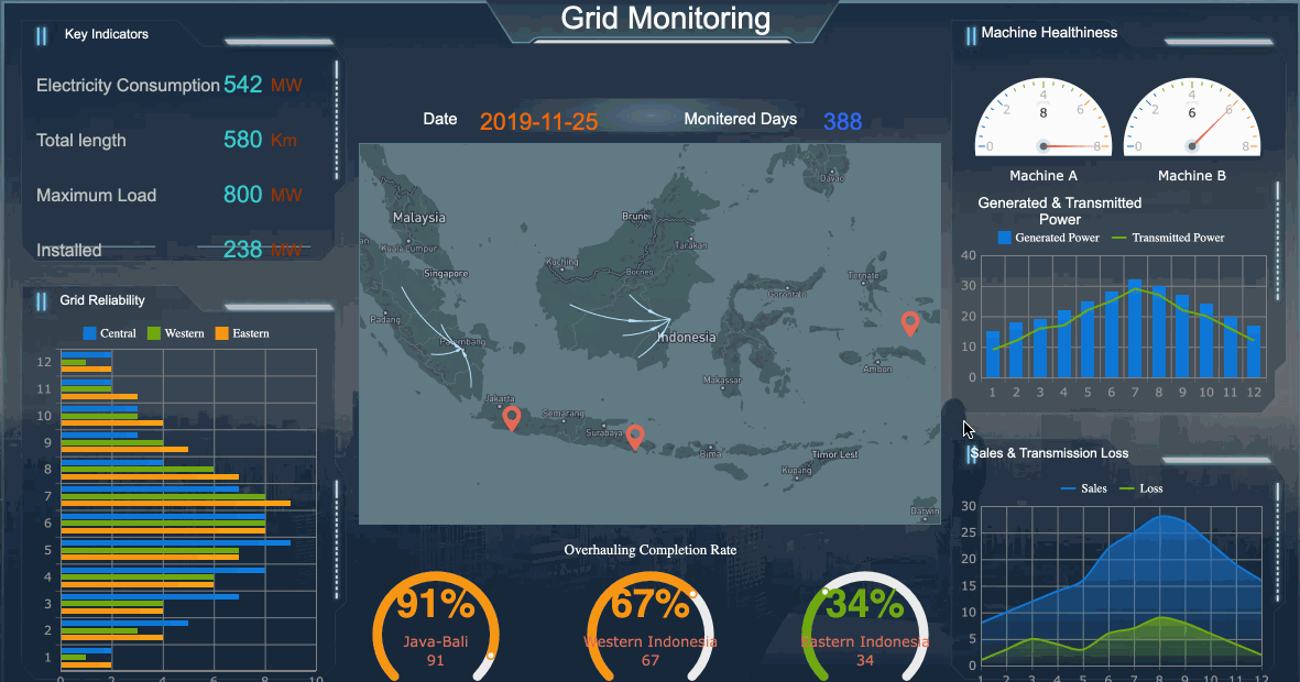
All dashboards in this article are created by FineBI
What a Teams Call Queue Dashboard Should Help You See
Raw queue data tells you what happened. A strong teams call queue dashboard tells you what needs attention now, what is changing over time, and where operations need intervention.
For operations leaders, that distinction matters. Looking at disconnected numbers like total calls, average wait time, or answered calls in isolation is not enough. The dashboard should connect metrics to action: where staffing is too light, which queues are slipping, and whether service performance is improving or deteriorating.
A practical dashboard should answer questions such as:
Which queues are currently at risk?
Are wait times rising beyond acceptable thresholds?
Where are abandonment rates trending upward?
Which teams or shifts are missing service targets?
Are today’s issues isolated, or part of a recurring pattern?
Where should supervisors reallocate agents right now?
When these answers are visible at a glance, leaders can manage service levels more proactively. That means better staffing alignment, faster escalation, and a more consistent customer experience.
Define the Goals of Your Teams Call Queue Dashboard
Before choosing charts or metrics, define the decisions your dashboard must support. This is where many projects fail. They start with available data rather than operational need.
Start with the decisions the dashboard needs to support
A teams call queue dashboard can serve multiple purposes, but each use case needs a different design emphasis.
Real-time monitoring: Used by supervisors to detect queue congestion, long waits, and staffing gaps as they happen.
Trend analysis: Used by operations managers to identify recurring pressure periods, demand shifts, and queue performance patterns.
Executive reporting: Used by leadership to assess service quality, operational efficiency, and cross-team performance at a strategic level.
Each audience needs different levels of detail.
Frontline supervisors need immediate, queue-level visibility and threshold alerts.
Operations managers need comparative trends across teams, shifts, and locations.
Leadership stakeholders need high-level KPIs tied to service outcomes and resource efficiency.
If one dashboard tries to serve all three audiences equally, it usually becomes cluttered and underused. A better approach is to prioritize the primary decision-maker, then layer in secondary views through filters or drill-downs.
Choose the outcomes that matter most
Your dashboard should be built around business outcomes, not just data availability. In most Teams call queue environments, the most valuable outcomes include:
Reducing customer wait times
Improving answer rates
Lowering abandonment rates
Identifying queue bottlenecks faster
Creating a unified view across teams, shifts, or locations
These outcomes create alignment between service operations and leadership expectations. They also make the dashboard more actionable because every chart and KPI supports a specific operational response.
Identify the Right Data Sources and Core Metrics
A dashboard is only as useful as the consistency and quality of the data behind it. Before building visuals, validate the raw inputs, reporting logic, and refresh cadence.
Gather the raw data behind queue performance
To build a reliable teams call queue dashboard, you need access to the core operational data driving queue behavior. Typical source data includes:
Call volume
Answered calls
Missed or abandoned calls
Wait time data
Call handling duration
Agent status or activity data
Overflow or routing behavior
Queue-level configuration details
Time and date stamps for trend analysis
The most common failure at this stage is inconsistent definitions. For example, one team may define “abandoned call” differently from another, or reporting windows may not align across systems. That creates distrust in the dashboard and undermines adoption.
Before building, confirm:
The exact definition of each metric
The time zone and reporting period used
Data refresh frequency
How queue transfers and overflow calls are treated
Whether agent activity is real-time, near real-time, or delayed
Focus on metrics that drive action
Not every available metric deserves dashboard space. Focus on measures that directly support staffing, service management, and queue optimization.
Key Metrics (KPIs)
Service Level: The percentage of calls answered within a target threshold. This is a core indicator of responsiveness.
Average Wait Time: The average time callers spend waiting before an agent answers. Useful for spotting congestion.
Abandonment Rate: The percentage of callers who hang up before being answered. A strong signal of service friction.
Answer Rate: The percentage of incoming calls successfully answered by agents. Helps assess queue effectiveness.
Call Volume: Total inbound calls over a defined period. Essential for understanding demand patterns.
Peak Hour Volume: Highest call activity periods during the day or week. Critical for staffing and scheduling decisions.
Overflow Rate: The share of calls routed outside the primary queue path. Indicates capacity strain or routing design issues.
Queue Backlog or Current Waiting Calls: The number of calls currently waiting. Useful for live operational intervention.
Average Handle Time: Average duration of answered calls, including talk and related work if tracked. Helps explain queue pressure.
Agent Availability or Occupancy: Shows how much agent capacity is available or fully utilized. Supports workforce balancing.
Queue-by-Queue Comparison: Side-by-side performance of different queues to identify underperforming teams or uneven demand.
Historical Trend Performance: Day-over-day, week-over-week, or month-over-month movement in service metrics. Separates anomalies from recurring issues.
A good rule: if a metric does not lead to a clear decision, remove it.
Design the Dashboard for Fast Operational Decisions
Dashboard design should reduce response time, not add cognitive load. The best operational dashboards are simple, structured, and built around priority questions.
Organize the layout around priority questions
Structure the dashboard from most important to least detailed.
A proven layout is:
Headline KPIs at the top for immediate status
Trend visuals in the middle to show movement over time
Queue-level breakdowns below for diagnosis and action
This layout helps users move from “What is happening?” to “Where is it happening?” and then to “What should we do next?”
Useful filters typically include:
Time period
Queue
Team
Shift
Location
Keep filtering powerful but restrained. Too many options make the dashboard harder to use in live environments where speed matters.
Make performance issues easy to spot
If users must interpret every chart manually, the dashboard is too slow for operations. Strong visual design should make issues obvious.
Best practices include:
Use color thresholds for service level breaches
Flag sudden spikes in wait time or abandonment
Highlight queues with persistent underperformance
Apply consistent color rules across all charts
Use sparklines or trend indicators next to KPI values
Consistency matters more than visual creativity. Supervisors should recognize risk signals in seconds.
Balance real-time visibility with historical context
Real-time views are essential, but they are not enough on their own. A queue may look healthy now while trending worse over the last week. Conversely, a temporary spike may not require structural changes.
An effective teams call queue dashboard should show:
Current queue status
Same-day performance trends
Daily and weekly patterns
Monthly historical comparisons
This combination helps users distinguish temporary incidents from recurring operational problems. That is the difference between reactive management and informed planning.
Turn Dashboard Insights Into Operational Improvements
Dashboards create value only when teams use them to change decisions, staffing, and workflows. Insight without action is just reporting.
Use the data to guide staffing and scheduling
Call queue data is especially powerful when tied to workforce decisions. Once the dashboard shows peak demand periods, recurring pressure points, and underperforming queues, operations leaders can adjust coverage more intelligently.
Common actions include:
Increasing staffing during predictable peak hours
Reassigning agents between queues based on service risk
Adjusting shift timing to better match call demand
Escalating overflow patterns for routing redesign
Investigating long handle times that create avoidable wait pressure
A mature dashboard does not just describe queue performance. It supports better scheduling, capacity planning, and service recovery.
Create a repeatable review process
The dashboard should be embedded into operations, not treated as a passive reporting asset.
Set a review rhythm with clear accountability:
Real-time checks: Supervisors monitor active queues throughout the day
Daily reviews: Managers assess previous-day performance and incidents
Weekly reviews: Teams analyze trends, staffing alignment, and recurring problems
Monthly reviews: Leadership evaluates strategic service performance and resource needs
Just as important, define what actions follow specific signals. For example:
If abandonment rises above threshold, review queue coverage and callback options
If one queue consistently misses service level, investigate staffing mix and routing rules
If wait times spike only during specific windows, realign schedules or break patterns
This turns the dashboard into a management system rather than a reporting screen.
Common Mistakes to Avoid When Building Your Dashboard
Many dashboards fail not because of missing data, but because they are built without operational discipline.
Here are the most common mistakes to avoid:
Tracking too many metrics without linking them to decisions
More numbers do not create more insight. Focus on the metrics that drive staffing, service recovery, and queue optimization.
Mixing inconsistent data definitions across queues or reporting periods
If teams do not share the same definitions for answered, abandoned, or overflowed calls, trust in the dashboard will break quickly.
Building for reporting only instead of day-to-day operational use
If the dashboard works only in a weekly meeting, it is not supporting queue management where it matters most.
Ignoring user roles and decision context
Supervisors, managers, and executives need different views. One generic dashboard often satisfies none of them.
Overcomplicating filters and visual design
Operational users need speed and clarity. Too many controls, chart types, or visual rules slow interpretation.
Failing to revisit the dashboard as teams, workflows, and goals evolve
Queue structures, staffing models, and service expectations change. Your dashboard must be reviewed and refined regularly.
Build Faster and Operationalize at Scale With FineBI
Building a high-value teams call queue dashboard manually is possible, but it is often more complex than teams expect. You need clean metric definitions, repeatable data preparation, role-based views, visual consistency, threshold logic, and reliable refresh cycles. For most organizations, that becomes a time-consuming mix of manual reporting, spreadsheet workarounds, and dashboard redesigns.
This is where FineBI becomes the practical solution.
With FineBI, you can utilize ready-made templates and automate this entire workflow. Instead of building every metric, visual, filter, and reporting layer from scratch, teams can move faster with a platform designed for business intelligence at scale.
Utilize ready-made templates and automate this entire workflow with FineBI
Connect and unify operational data more efficiently
Standardize KPI definitions across queues and teams
Build interactive dashboards for supervisors, managers, and executives
Automate refreshes and reduce manual reporting effort
Use ready-made templates to accelerate deployment
Create more consistent, scalable reporting across locations and business units
For organizations that need a teams call queue dashboard to support real operational decisions, the goal is not just to visualize data. The goal is to build a repeatable system that improves staffing, service levels, and customer experience over time.
Building this manually is complex; use FineBI to utilize ready-made templates and automate this entire workflow. That approach reduces implementation friction, improves trust in the numbers, and helps decision-makers act on queue performance with confidence.
The most useful metrics usually include service level, average wait time, answer rate, abandonment rate, call volume, and queue-level trends. These KPIs help supervisors spot pressure quickly and decide where to intervene.
A Teams call queue dashboard is valuable for supervisors, operations managers, IT teams, and executives. Each group uses it differently, from real-time monitoring to trend analysis and high-level reporting.
Raw data shows isolated events and numbers, while a dashboard turns that information into a clearer view of risks, trends, and priorities. It helps teams act faster instead of manually piecing reports together.
The refresh rate depends on whether the dashboard is used for live supervision or historical analysis. Real-time or near real-time updates are best for operational monitoring, while scheduled refreshes may be enough for leadership reporting.
They often fail when they are built around available data instead of business decisions. Inconsistent metric definitions, unclear audience needs, and too many low-value charts also reduce trust and usability.
Product Trial
FineReport
Pixel-perfect reports · Interactive dashboards · Easy data entry · Digital twins


 These outcomes create alignment between service operations and leadership expectations. They also make the dashboard more actionable because every chart and KPI supports a specific operational response.
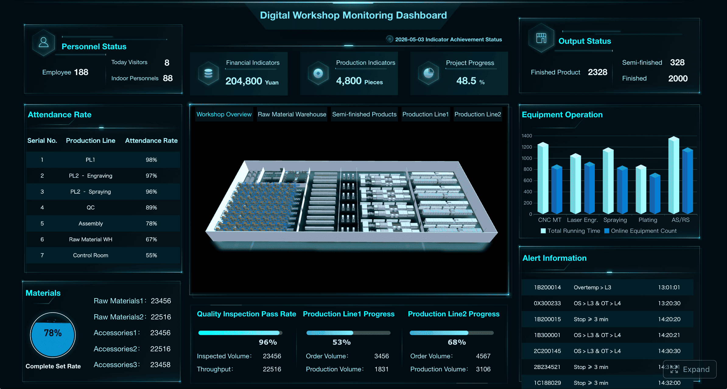 Consistency matters more than visual creativity. Supervisors should recognize risk signals in seconds.
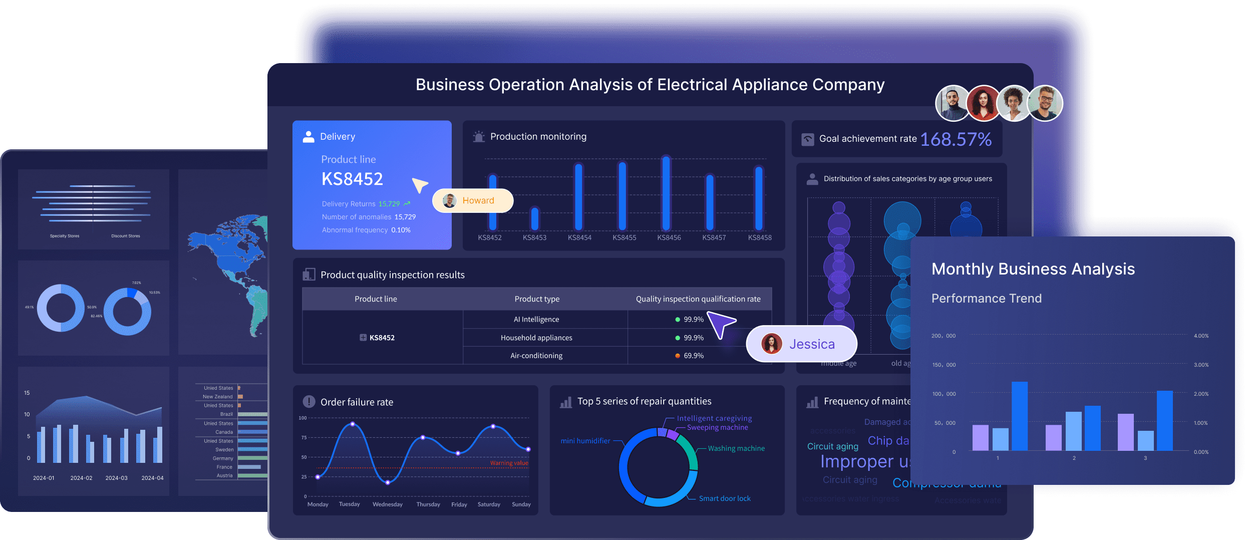 With
With 


