An engineering metrics dashboard gives enterprise teams one place to see whether software delivery is getting faster, quality is holding up, and developer workflows are improving or slowing down. For engineering leaders, platform teams, and delivery managers, the real value is not more reporting. It is better operational decisions.
In most enterprises, engineering data is fragmented across Git platforms, CI/CD tools, issue trackers, incident systems, and internal spreadsheets. That creates a familiar set of problems: leadership lacks a reliable delivery view, managers argue over metric definitions, teams get measured on noisy proxies, and improvement work stalls because nobody trusts the numbers. A well-designed dashboard fixes that by turning scattered activity into decision-ready signals.
The goal is simple: show trends, bottlenecks, and outcomes that help teams improve delivery predictability, reliability, and developer efficiency without turning measurement into surveillance.
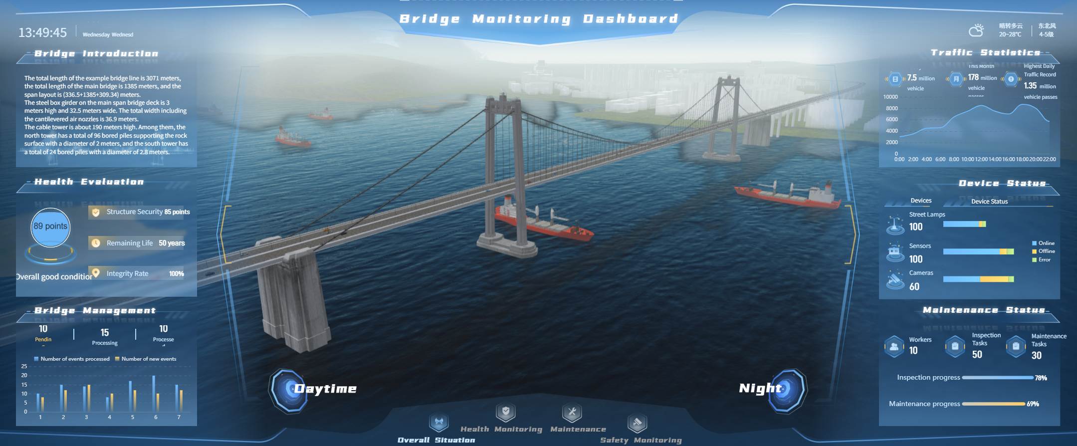
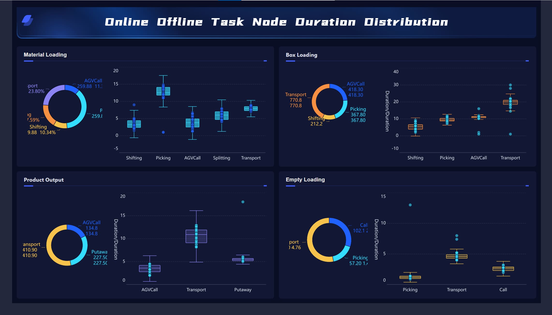
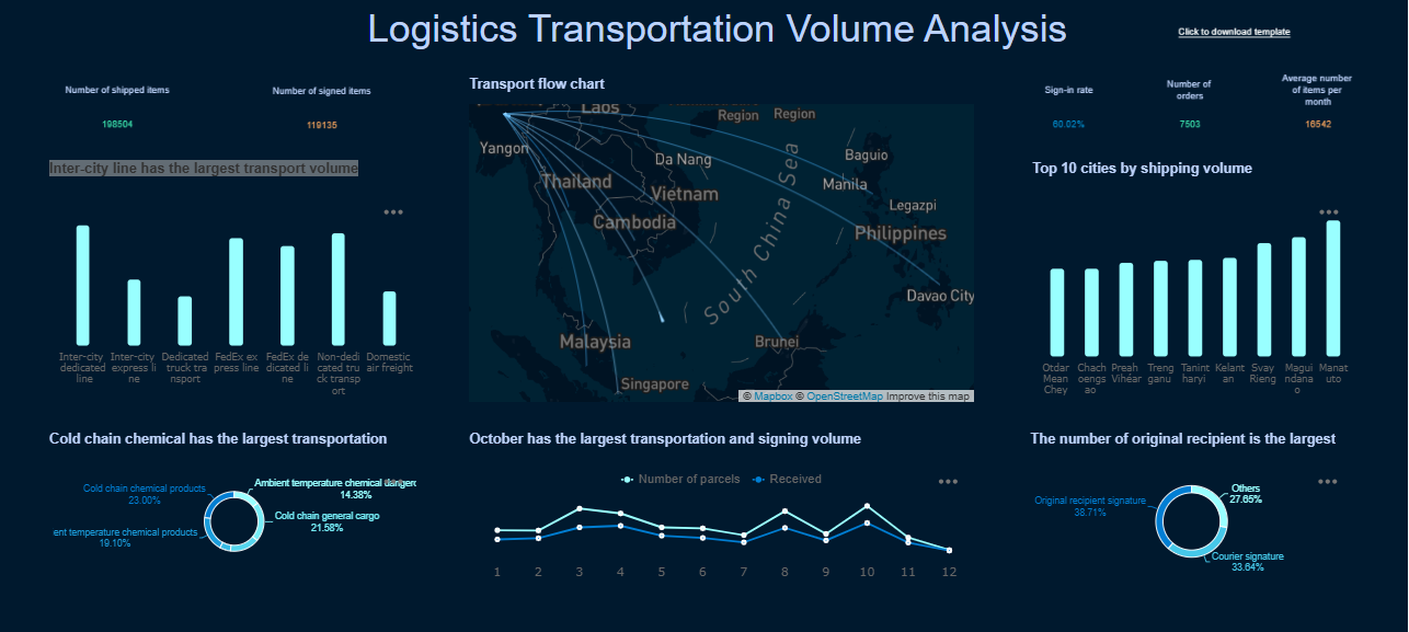
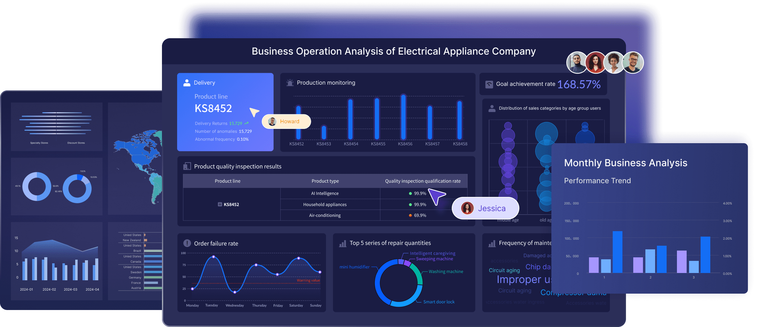
All dashboards in this article are created by FineBI
What an engineering metrics dashboard should help enterprise teams see
A strong engineering metrics dashboard should create a shared view of three things:
Delivery speed: how quickly work moves from idea to production
Software quality: whether releases remain stable and recoverable
Developer efficiency: whether engineers can do focused, effective work with low process friction
That shared view matters because enterprise delivery rarely breaks down from a single cause. Delays often sit between teams, approval layers, review queues, brittle pipelines, and inconsistent workflows. If leaders only look at raw output counts, they miss the system-level issues.
An effective dashboard turns disconnected engineering events into practical signals for:
planning and forecast discussions
release risk management
reliability reviews
tooling investment decisions
continuous improvement programs
It should also avoid the common trap of glorifying busywork. Commits, ticket counts, or PR volume alone do not explain engineering performance. Enterprise teams need context-rich trends that show where work slows, where quality degrades, and where teams are losing time.
Define the business questions before building the engineering metrics dashboard
Before selecting charts or integrations, define what business decisions the dashboard must support. This is where many enterprise reporting efforts fail. They start with available data instead of operational questions.
Align metrics with enterprise goals
Each dashboard section should connect directly to an enterprise priority. For example:
Predictable delivery: lead time, cycle time, throughput, WIP trends
Reliability: change failure rate, incident volume, mean time to restore
Team health: focus time, review delays, survey-backed developer experience indicators
This alignment keeps the engineering metrics dashboard useful at leadership level. It also prevents metrics sprawl, where dozens of charts exist but none answer a meaningful business question.
Separate executive needs from operational needs. Executives want a concise view of risk, trend direction, and cross-portfolio visibility. Managers and team leads need drill-down views that show where a bottleneck sits and what to change next.
Choose the audience for each view
A single dashboard should not try to satisfy every role with the same lens. Different stakeholders need different levels of abstraction.
Common audience layers include:
Engineering executives
Need portfolio-wide trends, delivery risk, quality posture, and investment signals
Directors and engineering managers
Need team-level comparisons, workflow bottlenecks, planning variance, and reliability hotspots
Team leads and platform owners
Need operational detail such as review turnaround, CI delays, WIP overflow, and incident patterns
When one-size-fits-all reporting is forced on the organization, important context disappears. Teams end up debating fairness instead of improving systems.
Set guardrails for responsible measurement
Metrics should support coaching and process improvement, not individual surveillance. This is especially important in enterprise environments where dashboards can quickly become politicized.
Set clear guardrails from the start:
measure systems and workflows before measuring individuals
avoid using proxy metrics as performance ratings
document every metric definition
define inclusions, exclusions, and exception rules
explain what decisions each metric is meant to inform
If teams do not share definitions, they will not trust trends. For example, “lead time” can mean request-to-production, first-commit-to-production, or PR-open-to-deploy depending on the organization. That ambiguity destroys dashboard credibility.
Select the core engineering metrics to track delivery, quality, and efficiency
The best engineering metrics dashboard uses a balanced measurement model. It should capture speed, quality, and workflow health together so leaders do not optimize one dimension at the expense of another.
Delivery metrics
Delivery metrics help enterprise teams understand how smoothly work moves through the system.
Key delivery measures include:
Lead time: total time from work start or request creation to production release
Cycle time: time for active work to move from in-progress to done
Deployment frequency: how often production deployments occur
Throughput: number of completed work items in a given period
Work in progress (WIP): amount of active unfinished work at a point in time
These measures reveal where delivery is slowing. For example:
rising lead time with stable coding time often points to approval or review delays
high WIP usually signals multitasking and weak flow discipline
falling deployment frequency may indicate release friction or environment instability
Quality metrics
Quality metrics ensure delivery speed is not achieved by pushing risk downstream.
Core quality measures include:
Change failure rate: percentage of deployments that cause incidents, rollback, hotfixes, or degraded service
Escaped defects: bugs found after release
Incident volume: number of production incidents over time
Mean time to restore (MTTR): average time to recover service after failure
Test stability: consistency and reliability of automated test results
These metrics should always sit alongside delivery metrics. If speed improves while failure rate and escaped defects rise, the system is not improving. It is just shifting cost to production support and customer experience.
Developer efficiency metrics
Developer efficiency is about how effectively teams can move work through the system, not how much visible activity individuals generate.
Useful developer efficiency measures include:
Focus time: amount of uninterrupted time available for meaningful engineering work
Review turnaround: time between review request and useful reviewer response
Build performance: pipeline duration, queue time, and failure patterns
Tooling friction: recurring delays caused by environment issues, flaky tests, or unstable developer platforms
These metrics are most powerful when paired with team feedback. If build time worsens and developers report reduced focus, the dashboard can support a business case for platform investment or process redesign.
KPI examples for enterprise reporting
To make the engineering metrics dashboard actionable, group measures into a small set of enterprise-friendly KPIs.
Key Metrics (KPIs)
Operational KPIs
Lead Time for Changes: Measures how long it takes for work to move from start to production.
Deployment Frequency: Shows how often teams release code to production.
Mean Time to Restore: Tracks how quickly services recover after production failures.
Work in Progress: Indicates how much work is active at once and whether flow is overloaded.
Strategic KPIs
Change Failure Rate: Measures release stability and operational risk.
Escaped Defect Trend: Shows whether quality problems are reaching customers over time.
Delivery Predictability: Compares planned versus completed work across periods.
Tooling Efficiency: Reflects how much delivery time is lost to CI/CD or developer environment friction.
Improvement KPIs
Review Turnaround Time: Highlights delays in peer review and approval processes.
Build Duration and Queue Time: Reveals pipeline bottlenecks that slow delivery.
Test Stability: Measures flakiness and automation reliability.
Focus Time Health: Indicates whether teams have enough uninterrupted time to complete complex work.
A practical rule for enterprise cadence:
Weekly team reviews: WIP, cycle time, review turnaround, build friction, escaped defects
Monthly leadership updates: lead time, deployment frequency, change failure rate, MTTR, predictability, major bottleneck trends
Design a engineering metrics dashboard that drives action
A dashboard only works if it changes behavior. That means designing for decisions, not for display density.
Comparisons should only be shown when context is truly comparable. A platform team supporting shared services should not be benchmarked the same way as a feature delivery squad with low operational burden.
Use visual design that makes bottlenecks obvious
The best enterprise dashboards are visually disciplined.
Use:
trend lines to show direction over time
control bands to identify normal versus abnormal variation
threshold markers for service or process limits
annotations for meaningful events such as major releases, staffing shifts, tooling migrations, or incident spikes
Avoid cluttered chart collections that force users to interpret too much at once. A few well-structured visuals outperform a wall of colorful but disconnected widgets.
Keep the dashboard trustworthy and easy to maintain
Trust comes from data quality and operational ownership.
Pull data from stable enterprise systems such as:
Git repositories
CI/CD platforms
issue tracking systems
incident management tools
service ownership or platform catalogs where available
Standardize these elements from the start:
refresh cadence
source system hierarchy
metric ownership
exception handling
data-quality checks
naming conventions for teams and workflows
If these foundations are missing, the engineering metrics dashboard becomes a recurring argument instead of a management tool.
Build the engineering metrics dashboard step by step in an enterprise scenario
Here is the practical rollout approach I would recommend in a large organization.
Start with a pilot team and a narrow use case
Do not begin with the entire engineering organization. Start with one business unit, product line, or value stream.
A good pilot has:
moderate delivery volume
clear ownership boundaries
accessible source systems
leaders willing to review data regularly
Use the pilot to validate:
metric definitions
source integration quality
workflow mapping
review rituals
chart usefulness
This is where you learn which metrics look smart on paper but are not decision-useful in practice.
Connect tools and define calculation rules
Once the pilot scope is clear, connect systems and lock metric logic.
Then embed the dashboard into recurring operating routines:
weekly engineering manager reviews
monthly portfolio or leadership reviews
quarterly process improvement retrospectives
The key is to convert findings into actions. If a dashboard repeatedly shows review latency or test instability and nothing changes, users will stop caring.
Common mistakes to avoid and how to improve over time
More charts do not create more insight. Every metric should support a real decision.
Comparing teams unfairly
Different architectures, product maturity, compliance load, and support burden distort comparisons.
Treating proxy metrics as productivity proof
PR count, commit volume, or ticket closure are weak indicators without context.
Ignoring metric definitions
If teams calculate the same KPI differently, trend reviews become meaningless.
Separating speed from quality
Faster delivery with rising incidents is not improvement.
How top development teams evolve their dashboards
Strong teams treat the engineering metrics dashboard as a living operating system.
They improve it by:
retiring charts that no longer influence decisions
adding new measures only when tied to a clear experiment or management need
revisiting thresholds as architecture and release patterns evolve
combining system telemetry with qualitative team feedback
using the dashboard to support learning, not punishment
In modern software organizations, the dashboard should help teams ask better questions:
Where is work slowing down?
Which bottlenecks are structural versus temporary?
Are we trading quality for speed?
Which platform or process changes would free the most engineering capacity?
Build faster with FineBI instead of doing it all manually
Building an enterprise-grade engineering metrics dashboard manually is possible, but it is rarely efficient. You need data pipelines, semantic definitions, role-based views, refresh governance, and ongoing maintenance across multiple engineering systems. That complexity grows quickly as teams, tools, and reporting needs expand.
This is where FineBI becomes the practical choice.
Instead of stitching together custom dashboards from scratch, use FineBI to utilize ready-made templates and automate this entire workflow. FineBI helps enterprise teams unify engineering data, standardize KPI definitions, create role-based dashboard views, and maintain trusted reporting without excessive manual effort.
connect multiple engineering data sources into one reporting layer
build executive, manager, and team-level views from the same trusted model
use ready-made templates to accelerate dashboard deployment
automate refreshes, governance, and recurring reporting workflows
scale from pilot dashboards to enterprise-wide engineering visibility
Utilize ready-made templates and automate this entire workflow with FineBI
For organizations that want delivery, quality, and developer efficiency insights without building and maintaining everything by hand, FineBI is the faster path to a reliable engineering metrics dashboard.
A strong dashboard usually combines delivery, quality, and developer efficiency metrics. Common examples include lead time, cycle time, deployment frequency, change failure rate, mean time to restore, review time, CI delays, and work-in-progress trends.
Start by defining the business decisions the dashboard needs to support, then map those questions to a small set of trusted metrics. After that, connect data from tools like Git, CI/CD, issue tracking, and incident systems, and create role-based views for executives, managers, and team leads.
A healthy dashboard measures systems, workflows, and trends rather than judging individual engineers by raw activity counts. Its purpose is to reveal bottlenecks, reliability risks, and process friction so teams can improve together.
The most useful delivery metrics usually include lead time, cycle time, deployment frequency, throughput, and work-in-progress. These help teams see how fast work moves, where it stalls, and whether delivery is becoming more predictable over time.
Trust breaks down when data comes from disconnected tools, metric definitions are inconsistent, or exclusions are not documented. A dashboard becomes credible when teams agree on definitions, standardize sources, and clearly explain how each metric should be used.
Product Trial
FineReport
Pixel-perfect reports · Interactive dashboards · Easy data entry · Digital twins