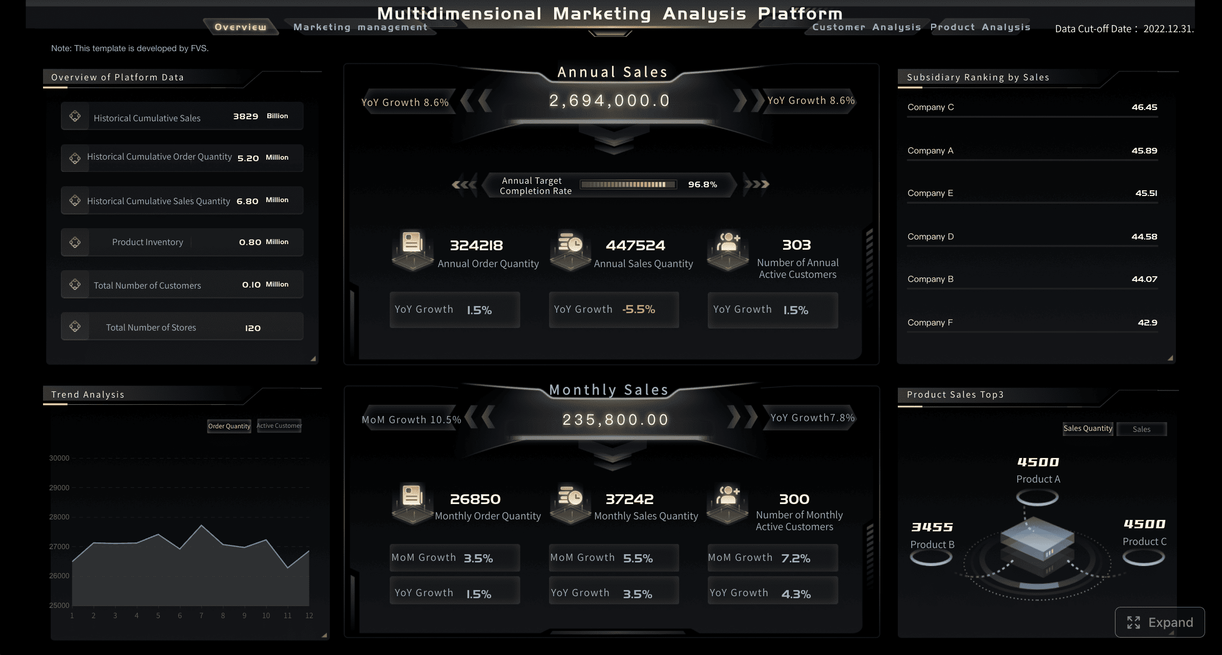
A data analyst dashboard is not just a collection of charts. It is a decision system that turns raw, scattered data into a focused view of business performance so teams can act faster, reduce uncertainty, and improve outcomes. For analysts, operations leaders, sales managers, and executives, the pain is familiar: too many reports, inconsistent metrics, slow answers, and delayed decisions. A well-designed dashboard fixes that by putting the right KPIs in front of the right people at the right time.
The business value is straightforward. A strong dashboard helps teams detect performance shifts early, diagnose issues faster, and align action across departments. Instead of spending hours pulling spreadsheets or debating whose numbers are correct, stakeholders can move directly to decisions.
All dashboards in this article are created by FineBI
Data Analyst Dashboard Fundamentals: What It Is and Why It Matters
In practical terms, a data analyst dashboard is an interactive visual interface that consolidates key business metrics from multiple data sources into one usable workspace. It gives teams a live or regularly refreshed view of performance, trends, and exceptions. The goal is not simply to display data. The goal is to support action.
Unlike static reports, dashboards are built for ongoing monitoring and exploration. A static report shows a snapshot in time and usually answers a predefined question. A dashboard supports continuous use. It helps users check current status, compare periods, filter by segment, and investigate why a KPI moved.
That difference matters in day-to-day operations. Reports are useful for documentation and formal updates. Dashboards are useful when someone needs to know what is happening now, what changed, and what should happen next.
KPI views are the core of that experience. When built correctly, they help teams:
Monitor progress against targets
Spot anomalies and underperformance quickly
Compare results across time periods, segments, or teams
Prioritize corrective action with confidence
Reduce dependency on ad hoc data pulls
How Data Analyst Dashboard Fits into the Role
For a data analyst, dashboards sit at the intersection of data preparation, analysis, and communication. Analysts do not create dashboards just to make data look better. They build them to translate raw data into operational and strategic visibility.
A typical analyst workflow includes:
Collecting and validating data from source systems
Defining KPI logic and business rules
Designing dashboard views around stakeholder decisions
Analyzing trends, outliers, and patterns
Explaining findings in plain business language
This is where many teams struggle. Analysts are often asked to build visually impressive dashboards without clear decision goals. The result is cluttered reporting that looks polished but fails in practice. The best analysts maintain balance: they spend enough time building reliable dashboards, but they also protect time for deeper analysis and stakeholder guidance.
A strong dashboard therefore reflects more than technical skill. It reflects business understanding, KPI discipline, and the ability to make data immediately useful.
Core Types of KPI Dashboards and When to Use Each
Not every dashboard serves the same purpose. The most effective data analyst dashboard strategy separates views by decision type, audience, and time horizon. In enterprise environments, three categories matter most: operational, analytical, and strategic.
Key Metrics (KPIs) Every Dashboard Framework Should Define
Before selecting charts or layouts, define the KPI model. These are the core elements that make dashboards decision-ready:
Primary KPI: The headline metric tied directly to business success, such as revenue, churn rate, or SLA compliance.
Leading Indicator: A metric that signals future performance, such as pipeline coverage, lead volume, or product usage.
Lagging Indicator: A metric that confirms past outcomes, such as closed revenue, completed orders, or monthly retention.
Target or Benchmark: The expected threshold, goal, or industry comparison used to judge performance.
Variance: The gap between actual performance and plan, target, or prior period.
Trend: Direction of movement over time, usually daily, weekly, monthly, or quarterly.
Segment View: KPI breakdown by region, product, channel, team, customer type, or other business dimension.
Exception Metric: A measure designed to reveal risk, delay, defects, or performance outside acceptable limits.
Freshness: The recency of data, which determines whether the dashboard can support real-time or periodic decisions.
Ownership: The accountable team or role responsible for each KPI definition and business response.
When these elements are missing, dashboards create confusion. When they are clear, dashboards become trusted operating tools.
Operational data analyst dashboards for real-time monitoring
Operational dashboards are designed for high-frequency monitoring. They help frontline teams and managers keep daily processes on track. These views often refresh in near real time or several times a day.
Common use cases include:
Monitoring order volume and fulfillment status
Tracking support queue backlogs
Watching service response times
Flagging system or process exceptions
Managing same-day sales or production targets
The KPI design here should emphasize speed and clarity. Users need to know what requires attention right now. That means visible thresholds, alert states, and minimal clutter.
Strong operational dashboards typically include:
Current status KPIs
Hourly or daily trend lines
Threshold-based color coding
Exception tables
Filters for team, region, queue, or shift
Analytical dashboards for deeper investigation
Analytical dashboards help users answer more complex questions. These are not just for checking status. They are for diagnosis, pattern detection, and planning.
Use analytical dashboards when teams need to:
Understand why a KPI changed
Compare segments and performance drivers
Explore conversion drop-offs
Investigate customer behavior
Support budgeting, forecasting, or optimization decisions
These dashboards usually include richer interaction. Filters, drill-downs, cohort views, funnel analysis, and period comparisons are common. The audience often includes analysts, managers, and power users who need context beyond a surface KPI.
The design priority is flexibility without chaos. Users should be able to investigate performance without getting lost in too many options.
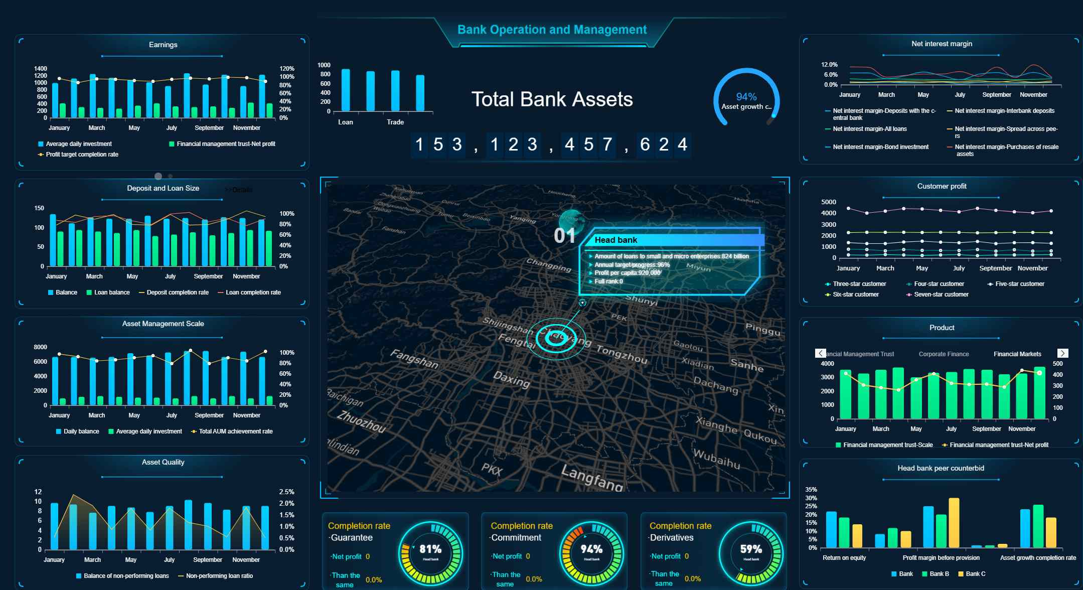
Strategic dashboards for executive decision-making
Strategic dashboards serve leaders who need a concise view of whether the business is moving in the right direction. These dashboards focus on top-level KPIs, goal tracking, and major trend summaries.
They are best used for:
Monthly or quarterly business reviews
Executive leadership meetings
Board-level KPI monitoring
Cross-functional performance management
Goal and initiative tracking
A strategic dashboard should not overwhelm executives with every underlying metric. It should highlight progress against objectives, show risk areas clearly, and offer enough context to trigger the right follow-up questions.
Typical components include:
Revenue and growth summaries
Margin or profitability indicators
Customer retention and acquisition trends
Forecast versus actual performance
Goal progress by business unit or function
Scenario-Based Data Analyst Dashboard Design for Better Business Decisions
The most effective dashboard design starts with business questions, not visual preferences. Too many projects begin with requests like “build me a dashboard with six charts” or “make it look like the executive template.” That approach almost always leads to weak adoption.
A better method is to anchor the dashboard to real operating scenarios. Ask:
What decision must the user make?
What metric tells them whether action is needed?
What comparison gives that metric meaning?
What breakdown helps them identify the source of the issue?
What follow-up action should be obvious from the view?
This is how analysts move from reporting outputs to decision support systems. KPI selection should follow the workflow of the user, not the convenience of available charts.
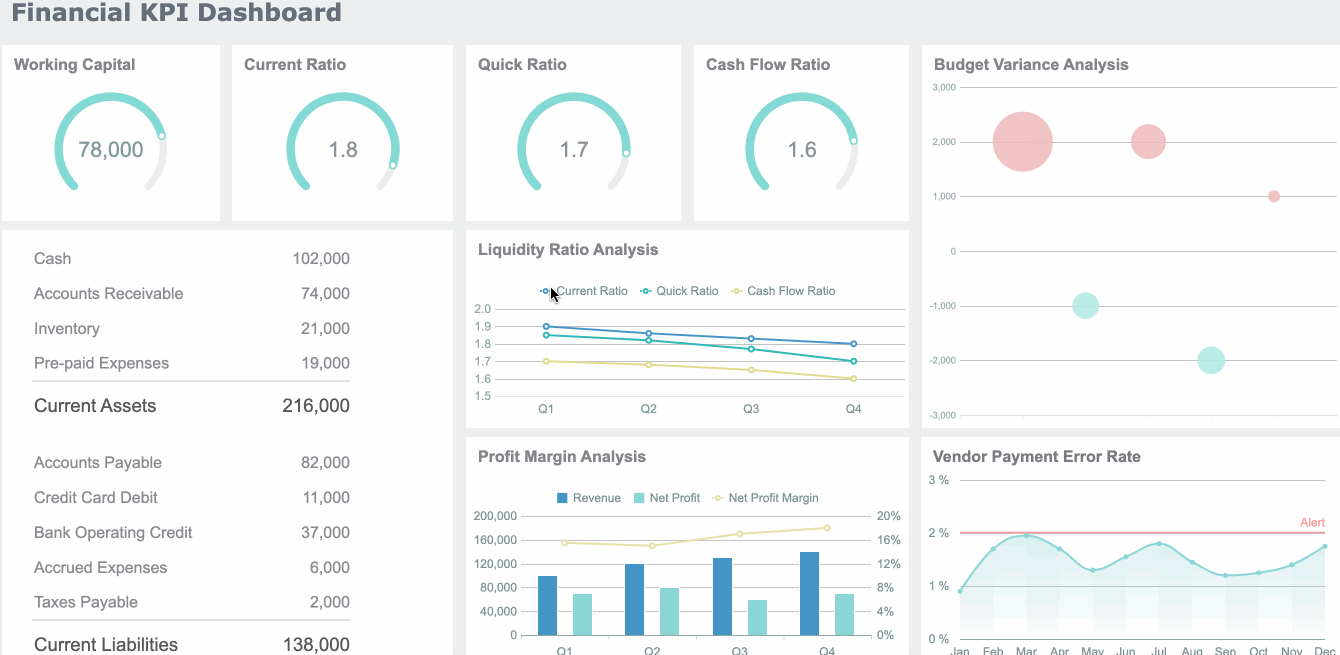
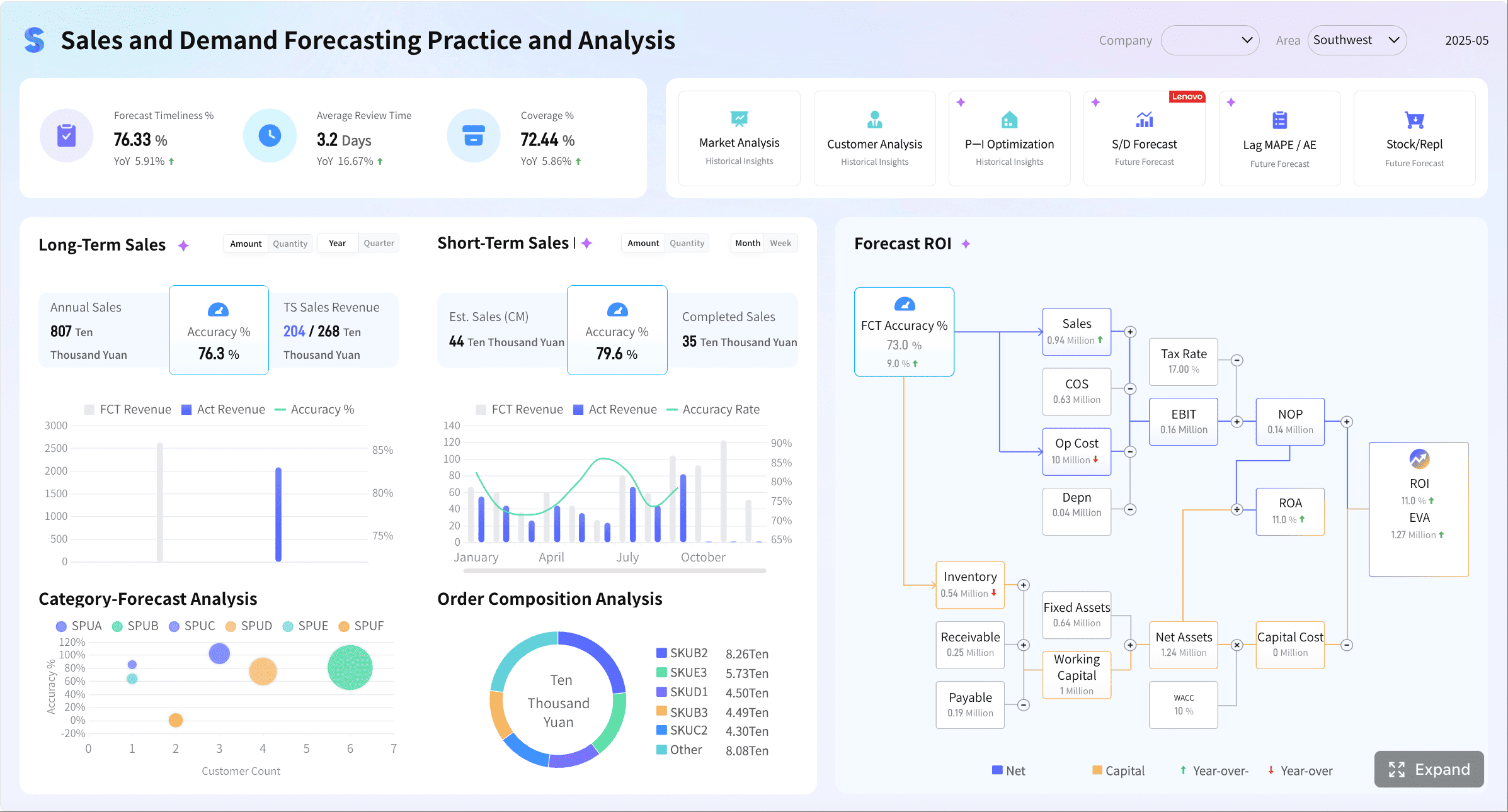
Scenario: Sales performance and pipeline health
A sales dashboard should help leadership and frontline managers answer two questions quickly: are we on pace to hit target, and where is pipeline quality improving or weakening?
Core KPI views should include:
Revenue versus target
Pipeline value by stage
Conversion rate by stage
Average deal size
Win rate
Sales cycle length
Forecast accuracy
These metrics become far more actionable when users can filter by:
Region
Sales channel
Product line
Sales representative
Customer segment
A regional manager may need to identify which territory is missing conversion goals. A sales director may need to compare forecast confidence by rep. A revenue operations analyst may need to detect pipeline inflation in later stages.
The right layout usually starts with top-line revenue, target attainment, and forecast variance, then moves into conversion and pipeline diagnostics. This lets users progress from “what happened” to “why it happened.”
Scenario: Marketing campaign effectiveness
Marketing stakeholders need dashboards that separate activity from impact. High traffic alone is not enough. A useful view must connect campaigns to lead quality, acquisition cost, and return.
Comparisons are critical here. Marketers need to evaluate:
Current period versus prior period
Campaign versus campaign
Channel versus channel
Spend versus pipeline contribution
Creative or audience segment performance
Attribution and trend comparison help budget decisions become more defensible. If paid search drives volume but poor conversion, while email drives lower volume but higher ROI, the budget decision becomes clearer.
A strong dashboard also distinguishes leading indicators from outcome metrics. Clicks and impressions matter, but they should not dominate the view unless they directly support optimization decisions.
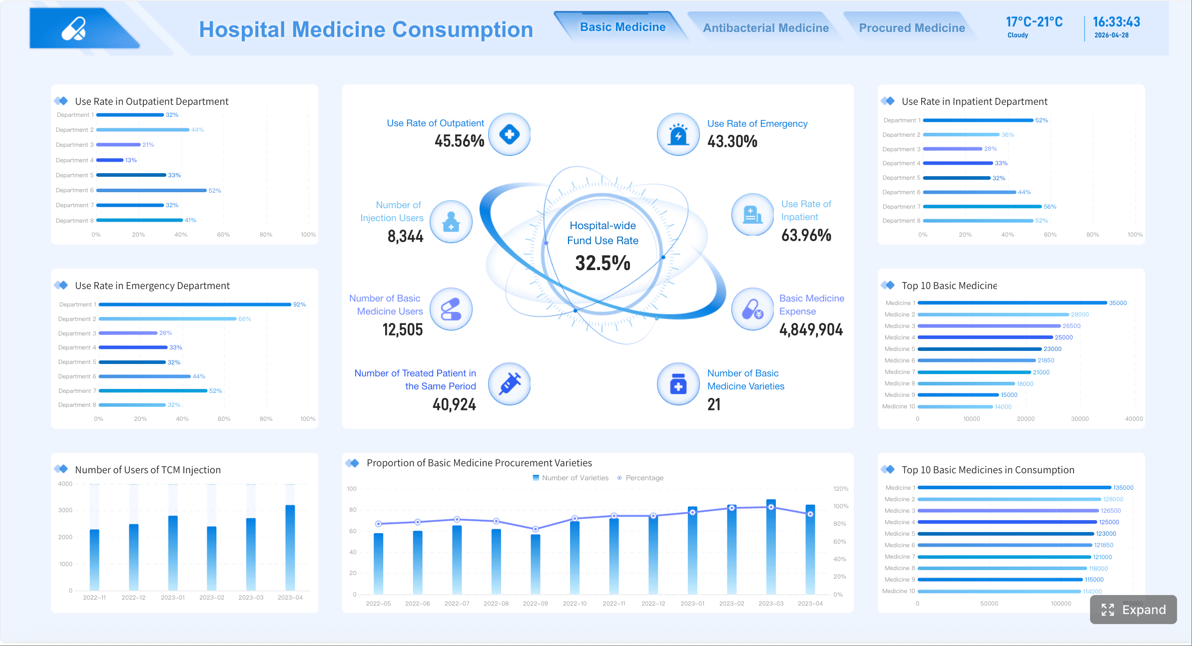
Scenario: Operations and service performance
Operations dashboards exist to prevent small issues from becoming expensive failures. The best designs make service risk visible before it affects customers or internal deadlines.
Core KPI views should include:
Turnaround time
Backlog volume
SLA compliance
First-response time
Throughput
Exception or error rate
Rework rate
To support fast action, dashboards should include status indicators and threshold logic. Teams need immediate clarity on whether performance is normal, at risk, or out of bounds.
Useful design patterns include:
Red-amber-green KPI status
Queue aging views
Daily throughput trends
Exception tables sorted by severity
Drill-down by team, location, or workflow stage
In service operations, speed matters, but trust matters more. If SLA logic changes every month or backlog definitions differ across teams, the dashboard loses credibility. Analysts must standardize these definitions before rollout.
Scenario: Product or customer behavior analysis
For product, customer success, and growth teams, the dashboard must reveal where users engage, where they stall, and where churn risk is building.
Core KPI views should include:
Retention rate
Feature adoption
Active users
Funnel completion
Churn indicators
Expansion opportunity signals
Customer segments by behavior
Cohort and funnel views are especially valuable here. They show where changes occur across time and user groups, rather than flattening everything into averages.
For example:
A retention cohort can reveal whether onboarding changes improved long-term usage
A funnel view can identify where trial users drop before activation
Segment analysis can show whether enterprise and SMB customers behave differently
Feature adoption trends can highlight which product capabilities drive stickiness
This scenario is a strong reminder that dashboards should not only show outcomes. They should expose the behavioral steps that influence those outcomes.
Building Data Analyst Dashboards That People Actually Use
The biggest dashboard failure is not bad design. It is non-use. Many dashboards are technically correct yet ignored because they are overloaded, unclear, or disconnected from decisions.
Usability comes from three priorities:
Clarity: Users understand what each metric means in seconds
Context: Users can tell whether performance is good, bad, or changing
Actionability: Users know what decision or follow-up the dashboard supports
A practical dashboard layout should reflect visual hierarchy. The most important KPIs go first. Supporting trends and comparisons come next. Detailed breakdowns and drill-down tables sit lower or behind interaction layers.
If every element is equally loud, nothing gets attention. Good dashboard design guides the eye and reduces cognitive effort.
Choosing the right metrics, comparisons, and time ranges
The best metrics are the ones tied directly to a decision. That sounds obvious, but many teams still load dashboards with every available number.
A seasoned consultant approach is to select metrics using this sequence:
Define the business outcome
Identify the KPI that measures it
Add the comparison that creates meaning
Add only the breakdowns that support action
Useful comparisons include:
Target versus actual
Current period versus prior period
Current performance versus benchmark
Planned forecast versus achieved result
Segment A versus segment B
Time range selection also matters. A daily operational dashboard should not default to yearly aggregation. A strategic dashboard should not force executives into hourly volatility unless that volatility affects strategic action.
Highlight these elements when relevant:
Trend when direction matters
Variance when performance against target matters
Exceptions when intervention is required
Designing for trust, speed, and self-service exploration
Stakeholders adopt dashboards they trust immediately. That trust is built through consistency, freshness, and simplicity.
Key best practices include:
Standardize KPI definitions
Create one business definition for each metric. Revenue, backlog, active customer, and SLA compliance should mean the same thing everywhere.
Make data freshness visible
Show the last refresh time clearly. Users need to know whether they are looking at live data, daily data, or monthly data.
Keep navigation simple
Limit tabs, avoid hidden logic, and use intuitive filter labels. A user should not need training to find the answer.
Design sensible filters
Use only filters that matter to the decision. Too many filters create friction. Too few remove control.
Support self-service without sacrificing governance
Allow drill-downs and segment exploration, but do it on top of governed datasets and trusted KPI logic.
These are the practices that make dashboards durable in enterprise environments. A visually attractive dashboard may win a demo. A trustworthy one wins adoption.
Common Data Analyst Dashboard Mistakes and How to Avoid Them
Most dashboard problems are predictable. They usually come from weak KPI alignment, not weak tooling.
Common mistakes include:
Metric overload: Too many KPIs on one screen dilute attention and reduce actionability.
Poor KPI alignment: Metrics are present, but they do not support a real decision.
Weak labeling: Ambiguous titles and unexplained acronyms confuse users.
No target or benchmark: Users see a number but cannot judge its significance.
Lack of context: Charts show movement without explaining what changed or why it matters.
Visual clutter: Excessive colors, chart types, or widgets create noise.
Inconsistent definitions: Different teams use different logic for the same KPI.
Overbuilt interactivity: Complex filters and drill paths make dashboards slower and harder to use.
To avoid these issues, pressure-test every chart with one question: what decision does this support? If there is no clear answer, remove or redesign it.
When to use dashboards vs. reporting
Teams often confuse dashboards and reports, then wonder why neither works well.
A modern analytics workflow needs all three. The dashboard shows the current signal. The report explains the story. The ad hoc analysis uncovers deeper answers when the signal changes.
A Practical Workflow for Creating Your Next Data Analyst Dashboard
A strong dashboard is built through process, not improvisation. If you want adoption and business impact, use a structured workflow.
Dashboard planning checklist
Start with planning, not design. Use this checklist before anyone opens a BI tool.
Define the audience
Who will use the dashboard: executives, managers, analysts, frontline teams, or a mix?
Clarify business goals
What outcome are they trying to improve, monitor, or protect?
List the decisions the dashboard must support
What will users actually do differently after seeing it?
Select KPIs intentionally
Choose a focused set of metrics tied to those decisions.
Identify data sources
Confirm where each KPI comes from and whether the data is complete and reliable.
Set refresh cadence
Decide whether the dashboard needs real-time, daily, weekly, or monthly updates.
Assign ownership
Define who owns the dashboard, the data model, and each KPI definition.
Define success criteria
Establish how you will measure dashboard success through adoption, clarity, speed of insight, and business impact.
This checklist prevents the most expensive dashboard mistake: building something no one truly needed.
Iterating after launch
Launch is the beginning, not the finish line. The first version of a dashboard is usually only directionally right. What matters is how quickly the team learns and refines.
After launch, track:
Usage frequency
Most-used filters and views
Stakeholder feedback
Decision outcomes influenced by the dashboard
Repeated questions the dashboard still does not answer
Then improve in small cycles. Often the most valuable changes are simple:
Renaming a confusing KPI
Reordering cards to match user priorities
Removing unused filters
Adding benchmark context
Improving drill-down paths
Reducing load time
These refinements increase trust and relevance. Over time, they turn a dashboard from a reporting artifact into a core operating asset.
From Manual Dashboarding to Scalable Decision Intelligence
Building an enterprise-grade data analyst dashboard manually is complex. You need clean data pipelines, stable KPI definitions, flexible visual design, proper access controls, refresh automation, and enough usability for non-technical stakeholders. Doing that repeatedly across sales, marketing, operations, and product teams becomes expensive and slow.
That is why many organizations move beyond manual dashboard assembly. Building this manually is complex; use FineBI to utilize ready-made templates and automate this entire workflow.FineBI helps teams accelerate dashboard delivery with governed self-service analytics, reusable KPI structures, interactive visualizations, and business-ready templates that reduce development time without sacrificing trust.
For enterprise teams, that matters in three ways:
Faster rollout of decision-ready KPI dashboards
More consistent metrics across departments
Easier self-service exploration for business users
Instead of rebuilding sales dashboards, marketing dashboards, and operational monitoring views from scratch, teams can standardize faster and scale with less friction. Analysts stay focused on analysis and business impact rather than repetitive dashboard rework.
Utilize ready-made templates and automate this entire workflow with FineBI
If your current environment depends on spreadsheet updates, static reports, or fragmented BI requests, this is the moment to modernize. The right dashboard strategy improves decisions. The right platform makes that strategy practical at scale. FineBI is built to do exactly that.
A data analyst dashboard is an interactive view that brings key metrics from multiple data sources into one place. It helps teams monitor performance, spot changes quickly, and make faster decisions.
A dashboard is built for ongoing monitoring, filtering, and quick investigation of KPI changes. A report is usually a static snapshot used to document results or answer a specific question at a point in time.
A useful dashboard should include a primary KPI, supporting leading and lagging indicators, targets or benchmarks, variance, trend, and segment views. It should also show data freshness and KPI ownership so users can trust and act on the numbers.
The main types are operational, analytical, and strategic dashboards. Operational dashboards support real-time monitoring, analytical dashboards help users explore causes and patterns, and strategic dashboards track high-level business goals over time.
Start with the decisions the audience needs to make, then choose only the KPIs that support those actions. Keep the layout focused, define metrics clearly, and make thresholds, trends, and exceptions easy to see.
Product Trial
FineReport
Pixel-perfect reports · Interactive dashboards · Easy data entry · Digital twins
 For enterprise teams, that matters in three ways: