An engineering KPI dashboard should help leaders make better decisions, not just collect more data. If you are an engineering manager, operations director, PMO lead, or CTO, the real challenge is rarely a lack of metrics. The problem is choosing measures that actually guide prioritization, expose risk early, and improve delivery without driving the wrong behavior.
Too many teams build dashboards around what is easiest to count: tickets closed, commits made, hours logged, or story points completed. Those numbers may look busy, but they do not reliably tell you whether engineering is delivering predictable outcomes, maintaining quality, protecting reliability, or supporting business goals.
The right dashboard depends on team type, delivery model, and stakeholder expectations. A product engineering team should not be measured like a platform team. A project-based engineering function needs different visibility than an architecture review group. When all teams are forced into the same dashboard, reporting gets distorted and decision-making gets weaker.
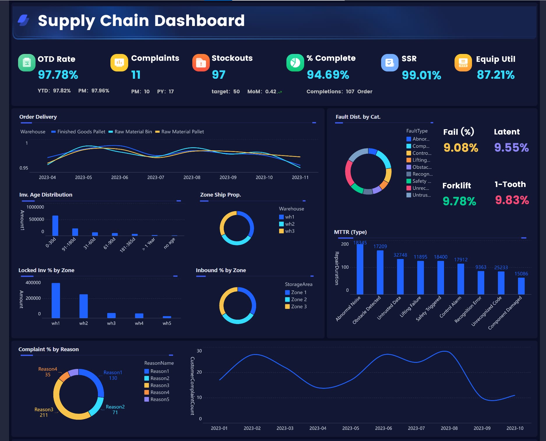
All dashboards in this article are created by FineReport
What an engineering KPI dashboard should help a team do
A good engineering KPI dashboard gives teams a shared operating view. It turns scattered project data, quality signals, and operational performance into a small number of metrics that support action. At its best, it helps leaders answer four questions quickly:
Are we delivering as planned?
Is quality improving or degrading?
Are services and systems reliable?
Is engineering effort creating business value?
That is the business value of an engineering KPI dashboard: faster decisions, earlier intervention, and better alignment between engineering work and enterprise outcomes.
KPIs vs. activity metrics, vanity metrics, and one-off reports
KPIs are measures tied to a defined objective and a recurring decision. They should influence prioritization, resource allocation, escalation, or process improvement.
Activity metrics track work volume, such as tickets created, pull requests opened, or meeting counts. These can support diagnosis, but they are rarely strategic on their own.
Vanity metrics look impressive but lack operational meaning. Examples include raw deployment count without context, total lines of code written, or cumulative task totals that always trend upward.
One-off reports answer a temporary question, such as a postmortem analysis or special audit request. Useful, yes. Core dashboard material, usually no.
A practical rule: if a metric does not have a clear owner, decision, and review cadence, it probably does not belong on your main engineering KPI dashboard.
Why the right dashboard depends on team type, delivery model, and business goals
Metrics only make sense in context. Teams work under different constraints:
Product teams optimize for feature delivery, adoption support, and release quality
Platform teams optimize for reliability, internal service performance, and developer enablement
Project teams optimize for milestones, cost control, and scope management
Architecture and specialized teams optimize for review quality, compliance, and technical alignment
A dashboard should reflect the mission of the team, the risks it manages, and the decisions stakeholders need to make. Otherwise, teams either ignore the dashboard or game the numbers.
How to choose the right metrics for an engineering KPI dashboard by team type
The most effective engineering KPI dashboard starts with operating reality, not a generic template. Choose KPIs by working backward from mission, decisions, and accountability.
Start with the team’s mission, stakeholders, and operating constraints
First define what the team exists to accomplish. Then identify who depends on that team and what constraints shape performance.
Ask:
What is this team accountable for?
Who reviews its performance?
What decisions should this dashboard support?
What risks are most expensive if missed?
Which metrics can be measured consistently from trusted systems?
For example, a platform team serving internal developers may need service-level metrics and internal customer sentiment. A project engineering team may need cost variance, milestone health, and scope change trends.
Match each KPI to a specific decision, owner, and review cadence
Every KPI on the dashboard should answer three governance questions:
Decision: What action does this metric trigger?
Owner: Who is accountable for monitoring and responding?
Cadence: How often should it be reviewed?
This prevents dashboard clutter and makes the reporting system operationally useful.
Balance delivery, quality, reliability, and business impact instead of over-indexing on output
One of the most common mistakes in engineering measurement is overweighting output. High throughput with rising defects, unstable releases, or poor adoption is not high performance. Strong dashboards balance four lenses:
Delivery
Quality
Reliability
Business impact
Key Metrics (KPIs)
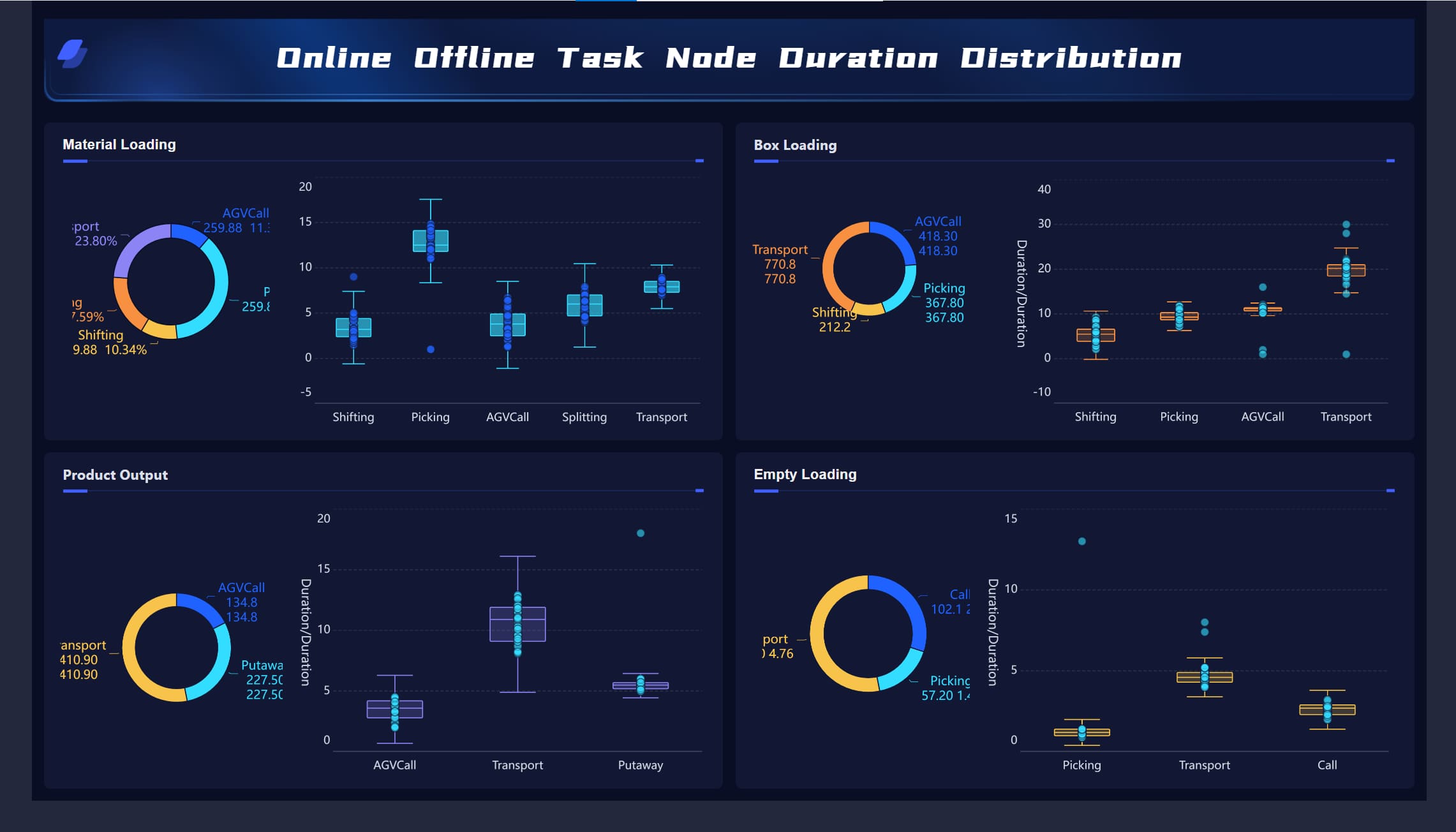
Below is a practical KPI set for a modern engineering KPI dashboard. These are not all required for every team, but they represent the core categories that matter most.
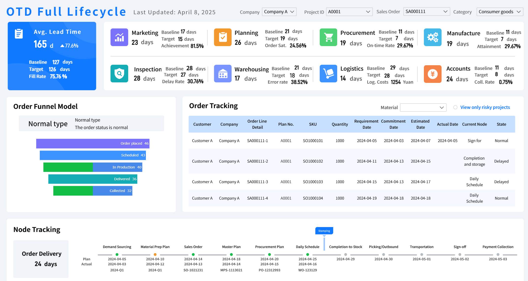
Lead Time: Time from request to delivery. Measures responsiveness and flow efficiency.
Cycle Time: Time from active work start to completion. Shows execution speed.
Throughput: Number of work items completed in a period. Indicates delivery capacity.
Work in Progress (WIP): Number of active items underway. High WIP often signals bottlenecks.
Escaped Defects: Defects found after release. Reflects quality control effectiveness.
Defect Density: Number of defects relative to size or scope. Helps normalize quality trends.
Rework Rate: Share of work spent revising completed output. Indicates avoidable inefficiency.
Test Effectiveness: Ability of testing processes to catch defects before release.
Uptime / Availability: Percentage of time systems remain operational. Core reliability signal.
Mean Time to Recovery (MTTR): Average time to restore service after an incident.
Incident Volume: Number of production incidents in a given period. Tracks stability pressure.
Change Failure Rate: Share of releases or changes causing incidents or rollback.
Schedule Variance: Difference between planned and actual progress against timeline.
Cost Variance: Difference between budgeted and actual spend.
On-Time Completion Rate: Percentage of milestones or deliverables achieved as planned.
Milestone Slippage: Delay against major planned delivery checkpoints.
Capacity: Available team effort for planned work over a period.
Utilization: Extent to which available effort is being used. Must be interpreted carefully.
Review Turnaround Time: Time to complete design, code, or compliance reviews.
Dependency Delay: Time lost waiting on external teams, approvals, or upstream inputs.
Feature Adoption Support: Evidence that delivered functionality is being used successfully.
Retention Support: Engineering contribution to keeping customer experience stable and valuable.
Business Value Delivered: Contribution of engineering output to revenue, efficiency, risk reduction, or strategic outcomes.
Product engineering teams
Product engineering teams should focus on predictable delivery and product quality, while staying linked to user and business outcomes.
Useful KPIs include:
Lead time
Cycle time
Throughput
Escaped defects
Rework rate
Feature adoption support
Dependency delays
Forecast accuracy
This mix helps product and engineering leaders see whether roadmap commitments are realistic and whether delivered features are stable enough to create value.
Platform and infrastructure teams
Platform and infrastructure teams should be measured on reliability, operational resilience, and internal customer enablement.
Useful KPIs include:
Uptime
MTTR
Incident volume
Change failure rate
Service latency or performance trends
Internal customer satisfaction
Review turnaround for platform requests
Dependency resolution time
For these teams, a dashboard overloaded with feature counts misses the point. Reliability and usability of internal services matter more than visible output volume.
Project-based engineering teams
Project-based engineering teams need strong control over time, cost, scope, and risk.
This set helps PMOs and engineering leads spot delivery drift before it becomes a contractual, financial, or client issue.
Architecture, design, and specialized technical teams
Architecture, design assurance, security review, and specialized engineering teams often operate through review cycles, approvals, standards, and advisory outputs.
Useful KPIs include:
Review throughput
Review turnaround time
Compliance adherence
Rework rate
Documentation quality
Stakeholder alignment score
Exception volume
Dependency aging
For these teams, dashboard design should emphasize service responsiveness and quality of technical governance rather than raw production output.
Core KPI categories that actually matter
A trustworthy engineering KPI dashboard should be structured around categories that map to business decisions. This makes the dashboard easier to scan and easier to govern.
Delivery flow metrics
Delivery flow metrics show how work moves through the system.
Common examples:
Lead time
Cycle time
Throughput
Work in progress
Blocker aging
Dependency delays
These metrics reveal whether delivery is predictable and whether bottlenecks are structural or temporary.
Quality metrics
Quality metrics show whether speed is coming at the cost of defects and rework.
Common examples:
Escaped defects
Defect density
Rework rate
Test effectiveness
Code review findings trend
Severity distribution of issues
Quality KPIs are essential because delivery volume without defect control creates hidden cost downstream.
Reliability metrics
Reliability metrics matter for any team supporting production systems, services, or internal platforms.
Common examples:
Uptime
MTTR
Incident volume
Change failure rate
Performance degradation rate
Service response time
These metrics help operations leaders monitor resilience and understand whether engineering changes are improving or destabilizing the environment.
Project performance metrics
Project performance metrics are critical where commitments, budgets, or external timelines must be tightly controlled.
Common examples:
Schedule variance
Cost variance
On-time completion
Milestone slippage
Scope change rate
Risk burndown
These are especially valuable for capital projects, client delivery functions, regulated programs, and engineering PMOs.
Team effectiveness metrics
Team effectiveness metrics help leaders see whether process friction is slowing execution.
Common examples:
Capacity
Utilization
Review turnaround
Dependency delays
Approval latency
Unplanned work ratio
These should be interpreted carefully. They are best used to improve systems, not pressure individuals.
Outcome metrics
Outcome metrics connect engineering work to broader business value.
Common examples:
Customer impact
Feature adoption support
Retention support
Cost savings delivered
Revenue enablement
Risk reduction achieved
This is where many engineering dashboards fall short. Enterprise decision-makers want more than delivery data. They want to understand what engineering progress means for the business.
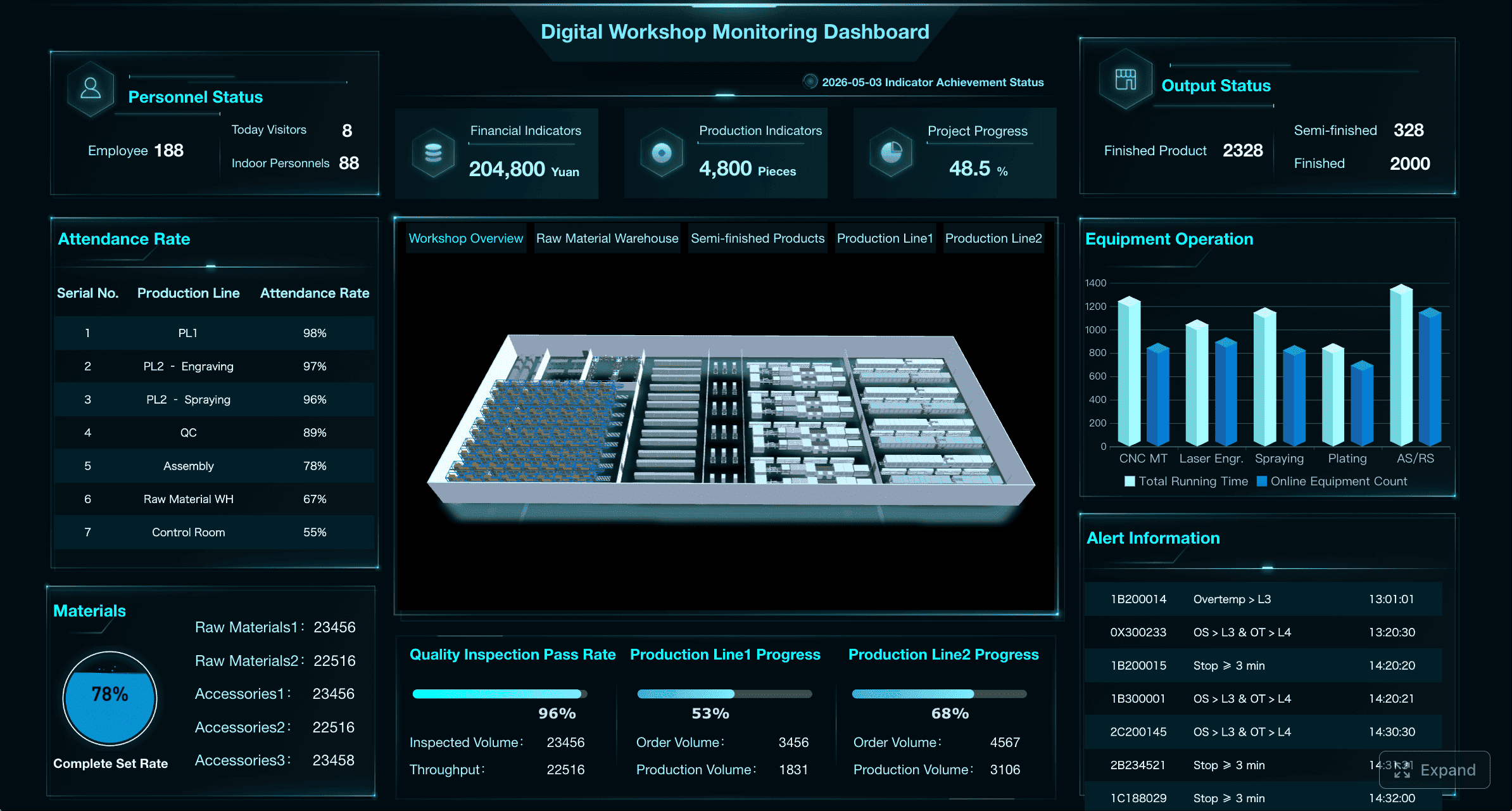
Top engineering KPI dashboard examples and when to use them
Different audiences need different dashboard views. A single engineering KPI dashboard can support multiple roles, but the views should be focused.
Use a focused set of metrics for executive reporting, team reviews, and operational stand-ups
Executives need pattern recognition, forecast confidence, and exception visibility. Delivery managers need execution detail. Team leads need immediate operational signals. Trying to satisfy all three with one crowded view leads to dashboard fatigue.
A better approach is to create role-based views from one governed metric model.
Select KPI examples based on whether the audience needs strategic visibility or day-to-day control
Leadership views should not drown executives in detail. Focus on:
Trend lines over time
Exceptions to plan
Forecast risk
Budget or capacity pressure
Business impact summary
Reliability and quality status at a glance
This supports portfolio steering and investment decisions.
Metrics for delivery and project management reviews
For delivery reviews, the dashboard should answer whether work is on track and what is likely to slip.
Use metrics such as:
Schedule health
Milestone status
Blocker aging
Scope change trend
Resource constraints
Forecast confidence
Dependency delays
This is the control room for project and program leaders.
Metrics for quality and performance monitoring
For quality and performance reviews, focus on operational outcomes and corrective action.
Use metrics such as:
Production issues
Response times
Uptime trends
MTTR
Change failure rate
Defect recurrence
Remediation effectiveness
This helps engineering and operations teams verify that quality interventions are working.
How to build a engineering KPI dashboard template that teams will actually use
A dashboard only works if people trust it, understand it, and use it in recurring reviews. Adoption depends on clarity and relevance.
Define a small set of must-have views: executive summary, delivery health, quality, reliability, and risks
Most teams do not need dozens of tabs. Start with five views:
Executive summary
Delivery health
Quality
Reliability
Risks and constraints
This structure makes the engineering KPI dashboard easier to navigate and keeps discussions focused.
Set thresholds, targets, and red-amber-green rules for each KPI
Metrics without thresholds create ambiguity. Teams need to know what good, acceptable, and risky look like.
For each KPI, define:
Target
Alert threshold
Escalation rule
Interpretation notes
This is especially important for enterprise environments where multiple teams report upward.
Document metric definitions, data sources, and ownership to prevent reporting disputes
Metric governance is not optional. If one team defines lead time from ticket creation and another defines it from development start, comparison becomes meaningless.
This is one of the highest-leverage practices in dashboard design.
Review and refine the dashboard as the team matures or its charter changes
A dashboard should evolve with the team. New delivery models, reorganizations, product shifts, or platform changes may require KPI redesign.
Do not treat the first version as permanent.
Common dashboard design mistakes
The most common design failures are predictable:
Too many KPIs
Inconsistent definitions
Missing context
No trend view
No thresholds
No ownership
No clear action path
If the dashboard does not make the next decision easier, it is too complicated.
A practical dashboard rollout checklist
Use this checklist before launch:
Confirm the audience for each view
Define the decisions each KPI supports
Limit the dashboard to a manageable number of metrics
Validate source data quality and refresh timing
Assign owners for each KPI
Set targets and red-amber-green thresholds
Create review rituals for weekly, monthly, and quarterly use
Collect feedback after the first reporting cycles and refine
How to keep KPI tracking useful over time
The value of an engineering KPI dashboard declines when old metrics remain in place long after they stop influencing decisions. Ongoing governance is what keeps reporting relevant.
Audit metrics regularly to remove measures that no longer drive decisions
At least quarterly, review whether each KPI still matters. Remove or replace metrics that no longer support planning, prioritization, or intervention.
Watch for gaming, local optimization, and unhealthy pressure from single-number targets
Every KPI creates behavioral incentives. If you optimize only for speed, quality may drop. If you optimize only for utilization, teams may hide slack needed for innovation or recovery.
Strong engineering leaders use dashboards to inform discussion, not force simplistic conclusions.
Combine quantitative KPIs with qualitative review notes for better interpretation
Numbers rarely explain themselves. Add short review commentary on:
Major drivers of change
Known data limitations
Risks not yet visible in the metrics
Corrective actions underway
This prevents overreaction and improves executive trust.
Revisit the dashboard after reorganizations, tooling changes, or major shifts in strategy
If team charters change, delivery tooling changes, or company priorities shift, your dashboard should change too. The engineering KPI dashboard must reflect the current operating model, not last year’s org chart.
Build smarter engineering KPI dashboards with FineReport
Designing an engineering KPI dashboard that fits multiple team types is not conceptually hard, but building it manually is complex. You need reliable data integration, consistent KPI definitions, role-based views, threshold logic, trend visualizations, and governed refresh cycles. That becomes difficult fast, especially in enterprise environments with Jira, Git, CI/CD, service monitoring, spreadsheets, and project systems all feeding different versions of the truth.
This is where FineReport becomes the practical solution.
With FineReport, engineering leaders can use ready-made templates and automate this entire workflow. Instead of stitching together fragile reports manually, teams can centralize KPI logic, standardize dashboards across functions, and create tailored views for executives, delivery managers, quality leaders, and operations teams.
FineReport helps you:
Build an engineering KPI dashboard faster with reusable templates
Connect data from multiple engineering and project systems
Standardize KPI definitions across team types
Create executive, operational, and project-level dashboard views
Apply thresholds, alerts, and red-amber-green rules consistently
Refresh reports automatically for recurring review cadences
Scale dashboard governance across large engineering organizations
For enterprise teams, the advantage is not just better visualization. It is better operational control. When the dashboard is trusted, current, and aligned to decisions, leaders can intervene earlier, communicate more clearly, and improve performance without drowning the organization in reporting overhead.
If your goal is to create an engineering KPI dashboard that teams actually use, the path is clear: define the right metrics by team type, govern them tightly, and avoid building the reporting stack from scratch. FineReport is the enabler that turns that framework into a scalable, enterprise-ready dashboard system.
A useful engineering KPI dashboard should focus on a small set of metrics across delivery, quality, reliability, and business impact. The exact mix should match the team’s mission, risks, and stakeholder decisions rather than using one standard template for every team.
Start with what the team is accountable for, who reviews its performance, and which decisions the dashboard needs to support. Then select metrics that are measurable, owned by someone, and reviewed on a clear cadence.
Metrics like lead time, cycle time, escaped defects, change failure rate, uptime, and business outcome measures usually provide stronger insight than raw activity counts. They help leaders see whether work is predictable, high quality, and creating value.
Most teams should keep the main dashboard limited to the few KPIs that directly support recurring decisions. If there are too many metrics, the dashboard becomes harder to read and easier to ignore.
Teams often track what is easiest to count instead of what drives action. That leads to vanity metrics, distorted behavior, and dashboards that look busy but do not improve delivery, quality, or reliability.
Product Trial
FineReport
Pixel-perfect reports · Interactive dashboards · Easy data entry · Digital twins