An effective elementary dashboard gives school leaders one operational view of what matters most: who is showing up, who is reading on grade level, who is struggling, and how quickly the school is responding. For principals, instructional leaders, MTSS teams, and teacher leaders, this is not a reporting luxury. It is a decision tool that helps teams move from scattered spreadsheets to timely action.
In elementary settings, delays are costly. A student with rising absences can become chronically absent before anyone connects the pattern. A student below benchmark in reading can lose months while teams wait for the next meeting cycle. A family may need support, but outreach records sit in separate systems. A strong dashboard solves that by making attendance, literacy, behavior, and intervention response visible in one place.
The goal is simple: build an elementary dashboard that helps adults act earlier, prioritize better, and monitor whether support is working.
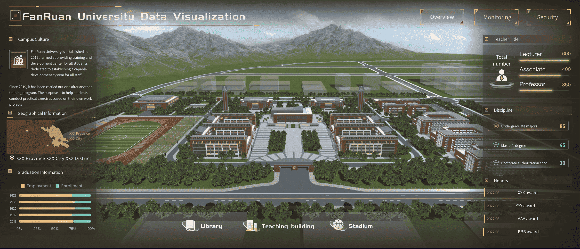
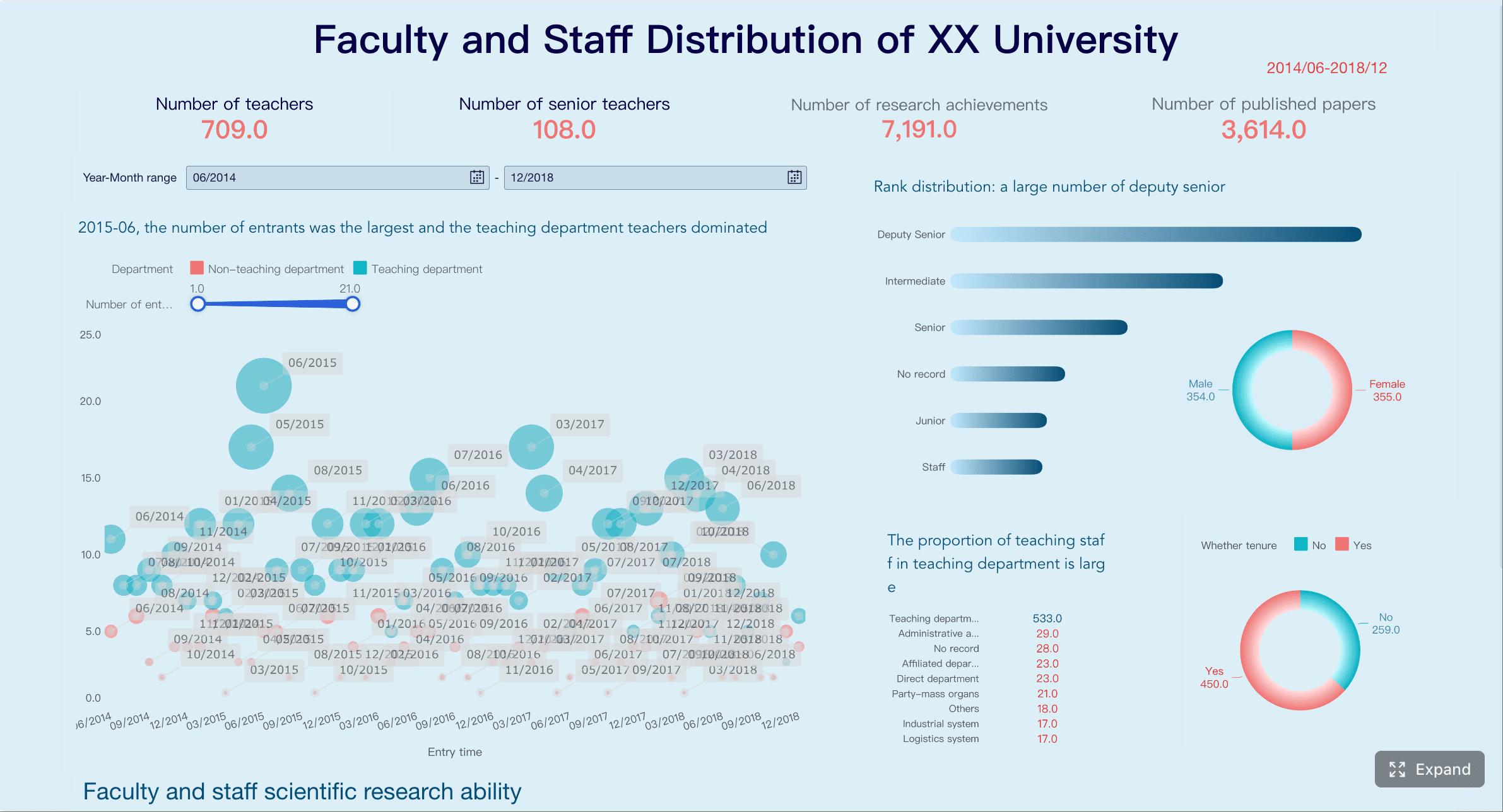
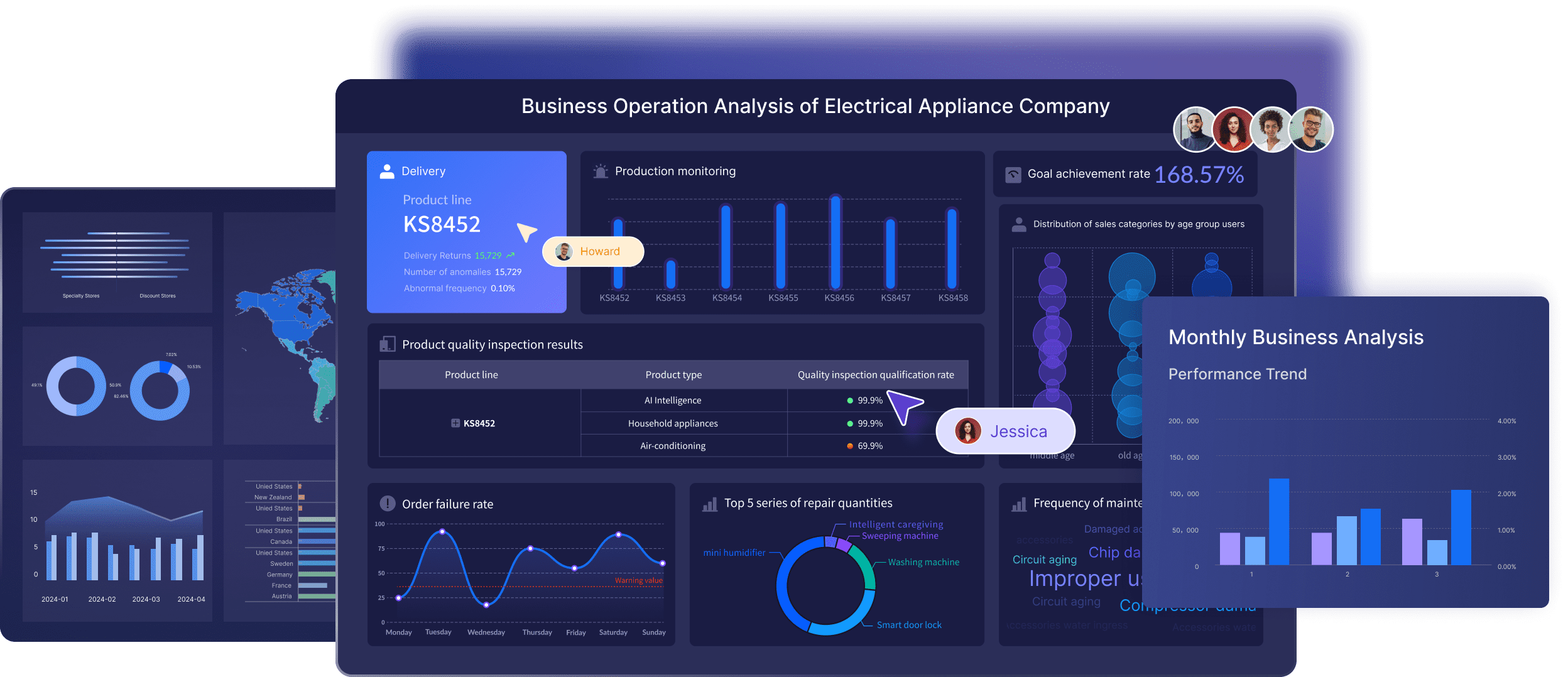
All dashboards in this article are created by FineBI
What an elementary dashboard is and why it matters
In practical K-12 terms, an elementary dashboard is a single interactive view that combines a small set of high-priority student success indicators for grades K-5. It is not just a data display. It is a working management tool that helps school teams answer three questions fast:
Which students need attention now?
Which trends are improving or worsening?
What action should happen next?
At the elementary level, the highest-value dashboard connects academic and nonacademic signals. Attendance affects literacy growth. Behavior affects instructional access. Family communication affects intervention follow-through. When these data points sit in separate tools, leaders miss the full student story. When they sit together, patterns become obvious.
For example, a second grader below reading benchmark may also have increasing tardies and missed intervention sessions. If your dashboard only shows reading scores, the response may focus on instruction alone. If your dashboard connects attendance and intervention participation, the team can address the root cause sooner.
The main users of an elementary dashboard usually include:
Principals who need a schoolwide view of performance and risk
Instructional leaders who monitor classroom and grade-level trends
MTSS teams who coordinate identification, intervention, and progress review
Teacher leaders who support data conversations and action planning
A well-built dashboard reduces meeting prep time, improves consistency across teams, and creates shared definitions for what “urgent” means.
Key Metrics (KPIs) every elementary dashboard should support
Before building visuals, define the core elements clearly. These KPIs should be visible, easy to interpret, and tied to a specific decision.
Daily Attendance Rate: The percentage of students present each day; used to spot immediate attendance dips.
Chronic Absenteeism Rate: The percentage of students missing a significant share of school days; used to identify long-term attendance risk.
Early Literacy Benchmark Status: The share of students at, above, or below reading benchmark; used to target literacy support.
Literacy Growth Rate: Student or group progress between screening windows; used to evaluate instructional effectiveness over time.
Intervention Time to Action: Days between identification and support assignment; used to measure response speed.
Intervention Progress Monitoring: Evidence of whether students receiving support are improving; used to judge intervention effectiveness.
Behavior and Engagement Signals: Referrals, classroom incidents, or other engagement indicators; used to understand barriers to learning.
Missed Instructional Time: Minutes or periods lost due to absence, behavior, or pull-outs; used to assess access to core instruction.
Family Outreach Completion Rate: The percentage of outreach attempts, conferences, or referrals completed; used to monitor support follow-through.
Equity Gap Indicators: Differences in outcomes by subgroup, classroom, or grade; used to check whether support is reaching all students fairly.
Data Freshness: The age of the latest refresh for each metric; used to maintain trust in the dashboard.
Metric Ownership: The team or role responsible for data quality and review; used to ensure accountability.
How to build an elementary dashboard around 7 must-have metrics
The most useful dashboard is not the one with the most charts. It is the one that supports the few recurring decisions leaders actually make every week and month. Start with seven must-have metrics that connect student participation, learning, response, and equity.
Attendance and chronic absenteeism
Attendance is the front-door indicator. If students are not consistently present, every other improvement strategy becomes harder to execute. Your elementary dashboard should show:
Daily attendance rate by school, grade, and classroom
Chronic absenteeism rate over time
Students nearing chronic absence thresholds
Patterns by subgroup, transportation, or homeroom where relevant
The operational value is early warning. Leaders should not wait until monthly attendance reports to identify risk. A dashboard should make it easy to flag students with emerging patterns such as repeated Mondays absent, frequent tardiness, or grade-level spikes.
It is also critical to separate schoolwide averages from student-level risk. A school can have acceptable average attendance while still having a cluster of students with serious absence patterns.
Early literacy growth and proficiency
In elementary schools, reading performance is one of the clearest predictors of later academic success. Your dashboard should surface both status and growth, because proficiency alone does not tell the whole story.
Track:
Universal screening results
Percent of students at or above benchmark
Percent below benchmark by grade
Growth between benchmark windows
Classroom, grade-level, and schoolwide comparisons
A strong dashboard lets leaders distinguish between two different scenarios: a grade with many students below benchmark but strong growth, and a grade with flat growth despite intervention. Those require different responses. One may need time and continued support. The other may need instructional adjustment, coaching, or scheduling changes.
Intervention response and time to action
Many schools identify student needs reasonably well but respond too slowly. That gap is where students lose momentum. This part of the elementary dashboard should answer:
How quickly are students identified after risk appears?
How many days pass before support is assigned?
Are progress checks happening on time?
Are interventions producing measurable gains?
The most overlooked metric here is time to action. If a student is flagged in screening data but waits weeks for support, the dashboard should expose that delay. MTSS teams need visibility into both student outcomes and process efficiency.
Useful fields include:
Date of concern identification
Date intervention started
Intervention type and tier
Review date
Progress monitoring trend
Intervention outcome status
Behavior, engagement, and instructional access
Behavior data is often underused because it gets treated as a discipline report instead of a learning access indicator. In an elementary dashboard, behavior should help leaders understand whether students are losing access to instruction.
Include:
Office discipline referrals
Classroom-managed incidents where available
Engagement signals such as participation concerns or repeated task avoidance
Missed instructional time linked to behavior or removal
The most valuable use case is pattern detection. If a student has minor but repeated classroom issues, growing absenteeism, and falling reading growth, the dashboard should help teams connect those dots. Schools should also watch grade-level and classroom patterns to identify where supports, routines, or staff coaching may be needed.
Family communication and support follow-through
Schools often assume outreach has happened because someone made contact once. In practice, student support slows down when communication is inconsistent, undocumented, or disconnected from intervention plans.
A practical dashboard should track:
Outreach attempts
Successful contacts
Conference participation
Family support referrals
Service follow-through where appropriate
This metric area matters because many elementary interventions depend on home-school coordination. If a student is missing school, not completing take-home literacy practice, or not accessing referred services, leaders need to know where breakdowns are happening.
Good dashboard design here focuses on process completion, not just activity volume. Ten attempted contacts are less useful than knowing whether the right family conference occurred and whether next steps were completed.
Equity checks across grades and student groups
Every elementary dashboard needs an equity lens. Without subgroup and classroom views, school averages can hide persistent gaps. Equity checks should be built into the main dashboard, not buried in a separate tab no one uses.
Review outcomes by:
Student subgroup
Grade level
Classroom
Program participation
Time period
The goal is not just compliance reporting. It is operational problem-solving. If one subgroup has higher chronic absence, lower reading growth, and slower intervention assignment, leaders need to address whether access, communication, staffing, or process design is contributing to that pattern.
Trend lines are especially important. Static gaps matter, but movement over time tells you whether current supports are working.
Data freshness, ownership, and meeting cadence
A dashboard becomes useless the moment teams stop trusting the numbers. That usually happens for one of three reasons: the data is stale, definitions are unclear, or no one owns the updates.
This is what keeps the dashboard actionable rather than turning it into a static report. Attendance may refresh daily. Reading benchmark data may update after screening windows or progress-monitoring cycles. Family outreach data may need weekly verification. Not every metric needs real-time updates, but every metric needs a predictable refresh rhythm.
How leaders should use dashboard data in weekly and monthly routines
A dashboard only creates value when it changes routines. The most successful schools tie the elementary dashboard to specific meeting structures and decision points.
Weekly student support reviews
Weekly reviews should be short, focused, and action-driven. Do not try to solve every issue in one meeting. Use the dashboard to identify the few students or signals that require immediate attention this week.
A seasoned approach looks like this:
Start with exception lists
Review students newly flagged for attendance decline, reading risk, behavior incidents, or delayed intervention action.
Validate urgency
Confirm whether the pattern is new, ongoing, or data noise. This prevents teams from overreacting to one-off events.
Assign next actions
Decide who will contact the family, adjust intervention, review classroom support, or escalate to the MTSS team.
Set deadlines
Every action should have an owner and a due date before the meeting ends.
Check prior commitments
Use the dashboard to confirm whether last week’s actions happened and whether they changed the student’s trajectory.
This weekly rhythm works best when the dashboard foregrounds the most actionable indicators instead of overwhelming teams with every possible metric.
Monthly leadership and school improvement check-ins
Monthly reviews should move up from individual students to system performance. This is where principals and leadership teams use dashboard trends to guide resourcing and improvement planning.
Focus on:
Schoolwide attendance patterns
Grade-level literacy performance
Subgroup differences
Intervention effectiveness
Family support completion rates
Data quality and process bottlenecks
This is also the right time to make bigger operational decisions. If third grade reading growth is flat, leaders may adjust schedules or coaching support. If one grade has high missed instructional time, classroom systems may need attention. If intervention assignment is delayed across the board, the issue may be workflow design rather than student need.
Common mistakes that make dashboards harder to use
Many elementary dashboard projects fail for predictable reasons. The data may be technically accurate but operationally weak.
The most common mistakes include:
Adding too many metrics without clear decisions attached
If a chart does not support a real meeting question, it does not belong in version one.
Showing data without definitions, benchmarks, or next steps
Teams need to know what the metric means, what counts as concern, and what action should follow.
Updating inconsistently so teams lose trust in the information
Once users suspect the dashboard is stale, they go back to side spreadsheets and anecdotal decision-making.
Designing for compliance instead of practical school action
A compliance dashboard documents. An action dashboard helps leaders intervene, allocate support, and monitor results.
A useful rule: every metric should answer one of three things—who needs support, where performance is shifting, or whether the response is working.
Choosing tools, examples, and the best next step for your school
Schools do not need to invent dashboard design from scratch. Good ideas can come from accountability dashboards, school profiles, and internal student support trackers. The key is to adapt thoughtfully for elementary priorities.
What to borrow from public and internal dashboard examples
Public dashboards often do a good job with layout clarity, trend comparisons, and subgroup filters. Internal dashboards often do a better job with student-level workflow. The best elementary dashboard combines both.
Borrow these design patterns:
Clear summary KPIs at the top
Filters for grade, classroom, subgroup, and date range
Trend lines rather than one-time snapshots
Student drill-down for action planning
Definitions and thresholds built into the interface
Avoid copying metrics just because they appear in state accountability systems. Elementary schools need a sharper focus on early warning indicators, literacy development, intervention speed, and support follow-through.
A simple starting plan for your first version
If your school is building its first elementary dashboard, keep the scope tight. Start with one audience, seven metrics, and one recurring meeting routine.
A practical rollout plan:
Choose the primary user group
Start with principals and MTSS leaders rather than trying to serve every stakeholder at once.
Define the seven must-have metrics
Lock definitions, thresholds, owners, and refresh schedules before designing visuals.
Build for one meeting use case first
Weekly student support review is often the highest-value starting point.
Pilot with a small team
Gather feedback on clarity, speed, and actionability.
Refine before scaling
Add filters, views, or user groups only after the first version proves useful.
Building this manually is complex; use FineBI to utilize ready-made templates and automate this entire workflow. Instead of stitching together spreadsheets, exports, and static reports, school teams can use FineBI to centralize attendance, literacy, intervention, behavior, and outreach data into one structured elementary dashboard. That means faster deployment, better visual consistency, easier drill-downs, and more reliable refresh cycles.
For schools that want a dashboard people will actually use, the best next step is not adding more data. It is designing a cleaner operating system for school decisions. FineBI helps make that possible with scalable dashboard templates, automated reporting flows, and interactive views that support both weekly intervention meetings and monthly leadership reviews.
An effective elementary dashboard should combine a small set of high-priority metrics such as daily attendance, chronic absenteeism, literacy benchmark status, literacy growth, intervention response time, behavior signals, and family outreach. The goal is to give school teams one clear view for faster decisions.
Chronic absenteeism shows long-term attendance risk that daily attendance alone can miss. Including it helps leaders identify students who need support before missed school starts affecting literacy and overall progress.
It helps MTSS teams quickly see which students need help, how long it takes to start support, and whether interventions are working. This makes meetings more action-oriented and reduces delays between identification and response.
Attendance and behavior data should be updated as close to real time as possible, while assessment and intervention data should refresh on a predictable schedule. Showing data freshness on the dashboard helps users trust what they are seeing.
Start with the recurring decisions school leaders make each week and choose only the metrics that directly support those actions. A focused dashboard is easier to read, faster to use, and more likely to drive timely follow-up.
Product Trial
FineReport
Pixel-perfect reports · Interactive dashboards · Easy data entry · Digital twins
 For schools that want a dashboard people will actually use, the best next step is not adding more data. It is designing a cleaner operating system for school decisions.


