A customer health dashboard is not just a reporting layer. For enterprise customer success teams, it is the operating system for retention, expansion, and renewal predictability. If your CSMs are chasing account updates across CRM records, product analytics, support queues, and spreadsheets, they are reacting too late. A strong dashboard turns fragmented signals into a clear view of account risk, growth potential, and next actions.
For customer success leaders, operations directors, and RevOps teams, the business value is straightforward: better prioritization, earlier risk detection, more accurate forecasting, and more consistent account management across complex enterprise portfolios.
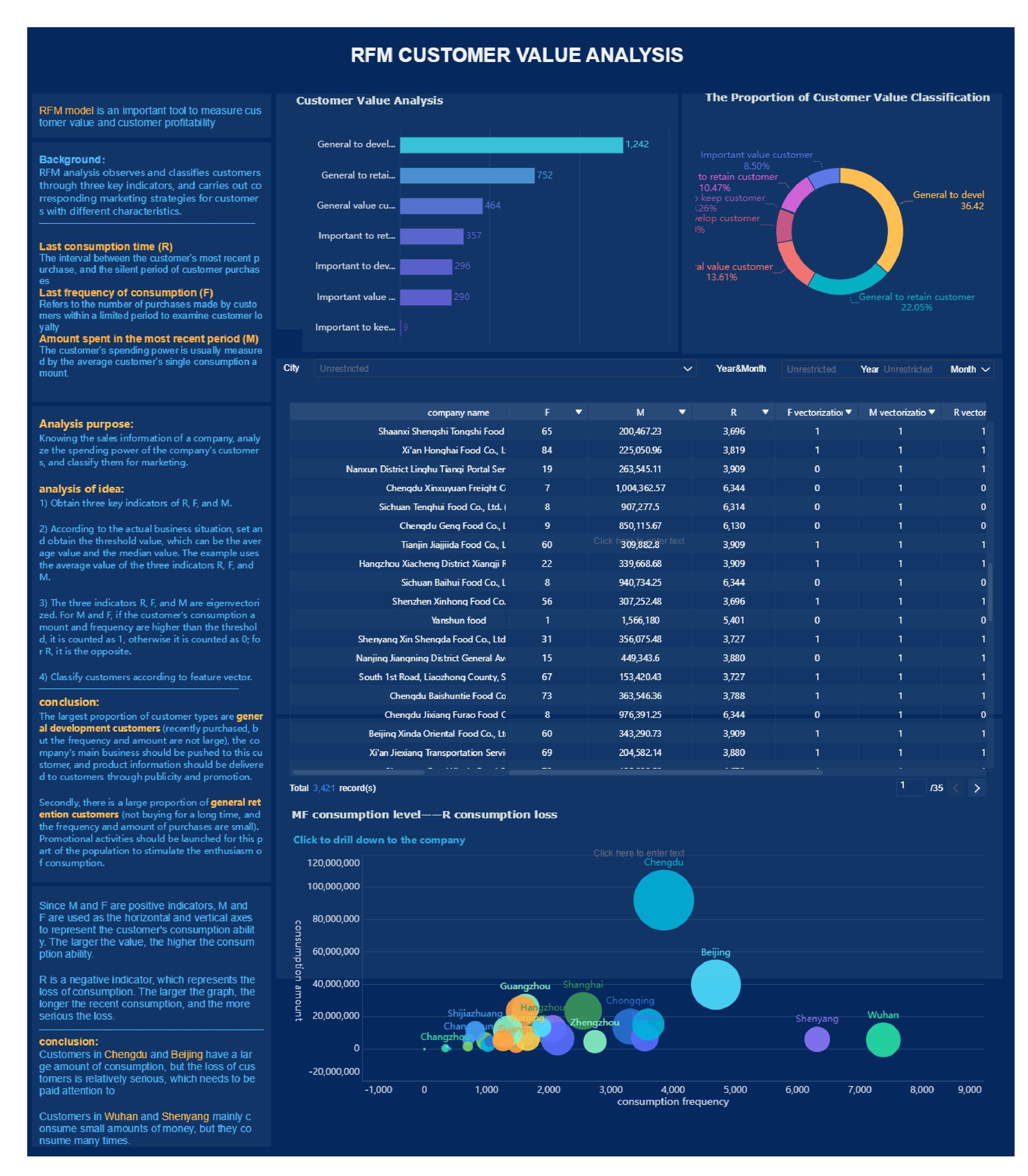
All dashboards in this article are created by FineBI
1. Define the goal of your customer health dashboard
Before you choose metrics or build charts, decide what business decision the dashboard must support. This is where many enterprise teams go wrong: they start with available data instead of operational intent.
A customer health dashboard should answer questions like:
Which enterprise accounts are at risk in the next 30, 60, or 90 days?
Which customers are positioned for expansion?
Which renewals need executive attention now?
Which accounts need intervention because adoption is stalling?
If the dashboard cannot help a team make those decisions faster, it is just another report.
Clarify what decisions the dashboard should support for enterprise customer success teams
Start by identifying the primary use case. In enterprise customer success, dashboards usually serve one or more of these purposes:
Risk detection: Spot churn signals before they surface in renewal conversations.
Growth identification: Highlight adoption patterns and stakeholder engagement linked to upsell potential.
Renewal forecasting: Improve forecast confidence by combining commercial, product, and relationship signals.
Portfolio prioritization: Help managers and CSMs focus on the right accounts first.
Define the dashboard in business terms, not technical ones. For example: “We need to reduce avoidable churn in strategic accounts by identifying declining adoption 90 days before renewal.”
Separate executive visibility needs from frontline CSM workflows
Executives and frontline teams do not need the same view.
Executive dashboards should focus on:
Portfolio-wide health trends
Renewal risk concentration
Segment-level performance
Coverage by account tier, region, or industry
CSM dashboards should focus on:
Account-level health changes
Drivers behind score movement
Open risks and support issues
Owners, tasks, and next steps
Trying to force both audiences into one interface often creates clutter and confusion. Build for role-specific action.
Decide whether the dashboard is focused on risk detection, growth opportunities, renewal forecasting, or a mix of all three
You can support multiple goals, but one goal must dominate the design. If your team is under pressure to improve gross retention, build around risk and renewal visibility first. If net revenue retention is the priority, bring expansion indicators forward.
A practical approach is to rank your priorities:
Primary outcome
Secondary outcome
Supporting outcome
That ranking will shape what appears at the top of the customer health dashboard and what remains in drill-down detail.
2. Choose the signals that reflect real account health
A trustworthy customer health dashboard depends on meaningful signals. Enterprise accounts are complex. One team may be highly active while another is disengaged. One sponsor may be enthusiastic while procurement is signaling budget pressure. You need a balanced signal set that reflects both usage reality and commercial reality.
Product usage and adoption
Product usage is often the strongest indicator of realized value, but only if you measure the right behaviors.
Focus on behaviors that show:
Initial activation
Ongoing engagement
Breadth of adoption across teams
Depth of feature usage
Consistency over time
Examples of useful enterprise adoption indicators include:
Weekly active users by account
License utilization rate
Feature adoption across strategic workflows
Team-level usage penetration
Time since last meaningful activity
Trend in usage over the last 30, 60, or 90 days
Avoid vanity metrics such as raw login counts without context. A high number of logins does not necessarily mean the customer is getting value. In enterprise environments, meaningful engagement is tied to workflow adoption, user distribution, and repeated outcomes.
Key Metrics (KPIs)
Weekly Active Users (WAU): Number of active users engaging with the product in a typical week.
License Utilization Rate: Percentage of purchased seats actively used.
Feature Adoption Rate: Share of target users using strategic product capabilities.
Usage Trend: Direction and rate of usage change over time.
Breadth of Adoption: Number of departments, teams, or business units actively using the platform.
Depth of Usage: Extent to which advanced or high-value workflows are being used.
Commercial and relationship signals
Enterprise customer health is never just a product story. Commercial risk and relationship strength matter just as much.
Your customer health dashboard should include:
Renewal date and contract stage
Expansion potential
Product mix and contract structure
Open opportunities
Payment or billing issues
Support case volume and severity
Stakeholder engagement frequency
Executive sponsor presence
QBR completion or strategic review cadence
These signals help teams interpret usage in context. A temporary decline in activity may be manageable if the customer has strong executive sponsorship and an active transformation roadmap. The same decline is more serious when the key champion has left and the renewal is 75 days away.
Key Metrics (KPIs)
Days to Renewal: Remaining time before contract renewal or review.
Expansion Potential: Estimated opportunity based on adoption, whitespace, and account strategy.
Support Ticket Volume: Number of cases raised in a defined period.
Support Severity Mix: Share of high-priority or SLA-breaching support incidents.
Stakeholder Engagement Rate: Frequency and quality of interactions with key contacts.
Executive Sponsorship Coverage: Presence of active senior-level relationships on both sides.
Leading indicators and early warning signs
The most valuable customer health dashboard identifies change early, before churn risk becomes obvious.
Strong early warning indicators include:
Declining usage from core user groups
Reduced engagement from champions
Increased support backlog
Slower onboarding milestones
Drop in meeting attendance
Stakeholder turnover
Negative survey sentiment
Repeated executive escalations
Enterprise teams should pay special attention to trend-based metrics. Static snapshots miss deterioration. A customer with decent current usage but a sharp 8-week decline is often riskier than one with lower but stable usage.
Key Metrics (KPIs)
Usage Decline Rate: Percentage drop in usage over a defined period.
Support Resolution Aging: Average time unresolved issues remain open.
Champion Risk Indicator: Signal tied to reduced engagement or stakeholder change.
Milestone Slippage: Delay against onboarding, rollout, or adoption plan milestones.
Sentiment Shift: Change in survey, call note, or interaction sentiment over time.
Health Score Movement: Direction and magnitude of score change, not just current score.
3. Build a customer health score that teams can trust
A customer health dashboard becomes much more actionable when it includes a clear health score. But if the score feels arbitrary, teams will ignore it. Trust comes from transparency, consistency, and validation against real outcomes.
Create a transparent scoring model
Your scoring model should show exactly how the score is built. That means:
Which signals are included
How each metric is calculated
What threshold counts as healthy, neutral, or at-risk
How much weight each factor carries
Which exceptions or overrides apply
A practical model may include weighted categories such as:
Product adoption: 35%
Relationship strength: 25%
Support and service: 15%
Commercial indicators: 25%
Those weights should vary by business model and lifecycle stage. For example, onboarding-stage accounts may place more weight on implementation milestones, while mature enterprise accounts may rely more heavily on adoption breadth and renewal factors.
The rule is simple: if a CSM cannot explain why an account scored 58 instead of 78, the model is too opaque.
Balance account-level and segment-level views
Enterprise portfolios are not uniform. A global customer with a phased rollout behaves differently from a smaller single-team account. Your customer health dashboard must support both account-level review and segment-level comparison.
Useful segment views include:
By ARR tier
By region
By industry
By product line
By lifecycle stage
By deployment maturity
This helps leadership spot patterns and prevents false comparisons. A one-size-fits-all score often creates noise because “healthy” behavior differs across account types.
For example:
A newly launched enterprise deployment may have low seat utilization but still be healthy if rollout milestones are on track.
A mature strategic account should show stable adoption across business units and stronger executive engagement.
Validate the score against real outcomes
Validation separates useful scoring from guesswork. Test the score against historical outcomes such as:
Renewals
Churn events
Expansions
Escalations
Support crises
Customer satisfaction drops
Ask practical questions:
Did low-score accounts churn more often?
Did high-score accounts expand more often?
Did score drops occur before escalations?
Are thresholds too sensitive or not sensitive enough?
Do not treat version one as finished. Health scoring should evolve quarterly or semiannually as customer behavior, product strategy, and go-to-market motions change.
4. Design the dashboard for action, not just reporting
A customer health dashboard should reduce decision time. If users have to hunt for meaning, the design has failed. Enterprise customer success teams need clarity, prioritization, and direct links to action.
Highlight account metrics that matter most
The top of the dashboard should show the metrics that answer one question quickly: “Is this account healthy, and why?”
For account-level views, prioritize:
Current health score and recent change
Renewal timing
Adoption trend
Support risk
Stakeholder engagement
Open actions or next milestone
Keep the summary layer tight. Then use drill-downs for detail, such as business unit adoption, feature usage by team, support case history, and stakeholder maps.
Add examples of healthy, neutral, and at-risk accounts
Teams interpret dashboards more consistently when they can compare real patterns. Include clear examples of what each health state looks like.
A healthy account might show:
Stable or rising usage
Strong executive sponsorship
Low support friction
Active roadmap alignment
Renewal more than 120 days out or progressing well
A neutral account might show:
Flat adoption
Mixed stakeholder engagement
Moderate support noise
Some delay in rollout milestones
An at-risk account might show:
Multi-period usage decline
Champion turnover
Escalated support issues
Poor meeting engagement
Renewal approaching with low executive alignment
These examples help new CSMs and cross-functional teams use the customer health dashboard with the same logic.
Make ownership and next steps visible
Dashboards should not stop at observation. Every health state should point to action.
Add fields or visual cues for:
Account owner
Risk owner
Next review date
Recommended playbook
Executive escalation needed
Renewal action plan status
This is especially important in enterprise environments where multiple teams share account responsibility. Visibility without accountability creates drift.
5. Launch your dashboard in six practical steps
Building a customer health dashboard is as much an operating model project as it is a BI project. Below is the six-step approach I recommend when advising enterprise customer success organizations.
Step 1: Align stakeholders on the business outcome
Get agreement from customer success leadership, CS operations, RevOps, product analytics, and frontline managers on what success means.
Define:
The primary business outcome
The audience for each dashboard view
The decisions the dashboard should improve
The time horizon for action
Without alignment here, teams will fight over metrics later.
Step 2: Audit your data sources
Review the systems feeding the customer health dashboard:
Product analytics
CRM
Support platform
Billing or subscription system
Survey platform
Customer success platform
Assess each source for:
Data quality
Freshness
Completeness
Consistent account IDs
Ownership of definitions
In enterprise settings, data fragmentation is usually the biggest blocker to trust.
Step 3: Define metrics and scoring logic
Document every important element before you build:
Metric definitions
Calculation windows
Thresholds
Weights
Segment exceptions
Override rules
Ownership for maintenance
This becomes your operating standard. It protects the dashboard from definition drift across teams.
Step 4: Build and test the first version
Do not launch a massive version first. Start with one high-priority segment, such as strategic enterprise accounts in a single region or product line.
Test for:
Accuracy
Usability
Speed to insight
Relevance to real account reviews
Alignment with known account conditions
A narrower launch lets you fix trust issues before scaling.
Step 5: Train teams on how to use it
The dashboard will not drive outcomes unless teams know how to interpret it and what to do when the health state changes.
Train users on:
Score logic
Metric definitions
Risk escalation rules
Expansion identification
Review cadences
Action playbooks by health state
This step matters more than most teams expect. Adoption fails when the interface ships without workflow enablement.
Step 6: Measure adoption and improve continuously
Once live, measure whether the dashboard changes behavior.
Track:
User adoption by role
Frequency of dashboard use in account reviews
Time to risk detection
Intervention rates
Renewal forecast accuracy
Retention and expansion outcomes
A customer health dashboard should improve both decision quality and business results. If it does not, revise the design, scoring model, or workflow integration.
6. Common mistakes to avoid when scaling for enterprise teams
As organizations scale, the customer health dashboard often becomes harder to maintain and easier to distrust. Avoid these common mistakes.
Relying too heavily on a single score without context: A score is useful only when teams can see its drivers and history.
Ignoring data governance and inconsistent definitions across systems: If product usage, account ownership, or renewal dates differ by source, confidence collapses.
Treating all enterprise accounts the same despite different deployment models: Different segments need different thresholds, weights, and benchmarks.
Failing to revisit the dashboard as customer behavior and business strategy evolve: Health models degrade when they are not recalibrated.
A mature enterprise dashboard is never static. It should evolve with your product, customer base, and retention strategy.
Turn the framework into a scalable system with FineBI
The methodology is clear: define the business goal, choose meaningful signals, build a transparent health score, design for action, and operationalize the dashboard through rollout and iteration. But building this manually is complex. Integrating data sources, maintaining metric logic, updating role-based views, and keeping dashboards trusted at enterprise scale requires significant ongoing effort.
That is where FineBI becomes the practical advantage.
With FineBI, enterprise teams can build a customer health dashboard faster by using ready-made templates, interactive drill-downs, and automated data workflows instead of stitching everything together by hand. This makes it easier to unify CRM, product, support, and commercial signals into one trusted view, while giving executives, managers, and CSMs the role-specific dashboards they actually need.
Centralize customer health data from multiple systems
Create reusable scorecard and dashboard templates
Automate refresh cycles and reduce manual reporting work
Support drill-down analysis from portfolio to account detail
Standardize definitions across teams with stronger governance
Scale customer health reporting without rebuilding every view from scratch
If your team is still managing customer health in spreadsheets or disconnected tools, the cost is not just inefficiency. It is missed risk, delayed action, and weaker renewal outcomes. Building this manually is complex; use FineBI to utilize ready-made templates and automate this entire workflow.
A customer health dashboard is a centralized view of account risk, adoption, relationship strength, and revenue signals. It helps teams spot churn risk early, prioritize the right accounts, and manage renewals and expansion more proactively.
The most useful metrics usually combine product usage, license utilization, feature adoption, support activity, stakeholder engagement, billing issues, and renewal timing. The right mix depends on whether your main goal is risk detection, expansion, or forecast accuracy.
Start with clear business goals, choose signals tied to real customer outcomes, and set simple thresholds that reflect healthy and unhealthy behavior. Then test the score with real accounts and refine it regularly so teams see it as actionable, not just theoretical.
Usually no, because they need different levels of detail and different actions. Executives need portfolio trends and renewal visibility, while CSMs need account-level drivers, risks, owners, and next steps.
It should be updated often enough to support timely action, ideally through automated daily refreshes or near real-time syncs for critical signals. The best cadence depends on your customer volume, data sources, and how quickly account health can change.
Product Trial
FineReport
Pixel-perfect reports · Interactive dashboards · Easy data entry · Digital twins