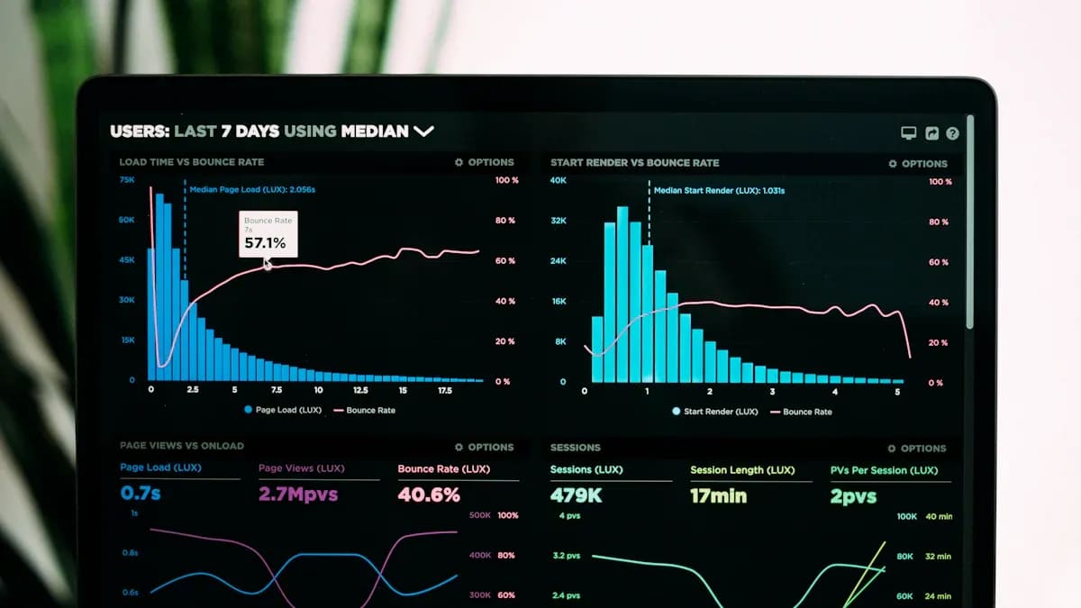
Data visualization plays a pivotal role in 2026, as businesses rely on it to unlock actionable insights from complex datasets. These tools empower you to interpret raw data, identify trends, and drive smarter decisions. Companies using advanced visual analytics report improved operational efficiency and a deeper understanding of market dynamics. Choosing the right data display tools is critical for staying ahead in today’s competitive landscape. FanRuan leads the way with FineVis, offering cutting-edge solutions to transform your data into compelling visuals and meaningful stories. Click here and you can have a FineVis demo before the reading.
Data visualization is important for making smart choices. It helps you see patterns and chances in big data.
Picking the right tool matters a lot. Think about how easy it is to use, if it works with other tools, and if it can grow with your needs.
FineVisby FanRuanis easy to use. It has a no-code setup and gives live data updates.
Tools like Power BI and Tableau are great for teamwork. They help groups share and understand data quickly.
Look at your budget and team skills before choosing. Cheaper tools like Zoho Analytics work well for small businesses.
Why Data Display Matters in 2026
The role of data display in modern decision-making
Data visualization plays a crucial role in helping you make informed decisions.It transforms raw data into clear and actionable insights, enabling you to identify patterns, trends, and opportunities. Tools like Tableau, Power BI, and Looker simplify complex datasets, making them accessible to decision-makers. These tools also highlight the implications of data, encouraging discussions that justify decisions and consider potential risks or trade-offs. By presenting findings visually, you can better understand data limitations and uncertainties, ensuring more balanced and strategic choices.
Key trends shaping the data display landscape in 2026
The data visualization landscape in 2026 is evolving rapidly. AI-powered analytics are revolutionizing how you interpret and utilize data. Self-service analytics tools are becoming more common, empowering non-technical users to engage directly with data. Advanced visualization techniques are essential for simplifying complex datasets, making them easier to understand. Augmented Analytics, which leverages AI and machine learning, is enhancing data analysis and insight discovery. These trends are reshaping how businesses and individuals interact with data, making visualization tools indispensable.
Challenges businesses face in selecting the right data visualization tools
Choosing the right data visualization tools can be challenging. The sheer volume of data generated daily—328.77 million terabytes in 2023, projected to reach 181 zettabytes annually by 2025—requires tools that can handle massive datasets efficiently. Businesses often struggle to find tools that balance ease of use with advanced functionality. Integration with existing systems and scalability for future growth are also critical factors. Additionally, the need for real-time analytics and industry-specific solutions adds complexity to the decision-making process. Selecting the wrong tool can lead to inefficiencies and missed opportunities.
Statistic
Value
Daily data creation in 2023
328.77 million terabytes
Projected annual data creation by 2025
181 zettabytes
Reduction in business meeting time using data visualization
24%
Increased likelihood of timely information retrieval with visual tools
28%
Faster decision-making likelihood for companies using data visualization
5 times
Execution likelihood for companies using data visualization
3 times
Average ROI from analytics
$9.01 per dollar spent
Top Data Display Tools of 2026
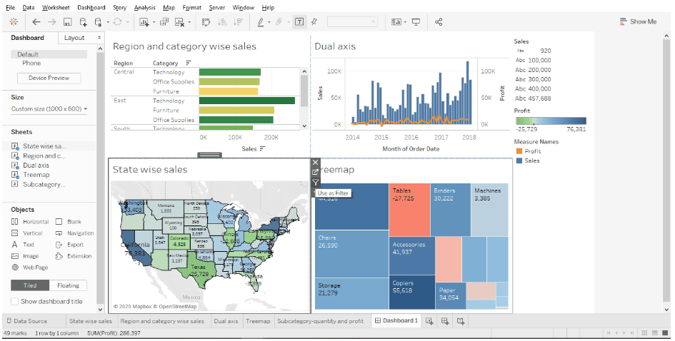
Tableau: A leader in interactive dashboards
Tableau stands out as one of the most popular data visualization tools in 2025. It offers a wide range of visualization options, making it ideal for creating interactive dashboards. You can use Tableau to transform raw data into visually compelling stories. Its drag-and-drop interface allows you to build charts and graphs without needing advanced technical skills. Tableau also supports real-time data updates, ensuring your visualizations stay current.
One of Tableau's key strengths is its strong community support. With a vast network of users, you can easily find tutorials, forums, and resources to enhance your skills. However, Tableau has a steep learning curve for beginners. If you're new to data visualization software, you may need time to master its advanced features.
Tool
Strengths
Weaknesses
Tableau
Broad spectrum of visualization options, strong community support
Steep learning curve for novices
Power BI: Seamless integration with Microsoft products
Power BI is a powerful tool that integrates seamlessly with Microsoft products like Excel, Teams, and Azure. This makes it an excellent choice if your organization already uses Microsoft’s ecosystem. Power BI allows you to create interactive dashboards and reports that provide actionable insights. Its user-friendly interface makes it accessible to both beginners and advanced users.
Power BI excels in real-time analytics, enabling you to monitor key metrics and make data-driven decisions quickly. However, some users report challenges with data governance and connection issues when working with large datasets. Despite these limitations, Power BI remains a top choice for businesses seeking a reliable data visualization solution.
Tool
Strengths
Weaknesses
Power BI
Seamless integration with Microsoft products
Difficult data governance and connection issues
Google Looker: Scalable cloud-based analytics
Google Looker is a cloud-based data visualization tool designed for scalability. It integrates well with Google’s suite of products, including Google Cloud and BigQuery. Looker’s collaboration features allow teams to work together on data analysis, making it a great choice for organizations that prioritize teamwork. You can use Looker to create interactive dashboards that simplify complex datasets.
Looker’s strength lies in its ability to handle large-scale data analytics. However, its initial setup can be complex and may require technical expertise. If your team has the necessary skills, Looker can provide a robust platform for data visualization and analysis.
Tool
Strengths
Weaknesses
Looker
Strong collaboration features, integrates well with Google products
Qlik Sense: Associative data model for deeper insights
Qlik Sense offers a unique approach to data visualization through its associative data model. Unlike traditional linear models, Qlik Sense allows you to explore data from multiple angles without predefined paths. This flexibility helps you uncover hidden relationships and patterns that might otherwise go unnoticed. You can use its intuitive interface to create interactive dashboards and charts that adapt to your analysis in real time.
One of Qlik Sense's standout features is its ability to handle large datasets efficiently. Its in-memory processing ensures quick responses, even when working with complex data. The tool also supports self-service analytics, empowering you to dive deep into data without relying on IT teams. This makes it ideal for businesses that prioritize agility and independence in their data-driven decision-making.
Qlik Sense integrates seamlessly with various platforms, including cloud services and on-premises systems. Its scalability ensures that it grows alongside your business needs. However, mastering its advanced features may require some training. If you're looking for a tool that combines flexibility, speed, and depth, Qlik Sense is a strong contender.
Tip: Use Qlik Sense's associative model to explore "what-if" scenarios and gain deeper insights into your data.
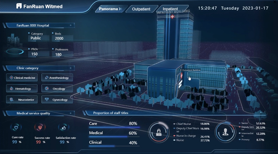
FineVis by FanRuan: Comprehensive data display and visualization solutions
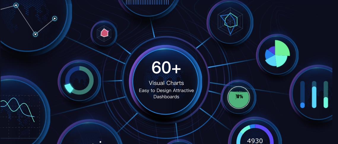
FineVis by FanRuan stands out as a versatile and user-friendly platform for data visualization solutions. It offers over 60 chart types, dynamic 3D visualizations, and customizable dashboards. Its zero-code drag-and-drop interface makes it accessible to users of all skill levels, allowing you to create compelling visuals without technical expertise. FineVis excels in delivering real-time dashboards, enabling you to monitor key metrics and make data-driven insights quickly.
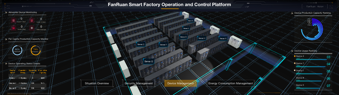
FineVis is designed to cater to a wide range of industries, including manufacturing, healthcare, logistics, and smart cities. For example, manufacturers use FineVis to visualize production data, identify bottlenecks, and optimize workflows. Healthcare providers rely on its dashboards to track patient outcomes and resource allocation. Logistics companies benefit from its real-time analytics to streamline supply chain operations.
The platform's adaptive design ensures seamless access across devices, whether you're using a smartphone, tablet, or PC. FineVis also supports off-screen control, allowing you to manage presentations remotely via mobile devices. Its industry-specific solutions enhance efficiency and performance, making it a valuable tool for businesses seeking tailored data visualization tools.
Note:FineVis has been recognized for its innovation and excellence, earning accolades such as an Honorable Mention in the Gartner Magic Quadrant for ABI Platform.
Features, Pros, and Cons of Each Data Display Tool
Tableau: Features, Pros, and Cons
Tableau is a powerful tool that excels in creating interactive dashboards and visual storytelling. Its features make it a favorite among data analysts and business professionals. You can use Tableau to transform raw data into visually compelling insights that drive decision-making.
Key Features:
Drag-and-drop interface for ease of use.
Wide range of visualization options, including heat maps, scatter plots, and treemaps.
Real-time data updates for dynamic dashboards.
Integration with multiple data sources, such as Excel, SQL databases, and cloud platforms.
Strong community support with extensive resources and tutorials.
Pros:
Offers advanced data visualization capabilities, making it suitable for complex datasets.
Provides real-time analytics, ensuring your data stays current.
Supports collaboration through Tableau Server and Tableau Online.
Highly customizable dashboards tailored to your needs.
Cons:
Steep learning curve for beginners.
Higher cost compared to some other tools, which may not suit small businesses.
Feature
Benefit
Drag-and-drop interface
Simplifies the process of creating visualizations
Real-time data updates
Ensures dashboards reflect the latest information
Integration options
Connects seamlessly with various data sources
Community support
Offers access to tutorials, forums, and user-generated content
Tip: Leverage Tableau's real-time data updates to monitor key metrics and make timely decisions.
Power BI: Features, Pros, and Cons
Power BI stands out for its seamless integration with Microsoft products, making it an excellent choice if your organization already uses tools like Excel or Azure. Its user-friendly interface and robust features make it a versatile option for businesses of all sizes.
Key Features:
Integration with Microsoft ecosystem, including Excel, Teams, and Azure.
Real-time analytics for monitoring performance metrics.
AI-powered insights to uncover trends and patterns.
Customizable dashboards with drag-and-drop functionality.
Extensive library of pre-built connectors for data integration.
Pros:
Easy to use, even for beginners, due to its intuitive interface.
Provides strong collaboration features, allowing teams to share insights effortlessly.
Affordable pricing compared to some competitors.
Scalable for businesses of all sizes, from small startups to large enterprises.
Cons:
Challenges with data governance when handling large datasets.
Occasional connection issues with non-Microsoft data sources.
Feature
Benefit
Microsoft integration
Enhances productivity for organizations using Microsoft tools
AI-powered insights
Helps identify trends and make data-driven decisions
Real-time analytics
Enables quick responses to changing business conditions
Pre-built connectors
Simplifies data integration from various sources
Note: Use Power BI's AI-powered insights to uncover hidden trends and gain a competitive edge.
Google Looker: Features, Pros, and Cons
Google Looker is a cloud-based data visualization tool designed for scalability and collaboration. It integrates seamlessly with Google Cloud and other Google products, making it a strong choice for organizations already using Google's ecosystem.
Key Features:
Cloud-based platform for scalability and flexibility.
Integration with Google Cloud, BigQuery, and other Google tools.
Collaboration features that allow teams to work together on data analysis.
Customizable dashboards for interactive data exploration.
Advanced analytics capabilities for handling large-scale datasets.
Pros:
Scalable solution for businesses with growing data needs.
Strong collaboration tools that enhance teamwork and productivity.
Seamless integration with Google products for a unified experience.
Robust data visualization capabilities for simplifying complex datasets.
Cons:
Initial setup can be complex and may require technical expertise.
Higher learning curve for users unfamiliar with Google Cloud services.
Feature
Benefit
Cloud-based platform
Offers scalability and flexibility for growing businesses
Collaboration tools
Enhances teamwork and data sharing
Google integration
Provides a seamless experience for users of Google products
Advanced analytics
Handles large-scale datasets effectively
Tip: Use Google Looker's collaboration features to streamline teamwork and improve data-driven decision-making.
Qlik Sense: Features, Pros, and Cons
Qlik Sense provides a unique approach to data visualization by using its associative data model. This model allows you to explore data from multiple perspectives without following a predefined path. It helps you uncover hidden patterns and relationships that traditional linear models might miss. The tool’s intuitive interface enables you to create interactive dashboards and charts that adapt to your analysis in real time.
Key Features:
Associative Data Model: Lets you explore data freely and discover insights without constraints.
Self-Service Analytics: Empowers you to analyze data independently, reducing reliance on IT teams.
Scalability: Adapts to your business needs, whether you’re a small startup or a large enterprise.
Integration: Connects seamlessly with cloud services and on-premises systems.
In-Memory Processing: Ensures quick responses, even when handling large datasets.
Pros:
Offers flexibility to explore data from various angles.
Handles large datasets efficiently with in-memory processing.
Supports real-time dashboards for immediate insights.
Encourages independence with self-service analytics.
Cons:
Advanced features may require training to master.
Initial setup can be complex for beginners.
Tip: Use Qlik Sense’s associative model to perform “what-if” analyses and uncover deeper insights into your data.
FineVis by FanRuan: Features and Advantages
FineVis by FanRuan stands out as a comprehensive platform for data visualization. It offers over 60 chart types, dynamic 3D visualizations, and customizable dashboards. Its zero-code drag-and-drop interface makes it accessible to users of all skill levels. Whether you’re a beginner or an advanced analyst, you can create compelling visuals effortlessly.
FineVis simplifies data visualization with its user-friendly interface. You can create visuals without technical expertise.
Its real-time dashboards enable you to monitor key metrics and respond to changes instantly.
The platform’s adaptive design ensures you can access your data anytime, anywhere.
Industry-specific solutions enhance efficiency and performance in various sectors. For example, manufacturers use FineVis to optimize workflows, while healthcare providers track patient outcomes.
Note: FineVis has earned recognition for its innovation, including an Honorable Mention in the Gartner Magic Quadrant for ABI Platform. Many of enterprise connect FineVis with FineReport. The banner shows a way to try FineReport for free. Click and start now.
Comparing the Data Display Tools: Key Factors to Consider
Ease of use for beginners and advanced users
When choosing data visualization tools, ease of use plays a critical role. Beginners often prefer tools with intuitive interfaces and drag-and-drop functionality. For example, FineVis offers a zero-code interface, making it accessible to users without technical expertise. Similarly, Power BI and Tableau provide user-friendly dashboards that simplify the process of creating visuals. Advanced users, on the other hand, look for tools that allow deeper customization and integration with complex datasets. Tools like Qlik Sense and Grafana cater to these needs by offering advanced features and flexibility.
The best tools balance simplicity and functionality. They empower beginners to start quickly while providing advanced users with the tools they need for complex analysis. This balance ensures that teams with diverse skill levels can collaborate effectively.
Functionality and customization options
Functionality and customization are essential for creating impactful visualizations. Tools with a wide range of features, such as FineVis and Tableau, allow you to design visuals tailored to your audience. FineVis, for instance, supports over 60 chart types and dynamic 3D visualizations. It also offers real-time dashboards, enabling you to monitor key metrics instantly. Similarly, Google Looker excels in collaboration, allowing teams to work together on interactive presentations.
Customization options, such as templates and design assistance, enhance the user experience. A tool’s ability to adapt dashboards and charts to specific needs ensures that key performance indicators are displayed clearly. This flexibility makes data visualization more effective and meaningful.
Key Performance Indicator / Cost Analysis
Description
Data Integration
Ability to connect with various data sources, supporting real-time syncing.
Customization
Flexibility in adapting charts and dashboards to different audiences.
Templates and Design Assistance
Availability of a library of templates for various use cases.
Interactive Presentations
Capability to embed interactive visuals into presentations.
Visual Representation of Key Metrics
Effectiveness in displaying KPIs clearly and meaningfully.
Integration with other platforms and systems
When selecting a data visualization tool, integration capabilities play a vital role. You need a tool that connects seamlessly with your existing platforms and systems. This ensures smooth workflows and eliminates the need for manual data transfers. Tools like Power BI and Google Looker excel in this area by offering pre-built connectors for popular platforms such as Salesforce, Google Analytics, and Azure. These integrations allow you to pull data directly into the visualization tool, saving time and reducing errors.
FineVis by FanRuan also stands out with its ability to integrate with over 100 data sources. Whether you use databases, cloud services, or proprietary systems, FineVis ensures compatibility. For example, manufacturers can connect their production systems to FineVis for real-time monitoring of key metrics. This level of integration enhances productivity and ensures that your data remains up-to-date.
You should also consider tools that support APIs. APIs enable custom integrations, allowing you to tailor the tool to your specific needs. For instance, Grafana’s open-source nature makes it highly adaptable for businesses requiring unique solutions. By choosing a tool with robust integration features, you can streamline your data analysis process and focus on deriving insights.
Scalability for growing businesses
Scalability is another critical factor when evaluating data visualization tools. As your business grows, your data needs will expand. You require a tool that can handle increasing data volumes without compromising performance. Tools like Tableau and Qlik Sense are designed to scale with your business. They offer features like in-memory processing and cloud-based storage, ensuring quick responses even with large datasets.
FineVis provides exceptional scalability. Its adaptive design supports businesses of all sizes, from startups to large enterprises. For example, logistics companies can use FineVis to track supply chain data across multiple locations. As operations grow, FineVis adjusts to accommodate new data sources and users. This flexibility ensures that your tool remains effective as your business evolves.
Scalable tools also support team collaboration. Platforms like Domo and Zoho Analytics allow multiple users to access and analyze data simultaneously. This fosters teamwork and ensures that everyone stays informed. By investing in a scalable tool, you future-proof your data visualization strategy and ensure long-term success.
How to Choose the Right Data Display Tool for Your Needs
Identifying your goals and data display requirements
Start by defining what you want to achieve with data visualization. Are you looking to track real-time metrics, create interactive dashboards, or analyze historical trends? Understanding your goals helps you narrow down the tools that align with your needs. For example, if your focus is on real-time analytics, platforms like FineVis might be ideal. On the other hand, if collaboration is a priority, Google Looker offers strong team-oriented features.
Consider the type of data you work with and the insights you need. Tools like Qlik Sense excel in uncovering hidden patterns, while Tableau provides advanced storytelling capabilities. By identifying your specific requirements, you can ensure the tool you choose supports your objectives effectively.
Evaluating your budget and team expertise
Budget plays a crucial role in selecting the right tool. Small businesses often benefit from affordable options like Zoho Analytics, which offers robust features at a lower cost. Larger organizations may prioritize scalability and advanced functionalities, making tools like Tableau or Power BI worth the investment.
Assess your team’s technical expertise as well. Tools with a zero-code interface, such as FineVis, are perfect for teams with limited technical skills. For more advanced users, platforms like Grafana provide extensive customization options. To guide your decision, frameworks like the Rational Decision-Making Model or Multi-Criteria Decision Analysis can help evaluate costs and benefits systematically.
Framework
Description
Rational Decision-Making Model
A structured process for identifying problems, collecting information, and evaluating options.
SWOT Analysis
Analyzes strengths, weaknesses, opportunities, and threats to aid strategic planning.
Multi-Criteria Decision Analysis
Evaluates multiple options against defined criteria to make informed choices.
Considering scalability and future needs
Your chosen tool should grow with your business. Scalability ensures that as your data volume increases, the tool continues to perform efficiently. FineVis, for instance, adapts to businesses of all sizes, making it a reliable choice for long-term use. Similarly, Qlik Sense and Tableau offer features like in-memory processing and cloud storage to handle large datasets.
Think about future integrations as well. Tools that support APIs or connect with multiple platforms, such as Power BI or Grafana, provide flexibility for evolving business needs. By considering scalability and integration capabilities, you can invest in a tool that remains effective as your organization expands.
Why FineVis by FanRuan is ideal for tailored data display solutions
FineVis by FanRuan offers a comprehensive platform for creating tailored data visualization solutions. Its architecture combines simplicity with advanced functionality, making it accessible to users of all skill levels. You can use its zero-code drag-and-drop interface to design dashboards and charts without technical expertise. With over 60 chart types and dynamic 3D visualizations, FineVis ensures your data display is both engaging and informative.
The platform excels in real-time analytics. You can monitor key metrics instantly, enabling faster decision-making. Its adaptive design allows seamless access across devices, whether you use a smartphone, tablet, or PC. FineVis also supports off-screen control, letting you manage presentations remotely through mobile devices. This feature enhances flexibility, especially for professionals who need to present data on the go.
FineVis shines in industry-specific applications. Manufacturers use it to visualize production data and optimize workflows. Healthcare providers rely on its dashboards to track patient outcomes and allocate resources effectively. Logistics companies benefit from its real-time analytics to streamline supply chain operations. These tailored solutions make FineVis a versatile choice for businesses across various sectors.
Tip: Use FineVis’s real-time dashboards to identify trends and act on insights quickly. This feature is particularly useful for industries requiring immediate responses to changing conditions.
FineVis’s ability to integrate with over 100 data sources further enhances its appeal. Whether you work with databases, cloud services, or proprietary systems, FineVis ensures compatibility. Its robust architecture and user-friendly features make it an ideal tool for transforming raw data into actionable insights.
Choosing the right data visualization tool can transform how you interpret and act on information. Each tool discussed offers unique strengths, from Tableau's interactive dashboards to FineVis by FanRuan's real-time analytics and industry-specific solutions. Aligning your choice with your business needs ensures you maximize value and efficiency. FineVis stands out as a reliable and innovative platform, offering versatility and ease of use for users of all skill levels. Explore these tools to find the perfect fit or consult FanRuan for expert guidance tailored to your goals. Click the banner and start your tour with FineVis in FineReport.
Access a wealth of case studies, industry insights, and solution guides to accelerate digital transformation.
FAQ
What is the best data display tool for beginners?
If you're new to data visualization, tools like FineVis and Power BI are great choices. FineVis offers a zero-code drag-and-drop interface, making it easy to create visuals. Power BI provides user-friendly dashboards and integrates well with Microsoft products, simplifying the learning process.
Can I use these tools on mobile devices?
Yes, most tools, including FineVis and Tableau, support mobile access. FineVis offers adaptive design, ensuring dashboards work seamlessly on smartphones, tablets, and PCs. This feature allows you to monitor data and make decisions on the go.
Which tool is best for real-time analytics?
FineVis and Power BI excel in real-time analytics. FineVis provides instant updates on dashboards, helping you track metrics as they change. While Power BI offers real-time monitoring for Microsoft ecosystem users.
Are there free options for data display?
Grafana is a popular open-source tool that’s free to use. It’s ideal for visualizing time-series data. Zoho Analytics also offers affordable plans with robust features. These options are great if you’re looking for cost-effective solutions.
How do I choose the right tool for my business?
Identify your goals, data needs, and budget. For example, FineVis suits industries like manufacturing and healthcare with its tailored solutions. If you need collaboration, Google Looker is a strong choice. Evaluate scalability and integration options to ensure the tool grows with your business.