You want to pick a dashboard app that truly fits your business, but the options can feel overwhelming. Many organizations rush the process and end up with a tool that complicates their workflow. To avoid dashboard overload, start by defining your goals and understanding your data. Think about what you need from a dashboard and how you will use the tool each day. According to industry research, common mistakes include overcrowded dashboards, poor navigation, and missing labels, which can make even the most advanced tool less effective.
Dashboard App Goals
Before you choose a dashboard app, you need to clarify your goals. This step helps you focus on what matters most for your business and ensures your dashboard system supports your strategy. FanRuanrecommends aligning your dashboard with your business objectives and involving all key users from the start.
Key Functions
Start by identifying the main objectives you want to achieve with your dashboard system. Companies often use dashboards to monitor progress on important business goals. These goals might include improving operational efficiency, driving financial growth, boosting customer service, or increasing productivity. Dashboards give you real-time visibility into your work and key metrics, which leads to better decisions and faster responses.
Data Visualization: Displays data through charts, graphs (line, bar, pie), and KPIs.
Centralized View: Pulls data from multiple sources (databases, files, other apps) into one place.
Monitoring: Tracks business health, sales, website traffic, or project progress in real-time.
Customization: Allows users to tailor dashboards to show the most relevant information.
Tip: Think about the specific outcomes you want to see. For example, you might want to reduce delivery times, minimize product defects, or improve customer response rates. Dashboards empower your team by providing clear, up-to-date reporting that supports these objectives.
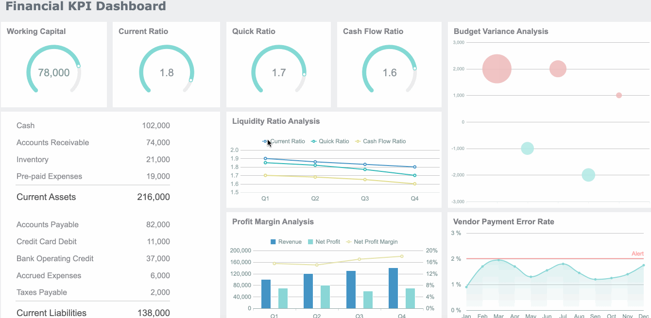
Dashboards serve as central hubs for your analytics. They bring togetherkey performance indicators (KPIs)and present them in a single, easy-to-understand view. This approach helps you visualize, analyze, and manage critical data efficiently. By combining different charts and reports, dashboards help your team focus on the most relevant information and improve collaboration.
App Store Ratings, Reviews, Net Promoter Score, In-app Survey Responses
Retention Metrics
Retention Rate, Daily Active Users, Monthly Active Users, DAU/MAU Ratio, Cohort Analysis
User Behavior Metrics
Tagged Events, Funnels, User Journey Tracking
App Performance Metrics
App Load Time, Crash Reports, API Latency, Error Rates
Stakeholders
You need to identify everyone who will use the dashboard system. Stakeholders include project members, team members, and key contacts. Some dashboards are personal, helping individual users track their own assignments and activities. Others are team dashboards, which help groups meet goals, monitor status, and spot bottlenecks.
Executives often focus on high-level KPIs like revenue and profit margins.
Sales teams need detailed analytics on performance, such as individual and team sales figures.
Marketing departments track campaign results and customer analytics.
Project teams use dashboards to monitor work progress and goals.
External partners and frontline employees may also need access to certain data.
Each group has unique needs, so you should tailor the dashboard system to fit their roles and responsibilities. This ensures everyone gets the data-backed insights they need to make informed decisions.
Success Criteria
To measure the effectiveness of your dashboard system, set clear criteria from the start. Successful organizations use several methods to track how well their dashboards perform:
Mobile Responsiveness: Make sure your dashboard works well on smartphones and tablets.
User Training and Support: Provide training and ongoing help so users can get the most from the tool.
Data Security: Use strong security measures, define user roles, and update protocols regularly.
Testing and Iteration: Test the dashboard, gather feedback, and keep improving the design.
Return on Investment (ROI): Track the financial return compared to the cost of the dashboard app.
Net Promoter Score (NPS): Measure user satisfaction and loyalty.
User Customization: Allow users to adapt the dashboard system to their needs.
Visual Design: Keep the interface simple and engaging, avoiding information overload.
Alerting: Use color-coded alerts to highlight important changes or exceptions.
System Connectivity: Ensure the dashboard app integrates with your existing data sources and analytics tools.
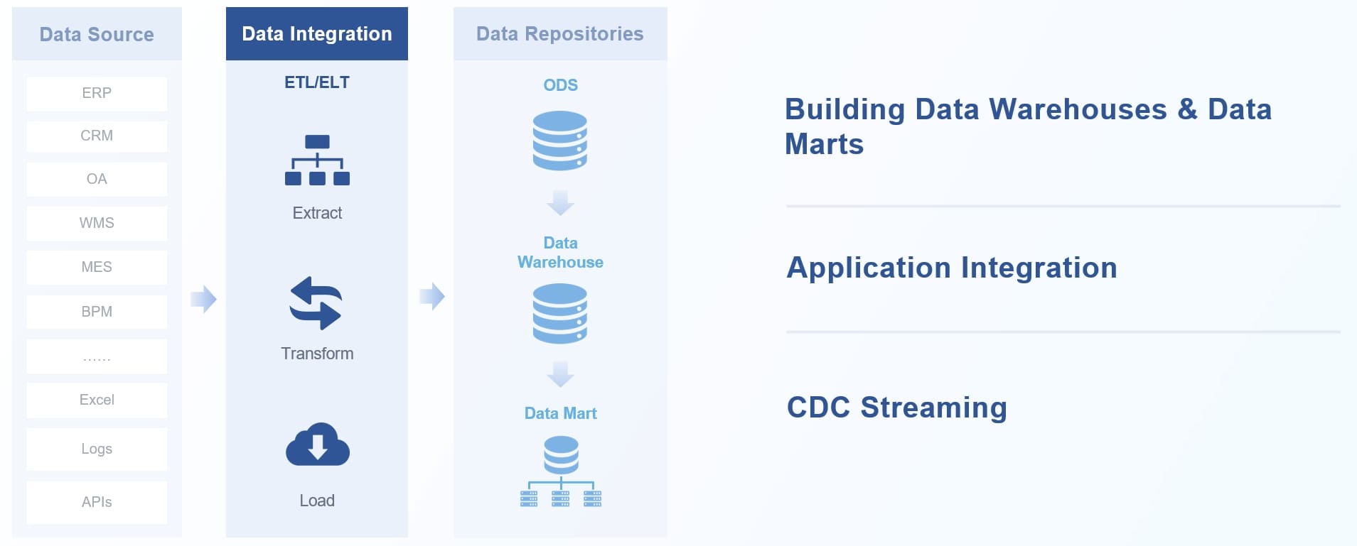
Choosing the right dashboard system means you must pay close attention todata sources. Your dashboard system becomes powerful only when it connects to the right data and keeps everything up to date. You want to see real-time numbers, track trends, and make decisions based on accurate information. This is why integration with a wide range of data sources is so important.
Integration
You need a dashboard system that can bring together data from many places. Most businesses use a mix of internal databases, cloud services, CRM systems, and marketing platforms. Here are some of the most common data sources you might want to connect:
Internal databases for sales, goals, and metrics
Cloud services for scalable storage and application data
CRM systems to track customer activity and sales
Developer tools for project management and productivity
Analytic software for customer feedback and survey results
Marketing platforms for campaign performance and engagement
Online forms, chat systems, and billing platforms
FineBIstands out with its data integration capabilities. You can connect to over 60 data sources, including popular databases like MySQL, Oracle, and SQL Server, as well as cloud data warehouses and big data platforms. FineBI also supports file uploads, API connections, and custom program datasets. This flexibility ensures your dashboard system always has the data you need.
FanRuan’s FineDataLink takes integration even further. It helps you synchronize data across multiple tables in real time, automate ETL processes, and connect with over 100 data sources. FineDataLink makes it easy to build a high-quality data layer for your business intelligence needs.
You want everyone on your team to access the right data at the right time. Good dashboard systems let you set up clear access controls. You can map users to permissions, define who can see or edit certain data, and review access regularly. This keeps your data secure and ensures each person only sees what they need.
Security
Security is a top priority when dealing with business data. You should create an access control matrix, develop strong access management policies, and review permissions often. Automating parts of the review process helps you keep everything accurate and up to date. Always apply the principle of least privilege, giving users only the access they need for their roles.
Scalability
As your business grows, your dashboard system must handle more data and more users. Leading dashboard apps achieve scalability by using cloud infrastructure, supporting real-time data refresh, and providing mobile access. FineBI’s architecture supports high performance even with large datasets and many users. FineDataLink also ensures your data pipelines can scale as your needs change. This means your dashboard system will keep up with your business, no matter how much your data grows.
Tip: Always plan for scalability from the start. This saves you time and resources as your data and user base expand.
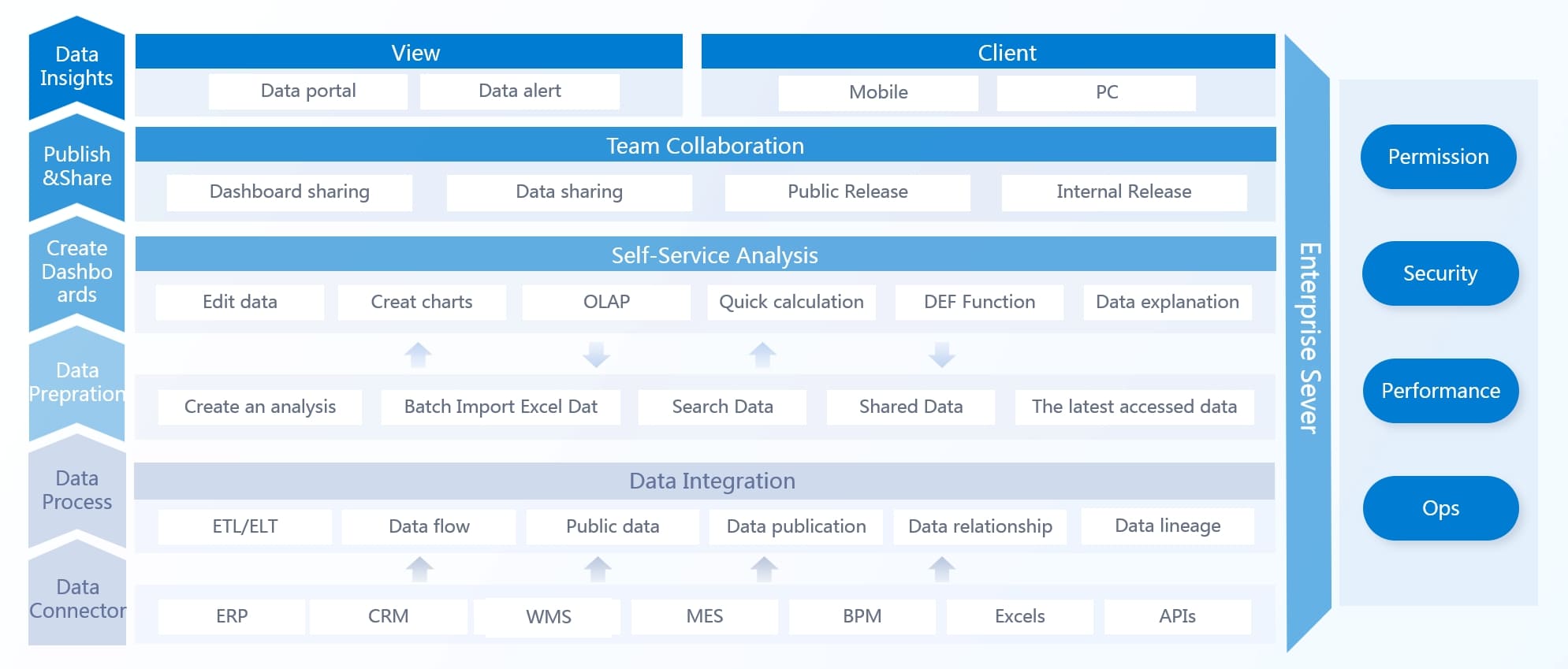
Essential Features of Dashboard App
Ease of Use
When you choose adashboard app, ease of use should be at the top of your list. You want a tool that lets you build dashboards and reports without needing advanced technical skills. A simple interface helps you focus on your analytics instead of struggling with complicated menus or code. FineBI stands out in this area. Its drag-and-drop design allows you to create dashboards quickly, even if you have little experience with business intelligence tools. You can add charts, tables, and filters with just a few clicks. This approach improves user experience and encourages more people in your organization to use analytics every day.
A dashboard that is easy to use saves time and reduces training costs. You can get your team up and running faster, which means you see value from your investment sooner.
Many modern dashboard apps also offer 24/7 access from any device. You can check your data on a computer, tablet, or smartphone. This flexibility supports real-time decision-making and keeps your team connected, no matter where they work.
Customization
Customization is another key feature you should look for in a dashboard app. Every business has unique needs, so your dashboards must reflect your brand and your goals. You can adjust colors, fonts, and backgrounds to match your company’s style. Many tools let you add your logo or create custom themes, which helps with branding and storytelling.
You can also customize the layout of your dashboards. Drag-and-drop report builders and customizable widgets let you organize data in a way that makes sense for your team. You might want to create different dashboards for sales, marketing, or operations. Some apps allow you to blend data from multiple sources, so you can build custom metrics that matter most to your business.
Customization Feature
Description
Example Use Case
White-labeling & Branding
Adjust colors, logos, and themes to match your company identity
Create new metrics by combining data from different sources
Blend CRM and marketing data for deeper insights
Multiple Dashboards
Build separate dashboards for different teams or projects
One for sales, one for marketing, one for finance
FineBI gives you strongcustomization options. You can select from a wide range of KPIs, create custom metrics, and design dashboards for different departments. This flexibility ensures your dashboards stay relevant and useful as your business grows.
Visualization
Data visualization is at the heart of any effective dashboard. You need clear, interactive charts and graphs to turn raw data into insights. The best dashboard apps offer a variety of visualization tools, such as bar charts, line graphs, pie charts, tables, and gauges. Each type serves a different purpose. For example, line charts show trends over time, while bar charts help you compare values across categories.
You can use global filters to adjust multiple charts at once, saving time and making your dashboards more interactive. Many tools also let you add dynamic images or embed objects like company logos, which enhances your storytelling. Tabs help you organize information and prevent overload, so users can focus on what matters most.
FineBI provides over 60 chart types and 70 styles, giving you powerful visualization capabilities. You can apply real-time filters, drill down into details, and link charts for deeper analytics. These features help you spot trends, track KPIs, and make better decisions.
Tip: Choose visualization tools that match your audience. Simple, clear visuals improve user experience and make your analytics more actionable.
A strong dashboard app supports real-time data processing, so your visualizations always show the latest updates. This keeps your team informed and ready to act. With the right visualization tools, you can transform complex data into easy-to-understand stories that drive results.
Security
Security stands as one of the most important features when you choose a dashboard app. You handle sensitive business data every day. Protecting this information should be a top priority. A secure dashboard app helps you prevent data leaks, unauthorized access, and compliance risks.
Most enterprise dashboard apps support industry-recognized security certifications. These certifications show that the app meets strict standards for protecting your data. Here are some of the most common certifications and security controls you should look for:
SOC 2: This certification checks if the app keeps your data secure, available, and private.
ISO 27001: This international standard proves the app follows best practices for information security management.
GDPR: This regulation protects personal data for users in the European Union.
HIPAA and CCPA: These standards cover health information and consumer privacy, especially in the United States.
Note: Certifications like SOC 2 and ISO 27001 help you build trust with your clients and partners. They show that your dashboard app follows global security rules.
A secure dashboard app also gives you tools to manage access and monitor activity. You can set user roles, control who sees what, and review access logs. Many apps include features like:
Multi-factor authentication (MFA)
Data encryption in transit and at rest
Secure offline storage for mobile devices
Remote wipe and session timeouts for lost or stolen devices
Regular security updates and incident response plans
FineBI, for example, uses enterprise-level data permission controls. You can assign access based on department, role, or project. Sensitive data stays protected, and you can mask information for certain users. FineBI also supports audit trails, so you can track who accessed or changed data.
You should review your dashboard app’s security settings often. Set up alerts for unusual activity. Make sure your team follows best practices, such as using strong passwords and updating software regularly. These steps help you stay ready for audits and keep your business data safe.
When you compare dashboard apps, you want to focus on how well each tool fits your business needs. Start by looking at thecore featuresthat matter most for analytics and decision-making. The right dashboard should bring together key data on a single screen, support your full analytics workflow, and adapt to your industry or department. You should always align your choice with your business priorities and objectives.
Here are some important criteria to consider when you compare tools:
Integration capabilities: Can the tool connect with your existing business systems and data sources?
Cognitive design: Does the dashboard present information in a clear, simple way that matches how people process data?
Customization: Can you adjust visual formats, sizes, fonts, and colors? Does it support role-based data access?
Collaboration features: Does the tool allow multiple users to access and share dashboards across teams or with external partners?
User experience: Is the interface easy to use and intuitive for everyone?
Interactive visualizations: Can you explore data with charts, graphs, and maps?
Advanced analytics and reporting: Does the tool offer drill-down, filtering, alerts, and custom reports?
Security: Does it provide enterprise-grade data protection and compliance?
Performance and scalability: Can the tool handle growth in data and users?
Embedded analytics: Can youintegrate dashboards into your existing apps or workflows?
Pricing models: Are the costs transparent and predictable?
Tip: Always match the dashboard app’s features to your business goals. This ensures your analytics drive real results.
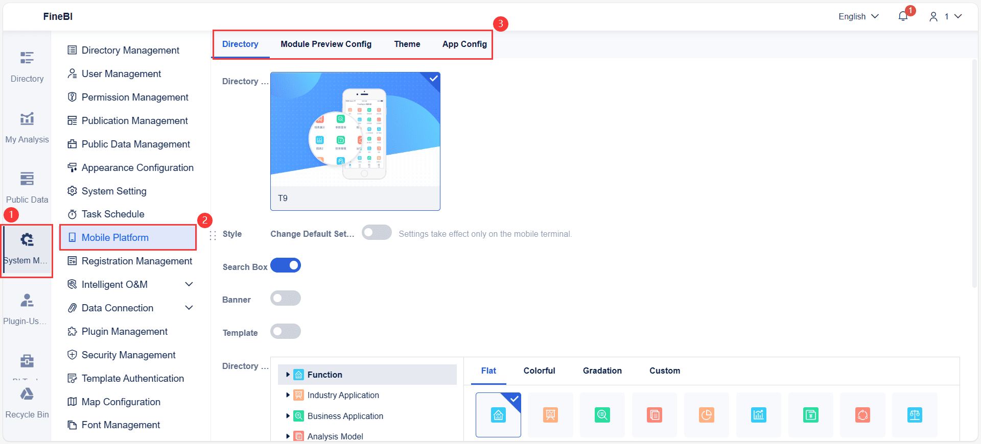
Mobile Platform
Mobile access is now essential for any dashboard. You need to check if the tool offers a strong mobile platform. Business users often request features that help them make decisions on the go. The most requested mobile features include:
Real-time data access and reporting. You can view up-to-the-minute information, which is vital for roles like retail managers or sales executives.
Interactive visualizations. Charts and heat maps help you understand complex analytics quickly.
Personalized dashboards. You can customize your view to highlight the KPIs that matter most to your role.
Offline capabilities. You can access critical data even without a network connection, which is helpful for field engineers or remote workers.
Seamless integration with other business systems. You get a unified view by connecting your dashboard to ERP or CRM tools.
FineBI supports mobile access with a responsive design. You can view and interact with dashboards on your smartphone, ensuring you never miss important analytics. The tool also provides offline access, so you stay connected to your data wherever you work. You can log in to FineBI as the admin, and choose System Management > Mobile Platform to go to the configuration interface of the mobile platform.
Tablet Display Optimization
Tablets offer a larger screen than phones, but they require special design for the best user experience. Leading dashboard apps use an 8-column grid system with larger margins (32dp) for tablets. This layout allows you to arrange widgets in 2x2 or 2x1 patterns, balancing content density and readability. For comparison, phones use 4 columns and smaller margins, stacking widgets vertically, while laptops use 12 columns for multi-column layouts.
Device Type
Margin Size
Grid Columns
Widget Layout Example
Phone
16dp
4
Vertical stacking
Tablet
32dp
8
2x2 or 2x1 layouts
Laptop
200dp
12
Multi-column arrangements
Other tablet optimizations include:
Touch targets sized at least 48x48 pixels, placed for easy thumb access.
Bottom navigation bars for quick access to main dashboard sections.
Progressive disclosure menus to keep the interface clean.
Gesture-based navigation with clear visual cues.
Consistent icons and labels, plus subtle animations for feedback.
Performance features like data aggregation, progressive loading, and caching to keep analytics fast and responsive.
FineBI dashboards automatically adjust to tablet screens. You get a structured, easy-to-read layout, with all interactive analytics features available. This ensures your team can analyze data efficiently, whether in the office or on the move.
Note: Always test your dashboard on different devices. This helps you deliver a consistent user experience for everyone.
Comparing Deployment Options
You also need to decide how you want to deploy your dashboard app. Most tools offer both cloud-based dashboard and on-premises options. Each has its own strengths and trade-offs.
Deployment Option
Advantages
Disadvantages
Cloud
Cost savings, high scalability, access from anywhere, provider handles maintenance
Security concerns, needs stable internet, less control over updates, possible hidden fees
On-Premises
Higher security, easier compliance, predictable costs, no internet needed, good for legacy data
High upfront cost, ongoing IT maintenance, limited scalability, tied to physical location
Cloud-based dashboards give you flexibility and easy access, while on-premises solutions offer more control and security. FineBI supports both deployment types. You can choose the option that best fits your data sensitivity, compliance needs, and budget.
Support and Real-World Insights
Support and user feedback play a big role in your decision. You want a tool with strong customer support and a proven track record. FanRuan provides robust support for FineBI, including training, documentation, and responsive help channels. Many organizations share positive testimonials about FineBI’s ease of use, flexible deployment, and analytics power.
You should also look for real-world case studies. These stories show how companies in your industry use the tool to solve problems and achieve results. For example, manufacturers use FineBI to monitor production efficiency, while banks use it for real-time financial analytics. These examples help you see how the dashboard app performs in practice.
Tip: Ask for references or case studies before you make your final choice. Real user experiences can reveal strengths and benefits you might not see in a feature list.
By comparing dashboard apps across these dimensions, you can find the tool that delivers the best analytics, user experience, and business value for your organization.
FineBI gives you the power to create customizable business dashboards that fit your needs. You can connect to many data sources and build dashboards for sales, finance, HR, or operations. FineBI supports both embedded dashboards and standalone dashboards, so you can choose the best setup for your team. Real-time data access and self-service reporting help you respond faster to market changes. FineBI’s analytical dashboards let you explore trends, track KPIs, and share insights across departments. Many organizations report higher productivity, better collaboration, and improved decision accuracy after using FineBI.
FineReport focuses on dynamic reporting and advanced analytics. You can use it to design operational dashboards that track performance in real time. FineReport integrates with major enterprise systems, making it easy to combine data from different sources. You can create strategic dashboards for executives or analytical dashboards for detailed analysis. FineReport’s embedded dashboards help you distribute reports in multiple formats, supporting collaboration and quick decision-making. Real-world cases show that companies using FineReport reduce reporting time, improve data accuracy, and gain deeper insights for business growth.
Business dashboards give you a clear view of your operations and strategy. With the right tools, you can make smarter decisions, improve efficiency, and drive success in any industry.
Choosing the right dashboard starts with matching features to your business goals. Use a checklist or pilot program to reduce risks and ensure a smooth rollout.
Work with your team to set clear goals and metrics.
Record your current data for comparison.
Plan how you will measure progress and assign roles.
Keep everyone informed with regular updates.
Train users and set up access.
Check data connections for accuracy.
Test the dashboard in a real setting.
Review permissions for security.
Checklists help you organize tasks and avoid mistakes.
Pilot programs let you test with real users and fix issues early.
This approach improves teamwork and builds user confidence.
A step-by-step process leads to better results and higher satisfaction. Try FineBI for a free demo or consult with FanRuan experts to see how you can transform your business with data-driven insights.
Click the banner below to try FineBI for free and empower your enterprise to transform data into productivity!
Smarter product, pricing, and inventory management across retail sectors.
FAQ
What is a dashboard app and why do you need one?
A dashboard app helps you see your business data in one place. You use it to track key metrics, spot trends, and make better decisions. It brings together information from different sources for easy access and analysis.
How do dashboard apps support self-service analytics?
You can use self-service analytics to explore data without help from IT. A dashboard app with strong ease of use lets you build reports, create visualizations, and answer questions on your own. This saves time and boosts your confidence in data-backed insights.
What features should you look for in a business intelligence dashboard?
Look for features like data integration capabilities, customization, real-time data visualization, and strong security. Good visualization tools and responsive design improve user experience. You should also check for scalability, cost, and support for both embedded dashboards and standalone dashboards.
How does integration affect dashboard system performance?
Integration connects your dashboard system to different data sources. This ensures you always see up-to-date information. Strong data integration capabilities help you combine data from cloud-based dashboards, operational dashboards, and analytical dashboards for a complete view.
What is the difference between embedded dashboards and standalone dashboards?
Embedded dashboards live inside other apps or websites. You use them to see analytics without leaving your workflow. Standalone dashboards work as separate tools. Both types help you track KPIs, but embedded dashboards offer a smoother user experience.