A churn dashboard is not just a reporting screen. For enterprise retention teams, it is the operating system for protecting renewals, prioritizing at-risk accounts, and turning scattered customer signals into action. If your customer success, finance, sales, and operations teams are all using different churn numbers, your retention process is already leaking revenue.
Enterprise teams need a dashboard that answers three urgent questions fast:
Which accounts are most likely to churn?
Why is churn increasing in specific segments?
What should the team do first to protect revenue?
In complex B2B environments, churn is rarely caused by one issue. It can be driven by contract timing, weak product adoption, unresolved support issues, payment delays, declining stakeholder sentiment, or missed expansion opportunities. A reliable churn dashboard brings these signals into one workflow so leaders can monitor risk, managers can diagnose patterns, and frontline teams can intervene before renewal loss becomes inevitable.
All dashboards in this article are created by FineBI
What a churn dashboard should help enterprise retention teams answer
A well-designed churn dashboard should support decisions, not just visibility. That means every metric, chart, and filter should help a retention team move from observation to intervention.
At the executive level, the dashboard should show whether churn is improving or worsening, where revenue is exposed, and which trends require strategic attention. Executives need concise KPI monitoring with clear comparisons to targets, prior periods, and plan.
For managers, the dashboard should make concentration patterns obvious. They need to identify whether churn risk is clustering by segment, region, account owner, product line, or tenure band. Their job is to allocate resources and coach teams based on where the biggest preventable losses sit.
For frontline account teams, the churn dashboard should go one step further. It should highlight individual accounts with risk context, renewal timing, recent behavior changes, and the next-best-action path. If a CSM or account manager cannot get from top-line churn metrics to a prioritized account list in a few clicks, the dashboard is not operationally useful.
For enterprise use cases, the scope should extend beyond simple cancellation reporting. A modern churn dashboard should support:
Contract renewals: Identify upcoming renewals and risk before decision dates.
Expansion risk: Flag accounts that are retained but shrinking in value.
Product adoption: Surface declining engagement before commercial churn happens.
Support-driven churn: Connect service issues and escalations to retention outcomes.
Executive business reviews: Provide a shared view of retention health across teams.
Core KPIs to include in a churn dashboard
The strongest churn dashboards balance lagging outcome metrics with leading risk indicators. That combination lets teams understand both what already happened and what is likely to happen next.
Key Metrics (KPIs)
Gross Revenue Churn: Percentage of recurring revenue lost from downgrades and churned accounts, excluding expansion. Measures pure revenue leakage.
Net Revenue Churn: Revenue lost after accounting for expansion and reactivation. Shows whether retained accounts are offsetting churn.
Logo Churn: Percentage of customer accounts lost in a period. Useful for tracking account count attrition separately from revenue impact.
Renewal Rate: Percentage of eligible contracts that renewed. A core measure for enterprise retention teams with contract-based revenue.
Expansion Revenue: Additional recurring revenue gained from existing accounts through upsell, cross-sell, or seat growth.
Contraction Revenue: Revenue reduction from retained accounts that downgrade or reduce usage.
Reactivation Rate: Percentage or value of previously churned accounts that return within a defined timeframe.
Usage Decline Rate: Drop in product activity, feature adoption, or active users compared with prior periods. A leading churn signal.
Support Risk Index: Composite view of ticket spikes, escalation frequency, unresolved case age, or severity trends.
NPS or CSAT Shift: Change in customer sentiment scores over time, especially near renewal windows.
Payment Risk Rate: Share of accounts showing overdue invoices, failed payments, or billing disputes.
Renewal Pipeline Coverage: Total renewable ARR or MRR in upcoming periods segmented by risk tier and owner.
At-Risk ARR: Revenue tied to accounts currently flagged as high-risk based on business rules or health scoring.
Retention by Cohort: Percentage of customers or revenue retained over time by start month, contract cohort, or go-live period.
These metrics should also be sliced across the business dimensions that matter operationally:
Plan
Industry
Region
Customer tenure
Account owner
Contract type
Product line
Cohort
Health tier
Without segmentation, churn remains an average. And averages hide risk.
How to define each KPI consistently
Most churn dashboard failures are not visual. They are definitional. If finance, customer success, and leadership each calculate churn differently, the dashboard becomes a source of conflict instead of action.
Start by standardizing time windows. Decide whether metrics will be reported monthly, quarterly, trailing 12 months, or by renewal period. Enterprise businesses often need all three, but each must be labeled clearly. A monthly gross churn figure should never be compared casually to a quarterly renewal rate.
Next, define account status rules precisely. Teams need a shared understanding of what counts as:
Churned
Renewed
Active
Pending renewal
Expanded
Contracted
Reactivated
Just as important, separate customer-level churn from revenue-level churn. Losing one small account and losing one strategic enterprise logo may both count as one logo churn event, but the revenue implications are wildly different. Your churn dashboard should always distinguish count-based attrition from value-based attrition.
Finally, assign metric ownership. A practical governance model typically looks like this:
Finance owns revenue logic
Customer success or retention ops owns account health logic
Sales operations owns renewal pipeline and ownership mapping
BI or data team owns dashboard calculation rules and semantic consistency
Recommended dashboard layout for enterprise retention workflows
A high-performing churn dashboard follows the retention workflow from summary to diagnosis to action. It should not feel like a random collection of charts.
The best structure is usually a three-layer layout:
Top section: Executive summary KPIs and trend indicators
Middle section: Segment and diagnostic views
Bottom section: Account-level action and drill-down tables
At the top, place summary metrics that answer the health question immediately. Include current-period churn KPIs, trend lines, target comparisons, and directional change indicators. This is where leaders decide whether the business is inside or outside retention guardrails.
In the middle, show segmented views that reveal concentration. Churn does not need a hundred charts; it needs the right cuts. If one region, product line, tenure band, or owner group is driving most revenue loss, the dashboard should surface that in seconds.
The lower section should support action. This is where you place prioritized account risk lists, upcoming renewals, accounts with declining usage, and drill-down tables with owner, ARR, renewal date, health tier, and risk reason.
Filters should be visible and practical. For enterprise use cases, the most useful filters are:
Date range
Segment
Contract type
Product line
Region
Customer health tier
Account owner
Renewal window
Visualizations that make churn patterns easier to spot
Not every chart belongs in a churn dashboard. Choose visuals based on the decision they support.
Cohort retention charts are essential for showing how retention changes over time. They help teams identify whether newer customer groups are dropping faster than earlier cohorts, which often points to onboarding, fit, or product adoption problems.
Waterfall charts or revenue decomposition views are ideal for explaining movement in retained, lost, contracted, expanded, and reactivated revenue. They tell a better revenue story than a single net churn number.
Heatmaps help teams compare risk concentration across dimensions such as region by product line, owner by health tier, or cohort by tenure band.
Scatter plots are valuable when you want to compare two leading indicators, such as usage decline versus ARR, or NPS shift versus renewal probability. These are especially effective for identifying high-value accounts that need urgent intervention.
Tables with conditional formatting remain one of the most important dashboard elements. Retention teams ultimately act on accounts, not on charts. A ranked intervention list with clear visual cues often drives more business value than an extra graph.
Common layout mistakes to avoid
Many churn dashboards fail because they overload users with information but do not guide a decision path.
Common mistakes include:
Too many charts with no priority order: Users see data, but not what to do next.
Mixing strategic KPIs with noisy operational details: Executives do not need raw ticket logs beside net revenue churn.
Unclear drill-down paths: If users cannot move from churn trend to segment to account, adoption drops.
Over-filtering: Too many controls create friction and make dashboards harder to use consistently.
A practical test is simple: can a retention manager identify a churn problem, isolate the affected segment, and open a ranked account list within one workflow? If not, redesign the layout.
The data model behind a reliable churn dashboard
A strong churn dashboard depends on a disciplined data model. If the model is weak, the visuals will look polished but produce misleading decisions.
Enterprise churn reporting usually requires combining data from multiple operational systems:
CRM or account master data
Subscription or contract systems
Billing and finance platforms
Product usage telemetry
Support systems
Survey or feedback platforms
The key is to unify these into a retention model that supports both summary reporting and account-level investigation. That means choosing the correct grain for each table and building relationships carefully.
Typical grains include:
Account-month: Best for trend analysis and health scoring over time
Subscription-term: Best for renewal and contract lifecycle tracking
Invoice event: Best for payment risk and revenue reconciliation
Usage event or usage-day: Best for product engagement detail
Ticket event: Best for support burden and escalation analysis
Derived fields are equally important. A reliable churn dashboard usually depends on calculated attributes such as:
Churn status
Renewal window
Health score
Risk reason
Tenure band
Revenue movement type
Cohort label
Essential tables and fields
A practical enterprise churn data model usually starts with a customer and account dimension. This table should include stable business attributes such as:
Account ID
Parent account
Account owner
Industry
Region
Segment
Plan
Lifecycle stage
Customer start date
Tenure
The subscription or contract fact table should capture commercial commitments and renewal structure, including:
Subscription or contract ID
Account ID
Start date
End date
ARR or MRR
Renewal type
Auto-renew status
Contract term
Product line
Status
The product usage fact table should contain behavioral data that can serve as leading churn indicators, such as:
Account ID
Activity date
Active users
Login frequency
Core feature usage
Adoption depth
Engagement score
The support and feedback layer should include operational friction and sentiment signals:
Ticket count
Ticket severity
Escalation marker
Resolution time
CSAT
NPS
Survey response date
Sentiment trend
A useful design principle is this: account-level summaries should be easy, but detail should remain traceable. A retention manager may start from a regional churn spike, then drill into owner performance, then into a single account’s usage decline and support history. Your model should allow that path without forcing separate reports.
Data quality and governance checks
Retention teams lose faith in a churn dashboard when one number does not match a board report or finance review. That is why governance is not optional.
At minimum, run these checks before publishing:
Reconcile revenue metrics with finance systems
Audit missing renewal dates
Find duplicate accounts and hierarchy issues
Standardize inconsistent status values
Validate owner mappings across CRM and contract systems
Check for gaps in usage feeds or delayed event ingestion
Review survey and support joins for unmatched accounts
Refresh cadence matters too. A churn dashboard should update at the speed of the workflow it supports. If frontline teams review renewals daily, weekly refreshes are too slow. If executives monitor trends monthly, real-time refresh may be unnecessary overhead. Align refresh frequency to how teams actually make retention decisions.
How to create a churn dashboard that drives action
Building a churn dashboard that changes retention outcomes requires more than selecting KPIs. You need a workflow-driven implementation plan.
Here is the consultant approach I recommend.
Step 1: Start with a decision-first prototype
Do not begin with chart preferences. Begin with the moments when a user needs to decide something:
Which renewals need intervention this week?
Which segment explains the churn increase this month?
Which owners are carrying too much risk exposure?
Which accounts show leading indicators before formal churn?
Sketch the dashboard around those decisions. If a visual does not support one, remove it.
Step 2: Validate metric definitions with every stakeholder group
Before you build production logic, align customer success, finance, sales, and operations on core calculations. This prevents endless rework later.
Specifically validate:
Churn event timing
Revenue inclusion rules
Renewal eligibility criteria
Account hierarchy handling
Expansion and contraction treatment
Reactivation rules
This step often saves more time than any later technical optimization.
Step 3: Build the dashboard path from KPI to account action
A churn dashboard should support a simple movement:
Test this path with real users. Ask a retention manager to identify a problem and produce an action list within minutes. If they hesitate, your design still has friction.
Step 4: Roll out in phases
Do not attempt to launch the perfect dashboard in one release. Start with a stable version focused on the metrics that matter most:
Gross revenue churn
Net revenue churn
Logo churn
Renewal rate
At-risk ARR
Renewal pipeline
Top early warning signals
After adoption is established, layer in deeper diagnostics like cohort analysis, health scoring, predictive risk, and intervention outcome tracking.
Step 5: Operationalize thresholds and follow-up rules
The dashboard only drives retention if it connects to action thresholds. Define what should happen when metrics cross a line.
Examples:
Usage down 30% in 60 days before renewal triggers account review
Ticket escalation plus NPS drop triggers manager escalation
High-value renewals with low engagement enter save playbook
Questions to ask before launch
Before go-live, pressure test the dashboard with these questions:
Which teams will use it daily, weekly, and monthly?
Which KPI thresholds should trigger alerts or playbooks?
What filters are mandatory for renewal planning?
What export or sharing formats do executives need?
Which views must be mobile-friendly versus desktop-only?
What is the accepted source of truth for churn and renewal revenue?
How will users report metric disputes or data quality issues?
A dashboard is successful when it becomes part of the operating rhythm, not when it merely looks complete.
Examples, templates, and ways to evolve the churn dashboard over time
Most enterprise teams should not start from a blank canvas. Review existing churn dashboard examples to compare KPI grouping logic, chart choices, and drill-down flows. Templates accelerate design, but they should never be copied blindly.
A template is only useful if it can be adapted to your actual business model:
Long enterprise sales cycles
Multi-year contracts
Parent-child account structures
Product bundles
Regional ownership models
Complex expansion and contraction behavior
Once the basics are stable, evolve the churn dashboard in stages. Mature retention teams often add:
Predictive risk scoring based on usage, support, billing, and sentiment
Renewal forecasting by quarter, owner, and segment
Intervention tracking to measure which save actions actually work
Closed-loop accountability so each high-risk account has an assigned next step
Executive scenario views for revenue-at-risk planning
You should also revisit the dashboard regularly. Churn patterns shift as products change, onboarding evolves, support models mature, and customer expectations rise. A churn dashboard is not a static deliverable. It is a living management system.
Build faster and scale smarter with FineBI
Building this manually is complex; use FineBI to utilize ready-made templates and automate this entire workflow.
For enterprise teams, the challenge is not only designing the right churn dashboard. It is keeping metric logic consistent, integrating multiple systems, enabling drill-down analysis, and delivering a dashboard that business users actually adopt. FineBI helps solve that by combining self-service analytics, governed data models, and reusable dashboard templates in one environment.
Build role-based views for executives, managers, and frontline teams
Enable drill-down from retention KPI to account-level action
Automate refreshes and reduce manual reporting overhead
That matters because enterprise retention workflows move fast. If your team is still stitching together spreadsheets, CRM exports, and one-off BI requests, you are reacting too late. FineBI gives you a practical way to operationalize the churn dashboard as a real decision system, not just another report.
The bottom line is simple: a strong churn dashboard helps enterprise retention teams protect revenue, prioritize effort, and align leadership around one trusted retention story. FineBI makes that possible at scale with less manual complexity and faster time to value.
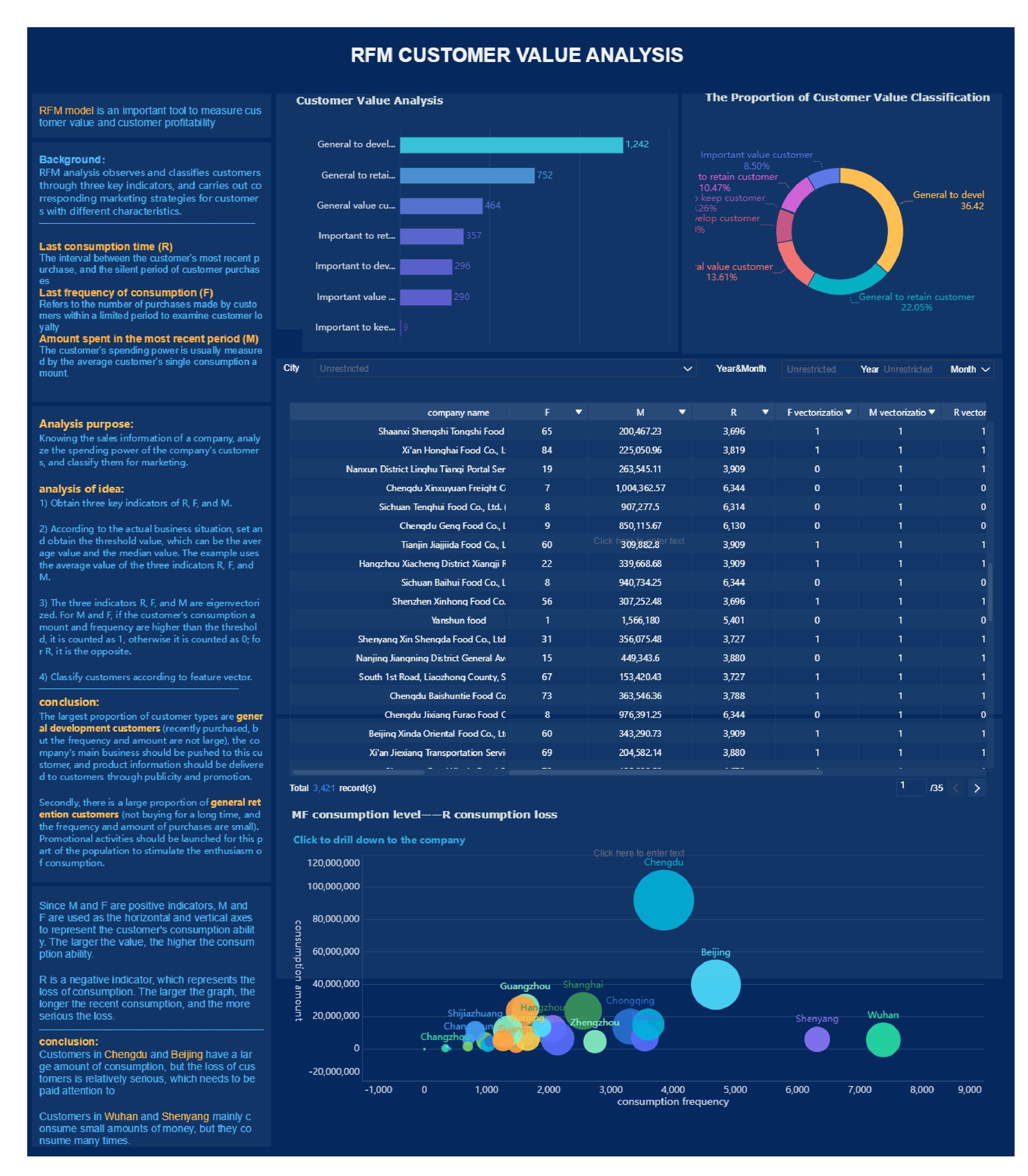
An enterprise churn dashboard should combine outcome KPIs such as gross revenue churn, net revenue churn, logo churn, and renewal rate with leading indicators like usage decline, support risk, sentiment shifts, and payment issues. It should also let teams drill from summary metrics into account-level risk and next actions.
Gross revenue churn measures recurring revenue lost from downgrades and churned customers without counting expansion. Net revenue churn factors in expansion and reactivation, so it shows whether retained accounts are offsetting lost revenue.
They usually combine signals such as renewal timing, declining product usage, unresolved support cases, negative feedback, and billing risk into a health score or risk model. The dashboard should rank accounts by risk so teams can prioritize outreach quickly.
The biggest problem is inconsistent metric definitions across finance, customer success, sales, and leadership. If teams use different time windows, account rules, or revenue logic, the dashboard becomes a source of debate instead of a tool for action.
A strong layout starts with top-line KPI cards and trend views for executives, then adds segmentation for managers, and finally a detailed at-risk account table for frontline teams. This structure helps users move from business-wide performance to specific interventions in a few clicks.
Product Trial
FineReport
Pixel-perfect reports · Interactive dashboards · Easy data entry · Digital twins
 That matters because enterprise retention workflows move fast. If your team is still stitching together spreadsheets, CRM exports, and one-off BI requests, you are reacting too late.


