A custom reporting dashboard is a software tool that lets teams connect data sources, build tailored reports, and present role-specific metrics in interactive dashboards.
How to Choose a Custom Reporting Dashboard Tool
Before comparing vendors, it helps to define what teams actually expect from a custom reporting dashboard in day-to-day work.
What teams usually need from a custom reporting dashboard
Most companies are not just looking for attractive charts. They need a reporting layer that turns scattered data into dashboards different stakeholders can trust and use.
Typical requirements include:
Unified visibility across tools such as CRM, ERP, marketing platforms, spreadsheets, cloud databases, and finance systems
Custom views for different users including executives, managers, analysts, and client-facing teams
Fast report creation without relying on developers for every change
Interactive exploration through filters, drill-downs, and dynamic date ranges
Automated distribution via scheduled emails, exports, TV dashboards, or embedded reports
Governance and permissions so users only access the right data
Consistent metrics across teams to reduce spreadsheet version conflicts
In practice, a marketing team may want campaign and attribution dashboards, a finance team may need controlled monthly board reporting, and an operations team may require live KPI tracking with alerts and drill-through detail.
Key evaluation criteria: data connections, visualization flexibility, permissions, automation, and pricing
When assessing any custom reporting dashboard software, focus on these five areas first:
Data connections: Does the platform connect natively to your stack, or will you need middleware, APIs, or manual CSV uploads?
Visualization flexibility: Can users build dashboards beyond basic charts, including tables, scorecards, drill-down paths, and reusable modules?
Permissions: Are role-based access, row-level security, approval workflows, and shared governance available?
Automation: Can reports refresh on schedule, trigger alerts, and distribute automatically in multiple formats?
Pricing: Is the cost based on users, viewers, refresh frequency, embedded use, data volume, or premium features?
A tool that looks affordable at the start can become expensive once you add governed sharing, large-scale distribution, or premium connectors.
When to prioritize ease of use versus advanced customization
Not every team needs the most customizable platform.
Choose ease of use when:
The team is small
Business users need to build reports without analysts
Reporting needs are fairly standard
Speed matters more than pixel-level control
Choose advanced customization when:
You need highly tailored dashboards for multiple departments
Embedded or white-labeled reporting is part of the requirement
Complex security, multi-source blending, or reusable report modules are essential
For many mid-sized and enterprise teams, the strongest option is not the simplest tool or the most technical one, but the platform that balances self-service with controlled customization. That balance is where FineReport stands out, especially for organizations that need highly flexible dashboard design, report formatting, and enterprise-level deployment without rebuilding reporting from scratch.
10 Custom Reporting Dashboard Tools Compared at a Glance
Comparison criteria used in this review
This review compares each custom reporting dashboard tool using the criteria buyers usually care about most:
Setup speed and learning curve
Report customization depth and dashboard flexibility
Sharing, scheduling, and collaboration options
Integration range, scalability, and total cost
The goal is not to crown one universal winner. It is to identify which tool fits which reporting environment.
Quick overview of the 10 custom reporting dashboard tools
Below are 10 widely used options for custom dashboards and reporting:
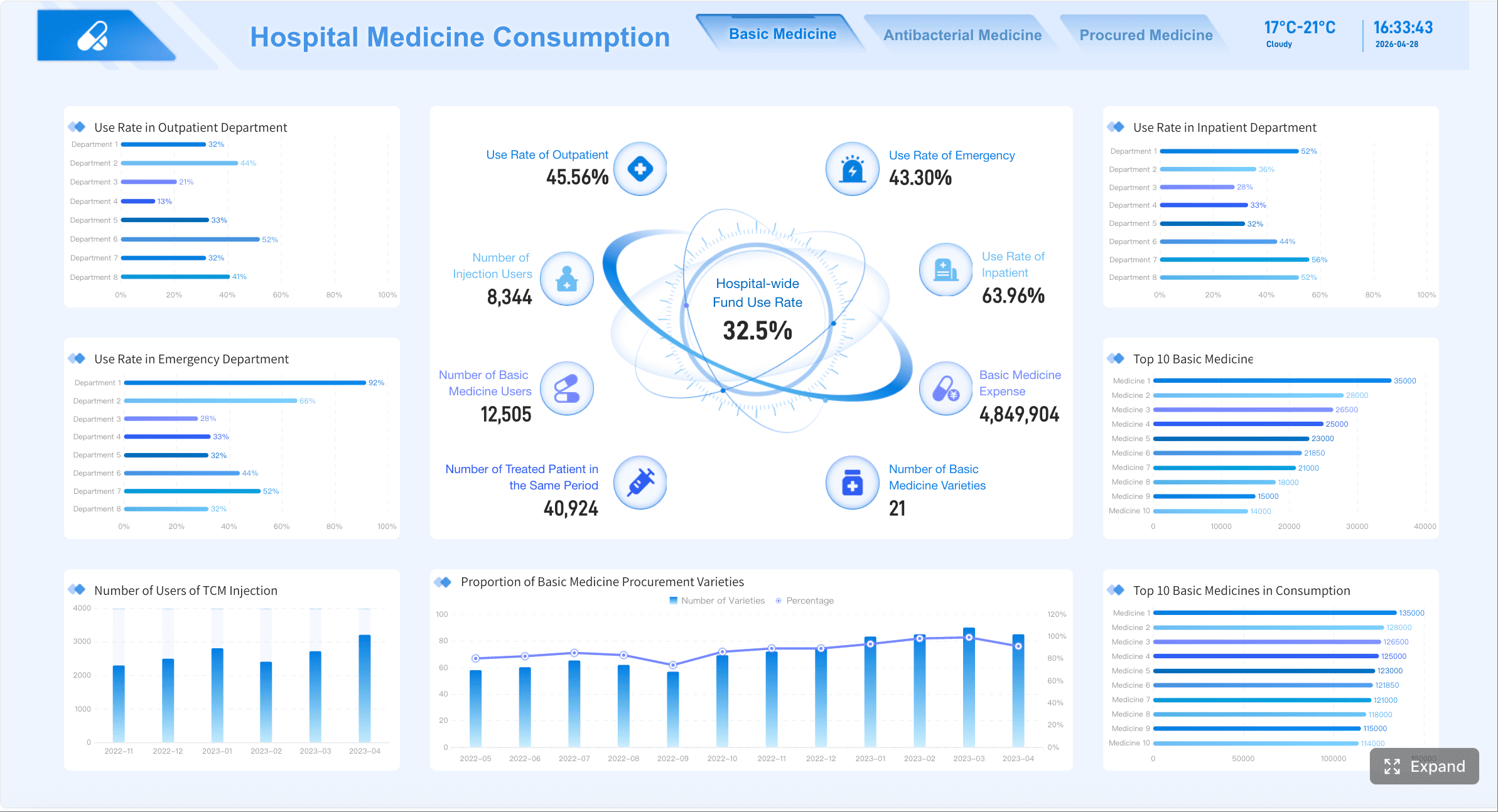
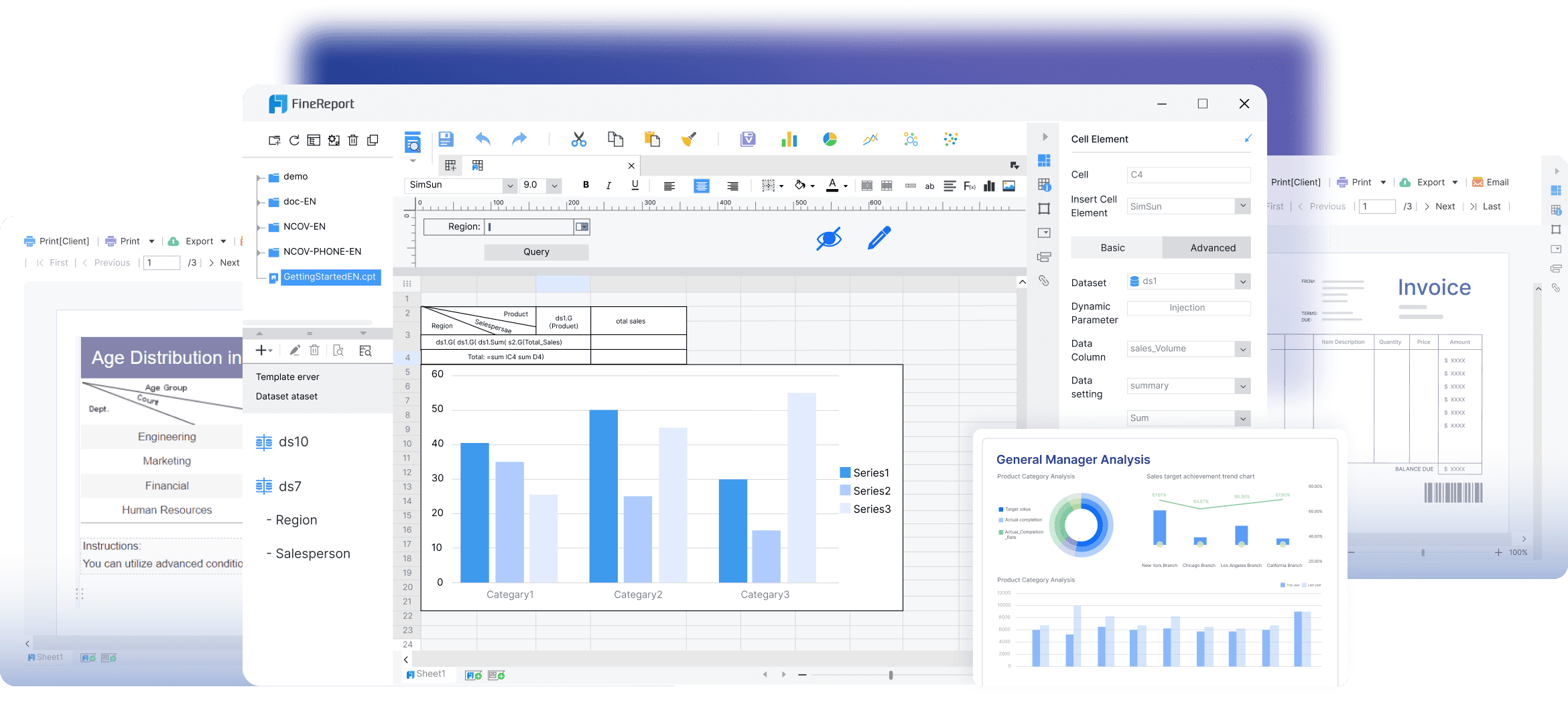
1. FineReport
One-sentence overview: A highly flexible enterprise reporting and dashboard platform built for pixel-perfect reports, complex dashboards, and governed self-service analytics.
Pros: Strong governance, reusable logic, scalable for data-mature organizations
Cons: Heavier implementation effort, less approachable for non-technical teams
Best For
Enterprises with centralized data teams and strong governance requirements
5. Klipfolio
One-sentence overview: A flexible dashboard reporting tool known for live metric tracking and broad integration coverage.
Key Features
Real-time dashboards
Client reporting support
Custom calculations
Scheduled email and TV dashboards
Pros & Cons
Pros: Good integration range, useful for KPI monitoring and agency reporting
Cons: Custom setup can become complex, less ideal for heavily governed enterprise reporting
Best For
Agencies, SaaS teams, and small-to-mid-sized companies tracking live performance metrics
6. HubSpot Reporting
One-sentence overview: A built-in reporting environment for teams already running marketing, sales, and service workflows in HubSpot.
Key Features
CRM-native reports
Dashboard sharing
Funnel and attribution reporting
Custom report builder by subscription tier
Pros & Cons
Pros: Fast setup for HubSpot users, no separate BI environment required for many use cases
Cons: Report limits and advanced features depend on plan level, less suitable as a full cross-system BI layer
Best For
Marketing and revenue teams working primarily inside the HubSpot ecosystem
7. Looker Studio
One-sentence overview: A lightweight dashboard tool for building shareable reports from Google and select third-party data sources.
Key Features
Free entry point
Easy dashboard creation
Google product integrations
Shareable online reports
Pros & Cons
Pros: Accessible, simple, good for quick dashboards
Cons: Limited governance, performance and modeling constraints for more complex reporting
Best For
Small teams, startups, and marketers needing simple dashboards quickly
8. Domo
One-sentence overview: A cloud analytics platform that combines data integration, dashboards, and distribution features in one environment.
Key Features
Cons: Pricing can be high, configuration may require specialist support
Best For
Growing and enterprise teams wanting a centralized cloud analytics platform
9. Qlik Sense
One-sentence overview: A self-service BI platform known for associative analysis and flexible data exploration.
Key Features
Associative engine
Interactive filtering
Dashboard creation
Governed self-service options
Pros & Cons
Pros: Strong exploration capabilities, useful for discovering hidden relationships in data
Cons: Interface and development model may feel less intuitive to casual users
Best For
Organizations with experienced analysts and exploratory reporting needs
10. Metabase
One-sentence overview: An accessible BI and dashboard tool designed for fast SQL and non-SQL reporting with a relatively low barrier to entry.
Key Features
Simple dashboard builder
Query editor
Scheduled reports
Open-source option
Pros & Cons
Pros: Fast to deploy, approachable, cost-effective for technical teams
Cons: Less polished for advanced enterprise formatting and governance
Best For
Startups and internal data teams that want lightweight reporting without heavy BI overhead
Best options for small teams, growing companies, and enterprise reporting
Small teams: Looker Studio, Metabase, HubSpot Reporting
FineReport: Best balance of custom report design and enterprise control; trade-off is broader capability than simple users may need
Power BI: Strong value and integration; trade-off is complexity in modeling and licensing
Tableau: Excellent visual analysis; trade-off is cost and enablement time
Looker: Strong governance; trade-off is technical setup
Klipfolio: Fast KPI dashboards; trade-off is less structured governance
HubSpot Reporting: Native convenience; trade-off is ecosystem dependency
Looker Studio: Fast and low-cost; trade-off is limited scalability for governed reporting
Domo: Unified cloud platform; trade-off is premium pricing
Qlik Sense: Strong associative analysis; trade-off is user onboarding
Metabase: Lightweight and efficient; trade-off is less enterprise-grade formatting
Feature-by-Feature Breakdown for Custom Reporting Dashboard
Dashboard customization and report building
A strong custom reporting dashboard should support both fast self-service creation and controlled formatting for formal reporting.
How well each platform supports custom dashboards for different stakeholders
Different stakeholders need different layouts:
Executives need at-a-glance KPI dashboards
Managers need operational trends and drill-down views
Analysts need flexibility in dimensions, filters, and calculations
Client-facing teams may need white-labeled or embedded dashboards
Tool-by-tool summary:
FineReport: Strong support for executive, operational, and formal reporting dashboards with highly customizable layouts
Power BI: Good stakeholder coverage, especially where reusable semantic models are established
Tableau: Strong for exploratory stakeholder views and presentation dashboards
Looker: Excellent for governed, reusable stakeholder dashboards built on defined logic
Klipfolio: Good for KPI-centric dashboards and client-facing monitoring
HubSpot Reporting: Best for sales and marketing users already inside the platform
Looker Studio: Good for basic stakeholder summaries
Domo: Strong for broad distribution across business users
Qlik Sense: Strong for users who need interactive exploration
Metabase: Good for internal stakeholders with straightforward dashboard needs
Whether users can create custom reports without heavy technical support
For self-service reporting, the practical question is simple: can business users make changes without waiting on data teams?
Easiest for non-technical users: Looker Studio, HubSpot Reporting, Metabase
Moderate self-service with some training:FineReport, Power BI, Klipfolio, Domo
More dependent on technical setup or analyst support: Tableau, Looker, Qlik Sense
FineReport performs well here because it supports business-friendly report creation while still allowing deeper configuration for complex enterprise requirements. That makes it a strong option when teams want self-service without giving up structured reporting standards.
Flexibility to create and edit report modules for custom dashboards
Reusable report modules matter when teams need to build multiple dashboards from shared components.
Important capabilities include:
Reusable widgets or tiles
Shared filters and parameters
Template-based layouts
Dashboard sections for different roles
Ability to edit report modules without breaking upstream logic
Best performers in modular flexibility:
FineReport: Strong support for reusable report blocks, templates, and formatted components
Looker: Very strong if the organization is comfortable with model-driven development
Power BI: Good through reusable datasets and report components
Tableau: Good for visual composition, though standardization can require discipline
Domo: Solid app-style composition
Klipfolio: Flexible, especially for KPI modules, though governance is lighter
Data handling and dynamic reporting
A custom reporting dashboard is only as useful as the freshness, consistency, and adaptability of the data behind it.
Support for live data, scheduled refreshes, and multi-source blending
Most teams need some combination of:
Live or near-real-time dashboards
Scheduled refreshes for operational or management reporting
Blended views across CRM, finance, marketing, and database sources
General performance:
Strong for live and scheduled reporting:FineReport, Power BI, Tableau, Domo, Qlik Sense
Strong for governed warehouse-centric reporting: Looker
Good for cloud app and KPI blending: Klipfolio
Good but simpler for lightweight use cases: Looker Studio, Metabase
Strong within native CRM data environment: HubSpot Reporting
If your reporting process combines operational systems, databases, and formal report outputs, FineReport is especially effective because it can handle both interactive dashboards and highly structured reports from multiple sources in one reporting environment.
Dynamic reporting with customizable reports for changing business needs
Business questions change quickly. Dashboards need to keep up without forcing a rebuild every quarter.
Useful dynamic reporting features include:
Parameter-driven reports
Dynamic date controls
User-specific filtering
Drill-down paths
Custom dimensions and metrics
Layout changes by audience or department
Best tools for dynamic reporting:
FineReport: Strong mix of dynamic parameters and structured customization
Power BI: Strong with filters, bookmarks, and drill-through
Tableau: Excellent interactivity and exploratory behavior
Looker: Strong if modeled correctly upfront
Qlik Sense: Very strong for associative exploration
Klipfolio: Good for changing KPI views and metric-focused dashboards
Filtering, drill-downs, and interactive views for faster decisions
Interactive reporting reduces follow-up questions and ad hoc analysis requests.
Here is where each category performs best:
Advanced drill-down and exploration: Tableau, Qlik Sense, Power BI
Controlled interactive dashboards plus formal reporting:FineReport
Metric-governed exploration: Looker
Quick filtering for business users: HubSpot Reporting, Looker Studio, Domo
Simple but useful interactivity: Metabase, Klipfolio
Collaboration, governance, and usability
Reporting is not just about building dashboards. It is also about how teams share, control, and trust them.
Access controls, approvals, and version consistency
Governance matters most when multiple departments rely on the same dashboard.
FineReport is especially strong for organizations that need both interactive dashboards and formatted exports for management packs, operational documents, or embedded reporting projects.
How intuitive each tool feels for analysts, managers, and executives
Usability differs by role:
Analysts often prefer Tableau, Power BI, Qlik Sense, or Looker
Managers often prefer FineReport, Domo, HubSpot Reporting, or Looker Studio
Executives often benefit most from clear, structured dashboards in FineReport, Power BI, Domo, or Tableau
Technical startup teams often find Metabase practical and efficient
There is no universal usability winner. The best experience depends on whether your users mostly build reports, review dashboards, or govern enterprise metrics.
Pros, Limits, and Best-Fit Use Cases for Each Custom Reporting Dashboard Tool
Best-fit scenarios by team type
Below is a more practical view of where each custom reporting dashboard tool fits best.
1. FineReport
One-sentence overview: FineReport is a custom reporting dashboard platform built for teams that need flexible dashboard design, complex report formatting, and enterprise-grade deployment.
Key Features
Pixel-level report design
Interactive dashboards with drill-down
Multi-source connectivity
Scheduled distribution and export automation
Embedding and portal deployment
Pros & Cons
Pros: Excellent for complex reports, strong governance, flexible custom dashboards, strong fit for enterprise operations and finance
Cons: Can be more robust than needed for very basic reporting environments
Best For
Finance, operations, executive reporting, manufacturing, and enterprise management reporting
Marketing teams, agencies, and growth-focused teams
6. HubSpot Reporting
One-sentence overview: HubSpot Reporting is a CRM-native reporting option for marketing, sales, and service teams using HubSpot as their primary system.
Key Features
Native custom reports
Funnel and attribution reporting
Dashboard sharing
Subscription-tier-based advanced reporting
Pros & Cons
Pros: Fast setup, strong for revenue team reporting
Cons: Cross-platform reporting is limited compared to dedicated BI platforms
Best For
Marketing, sales, revops, and customer success teams in HubSpot-centric organizations
7. Looker Studio
One-sentence overview: Looker Studio is a lightweight dashboard solution for simple, shareable reporting.
Key Features
Quick dashboard setup
Google integration
Shareable reports
Free or low-cost entry
Pros & Cons
Pros: Easy to start, low barrier to adoption
Cons: Limited governance and complexity handling
Best For
Startups, marketers, and small internal reporting teams
8. Domo
One-sentence overview: Domo is a cloud analytics platform combining dashboards, data integration, and sharing in one system.
Key Features
Connectors
Alerts
Cloud dashboards
Collaborative access
Pros & Cons
Pros: Broad capabilities in one platform
Cons: Cost and implementation effort can be significant
Best For
Growing companies and enterprises wanting centralized cloud reporting
9. Qlik Sense
One-sentence overview: Qlik Sense is a flexible BI tool designed for interactive, associative data analysis.
Startups, product teams, and internal technical reporting environments
Common limitations to watch for
Even strong tools have constraints. Here are the most common issues buyers run into.
Pricing constraints, data limits, feature gating, or implementation complexity
Watch for:
Feature gating by plan: Common in HubSpot Reporting, Looker Studio connectors, and some cloud BI platforms
Viewer-based cost inflation: Relevant for Power BI, Tableau, Domo, and some embedded scenarios
Implementation overhead: Common with Looker, Qlik Sense, and enterprise Tableau deployments
Customization limits: Often seen in simpler tools like Looker Studio or native CRM reporting
Maintenance burden: Possible in highly flexible tools if governance is not established early
Situations where a tool may look powerful but be harder to scale or maintain
A dashboard platform may perform well in a pilot but become difficult later if:
Dashboards rely on too many manual spreadsheet uploads
Business logic is duplicated across dozens of reports
Security is handled informally
Custom visualizations are hard to maintain
Distribution needs extend beyond browser access into formal reporting packs or embedded delivery
This is why many organizations eventually move from lightweight dashboard tools to platforms such as FineReport, Power BI, or Looker when reporting maturity increases.
Custom dashboards and report builder in action
A tool is easier to assess when you map it to actual workflows.
Real-world examples of how teams create and customize reporting dashboards
Marketing team: Connect ad, web analytics, and CRM sources to create channel performance dashboards with campaign filters and weekly email snapshots
Sales team: Build executive pipeline dashboards with drill-down from region to rep to deal stage
Finance team: Generate formal monthly management reports with consistent formatting, scheduled delivery, and role-based access
Operations team: Monitor live production, fulfillment, or service KPIs with exception-based alerts and daily performance views
Agency team: Create client-specific dashboards with branded views and recurring exports
Typical workflows from raw data to stakeholder-ready views
In this workflow, FineReport is particularly effective for teams that need both interactive dashboards and highly formatted output. For example, a finance department can create a live KPI dashboard for managers and also generate structured monthly board reports from the same reporting environment. That dual capability is one reason it stands out from tools that are stronger only in exploration or only in lightweight dashboarding.
Which Custom Reporting Dashboard Tool Is the Best Fit for Your Reporting Needs?
Best choices by priority
Best for fast setup and simple reporting
If speed and simplicity matter most, start with:
Looker Studio for lightweight dashboarding
HubSpot Reporting for CRM-native reporting
Metabase for simple internal BI
Klipfolio for fast KPI dashboards
These options work well when reporting needs are straightforward and governance is not highly complex.
Best custom dashboard software and reporting tool for advanced flexibility
If your priority is advanced customization, scalable reporting workflows, and support for both dashboards and formal reports, the top choice is:
Choose FineReport if you need the strongest combination of custom reporting dashboard flexibility, structured report building, enterprise governance, and scalable dashboard delivery
For most organizations beyond the startup stage, the best platform is the one that can support both today’s reporting requests and tomorrow’s governance demands. If your team needs more than lightweight dashboards and wants a reliable path to advanced, customizable, and stakeholder-ready reporting, FineReport is one of the strongest options to shortlist first.
It is software that connects data from multiple sources and turns it into tailored reports and interactive dashboards for different users. These tools help teams monitor KPIs, explore trends, and share insights more efficiently.
Start by checking data integrations, dashboard flexibility, permissions, automation features, and total pricing at scale. The right choice depends on whether you need quick self-service reporting or deeper customization and governance.
Yes, many platforms offer drag-and-drop builders, templates, and reusable widgets that let business users create reports without developer help. More advanced tools may still require training for data modeling or complex calculations.
The most important features usually include broad data connections, interactive filtering, drill-down analysis, role-based access, scheduled refreshes, and easy sharing or embedding. Strong governance is especially important when multiple teams rely on the same metrics.
For complex enterprise reporting, teams often look for platforms with strong formatting, permissions, automation, and multi-source dashboard design. In this comparison, FineReport stands out for organizations that need pixel-perfect reports and governed dashboard deployment.
Product Trial
FineReport
Pixel-perfect reports · Interactive dashboards · Easy data entry · Digital twins
 Key Features
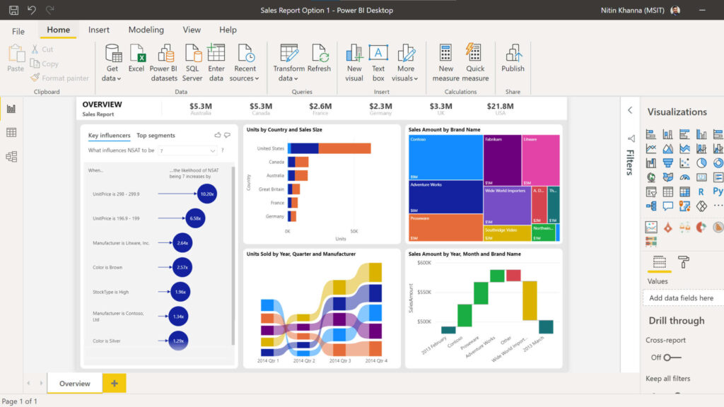 Key Features
 Key Features
 Key Features
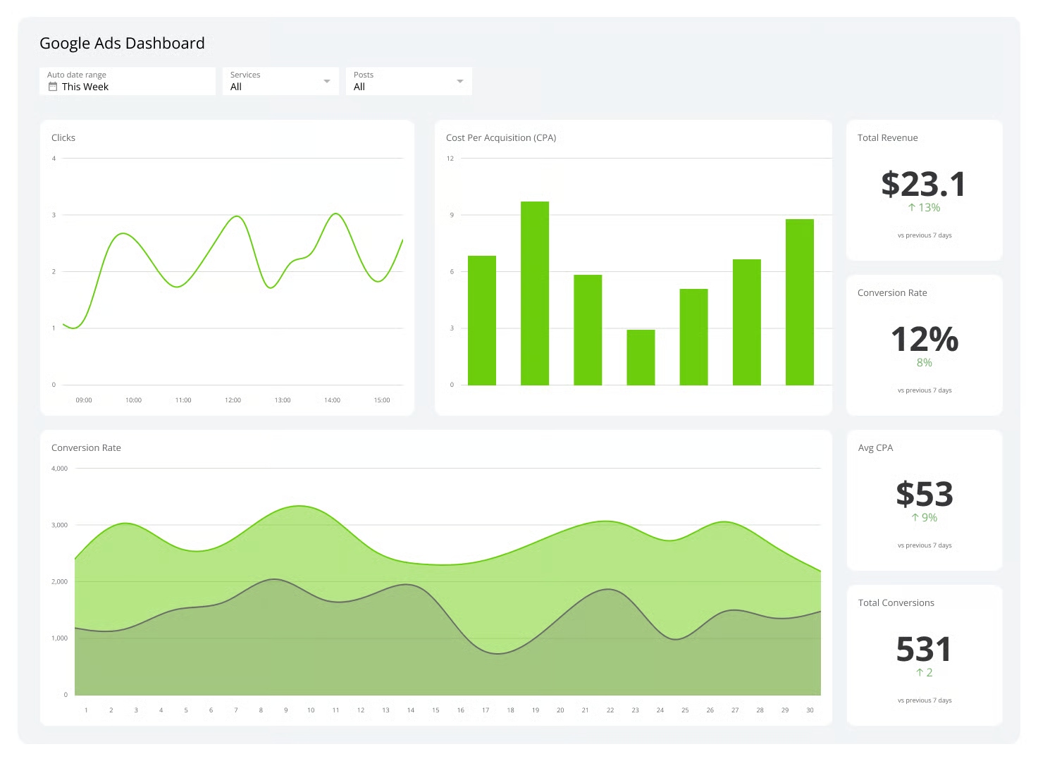 Key Features
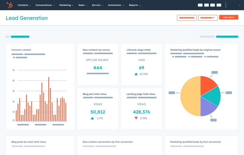 Key Features
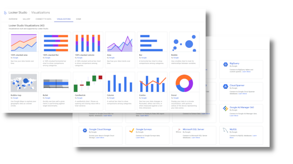 Key Features
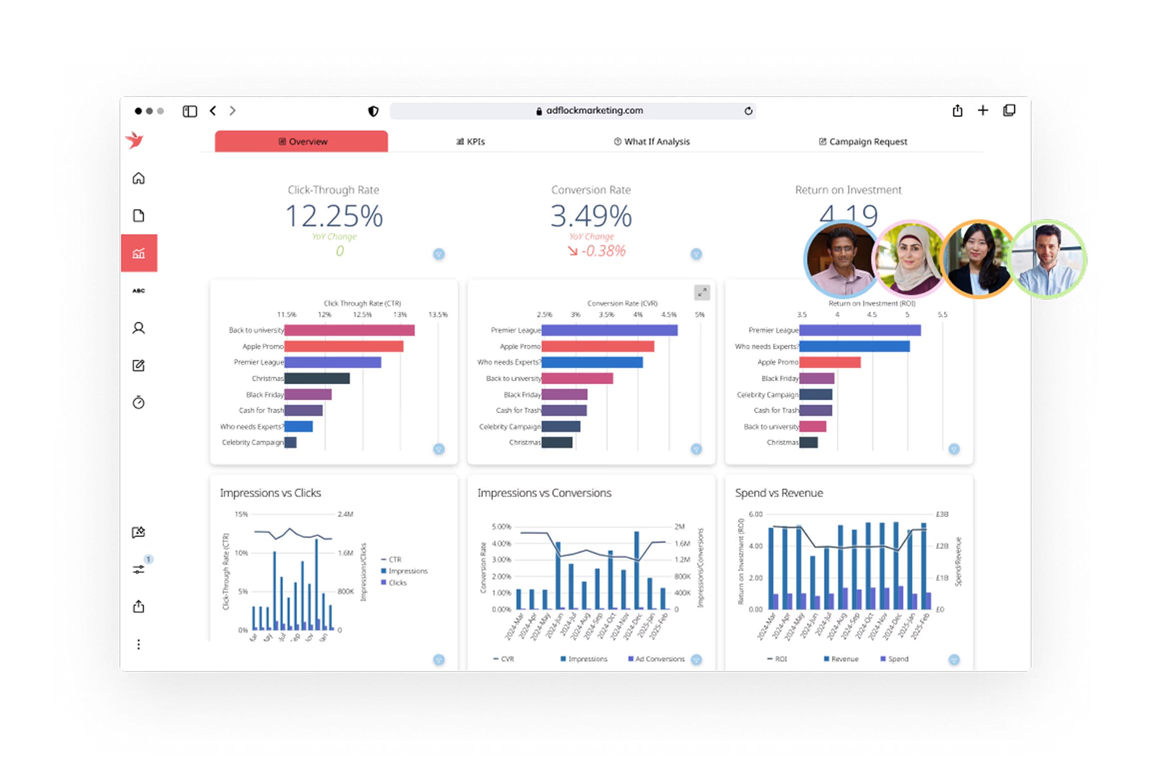 Key Features
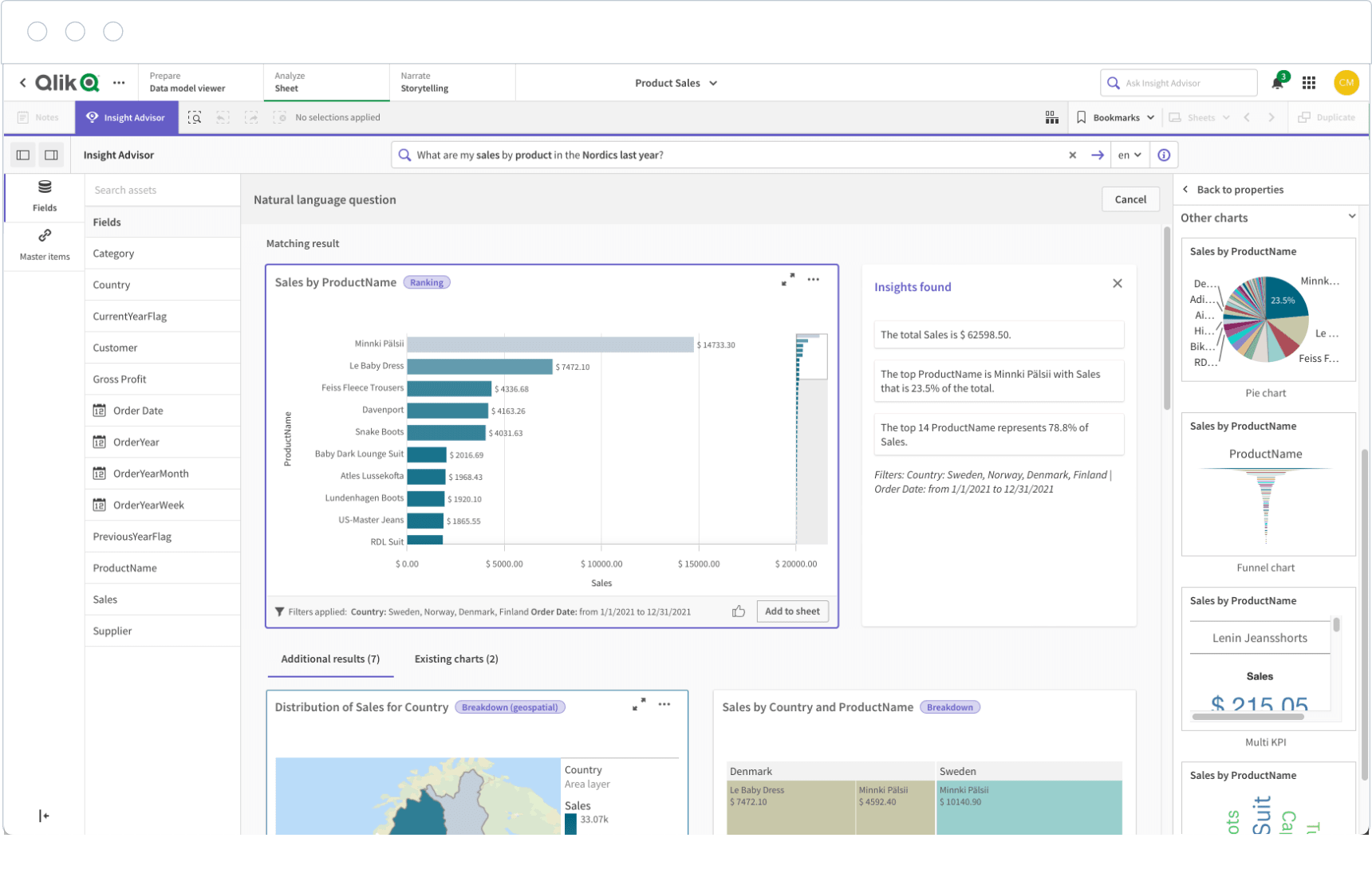 Key Features
 Key Features