Operational reports are the daily control system for running a business. They help operations managers, department heads, analysts, and frontline supervisors see what is happening right now, identify issues before they escalate, and make faster decisions with less guesswork. If your team is still stitching together spreadsheets, chasing updates across systems, or waiting on analysts to answer basic performance questions, better operational reporting can directly improve speed, accountability, and execution.
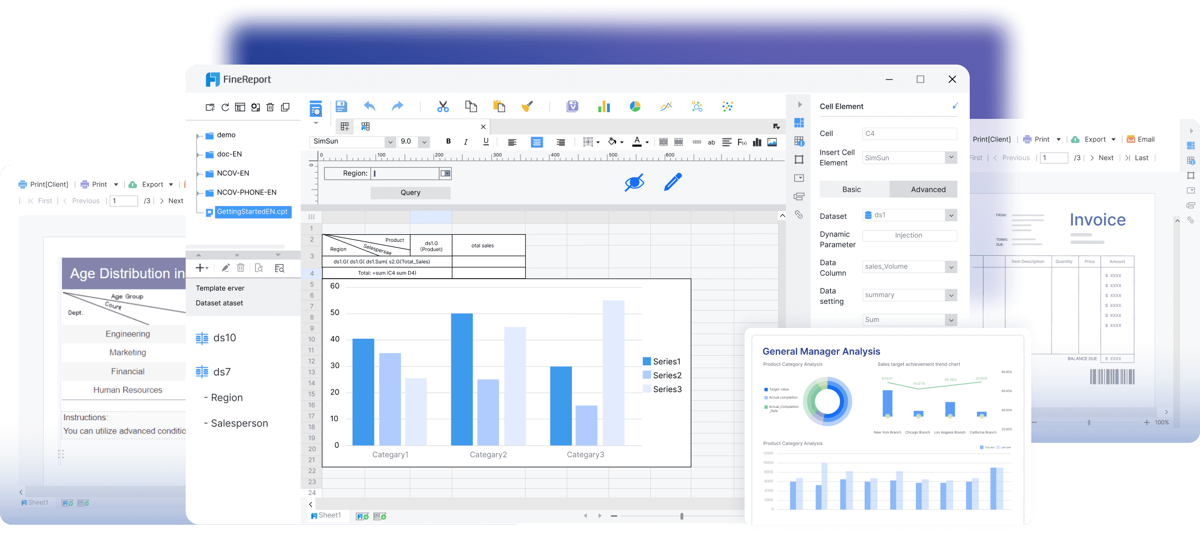
All reports in this article are built with FineReport
What operational reports are and why teams rely on them every day
Operational reports are structured reports or dashboards used to monitor day-to-day business activity. Unlike strategic reports built for quarterly planning, operational reports are designed for immediate action. They show current performance, exceptions, workloads, delays, service levels, and process health so teams can respond quickly.
In simple terms, an operational report answers questions like:
How much work did we complete today?
Where are delays happening?
Are we meeting SLAs?
Which teams are overloaded?
What needs attention before the next shift, meeting, or service window?
These reports are used across nearly every function:
Frontline managers use them to monitor team output, queues, and exceptions.
Operations leaders use them to track service consistency, staffing efficiency, and bottlenecks.
Analysts and business partners use them to validate performance and support root-cause analysis.
The business value is straightforward: timely reporting compresses the gap between event and action. When teams can see current performance clearly, they can correct issues faster, allocate resources better, and reduce the cost of operational drift.
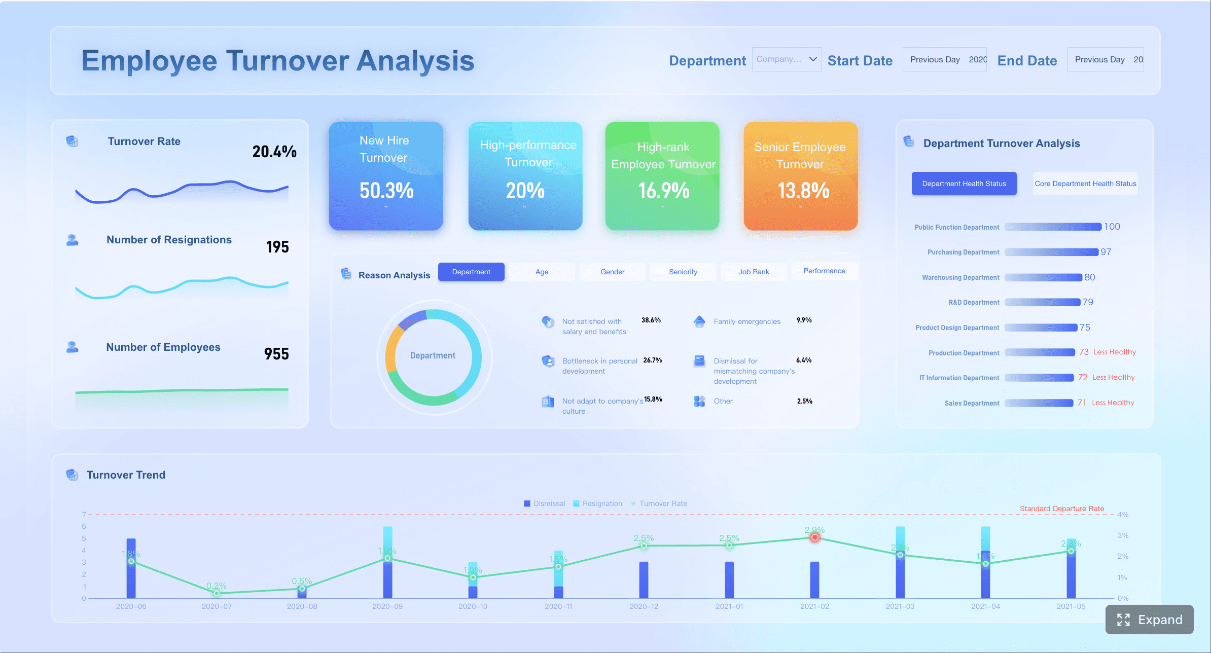
The 7 key metrics most operational reports include
The most effective operational reports are not overloaded with vanity metrics. They focus on the few measures that help teams detect problems, prioritize action, and maintain control over daily execution.
Key Metrics (KPIs)
Volume and throughput: Measures how much work is entering and leaving a process, such as orders processed, tickets resolved, or units produced.
Cycle time and turnaround time: Tracks how long work takes from initiation to completion.
SLA and on-time performance: Shows whether service commitments, deadlines, or delivery windows are being met.
Quality, error rate, and rework: Highlights defects, corrections, returns, and repeated work that reduce efficiency.
Utilization and capacity: Compares available people, machines, or time with actual usage.
Backlog and queue health: Reveals pending work volume, aging items, and bottlenecks.
Cost and productivity: Connects operational effort to cost efficiency and output per resource.
Volume and throughput
Volume and throughput are often the first metrics leaders check because they show whether work is flowing. In sales operations, that may mean orders booked and fulfilled. In customer support, it could be tickets opened versus resolved. In manufacturing, it may be units produced per hour or shift.
Use this KPI to answer:
Is demand increasing or falling?
Is output keeping pace with intake?
Are some teams or locations consistently underperforming?
A drop in throughput does not always mean poor performance. It may signal staffing gaps, upstream delays, system issues, or changes in demand. That is why this metric works best when paired with backlog and cycle time.
Cycle time and turnaround time
Cycle time measures the elapsed time required to complete a process. Turnaround time is similar, often referring to how long it takes to finish a specific request from receipt to delivery.
These metrics matter because delays compound. A process that slips by only a few hours each day can create major downstream disruption by the end of the week.
Track cycle time by:
Team
Process stage
Product line
Region
Customer segment
This helps pinpoint where work stalls. For example, if order approval is fast but fulfillment is slow, your real issue is not intake. It is downstream execution.
SLA and on-time performance
SLA compliance is essential in service-heavy operations. It tells you whether your team is delivering within agreed response times, resolution times, or shipment windows.
Common SLA-related measures include:
First response within target
Resolution within target
On-time shipment rate
On-time delivery rate
Missed deadline count
For enterprise teams, this metric is operationally critical because it links internal performance to customer experience, contract obligations, and revenue retention.
Quality, error rate, and rework
Operational reporting should not focus only on speed. Fast output with poor quality creates hidden cost. Error rate, defect rate, return rate, and rework volume show where efficiency is being undermined.
Examples include:
Incorrect invoices
Returned orders
Defective production output
Reopened support tickets
Manual corrections to payroll or finance workflows
This category is especially useful for identifying process instability. If throughput is high but rework is also rising, the process may look healthy on the surface while actually consuming more labor and creating service risk.
Utilization and capacity
Utilization and capacity metrics show whether resources are balanced. This includes labor, equipment, warehouse space, call center agents, or production lines.
Typical metrics include:
Agent occupancy
Machine uptime
Labor utilization rate
Capacity used versus capacity available
Shift coverage ratio
These KPIs help managers answer one of the most practical daily questions: do we have the right level of resources for the workload in front of us?
Without this view, teams often oscillate between overstaffing and overload.
Backlog and queue health
Backlog is one of the clearest signals of operational stress. If incoming work exceeds completed work, queues grow. If aged items accumulate, service performance eventually slips.
A strong backlog view should include:
Total open items
Aging buckets
Queue by priority
Queue by team or location
Work at risk of breaching SLA
This metric is particularly valuable in environments where delays are costly, such as customer service, claims processing, field service, logistics, and internal shared services.
Cost and productivity
Operational leaders ultimately need to tie activity to efficiency. Cost and productivity metrics connect process output with labor or operating expense.
Examples include:
Cost per order
Cost per ticket resolved
Output per employee
Revenue per shift
Units per labor hour
This is where operational reporting becomes more strategic. It moves beyond “Are we busy?” to “Are we operating efficiently?”
How to structure operational reports
A dashboard for operational reports should help users move from detection to action in seconds. If people need to hunt for the problem, ask what a chart means, or export the data into another tool before they can respond, the dashboard is not doing its job.
Start with the metrics that require action
Put the most actionable KPIs at the top. This usually means metrics tied to service risk, delays, output shortfalls, or exceptions.
A practical top section often includes:
Throughput today versus target
Backlog volume and aged items
SLA at risk
Capacity status
Critical exceptions or alerts
This layout works because it mirrors how operational decisions are made. Managers need to know first whether something requires intervention, not just whether a trend is interesting.
This structure makes it easier to serve multiple users without cluttering the screen. A regional operations director may want performance by location, while a frontline supervisor may need line-item detail for a specific queue.
Use segmentation that reflects how decisions are actually made:
By department
By service line
By plant or warehouse
By shift
By region
By hour, day, or week
Use clear visuals and thresholds
Operational reporting works best when users can distinguish normal from abnormal immediately.
Best-practice visual choices include:
KPI cards for current status
Line charts for trend and volatility
Bar charts for team or site comparison
Tables with conditional formatting for detailed monitoring
Status icons or traffic-light indicators for threshold-based alerts
Define thresholds clearly. For example:
SLA below 95% = warning
Queue aging above 48 hours = critical
Utilization above 90% for 3 days = overload risk
Thresholds turn passive reporting into active management.
Keep reporting accurate, timely, and easy to read
Trust is everything in operational reports. If definitions vary by department or refresh timing is inconsistent, adoption falls quickly.
To keep dashboards credible:
Standardize KPI definitions
Document calculation logic
Align refresh frequency to operational need
Label time windows clearly
Keep filters simple and relevant
Avoid chart overload
The strongest reporting environments also establish a shared metric language: name, formula, data source, refresh cadence, and owner. That prevents debates over numbers and keeps attention on action.
That combination improves daily execution and longer-term planning at the same time.
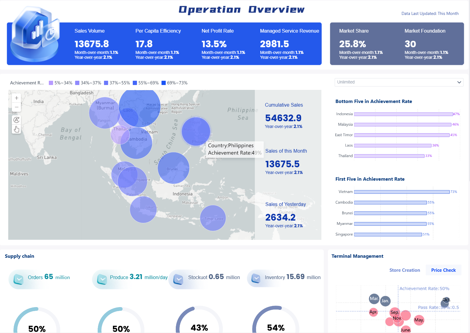
Common types and examples of operational reports teams use
Operational reports appear in almost every department, but the best designs are tailored to the workflow being managed.
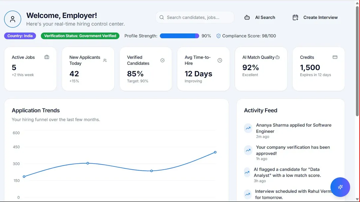
Sales and revenue operations reports
Sales and revenue teams use operational reports to manage pipeline movement, order processing, fulfillment status, and conversion efficiency.
Common metrics include:
New leads and opportunities
Pipeline stage movement
Orders booked
Conversion rate
Fulfillment status
Revenue by day or rep
A sales operations manager might review a daily dashboard each morning to see whether deal activity is keeping pace with target and whether order fulfillment issues are putting revenue at risk.
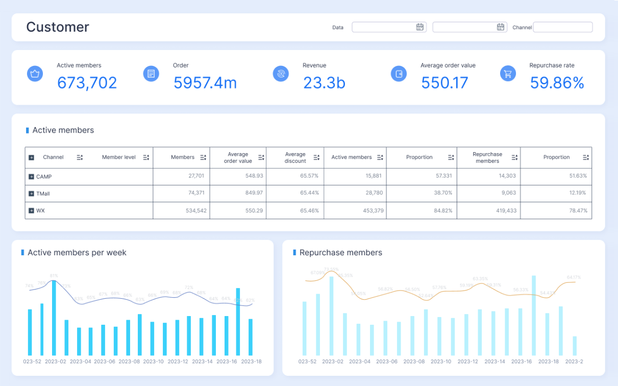
Customer support and service reports
Support organizations rely heavily on operational reports because service delays show up fast in customer sentiment.
Common metrics include:
Ticket intake
First response time
Resolution time
Open ticket backlog
SLA compliance
Reopened tickets
Agent utilization
For example, if response times spike during a promotion or seasonal surge, an operational dashboard should flag the trend early enough for the manager to reassign staff before complaints escalate.
Manufacturing, logistics, and inventory reports
These teams need granular visibility into output, downtime, movement, and stock health.
Common metrics include:
Units produced
Scrap or defect rate
Downtime
Order picking accuracy
Fill rate
Inventory turnover
Stockout risk
On-time delivery
In logistics, a daily operations report often combines throughput, delay reasons, queue status, and on-time performance to keep warehouse and transport teams aligned.
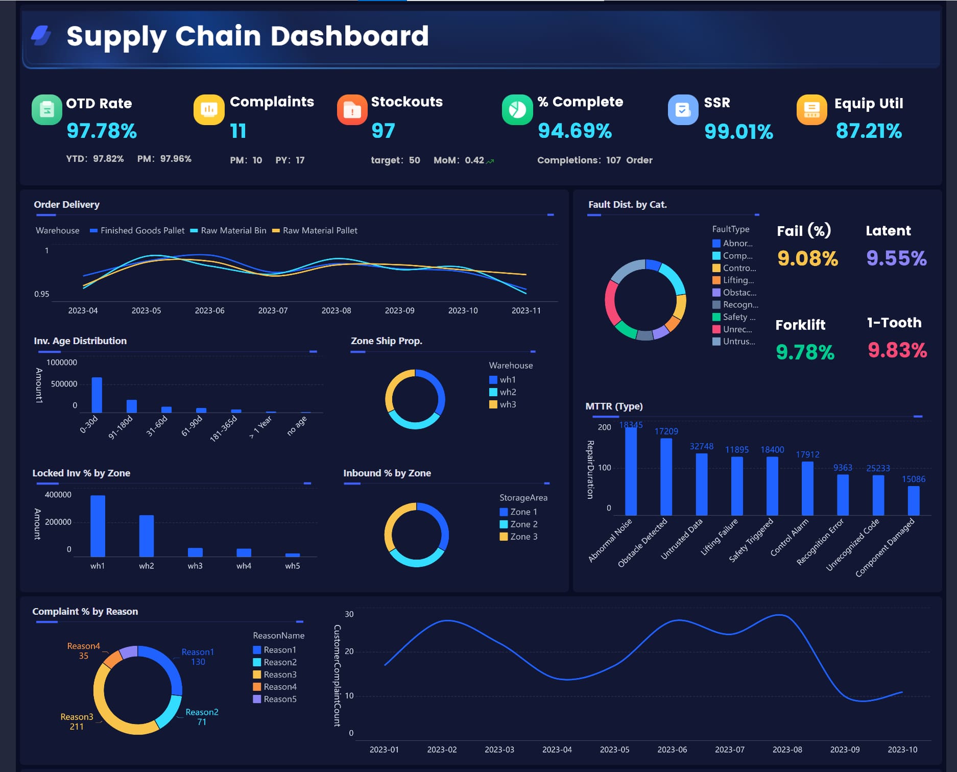
Finance, HR, and IT operations reports
Operational reports are just as important in internal functions, especially where recurring workflows must be completed accurately and on time.
Common use cases include:
Finance: cash collections, payment processing, expense exceptions, close task completion
IT: system uptime, incident response, ticket backlog, change request status
An IT operations dashboard, for instance, may track incidents by severity, mean time to resolve, SLA compliance, and system availability so leaders can quickly spot service degradation.
Best practices for making operational reports useful every day
Many operational reports fail for one reason: they show data, but they do not support a decision. Effective reporting starts with operational ownership, decision context, and a review rhythm.
1. Match each report to a decision, owner, and cadence
Every operational report should answer three questions:
What decision does this support?
Who owns the response?
How often is it reviewed?
A daily report for warehouse supervisors should not look like a monthly executive operations summary. Design for the decision moment, not for generic visibility.
2. Limit the dashboard to actionable KPIs
Do not confuse comprehensiveness with usefulness. Teams act faster when the dashboard emphasizes the few KPIs that reveal performance risk.
A seasoned rule of thumb: if a metric does not drive a clear action, move it to a secondary view.
3. Add context with targets, benchmarks, and recent trends
A raw number rarely tells the full story. “Backlog: 1,240” means little unless users know:
Is that above target?
Is it rising?
Which segment is driving it?
Has this happened before?
Add targets, variance indicators, short-term trends, and threshold colors so users can interpret performance instantly.
4. Build drill-down paths for root-cause analysis
Teams should be able to move from summary KPI to underlying detail without leaving the dashboard.
Examples:
From late deliveries to route-level exceptions
From ticket backlog to team and agent views
From production shortfall to line, machine, or shift
This is where many spreadsheet-based reporting processes break down. Detection happens in one file, investigation happens in another, and action slows down.
5. Review and refine the report continuously
Operations change. So should the report.
As processes, staffing models, channels, and business priorities evolve, your operational reports need tuning. Review them regularly with actual users and remove metrics or visuals that no longer support decisions.
Building operational reports at scale with FineReport
Building this manually is complex; use FineReport to utilize ready-made templates and automate this entire workflow.
Get Ready-to-Use Dashboard Templates in Fine Gallery
That matters because operational reporting is rarely just one dashboard. Enterprise teams need a connected reporting system that can pull from multiple sources, standardize KPI logic, automate updates, support drill-down analysis, and distribute reports to the right people on the right schedule.
FineReport helps teams do exactly that by enabling:
Multi-source data integration across ERP, CRM, MES, finance systems, APIs, and spreadsheets
Low-code report development with an Excel-like design experience
Operational dashboards that combine KPI cards, charts, tables, filters, and drill-down interactions
Automated report scheduling and distribution for daily, weekly, and monthly operational reporting
Threshold-based alerts and notifications to surface exceptions early
Mobile access so managers can monitor operations anywhere
Role-based permissions for secure enterprise-wide deployment
Export and print options for PDF, Excel, and Word-based reporting needs
For organizations still relying on manual reporting, this can eliminate a major operational bottleneck. Instead of teams spending hours collecting data, reconciling numbers, and formatting recurring reports, they can shift focus to issue resolution and process improvement.
FineReport is especially strong when you need to support both:
Interactive dashboards for monitoring and drill-down
Automated report push for shift handoffs, morning meetings, and management updates
The result is not just better visibility. It is a more reliable operating rhythm: one version of the truth, faster exception handling, and less time wasted producing reports by hand.
If your goal is to make operational reports truly useful every day, start with the right KPIs, structure the dashboard around action, and automate delivery wherever possible. That is how reporting becomes part of execution rather than an after-the-fact summary.
An operational report is a day-to-day report or dashboard that shows current business activity, performance, and issues that need immediate attention. Teams use it to monitor workflows, spot exceptions, and make faster decisions.
Operational reporting focuses on current performance and short-term action, while analytical reporting looks at patterns, causes, and longer-term trends. In practice, operational reports help teams react now, and analytical reports help them improve later.
Most operational reports track a small set of actionable KPIs such as throughput, cycle time, SLA performance, backlog, quality, utilization, and productivity. The right mix depends on the process, audience, and decisions the report is meant to support.
A good operational dashboard is easy to scan, updates at the right frequency, and highlights exceptions before they become bigger problems. It should show the most important KPIs first and let users drill into the causes of delays, errors, or capacity issues.
That depends on how fast the business changes, but many teams review them daily, hourly, or in real time. The best update frequency is the one that helps users take action before problems escalate.
Product Trial
FineReport
Pixel-perfect reports · Interactive dashboards · Easy data entry · Digital twins