Enterprise customer success teams do not lose accounts because they lack data. They lose accounts because critical signals are scattered across CRM records, product analytics, support systems, survey tools, and CSM notes. A strong customer success dashboard solves that problem by turning fragmented account activity into a clear operating view of health, renewal risk, adoption, and expansion potential.
For operations leaders, CS directors, and revenue teams, the business value is straightforward: faster risk detection, better renewal forecasting, more consistent CSM execution, and stronger expansion planning across complex account portfolios. In enterprise environments, that visibility is not optional. It is how teams manage large contracts, multiple stakeholders, regional rollups, and high-cost churn events.
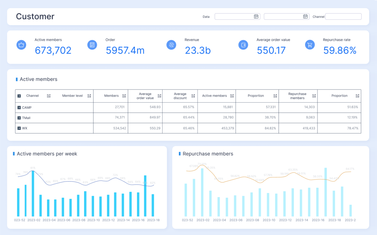
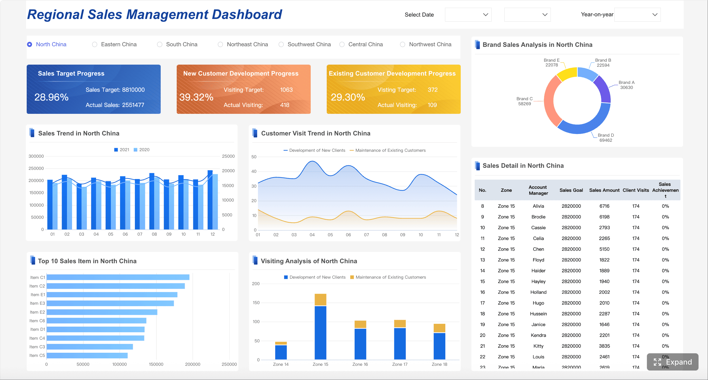
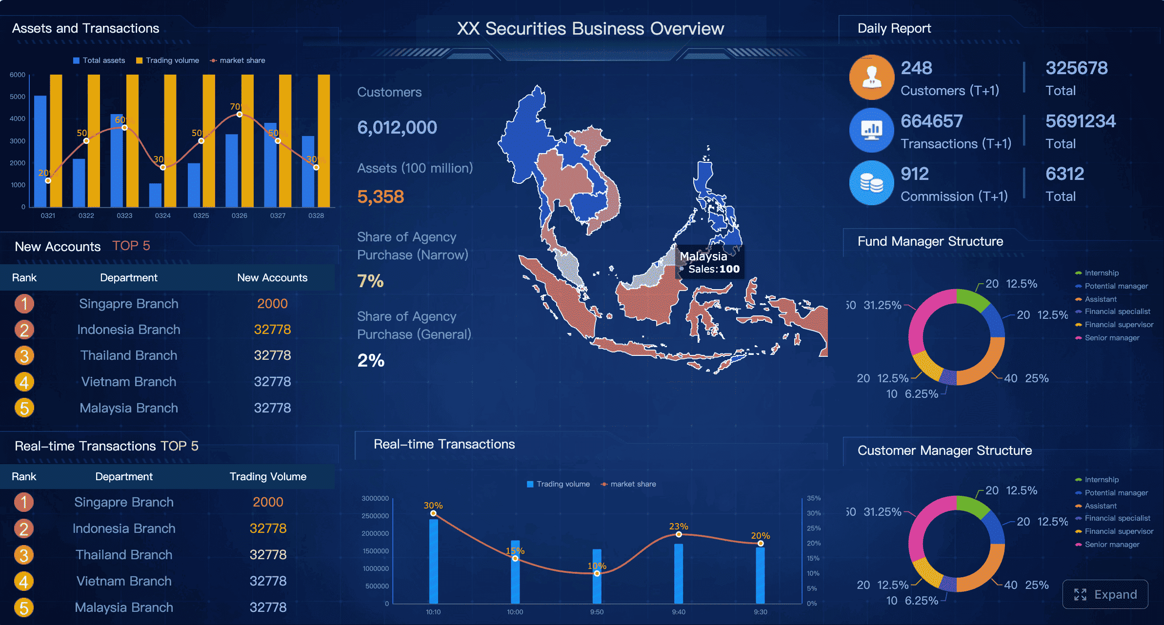
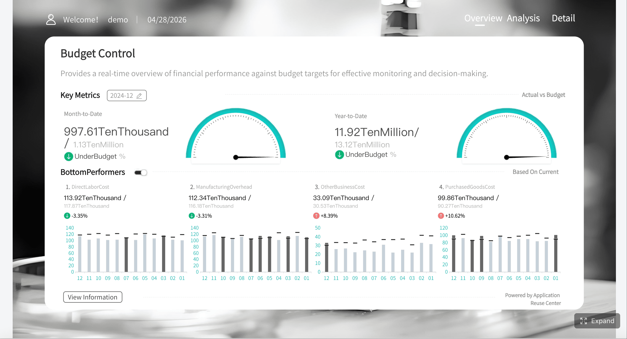
All dashboards in this article are created by FineBI
What a customer success dashboard should do for enterprise accounts
A customer success dashboard for enterprise accounts should help teams answer three practical questions:
Which accounts are healthy, at risk, or ready to grow?
Why is an account moving in that direction?
What should the CSM, manager, or executive do next?
Unlike generic reporting, enterprise customer success reporting must support action at multiple levels. CSMs need account-level context. Leaders need portfolio trends. Executives need revenue-level clarity. A dashboard that only reports metrics without guiding prioritization will quickly become shelfware.
Enterprise accounts also introduce structural complexity that SMB dashboards usually do not address. One customer may have multiple business units, regions, product lines, commercial entities, and executive sponsors. Usage can vary by team, renewals may happen in phases, and stakeholder sentiment can be mixed. Your dashboard must account for these realities rather than flatten them into a single simplistic score.
Why enterprise customer success dashboards differ from SMB reporting
SMB dashboards often focus on volume, broad segmentation, and lightweight lifecycle automation. Enterprise dashboards need deeper account intelligence and stronger governance.
Key differences include:
Multi-stakeholder visibility: Enterprise accounts require tracking champions, admins, end users, procurement contacts, and executive sponsors.
Complex product usage: Adoption must be measured across teams, modules, seats, and strategic workflows, not just logins.
Global account structures: Parent-child hierarchies, subsidiaries, and regional account ownership matter.
Higher revenue concentration: A small number of renewals can materially affect quarterly targets.
Longer lifecycle management: Onboarding, value realization, renewal, and expansion often happen in overlapping phases.
A dashboard built for enterprise success should help teams manage strategic accounts as living systems, not as rows in a report.
Operational dashboards vs executive views vs portfolio-level reporting
Not every dashboard serves the same purpose. One of the most common design mistakes is forcing every user into a single view.
Operational dashboards
These are for CSMs, CS operations, and frontline managers. They focus on daily execution, including:
Accounts with declining health
Overdue success plan milestones
Open risks and escalations
Upcoming renewals
Recommended next actions
Executive views
These summarize business performance for senior leadership. They focus on:
Renewal forecast
Gross and net revenue retention trends
At-risk ARR
Health distribution across strategic segments
Expansion pipeline by region or product line
Portfolio-level reporting
This sits between frontline and executive layers. It helps managers oversee books of business, teams, and segments by showing:
Risk concentration by CSM or region
Adoption trends by cohort
Onboarding bottlenecks
Expansion readiness across account tiers
Health movement over time
Core KPIs to include in an enterprise customer success dashboard
The best enterprise dashboards do not track everything. They track the indicators that support timely decisions. A useful customer success dashboard combines leading indicators, operational signals, and commercial outcomes.
Key Metrics (KPIs)
Customer health score: A composite score that summarizes account condition based on usage, engagement, support, sentiment, and milestone progress.
Health score inputs: The underlying drivers of health, such as feature adoption, active users, support volume, stakeholder engagement, and survey feedback.
Product adoption rate: Measures whether target users are consistently using the product or key workflows.
Feature usage trend: Tracks adoption of strategic features tied to retention or expansion.
License or seat utilization: Shows whether purchased capacity is being consumed effectively.
Time-to-value: Measures how long it takes a customer to reach first meaningful business outcome after kickoff or go-live.
Onboarding progress: Tracks completion of implementation tasks, training, integrations, and launch milestones.
Milestone completion rate: Shows whether the account is advancing through agreed success plan milestones on time.
Renewal likelihood: A forecasted indicator of whether the account is likely to renew based on current health and historical patterns.
Churn risk signals: Specific warning indicators such as declining usage, executive disengagement, unresolved escalations, or missed milestones.
Support escalation pattern: Tracks ticket severity, backlog, repeat incidents, and issue concentration.
NPS or CSAT trend: Measures customer sentiment over time and helps identify experience breakdowns.
Seat growth: Indicates expansion through increased usage footprint or additional licenses.
Cross-sell readiness: Flags accounts whose usage patterns or business needs align with adjacent products.
Success plan progress: Measures advancement against customer goals, deliverables, and expected outcomes.
Value realization status: Indicates whether promised business outcomes have been achieved and documented.
At-risk ARR: Total recurring revenue associated with red or declining accounts.
Expansion pipeline: Revenue potential associated with healthy, growth-ready accounts.
Health score and health score inputs
The health score is often the centerpiece of a customer success dashboard, but it should never be treated as a black box. Enterprise teams need visibility into the components behind the score so CSMs can act on what changed.
Typical health score inputs include:
Product usage frequency
Adoption of critical features
Stakeholder engagement
Support case severity
Survey sentiment
Onboarding milestone completion
Executive sponsorship activity
Success plan progress
A red score without explanation creates noise. A red score tied to declining admin usage, delayed integration, and two unresolved escalations creates action.
Product adoption and feature usage trends
Usage matters most when it reflects value realization. In enterprise environments, simple login counts are not enough. Focus on behaviors that align with business outcomes.
Examples include:
Adoption of workflow-critical modules
Usage by target personas
Weekly active admins versus total licensed admins
Completion of high-value workflows
Expansion of usage across departments or regions
Trend lines are especially important. A flat but low adoption rate suggests onboarding issues. A sharp decline after strong adoption may signal process changes, product friction, or stakeholder turnover.
Time-to-value, onboarding progress, and milestone completion
Many enterprise churn problems begin during implementation, even if the renewal date is far away. Your dashboard should surface onboarding progress, delays, and blocked milestones early.
If enterprise customers are not reaching early value, the renewal conversation becomes harder no matter how strong the relationship appears.
Renewal likelihood, churn risk signals, and support escalation patterns
Renewal forecasting should not rely only on manager judgment. A mature customer success dashboard combines quantitative risk signals with CSM context.
Useful signals include:
Usage decline over 30, 60, or 90 days
Executive sponsor disengagement
Rising support severity
Repeated unresolved issues
Negative survey or meeting sentiment
Unmet business objectives
Delayed QBRs or stakeholder reviews
These indicators help teams move from reactive save motions to proactive intervention.
Expansion indicators such as seat growth, cross-sell readiness, and stakeholder engagement
Expansion rarely appears out of nowhere. Healthy enterprise accounts usually show evidence before an opportunity is formally created.
Look for:
Growth in active teams or business units
Increased seat utilization
Adoption saturation in one department, suggesting broader rollout potential
Requests for adjacent capabilities
Higher executive participation
Positive outcome documentation tied to measurable business value
A dashboard should help revenue teams spot these moments before they become missed opportunities.
How to choose the metrics that actually matter
The right metrics depend on the account, the lifecycle stage, and the decision being made. Avoid building a dashboard by asking every team what they want to see. That usually produces clutter, not clarity.
Match KPIs to lifecycle stage, account tier, and business outcome
Enterprise onboarding dashboards should emphasize implementation and time-to-value. Mature account dashboards should emphasize adoption depth, stakeholder health, and renewal confidence. Strategic growth accounts should emphasize expansion readiness and documented value.
Separate leading indicators from lagging indicators
This is essential for useful forecasting.
Leading indicators help teams act early:
declining feature usage
low sponsor engagement
onboarding delays
support escalation spikes
stalled success plans
Lagging indicators confirm outcomes:
churn
renewal rate
NRR
contraction
expansion closed
Dashboards overloaded with lagging indicators tell you what happened. Enterprise teams need leading indicators to influence what happens next.
Avoid vanity metrics that do not support action
Metrics are vanity metrics when they look informative but do not change decisions. Common examples include:
Total logins without context
Meeting counts without relationship quality
Survey response volume without trend analysis
Generic account activity totals
Usage metrics unrelated to value delivery
If a metric does not trigger prioritization, outreach, escalation, or planning, it does not belong in the primary dashboard.
What should be on your CS dashboard?
An enterprise customer success dashboard should combine commercial, operational, relationship, and experience data in a way that supports both account reviews and day-to-day action.
Account summary: ARR, renewal date, contract status, and owner
Every dashboard should begin with core account facts. These give immediate context before anyone interprets health or risk.
Include:
Current ARR or ACV
Contract start and renewal date
Auto-renewal or manual renewal status
Product lines purchased
Region and segment
Account owner and supporting team members
This summary anchors the rest of the analysis. Without it, users must constantly cross-reference CRM records.
Stakeholder map: champions, decision-makers, and relationship strength
Enterprise account health depends heavily on people, not just product usage. A proper stakeholder map should identify:
Executive sponsor
Day-to-day champion
Administrator or power user
Procurement or legal contacts
Decision-maker influence level
Relationship strength and recency
This section helps teams understand whether the account has enough internal support to renew, expand, or survive a champion departure.
Success plan progress, open risks, and recent customer interactions
A strategic account should not be managed from memory. The dashboard should surface:
Current success plan objectives
Milestones due this quarter
Open risks and mitigation status
Last executive meeting date
Recent QBR summary
Latest product or support concerns
Upcoming action items
This turns the dashboard into a working system for account management rather than a passive reporting screen.
Support, NPS/CSAT, and product feedback signals in one view
Support data is often disconnected from customer success, which is a mistake in enterprise environments. CSMs and leaders need a unified view of service and sentiment.
Bring together:
Open tickets by severity
Escalation count
SLA breaches
NPS trend
CSAT trend
Verbatim feedback themes
Product requests or complaints
When these inputs sit together with usage and commercial data, the reason behind changing health becomes much easier to interpret.
Lifecycle insights to surface at a glance
A high-performing dashboard should make lifecycle status obvious in seconds.
Onboarding, adoption, value realization, renewal, and expansion status
Show a simple lifecycle panel that answers:
Is onboarding complete?
Is adoption on track?
Has business value been demonstrated?
Is the renewal risk stable, rising, or critical?
Is the account expansion-ready?
This is especially helpful for leadership reviews and cross-functional meetings.
Changes in health over time and the events driving movement
Health should never be displayed as a static badge alone. Include movement over time with key event annotations such as:
executive sponsor left
major feature launched
support escalation opened
training completed
usage dropped
QBR held
renewal discussion started
That context allows teams to explain not just where an account is, but how it got there.
Recommended next actions for CSMs and leadership
The best dashboards reduce ambiguity. Instead of merely showing risk, they suggest action.
Examples:
Schedule executive check-in within 7 days
Escalate unresolved ticket to support leadership
Launch feature adoption play for underused module
Prepare ROI summary before renewal review
Route healthy account to expansion planning
Customer success dashboard template for enterprise teams
A strong template should balance breadth and focus. It should give leaders a portfolio view, provide CSMs with account detail, and support executive summaries without forcing users to rebuild the same logic in separate tools.
A simple enterprise template includes three layers:
Portfolio overview
Account detail
Executive summary
A simple structure for combining portfolio metrics, account detail, and executive summaries
1. Portfolio overview
This top layer should include:
Total managed ARR
Health distribution
At-risk renewal amount
Renewal calendar by month or quarter
Expansion-ready accounts
Segmentation filters by region, tier, product, or CSM
2. Account detail
This should include:
Account summary
Stakeholder map
Health score and drivers
Usage and adoption trends
Open risks and support issues
Success plan status
Recent interactions
Next actions
3. Executive summary
This should include:
Portfolio health trend
Renewal forecast confidence
Risk concentration by segment
Expansion pipeline potential
Top strategic account changes
Suggested sections for filters, KPI cards, trend charts, risk queues, and expansion opportunities
For usability, keep the template modular:
Global filters: region, product, segment, lifecycle stage, CSM, account tier
Expansion queue: healthy accounts with growth indicators
Drill-down tables: detailed account lists linked to account pages
This structure makes the dashboard practical for weekly operations and monthly leadership reviews.
Guidance on tailoring templates by segment, region, or product line
No enterprise customer base is perfectly uniform. Template flexibility matters.
Tailor by:
Segment: strategic, enterprise, mid-market
Region: local ownership, language, support model, renewal timing
Product line: different adoption definitions and milestone logic
Lifecycle stage: implementation-heavy versus mature relationship views
What should remain constant is the metric definition layer. If health or adoption means different things in each dashboard without governance, trust disappears quickly.
Dashboard design best practices
Keep layouts role-based for CSMs, leaders, and executives
Different users need different levels of detail. CSMs need action lists. Leaders need team patterns. Executives need revenue summaries. Role-based views improve adoption and reduce noise.
Standardize metric definitions and refresh cadence
Enterprise dashboards fail when teams argue about definitions. Document:
what counts as active usage
how health is calculated
when data refreshes
which source system is authoritative
how account hierarchies are rolled up
If leaders review stale or inconsistent numbers, dashboard trust erodes fast.
Use alerts and drill-downs so teams can move from insight to action
A dashboard should support workflow, not just observation. Use threshold alerts and clickable drill-downs so users can go from a red KPI to the exact accounts and drivers behind it.
Building in Salesforce or your existing BI stack
Many teams build their customer success dashboard in Salesforce, a modern BI platform, or both. The key is not the brand of tool. The key is data model quality, consistent definitions, and role-appropriate delivery.
Key data sources to connect, such as CRM, product analytics, support, and survey tools
Most enterprise dashboards require data from:
CRM for account, contract, and opportunity data
Product analytics for feature usage and adoption
Support platforms for tickets, SLA performance, and escalations
Survey tools for NPS, CSAT, and qualitative feedback
Customer success platforms for success plans and playbooks
Data warehouse for standardized historical modeling
When these sources remain disconnected, teams end up debating signals instead of acting on them.
Practical considerations for governance, data quality, and permissions
Before building, define:
account hierarchy rules
metric ownership
refresh frequency
field naming standards
exception handling
user permissions by role and region
Enterprise environments also require careful handling of sensitive notes, commercial data, and executive relationship information. Access controls should be intentional from the beginning.
Top customer success dashboard examples for reporting, coaching, and planning
The most effective customer success dashboard setups use multiple purpose-built views rather than one overloaded screen.
Executive dashboard example for renewal forecasting and portfolio health
This dashboard is designed for CS leadership, revenue leaders, and executives.
Core components:
Total renewable ARR by quarter
At-risk ARR by health band
Renewal likelihood distribution
Portfolio health movement over time
Top strategic accounts with material changes
Expansion forecast by region or segment
This view should be concise, revenue-oriented, and easy to review in leadership meetings.
CSM workflow dashboard example for daily risk management
This dashboard is for frontline execution.
Core components:
Accounts with declining health in the past 7 to 30 days
Overdue follow-ups
Upcoming renewals in the next 90 to 180 days
Open escalations
Success plan tasks due
Recommended outreach actions
This dashboard should prioritize actionability over summary. If a CSM cannot use it to plan the day, it is not doing its job.
Account review dashboard example for QBRs and stakeholder updates
This dashboard supports structured business reviews.
Core components:
Customer goals and progress
ROI or value realization summary
Adoption trend by team or business unit
Support summary and issue resolution
Key wins, risks, and next-quarter plan
Stakeholder engagement map
This is especially effective when shared internally before QBRs and selectively externally during stakeholder updates.
Expansion dashboard example for identifying growth-ready accounts
This view helps CS, sales, and account teams align on growth.
Core components:
Accounts with high health and strong adoption
Seat utilization nearing thresholds
New department or region usage
Product request patterns tied to adjacent offerings
Executive sponsor engagement
Open or suggested cross-sell plays
Healthy expansion depends on timing. This dashboard helps identify accounts ready for a value-led commercial conversation.
Voice-of-customer dashboard example for feedback and service trends
This dashboard helps teams connect sentiment to retention and roadmap priorities.
Core components:
NPS and CSAT trend by segment
Ticket categories and recurring complaint themes
Escalation volume
Product feedback trends
Sentiment change after major releases or incidents
Accounts with repeated service pain
This is particularly useful for CS leaders working with support, product, and operations teams.
How to evaluate whether a dashboard is actually useful
A dashboard is useful if it improves decisions, not if it simply looks polished.
Check whether the dashboard answers real decisions, not just reporting requests
Ask questions like:
Can a CSM identify which account to contact first?
Can a manager see where team intervention is needed?
Can leadership trust the renewal forecast?
Can account teams identify expansion-ready customers?
If the answer is no, redesign the dashboard around decisions rather than data availability.
Test clarity, usability, and actionability with CSMs and leadership
Run live reviews with actual users. Watch where they hesitate, what they ignore, and what they manually look up elsewhere. The most useful feedback often comes from observing workflow, not from surveying preferences.
Review common gaps such as too many metrics, stale data, or missing context
The fix is usually simplification plus stronger data design.
How to launch and improve your dashboard over time
A dashboard launch should be treated as an operating model rollout, not a one-time reporting project. The best enterprise teams start focused, pilot with real users, and refine based on outcomes.
Start with a minimum viable dashboard tied to a few business-critical outcomes
Do not begin by trying to visualize every available signal. Start with the few outcomes leadership cares about most, such as:
renewal confidence
at-risk ARR
onboarding progress
adoption of strategic features
expansion readiness
This creates faster alignment and prevents analysis overload.
Pilot with enterprise CSMs, gather feedback, and refine the layout and metrics
Choose a representative group of users across segments or regions. During the pilot, evaluate:
which metrics they trust
what decisions the dashboard actually improves
where definitions are unclear
what drill-downs are missing
which alerts help versus distract
Expect at least one or two rounds of revision before broad rollout.
Set a review cadence to update thresholds, benchmarks, and health scoring logic
Enterprise accounts evolve. Product usage patterns change. New service motions emerge. Health scoring thresholds that worked last year may be wrong now.
Review regularly:
health score weighting
risk thresholds
adoption definitions
lifecycle stage rules
benchmark expectations by segment
This keeps the dashboard aligned with real customer behavior.
Measure dashboard adoption and its impact on retention, expansion, and team efficiency
Treat the dashboard itself as a managed asset. Track:
weekly active users
dashboard views by role
drill-down usage
alert response times
reduction in manual reporting effort
improvement in renewal forecast accuracy
impact on retention and expansion outcomes
A customer success dashboard should make customer teams faster, more consistent, and more proactive. If it does not change behavior, it needs redesign.
Turn the framework into a scalable operating system with FineBI
Building this manually is complex; use FineBI to utilize ready-made templates and automate this entire workflow. For enterprise customer success teams, the challenge is not just building charts. It is connecting CRM, product, support, and feedback data into a governed, role-based system that teams actually use.
build role-based dashboard experiences for CSMs, managers, and executives
standardize KPI definitions across regions and business units
create drill-down workflows from portfolio view to account detail
automate refreshes, alerts, and distribution
start faster with reusable dashboard templates instead of building from scratch
If your goal is to operationalize renewals, reduce churn risk, and surface expansion opportunities at scale, FineBI is the practical enabler. It lets enterprise teams move beyond scattered reporting and into a repeatable, trusted customer success operating model.
It should combine health scores, product adoption, onboarding progress, support activity, renewal timing, and expansion signals in one view. Enterprise teams also need account hierarchy, stakeholder visibility, and segment filters so they can manage complex accounts accurately.
Enterprise dashboards must handle larger contract values, multiple business units, regional rollups, and more stakeholders per account. They also need stronger governance and deeper drill-downs to support CSMs, managers, and executives.
The most useful KPIs usually include customer health score, product adoption, feature usage trends, seat utilization, time-to-value, onboarding progress, churn risk signals, and renewal likelihood. Revenue-focused teams often add gross retention, net retention, and expansion pipeline metrics.
Start by combining leading indicators such as usage, stakeholder engagement, support trends, sentiment, and milestone completion into a weighted score. The score should be transparent, easy to explain, and backed by drill-down details so teams know what action to take.
CSMs use it for daily account actions, managers use it to monitor portfolio risk and team performance, and executives use it to track retention and forecast renewals. The best setup gives each audience a tailored view rather than forcing everyone into the same dashboard.
Product Trial
FineReport
Pixel-perfect reports · Interactive dashboards · Easy data entry · Digital twins