A CMMS Dashboard should do one job exceptionally well: help maintenance and operations leaders make faster, better decisions with less guesswork. If your dashboard only reports how many work orders were opened or closed, it is tracking activity, not improving performance.
For maintenance managers, plant leaders, and reliability teams, the real value of a CMMS dashboard is operational clarity. It should show where downtime risk is rising, which assets are draining budget, where backlog is becoming dangerous, and whether preventive maintenance is actually reducing failures. When designed correctly, a CMMS dashboard shortens response time, improves planning accuracy, and reduces avoidable downtime.
The problem in most organizations is not lack of data. It is that too much maintenance data is presented without context, prioritization, or role relevance. A supervisor, an operations director, and a reliability engineer do not need the same screen. They need different views of the same maintenance reality, aligned to the decisions they own.
All the dashboards in this article are created by dashboard software: FineBI
A useful CMMS Dashboard is not a digital wall of charts. It is a decision-support system for daily, weekly, and monthly maintenance management.
Tracking activity vs. supporting decisions
Many dashboards stop at surface-level reporting:
Work orders created
Work orders closed
Labor hours logged
Parts issued
These numbers are not useless, but on their own they rarely answer the questions leaders actually ask:
Which assets are most likely to fail next?
Is backlog becoming a production risk?
Are PM programs preventing breakdowns or just generating work?
Is emergency work increasing because planning is weak?
Which cost patterns suggest repair is no longer the right strategy?
A decision-oriented dashboard translates raw system transactions into operational signals. It moves the team from “what happened” to “what needs action.”
How the right dashboard improves maintenance outcomes
When a CMMS dashboard is built around decisions, three things improve quickly:
Response time: Teams can spot exceptions faster and escalate before small issues become outages.
Planning quality: Planners can balance preventive, corrective, and reactive work based on real capacity and risk.
Downtime reduction: Chronic failure trends become visible earlier, making root cause work more targeted.
This is especially important in environments where maintenance delays directly affect throughput, service levels, safety, or customer commitments.
Why different roles need different views
One of the biggest dashboard design mistakes is giving every user the same view. That creates clutter for some users and missing context for others.
A role-based CMMS dashboard works because it aligns metrics to decisions:
Maintenance managers need execution control and team performance visibility.
Operations leaders need production impact and business risk visibility.
Reliability and planning teams need pattern detection, forecast support, and asset history analysis.
The underlying data can be shared. The presentation should not be.
Core KPIs that make a CMMS Dashboard actionable
A strong CMMS Dashboard needs a focused KPI structure. Below are the core elements that turn maintenance data into action.
Key Metrics (KPIs)
Mean Time Between Failures (MTBF): Measures how long an asset operates between failures. Higher MTBF generally indicates better reliability.
Unplanned Downtime: Total time production or service is lost due to unexpected equipment failure.
Repeat Failures: Tracks recurring issues on the same asset or component, signaling unresolved root causes.
Asset Criticality Trend: Shows whether high-impact assets are becoming more failure-prone over time.
Work Order Backlog: Open work waiting to be completed, ideally segmented by age and priority.
On-Time Completion Rate: Percentage of work orders completed by the required due date.
Schedule Compliance: Measures how much planned work was actually executed as scheduled.
Wrench Time: Share of technician time spent doing actual maintenance work versus travel, waiting, or admin tasks.
Emergency Work Ratio: Percentage of total work that is urgent and unplanned. High ratios usually indicate reactive maintenance culture.
Maintenance Cost by Asset: Total spend on labor, parts, and contractors for each asset.
Labor Utilization: Indicates whether workforce capacity is being used effectively across planned and unplanned work.
Overtime Patterns: Reveals whether staffing gaps, poor scheduling, or excessive reactive work are driving labor overruns.
Stockouts: Counts or flags critical spare parts unavailable when needed.
Parts Consumption Trend: Tracks usage rates of parts over time to support forecasting and reliability analysis.
Asset reliability and downtime indicators
The first job of a CMMS dashboard is to expose asset risk before it becomes an outage.
Mean time between failures
MTBF is one of the clearest indicators of reliability trend. If MTBF is rising, the asset is staying online longer between failures. If it is falling, the maintenance strategy may be losing effectiveness.
MTBF becomes more useful when viewed by:
Critical asset group
Production line
Site
Failure class
Time period
A single MTBF number for the whole plant is too broad to guide action.
Unplanned downtime
Unplanned downtime is the metric operations leaders care about most because it connects maintenance performance to output loss. Your dashboard should show:
Downtime hours by asset
Downtime trend over time
Top downtime causes
Downtime by shift, line, or site
This makes it easier to isolate where reliability problems are hurting production the most.
Repeat failures and asset criticality trends
Repeat failures often reveal weak corrective action. If the same motor, pump, valve, or conveyor keeps failing, the issue may be poor root cause analysis, wrong spare parts, poor installation, or a planning gap.
Overlaying repeat failures with asset criticality is powerful. A frequently failing non-critical asset may be inconvenient. A moderately failing critical asset can be a major business risk.
Work order flow and maintenance execution metrics
A CMMS Dashboard should also tell you whether the maintenance process itself is healthy.
Work order backlog
Backlog is not just a count of open jobs. It is a capacity and risk indicator. The most useful backlog view breaks open work into:
0 to 7 days
8 to 30 days
30+ days
By priority level
By craft or team
By asset criticality
A growing backlog in high-priority or critical-asset work is an early warning signal that planning capacity or labor allocation needs attention.
On-time completion and schedule compliance
These metrics show whether the team is delivering work as intended.
On-time completion rate answers whether jobs are finished by due date.
Schedule compliance answers whether the planned schedule is being followed.
A team may close many jobs but still have poor schedule discipline if urgent work constantly disrupts the plan.
Wrench time and emergency work ratio
Wrench time highlights execution efficiency. Low wrench time can point to poor parts staging, too much travel, unclear job plans, or excessive admin burden.
Emergency work ratio shows how much of your maintenance effort is spent firefighting. If emergency work consumes too much capacity, planned work suffers, backlog grows, and failure rates usually increase later.
Cost, labor, and parts performance measures
Maintenance decisions are never just about reliability. They are also about cost control and resource efficiency.
Maintenance cost by asset
This KPI helps identify assets that consume disproportionate spend. When an asset shows repeated high maintenance cost over multiple periods, leaders can make evidence-based repair-versus-replace decisions.
This view becomes stronger when paired with:
Downtime impact
Asset age
Failure frequency
Production criticality
Labor utilization and overtime patterns
A maintenance team can look busy while still operating inefficiently. Labor utilization helps assess whether the available workforce is aligned to workload. Overtime patterns show whether the system is being stretched due to poor planning, chronic breakdowns, or under-resourcing.
Persistent overtime is often a symptom, not the root problem.
Stockouts and parts consumption trends
Parts visibility is essential for planning credibility. If planners schedule work but critical parts are unavailable, schedule compliance collapses.
Your dashboard should flag:
Critical part stockouts
Reorder risk
Parts causing work delays
Unusual consumption spikes
This is where maintenance, storeroom, and procurement performance intersect.
Role-based dashboard views for managers and operations leaders
The most effective CMMS Dashboard is role-specific. Each audience should see the same operational truth through a decision lens that matches their responsibility.
Maintenance managers
Maintenance managers need a dashboard that helps them run the function day to day and week to week.
Their ideal view should focus on:
Backlog health by age and priority
Technician productivity
PM compliance
Schedule compliance
Emergency work ratio
Top recurring failure causes
This dashboard should answer practical management questions:
Where is the team falling behind?
Which technicians or crews need support?
Which PMs are overdue on critical assets?
What failure modes are repeating often enough to justify root cause action?
Operations leaders
Operations leaders are not looking for maintenance detail for its own sake. They want to understand production risk, service exposure, and cost impact.
Their view should focus on:
Downtime drivers
Production impact by asset or line
Service level risk
Maintenance cost versus output
Availability trend for critical assets
Major exception alerts
This lets operations leaders engage with maintenance using business language, not just maintenance language.
Whether maintenance spending is protecting output effectively
Whether a specific area is becoming an operational bottleneck
Reliability and planning teams
Reliability engineers and planners need a deeper analytical layer than frontline managers.
Their dashboard should focus on:
Failure patterns by asset class
Planned versus reactive work
Detailed asset history
Repeat failure analysis
Forecasted labor and parts demand
PM effectiveness trends
This is the audience most likely to use drill-down analysis. They need to move from summary to root cause, then translate findings into revised maintenance strategy.
How to build custom dashboards without overwhelming users
Custom dashboards fail when teams treat them as storage space for every available metric. The goal is not to display more data. The goal is to reduce decision friction.
Start with decisions, not data volume
Before adding any chart, answer three questions:
What decision should this metric support?
Who owns that decision?
How often should it be reviewed?
This simple discipline prevents dashboard bloat. If a metric has no action owner and no review cadence, it probably does not belong on the main screen.
A seasoned consultant will usually insist on a metric map before dashboard design begins. That map should define:
This creates a shared data language and avoids endless debates over KPI definitions later.
Choose 7 must-have views for everyday monitoring
For most organizations, seven views are enough to cover the daily and weekly maintenance decision cycle.
1. Executive summary
A high-level snapshot of reliability, backlog, PM compliance, and maintenance cost.
2. Asset health
Focus on availability, MTBF, repeat failures, and top risk assets.
3. Work order status
Track open work, aging, priorities, and completion trends.
4. Preventive maintenance performance
Show PM schedule adherence, overdue PMs, and PM completion rates.
5. Downtime analysis
Surface major downtime events, causes, trends, and impacted areas.
6. Cost tracking
Monitor maintenance spend by asset, department, site, or line.
7. Inventory risk
Highlight stockouts, low-stock critical spares, and parts delaying work.
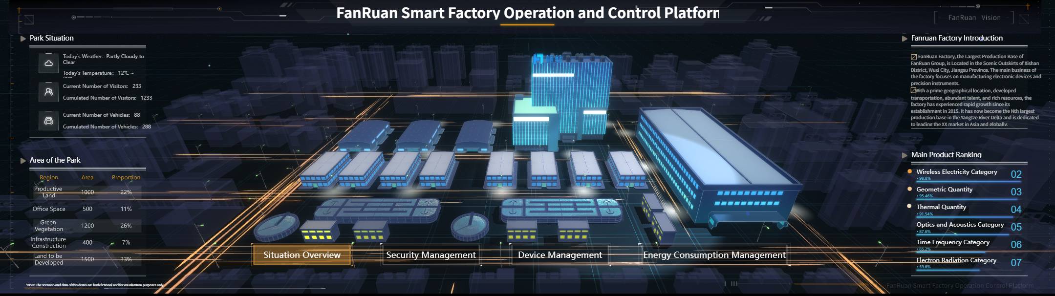
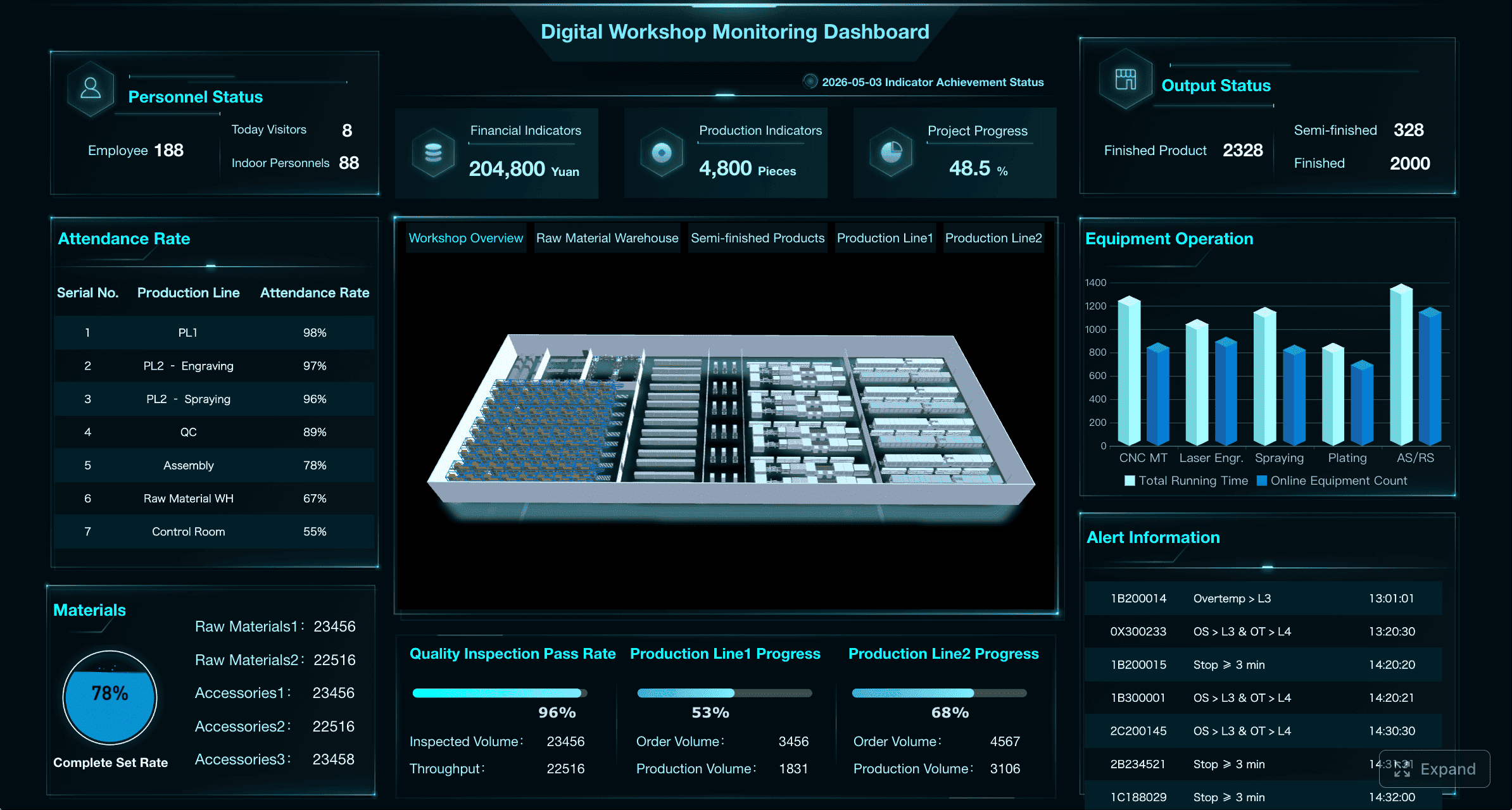
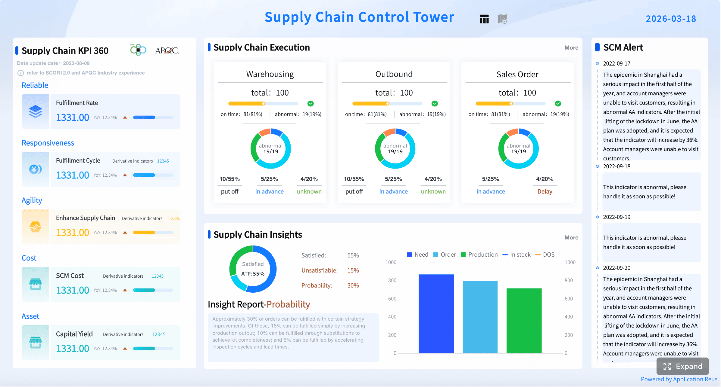
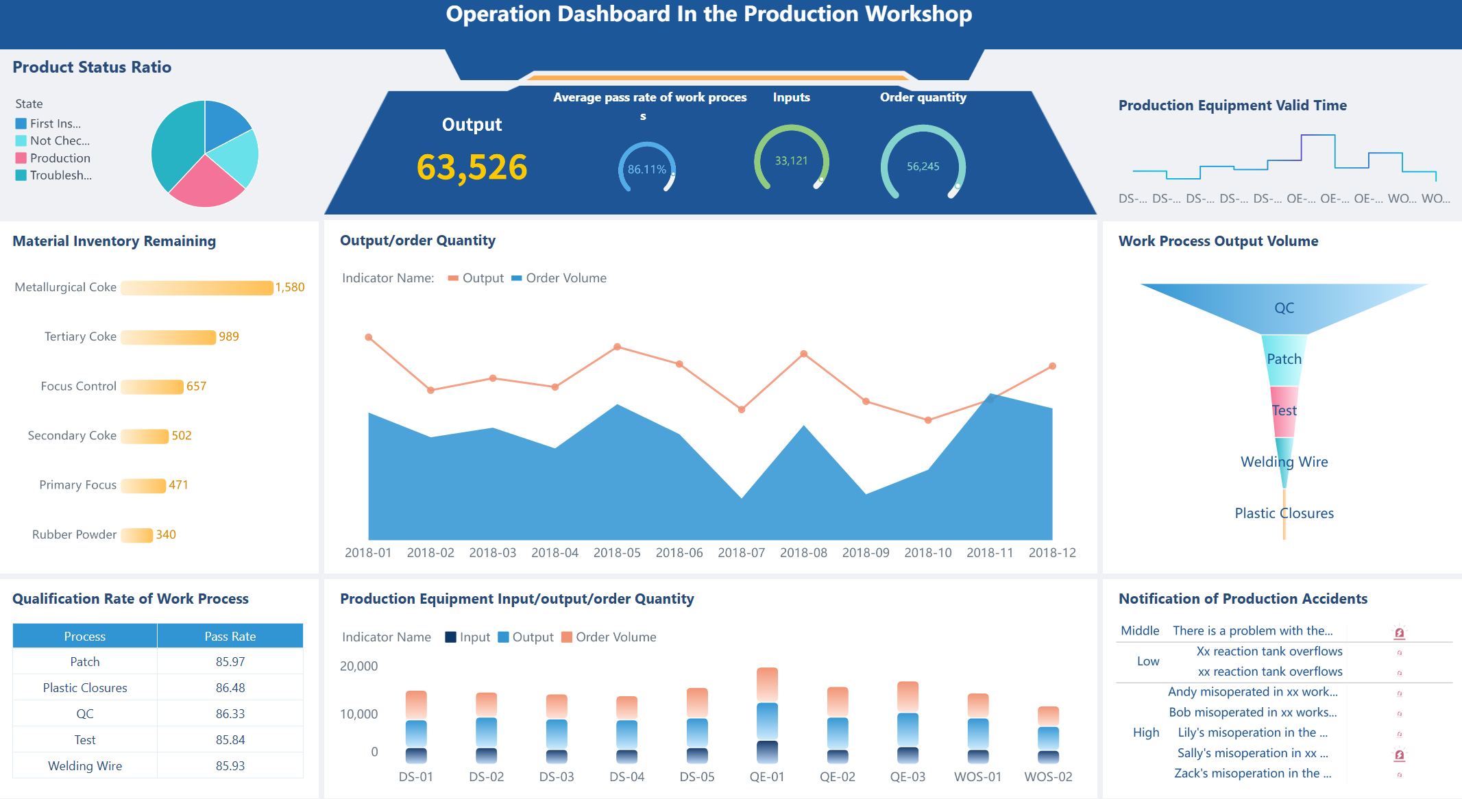
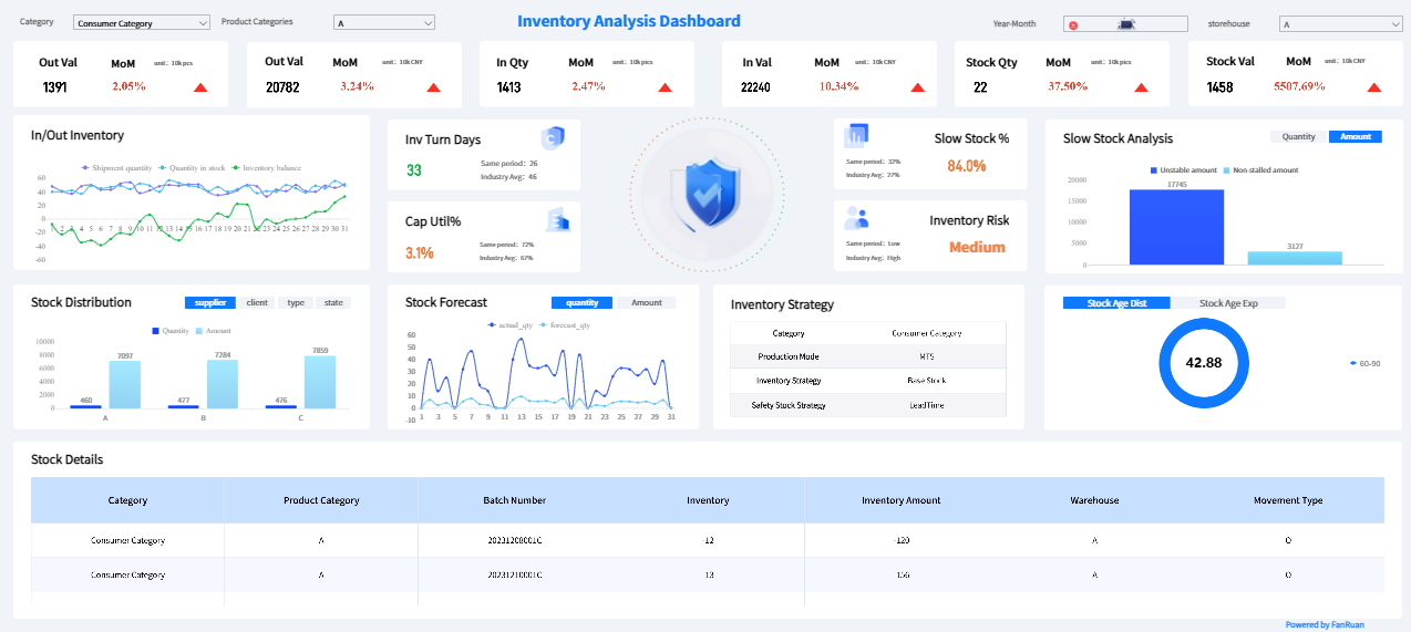
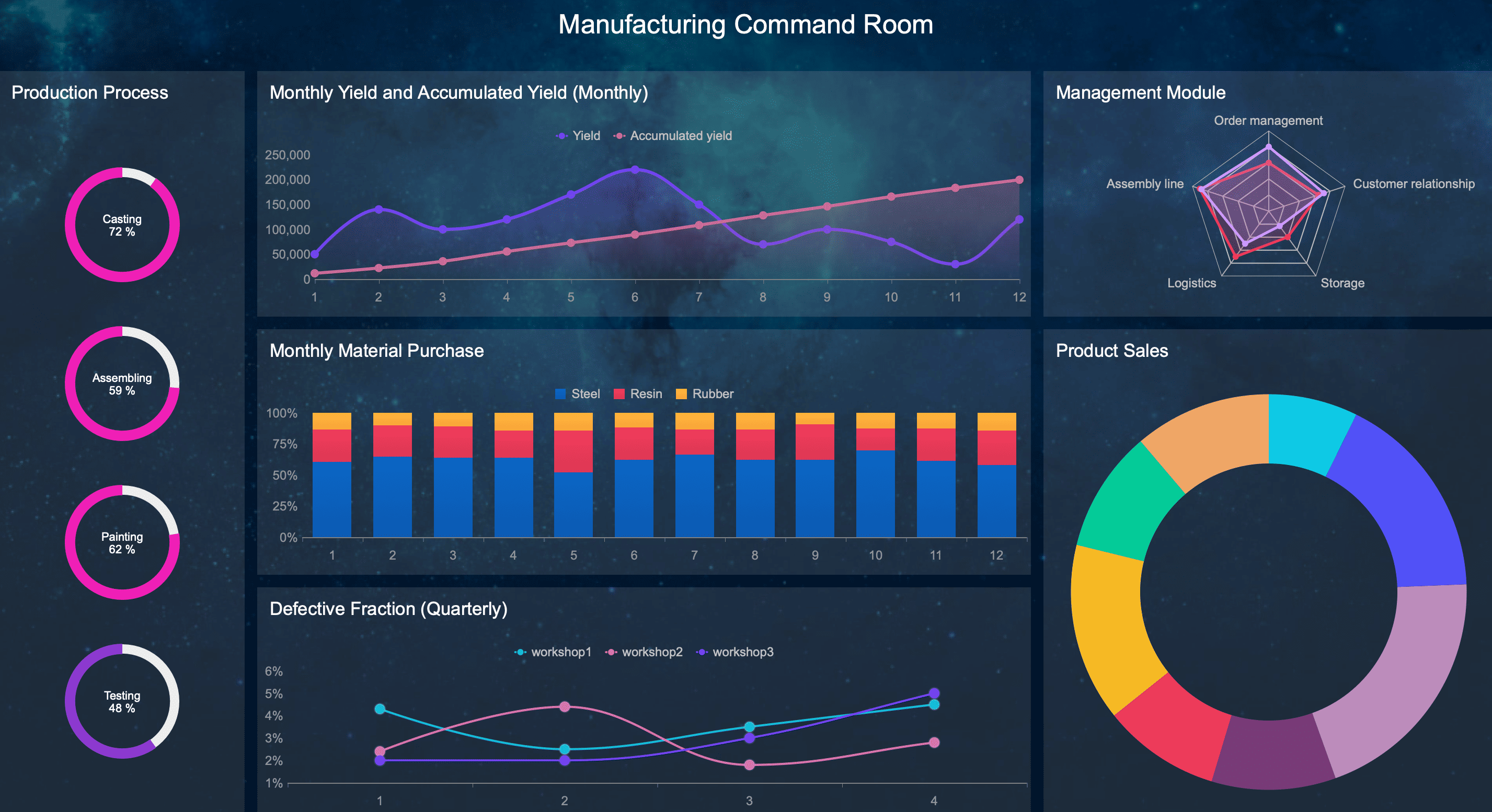
[Insert Dashboard Demo Here: Seven-tab CMMS dashboard navigation with executive summary, asset health, work orders, PM, downtime, cost, and inventory views]
Set thresholds, alerts, and drill-down paths
Dashboards become actionable when they emphasize exceptions, not just totals.
Best practice is to configure:
Thresholds: Green, yellow, red performance zones
Alerts: Automatic notification when a KPI crosses a risk boundary
Drill-down paths: Click from high-level KPI to asset, work order, part, technician, or failure record
This helps teams notice what needs action first and avoids wasting review time on stable metrics.
Exception-based reporting is especially valuable for distributed operations where leaders cannot manually inspect every metric every day.
4 best practices for implementation
Here are four practical steps to build a CMMS dashboard that users will actually trust and use:
Standardize KPI definitions before design
Define downtime, backlog, on-time completion, emergency work, and PM compliance consistently across sites and teams.
Design one primary dashboard per role
Avoid trying to satisfy executives, managers, planners, and technicians on one screen.
Prioritize trend plus drill-down, not just current status
A single number lacks direction. A trend with drill-down tells users whether performance is improving and why.
Review adoption and actionability every month
If a widget is never used or never triggers action, remove or redesign it.
[Insert Dashboard Demo Here: Alert-enabled dashboard with red/yellow/green thresholds and drill-down from KPI card to asset-level details]
Common reporting mistakes that make cmms dashboards less useful
Even modern maintenance organizations often weaken dashboard value with avoidable design mistakes.
Overloading screens with too many KPIs
When every metric looks equally important, none of them gets attention. Too many widgets create scanning fatigue and slow decision-making.
A dashboard should prioritize the few metrics most closely tied to risk, capacity, reliability, and cost.
Mixing strategic and frontline metrics without context
Executives do not need raw technician-level task views. Frontline supervisors do not need portfolio-level cost rollups without operational detail.
Mixing these layers on one screen creates confusion and distracts each audience from the actions they need to take.
Reporting lagging indicators only
If your dashboard only reports what already happened, it becomes a historical summary, not a management tool.
Lagging metrics like monthly downtime and spend must be paired with leading indicators such as:
PM compliance
Schedule compliance
Backlog aging
Emergency work ratio
Stockout risk
These are the signals that help teams intervene earlier.
Failing to standardize definitions
If one site defines downtime differently from another, or if backlog includes different work types by team, comparisons become unreliable.
A CMMS dashboard is only as credible as the governance behind it. Standard definitions are not bureaucracy. They are the foundation of trust.
[Insert Dashboard Demo Here: Side-by-side example of cluttered dashboard versus simplified role-based dashboard with prioritized KPIs]
How to review and improve cmms dashboard performance over time
A CMMS Dashboard should evolve with your maintenance maturity. What matters in a reactive environment is different from what matters in a reliability-led operation.
Establish a monthly KPI review process
At least once a month, review each dashboard metric and ask:
Did this metric trigger a decision?
Did it create a useful conversation?
Did it lead to corrective action?
Is it still aligned with current maintenance goals?
If the answer is no repeatedly, the metric may not deserve prime dashboard space.
Compare dashboard insights with real maintenance outcomes
A dashboard is only successful if it correlates with better performance in the field.
Look for evidence that dashboard use aligns with:
Reduced unplanned downtime
Better PM completion discipline
Lower emergency work ratio
Improved backlog control
Lower maintenance cost on critical assets
Better labor and parts planning
If trends look good on screen but outcomes are not improving, the issue may be bad data quality, weak threshold design, or poor action follow-through.
Evolve reporting as operations mature
As maintenance programs improve, dashboard needs change.
Early-stage teams may focus on:
Backlog control
PM compliance
Emergency work reduction
More mature teams may shift toward:
Reliability growth by asset class
Failure mode trend analysis
Forecasting labor and parts needs
Cost-to-replace decision support
Dashboards should be treated as living management tools, not fixed reporting artifacts.
Build the CMMS Dashboard faster with FineBI
Building this manually is complex; use FineBI to utilize ready-made templates and automate this entire workflow.
A high-performing CMMS Dashboard requires more than charts. It needs structured KPI logic, role-based views, drill-down analysis, exception alerts, and repeatable review workflows. Trying to maintain all of that manually in spreadsheets or static reporting tools quickly creates inconsistency, delay, and low adoption.
FineBI helps enterprise teams turn maintenance data into decision-ready dashboards without forcing every request through IT. With self-service analysis, visual dashboard building, drill-down capability, personalized views, and collaborative sharing, teams can build dashboards that fit maintenance managers, operations leaders, and reliability teams without overwhelming users.
Share trusted dashboards across teams with governance and control
Instead of stitching together static reports, teams can use FineBI to combine analysis, interpretation, and action in one environment. That makes it easier to move from seeing a maintenance issue to assigning ownership and tracking improvement over time.
If your current CMMS dashboard is heavy on data but light on decisions, the next step is not adding more widgets. It is redesigning the reporting workflow around action. FineBI gives you a faster way to do that with scalable dashboard templates, self-service analytics, and automation built for enterprise decision support.
The most useful KPIs are the ones that expose risk, capacity, and cost, such as MTBF, unplanned downtime, backlog aging, emergency work ratio, PM compliance, and maintenance cost by asset. These metrics help teams decide where to act, not just report what happened.
Different roles make different decisions, so they need different metrics and levels of detail. A maintenance manager may need backlog and schedule compliance, while an operations leader cares more about downtime impact and cost trends.
A well-designed dashboard highlights early warning signs like falling MTBF, repeat failures, overdue preventive work, and growing emergency work. That visibility helps teams intervene sooner before minor issues turn into production outages.
Activity metrics show volume, such as work orders opened or hours logged, but they do not explain whether maintenance performance is improving. Decision-making metrics add context by showing reliability, backlog risk, execution quality, and cost patterns that guide action.
Review frequency depends on the metric and the role, but most operational KPIs should be checked daily or weekly, while broader cost and reliability trends are often reviewed monthly. The key is matching the review cadence to the decision being made.
Product Trial
FineReport
Pixel-perfect reports · Interactive dashboards · Easy data entry · Digital twins