An SPC dashboard gives manufacturing leaders one place to monitor process variation, detect quality risks early, and respond before defects, downtime, or missed delivery targets escalate. If you manage a plant, production line, or quality team, the real value is simple: it turns scattered shop-floor data into faster operational decisions.
Too often, production teams rely on separate spreadsheets, static quality reports, or individual control charts that only specialists can interpret. The result is familiar: abnormal variation is spotted late, root causes take too long to isolate, and supervisors spend more time assembling reports than controlling the process. A well-designed SPC dashboard fixes that by making signals visible, actionable, and role-specific.
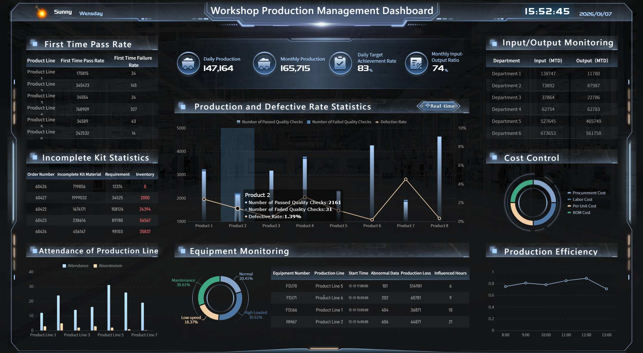
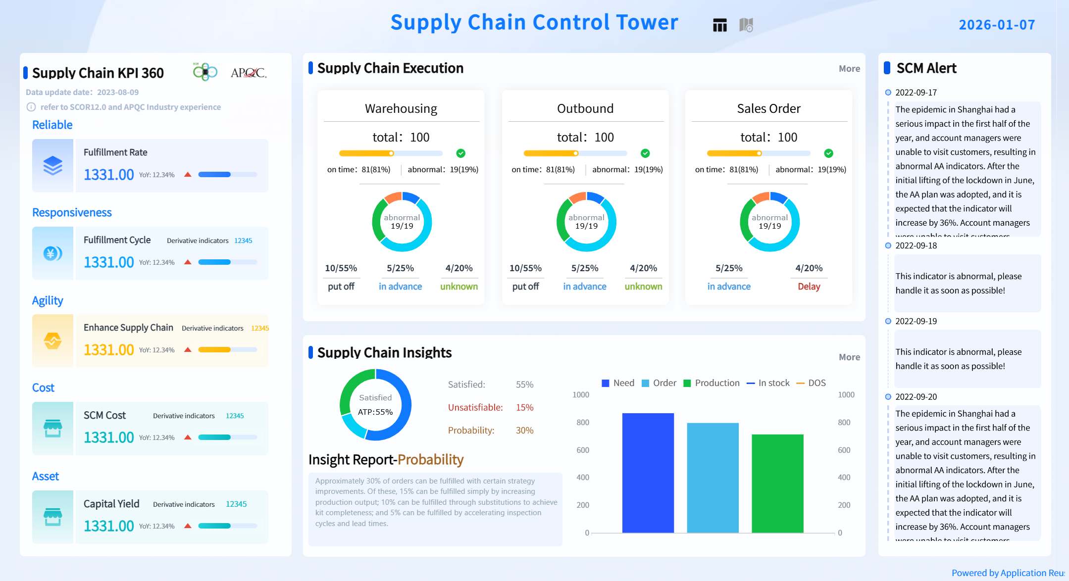
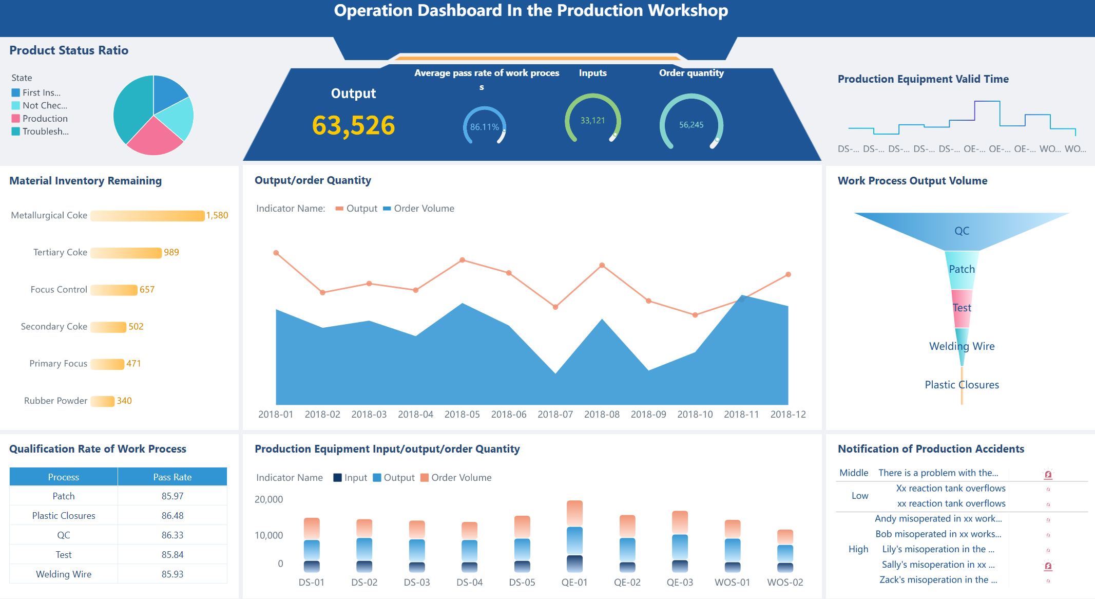
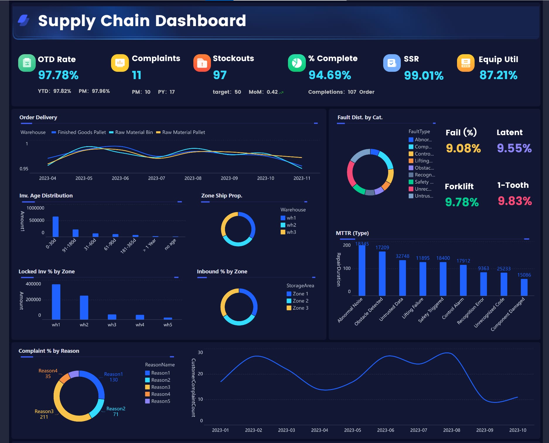
All the dashboards in this article are created by dashboard software: FineBI
An SPC dashboard is a visual monitoring layer that combines statistical process control indicators, quality metrics, and operational context into a single decision-making view. In plain language, it helps manufacturing leaders see whether a process is stable, capable, and drifting toward trouble.
Unlike a spreadsheet or a static monthly report, an SPC dashboard is built for ongoing control. It should help operators spot abnormal conditions in real time, supervisors compare shifts or machines, and plant leaders understand whether process variation is affecting cost, throughput, and customer quality.
Define an SPC dashboard in plain language for manufacturing leaders
Think of an SPC dashboard as the operating screen for process behavior. It does not just show output totals or defect counts. It shows whether the process is behaving normally, whether it is staying within expected statistical limits, and whether it can reliably meet specification.
For manufacturing leaders, that means three business outcomes:
Faster intervention before scrap and rework rise
More confident decisions based on statistical evidence, not intuition
Better alignment between quality, production, and maintenance teams
Explain how it turns shop-floor data into faster, more confident decisions
A useful SPC dashboard connects raw production data to operational action. Instead of asking analysts to manually pull samples, update charts, and email summaries, the dashboard surfaces the signals that matter:
Is the process stable right now?
Which line or machine is showing special-cause variation?
Is capability trending below acceptable thresholds?
Are downtime spikes driving cycle time variation?
Can the team trust the measurement system behind the data?
This matters because speed in quality control is not just about visualization. It is about shortening the time between signal, diagnosis, and response.
Clarify the difference between a dashboard, a control chart, and a broader quality reporting system
These three tools serve different purposes:
Control chart: A statistical chart that tracks process behavior over time against a centerline and control limits
SPC dashboard: A broader management layer that combines multiple control charts and supporting metrics into one operational view
Quality reporting system: A wider reporting environment that may include audits, complaints, supplier quality, compliance, and historical analysis
In practice, the control chart is one component. The SPC dashboard is the command center. The quality reporting system is the larger ecosystem.
The 7 Must-Track Metrics in an SPC Dashboard
If your SPC dashboard does not focus on the right measures, it becomes another screen full of numbers with no operational value. These seven metrics form the core monitoring framework for effective statistical process control.
Key Metrics (KPIs)
Process stability: Indicates whether variation is predictable or whether special-cause signals are present
Process capability: Shows how well the process can meet specification limits
Defect rate: Measures quality loss through scrap, rework, or nonconforming output
First pass yield: Tracks how often product is made right the first time
Cycle time: Reveals delays, flow imbalance, and throughput risk
Downtime and stoppages: Identifies interruptions that may introduce instability or output loss
Measurement system health: Confirms the reliability of gauges, tests, and data collection inputs
Process stability
Process stability is the foundation of SPC. If the process is not stable, capability metrics and trend analysis become far less meaningful. Your dashboard should make special-cause variation obvious by tracking:
Points beyond control limits
Long runs above or below the centerline
Upward or downward trends
Cycles or repeating patterns
Sudden shifts after setup changes, maintenance events, or material changes
This metric answers a critical question: Is the process behaving consistently enough to predict future output?
For production teams, stability should be visible at a glance through control chart signals, color-coded status flags, and line-level summaries.
Process capability
Once a process is stable, the next question is whether it is capable of meeting customer or engineering requirements. That is where capability metrics matter.
Your SPC dashboard should monitor:
Cp: Potential capability relative to specification width
Cpk: Actual centered capability accounting for process shift
Pp: Overall performance capability over a broader period
Ppk: Actual long-term performance against specs
These metrics help quality managers distinguish between a process that is statistically stable but still unable to meet tolerance and a process that is both stable and capable.
A practical rule: capability should never be shown without specification context. Put upper and lower spec limits next to the relevant process metric so teams can see whether the gap is a variation issue, a centering issue, or both.
Defect rate
Defect rate is one of the clearest indicators of quality loss, but it is often too lagging when shown alone. In an SPC dashboard, it should be tied back to process behavior so teams can understand not only what went wrong, but why it started going wrong.
Track defect rate through:
Scrap percentage
Rework percentage
Nonconforming units per batch, lot, or shift
Defect counts by type, machine, operator, or material lot
A strong dashboard lets users segment defects so emerging patterns become visible early. If one line, one shift, or one product family is driving losses, the dashboard should make that easy to isolate.
First pass yield
First pass yield tells you how often products meet requirements without any rework or correction. It is one of the best operational indicators for balancing quality and efficiency because it reflects whether the process is producing acceptable output the first time through.
A falling first pass yield often signals:
Hidden instability
Poor setup consistency
Inadequate process capability
Training issues
Measurement inconsistency
For plant leaders, this metric is powerful because it links directly to cost, throughput, labor efficiency, and customer service performance.
Cycle time
Cycle time belongs in an SPC dashboard because variation is not just a quality issue. Time instability often reveals process friction before defects become visible.
Compare actual cycle time against:
Standard cycle time
Shift target
Product-specific target
Machine benchmark
Historical baseline
When cycle time begins to drift, the root cause may include micro-stoppages, operator variability, tooling wear, material inconsistencies, or setup issues. By placing cycle time beside quality metrics, the dashboard helps teams see whether speed pressure is damaging process control or whether delays are symptoms of a deeper process problem.
Downtime and stoppages
Downtime is not only a maintenance metric. In many environments, stoppages create process interruptions that directly increase variation, startup defects, and unstable conditions after restart.
An effective SPC dashboard should show:
Planned vs. unplanned downtime
Stoppage frequency
Mean duration per stoppage
Top downtime reasons
Restart quality impact after interruptions
This is especially useful in high-mix or high-speed operations where variation is often triggered by frequent interventions, equipment instability, or repeated short stops.
Measurement system health
No SPC dashboard is trustworthy if the measurement system is weak. Bad data creates false alarms, masks real variation, and leads teams to adjust processes unnecessarily.
Measurement system health should include visibility into:
This metric is often overlooked, but it is essential. If operators and supervisors do not trust the inputs, they will not trust the dashboard, and adoption will fail.
How to Design a Useful Dashboard for Manufacturing Teams
A good SPC dashboard is not built around what data is available. It is built around what manufacturing teams need to decide, when they need to decide it, and what action should follow.
Start with the decisions the dashboard should support
Before selecting visuals, define the decisions by role:
Operators: Should I stop, adjust, or continue the process?
Supervisors: Which line, shift, or machine needs immediate intervention?
Quality engineers: Is the issue stability, capability, or measurement error?
Plant leaders: Where is variation driving the largest cost or service impact?
Every metric should support a decision. If a KPI does not trigger action, it is dashboard clutter.
A practical design rule is to map each metric to:
Owner
Trigger condition
Expected response
Escalation path
That structure turns a passive reporting page into an active control tool.
Show trends, limits, and thresholds clearly
Manufacturing users do not need decorative charts. They need signals they can interpret within seconds.
Use visual design elements that emphasize abnormality:
Control limits on charts
Specification limits on capability views
Threshold colors for KPI cards
Trend arrows for direction of change
Alert icons for escalation status
Do not overload one screen with too many chart types. Make the main page scan-friendly, then allow drill-down into line, machine, product, or shift details.
Segment data by line, shift, machine, or product
Variation almost always starts somewhere specific. If the dashboard only shows plant-level averages, teams will miss where the issue originated.
At minimum, your SPC dashboard should allow segmentation by:
Production line
Shift
Machine or workstation
Product or SKU
Tooling or setup version
Material lot or supplier batch
Segmentation supports root-cause isolation and improves accountability. It also prevents one stable area from masking severe instability in another.
Set alert rules and review cadences
Dashboards become effective when teams know exactly when to react. That means defining alert logic and review discipline.
Examples include:
Notify supervisor when two consecutive special-cause signals appear
Escalate to quality engineer if Cpk drops below threshold for two shifts
Trigger maintenance review when stoppages exceed target frequency
This creates a closed loop between monitoring and action.
Common Mistakes That Make SPC Dashboards Less Effective
Many manufacturers launch an SPC dashboard but fail to improve control because the design is too analytical, too broad, or too disconnected from operations.
Tracking too many metrics without linking them to action
A crowded screen creates hesitation. Teams stop using the dashboard when they cannot tell which metrics matter right now. Focus on a small number of decision-critical KPIs and make the response path obvious.
Using lagging indicators only and missing early warning signals
Scrap and customer defects matter, but they show the damage after it happens. A better SPC dashboard combines lagging outcomes with leading indicators such as control limit signals, trend violations, cycle time drift, and stoppage spikes.
Ignoring measurement error or inconsistent data collection methods
If sample timing changes by shift, gauges are overdue for calibration, or manual entries are inconsistent, the dashboard may reflect noise instead of reality. Data quality must be treated as part of process control, not a separate issue.
Building views for analysts instead of the people running the process
An analyst may want deeper statistical detail on the first screen. An operator or supervisor usually needs a simple answer first: normal, abnormal, where, and what next. Design for the people closest to the process.
How Manufacturing Leaders Can Put an SPC Dashboard Into Practice
The fastest way to fail is to roll out an enterprise-wide SPC dashboard before proving the data, workflow, and team response model. Start focused, validate, then expand.
Roll out the dashboard in stages
Use a phased implementation approach:
Choose one process or line with a clear quality or variation problem
Validate the data pipeline and confirm calculation logic for all SPC metrics
Test operator and supervisor workflows for alert response and escalation
Document early wins such as scrap reduction, faster diagnosis, or fewer manual reports
Scale to adjacent lines or plants only after adoption is proven
This staged model reduces resistance and improves dashboard credibility.
Train teams on interpretation, not just navigation
Training should not stop at where to click. Teams need to understand:
What an out-of-control signal means
When not to tamper with a stable process
How to distinguish common-cause from special-cause variation
When capability issues require engineering action
Why poor measurement data leads to wrong decisions
The goal is operational judgment, not just dashboard usage.
Review results and refine the dashboard over time
Your first version will not be your best version. Review how teams actually use the SPC dashboard and refine it based on behavior.
Retire low-value metrics if nobody acts on them. Add views if users repeatedly need drill-down context. Tighten thresholds if alerts are too noisy. Adjust layout if critical signals are buried.
An SPC dashboard should evolve with the process, the plant, and the maturity of the team.
Build Faster and Scale Smarter with FineBI
Building an SPC dashboard manually is possible, but it is usually slower, harder to maintain, and more dependent on analysts than manufacturing teams expect. You need consistent metrics, trusted visual logic, role-based access, drill-down analysis, alerting, and repeatable dashboard standards across lines or sites.
That is where FineBI becomes the practical choice.
FineBI helps manufacturers turn fragmented process data into usable, collaborative dashboard applications. Instead of stitching together spreadsheets, static reports, and one-off charts, teams can build an SPC dashboard that supports ongoing decision-making with:
The strategic advantage is not just speed of dashboard development. It is the ability to create a repeatable process-control workflow that teams can actually use day to day.
Building this manually is complex; use FineBI to utilize ready-made templates and automate this entire workflow. With the right structure, your SPC dashboard becomes more than a reporting screen. It becomes a control system for reducing variation, improving quality, and helping manufacturing leaders act with confidence.
An effective SPC dashboard should combine process stability, capability, defect rate, first pass yield, cycle time, downtime, and measurement system health in one view. It should also make abnormal variation and priority alerts easy to spot quickly.
A control chart tracks one process characteristic over time against statistical limits. An SPC dashboard brings multiple control charts and supporting KPIs together so teams can monitor overall process performance and act faster.
Process stability is usually the starting point because other metrics are harder to trust when the process is unstable. If special-cause variation is present, teams should address that before drawing conclusions from capability results.
It highlights early warning signals such as out-of-control points, rising defect trends, or stoppage patterns before they become larger production problems. That helps operators and supervisors intervene sooner and reduce scrap, rework, and lost output.
Process capability should be tracked after the process is shown to be stable. Once variation is predictable, capability metrics can show whether the process can consistently meet specification limits.
Product Trial
FineReport
Pixel-perfect reports · Interactive dashboards · Easy data entry · Digital twins