You rely on accurate data to keep your factory running smoothly. A manufacturing KPI dashboard gives you a clear view of your operations by consolidating critical metrics for real-time tracking. You can respond instantly to production changes and use AI-driven analytics for proactive decision-making. Solutions likeFanRuan’sFineReportempower you to build dashboards tailored to your needs.
88% of manufacturers use KPI dashboards to monitor performance.
Real-time monitoring enhances operational efficiency and supports quick decision-making. Consider your unique manufacturing goals and challenges as you explore how to boost productivity and quality.
A manufacturing KPI dashboardacts as your command center for factory performance. It brings together the most important data, so you can spot trends, solve problems, and make decisions faster. With the right dashboard, you gain a clear view of your operations and can drive improvements across every department.
FanRuan and its FineReport platform stand out as trusted solutions for building dashboards and tracking KPIs in manufacturing. FineReport gives you the flexibility to connect to multiple data sources, visualize complex metrics, and customize dashboards for every team member. You can monitor production, quality, and efficiency in real time, helping you stay ahead of issues and meet your goals.
You need to start by identifying the key metrics that matter most to your operation. The right metrics give you a true picture of your factory’s health and performance. Most manufacturers focus on a core set of KPIs that reflect production, quality, and delivery. Here are some of the most commonly tracked metrics in a manufacturing KPI dashboard:
Throughput – The ultimate production metric
Cycle Time – How long does it really take?
Demand Forecasting – Stop running out of materials
Inventory Turns – Are you sitting on dead stock?
Overall Equipment Effectiveness (OEE) – The gold standard
First Pass Yield (FPY) – Are you getting it right the first time?
Scrap Rate – How much are you throwing away?
On-Time Delivery – Keeping customers happy
You can use FineReport to track these metrics in real time, visualize trends, and drill down into the details. This helps you quickly identify bottlenecks, reduce waste, and improve delivery performance.
You should always choose KPIs that support your business objectives. When you align your metrics with your goals, you make sure every action moves your factory forward. Leading manufacturers use several strategies to select the right KPIs:
Alignment with business goals: Pick KPIs that directly support your company’s main objectives.
Relevance to your product: Choose metrics that reflect how your products perform and how customers respond.
Measurability: Select KPIs you can track and measure accurately, so you can see progress and make smart decisions.
FineReport makes it easy to connect your KPIs to your business strategy. You can customize dashboards to highlight the metrics that matter most for your team, whether you focus on quality, cost, or delivery.
Tip: Review your KPIs regularly to make sure they still match your goals. As your business changes, your metrics should evolve too.
Prioritize for Audience
Not every team member needs the same information. Operators, managers, and engineers each have unique needs. You should tailor your manufacturing KPI dashboard to fit each audience:
Operators need real-time data on machine status, cycle times, and quality alerts.
Managers want a summary of production output, OEE, and on-time delivery.
Engineers look for detailed breakdowns of downtime, scrap rates, and process trends.
FineReport supports this level of customization. You can create role-based dashboards that deliver the right insights to the right people. This ensures everyone stays focused and can act quickly when issues arise.
A well-designed manufacturing KPI dashboard empowers your entire team. By defining key metrics, aligning them with your goals, and prioritizing for your audience, you set the stage for continuous improvement and operational excellence.
User Needs and Dashboard Types of Manufacturing KPI Dashboard
Stakeholder Analysis
You need tounderstand your stakeholders before designing a manufacturing KPI dashboard. Each group in your organization has unique goals and information needs. Start by identifying who will use the dashboard and what decisions they must make. Consider these key factors:
Understand and identify stakeholder needs
Analyze specific requirements for each role
Select and prepare relevant data sources
Design the dashboard layout for clarity
Incorporate interactivity and customization options
Establish a feedback loop with stakeholders
When you focus on these steps, you ensure the dashboard delivers value to everyone, from operators to executives.
Dashboard Formats
Choosing the right dashboard format is essential. Different user groups benefit from different types of dashboards. The table below shows how you can match dashboard types to user needs:
Dashboard Type
Key Metrics
User Group
Real-time Dashboard
Inventory levels, machine status, production rates
Supervisors, Operators
Summary Dashboard
Sales performance, gross profit, service levels
CFO, Board Members
Mobile Dashboard
On-the-go access to key metrics, alerts for inventory and production issues
Sales Team, Executives
Real-time dashboards help you track production metrics and operational efficiency. Summary dashboards give you insights into sales and service levels. Mobile dashboards let you access critical data anytime, anywhere. Many manufacturers use these dashboards to monitor assembly line efficiency, spot bottlenecks, and manage resources. You gain immediate insights that support informed decision-making.
Customization with FineReport
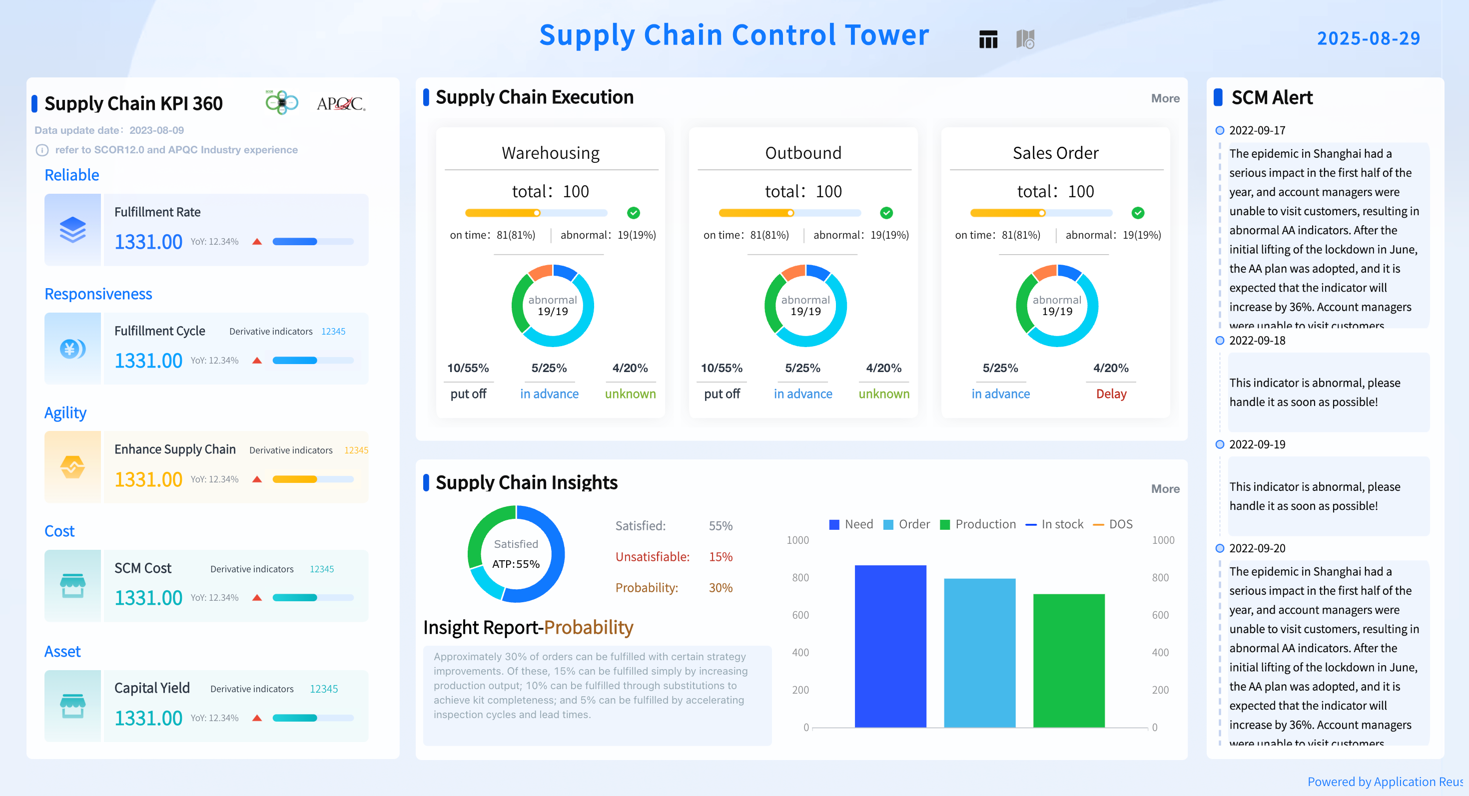
FineReport gives you the flexibility to customize dashboards for every user group and device. You can create role-based dashboards that show only the most relevant metrics. FineReport supports real-time, summary, and mobile dashboards, so you can deliver the right information to the right people. Its drag-and-drop interface makes it easy to design dashboards that fit your workflow. You can also add interactive features, such as drill-downs and alerts, to help users explore data and respond quickly to changes. With FineReport, your manufacturing KPI dashboardadapts to your evolving business needs.
Design and Visualization of Manufacturing KPI Dashboard
Clarity and Layout
You want your manufacturing KPI dashboard to deliver information at a glance. Clear design helps you spot issues and make decisions quickly. Start by placing the most important data in the upper right corner of your dashboard. This area draws attention and ensures you see critical metrics first. Keep your layout consistent. Use the same style for buttons, titles, and data across all dashboards. This consistency helps you and your team navigate faster. Always choose font sizes and display locations that are easy to read, especially on large plant floor screens.
Best Practice
Description
Information Layout
Place the most important information in the upper right corner, adjusting based on screen location.
Layout Consistency
Maintain a standard layout for buttons, titles, and data across dashboards for quick navigation.
Visual Accessibility
Consider font size and display location to ensure readability, especially on plant floor screens.
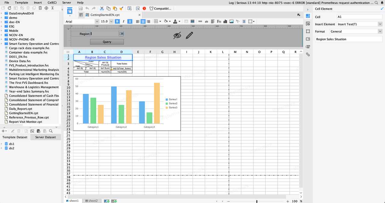
FineReport’s drag-and-drop interface makes it easy to arrange charts, tables, and visuals. You can build dashboards that look professional and keep your team focused on what matters.
Interactive dashboards keep users engaged and support better decisions. You can drill down into data, set alerts, and customize views for different roles.Real-time updates let you respond to production issues as they happen. FineReportoffers 3D components and dynamic charts, making complex data easy to understand.
Feature
Description
Clarity and Simplicity
Information is presented clearly, making complex data understandable through visualizations.
Real-time Data
Provides immediate data updates, allowing quick responses to production issues.
Customizability
Dashboards can be tailored to display metrics relevant to different user roles.
Interactivity
Users can engage with the dashboard, drill down into data, and set alerts for anomalies.
You can tailor each dashboard to fit the needs of operators, managers, or engineers. This flexibility ensures everyone gets the right information at the right time.
Mobile Access
Mobile access changes how you use your manufacturing KPI dashboard. With 98% of Americans owning smartphones, you can check key metrics from anywhere. Mobile dashboards give you real-time updates on production, costs, and performance. You stay connected to your factory, even when you are off-site.FineReport’s mobile dashboard adapts to any device, so you always have the latest data at your fingertips. This access helps your team collaborate and make decisions faster, keeping everyone aligned and informed.
Key KPIs of Manufacturing KPI Dashboard
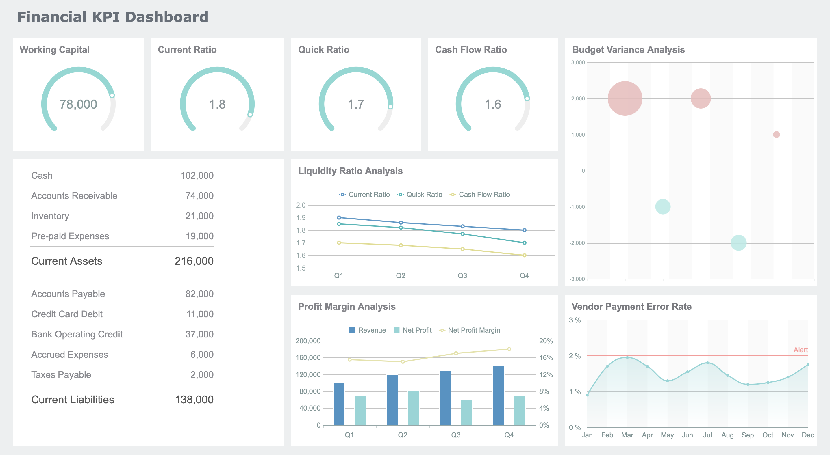
Tracking the right KPIs gives you a clear picture of your factory’s performance. When you use a manufacturing kpi dashboard, you can monitor these metrics in real time and make smarter decisions. Let’s look at the most important KPIs you should track toboost efficiency, quality, and profitability.
OEE and Efficiency
Overall Equipment Effectiveness (OEE) stands at the heart of manufacturing performance. You use OEE to measure how well your equipment runs by looking at three factors: Availability, Performance, and Quality. When you break down OEE, you can spot where you lose time or quality and take action to fix it.
OEE directly links to your productivity. If you improve OEE, you see real gains in output and cost savings.
Focus on each OEE component:
Availability: Measures how often your machines run when needed.
Performance: Shows if your equipment works at the right speed.
Quality: Tracks how many products meet your standards.
You also want to track related efficiency KPIs:
On-time Delivery: Shows how well you meet customer deadlines.
Unit Cost: Reveals how much it costs to make each product.
Overall Operations Effectiveness (OOE): Looks at the percentage of time spent making good products.
Capacity Utilization: Tells you how much of your total production capacity you use.
Each of these KPIs helps you find bottlenecks and areas for improvement. FineReport’s OEE dashboards let you visualize these metrics, drill down into the details, and act fast when you spot a problem. You can connect data from your MES, ERP, or other systems for a complete view of your operations.
Tip: Even a small increase in OEE can add significant value to your bottom line. Use your dashboard to track trends and set improvement targets.
Quality Metrics
Quality metrics help you maintain high standards and reduce waste. You need to track these KPIs to catch defects early and keep customers happy. Here are the most common quality metrics you should include in your dashboard:
Metric
Description
Cost of Quality (CoQ)
Total cost of poor quality plus investments in quality improvement.
Defects
Measured by Defective Parts Per Million (DPPM) or Defects Per Million Opportunities (DPMO).
Customer Complaints
Number of complaints, rejects, or returns over a set period.
Scrap Rate
Percentage of materials that do not become finished products.
Yield
Measures how efficiently your process turns materials into good products.
You can also track:
First Pass Yield (FPY): Measures how many products pass inspection the first time.
Customer Returns: Shows how often products come back due to quality issues.
FineReport’s quality control dashboards help you monitor these metrics in real time. You can use interactive charts to analyze trends, compare production lines, and identify root causes of defects. This approach supports continuous improvement and helps you meet regulatory standards.
Note: High-quality products lead to fewer complaints and lower costs. Use your dashboard to spot issues before they grow.
Scrap Rate and Downtime
Scrap rate and downtime have a direct impact on your costs and profits. High scrap rates mean you waste materials and money. Unplanned downtime stops production and can cost you thousands of dollars per hour.
Scrap and rework costs can reach up to 2.2% of your revenue.
Unplanned downtime can cost manufacturers up to $50 billion each year.
For large companies, downtime may account for 8-11% of annual revenue.
The average manufacturer faces up to 800 hours of downtime per year.
Cost Type
Impact on Revenue (%)
Description
Scrap and Rework Costs
Up to 2.2%
Direct costs from waste and inefficiencies in production.
Hidden Costs
N/A
Includes waste disposal, defect correction, and lost opportunities.
Effective Management of Waste
0.6%
You can reduce costs with better waste management practices.
When you track scrap rate and downtime in your manufacturing kpi dashboard, you can:
Identify lost revenue from missed production.
Reduce waste and improve material usage.
Lower costs by producing higher-quality goods.
FineReport’s smart factory dashboards give you real-time alerts for downtime and scrap spikes. You can set up automated notifications, analyze root causes, and take action before small problems become big losses.
Pro Tip: Use your dashboard to compare downtime and scrap rates across shifts or lines. This helps you find best practices and share them across your factory.
With the right KPIs and a powerful dashboard, you gain the insights you need to drive continuous improvement. FineReport’s manufacturing solutions for OEE, quality control, and smart factory management help you stay ahead in a competitive market.
Implementation and Optimization of Manufacturing KPI Dashboard
Paperless Operations
You cantransform your factory’s efficiency by moving to paperless operations. Digital systems replace manual paperwork, reducing lost information and miscommunication. Employees often spend up to 30% of their shift managing documents, which leads to a 21.3% productivity loss. Human error from outdated paper-based workflows costs manufacturers billions each year. When you adopt digital solutions, you boost productivity by up to 50% and improve labor efficiency by 15-30%. Throughput can increase by 10-30%.
Evidence
Description
Productivity Loss
Employees spend 5-15% of time reading info, 50% searching for documents.
Digital dashboards centralize your data, making it easier to access and analyze. You eliminate lost paperwork and improve accountability across your teams.
Monitoring and Alert: Real-Time Data Application
Real-time monitoring changes how you manage yourmanufacturing kpi dashboard. You see accurate data that reflects current conditions, not yesterday’s results. Automated alerts notify you when performance drops or anomalies occur, so you can act fast. This approach saves time on analysis and presentation. You avoid information silos and encourage a team mentality.
You access need-to-know information instantly.
Visual dashboards help you spot trends and optimize production.
Real-time alerts improve safety by signaling unsafe conditions.
Operators and supervisors share the same data, improving communication.
FineReport integrates seamlessly with FanRuan’s FineDataLink. You process complex SQL and cross-database associations, output results to your application database, and reuse processed datasets. This integration speeds up dashboard display and accelerates report development.
You need effective visualization formats to communicate performance metrics. Line and bar charts reveal trends. Heat maps highlight performance hotspots. Pie charts show composition analysis. Scatter plots uncover relationships and correlations.
KPI Category
Examples
Primary
OEE, Production Yield, Downtime, Quality
Secondary
Maintenance Response, Inventory Turnover
Visualization transforms complex datasets into clear graphics. You identify patterns and outliers quickly, making better decisions. Organize KPIs into categories for fast identification. Adopt Master Data Management practices to ensure data consistency and reliability. Regularly audit data sources and compare historical trends to maintain accuracy.
Tip: Foster a culture of data accountability. Train your team and automate data collection to reduce errors. Use feedback to refine your dashboard and streamline operations.
Building an effective manufacturing KPI dashboard requires clear goals, robust data collection, and regular review. Case studies show that companies like Toyota and Target achieved significant cost and inventory reductions by focusing on the right KPIs and investing in real-time data.
Company
Key KPI Focus
Outcome
Recommendations
Toyota
OEE
30% reduction in costs
Invest in IoT, review performance regularly
Target
Inventory
15% less excess stock
Define metrics, align with objectives
You can drive continuous improvement by setting S.M.A.R.T. targets, validating data, and adapting your dashboard as needs evolve. Start by reviewing your current KPIs or piloting a solution like FineReport to unlock actionable insights.
Click the banner below to try FineReport for free and empower your enterprise to transform data into productivity!
Continue Reading About Manufacturing KPI Dashboard
Real-time insights to optimize production, logistics, and decisions.
FAQ
What is a manufacturing KPI dashboard?
A manufacturing KPI dashboard displays your key performance indicators in one place. You can track production, quality, and efficiency metrics in real time. This tool helps you make faster, data-driven decisions on the factory floor.
How do I choose the right KPIs for my dashboard?
You should select KPIs that align with your business goals. Focus on metrics that impact production, quality, and delivery. Review your KPIs regularly to ensure they remain relevant as your operations evolve.
Can I customize dashboards for different roles?
Yes. FineReport lets you create role-based dashboards. You can show operators, managers, and engineers only the data they need. This approach improves focus and speeds up response times.
Does FineReport support real-time data integration?
Absolutely. FineReport integrates with FanRuan’s FineDataLink. You can connect multiple data sources and view real-time updates. This feature ensures your dashboard always reflects the latest factory conditions.
Is FineReport accessible on mobile devices?
Yes. You can access FineReport dashboards on smartphones and tablets. Mobile access keeps you connected to your factory’s performance, even when you are off-site.