A dashboard application is software that turns business data into live, visual, and shareable reporting for faster decisions.
1. FineBI
One-sentence overview:FineBI is a self-service BI and dashboard application designed for teams that need fast reporting, governed analytics, and flexible deployment without excessive complexity.
Key Features:
Pros: Good balance of usability and enterprise control; suitable for cross-functional BI; strong value for organizations scaling analytics; flexible for executive dashboards and operational reporting
Cons: May require planning for data governance setup; advanced enterprise rollouts still need implementation support
Best For (Target user/scenario): Mid-market companies, enterprises, and operations teams that want a scalable BI platform with strong dashboarding and governance.
One-sentence overview: Power BI is a widely adopted dashboard application with strong Microsoft ecosystem integration and broad analytics depth.
Key Features:
Pros: Excellent for deep analysis; strong visual flexibility; favored by data-heavy teams
Cons: Higher learning curve for non-technical users; total cost can be significant for larger deployments
Best For (Target user/scenario): Analytics teams, enterprise BI groups, and organizations prioritizing exploratory visual analysis.
4. Qlik Sense
One-sentence overview: Qlik Sense is a dashboard application known for associative analytics, guided exploration, and strong enterprise data handling.
Key Features:
Pros: Strong for complex data relationships; capable enterprise governance; solid analytics depth
Cons: Interface may feel less intuitive for some casual users; implementation can be more involved than lightweight tools
Best For (Target user/scenario): Enterprises and advanced BI teams managing multiple data sources and layered reporting needs.
5. Looker
One-sentence overview: Looker is a modern dashboard application centered on governed metrics, semantic modeling, and cloud data workflows.
Key Features:
Pros: Strong metric governance; well suited for embedded analytics; good fit for modern data stacks
Cons: Can require technical modeling expertise; cost and setup may be high for smaller teams
Best For (Target user/scenario): Data-mature organizations using cloud warehouses and needing governed KPI definitions across teams.
6. Domo
One-sentence overview: Domo is a cloud-first dashboard application focused on real-time operational visibility and business user accessibility.
Key Features:
Pros: Strong for operational dashboards; accessible interface; solid mobile experience
Cons: Pricing is often less transparent; advanced customization may depend on higher-tier plans
Best For (Target user/scenario): Fast-moving business teams that need live KPI monitoring and mobile dashboard access.
7. Klipfolio
One-sentence overview: Klipfolio is a lightweight dashboard application built for KPI tracking, business visibility, and relatively fast deployment.
Key Features:
Pros: Faster to launch than many enterprise BI suites; suitable for teams focused on KPI monitoring; budget-friendlier than some large platforms
Cons: Less robust for advanced analytics; may feel limited for complex enterprise data modeling
Best For (Target user/scenario): Small businesses, marketing teams, sales teams, and companies wanting lightweight dashboards.
8. Zoho Analytics
One-sentence overview: Zoho Analytics is a cost-conscious dashboard application that combines reporting, self-service analytics, and broad app connectivity.
Key Features:
Pros: Accessible pricing; broad SMB appeal; good for teams wanting all-in-one reporting
Cons: Advanced enterprise governance is not its strongest differentiator; very large-scale environments may outgrow it
Best For (Target user/scenario): Small to mid-sized businesses seeking an affordable dashboard application with solid reporting breadth.
9. Metabase
One-sentence overview: Metabase is a simple dashboard application for teams that want quick internal analytics with minimal setup friction.
Key Features:
Easy dashboard creation
Query builder for non-technical users
SQL support for analysts
Browser-based sharing
Basic alerts and embeds
Open-source availability
Pros & Cons:
Pros: Low barrier to entry; strong for internal reporting; attractive for technical teams wanting control
Cons: Less feature depth than enterprise BI suites; governance and advanced scalability can be limited depending on deployment model
Best For (Target user/scenario): Startups, product teams, and internal analytics use cases with moderate reporting requirements.
10. Geckoboard
One-sentence overview: Geckoboard is a dashboard application focused on simple, highly visible KPI dashboards for teams and office displays.
Key Features:
KPI-focused dashboards
Prebuilt integrations
TV mode and office screen display support
Easy metric sharing
Goal tracking and snapshots
Browser-based setup
Pros & Cons:
Pros: Very easy to use; good for visible team performance tracking; fast setup for non-technical users
Cons: Limited analytical depth; not ideal for advanced self-service BI or complex modeling
Best For (Target user/scenario): Sales floors, support teams, operations centers, and small teams needing lightweight scoreboards.
Why a dashboard application matters for BI teams in 2026
Modern BI teams need more than charts on a screen. A dashboard application in 2026 must support speed, usability, governance, and collaboration at the same time. Buyers should expect rapid data refreshes, intuitive self-service exploration, secure permissions, and easy distribution across web, mobile, and embedded environments.
This comparison is built for:
Startups that need affordable, fast-to-launch dashboards
Mid-market teams that need scalable reporting without enterprise-level overhead
Enterprises that require governance, security, and complex data modeling
Cross-functional operations teams that rely on shared KPI visibility across sales, marketing, finance, product, and support
Throughout this article, the evaluation criteria focus on:
AI-assisted insights and natural language assistance
Pricing, deployment, and support factors
Beyond features, buying the right dashboard application depends on practical rollout considerations. We reviewed:
Free plans and free trial availability
Entry-level and enterprise pricing models
Implementation effort and learning curve
Scalability for growing user bases
Cloud vs. on-premise deployment
Training resources and documentation
Customer support quality
Partner ecosystem and platform maturity
These factors matter because a low sticker price can still lead to a high total cost if the product requires heavy consulting, premium add-ons, or constant administrator involvement.
10 best dashboard application picks for 2026
Best overall options for business intelligence
Among the tools reviewed, FineBI, Power BI, Tableau, and Qlik Sense stand out as the strongest all-around BI platforms.
FineBI is the best overall choice for many organizations because it balances self-service usability, enterprise governance, and deployment flexibility. It works well for executive dashboards, departmental reporting, and broader company-wide analytics. For teams evaluating a dashboard application that can scale without becoming overly fragmented, FineBI deserves a close look.
Power BI is especially strong for companies already using Microsoft products and needing a cost-effective BI environment.
Tableau remains a top choice for visual analysis and interactive exploration.
Qlik Sense is compelling for enterprises that need deeper associative analytics and more advanced data relationships.
Best picks by use case and business size
Different tools fit different operating models. Here is the fastest way to map each dashboard application to a business context:
Best for small businesses: Zoho Analytics, Klipfolio, Geckoboard
Free, mobile, and desktop-friendly dashboard options
If budget, access model, or device support is a top priority, these options stand out:
Best free or budget-friendly entry points: Metabase, Zoho Analytics, Power BI
Best mobile-friendly dashboard application choices: Domo, Power BI, FineBI
Best browser-based experience: Looker, Metabase, Zoho Analytics, Geckoboard
Best for Windows-heavy environments: Power BI
Best for embedded dashboards:FineBI, Looker, Domo, Qlik Sense
For organizations testing BI software before committing, lower-cost or free-entry tools can reduce risk. However, teams should still check governance, scaling, and admin controls before standardizing on a platform.
Side-by-side comparison of dashboard application: features, pricing, and usability
Strong value for teams needing BI depth plus governance
Power BI
Low entry, higher premium scaling
Excellent value early; enterprise capacity planning matters
Tableau
Mid to premium
Worth it for advanced visual analytics teams
Qlik Sense
Mid to premium
Good fit when complex analytics justifies the investment
Looker
Premium
Best value in data-mature cloud environments
Domo
Premium
Valuable for operational speed if budget allows
Klipfolio
Lower to mid
Good value for KPI dashboarding
Zoho Analytics
Lower to mid
Strong budget-friendly option for SMBs
Metabase
Free/open-source to lower paid tiers
Attractive for internal and technical teams
Geckoboard
Lower to mid
Good value for visible team dashboards
Hidden implementation considerations often include:
Data warehouse or infrastructure costs
Premium connectors or embedding fees
Administrator time
User training
External consulting for modeling or governance design
A dashboard application that appears inexpensive can become costly if customization, maintenance, or permission management requires significant technical effort.
How to choose the right dashboard application for your team
Match the tool to your reporting needs
Start with your reporting environment, not the product demo. The right dashboard application depends on five factors:
Choose FineBI if you want the strongest balance of BI depth, usability, governance, and scalable dashboarding.
Choose Power BI if your organization is already standardized on Microsoft.
Choose Tableau if advanced visual analysis is the top priority.
Choose Looker if governed metrics on a modern cloud data stack matter most.
Choose Geckoboard or Klipfolio if speed and simplicity outweigh advanced analytics needs.
For most organizations comparing dashboard application platforms in 2026, the best choice is the one that matches both current reporting needs and future governance demands. If you want a platform that supports self-service BI, operational dashboards, and enterprise-ready control in one environment, FineBI is one of the strongest options to evaluate first.
FAQs
A dashboard application helps teams turn business data into visual reports, track KPIs, and monitor performance in real time. It is commonly used for executive reporting, operational visibility, and faster decision-making.
Start by comparing data connectors, ease of use, governance features, deployment options, and total cost. The best choice depends on your team size, technical skills, and whether you need lightweight KPI tracking or enterprise-grade BI.
Small businesses often prefer tools that are quick to deploy, affordable, and easy to manage, such as Klipfolio or Zoho Analytics. If you need room to scale, options like FineBI or Power BI may also be worth considering.
Key features usually include drag-and-drop dashboard building, real-time reporting, interactive filters, data integration, mobile access, and sharing controls. For larger organizations, governance, security, and embedded analytics are also important.
They overlap, but they are not always identical. A dashboard application focuses on visual monitoring and reporting, while a BI tool often includes broader analytics capabilities such as modeling, exploration, and governed self-service analysis.
Product Trial
FineReport
Pixel-perfect reports · Interactive dashboards · Easy data entry · Digital twins
 Key Features:
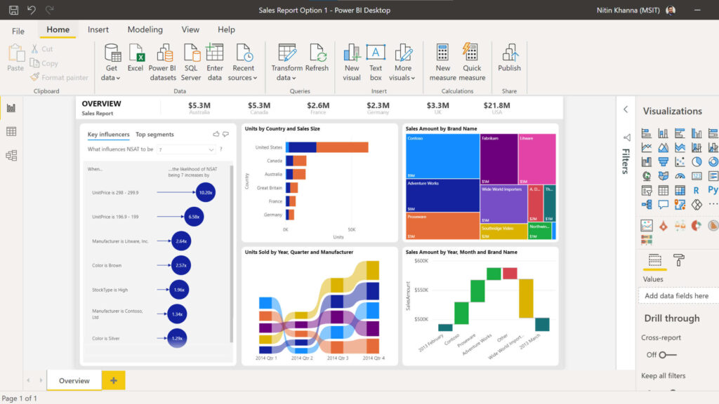 Key Features:
 Key Features:
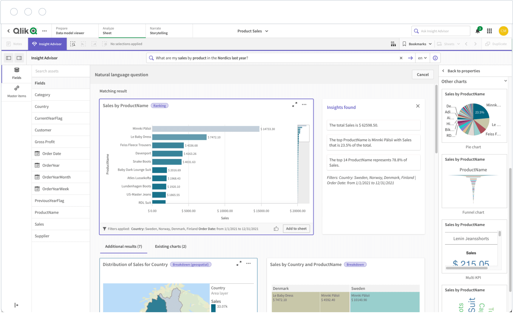 Key Features:
 Key Features:
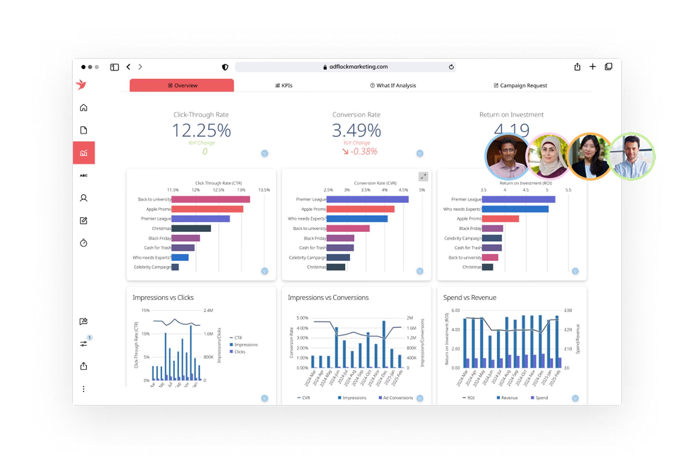 Key Features:
 Key Features:
 Key Features:
 Key Features: