A digital dashboard is a powerful tool that consolidates and visualizes key metrics in one place, making it easier to monitor performance and make data-driven decisions. According to a 2022 report by Deloitte, which surveyed 1,200 enterprises across 12 industries, 75% of organizations that utilize real-time dashboards report improved operational efficiency. However, the study also notes that 30% of respondents faced challenges in integrating legacy systems with modern dashboard tools, highlighting potential technical limitations.
Today, 80% of businesses actively use dashboards for decision-making, while 20% rely on them occasionally. These tools provide real-time insights, allowing you to respond quickly to changes and trends. Leading dashboard solutions, such as FineBI by FanRuan, are widely used to help organizations turn raw data into actionable insights.
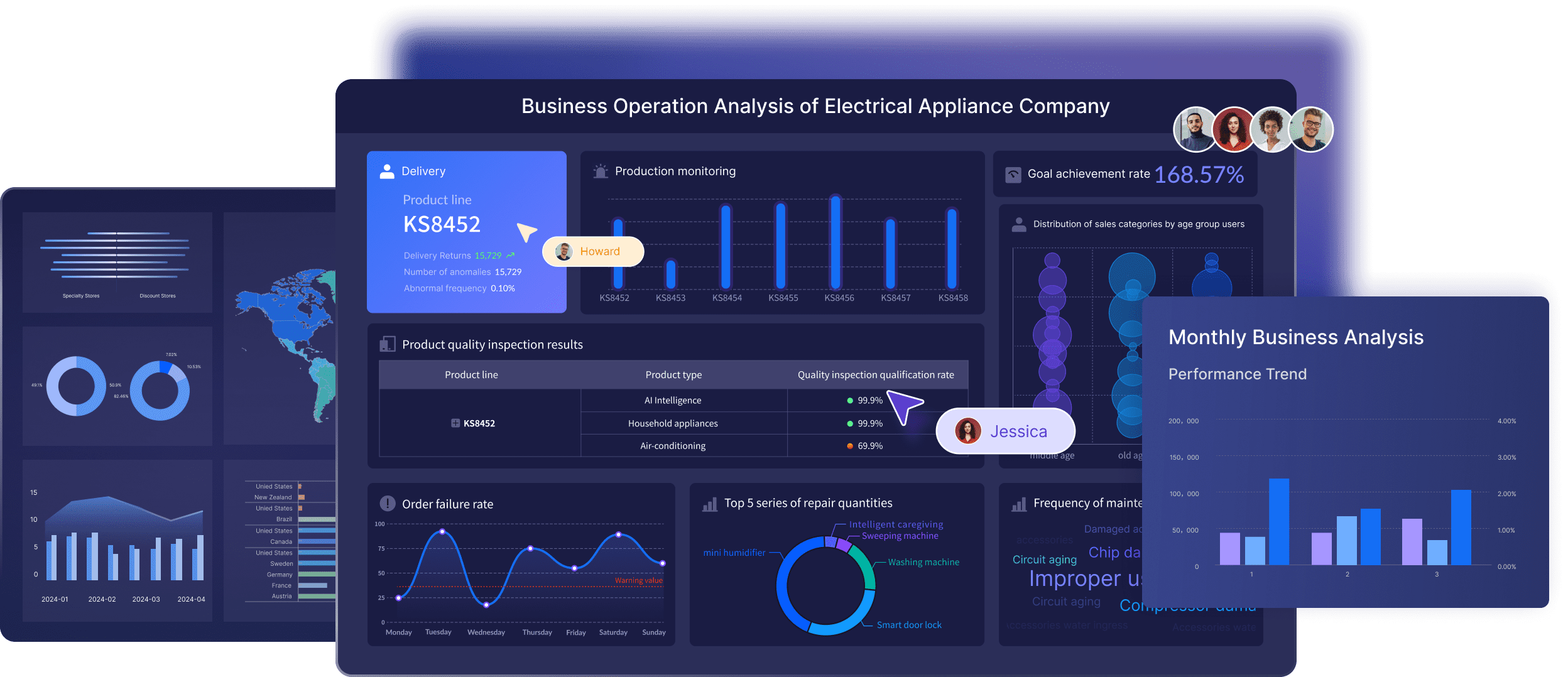
All the interactive dashboards in this article are created with FineBI, a leading BI tool. Click the button below to try FineBI for free and kick-start your data visualization journey!
What Is a Digital Dashboard?
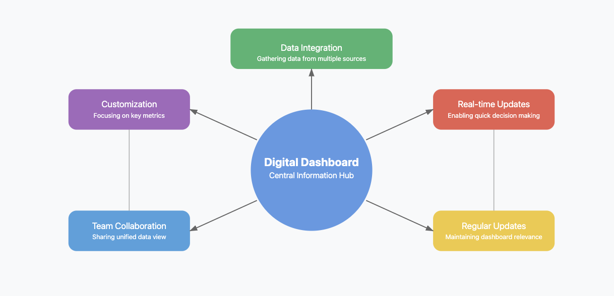
A digital dashboard is a visual interface that aggregates data from multiple sources—databases, APIs, spreadsheets, cloud services—and displays key metrics in real time or on a scheduled basis. Unlike static reports, digital dashboards are interactive: users can filter, drill down, and explore data without requesting new extracts from IT.
Digital dashboards serve three core purposes in organizations:
- Accelerate decisions by replacing manual report compilation with live, self-service visibility.
- Align teams through a shared, single source of truth accessible across departments.
- Trigger action via alerts, thresholds, and role-based views that surface what matters to each stakeholder.
| Purpose | Description |
| Enabling quick decisions | Real-time updates let teams monitor sales KPIs, inventory levels, and SLA status without waiting for periodic reports. |
| Enhanced decision-making | Streamlines reporting, reduces data overload, and delivers targeted insights to the right audience. |
| Improved collaboration | Provides a centralized platform where teams access shared data and align on priorities. |
| Real-time accessibility | Offers instant access to critical metrics for rapid response and strategic planning. |
How Does a Digital Dashboard Work?
Data Integration and Sources
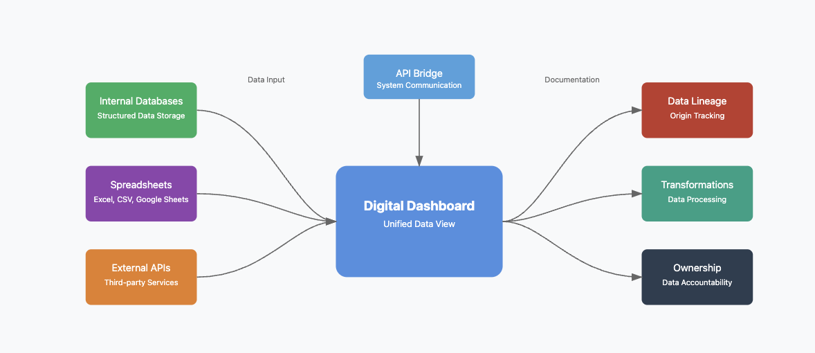
A digital dashboard connects to internal databases, third-party APIs, cloud applications, and flat files. Tools like FineDataLink automate ETL pipelines between ERP, CRM, and warehouse systems so dashboards always reflect current data. APIs act as bridges between systems, enabling synchronization without manual exports.
Organizations should document data lineage—tracking origin, transformations, and ownership—to maintain auditability and trust in dashboard outputs.
Real-Time vs. Scheduled Refresh
Real-time monitoring enables immediate response to operational changes, but requires robust infrastructure. Network latency, incompatible formats, or high-volume queries can introduce delays. For most business dashboards, scheduled refresh (every 5–15 minutes) balances freshness with system stability. Reserve true streaming for operational contexts like manufacturing lines or fraud detection.
Visualization and Interaction
Effective dashboards use charts, tables, and scorecards to present data clearly. Filtering and drill-down capabilities let users explore root causes without leaving the dashboard. Global filters apply selections across all widgets, while role-based views ensure each user sees only relevant metrics.
Alerts and Automation
Automated alerts notify stakeholders when metrics breach thresholds. Scheduled distribution pushes dashboard snapshots to email or messaging platforms. AI-assisted features—like anomaly detection and natural-language summaries—reduce the time from "seeing" to "understanding."
Digital Dashboard vs Traditional Report vs BI Dashboard
These terms are often used interchangeably, but they serve different purposes. Choosing the wrong format leads to missed signals or wasted effort.
| Type | Best For | Update Frequency | Main Value |
| Digital dashboard | Monitoring live business metrics | Real-time or scheduled | Quick visibility and action |
| Traditional report | Periodic summaries and formal review | Daily, weekly, monthly | Standardized reporting |
| BI dashboard | Interactive analysis and drill-down | Real-time or scheduled | Explore trends and root causes |
| Static spreadsheet | Small manual tracking tasks | Manual | Simple but hard to scale |
When to use which:
- Use a digital dashboard when operators or managers need at-a-glance status and fast response.
- Use a traditional report when compliance, audit, or executive review requires fixed-format, certified numbers. FineReport handles pixel-perfect reporting with scheduled distribution.
- Use a BI dashboard when analysts need to slice, filter, and drill into data interactively. FineBI supports self-service exploration without SQL.
- Avoid static spreadsheets beyond ad-hoc tracking. They lack governance, version control, and scalability.
Types of Digital Dashboards
Digital dashboards come in various types, each designed for specific needs. Understanding these types helps you choose the right one for your goals.
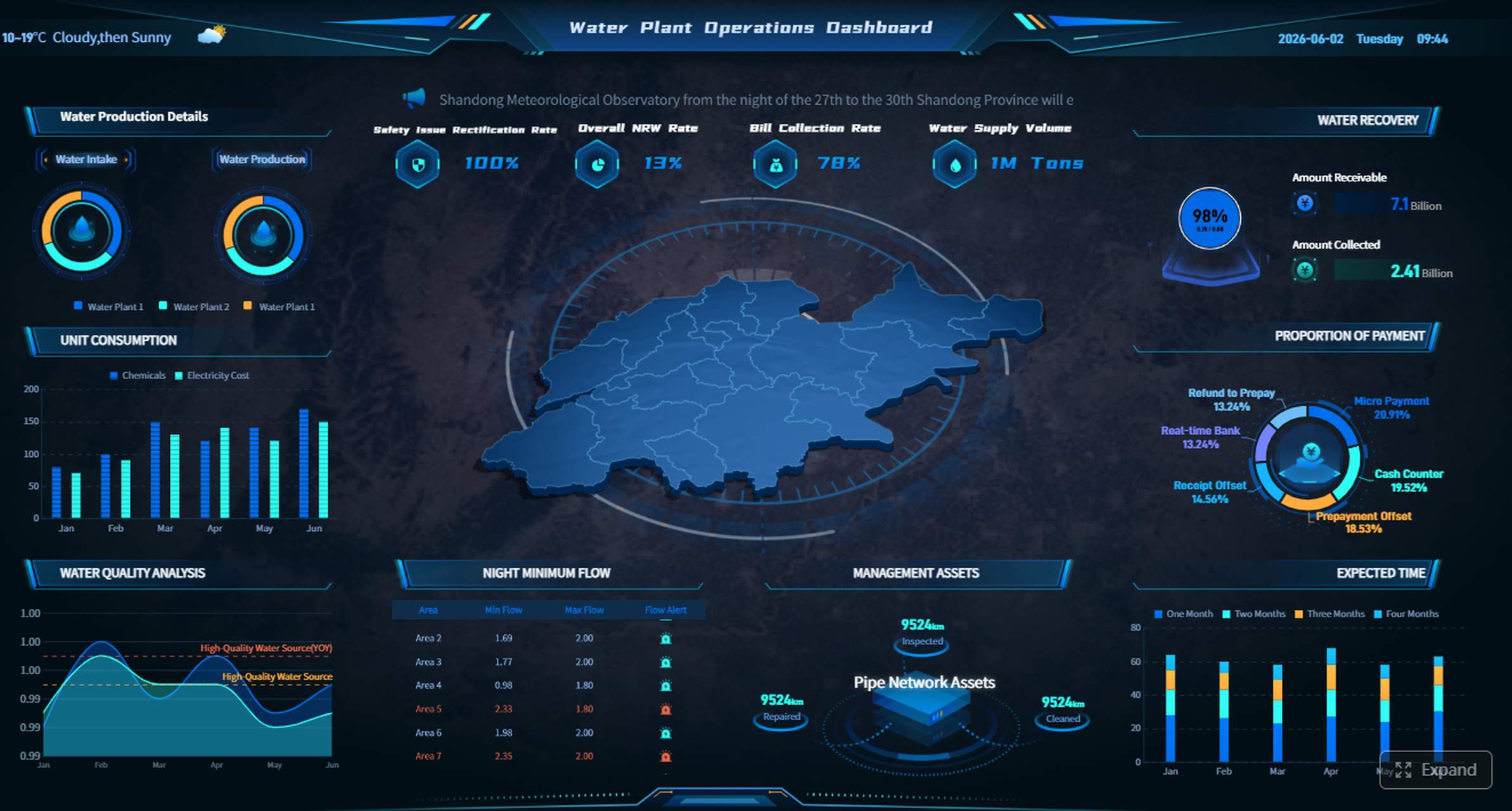
Operational Dashboards
Operational dashboards monitor short-term, real-time performance. They display KPIs like production rates, ticket resolution times, or order fulfillment status. Frontline staff and supervisors use them to respond to issues within minutes or hours.
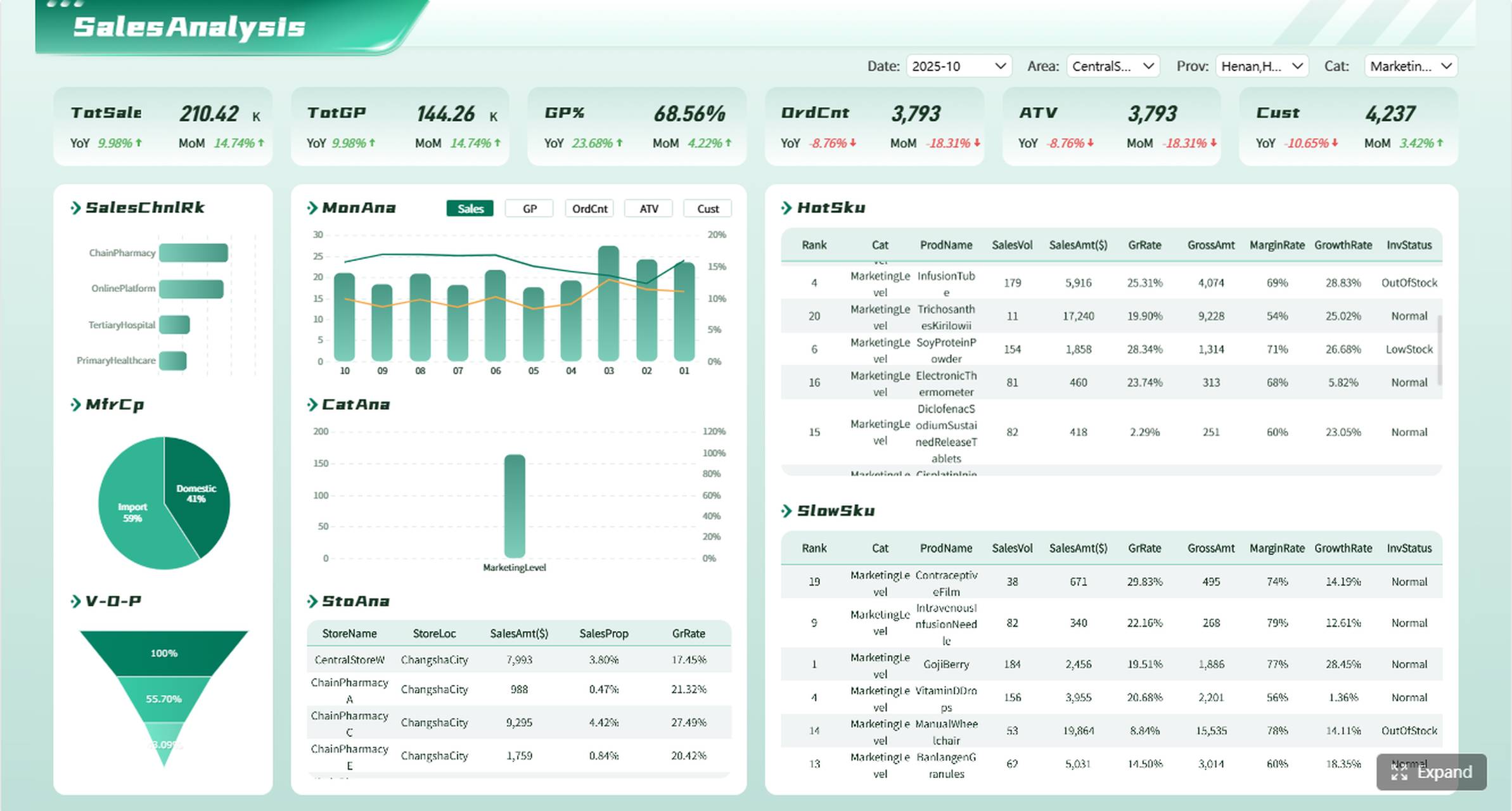
Analytical Dashboards
Analytical dashboards support trend identification, forecasting, and root-cause analysis. They combine historical data with interactive filters, allowing analysts to test hypotheses and uncover patterns. These dashboards feed strategic planning and quarterly reviews.
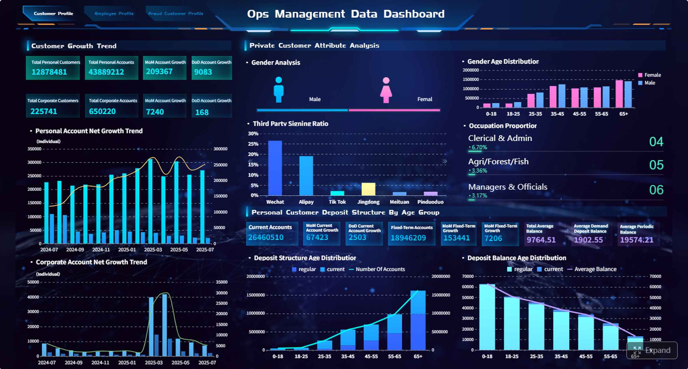
Strategic Dashboards
Strategic dashboards provide executives with a high-level view of long-term goals: revenue growth, market share, risk exposure, and initiative progress. They aggregate data from multiple operational and analytical sources, presenting only the metrics tied to organizational objectives.
Digital Dashboard Examples by Department
Dashboards should be designed around department-specific workflows and KPIs, not generic templates. Below are proven examples by function.
| Department | Example Dashboard | KPIs |
| Sales | Sales performance dashboard | Revenue, win rate, pipeline value, quota attainment |
| Finance | Cash flow dashboard | Cash balance, operating expenses, gross margin, budget variance |
| Operations | Operations dashboard | Cycle time, backlog volume, productivity rate, SLA compliance |
| Manufacturing | Production dashboard | Output volume, downtime hours, defect rate, OEE |
| Marketing | Campaign dashboard | Leads generated, conversion rate, CAC, campaign ROI |
| Executive | Executive KPI dashboard | Revenue, net profit, risk indicators, strategic milestone progress |
For detailed templates and implementation guidance, see Top 10 Business Intelligence Dashboard Examples and Reporting Dashboard Examples by Department.
Key Metrics and KPIs to Track
A dashboard without well-defined KPIs is just decoration. Follow these principles when selecting metrics:
1. Align to business outcomes. Every KPI should trace back to a strategic objective. If you cannot explain why a metric matters, remove it.
2. Balance leading and lagging indicators. Revenue is lagging; pipeline velocity is leading. Both are necessary for proactive management.
3. Set thresholds, not just targets. Define what "good," "warning," and "critical" look like for each metric. Color-coded status indicators make this scannable.
4. Limit scope. A single dashboard should answer one question set. Overloading with 30+ widgets dilutes focus. Aim for 5–8 primary KPIs per view.
5. Validate data quality. KPIs built on incomplete or stale data erode trust. Use FineDataLink to automate validation checks and alert on anomalies before they reach the dashboard.
For a deeper framework on KPI selection, see KPI Dashboard Benefits for Business.
Benefits of Digital Dashboards
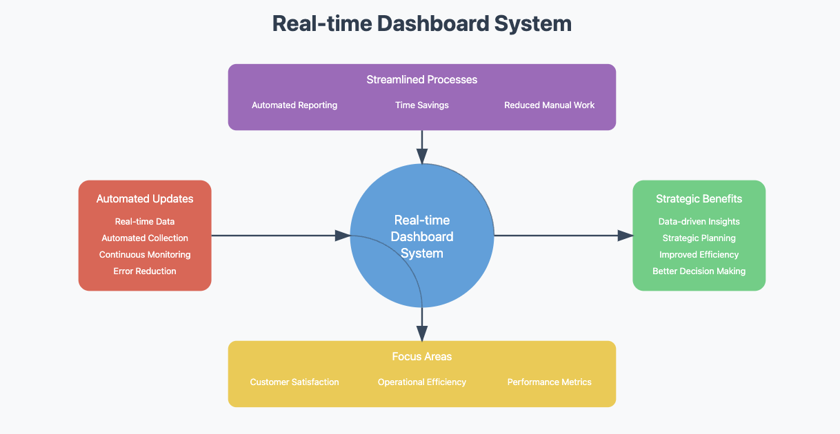
Real-Time Visibility and Faster Decisions
Live data eliminates the lag between events and awareness. Teams respond to inventory shortages, customer escalations, or production bottlenecks as they happen—not days later in a weekly report.
Reduced Reporting Burden
Automated dashboards replace manual spreadsheet consolidation. Finance teams that previously spent 2–3 days assembling monthly reports can redirect that time to analysis and advisory work.
Cross-Functional Alignment
A shared dashboard creates a single source of truth. Sales, operations, and finance stop debating whose numbers are correct and start discussing what to do about them.
Scalable Self-Service
Modern BI platforms like FineBI allow business users to build and modify dashboards without IT involvement. This reduces the analytics bottleneck and accelerates insight-to-action cycles.
Proactive Risk Management
Threshold-based alerts and anomaly detection surface issues before they escalate. Compliance teams monitor regulatory KPIs continuously rather than through periodic audits.
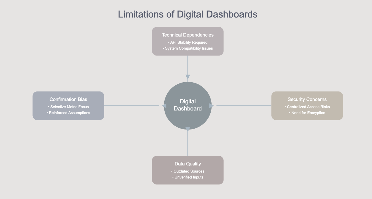
Common Limitations and Mistakes
Even well-intentioned dashboard initiatives fail. Avoid these pitfalls:
| Mistake | Impact | Fix |
| Too many KPIs per view | Cognitive overload; users ignore critical signals | Limit to 5–8 primary metrics; use tabs or separate dashboards for secondary detail |
| Poor data quality | Erodes trust; decisions based on wrong numbers | Implement automated validation via FineDataLink; document data lineage |
| No defined audience | Generic dashboards serve no one | Design per role: executive, manager, operator |
| Missing context | Numbers without benchmarks or targets are meaningless | Add trend lines, targets, and threshold indicators |
| Ignoring adoption | Built but unused | Involve end users in design; provide training; iterate based on feedback |
| Over-reliance on real-time | Unnecessary infrastructure cost for non-operational use cases | Match refresh frequency to actual decision cadence |
Digital Dashboard Design Best Practices
1. Start with the question. Before building any widget, define the specific business question the dashboard must answer. "How are we performing?" is too broad. "Is Q3 revenue on track vs. target by region?" is actionable.
2. Follow visual hierarchy. Place the most critical metric top-left. Use size, color, and position to guide attention. Avoid decorative elements that compete with data.
3. Use consistent formatting. Standardize date formats, currency units, color semantics (red = bad, green = good), and chart types across dashboards. Consistency reduces cognitive load.
4. Design for mobile. Many stakeholders check dashboards on phones during commutes or meetings. Ensure responsive layouts and legible font sizes.
5. Test with real users. Conduct usability sessions with intended audiences. Ask them to find a specific insight within 30 seconds. If they cannot, redesign.
6. Govern access and permissions. Not every user needs every metric. Role-based security ensures sensitive financial or HR data reaches only authorized viewers.
7. Plan for iteration. Dashboards are products, not projects. Schedule quarterly reviews to retire unused widgets, add emerging KPIs, and incorporate user feedback.

How FineBI Helps Build Digital Dashboards
FineBI is a self-service BI platform designed for building interactive digital dashboards at enterprise scale. Key capabilities include:
- Drag-and-drop dashboard builder. Business users create dashboards without coding. Pre-built templates for sales, finance, operations, and executive views accelerate deployment.
- Multi-source data integration. Connect to relational databases, cloud warehouses, APIs, and flat files. FineDataLink handles complex ETL pipelines underneath.
- Interactive exploration. Drill-down, filtering, cross-highlighting, and parameter controls let users investigate root causes without returning to IT.
- Scheduled refresh and distribution. Automate data updates and push dashboard snapshots via email or embedded links.
- Enterprise-grade security. Row-level permissions, field-level masking, and audit logging protect sensitive data while enabling broad access.
- Mobile-native experience. Responsive dashboards render correctly on iOS and Android without separate configuration.
For fixed-format reporting, regulatory submissions, or pixel-perfect management reports, complement FineBI with FineReport.
From Digital Dashboards to AI Data Agent
A digital dashboard shows current business performance, but managers often need the next layer of analysis: why a metric changed, which department is affected, and what action should happen next. With governed dashboards and reports as the data foundation, Dora helps business users ask natural-language questions, generate summaries, and follow up on insights without manually digging through every chart.
Dora operates as an AI analysis layer on top of your existing FineBI dashboards, FineReport reports, and connected data sources. It does not replace dashboards—it extends them:
- Natural-language Q&A. Ask "Why did West Region revenue drop last week?" and receive a narrative summary grounded in actual dashboard data.

- KPI change summaries. Automatically detect and explain significant metric movements across scheduled refreshes.
- Anomaly detection. Surface unusual patterns that static thresholds may miss, with contextual explanations.
- Role-based briefings. Deliver personalized daily or weekly summaries tailored to each stakeholder's KPI scope.
- Trusted data foundation. All Dora responses reference governed dashboards and reports, ensuring consistency with official metrics.
Digital dashboards help teams see what is happening. Dora helps them understand why and decide what to do next.
Continue Reading About Digital Dashboard
How to Quickly Build a Core App Dashboard
Store Performance Dashboard: Your Retail Command Center
Frequently asked questions
A digital dashboard emphasizes real-time monitoring and at-a-glance status for operational or managerial use. A BI dashboard adds interactive analysis, drill-down, and self-service exploration for analysts. In practice, modern platforms like FineBI combine both capabilities in a single tool.