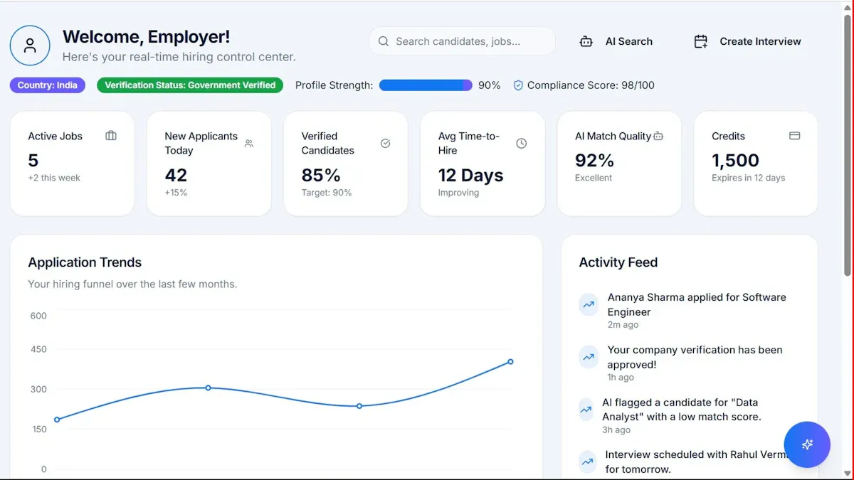
A data report is a structured document or digital report that turns raw data into findings, context, and recommended actions. For operations directors, analysts, finance leaders, and IT managers, its business value is simple: it helps teams stop reacting to scattered numbers and start making decisions with clarity. Without a solid data report, organizations often deal with conflicting metrics, unclear definitions, delayed decisions, and endless spreadsheet back-and-forth.
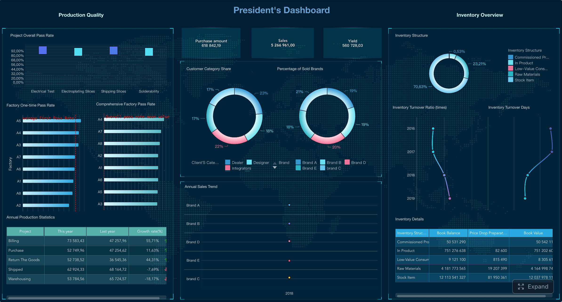
All reports in this article are built with FineReport.
What Is a Data Report?
A data report is a formal way to present data so people can understand what happened, why it matters, and what should happen next. It is used across business, research, government, and nonprofit environments to communicate performance, trends, risks, and opportunities.
In plain language, a data report answers questions such as:
- What changed this month?
- Which regions or teams are underperforming?
- Where are costs increasing?
- Are we meeting targets?
- What action should leadership take?
A strong data report does more than show numbers. It translates data into:
- Findings: the key facts or trends
- Context: benchmarks, comparisons, and definitions
- Decisions: clear next steps based on evidence
For example, a sales manager may have raw transaction data in a spreadsheet. That data alone does not explain whether conversion rates improved, which products drove growth, or which regions need intervention. A data report organizes that information into a usable narrative.
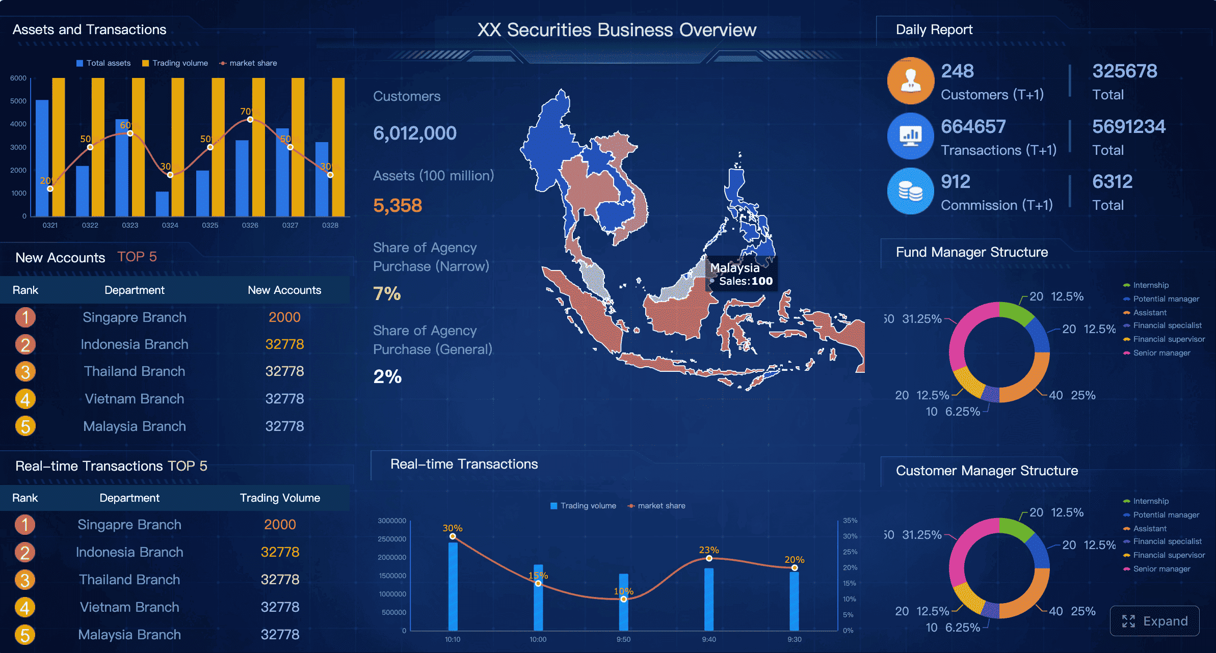
Data report vs. dashboard vs. spreadsheet vs. data analysis document
These terms are related, but they are not the same.
| Format | Primary purpose | Best use case | Limitation |
|---|---|---|---|
| Data report | Communicate findings and support decisions | Monthly reviews, board updates, compliance, research summaries | Can become static if not updated regularly |
| Dashboard | Monitor live or frequently updated metrics | Daily management, operational tracking, executive visibility | May lack explanation and narrative context |
| Spreadsheet | Store, calculate, and manipulate raw data | Data preparation, ad hoc analysis, exports | Hard to scan and easy to misinterpret |
| Data analysis document | Explain analytical methods and deeper interpretation | Research, statistical studies, root-cause analysis | Often too detailed for non-technical stakeholders |
A dashboard helps people monitor performance quickly. A spreadsheet helps teams work with the underlying data. A data analysis document explains deeper methods and reasoning. A data report sits in the middle: structured enough for decision-making, readable enough for stakeholders, and practical enough for action.
Core Components of an Effective Data Report
An effective data report is not just a collection of charts. It is a decision-support tool built around purpose, trust, and usability.
Clear objective and audience
Every good report starts with two questions:
- What question is this report answering?
- Who is going to use it?
If the objective is unclear, the report becomes a data dump. If the audience is unclear, the report becomes either too technical or too shallow.
A CFO may need margin trends, variance explanations, and financial risk indicators. An operations manager may need throughput, downtime, backlog, and SLA performance. A marketing lead may need campaign ROI, lead quality, and channel attribution.
The best reports match the audience in three ways:
- Level of detail: executive summary vs. line-level detail
- Terminology: business-friendly language vs. technical definitions
- Visual format: KPI cards and trend charts vs. analytical tables
Key Metrics (KPIs)
Below are the core KPI categories most data reports need. The exact metrics vary by function, but the structure stays consistent.
- Volume metrics: Measure total activity, such as sales orders, tickets closed, website visits, or units produced.
- Performance metrics: Show outcomes against goals, such as revenue attainment, on-time delivery rate, or campaign conversion rate.
- Trend metrics: Track movement over time, such as month-over-month growth, year-over-year change, or rolling averages.
- Comparison metrics: Compare teams, regions, products, or periods to identify gaps and leaders.
- Efficiency metrics: Measure resource use, such as cost per lead, output per labor hour, or cycle time.
- Quality metrics: Reveal accuracy and reliability, such as defect rate, return rate, or customer complaint volume.
- Risk metrics: Flag exposures, such as overdue receivables, compliance breaches, or data quality exceptions.
Core elements every data report should include
- Objective: The business question the report is designed to answer
- Audience: The stakeholder group using the report
- Reporting period: The time window covered by the data
- Metrics and definitions: The KPIs, formulas, and business rules applied
- Data sources: Systems, databases, or surveys used
- Findings: The most important trends, comparisons, and exceptions
- Visuals: Charts, tables, and summaries that improve comprehension
- Conclusions: What the results mean
- Recommendations: Practical next steps based on the findings
Data sources and methodology
If users do not trust the inputs, they will not trust the report.
A credible data report clearly explains:
- Where the data came from
- How it was collected
- What time period it covers
- How key figures were calculated
- What limitations or assumptions apply
This section matters more than many teams realize. Different systems may define the same metric differently. For instance, one department may count “active customers” as anyone who purchased in the last 12 months, while another uses a 90-day window. A data report should remove that ambiguity.
Good methodology notes often include:
- Source systems: ERP, CRM, HRIS, web analytics platform, survey tool, government database
- Collection method: manual entry, API sync, transaction logs, form submission, sampling
- Refresh frequency: daily, weekly, monthly, quarterly
- Calculation logic: formulas, inclusion rules, exclusions, segmentation criteria
- Limitations: missing records, small sample sizes, delayed updates, known anomalies
This is one area where FineReport is often useful in enterprise settings. When reports pull from multiple systems, teams need consistent logic, governed templates, and traceable calculations instead of isolated spreadsheet versions.
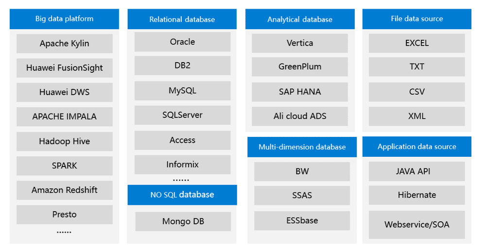 Source Systems
Key findings and visual presentation
A reader should not have to hunt for the story.
An effective data report highlights:
- Major trends
- Significant comparisons
- Outliers and anomalies
- Performance against target
- Meaningful changes from the previous period
The visual layer matters because scanning speed matters. Busy stakeholders usually review reports under time pressure. They need to know what changed within seconds.
Useful visual formats include:
- Line charts for trends over time
- Bar charts for category comparisons
- Tables with conditional formatting for precise values
- KPI cards for headline metrics
- Maps for geographic analysis
- Waterfall charts for variance explanation
The best visual design principles are simple:
- One chart, one message
- Use labels and titles that state the conclusion
- Avoid clutter and decorative visuals
- Keep scales consistent
- Highlight the most important data point or variance
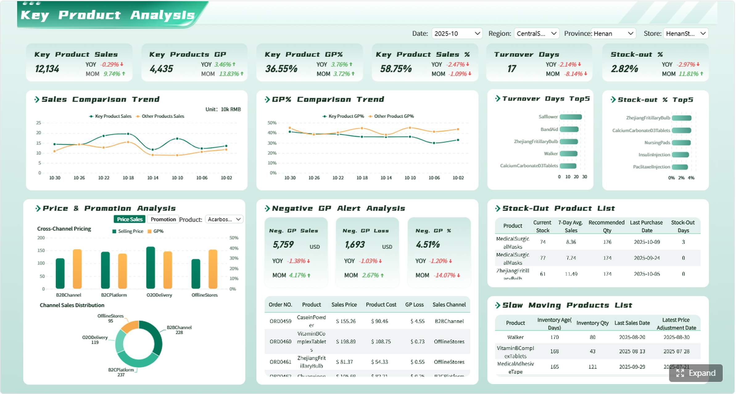 A Visual Design Example created by FineReport
Conclusions and recommended actions
A report is only complete when it connects data to action.
This section should answer:
- What do the findings mean?
- Why does this matter now?
- What should the business do next?
- What assumptions or risks should stakeholders know?
Strong recommendations are specific. Instead of saying “improve sales performance,” the report should say something like:
- Reallocate budget toward the top two converting channels
- Investigate late shipments in the Southeast region
- Standardize lead scoring across business units
- Run a root-cause review on the spike in service tickets
- Update pricing assumptions for under-margin product lines
This is where a data report becomes operationally valuable.
How Data Report Works in Practice
A data report is not a one-time document. It is the output of a repeatable workflow that moves from raw inputs to governed business communication.
From collection to reporting
In practice, most data reporting follows this sequence:
- Collect data from source systems, forms, databases, or external sources
- Clean the data by removing duplicates, fixing errors, and addressing missing values
- Organize it using consistent fields, categories, and time periods
- Analyze it to identify patterns, performance shifts, and exceptions
- Present it in a report with visuals, commentary, and recommendations
- Review and distribute it to stakeholders on the right schedule
To maintain accuracy, teams need controls at each stage:
- Standard metric definitions
- Validated data pipelines
- Version control
- Approval workflows
- Scheduled refreshes
- Exception checks for unusual values
When these controls are missing, reporting quality degrades fast. Teams spend more time reconciling numbers than acting on them.
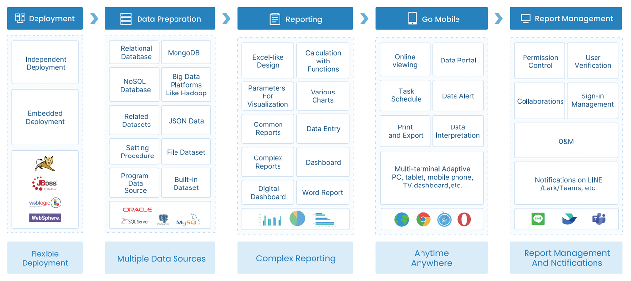 Workflow
Common tools and reporting techniques
Different tools serve different reporting needs.
- Spreadsheets: Best for ad hoc work, manual analysis, and small datasets
- Databases: Best for storing structured data at scale
- BI platforms: Best for dashboards, governed reporting, and self-service exploration
- Visualization tools: Best for presenting patterns clearly to non-technical users
- Reporting platforms: Best for scheduled distribution, print-ready layouts, and enterprise templates
Common reporting techniques include:
- Automated reports: Generated on a schedule for recurring business reviews
- Periodic reports: Weekly, monthly, quarterly, or annual summaries
- Interactive reports: Filterable reports that let users drill into regions, teams, or categories
- Exception reports: Highlight only unusual results or threshold breaches
- Comparative reports: Show period-over-period or segment-to-segment performance
For organizations that need both highly formatted reports and dashboard-style access, FineReport is a practical option because it supports enterprise reporting, visual dashboards, scheduled distribution, and multi-source integration in one environment.
Benefits of strong data reporting
Good data reporting creates value far beyond “visibility.”
Key business benefits
- Better decision-making: Leaders act on verified evidence rather than assumptions
- Performance tracking: Teams know whether they are meeting targets
- Faster issue detection: Problems appear earlier through trend and variance reporting
- Greater transparency: Stakeholders see the same numbers and definitions
- Stronger communication: Reports align technical teams and business leaders
- More accountability: Ownership becomes clear when metrics are visible
- Higher efficiency: Automation reduces manual reporting work and rework
In enterprise environments, the biggest benefit is often consistency. A well-designed data report reduces meetings spent debating what the numbers mean.
Types of Data Report and Real-World Examples
Different business questions require different report types. A useful data report is shaped by its purpose, not by a generic template.
Common types of data reports
Here are the most common report categories used across organizations.
Operational reports
These track day-to-day business activity.
Examples include:
- Production output
- Delivery performance
- Call center volume
- Inventory levels
- Downtime and incident logs
Operational reports are usually frequent and action-oriented.
Financial reports
These focus on monetary performance and control.
Examples include:
- Budget vs. actual
- Profitability by business unit
- Cash flow summaries
- Expense trends
- Accounts receivable aging
These reports need strong data governance and clear calculation rules.
Marketing reports
These measure campaign and channel performance.
Examples include:
- Lead generation by source
- Cost per acquisition
- Funnel conversion
- Website traffic trends
- Content engagement performance
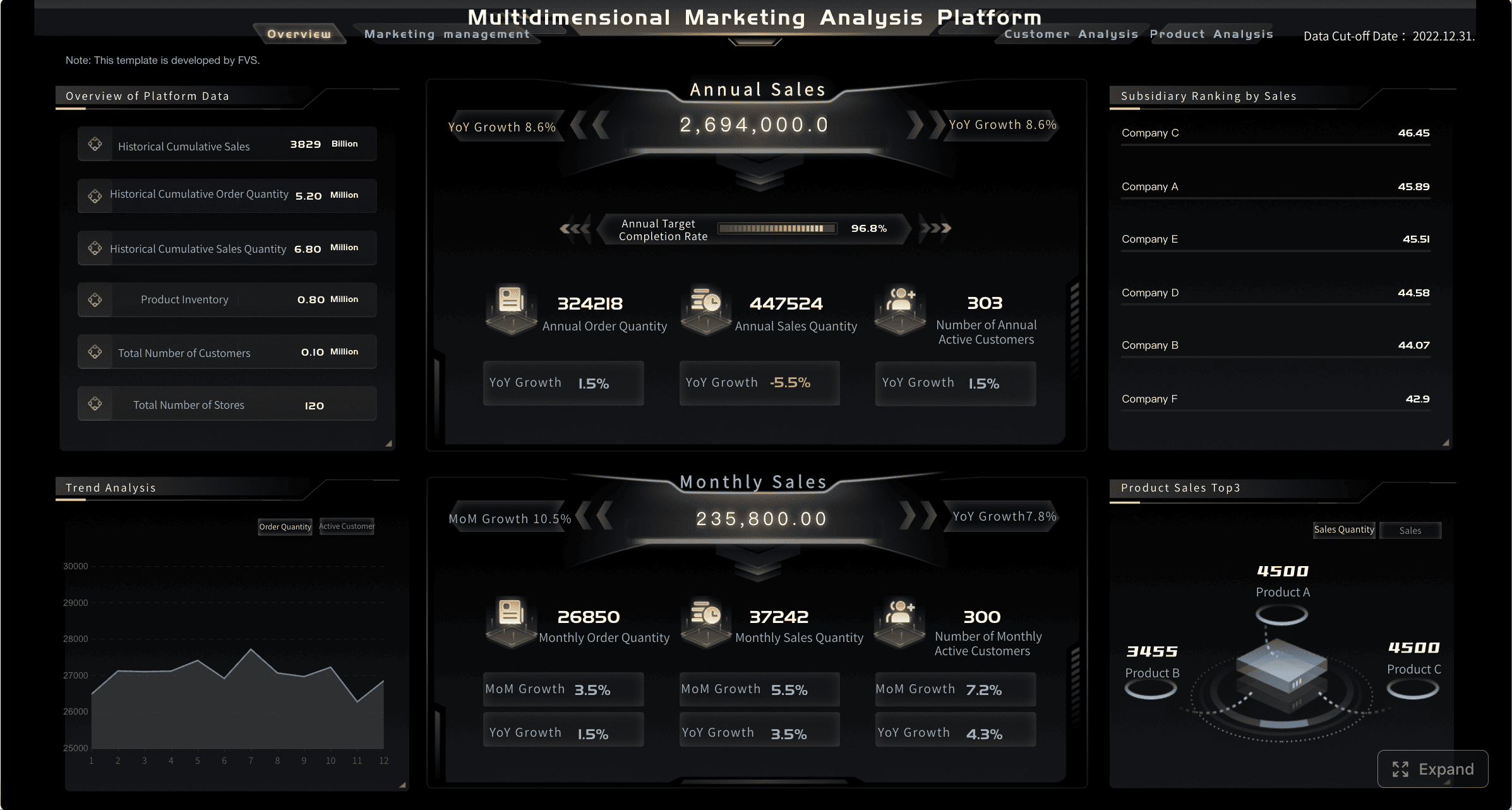
Sales reports
These help revenue teams monitor pipeline and output.
Examples include:
- Revenue by region
- Win rate
- Pipeline coverage
- Average deal size
- Sales cycle length
Compliance reports
These support auditability and regulatory oversight.
Examples include:
- Policy adherence
- Incident reporting
- Access control reviews
- Training completion rates
- Regulatory filing metrics
Research reports
These summarize findings from studies, surveys, or field data.
Examples include:
- Survey response patterns
- Demographic summaries
- Experimental outcomes
- Public health indicators
- Policy impact assessments
Descriptive, diagnostic, and trend-based reporting
Most data reports fall into one of three analytical styles.
- Descriptive reporting: Explains what happened
- Diagnostic reporting: Explains why it happened
- Trend-based reporting: Explains how performance is changing over time
The strongest business reporting often combines all three. It states the result, explores the cause, and shows direction.
Public and industry examples
Many of the best real-world examples come from public data initiatives and industry reporting projects.
Government and public data reporting
Government data platforms often make large datasets easier to understand through profiles, charts, and comparisons. Typical examples include:
- Census-based population and housing reports
- Labor market and employment summaries
- Public health tracking reports
- Open data portals with downloadable tables and maps
These examples are useful because they show how complex data can be made accessible to broad audiences through structured summaries and visual context.
Digital trends and industry reporting
Industry reports often package large-scale behavioral or market data into executive-friendly insight documents. Common examples include:
- Global digital adoption reports
- Consumer trend reports
- Ecommerce benchmark reports
- Technology adoption studies
- Market segmentation reports
These reports usually work well because they blend headline findings, comparisons, charts, and plain-language commentary.
Analytics and business reporting examples
Within companies, strong examples include:
- Monthly executive business review reports
- Plant performance reports for manufacturing leaders
- Customer support SLA reports
- Territory sales performance packs
- Marketing ROI reports combining CRM and campaign data
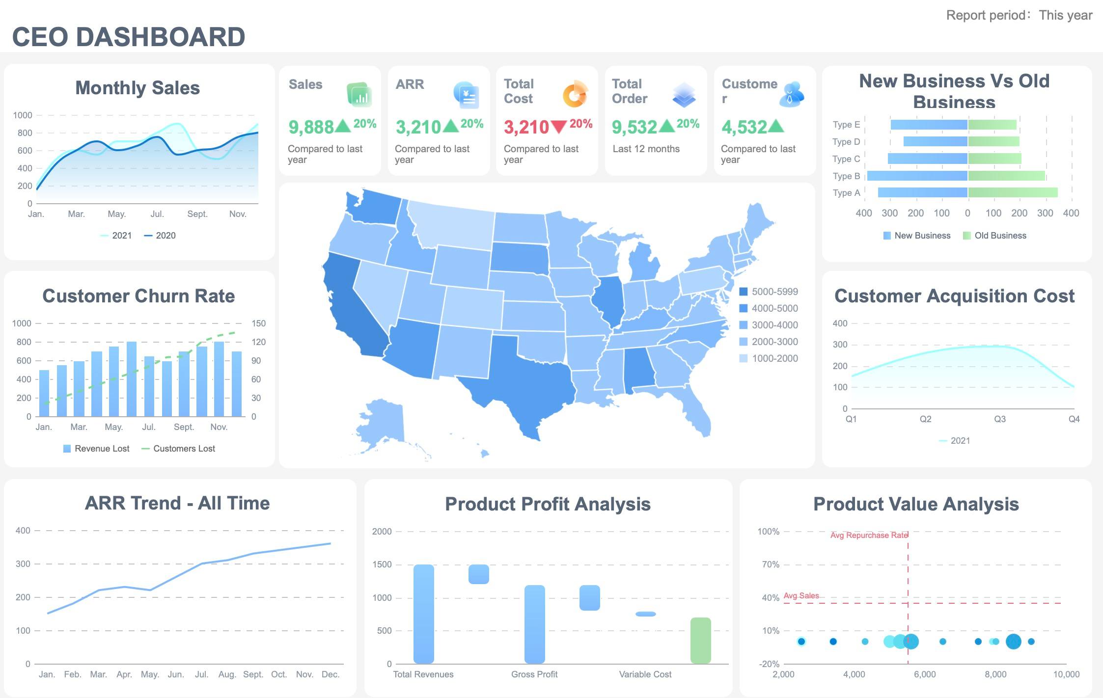
What readers can learn from strong examples
The best data reports share three traits:
- Credibility: clear sources, definitions, and methodology
- Clarity: focused visuals and concise findings
- Relevance: recommendations tied to stakeholder decisions
Readers can also learn an important structural lesson: good reports are layered.
A strong report usually has:
- A quick executive summary
- KPI highlights
- Supporting charts and tables
- Commentary on what changed and why
- Recommended next actions
That structure helps both executives and analysts use the same report without friction.
How to Write a Data Report Step by Step
If you need to create a data report from scratch, use a disciplined workflow. This keeps the report useful, credible, and easy to maintain.
Plan the report before writing
Start with purpose, not data.
Define:
- The goal of the report
- The audience
- The scope
- The reporting period
- The decisions the report should support
- The KPIs that matter most
Ask practical stakeholder questions such as:
- What decision will this report influence?
- Which metrics will trigger action?
- What level of detail does the audience need?
- How often should the report be updated?
- What comparisons matter most?
A simple planning table can help:
| Planning item | What to define |
|---|---|
| Objective | The core business question |
| Audience | Executives, managers, analysts, regulators, public readers |
| Scope | Teams, regions, products, channels, or time period covered |
| KPIs | Metrics tied directly to decisions |
| Format | PDF report, dashboard, board pack, presentation, or portal |
| Frequency | Daily, weekly, monthly, quarterly |
Organize and analyze the data
Once the plan is clear, prepare the data.
Step-by-step best practices
-
Clean the dataset
- Remove duplicates
- Standardize formats
- Fix obvious entry errors
- Check for missing values
-
Confirm definitions
- Align KPI formulas
- Validate dimension labels such as region, product, and department
- Ensure date ranges and filters are correct
-
Summarize patterns
- Compare current performance to prior periods
- Segment by category
- Flag exceptions and outliers
- Check progress against target
-
Prioritize insights
- Focus on the few findings that actually matter
- Separate signal from noise
- Do not include every available metric
-
Validate before publication
- Reconcile totals with source systems
- Review unusual values with data owners
- Check if charts and tables tell the same story
This is often where reporting projects fail. Teams rush from extraction to presentation without enough data validation. In enterprise reporting, that creates credibility problems quickly.
Draft, review, and present the report
Now write the report in a decision-first format.
A practical structure is:
- Executive summary
- Objective and reporting scope
- Key metrics
- Findings and visuals
- Interpretation
- Recommended actions
- Methodology notes
Your executive summary should be short and direct. It should tell a senior stakeholder what changed, why it matters, and what action is recommended.
Then review the draft for:
- Accuracy
- Consistency
- Readability
- Logical flow
- Visual clarity
- Terminology alignment
Finally, present the report in a format the audience will actually use. Some stakeholders want scheduled PDFs. Others prefer interactive reports with filters and drill-down. If your business needs both, a platform like FineReport can help standardize delivery while preserving usability for different departments.
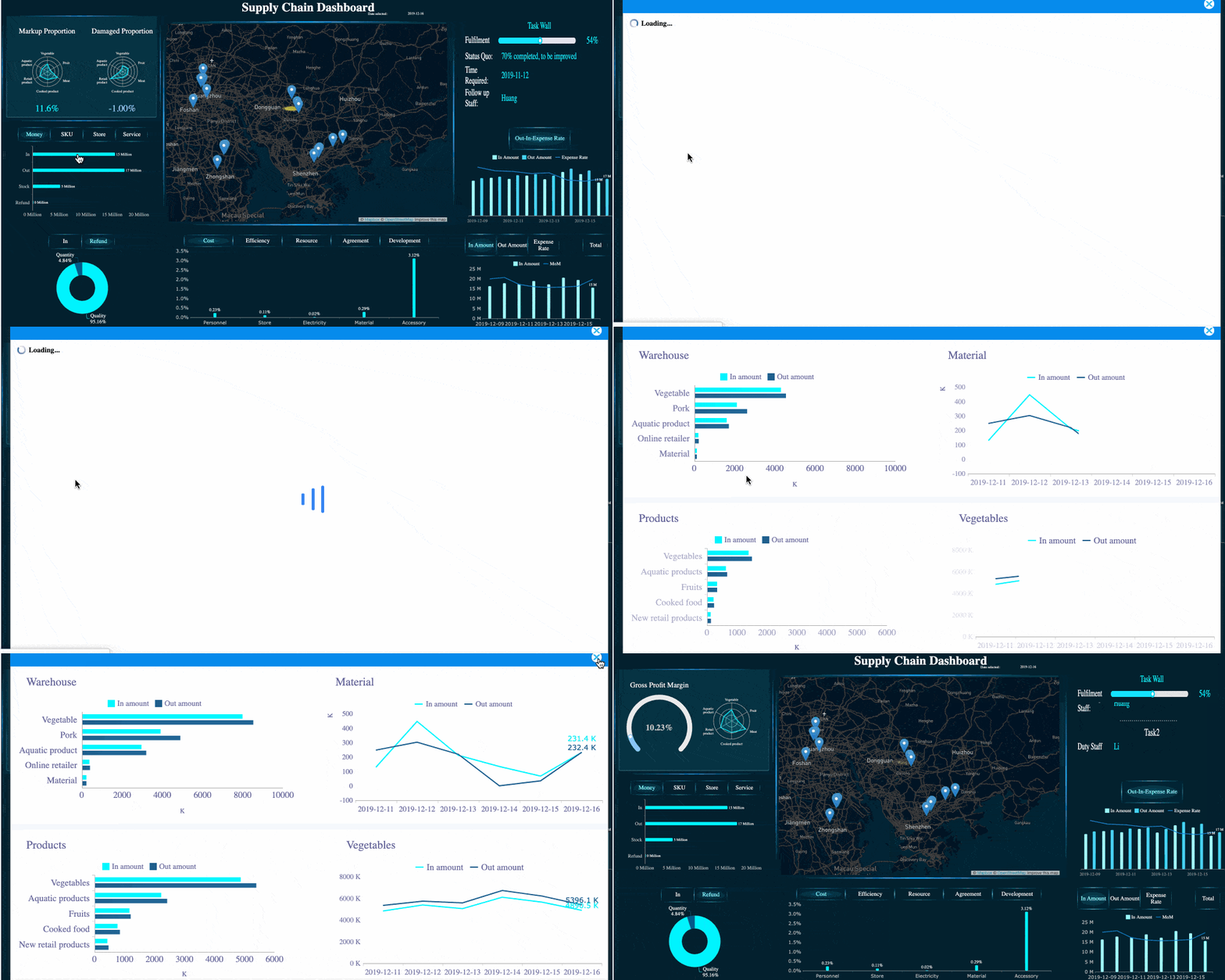 Data Drill-down
Actionable Best Practices for Implementing a Data Reporting Process
Below are practical recommendations I would give any enterprise team building or improving its data report workflow.
1. Standardize KPI definitions before automating anything
Do not automate conflicting logic. First align definitions for core metrics such as revenue, active customer, conversion, backlog, or compliance breach. A report built on disputed metrics will not be trusted.
2. Design for the decision-maker, not the data owner
Many reports are written from the perspective of the analyst. Flip that. Start with the stakeholder’s questions, then include only the data needed to answer them.
3. Build one reporting layer for summary and one for detail
Executives need concise summaries. Managers need drill-down. The best reporting systems provide both without forcing every user into the same view.
4. Add commentary rules, not just charts
Numbers alone rarely drive action. Define a reporting standard that requires commentary on:
- what changed,
- why it changed,
- whether it matters,
- what should happen next.
5. Automate distribution, but keep review checkpoints
Scheduled reporting saves time, but key reports still need review controls. Build approval steps for sensitive financial, compliance, or executive-facing outputs.
Common Mistakes to Avoid in a Data Report
Even technically correct reports can fail if they are poorly designed.
Overloading the report with too much data and too little interpretation
More data does not mean more insight. If readers cannot tell what matters within a minute, the report is too dense.
Using unclear charts, inconsistent definitions, or missing source information
This is one of the fastest ways to lose trust. If users cannot understand the visual or verify the calculation, they will question the entire report.
Ignoring audience needs, context, or actionable next steps
A report for analysts should not read like a board memo, and a board memo should not read like a raw extraction log. Context and action are what make reporting useful.
Treating the report as a data dump instead of a decision-support tool
This is the most common problem. A data report should not just display data. It should help someone decide what to do.
Final Thoughts
A data report is not just a document with charts and tables. It is a structured communication tool that converts data into business understanding and action. The most effective data reports define a clear objective, use trustworthy data sources, focus on meaningful KPIs, present findings visually, and conclude with specific recommendations.
Whether you are reporting on operations, finance, sales, compliance, or public research, the principle is the same: make the data credible, readable, and relevant to the decision at hand.
If your team is still relying on fragmented spreadsheets or inconsistent templates, this is the right time to standardize your reporting process. FineReport is especially well suited for organizations that need enterprise-grade data reports, visual dashboards, scheduled outputs, and governed multi-source reporting in one platform.
 Get Ready-to-Use Dashboard Templates in Fine Gallery
FAQs
A data report turns raw data into clear findings, business context, and recommended actions. Its main purpose is to help stakeholders understand performance and make better decisions faster.