A data dashboard is a simple online tool that helps you see, track, and understand important data so you can make smart decisions quickly.
You use a dashboard to turn raw data into clear charts and summaries. This helps you spot trends, monitor key numbers, and act fast. Most companies now rely on dashboards for decision-making, with 78% offering dashboards in their products. Dashboards give you real-time access and interactive features that make finding answers easy. FineBI lets you connect multiple data sources, explore information, and share insights without needing technical skills.
Feature
Dashboards
Traditional Reports
Interactivity
High - users can engage dynamically
Low - typically static documents
Accessibility
Real-time access via web platforms
Often distributed offline
Usability
Designed for intuitive navigation
Less user-friendly
Decision-making speed
5x faster according to Forrester
Slower due to static nature
Data Dashboard Basics
What Is a Data Dashboard
A data dashboard is a digital workspace that lets you view, track, and analyze important data in one place for quick decision-making.
You use a dashboard to turn raw data into clear visuals and summaries. This tool helps you monitor metrics, spot trends, and respond to changes fast. An effective data dashboard brings together information from different sources, making it easy for you to see what matters most. You can customize dashboards to show the data that fits your needs, whether you want to follow sales numbers, website traffic, or production rates.
Data Dashboard created by FineBI (Click to Engage)
FineBI is a modern solution for building dashboards. You do not need coding skills to use it. You can connect multiple data sources, drag and drop charts, and share insights with your team. FineBI makes data accessible and helps you create dashboards that support smart business decisions.
Tip: An effective data dashboard should be simple to use, update in real time, and show the most important data at a glance.
Core Functions and Features
A dashboard works best when it combines several key components. These elements help you understand your data and make better choices.
Component
Description
Visualization Tools
Transform complex datasets into clear visual representations for easy understanding.
Widgets
Display data in different ways, tailored to your specific needs.
Real-time Data Updates
Keep your dashboard current so you can act on the latest information.
You will find these common features in most modern dashboards:
Self-service analytics, so you can explore data without IT help.
Interactive dashboards that let you dig deeper into your data.
Many visualization options for clear communication.
Real-time data analysis for quick responses.
When you use an effective data dashboard, you gain several advantages:
Track performance and key metrics in real time.
Spot issues early and take action.
Understand customer needs and improve their experience.
Optimize costs and resources.
Adapt quickly to changes.
Plan and forecast using historical data.
Hold teams accountable for results.
Compare performance against goals or standards.
Manage risks before they become problems.
Stay compliant with regulations.
Build a culture that relies on data for decisions.
Improve customer retention and acquisition.
Allocate resources more effectively.
Use feedback to drive continuous improvement.
Align actions with business goals.
Data Dashboard created by FineBI (Click to Engage)
A dashboard is more than just a collection of charts. It is a powerful tool that helps you turn data into action. With FineBI, you can build effective data dashboards that make your business smarter and more agile.
How a Data Dashboard Works with FineBI
A data dashboard is a digital tool that lets you view, track, and analyze important information in one place for smarter decisions.
Data Integration and Preparation
You start building a data dashboard in FineBI by connecting your data sources. FineBI supports many types of data, including local Excel files and project data you have permission to access. You can upload spreadsheets from your device or use data already available in your workspace.
All data in 'My Analysis' and data with permissions in 'Public Data'.
Local Excel
Excel sheets from local devices that can be uploaded as data sources.
FineBI makes it easy to bring together data from different places. You do not need coding skills. You can connect databases, cloud platforms, and files with just a few clicks. Before you create visualizations, you should prepare your data using tables. This step helps you organize and clean your data, making sure your dashboard shows accurate results.
Prepare your data using tables before making charts.
Clean and organize your data for better analysis.
Combine data from multiple sources for a complete view.
You can join tables, add calculated fields, and filter out unnecessary records. These steps help you focus on the metrics that matter most. FineBI’s self-service datasets let you customize your data for any analysis.
Tip: Preparing your data before building a dashboard helps you avoid mistakes and makes your insights more reliable.
Visualization and Interactivity
Once your data is ready, you can create visualizations in FineBI using a drag-and-drop interface. You choose the data fields you want to display, then drag them into charts and tables. FineBI recommends the best visual effects based on your selected data, so you get clear and meaningful results.
You create visualizations easily by dragging and dropping data, making the process simple and fast.
Self-Service Datasets
You use self-service datasets for analysis, giving you control over your data dashboard.
Multi-Dimensional Analysis
You explore data from different angles, drilling down into metrics and applying calculations for deeper insights.
User-Centric Visualization Style
FineBI suggests visual styles that match your data, improving your data visualization experience.
Dashboard Functionality
You merge analytic data into unified reports, customize layouts, and use themes for effective communication.
Interactive dashboards let you engage with your data in real time. You can filter results, drill down into specific metrics, and adjust views to see different segments. This makes you an active participant in data exploration. You can personalize your dashboard, making the insights more relevant to your needs.
You drill down into metrics and filter data for deeper analysis.
60% of business users prefer dashboards they can personalize and interact with.
Customization helps you adjust views and focus on what matters.
Interactive dashboards support collaborative decision-making, letting teams explore trends and patterns together.
FineBI’s interactive dashboards help you spot trends, compare performance, and make decisions faster. You can share your findings with others, encouraging teamwork and better results.
Note: Interactive dashboards increase user engagement and make data analytics dashboards more effective for everyone.
Real-Time Updates and Sharing
You need up-to-date information to make smart decisions. FineBI supports real-time monitoring, so your dashboard always shows the latest data. You can set dashboards to refresh automatically at regular intervals. If you need more control, you can use custom JavaScript for timed updates.
FineBI supports real-time updates for dashboards.
You can refresh dashboards at set intervals.
Custom scripts allow for timed refreshes.
Sharing your data analytics dashboard is simple and secure with FineBI. You can collaborate with your team by sharing the entire analysis subject and editing together. You can publish dashboards to a directory or as public data for long-term access. For small groups, you can create a public link that lets others view the dashboard without logging in.
Share the analysis subject and work together on editing.
Apply for Publication
Publish dashboards for long-term team access.
Public Link
Allow viewing without login, ideal for small group sharing.
FineBI’s sharing options help you keep your team informed and aligned. You control who can see and edit your dashboards, protecting sensitive data while promoting collaboration.
Tip: Real-time monitoring and secure sharing make your data dashboard a powerful tool for business growth.
You use FineBI to connect data, prepare it, create interactive dashboards, and share insights. This workflow helps you turn raw data into clear, actionable information. You make better decisions, respond quickly to changes, and keep your team working together.
Types of Dashboards for Business Needs
A data dashboard is a digital tool that lets you view, track, and analyze key metrics and kpi in real time, helping you make informed decisions quickly and efficiently.
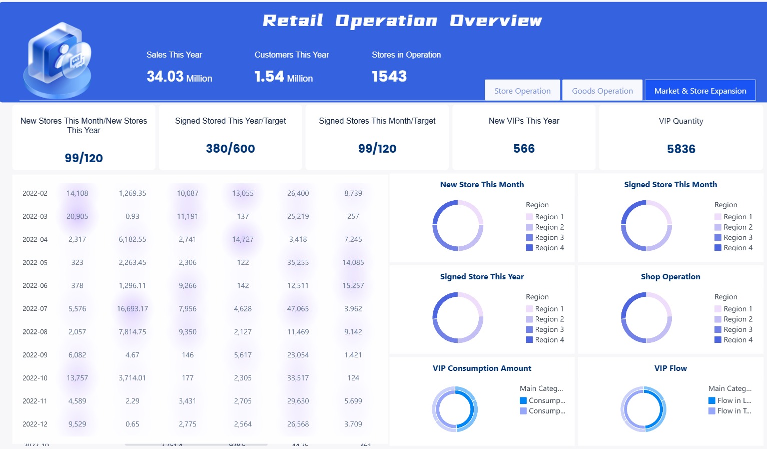
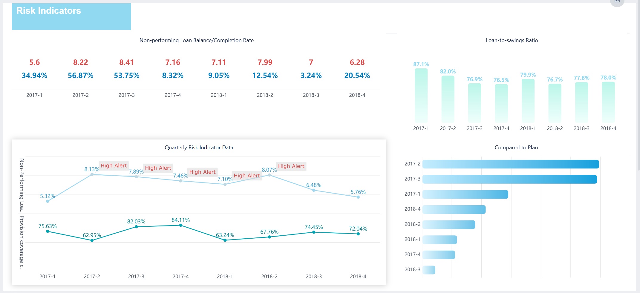
Operational Dashboards
You use operational dashboards to monitor daily business activities. These dashboards focus on real-time data, giving you instant visibility into operations. You see information from different systems, such as warehouse management or ERP, all in one place. The layout highlights urgent issues, so you can act fast. You track machinery and workforce deployment, which helps you spot bottlenecks. These dashboards support continuous improvement by showing process metrics for quality control and waste reduction.
Operational Dashboard created by FineBI (Click to Engage)
Uses large metrics and clear trends for fast understanding.
Alignment with Improvement
Supports Lean and Six Sigma by tracking process metrics.
Greater Customization
Adapts to specific operational needs.
Broader User Spectrum
Serves users with different technical skills.
Tip: Operational dashboards help you manage multiple locations and keep everyone accountable by making performance visible.
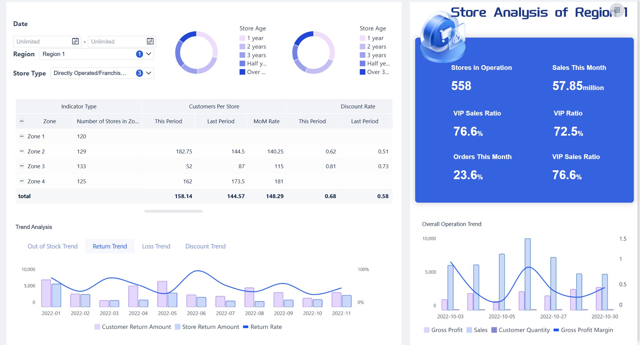
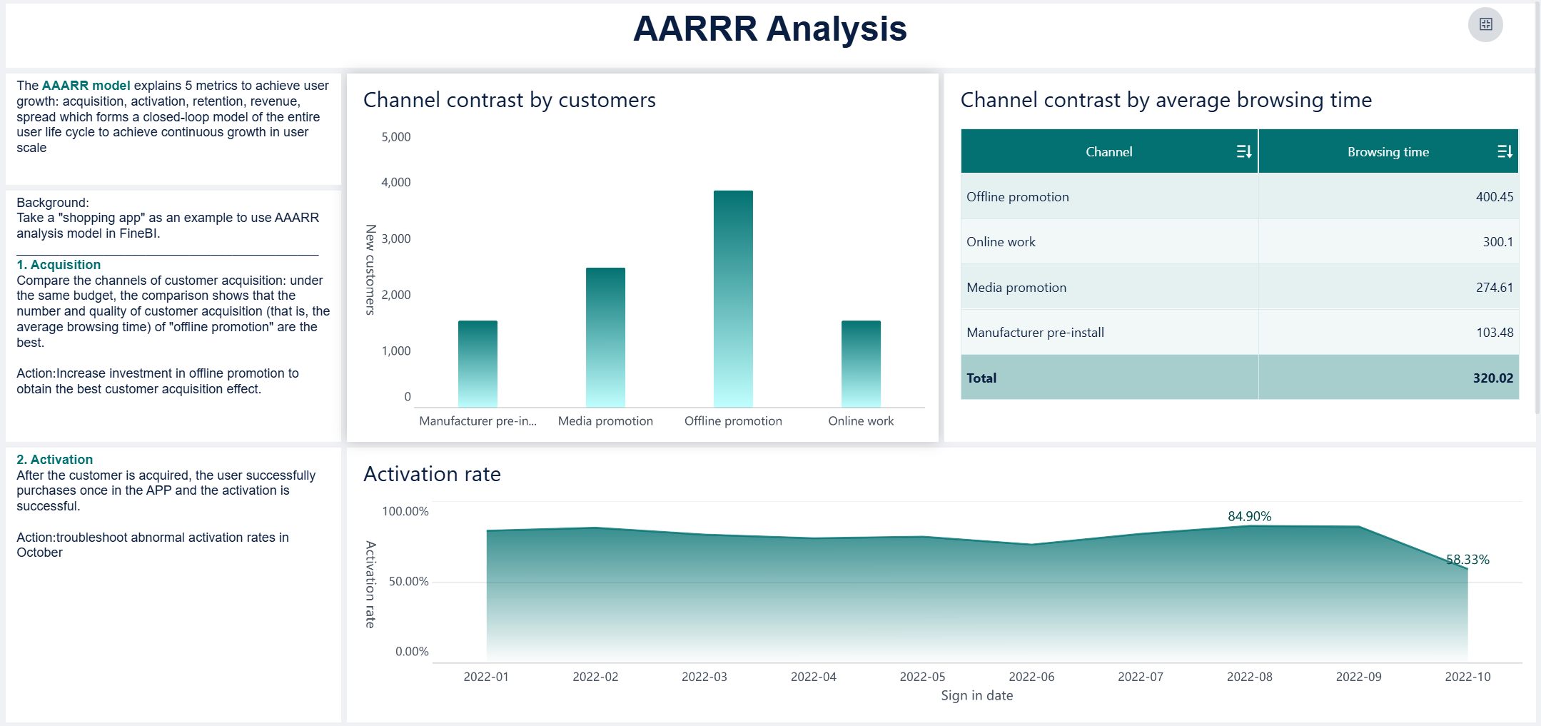
Analytical Dashboards
Analytical dashboards help you explore data and uncover trends. You use filters and comparisons to dig deeper into your business. These dashboards let you manipulate data dynamically, so you can see patterns and forecast future outcomes. Drill-down features allow you to interpret details and make sense of complex information.
You explore data with filters and comparisons.
You use forecasting tools to predict trends.
Drill-down capabilities help you understand details.
Analytical Dashboard created by FineBI (Click to Engage)
Note: Analytical dashboards give you the flexibility to create custom views and make data-driven decisions.
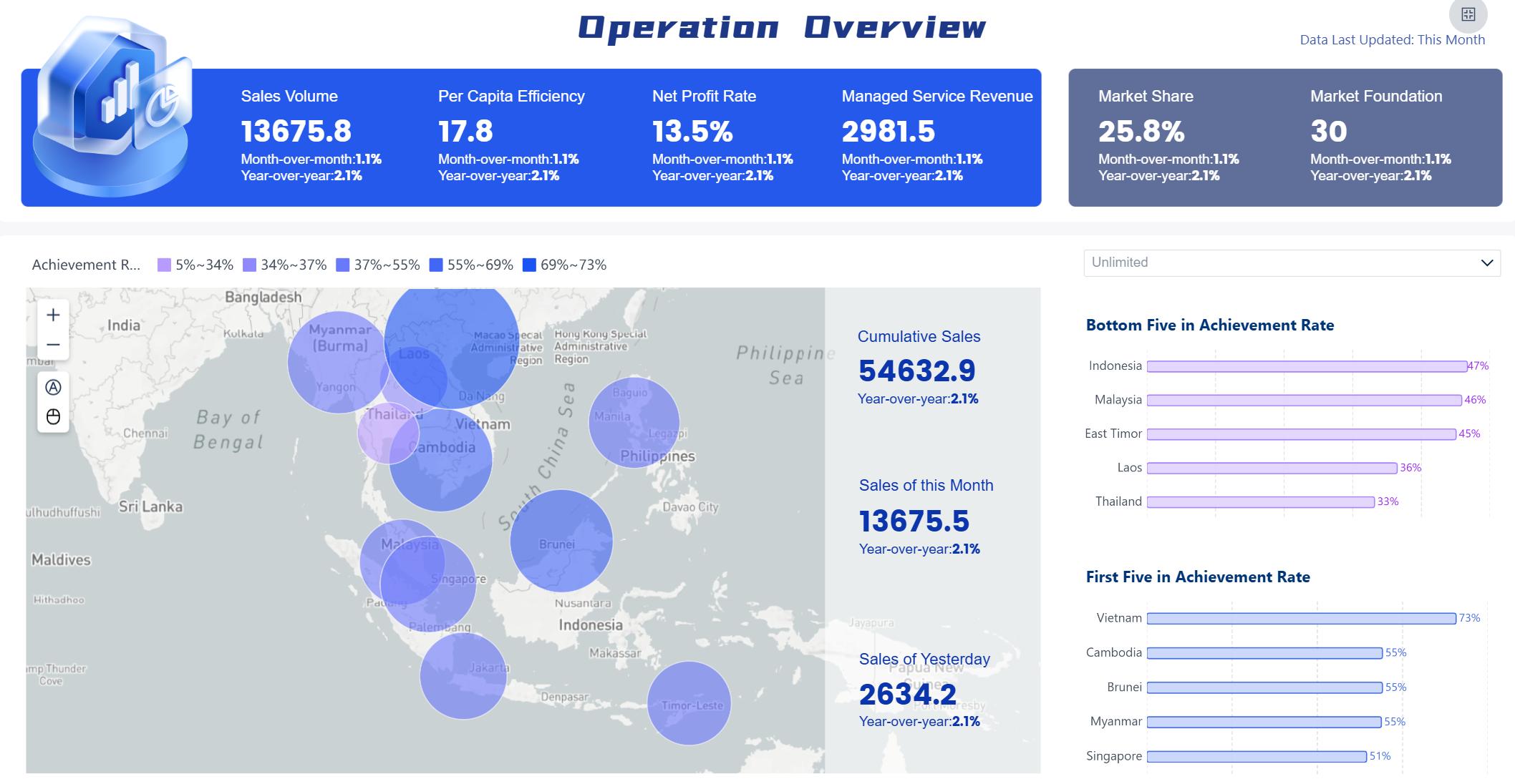
Strategic Dashboards
Strategic dashboards support long-term planning and executive decision-making. You track high-level metrics across departments, such as financial health, market position, and operational efficiency. These dashboards present kpi and metrics that matter most to leaders, helping you align actions with business goals.
Executive Role
Key Metrics
CEO
Financial Health, Customer Health, Market Position
CFO
Profitability, Liquidity, Budgeting, Cash Flow
CRO
Pipeline Health, Revenue, Team Productivity
CMO
Lead Generation, ROI, Channel Performance
COO
Production, Quality, Supply Chain, Efficiency
Strategic Dashboard created by FineBI (Click to Engage)
FineBI lets you customize dashboards for any industry. You set global styles, adjust layouts, and tailor components to fit your needs.
Feature
Description
BI Global Style
Set unified styles for all dashboards.
Custom Global Styles
Create and modify styles for different components.
Dashboard Style
Customize each dashboard for your industry.
Component Style
Adjust individual components for granular control.
Tip: FineBI’s flexibility means you can build dashboards for manufacturing, finance, sales, or any other field.
Benefits and Use Cases of Data Dashboards
A data dashboard is a digital tool that lets you view, track, and analyze key business metrics in real time, helping you make smarter decisions quickly.
Decision-Making and Goal Tracking
When you use dashboard reporting, you gain several dashboard benefits. You save time and resources because dashboards make complex data easy to read and interpret. You can monitor effects and measure goals against progress in real time. Dashboards help you communicate business-critical information at a glance and empower you with better access to information.
You track and execute on KPIs, identify changes and trends faster, and share trusted data across your team. Dashboards make monitoring overall business easier and more meaningful. You achieve true data-driven decision-making and spot outliers quickly.
Here is how dashboards support goal tracking and performance management:
Evidence Description
Key Contribution
Real-time data helps maintain focus
Enables better decision-making and proactive problem detection
Ongoing assessment of progress
Allows for evaluation of performance against goals and early problem identification
Alignment of strategic goals
Facilitates measurement of progress across teams and promotes accountability
Visualization of performance
Drives informed decision-making and enhances organizational alignment
Transparent views of objectives
Supports data-driven decisions and strategy adaptation based on real-time insights
Tip: You can use dashboards to align your team, track progress, and adapt strategies based on live data.
Industry Solutions and Customer Stories
You see dashboard reporting in action across many industries. In manufacturing, dashboards help you monitor product quality, defect rates, and scrap rates. FineReport’s solution lets you analyze trends and pinpoint root causes, improving production efficiency and reducing waste.
In the semiconductor industry, dashboards give you real-time views of production, equipment status, and risk alerts. FineBI enables you to create multi-dimensional dashboards for business analysis and decision-making. You can monitor operations, quality, and supply chain metrics, helping you respond quickly to market changes.
Customer stories show the impact of dashboards. BOE Technology Group used FineBI to unify data, standardize metrics, and build KPI dashboards. This led to a 5% reduction in inventory costs and a 50% increase in operational efficiency. NTT DATA Taiwan implemented dashboard reporting to integrate data from ERP, POS, and CRM systems. Their teams now visualize data, track goals, and make better decisions at every level.
Note: Dashboards help you unlock the value of your data, improve collaboration, and drive business growth.
Creating Effective Dashboards with FineBI
A data dashboard is a digital workspace that lets you view, track, and analyze important data in one place, helping you make smarter decisions quickly.
Creating Effective Dashboards with FineBI
Practical Steps to Build a Dashboard
You can build a dashboard in FineBI by following a clear process. This approach helps you organize your data and present it in a way that supports business decisions.
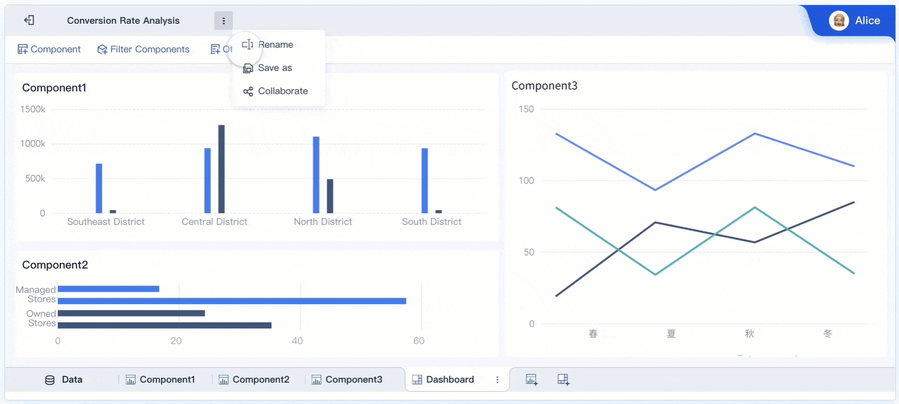
Complete the creation of components within the dashboard. Add charts, tables, and indicators that show your key metrics.
Lay out the overall dashboard. Arrange your visual elements so users can easily find important information.
Enrich the content of the dashboard. Add text, images, and links to provide context and make the dashboard more useful.
Beautify the design to finalize the dashboard creation. Adjust colors, styles, and spacing to make the dashboard attractive and easy to read.
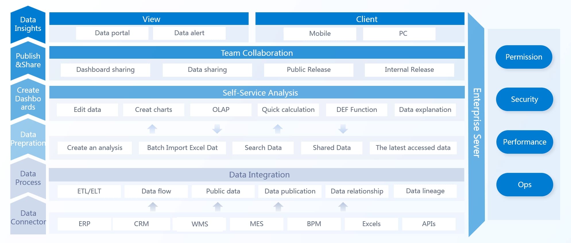
FineBI stands out because you can use a drag-and-drop interface to create analytical charts. You can integrate various reports and display key metrics and dimensions on a single page. FineBI works well for large enterprises, handling vast data volumes and connecting to legacy systems.
FineBI architecture
Tip: Always preview your dashboard before sharing it. This helps you catch errors and improve the user experience.
Common Mistakes and Best Practices
When designing a dashboard, you should avoid common mistakes that can make your data hard to understand.
Mistake
Explanation
Excessive detail or precision
Too much information can hide what matters.
Choosing a deficient measure
Wrong metrics can mislead users.
Choosing inappropriate display media
Poor visual choices distort understanding.
Introducing meaningless variety
Unnecessary elements confuse users.
Using poorly designed display media
Bad visuals lead to misinterpretation.
Encoding quantitative data inaccurately
Inconsistent colors mislead users.
Arranging the data poorly
Disorganized layout confuses viewers.
Highlighting important data ineffectively
Key data gets overlooked.
Cluttering the display with useless decoration
Decorations distract from the data.
Misusing or overusing color
Too many colors complicate interpretation.
Designing an unattractive visual display
Poor aesthetics demotivate users.
You should use the best visualization for your data and keep the color scheme simple. Place dashboard visualizations in a logical order. Never assume users know the context—always provide clear labels and explanations.
For effective data governance, start with a clear strategy and focus on business value. Assign stewardship roles, activate metadata, and automate lineage tracking. Build a collaborative glossary and measure what matters. Communicate wins early to build momentum.
Note: Good dashboard design and strong data governance help you deliver reliable insights and support better decisions.
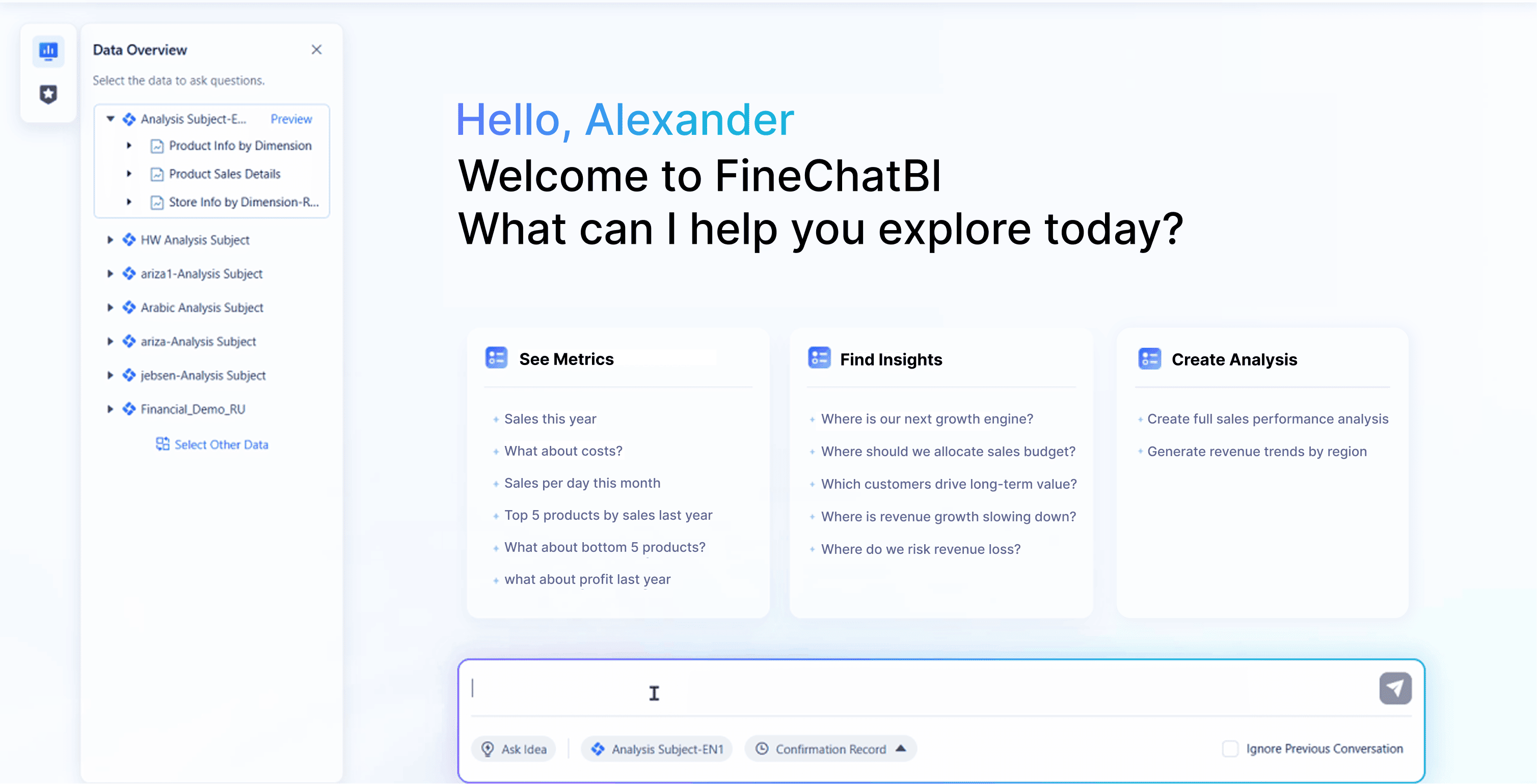
A data dashboard is a digital tool that lets you see, track, and analyze key information for smarter decisions. FineBI makes dashboard creation simple for you by offering AI assistance, natural language queries, and instant visualizations:
Access a wealth of case studies, industry insights, and solution guides to accelerate digital transformation.
FAQ
What is a data dashboard?
You use a data dashboard to view and understand key data quickly. It shows charts, numbers, and trends in one spot. This helps you make better choices without searching through many reports.
How does FineBI help you build dashboards?
FineBI lets you connect data from many sources. You can drag and drop charts, clean your data, and share dashboards with your team. You do not need coding skills to use FineBI.
Can you use FineBI with different types of data?
Yes, you can. FineBI connects to databases, Excel files, cloud platforms, and APIs. You can combine data from many places for a complete view.
How do you keep your dashboard up to date?
You set your dashboard to refresh automatically. FineBI supports real-time updates, so you always see the latest numbers and trends.
Is it safe to share dashboards with others?
Yes. FineBI gives you control over who can view or edit your dashboards. You can share with your team or create public links for wider access.