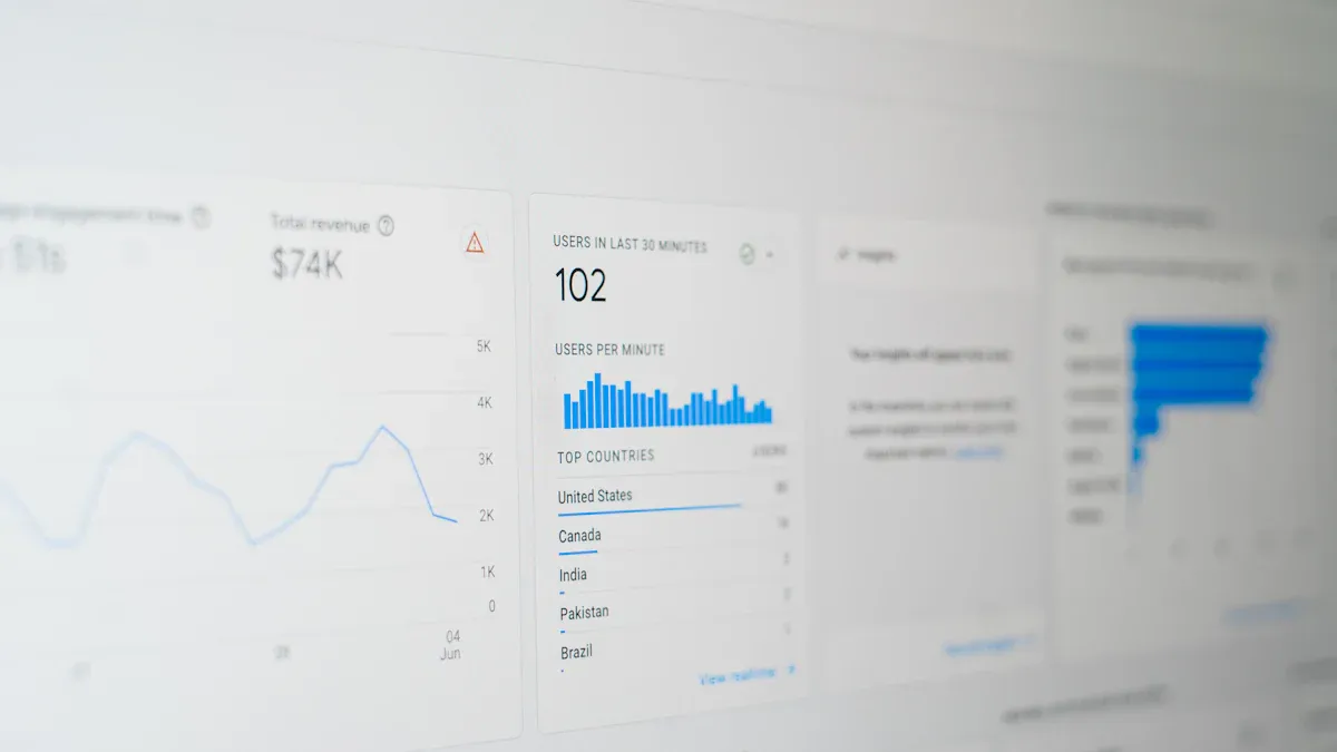
A data analytics dashboard is a tool that lets you see your data in one place. You can check important numbers and spot trends fast. This is important because many people have trouble with data spread out everywhere. They also make slow choices. Dashboards are more important now as companies want easy tools for everyone. These tools are not just for experts. 53% of leaders say self-service analytics is very important. But only 20% of people use most platforms. Here are the main problems:
A data analytics dashboard is a tool that puts all your important information together. You can look at numbers, see patterns, and make choices fast. FineBI is a self-service analytics dashboard. You do not need special training to use it. You can link your data, make charts, and check results by yourself.
Experts say a good dashboard has three main parts:
Component
Description
Metrics and KPIs
These are the main numbers you want to watch, like sales or website visits.
Visualizations
These are charts and graphs that help you spot patterns and trends in your data.
Interactive elements
These let you filter, click, or dig deeper to find more details and better insights.
You might use a web analytics dashboard to see how many people visit your website each day. You can check which pages are liked most and where visitors come from. With FineBI, you can do this for any kind of data, not just websites.
Self-service analytics dashboards like FineBI are not the same as old business intelligence tools. Here is a quick way to see how they are different:
FineBI lets you explore and understand your data without waiting for IT help. You can make dashboards that fit your needs and change them as your business grows.
Core Purpose and Benefits
The main reason for an analytics dashboard is to help you make smarter choices. You can see all your key numbers, or KPIs, in one spot. This makes it easy to know if you are reaching your goals.
When you use a dashboard, you get many good things:
You can make choices faster because you see live data and insights.
You get instant access to important info, so you can react quickly to changes.
You can track your progress and see if you are doing well.
You find the data you need without looking through lots of files or systems.
You spot changes, outliers, and trends early, so you can act before problems get bigger.
You see how your business works and find ways to make it better.
Many companies have data in lots of different places. This is called data fragmentation. It makes it hard to see what is really happening. Dashboards fix this by bringing all your data together. FineBI connects to many sources, like databases, files, and APIs. You can see everything in one view.
Here are some ways dashboards help with data fragmentation and accessibility:
They use data lakes or warehouses to keep information in one place.
They show live analytics and KPIs, so you always have the newest numbers.
They mix data from different sources, giving you a full view of your business.
They break down data silos, making it easy for everyone to find what they need.
They let you link your data straight to the dashboard, so you do not waste time searching.
With FineBI, you can turn scattered data into clear, helpful dashboards. You get the answers you need, when you need them. This helps you work smarter and reach your goals.
Significance of Data Analytics Dashboard for Business
Why Analytics Dashboards Matter
You have to make smart choices every day. An analytics dashboard puts all your important data together. Many business leaders say workers spend up to 20% of their time looking for information. This wastes time and slows down work. With a dashboard, you find what you need fast. You do not have to search through emails or spreadsheets.
A good analytics dashboard helps you see how your team is doing. You can track KPIs like sales numbers or customer satisfaction scores. This makes everyone more responsible. You know who is meeting goals and who needs help. Only 24% of decision-makers feel sure about using data. Dashboards make it easier to understand numbers and trends, even if you are not a data expert.
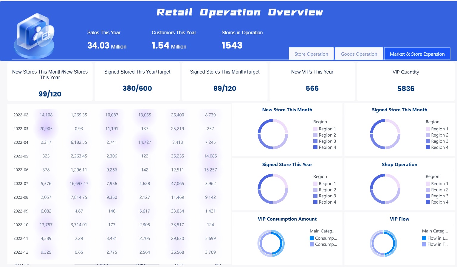
Store performance dashboard created by FineBI (click to engage)
Most companies do not use all their data. In fact, 73% of data is not used. With good analytics dashboard tools, you can find this hidden value. You see patterns, spot problems, and find new ways to grow. You also help everyone use data to make better choices.
Here are some top reasons why business leaders use analytics dashboards:
Save time by finding information fast.
Make teams more responsible with clear performance data.
Help more people use data well.
Track performance every day, not just once a month.
Use more data to make smarter choices.
Dashboards become more important when you face tough industry problems. For example, in the semiconductor industry, companies must keep up with fast changes and high standards. Data fragmentation and slow reporting can hurt production and quality. A web analytics dashboard or a business dashboard solves these problems by putting all your data together. You get a clear view of your work, spot risks early, and respond faster.
Real-Time Insights and Decision-Making
You need to act fast when things change. Real-time analytics dashboards give you live updates on your KPIs. You do not have to wait for old reports. You see what is happening right now. This helps you fix problems or grab new chances before others do.
FineBI gives you real-time analysis and KPI tracking. You can watch sales, inventory, or production as it happens. This is very important in industries like manufacturing or technology. For example, in the semiconductor field, real-time dashboards help you watch equipment, spot quality issues, and manage supply chains. You can fix problems before they get worse.
A data analytics dashboard also helps you work better with your team. Everyone sees the same numbers and goals. This makes it easier to share ideas and solve problems together. Visualization tools turn hard data into simple charts and graphs. You can spot trends and outliers fast. You do not need to be a data scientist to understand what is going on.
Here is how real-time dashboards help your business:
You get instant insights into sales, operations, and other key areas.
You can act on new trends or problems right away.
Teams work together on shared KPIs and goals.
Visualization makes it easy to understand lots of data.
Decision-making gets faster and more accurate.
A Gartner survey found that companies using real-time dashboards make decisions 20% faster. You can see the difference in your daily work. You respond to changes, track progress, and make data-driven choices with confidence.
The importance of dashboards is clear. They help you stay competitive, flexible, and ready for anything. When you use analytics dashboard tools like FineBI, you turn data into action. You lead your team with facts, not guesses.
Key Features of FineBI Dashboards
Data Integration and Processing
You can link FineBI to lots of data sources. This helps you put all your information in one dashboard. FineBI works with databases like Hadoop, MySQL, and Oracle. You can also use files and cloud data. The platform lets you work with data right away. You always see the newest numbers. You do not have to wait for IT help. You can clean, join, and filter your data by yourself. This helps you build a strong base for your analytics dashboard.
FineBI’s drag-and-drop tools help you make dashboards fast. You do not need special lessons. This saves time and helps you find answers quickly.
Drag and drop to process data
Visual Analysis and Interactivity
You can change raw data into easy charts and graphs. FineBI gives you more than 60 chart types. These include Sankey diagrams and box plots. These tools help you see trends, outliers, and patterns. You can use KPI cards to watch your most important numbers. You can sort, filter, and change fields by dragging and dropping. This makes your dashboard interactive and simple to use.
Feature
Description
Sankey Diagram
Shows how data moves and helps you find problems.
Box Plot
Lets you see bias, outliers, and how data is spread out.
KPI Indicator Card
Tracks changes and trends in your KPIs.
Header Operations
Lets you sort, filter, and change fields easily.
Data Explanation
Gives smart tips to show what affects your numbers.
You can look at your data and get answers fast. FineBI helps you make better choices with good dashboard tools.
You can trust FineBI to keep your data safe. The platform uses strong safety steps like cookie protection, HSTS, and token checks. You can choose who can see or change your dashboards by setting roles. Only the right people get access.
Security Protocols
Description
Cookie Enhancement
Makes cookies safer when using HTTPS.
HSTS Settings
Forces safe links for sending data.
File Upload Verification
Checks files before adding them.
Referer Validation
Controls access based on where requests come from.
Forbidding Scripts to Call Formulas
Blocks risky script actions.
Security Headers
Adds extra protection to requests.
Token Authentication
Checks user identity with IP address.
You can share dashboards with your team using public links. You can set passwords and time limits for these links. This helps you work together and keep your data safe. FineBI works on mobile devices, so you can see your dashboard anywhere. You can work with others, track KPIs, and get answers on the go.
Tip: FineBI’s self-service tools help everyone in your company use data analytics, not just experts.
Types of Data Analytics Dashboards
You can use different data analytics dashboards for business problems. FineBI gives you tools to make dashboards for daily work, planning, and deep study. Each dashboard type helps you see data in a new way. This supports your goals.
Operational Dashboards
Operational dashboards help you watch your business as it happens. You can see what is going on right now. You can act fast if things change. These dashboards get data from many places, like inventory or employee systems. They show everything together. You can find problems, check progress, and keep your team on track.
Combine information from different systems for a full view.
Focus on Immediate Action
Act fast when you see something unusual.
Asset and Resource Monitoring
Watch machines and people to find bottlenecks.
Fast Visual Design
See big numbers and clear charts for quick understanding.
Customization
Change the dashboard to fit your team’s needs.
FineBI lets you set up these dashboards once and use them again. The data updates by itself. You always see the newest numbers. You can check team progress anytime. This keeps your work running well.
Tip: Use operational dashboards to find slow spots and keep things moving every day.
Strategic Dashboards
Strategic dashboards help you see the big picture. You can use them to plan ahead and make smart choices. These dashboards show trends and gaps. They help you find new ways to grow. You can use filters to look closer at your data.
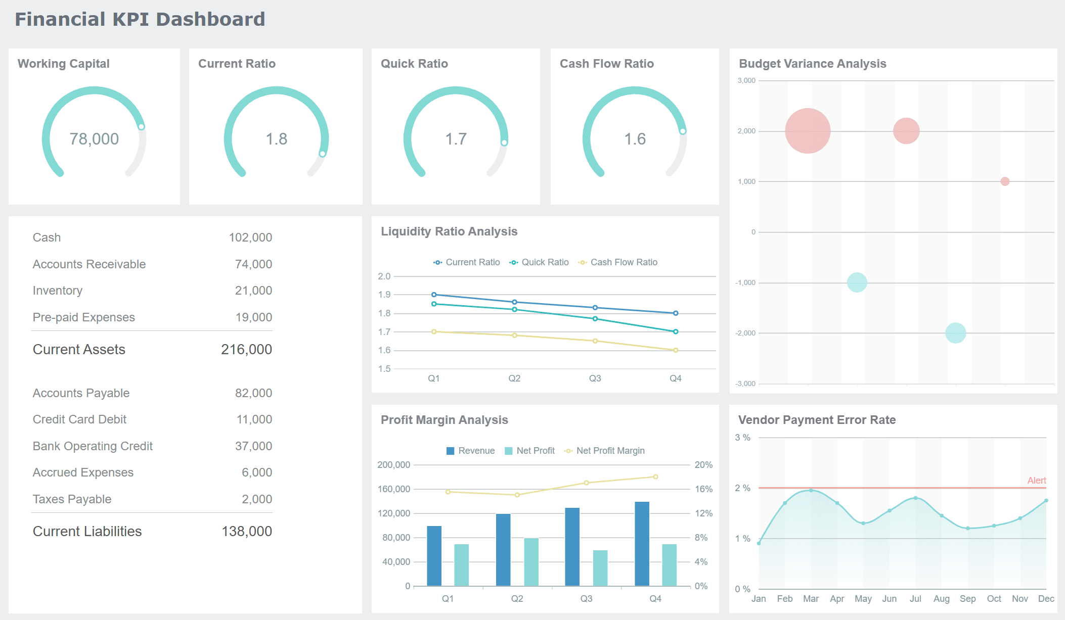
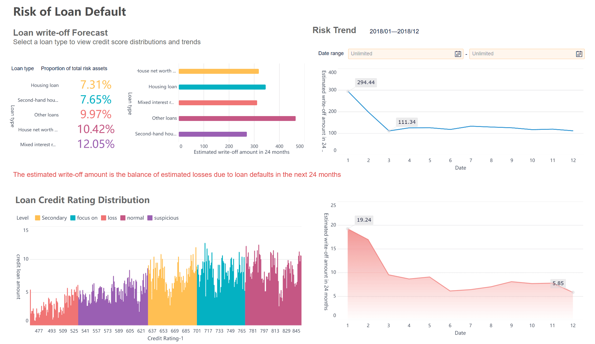
Risk dashboard created by FineBI (click to engage)
FineBI gives you strong analytics, live reports, and over 50 chart types. You can share dashboards with your team. You can set rules for who can see what. This keeps your data safe and helps everyone trust the numbers.
Analytical Dashboards
Analytical dashboards let you look deep into your data. You can put reports together, link charts, and filter information for close study. These dashboards help you track KPIs, find problems early, and compare results over time.
Feature
How It Helps You
Merging Analytic Data
See all your important numbers in one place.
Adaptive Layouts
View dashboards on any device, big or small.
Component Linkage
Click on one chart to update others for related analysis.
Put several dashboards together for a bigger view.
You can use analytical dashboards to do better, manage risks, and help your team reach goals. FineBI lets you change layouts and styles. This makes dashboards easy to use and understand.
Note: Analytical dashboards help you build a data-driven culture by making it easy to see and share insights.
By using all three types of dashboards in FineBI, you can handle daily work, plan for the future, and study your data for better choices.
Real-World Use Cases and Success Stories of Data Analytics Dashboard
Semiconductor Industry Solution
A dashboard helps a lot in the semiconductor industry. This industry needs quick choices and good products. Many companies have trouble with slow reports and data in many places. FineBI lets you connect all your data together. You can check machines, watch production, and get risk alerts. You see new updates and act fast. You work better and keep quality high. Dashboards in this field help you save money and do better work.
Tip: You can use dashboards to watch KPIs like yield rate and machine uptime. This helps you find problems early and fix them before they get worse.
BOE Customer Story
BOE Technology Group uses FineBI to fix data spread out everywhere. You can learn from what they did. They made one dashboard to track KPIs for all their factories. They cut inventory costs by 5%. They made their work 50% faster. You see all your main numbers in one spot. You compare how teams and places are doing. Dashboards like this help you make smart choices and reach your goals faster.
Benefit
Result
Unified data
Clear view of operations
Standardized KPIs
Easier performance tracking
Real-time analytics
Faster decision-making
Other Industry Applications
You can use an analytics dashboard in many jobs. Stores check sales and customer habits. Banks watch money moves and spot risks. Airlines check flights and plan schedules. You link your data and make dashboards for what you need. You see trends and make smart choices. You share what you learn with your team and get better results. Analytics dashboards help you turn data into action.
Note: Dashboards work for any company. You can track KPIs, find trends, and make choices with confidence.
Getting Started with FineBI Data Analytics Dashboard
Steps to Build Your First Dashboard
You can begin using FineBI with a few easy steps. If you want to make a dashboard, follow this guide:
Build good steps for analytics and data modeling. Planning well helps you make smart choices.
Update your dashboard often. Make sure it matches business goals and tracks important company KPIs.
Make changes based on what users say. This keeps your dashboard helpful and up to date.
When you follow these steps, you make a dashboard in power bi style that helps you find answers and make good choices. You help your team use analytics dashboard tools for better results.
You need clear data to make smart choices. A data analytics dashboard brings all your numbers together. FineBI helps you see trends, track KPIs, and share insights with your team. You do not need special skills to get started. Try FineBI for yourself. Start a free trial or read customer stories to see real results.
Tip: Explore FineBI’s features and see how easy data-driven decisions can be.
Product Trial
FineReport
Pixel-perfect reports · Interactive dashboards · Easy data entry · Digital twins
See how Dora turns trusted BI data into chat-based answers, scheduled briefings, and automated follow-up — built for real enterprise workflows, not just chat.
FAQ
What types of data sources can you connect to with FineBI?
You can link FineBI to databases like MySQL, Oracle, and Hadoop. You can also use Excel files, cloud warehouses, and APIs. FineBI works with more than 60 connectors.
Can you build dashboards without coding skills?
Yes, you can use drag-and-drop tools in FineBI. You do not need to write any code. The platform helps you at every step.
How does FineBI keep your data secure?
FineBI uses role-based access, token checks, and security headers. You choose who can see or change dashboards. Your data stays safe.
Does FineBI support real-time data analysis?
FineBI gives you real-time updates. The dashboard shows live data. You can make quick choices and track KPIs as they change.