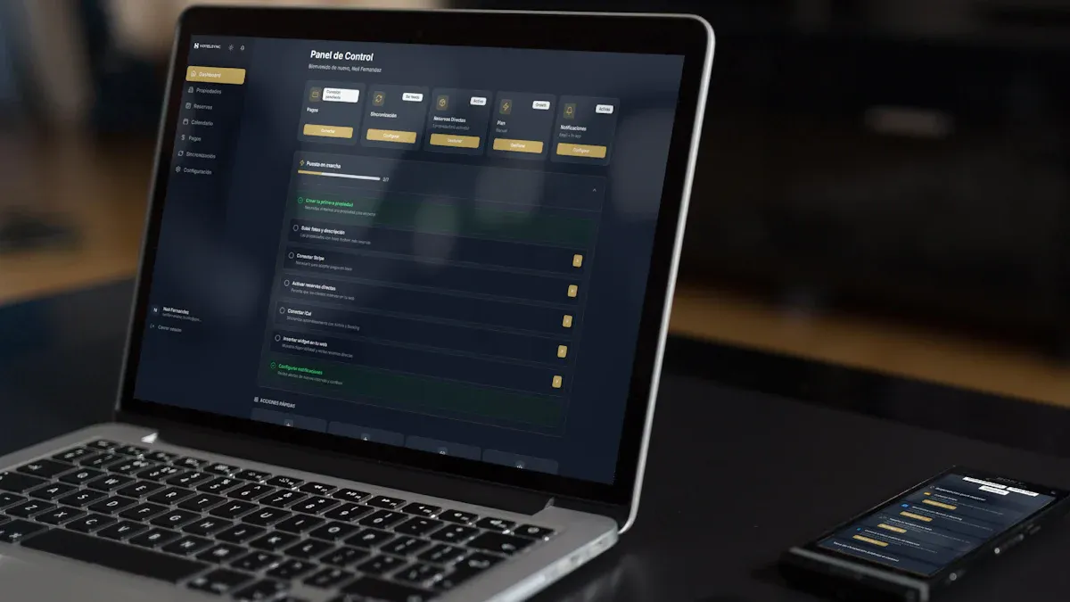
A tableau reporting tool usually refers to using Tableau to turn business data into visual reports, interactive dashboards, and shareable analytics views. If you are researching this term, you are likely trying to understand whether Tableau is just a dashboard builder, a full reporting platform, or part of a broader business intelligence workflow.
In practice, Tableau is commonly used by analysts, managers, executives, and operational teams to monitor KPIs, explore trends, and distribute data-driven insights across the business. It supports both structured reporting and interactive analysis, which is why many teams use it for more than static monthly reports.
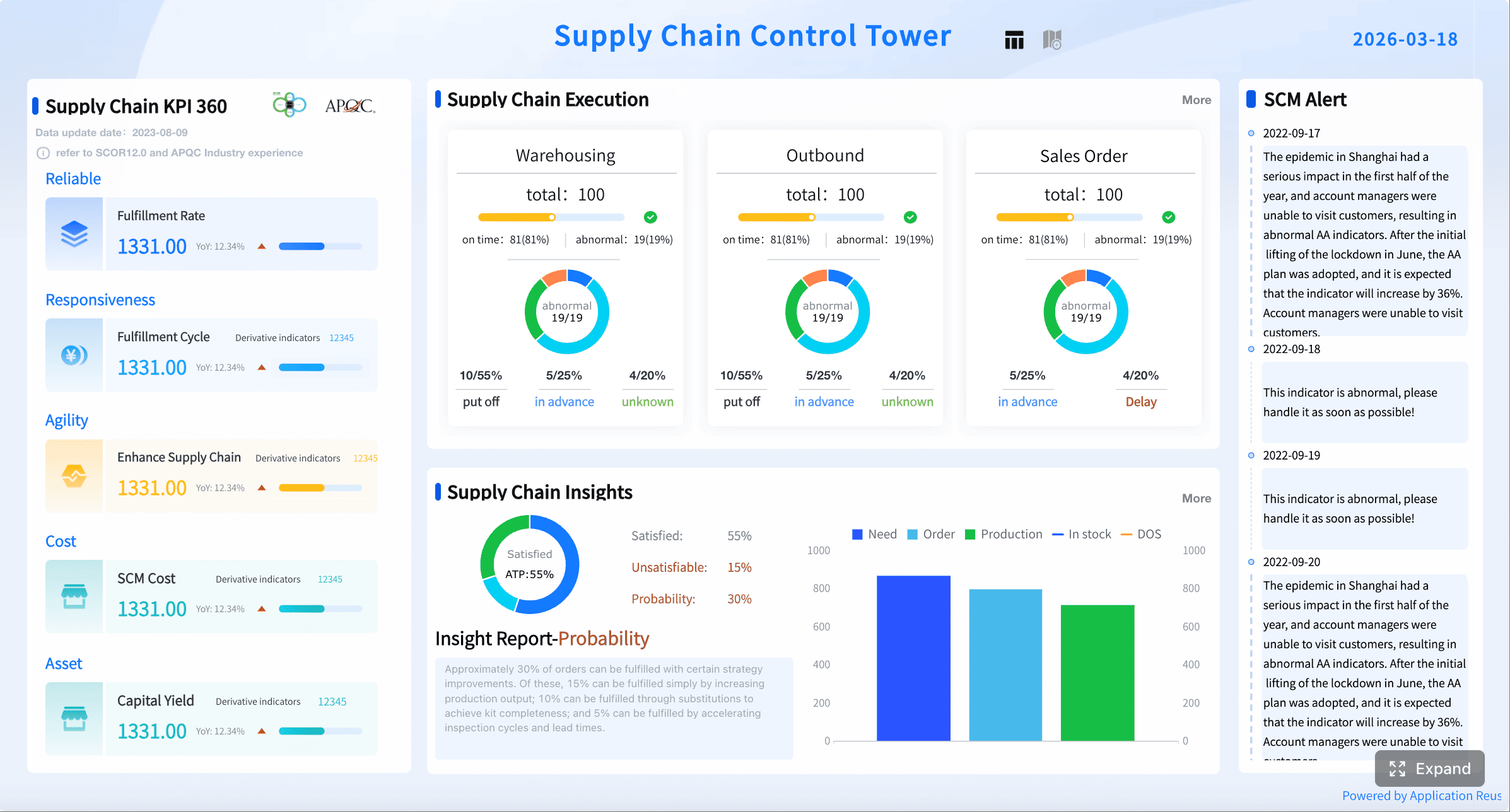
Key Elements of a Good BI Reporting Tool
- Clear reporting purpose: It should support a business decision, not just display data.
- Flexible visual output: Users need charts, tables, filters, and drill-down analysis.
- Reliable data connectivity: The platform should connect to business data sources and keep them updated.
- Sharing and distribution: Reports should be easy to publish, subscribe to, export, or review collaboratively.
- Governance and control: Teams need permissions, version ownership, and trusted KPI definitions.
- Support for exploration: A useful reporting tool helps users move from monitoring metrics to investigating why they changed.
What a tableau reporting tool is and why teams use it
A tableau reporting tool is best understood as a visual analytics and reporting environment. Rather than producing only fixed-format reports, Tableau helps users build charts, dashboards, and interactive views that can be shared with business stakeholders.
Define a tableau reporting tool in plain language
In plain language, Tableau is a tool that lets teams connect to data, organize it into visual views, and publish those views so other people can monitor performance or answer business questions. It is often used when organizations want reporting that is easier to scan than spreadsheets and more interactive than static PDFs.
A report in Tableau may look like a dashboard with filters, charts, and KPI summaries. In some cases, it may also be exported or subscribed to on a schedule for recurring review.
Explain how it turns raw data into visual reports and interactive dashboards
Tableau works by connecting to underlying data sources, such as spreadsheets, databases, or cloud systems, then letting users create visual components from that data. Instead of writing every report manually, users can drag fields into views and turn rows of raw data into:
- Line charts for trends
- Bar charts for comparisons
- Maps for regional performance
- Tables for detailed review
- KPI tiles for headline metrics
- Filtered dashboards for role-specific analysis
This approach makes reporting more useful for teams that want both at-a-glance monitoring and interactive investigation.
Clarify who uses it, from analysts and managers to executives and operations teams
A tableau reporting tool is not only for technical BI specialists. Different roles use it in different ways:
- Data analysts build and refine dashboards
- Managers review team performance and drill into issues
- Executives track scorecards and high-level KPIs
- Operations teams monitor daily activity, exceptions, and service levels
- Finance teams review budget, actuals, and variance reporting
- Marketing teams analyze campaign performance and conversion trends
Set expectations for what readers will learn about reporting, dashboards, and workflows
To evaluate Tableau properly, you need to understand more than charts. You also need to know how dashboards are built, how reports are shared, how data is prepared, and what governance is required to keep reporting reliable. The rest of this guide covers those areas in practical terms.
Core features that make Tableau useful for reporting
Tableau is widely used because it combines data connectivity, visual design, and publishing workflows in one BI environment. For reporting teams, the value is not just in chart creation, but in how those charts become managed business assets.
Quick Comparison Table
| Capability | Tableau Reporting Tool |
|---|---|
| Best for | Visual analytics, dashboard reporting, exploratory analysis |
| Ease of use | Accessible for basic visuals; more advanced work can require experience |
| Dashboard design | Strong interactive dashboards and visual storytelling |
| Data preparation | Supports data connection and preparation workflows, often with additional prep steps |
| Enterprise reporting | Suitable for shared reporting when governance and publishing are managed well |
| Collaboration | Shared views, subscriptions, exports, and server/cloud-based access |
| Deployment | Commonly used in server or cloud-based analytics environments |
| Learning curve | Moderate, especially for advanced dashboard design and data modeling |
| Recommended users | Analysts, BI teams, managers, and organizations that value visual analysis |
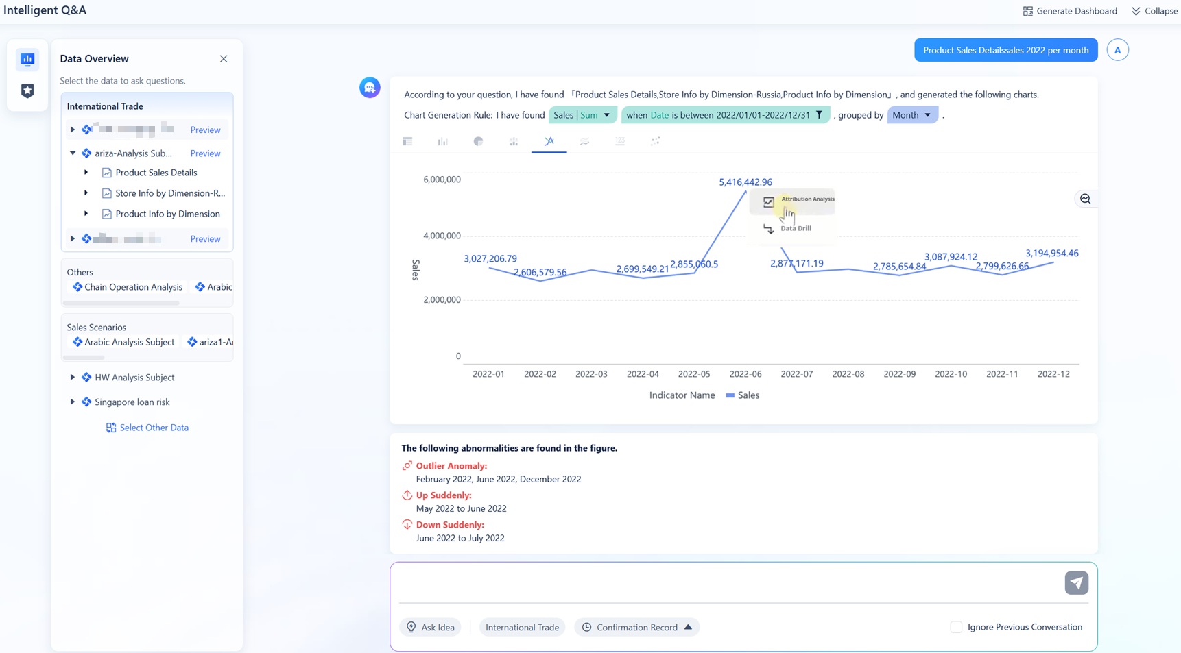
Dashboards, worksheets, and data visualizations
At the core of Tableau reporting are the building blocks used to create business views.
Show how charts, tables, filters, and drill-down views work together
A useful Tableau report often combines multiple components:
- Charts summarize trends and comparisons
- Tables provide exact values and transaction detail
- Filters let users narrow by time period, region, department, or product
- Drill-down views help users move from summary metrics into root-cause analysis
For example, a sales dashboard might show total revenue, monthly trend, top products, and a regional map. A manager can then filter by quarter or click into a region to investigate why performance changed.
Explain the difference between a worksheet, dashboard, and story
These terms are important when discussing a tableau reporting tool:
- Worksheet: A single visualization or view, such as a bar chart or data table
- Dashboard: A collection of worksheets and filters displayed together for monitoring or decision-making
- Story: A sequence of views arranged to guide users through a narrative or insight path
For everyday reporting, dashboards are usually the most important output because they combine multiple metrics into one working interface.
Reporting and distribution options
Reporting is not only about building visuals. It also includes how those visuals reach users consistently.
Cover scheduled refreshes, subscriptions, exports, and shared views
Common Tableau reporting workflows may include:
- Scheduled refreshes to keep data current
- Subscriptions so users receive snapshots or report links regularly
- Exports to PDF, image, or data formats when offline sharing is needed
- Shared views through published content in a governed environment
These options help organizations move from one-off analysis to repeatable reporting.
Explain how recurring reports differ from live dashboard monitoring
A recurring report is usually reviewed on a defined schedule, such as weekly sales review or monthly finance close. A live dashboard, by contrast, is used for ongoing monitoring. The difference matters because the design, refresh frequency, and audience expectations are different.
For example:
- A monthly board report prioritizes summary and consistency
- A daily operations dashboard prioritizes freshness and fast issue detection
Data connections and preparation
Data preparation is often the hidden factor behind whether Tableau reporting succeeds.
Introduce connections to spreadsheets, databases, and cloud platforms
Tableau is commonly used to connect to a range of business data sources, including:
- Spreadsheets
- Relational databases
- Cloud data platforms
- Business application datasets
This flexibility makes it useful in organizations where reporting data is spread across several systems.
Note the role of cleaning, shaping, and validating data before reporting
Even strong visualization tools depend on clean data. Before building dashboards, teams usually need to:
- Standardize field names
- Resolve duplicates
- Join related datasets
- Validate totals and KPI logic
- Confirm date and category consistency
Without these steps, reports may look polished but still mislead decision-makers.
How Tableau fits into business intelligence and analytics
A tableau reporting tool is best seen as part of a broader BI process. It helps teams move from raw operational data toward management reporting and decision support.
From descriptive reporting to decision support
Tableau can support both descriptive reporting and exploratory analytics.
Explain how teams use Tableau to track KPIs, spot trends, and answer business questions
Many teams use Tableau to answer questions like:
- Are we meeting revenue targets?
- Which region is underperforming?
- How did campaign results change after budget shifts?
- Where are operational delays increasing?
- Which product line has the highest margin decline?
This is where visual reporting becomes more valuable than a spreadsheet dump. The goal is not just to display numbers, but to help people identify patterns and act.
Show the difference between static reporting and exploratory analytics
A static report tells users what happened. Exploratory analytics helps them investigate why it happened.
For instance:
- Static reporting: Monthly revenue was down 8%
- Exploratory analytics: Revenue declined mainly in two regions, tied to lower conversion in one channel and delayed fulfillment in a product category
That second layer is why many organizations choose visual BI tools instead of traditional report-only systems.
Common business use cases
Tableau reporting is often applied across departments where KPI tracking and trend analysis matter.
Sales and revenue performance
Sales teams use dashboards to monitor pipeline, quota attainment, bookings, regional performance, and product mix. Reporting often combines summary scorecards with drill-down into team or territory details.
Marketing campaign analysis
Marketing users track leads, conversion rates, channel performance, campaign ROI, and funnel movement. Interactive filtering helps compare segments, time periods, and campaign types.
Finance and operational reporting
Finance teams may use dashboards for budget versus actual analysis, expense tracking, profitability review, and variance monitoring. Operations teams often use them for fulfillment, service levels, productivity, or exception reporting.
Executive scorecards and departmental dashboards
Executives usually need a concise scorecard view across business functions, while departments need more detailed operational dashboards. A good reporting setup can support both without duplicating logic unnecessarily.
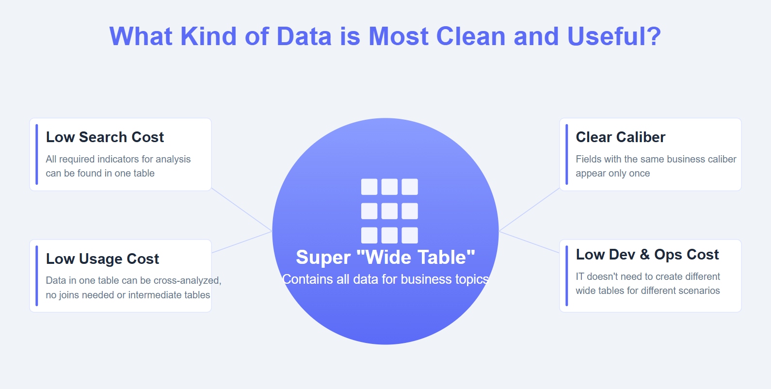
A practical reporting workflow in Tableau
A reporting platform should be evaluated not just by what it can display, but by how a team actually uses it end to end.
Step 1: Connect and prepare the data
The first step is identifying which systems should feed the report and how those datasets relate.
Identify data sources, joins, and data quality checks
In a practical workflow, teams typically:
- Identify source systems
- Define the reporting grain and business logic
- Join or combine relevant data
- Check for missing values, duplicates, and inconsistent definitions
- Validate KPI totals against trusted benchmarks
This stage is often more important than dashboard styling because weak source logic creates weak reporting outcomes.

Step 2: Build views and dashboards
Once the data is ready, the next step is designing views that match how stakeholders consume information.
Choose the right chart types and layout for the audience
A useful dashboard design process includes:
- Matching chart type to the question
- Highlighting top KPIs first
- Keeping filters understandable
- Avoiding clutter and redundant visuals
- Designing for the intended audience, such as executives versus analysts
For example, executives often need a compact scorecard with a few supporting trends, while analysts may need more detailed comparison and drill-through options.
Step 3: Share, govern, and maintain reports
Publishing a dashboard is not the end of the reporting process. Long-term success depends on governance and maintenance.
Publish content, manage permissions, and monitor refresh reliability
Reporting teams need to manage:
- Access permissions
- Data refresh schedules
- Report ownership
- Update processes
- Reliability checks for broken or stale content
If these controls are missing, dashboards can multiply quickly without consistent definitions or accountability.
Create a repeatable process for updates, ownership, and version control
A mature reporting workflow usually assigns:
- A data owner
- A dashboard owner
- A refresh owner or admin
- A review cycle for content quality
- A retirement process for outdated reports
This is what separates a reporting platform from a collection of one-off dashboards.
How to evaluate whether Tableau is the right reporting platform
A tableau reporting tool may be a strong fit for some teams, but not every organization has the same reporting maturity, data complexity, or user profile.
Questions to ask before adoption
Before choosing a reporting platform, evaluate the reporting need itself.
Assess reporting goals, data complexity, user skills, and collaboration needs
Ask questions such as:
- Do users mainly need recurring reports, or do they need interactive exploration too?
- How many data sources must be combined?
- Will business users create content, or mostly consume it?
- How much dashboard customization is required?
- How often do reports need to refresh?
- How many teams need shared access and collaboration?
These answers often matter more than a feature checklist.
Consider governance, security, scalability, and total cost of ownership
Reporting platforms should also be assessed on operational criteria:
- Governance model
- Permission control
- Scalability across teams
- Ongoing admin effort
- Training needs
- Total cost of ownership over time
A visually capable tool can still become difficult to manage if reporting ownership and governance are unclear.
Potential limitations and challenges
Tableau is powerful, but teams should understand likely implementation challenges.
Learning curve for advanced analysis
Basic charting can be approachable, but advanced calculations, dashboard optimization, and scalable reporting design may require more expertise. Organizations should plan for enablement rather than assuming every user will become productive immediately.
Data modeling and performance considerations
Reporting quality depends heavily on how data is structured. If the underlying model is complex or poorly prepared, dashboards may become slow, confusing, or inconsistent.
Risks of poorly designed dashboards or unmanaged report sprawl
Like many BI tools, Tableau can lead to dashboard sprawl if teams publish content without governance. Too many overlapping reports, inconsistent KPI logic, or weak naming standards make adoption harder, not easier.
Best practices for better dashboards and reports
The most effective reporting environments are not the ones with the most charts. They are the ones with the clearest decision support.
Design principles for clarity
Good dashboard design improves trust and usability.
Focus each dashboard on a clear decision or audience need
Each report should answer a specific question for a defined audience. A sales leader dashboard should not try to serve finance, operations, and marketing equally well in the same layout.
Use visual hierarchy, consistent filters, and readable labels
Prioritize:
- Most important KPIs at the top
- Consistent date and category filters
- Plain-language labels
- Limited color for emphasis
- Enough white space for readability
A simpler dashboard is often more effective than a dense one.
Workflow and governance tips
Strong reporting practices reduce confusion and rework over time.
Standardize data definitions and KPI logic
Create shared definitions for core business metrics. If every department calculates revenue, margin, or conversion differently, dashboard adoption will suffer.
Review report usage regularly and retire low-value content
Use a governance process to review which dashboards are still useful. Retiring low-value content helps keep the reporting environment focused and trusted.
Balance self-service access with control and quality standards
The best BI programs support self-service without sacrificing consistency. Users should be able to explore data, but core KPIs and certified reporting assets should still follow standards.
Practical recommendations before you choose or scale a tableau reporting tool
If you are evaluating a tableau reporting tool for your organization, these steps help reduce risk and improve adoption:
- Start with reporting decisions, not visuals. Define which decisions the dashboard must support before choosing charts.
- Audit your data readiness early. Data quality and KPI consistency matter more than design polish.
- Separate executive dashboards from analyst workspaces. Different audiences need different levels of detail.
- Set governance rules before content scales. Ownership, naming, permissions, and refresh monitoring should be defined early.
- Test with real business users. A report that looks strong in development may still fail if end users cannot interpret or trust it.
When to consider FineBI alongside Tableau
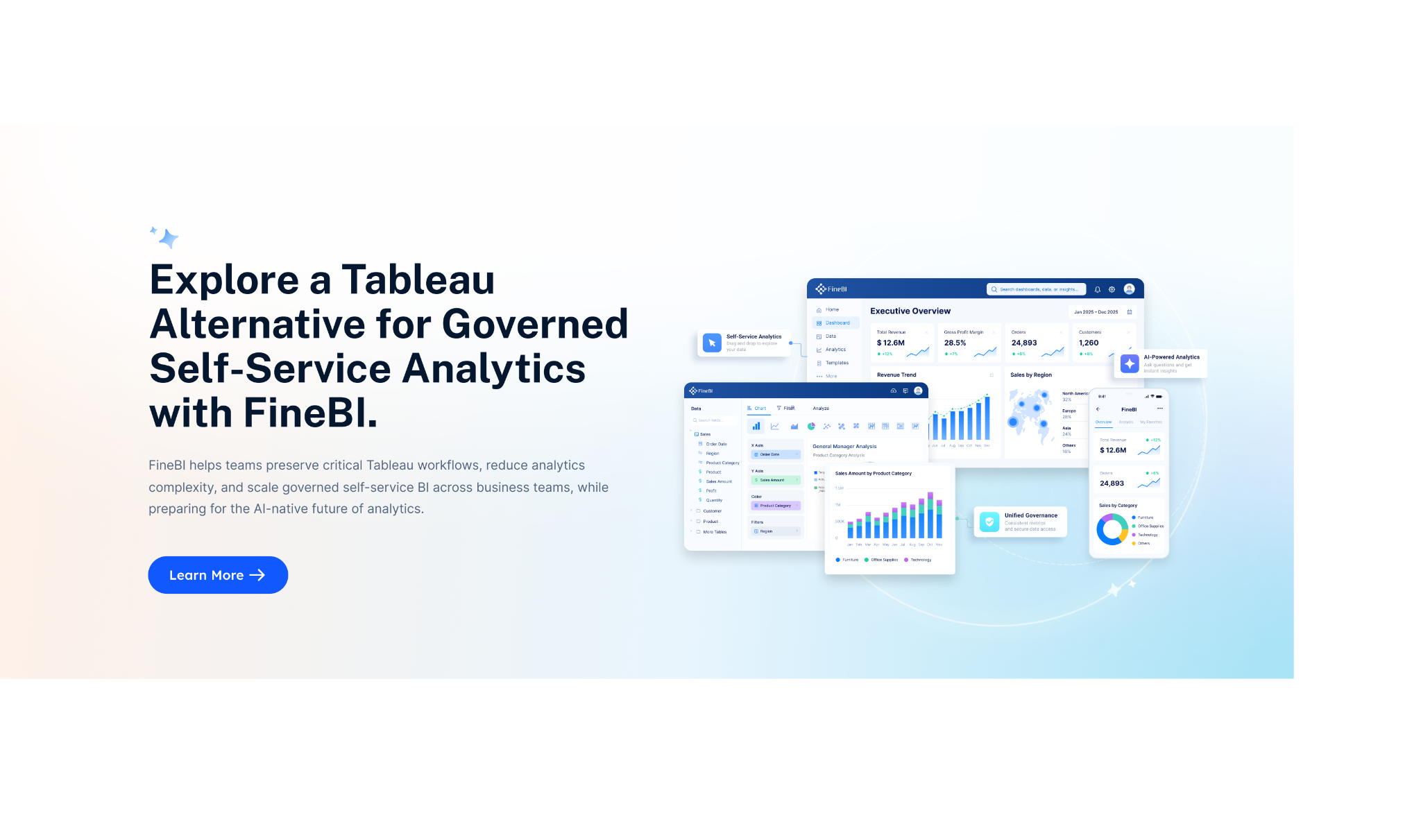
Tools like Tableau and Power BI are widely used in the BI market, but teams that need a more business-user-friendly, self-service BI platform may also consider FineBI.
FineBI is positioned as a self-service BI and analytics platform designed to help business teams connect data, build dashboards, explore metrics, and share insights with less dependency on specialist report developers. For organizations that want wider dashboard adoption beyond a central analytics team, that can be an important consideration.
Where FineBI can be a good fit for reporting and dashboard workflows
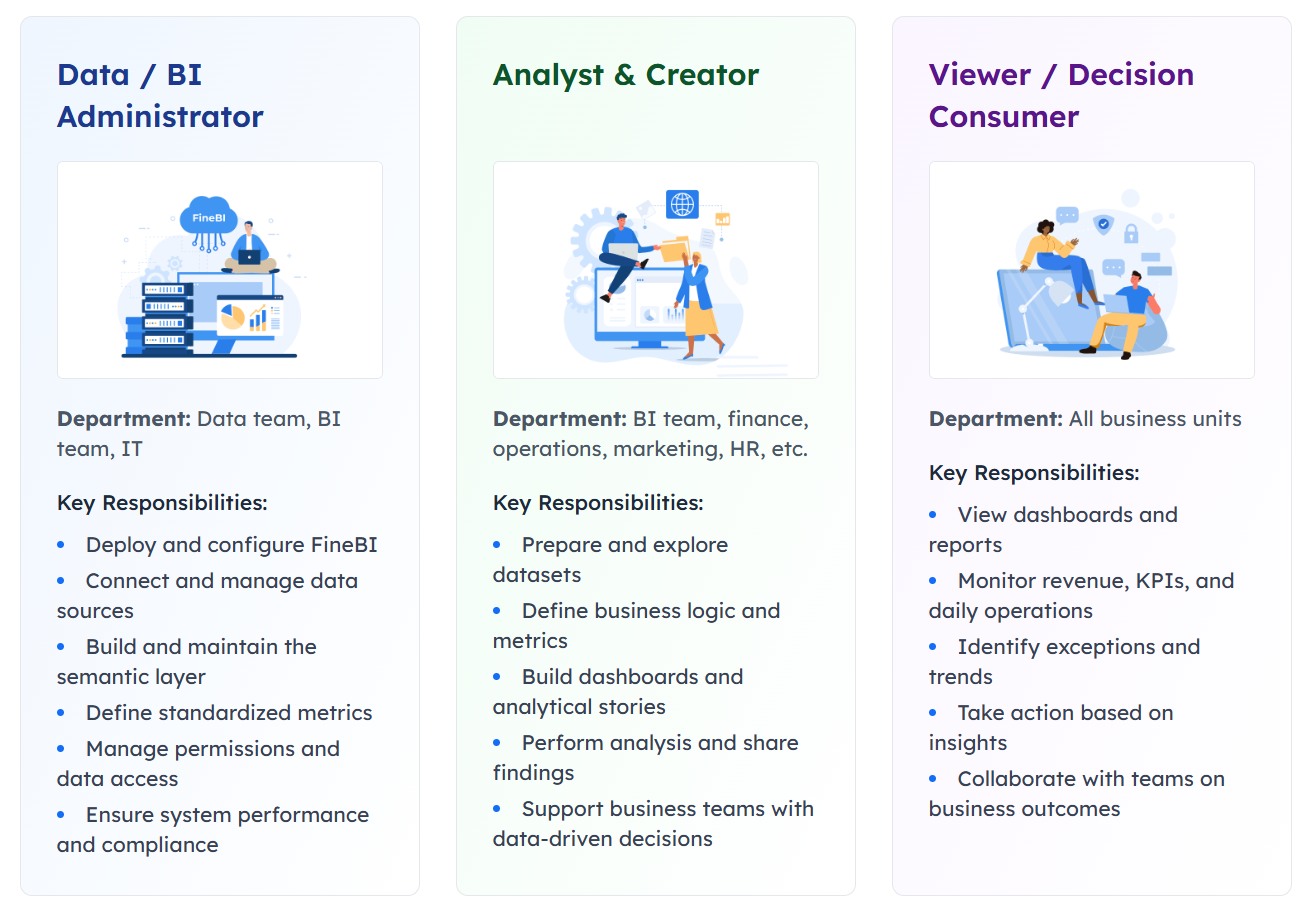
FineBI is especially relevant when teams need:
- Self-service dashboard creation for business users
- Drag-and-drop analysis
- Interactive filtering and drill-down exploration
- Shared dashboards across departments
- Faster reporting iteration for operational teams
- Enterprise analytics with managed data access
Rather than replacing every reporting scenario, FineBI is often worth considering when the challenge is making BI easier to use across the business, not just giving analysts another visualization layer.
Get Ready-to-Use Dashboard Templates in Fine Gallery
Tableau vs FineBI in practical reporting terms
A balanced way to think about the comparison is this:
- Tableau is commonly chosen for visual analytics and interactive dashboarding
- FineBI is often attractive for teams that want self-service BI with easier business-user participation and dashboard iteration
If your organization already has strong analyst resources and established BI governance, Tableau may fit well. If your goal is to expand reporting access to more business users while keeping dashboards interactive and manageable, FineBI may be worth evaluating.
Final thoughts
A tableau reporting tool is more than a chart builder. It is part of a broader process for connecting data, building dashboards, sharing insights, and supporting business decisions. For the right team, Tableau can be an effective reporting platform, especially when paired with strong data preparation and governance practices.
At the same time, reporting success depends on more than the tool itself. You need clean data, clear KPI definitions, audience-focused dashboard design, and a repeatable publishing workflow. And if your priority is broader self-service adoption across business teams, FineBI is a practical platform to explore alongside Tableau.
FAQs
A tableau reporting tool is used to turn business data into visual reports, dashboards, and interactive views that help teams monitor KPIs, spot trends, and answer business questions.