You can make a shipment tracking dashboard that shows updates right away and gives clear information. Real-time shipment tracking helps you know where your cargo is. It helps you stop delays and keeps your customers happy. Here is how real-time tracking makes supply chain work better:
| Benefit | Result |
|---|---|
| Continuous Visibility | Live updates help you plan better |
| Proactive Decision-Making | You can fix problems fast |
| Dynamic Rerouting | There are fewer slowdowns and deliveries are quicker |
| Enhanced Customer Satisfaction | Deliveries are more accurate and trust grows |
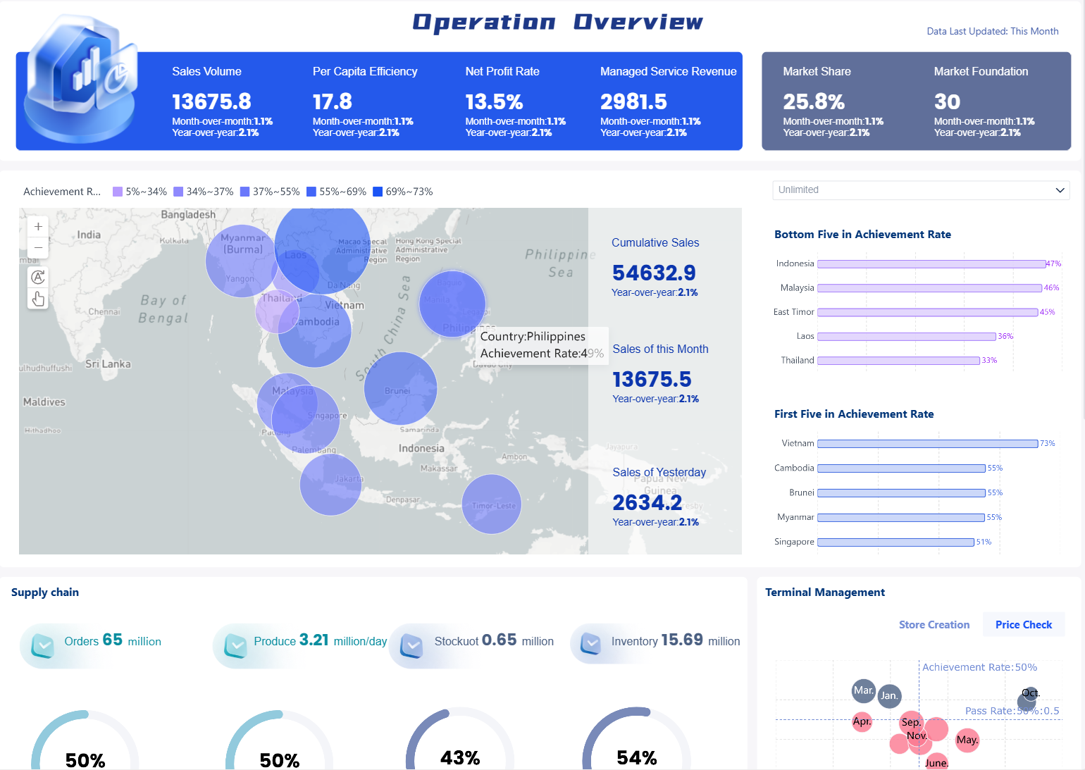
With tools like FineReport from FanRuan, you can build a dashboard. This dashboard makes shipment and supply chain management simpler.
![]()
Define Goals for Your Shipment Tracking Dashboard
Identify User and Business Needs
Before you make your shipment tracking dashboard, you should know who will use it. You also need to know what problems it should fix. Think about people in your company who want to see shipment updates. These people might be logistics managers, customer service teams, or customers. Each group wants different things. Managers want to see big patterns. Customers want to know where their package is right now.
A shipment tracking dashboard helps with real business problems. You can use it to stop delivery delays. It can help make customers happier. It also makes your supply chain dashboard work better. Here are some ways a dashboard helps your business:
- It gives real-time tracking so you always know where shipments are.
- It sends alerts to warn you about possible problems.
- It shows important numbers like delivery times and how well carriers do.
- It helps you handle orders and make deliveries more personal.
- It gives you data to help make your delivery process better.
When you focus on these needs, your dashboard will be useful for your business.
Set Clear Dashboard Objectives
You should pick clear goals for your dashboard before you start. This helps you stay on track and not add too much. First, decide what you want your dashboard to do. Do you want to track delivery times? Do you want to check how well carriers do? Or do you want to make customers happier? Pick the most important numbers that match your business goals.
Here is a table that shows common goals for shipment tracking dashboards:
| Goal | Description |
|---|---|
| Real-time visibility | Lets you meet client demands for instant updates on shipment status. |
| Performance metrics | Shows key indicators like average delivery time and delay frequencies. |
| User experience enhancements | Adds features like alerts and responsive design for better engagement. |
Follow these steps to match your dashboard with your business goals:
- Choose the main reason for your dashboard, like tracking shipments or checking delivery performance.
- Pick only the most important numbers that tell your story.
- Make sure your dashboard is simple and gives clear information you can use.
When you set clear goals, your dashboard will help your business run better and keep your customers happy.
Select Key Data for Shipment Tracking Dashboard
Essential Shipment Metrics
You need to pick the right numbers for your dashboard. These numbers show how well your shipments move. When you track the right numbers, you can find problems early. This helps you make better choices. Many companies use these numbers to check how they are doing:
| Metric | What it Measures | Why it Matters | Formula | Benchmark |
|---|---|---|---|---|
| On-Time Shipment Rate | Percentage of orders shipped by the promised date | Impacts customer satisfaction and can trigger financial penalties in B2B. | (Orders Shipped On Time / Total Orders) × 100 | Target 98%+ on-time shipment |
| Inventory Turnover Ratio | How many times inventory is sold and replaced | Shows how well you manage stock; higher turnover means fresher inventory. | Cost of Goods Sold / Average Inventory Value | FMCG: 12-15; Electronics: 6-8; Fashion: 4-6 per year |
You should put these numbers on your dashboard. They help you see if shipments are on time. They also show if you handle your inventory well. Good tracking helps your business do better.
Status and Progress Indicators
Your dashboard should show the status of each shipment. This lets you know where every order is right now. You can use simple labels like shipped, in transit, delayed, or delivered. These labels make it easy to see what is happening with your shipments.
To get updates right away, connect your dashboard to good data sources. Many dashboards use APIs, webhooks, and client API access. These tools help you get live tracking data from different places. Here is a quick look at common data sources:
| Data Source Type | Description |
|---|---|
| Standardized APIs | Use REST or GraphQL to fetch real-time updates. |
| Webhooks | Enable push notifications to instantly reflect events. |
| Client API Access | Provide exportable endpoints for client integration. |
When you use these data sources, your dashboard will always have the newest information. You can act fast if something changes. This keeps your team and your customers up to date.
Design a User-Friendly Shipment Tracking Dashboard
Organize Information Clearly
Your shipment tracking dashboard should help you get answers fast. Think about what you want to know from the dashboard. You might want to see which shipments are late. You may also want to know how many packages are moving. When you design your dashboard, put similar information together. Use clear status labels and worklists. Make sections for extra details. This helps you find what you need quickly.
FineReport lets you move charts, tables, and cards easily. You can set up the layout to fit your team’s needs. Here are some good ways to organize your dashboard:
- Show the most important results at the top, not just numbers.
- Use cards or grids to keep things neat and easy to sort.
- Take away anything that is not needed. Only show the most important numbers.
- Use shapes, icons, and colors to make things easy to see.
- Label your charts and show old data so you can compare.
When you organize your dashboard well, mistakes are less likely. Your team can spot problems and fix them fast.
Intuitive Navigation and Filters
Easy navigation helps you find things without getting lost. A good dashboard has a simple layout with lots of white space. This makes it easy to focus on the main tracking numbers. Put the most important numbers where you can see them right away. Use filters to look at details, like shipments by carrier or by delivery status.
| Design Principle | Description |
|---|---|
| Clean layout with white space | Makes the dashboard less confusing |
| Top-level metrics in plain view | Lets you check important numbers quickly |
| Intuitive navigation and filters | Helps you explore details without extra steps |
You can also set up different views for different jobs. For example, managers can see how the whole team is doing. Customer service can see the status of each shipment. This makes the dashboard helpful for everyone.
If you follow these steps, your shipment tracking dashboard will be easy for everyone to use.
Visualize Data in Your Shipment Tracking Dashboard
Maps and Timelines
You can make your dashboard better by adding maps and timelines. Maps help you see where shipments are right now. You can look at routes, stops, and delivery zones. This helps you find delays and plan better ways to deliver. For example, heat maps show busy areas in real time. One beverage company used this and made deliveries 18% faster. You can also use maps to check if shipments take the best routes.
Timelines show how shipments move step by step. You can follow each package from the warehouse to the customer. Timelines help you see if a shipment is late or on time. They make hard information easy to understand. When you use both maps and timelines, you can see more and act fast if things change.
| Visualization Type | Description | Benefits |
|---|---|---|
| Maps | Show shipment locations and routes | Route optimization, better accuracy |
| Timelines | Display delivery progress over time | Clear communication, easy tracking |
Color-Coded Alerts and KPIs
Color-coded alerts make your dashboard simple to read. You can set up alerts that change color when something is wrong. For example, red means a shipment is late and needs help. Yellow means you should watch a shipment closely. This system helps you fix problems faster.
You can also use color to show important numbers. Good results, like on-time deliveries, can be green. Bad results can be red. One company used a daily OTIF board with color alerts. Red meant they had to check the problem, and yellow meant to keep an eye on it. This helped them improve OTIF by 12% in three months.
- Color-coded alerts help you find problems fast.
- Visual graphs and live updates make your dashboard clear and quick.
- Alerts based on limits let you act fast and keep shipments moving.
When you use these tools, your shipment tracking dashboard becomes a strong tool for making choices. You see problems early and keep your work running well.
Enable Real-Time Tracking and Updates in Your Shipment Tracking Dashboard


FAQ

The Author
Lewis
Senior Data Analyst at FanRuan
Related Articles

Portfolio Reporting for PMOs: 9 Executive Metrics Every Weekly Portfolio Dashboard Should Include
Weekly portfolio reporting should help executives answer three questions fast: Are we delivering the right initiatives, are we putting outcomes at risk, and what decisions need leadership this week? For PMOs, that means
Yida Yin
Jul 01, 2026

How to Build an Investment Portfolio Reporting Dashboard for Executives: KPIs, Benchmarks, and Drill-Down Views
Investment portfolio reporting for executives is not about showing every holding, transaction, and chart your investment team can produce. It is about giving CEOs, CFOs, CIOs, boards, and investment committees a fast, re
Yida YIn
Jun 25, 2026

12 KPI Reporting Examples for Executive Dashboards: What to Show in Weekly, Monthly, and Quarterly Reviews
Executive leaders do not need more data. They need decision ready $1 examples that match how often they review the business and what actions they are expected to take. A weekly $1 should surface fast moving risks and per
Yida YIn
Jun 25, 2026