A salesforce kpi dashboard should do one job exceptionally well: help revenue leaders make faster, better decisions about whether the business will hit target, where risk is building, and what actions will change the outcome.
If you are a CRO, VP of Sales, Sales Operations leader, or frontline manager, the pain is familiar. Pipeline reports look healthy until late-stage deals slip. Forecast calls become debates about opinion instead of evidence. Win-rate reviews surface too late to change execution in-quarter. And when every team uses different definitions for stages, forecast categories, or pipeline inclusion, trust in the numbers erodes.
The goal of this guide is simple: show you how to build a dashboard that turns Salesforce data into a practical operating system for revenue leadership.
All dashboards in this article were generated by FineBI.
What a Salesforce KPI Dashboard Should Help Revenue Leaders See
A strong dashboard is not a collection of charts. It is a decision tool.
For revenue leaders, the dashboard should answer three questions quickly:
Do we have enough pipeline to hit target?
Can we trust the current forecast?
Are we winning at the rates we need across segments, sources, and teams?
Those three questions map directly to pipeline health, forecast accuracy, and win-rate performance. If your dashboard cannot support those decisions in a weekly review, it is not doing enough.
The audience usually spans multiple levels of the revenue organization:
CROs and CEOs need a strategic summary of target attainment, pipeline sufficiency, forecast confidence, and major risks.
VPs of Sales and Regional Leaders need to compare teams, inspect forecast quality, and identify where coverage or conversion is weak.
Frontline Managers need operating detail: stage aging, rep-level pipeline mix, deal movement, and stalled opportunities.
Sales Operations and Revenue Operations need data consistency, metric governance, and trusted drill-down paths.
A practical dashboard should distinguish between two views:
Strategic executive view: concise, high-signal, focused on summary KPIs, trend direction, and risk flags.
Day-to-day operating view: more tactical, built for inspection, drill-down, exception handling, and coaching.
The most effective design pattern is to keep both views connected. Executives should be able to spot a risk at the top level, and managers should be able to drill into the underlying drivers without jumping across disconnected reports.
Core Metrics to Include in a Salesforce KPI Dashboard
Your dashboard should prioritize metrics that influence revenue outcomes, not vanity reporting. That means fewer totals, more ratios, trends, and conversion insights.
Key Metrics (KPIs)
Pipeline Coverage Ratio: Open pipeline divided by quota for a defined period. Shows whether the team has enough opportunity value to realistically hit target.
Pipeline by Segment: Pipeline split by customer segment, such as enterprise, mid-market, or SMB. Reveals whether the revenue mix aligns with strategy.
Pipeline by Region: Opportunity value by territory or geography. Helps identify regional concentration risk or uneven performance.
Pipeline by Rep: Open pipeline at the seller level. Useful for coaching, capacity planning, and identifying outliers.
Pipeline by Time Period: Pipeline aligned to month or quarter based on close date. Supports in-period planning and forecast review.
Forecast Attainment: Actual closed revenue versus forecasted revenue. Shows whether forecast expectations are translating into results.
Forecast Accuracy: Difference between forecasted and actual outcomes. Measures forecast reliability over time.
Commit vs Best-Case Gap: The spread between commit forecast and best-case forecast. Highlights uncertainty and deal risk.
Win Rate: Closed won deals divided by total closed deals, or based on your agreed opportunity population. Measures sales effectiveness.
Win Rate by Stage: Conversion from one stage to the next or to closed won. Helps identify funnel breakdown points.
Win Rate by Source: Performance by lead or opportunity source. Useful for evaluating channel quality.
Win Rate by Segment: Compares conversion performance across customer types.
Win Rate by Competitor: Measures success when a named competitor is present.
Win Rate by Deal Size: Shows whether the team performs differently on small, mid-sized, or large deals.
Sales Cycle Length: Average number of days from opportunity creation to close. Indicates process efficiency and forecasting assumptions.
Average Deal Size: Mean revenue per closed won deal. Helps explain attainment changes beyond volume alone.
Stage Conversion Rate: Percentage of deals that move successfully between stages. Surfaces funnel friction early.
Stage Aging: Time spent in a stage. Useful for spotting stuck deals and inflated pipeline.
These KPIs matter because they connect directly to core operating decisions:
Pipeline coverage tells you whether growth targets are even feasible.
Forecast metrics tell you whether current commit numbers deserve confidence.
Win-rate metrics tell you whether the team is executing effectively.
Sales cycle and conversion metrics explain why targets are at risk before the quarter closes.
The sales KPIs every team should track first
Many organizations make the same mistake: they start with everything. That usually leads to crowded dashboards, unclear ownership, and no action.
Start with the shortest useful list:
Pipeline coverage
Forecast attainment
Forecast accuracy
Overall win rate
Stage conversion rate
Sales cycle length
Average deal size
This first layer is enough to answer the weekly operating questions that matter most. It also keeps the dashboard usable for executives.
A good rule: if a metric cannot drive a coaching action, inspection action, territory action, or forecast action within a week, it probably does not belong on the first version of the dashboard.
How to configure your key performance indicators
This is where most Salesforce dashboard projects succeed or fail. The visual layer is easy. Metric standardization is the hard part.
At minimum, align the following before you build visualizations:
1. Stage definitions
Make sure every sales stage means the same thing across teams. If one team treats “Proposal” as commercial validation and another treats it as legal review, stage conversion metrics will be misleading.
2. Close date rules
Decide how close dates are maintained, when changes are allowed, and how slippage is tracked. Forecast quality depends heavily on this discipline.
3. Pipeline inclusion rules
Define what counts as pipeline. Consider minimum opportunity criteria, exclusion logic, duplicate handling, and whether renewals or expansion deals should be reported separately.
4. Forecast categories
Standardize what qualifies as pipeline, best case, commit, and closed. If category usage is inconsistent by manager or region, the forecast view becomes political instead of analytical.
5. Time windows and cohorts
For win rate and cycle metrics, clarify whether you measure by created date cohort, close date cohort, or stage-entry cohort. Different choices answer different business questions.
If you want one source of truth, metric logic cannot live only in slide decks, tribal knowledge, or separate team spreadsheets. It has to be consistently modeled and governed.
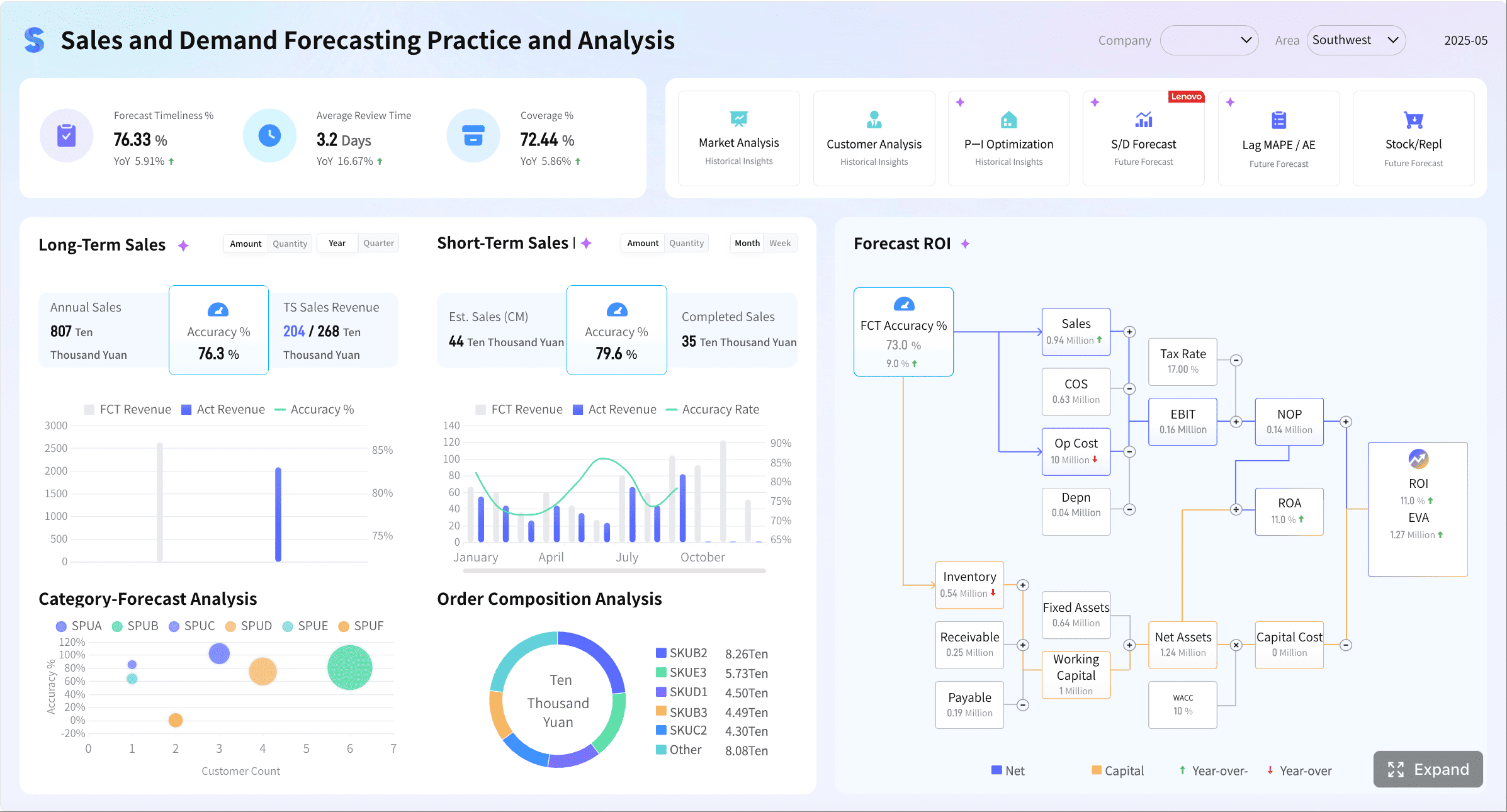
How to Structure Pipeline, Forecast, and Win-Rate Views in Salesforce KPI Dashboard
The best salesforce kpi dashboard layouts are layered. They let leaders scan the business in seconds and investigate issues in minutes.
A proven structure looks like this:
1. Summary cards
Use top-row KPI cards for the few metrics that deserve immediate attention:
Pipeline coverage
Forecast for current quarter
Forecast accuracy trend
Overall win rate
Average sales cycle
Average deal size
These should include variance to goal or prior period, not just raw totals.
2. Trend charts
Trend lines are critical because static totals hide movement. Show:
Pipeline trend over time
Forecast trend by weekly snapshot
Win-rate trend by month or quarter
Sales cycle trend by segment or team
A dashboard without trends encourages reactive management. A dashboard with trends helps leaders spot deterioration early.
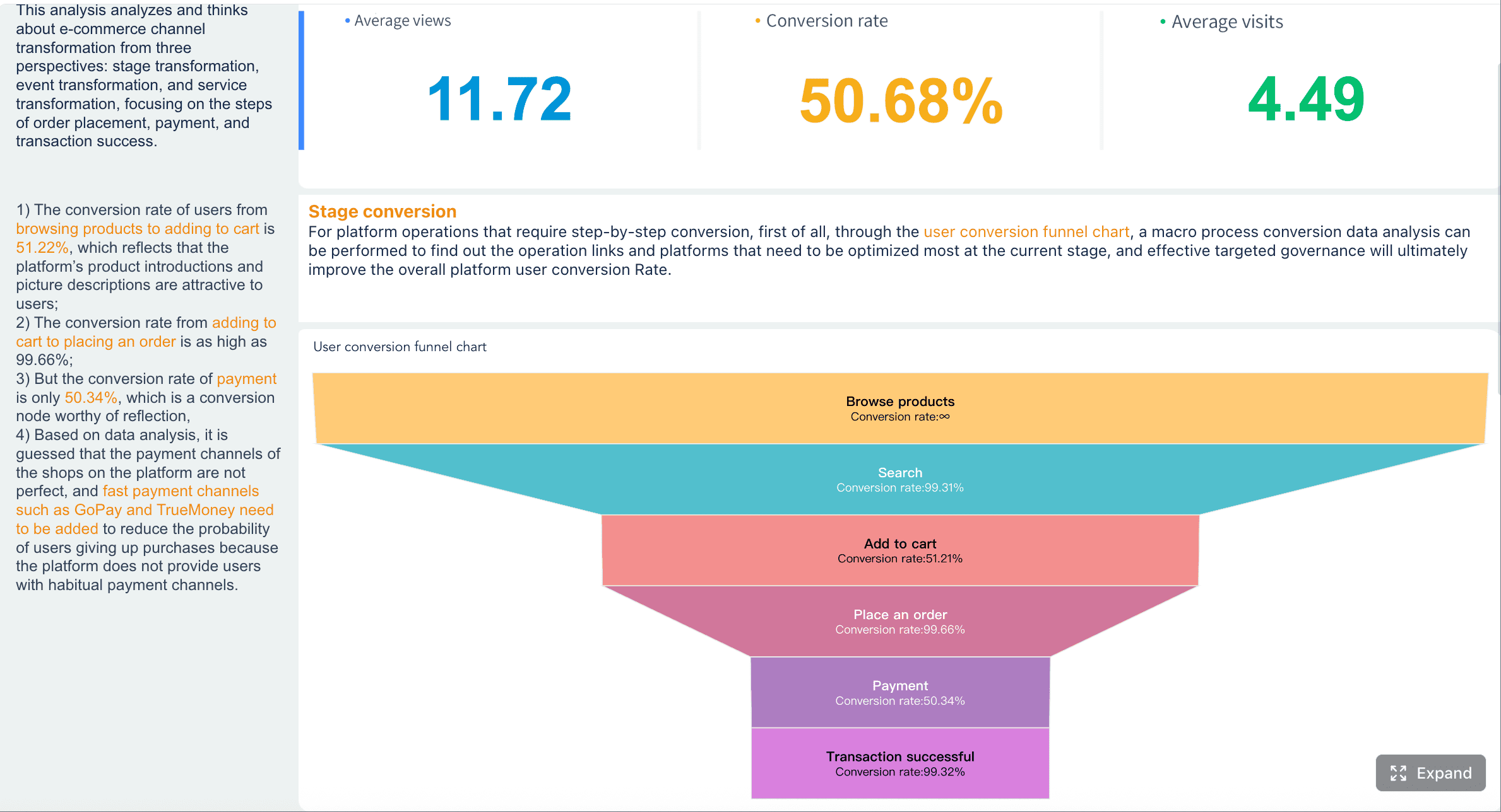
3. Funnel and conversion views
Use funnel charts or stage progression visuals to show:
Volume and value by stage
Conversion rate between stages
Stage aging hotspots
Drop-off points by segment or source
These views make bottlenecks visible. They are especially useful in weekly pipeline reviews.
4. Drill-down tables
Tables are not glamorous, but they are essential for action. Include drill-down views for:
Deals slipping this quarter
High-value deals with stale activity
Opportunities aging beyond threshold
Forecast commits with missing next steps
Competitor-led losses by segment
The dashboard should also support role-based filtering. The minimum filter set usually includes:
Team
Manager
Geography
Product line
Segment
Time period
These filters make the same dashboard useful to both executives and managers without forcing you to build fragmented versions.
Most importantly, highlight exceptions and change over time. A big number alone rarely drives action. Leaders need to know:
What changed since last week?
Which deals slipped?
Where is coverage below threshold?
Which stages are slowing down?
Which teams are winning less than expected?
Sample CRM dashboards worth modeling
Several dashboard patterns consistently work well because they map to real operating rhythms.
Executive summary dashboard
Built for leadership meetings. It should answer:
Are we on track to hit target?
Is forecast confidence improving or worsening?
Where are the biggest risks by segment or region?
Use scorecards, trend lines, and a small number of exception indicators.
Pipeline inspection dashboard
Built for weekly manager reviews. It should answer:
Do we have enough quality pipeline?
Which deals are stale, slipping, or underqualified?
Where is stage aging becoming a problem?
Use funnel visuals, aging charts, and deal inspection tables.
Forecast review dashboard
Built for leadership forecast calls. It should answer:
How has forecast changed week over week?
Which commits are fragile?
What is the variance between best case and commit?
Which managers consistently over- or under-call?
Use forecast waterfall charts, snapshot trends, and risk tables.
These patterns work because each dashboard is tied to a meeting, a workflow, and a decision. That is exactly how dashboards earn adoption.
What a sales dashboard looks like in practice
In a practical setup, each visual should answer one decision question.
For example:
A scorecard answers: Are we above or below target?
A trend line answers: Is performance improving or deteriorating?
A funnel chart answers: Where are deals dropping out?
A heatmap answers: Which team or stage has the biggest issue?
A drill-down table answers: Which exact deals or reps require intervention?
That balance matters. Too much summary and leaders cannot diagnose problems. Too much detail and executives get buried in noise.
A well-designed dashboard behaves like a guided analysis path:
Spot the issue.
Isolate the segment or team.
Identify the driver.
Assign action.
Common Salesforce KPI Dashboard Mistakes That Undermine Decisions
Most weak dashboards fail for predictable reasons. The issue is rarely lack of data. It is usually lack of focus, consistency, and governance.
1. Too many metrics on one screen
When every stakeholder adds “just one more KPI,” the result is clutter. Leaders stop scanning because nothing stands out.
If pipeline, forecast categories, or win-rate formulas differ across teams, the dashboard becomes an argument generator.
This problem is especially common with:
Opportunity inclusion logic
Stage mapping
Forecast category usage
Win-rate cohort definitions
Renewal versus new business reporting
Consistency matters more than theoretical perfection. A simpler metric that everyone trusts is better than an advanced metric nobody believes.
3. No visibility into exceptions
Dashboards often show totals but not risks. That leaves managers to inspect manually.
A stronger design highlights:
Stage aging exceptions
Pipeline coverage below threshold
Large deal slippage
Commit deals without recent activity
Falling win rates by source or segment
4. Ignoring post-sale indicators that affect revenue quality
Some organizations isolate sales metrics so aggressively that they miss leading signals affecting expansion and retention. That is a mistake when support or customer health directly influences revenue outcomes.
However, these metrics should be included selectively and intentionally.
Avoiding metrics and KPI chaos in Salesforce
If multiple teams publish similar reports with slightly different numbers, the dashboard will lose credibility fast. Governance fixes that.
A practical governance model should define:
Metric owners: Who is accountable for each KPI
Refresh cadence: Daily, hourly, weekly, or monthly
Calculation logic: Centralized and documented
Change control: How new KPIs are requested and approved
Retirement rules: How unused metrics are removed
Review cycle: Monthly or quarterly KPI relevance review
Think of KPI governance as operational hygiene. It keeps the dashboard focused, trusted, and scalable.
You should also standardize alerting and exception thresholds. For example:
Pipeline coverage below 3x quota
Stage aging above 21 days in proposal
Commit deals with no activity in 14 days
Win rate down more than 10% quarter over quarter
That turns a passive dashboard into an active management tool.
When service KPIs belong in the same executive view
Service metrics should appear in the same executive dashboard only when they affect revenue outcomes directly.
Appropriate examples include:
Support responsiveness affecting renewals
Case backlog impacting expansion readiness
Customer health scores influencing forecast confidence for upsell
Escalation volume signaling churn risk in key accounts
When these conditions apply, keep service indicators as a small adjacent section, not mixed into core sales execution visuals.
If the primary question is sales execution, do not dilute it with unrelated operational metrics. Combined executive views work best when they preserve decision clarity.
How Revenue Leaders Can Use the Dashboard to Drive Action
A great dashboard is valuable only if leaders use it to change behavior.
Here is the operating rhythm I recommend.
1. Run weekly pipeline reviews with a risk lens
Do not spend the meeting reading totals. Focus on gaps and bottlenecks.
Inspect:
Coverage gaps by team and segment
Opportunities with excessive stage aging
Stage conversion drop-offs
Slipped deals with large revenue impact
Reps with pipeline concentration risk
The point is to intervene early, not explain failure late.
2. Use forecast trends to challenge assumptions
Forecast reviews should not rely on manager confidence alone. Use the dashboard to compare:
Current forecast versus prior weekly snapshot
Commit versus best-case spread
Forecast changes by manager
Historical forecast accuracy by team
Deal-level risk indicators
This improves commit quality over time and reduces sandbagging or optimism bias.
3. Turn win-rate insights into coaching and planning
Win-rate analysis becomes powerful when segmented correctly.
Use it to answer:
Which sources produce low-quality opportunities?
Which competitors are beating us in enterprise deals?
Which reps win at strong rates but have insufficient pipeline?
Which teams lose late in the process due to pricing or procurement issues?
That turns reporting into coaching, enablement, and territory planning.
4. Review and refine the dashboard monthly
Revenue teams evolve. The dashboard should too.
Once a month, assess:
Which metrics led to action
Which metrics were ignored
Whether leading indicators should be added
Whether stale visuals should be retired
Whether the business needs new segment or product cuts
This prevents dashboard bloat and keeps reporting aligned with the operating model.
3 to 5 best practices for implementation
If you are building this in a live Salesforce environment, follow these consultant-grade practices:
Best practice 1: Start with decisions, not charts
List the top weekly and monthly decisions leaders need to make. Only then map metrics and visuals to those decisions.
Best practice 2: Standardize KPI logic before designing the dashboard
Agree on definitions for stages, forecast categories, close-date rules, and opportunity inclusion before any visual build begins.
Best practice 3: Design separate executive and manager layers
Executives need summary and trend. Managers need inspection and drill-down. One screen cannot serve both equally well without role-based design.
Best practice 4: Build exception-based views
Show what changed, what slipped, what stalled, and what is below threshold. Static summaries alone do not drive action.
Best practice 5: Put governance in place from day one
Assign metric owners, document formulas, control additions, and review KPIs quarterly. Without governance, dashboard quality always degrades.
Build Faster and Scale Smarter with FineBI
Building this manually is complex; use FineBI to utilize ready-made templates and automate this entire workflow.
Get Ready-to-Use Dashboard Templates in Fine Gallery
That is the practical reality. A high-performing salesforce kpi dashboard is not just a reporting project. It requires data integration, KPI standardization, visual design, drill-down logic, governance, and ongoing adoption. Doing all of that manually across teams and changing business rules takes time and creates maintenance overhead.
FineBI is a strong fit when you need to move from fragmented Salesforce reports to a more scalable, enterprise-ready analytics workflow.
Here is why revenue teams and operations leaders should care:
Ready-made dashboard patterns help you launch executive summaries, pipeline inspection views, and forecast review dashboards faster.
Visual self-service analysis makes it easier for business users to explore data without depending on technical teams for every adjustment.
Interactive dashboards support filters, drill-down paths, linked analysis, and role-based consumption.
From an enterprise perspective, the bigger advantage is sustainability. FineBI is designed to help organizations move beyond one-off dashboards and build reusable decision applications. That matters when revenue operations needs to support multiple teams, recurring forecast cycles, and evolving KPI definitions without endless report rework.
If your current Salesforce reporting environment suffers from inconsistent logic, slow dashboard updates, or low adoption outside ops and analysts, FineBI gives you a more operationally scalable path. It helps transform dashboarding from a static reporting exercise into a governed, interactive, decision-support workflow.
The winning approach is straightforward:
Define the business decisions.
Standardize KPI logic.
Structure the dashboard for executive and manager use.
Build exception-driven analysis paths.
Use FineBI to accelerate deployment, automate reporting, and keep the system maintainable as the business grows.
That is how a dashboard stops being a slide-replacement tool and becomes a real revenue management system.
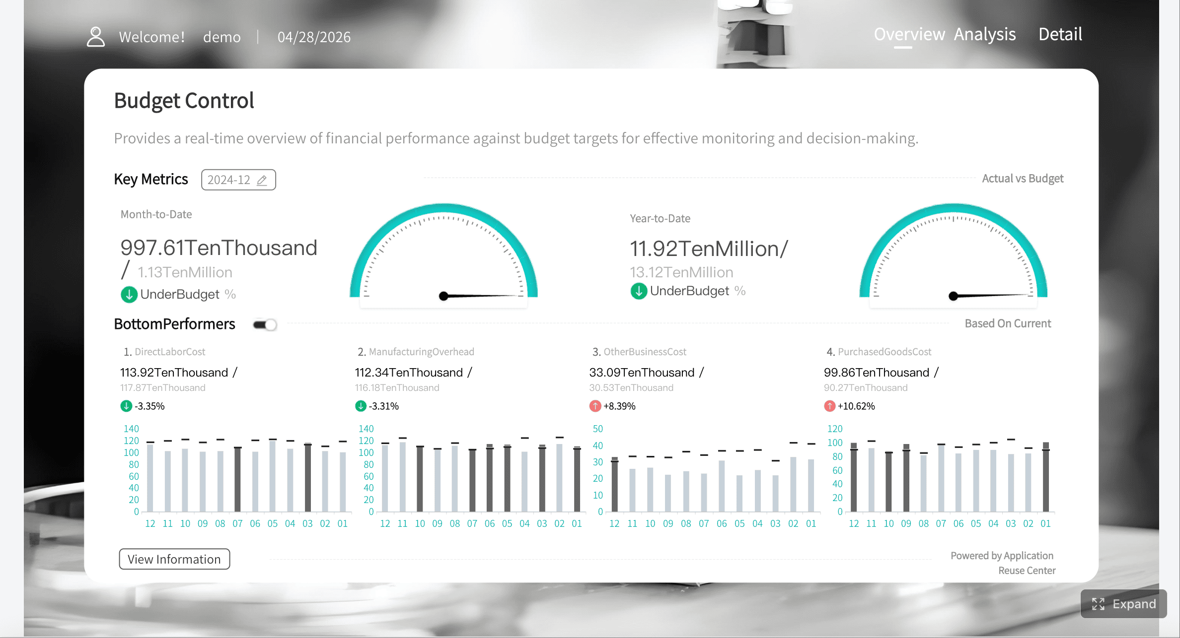
A strong dashboard should focus on pipeline coverage, forecast attainment and accuracy, win rate, stage conversion, and stage aging. These metrics help leaders see whether the team can hit target, where risk is building, and what actions to take.
Pipeline coverage is typically calculated by dividing open pipeline value by quota for a defined month or quarter. This shows whether the team has enough qualified opportunity value to realistically achieve its revenue goal.
Forecast attainment compares actual closed revenue to the forecasted number. Forecast accuracy measures how close the forecast was to the final outcome, which helps teams judge how reliable their commit calls really are.
Win rate shows how effectively the team converts opportunities into closed won deals. When broken out by segment, source, stage, or competitor, it helps leaders identify where execution is strong and where sales performance needs improvement.
Most revenue teams review executive KPIs weekly and use operational views more frequently for pipeline inspection and coaching. The right cadence depends on your sales cycle, deal volume, and how quickly pipeline conditions change.
Product Trial
FineReport
Pixel-perfect reports · Interactive dashboards · Easy data entry · Digital twins