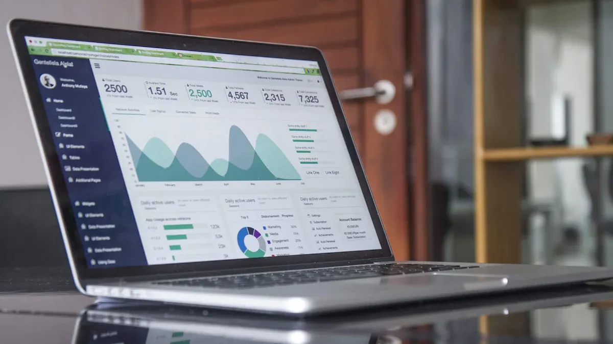
What is a "sales KPI dashboard"? A sales KPI dashboard is a digital tool that displays key performance indicators for your sales activities in one place. You can track progress, measure targets, and monitor team performance in real time. This tool helps you make faster, smarter decisions about sales strategies and resource allocation.
Tracking sales KPIs is essential for business growth. Real-time data visualization improves team accountability, highlights strengths and weaknesses, and encourages collaboration. You can instantly see trends, identify top-performing products, and adjust your sales approach for better results.
Real-time monitoring of sales performance drives revenue growth.
Transparent progress tracking creates a motivated, focused sales team.
Sales KPI Dashboard Basics
What is a Sales KPI Dashboard
Asales KPI dashboardis a digital platform that brings together the most important metrics for your sales team. You use this tool to track sales KPIs, monitor progress, and manage performance in real time. The dashboard gives you a clear overview of your sales activities, helping you understand what works and what needs improvement.
The core functions of a sales KPI dashboard include:
Tracking the performance of sales representatives and their activities.
Stimulating collaboration among team members.
Increasing staff motivation by breaking down tasks into manageable steps.
Fostering accountability by displaying activities and deadlines.
Providing a clear overview of departmental activities and goals.
Helping managers identify new sales growth opportunities.
You can use a sales KPI dashboard to see how your team performs against targets. This visibility helps you make better decisions and adjust your strategy quickly. The dashboard also supports compliance and data security by monitoring user access and tracking the status of data encryption.
A sales KPI dashboard acts as your command center for sales management. You can see all your key metrics in one place, which makes it easier to lead your team and reach your goals.
How a KPI Dashboard Works
A KPI dashboard works by collecting data from your sales systems and turning it into visual insights. You start by choosing the sales KPIs that matter most to your business. These might include total sales, conversion rates, average deal size, or sales cycle length. Once you select your KPIs, you connect your data sources, such as your CRM or ERP system, to the dashboard.
The workflow of a sales KPI dashboard usually follows these steps:
Determine your KPIs.
Choose a dashboard tool.
Connect your data sources.
Visualize your data.
Share the dashboard with your team or customers.
Integration with CRM and ERP systems is essential. When you connect these systems, you create a single source of truth for your sales data. This integration allows for real-time updates and automated workflows, such as converting accepted quotes into orders. You reduce manual data entry and ensure that everyone works with the same information.
FineReportmakes this process even easier. You do not need to write code to build or update your sales KPI dashboard. FineReport automates dashboard creation and updates, so you always have the latest data. The tool is designed for efficiency, letting you manage and update sales KPIs in real time. You can focus on analyzing your sales performance instead of spending time on manual reporting.
A KPI dashboard also supports compliance and data security. You can monitor compliance status, track user access, and measure the proportion of encrypted data. This helps you protect sensitive information and meet regulatory requirements.
KPI
Description
Example
Volume of Sensitive Data Encrypted
Measures the percentage of sensitive data that is encrypted, indicating data protection effectiveness.
95% adoption rate of encryption shows strong security posture.
Privacy Program ROI
Assesses the financial return on privacy investments, highlighting the value of compliance efforts.
Comparing privacy tech spend vs. fines avoided.
Board-Level Reporting Frequency
Tracks how often privacy is reported to the board, ensuring data protection is prioritized.
Regular quarterly updates signal strategic importance.
You can use a sales KPI dashboard to monitor compliance, spot unauthorized access attempts, and ensure your data remains secure.
When you use FineReport, you gain access to a zero-coded visualization tool that simplifies dashboard management. You can automate updates, integrate multiple data sources, and share insights with your team. This approach helps you stay focused on your sales goals and respond quickly to changes in the market.
When you use asales KPI dashboard, you give your team a powerful tool for improving performance and transparency. You can track sales KPIs in real time, which helps everyone stay focused on their goals. The dashboard ensures that all team members work with the same data, reducing confusion and boosting data consistency. You align sales activities with your business objectives, making sure every effort supports your strategy.
Here is a table showing the measurable benefits sales teams report after implementing a KPI dashboard:
Benefit
Description
Data Consistency
Ensures that all team members are working with the same data.
Strategic Alignment
Aligns sales activities with overall business goals.
Informed Decision-Making
Supports better decision-making through data insights.
Transparency and Accountability
Improves visibility into performance, fostering accountability.
Real-Time Performance Tracking
Allows for immediate adjustments based on current performance metrics.
Proactive Issue Resolution
Facilitates quick identification and resolution of performance issues.
You foster a culture of motivation within your sales team. The dashboard establishes clear performance targets and provides transparent visibility into individual and collective performance. Sales professionals feel motivated to strive for excellence because they can see their progress and compare it with their peers.
Sales KPI dashboards also improve collaboration. Real-time updates give everyone immediate insights into performance metrics. Visualization of progress helps team members understand achievements and areas for improvement. When you share the same data, you can engage in informed discussions and strategize together.
Impact on Decision-making
A sales KPI dashboard transforms how you make decisions. You gain access to actionable insights from your sales KPIs, which support faster and more accurate choices. Real-time data lets you identify patterns and take proactive measures to drive revenue growth. You can spot issues early and adjust your strategy before problems escalate.
Sales dashboards provide real-time access to crucial sales data. You make informed decisions based on accurate information, not guesswork. The best dashboards surface real-time data, informing smarter, faster, data-driven decision-making across all go-to-market functions.
FineReport plays a key role in enabling data-driven decisions and collaboration. You can use its robust data visualization and reporting tools to turn complex sales metrics into actionable insights. FineReportlets you create interactive dashboards and multi-dimensional reports, supporting comprehensive analysis of your key performance indicators. You empower your team to collaborate and make decisions with confidence.
In manufacturing sales management, KPI dashboards help you overcome challenges like data fragmentation and poor communication. You can monitor sales KPIs, track performance indicators, and coordinate across departments. This approach leads to improved accuracy in sales target setting, enhanced transparency, and more effective problem-solving.
Tip: When you use a sales KPI dashboard, you create a unified view of your sales metrics. This clarity helps you lead your team, respond to market changes, and achieve your business goals.
When you build a salesKPI dashboard, you need to choose the right sales KPIs to monitor business performance. These KPIs help you measure progress, spot trends, and make data-driven decisions. Common sales KPIs include:
Annual contract value
Average cost per lead
Customer lifetime value
Average conversion time
Average age of leads in pipeline
Quote-to-close ratio
Average purchase value
Calls and emails per rep
Customer acquisition cost
Sales by region
Number of monthly onboarding and demo calls
Product performance by revenue
Sales opportunities
Average sales cycle length
Average new deal size
Sales KPIs align with business KPIs like revenue growth, efficiency, and customer retention. You use these metrics to monitor business performance and drive improvement. Tracking sales KPIs gives you actionable insights that support better decisions and help you reach your goals.
Sales KPIs are crucialto guiding business growth. By tracking these critical metrics, you gain visibility into performance trends, identify opportunities for improvement, and make decisions that directly impact revenue.
KPI
Description
Revenue Growth
Indicates the increase in sales over a period.
Efficiency
Measures how effectively resources are used.
Customer Retention
Reflects the ability to retain customers over time.
Dashboard Layout and Customization
A well-designed dashboard makes it easy to interpret sales data quickly and accurately. Good dashboard design minimizes user effort and creates a clear hierarchy of information. Overwhelming layouts can cause users to disengage, so you should focus on effective visual communication.
FineReportoffers flexible dashboard layout options. You can customize graphics, fonts, colors, and backgrounds. You set section ranges, value formats, and theme colors. You enable timed refresh and carousel intervals for real-time updates. These features help you create a sales performance dashboard that fits your needs.
Customization Aspect
Options
Graphics
Customize character, font, font size, and color of the indicator value.
Section Configuration
Set section range and range colors.
Value Format
Set the value format of the indicator value.
Style
Set the theme color of the outer frame.
Background
Set fill color and opacity of the chart background.
Timed Refresh
Enable timed refresh and set the refresh interval.
Carousel Interval
Set the carousel interval.
Carousel Linkage
Choose between linked cell, floating element, or dashboard object.
FineReport'sMultiple Built-in Charts For Visualization
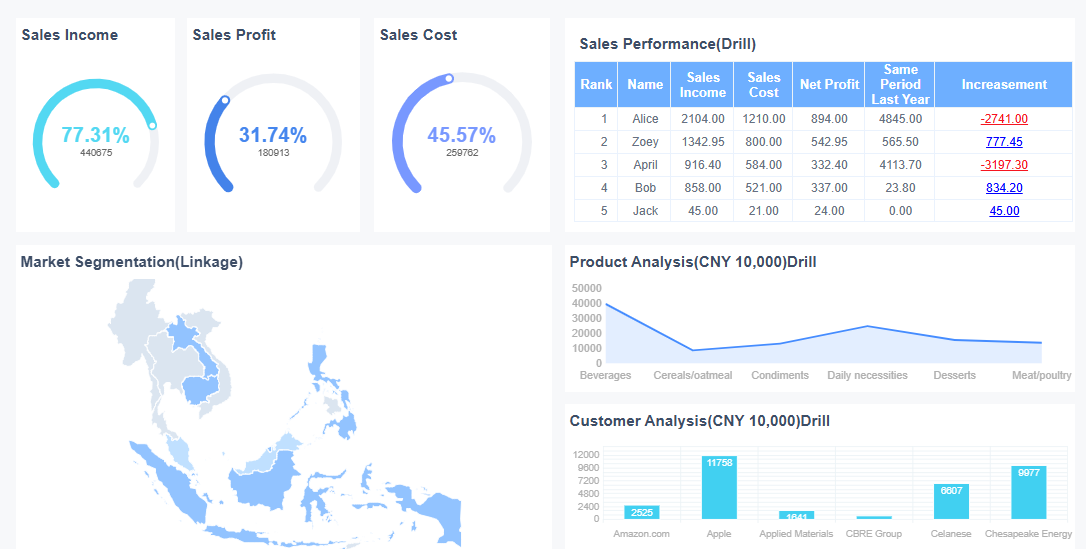
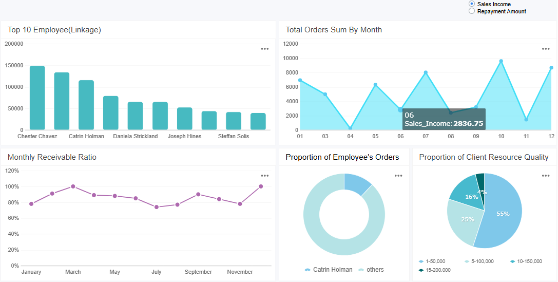
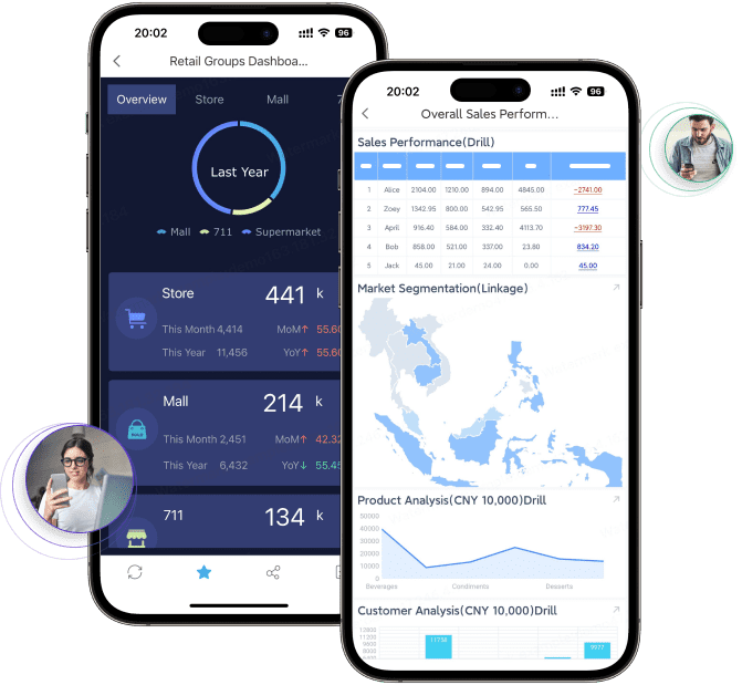
FineReport gives you powerful tools to build and manage your sales KPI dashboard. You can create dashboards with multi-report layouts, interactive charts, and real-time performance indicators. FineReport supports mobile dashboards, so you can access sales data anywhere. You use 3D dashboards for advanced visualization and data entry forms to collect sales metrics directly from your team.
With FineReport, you get real-time updates and actionable insights. You can customize your dashboard to match your workflow and monitor business performance with ease. FineReport provides kpi dashboard examples that help you design dashboards for different industries and business needs.
You use FineReportto track sales KPIs, analyze sales metrics, and improve your sales strategy. The platform helps you make informed decisions and drive business growth.
To create effective kpi dashboards, you need to focus on what matters most. Start by selecting key sales metrics that align with your business goals. Keep your dashboard simple and uncluttered. This approach helps users interpret data quickly. Use the right visualizations for each type of data. For example, line charts work well for trends, while bar charts highlight comparisons. Always ensure your data is accurate. Reliable data builds trust and supports better decisions.
Design your dashboard for your audience. Sales teams need real-time updates, so set your dashboard to refresh automatically. Choose a color palette that matches your brand. Assign specific colors to different data types, such as green for growth and red for decline. Use bright colors only for important information. Consistent design elements make navigation easier. Avoid cramming too much information into one view. Clear layers and focused visuals help tell a story.
Aspect
Description
Highlighting Key Data
Use bright, saturated colors for important information and subtle greys for supporting data.
Reducing Visual Clutter
Effective color use can minimize distractions and enhance focus on key metrics.
Tip: Prioritize the most relevant kpi and avoid excessive detail. Too much information can overwhelm users and reduce the dashboard’s effectiveness.
Interpreting Sales KPI Data
You need to understand what your sales KPI dashboard shows to make smart decisions. Start by cleaning your data to remove errors and duplicates. Normalize your data so you can compare different sales periods or teams. Establish a baseline by looking at historical trends. Use graphs, heat maps, and conditional formatting to spot trends and anomalies. Time series analysis helps you see seasonal patterns or sudden changes. When you notice an unusual spike or drop, investigate the cause. This process gives you actionable insights and helps you adjust your sales strategy quickly.
Sales managers use real-time dashboard data to monitor performance indicators. Immediate access to data allows you to shift from reacting to problems to making proactive decisions. You can adjust your sales approach before issues grow.
Implementing With FineReport
You can create effective kpi dashboards with FineReport by following a few steps. First, define your sales KPIs and connect your data sources. Use the drag-and-drop interface to add KPI cards for sales and profit. Build word clouds to visualize sales by region. Create group tables to analyze sales by product. Use multi-series line charts to track sales and profit over time. FineReport supports real-time updates and mobile access, so your team can view the dashboard anywhere.
When you implement a sales KPI dashboard, you may face challenges like defining the right KPIs or managing data quality. FineReporthelps you overcome these hurdles with automated data integration, customizable layouts, and ongoing support. Training your team ensures everyone can use the dashboard effectively. Regular updates keep your KPIs relevant and your dashboard valuable.
A sales KPI dashboard transforms how you manage sales by centralizing data and delivering real-time insights. You gain tools for strategic decision-making, performance tracking, and actionable forecasting. See the main impacts in the table below:
Impact Area
Description
Strategic Decision-Making
Real-time insights for informed choices
Performance Tracking
Centralized view of progress toward goals
Actionable Insights
Clear narratives to guide your sales team
Revenue Growth Forecasting
Accurate forecasting and territory optimization
Coaching and Development
Targeted coaching for consistent growth
You can measure ROI by tracking revenue, costs, and integrating data for real-time analysis. To get started, organize your team, choose your KPIs, and add users to your sales KPI dashboard. Explore FineReportto see how it supports your industry and drives better results.
Access a wealth of case studies, industry insights, and solution guides to accelerate digital transformation.
FAQ
What is a sales KPI dashboard?
A sales KPI dashboard is a digital tool that displays your key sales metrics in one place. You can track performance, monitor trends, and make informed decisions quickly. This dashboard helps you stay focused on your sales goals.
How do you choose the right KPIs for your sales KPI dashboard?
You should select KPIs that match your business goals. Focus on metrics like revenue growth, conversion rates, and customer retention. These indicators give you a clear view of your sales performance and help you identify areas for improvement.
Can you customize a sales KPI dashboard in FineReport?
Yes, you can fully customize your sales KPI dashboard in FineReport. You can adjust layouts, colors, and data sources. The drag-and-drop interface lets you build dashboards that fit your workflow and business needs.
Is a sales KPI dashboard accessible on mobile devices?
You can access your sales KPI dashboard on any mobile device with FineReport. The platform supports mobile dashboards, so you can monitor sales performance and KPIs anytime, anywhere.
How does a sales KPI dashboard improve decision-making?
A sales KPI dashboard gives you real-time insights into your sales data. You can spot trends, identify problems early, and make quick adjustments. This leads to better decisions and improved sales results.