Organizations rarely struggle because they lack data. More often, they struggle because the right people cannot see the right signals quickly enough to make timely decisions. That is why strong bi dashboard examples are valuable: they show how metrics, visuals, and interactions can be designed around real operating needs rather than generic reporting.
Across SaaS, ecommerce, manufacturing, healthcare, and logistics, dashboards serve different teams, support different cadences, and emphasize different forms of action. A plant manager may need minute-level visibility into downtime, while a revenue leader may review pipeline and expansion trends daily or weekly. The best dashboards reflect those realities.
This article examines 10 practical bi dashboard examples by industry and explains how to translate those patterns into a dashboard plan for your own business.
What makes these BI dashboard examples useful in real business settings
A dashboard becomes useful when it does more than display numbers. It should help users understand what is changing, identify where attention is needed, and decide what to do next.
Surface trends so teams can spot momentum, seasonality, and decline
Flag exceptions so users can quickly detect anomalies, bottlenecks, and risk
Support faster decisions by connecting metrics to actions, owners, and context
This seems straightforward, but dashboard effectiveness changes significantly by industry and role. The right KPI set for a subscription business is different from the right KPI set for a hospital network or warehouse operation. Industry context influences at least four design choices:
KPIs: what matters operationally and financially
Visuals: which chart type best reveals performance patterns
Filters: how users segment by region, team, product, site, or period
Update frequency: whether users need real-time, daily, weekly, or monthly refreshes
For example, a logistics dashboard may require live updates for route exceptions, while an executive healthcare dashboard may refresh several times per day but emphasize governance and role-based access. Similarly, a SaaS product team may need feature adoption views by cohort, while finance focuses on ARR, net retention, and expansion revenue.
To evaluate each of the following bi dashboard examples, it helps to use clear criteria:
Clarity: can users understand the performance picture in seconds
Actionability: does the dashboard point toward specific follow-up actions
Stakeholder fit: is the dashboard aligned to how a real team works and decides
When these three qualities are present, dashboards become part of daily management rather than static reporting artifacts.
10 real-world BI dashboard examples by industry
SaaS dashboards for revenue, retention, and product usage
SaaS companies rely on recurring revenue and customer retention, so their dashboards must connect financial performance with customer behavior and product value. Good bi dashboard examples for SaaS do not isolate finance, product, and customer success into separate worlds. Instead, they create a shared operating view with different drill-down paths for each function.
The top section often uses KPI cards for current-period performance and target variance. Below that, line charts show MRR and ARR growth over time, while waterfall visuals can break net revenue movement into new business, expansion, contraction, and churn.
This type of dashboard is useful because leadership can immediately answer questions such as:
Are we growing efficiently
Is expansion offsetting churn
Which segments drive the strongest recurring revenue performance
A refined version also segments results by plan tier, region, sales channel, or customer cohort. That allows executives to distinguish broad growth from concentrated growth.
2. SaaS product and customer health dashboard
A second SaaS example focuses on adoption and retention drivers rather than only topline revenue. Common metrics include:
This dashboard helps product, sales, and customer success teams use the same data differently:
Product teams look for underused features, low activation steps, and engagement patterns
Sales teams identify upsell-ready accounts and segments with high conversion potential
Customer success teams monitor churn risk, onboarding progress, and declining usage
The most useful version combines cohort charts, funnel views, and account-level detail tables. A cohort retention chart may reveal that customers acquired through a certain channel churn sooner. A feature adoption heatmap may show that accounts using two key features retain better than others. Those are not merely observations; they shape onboarding, packaging, and expansion strategy.
For SaaS organizations seeking a scalable analytics layer, FineBI can support these use cases by combining subscription, CRM, product event, and support data into one governed self-service environment. That is especially valuable when multiple teams need consistent definitions for metrics such as churn, activation, and expansion revenue.
Ecommerce dashboards for sales, conversion, and customer behavior
Ecommerce dashboards must balance acquisition, conversion, merchandising, and retention. Unlike SaaS dashboards, which emphasize recurring customer value over longer horizons, ecommerce dashboards often deal with rapid campaign shifts, daily sales movement, and channel-level efficiency.
An Ecommerce BI Dashboard Example created by FineBI (Click to Engage)
3. Ecommerce executive sales dashboard
An executive ecommerce dashboard usually combines the following metrics in one view:
Traffic by source
Conversion rate
Revenue
Average order value
Cart abandonment
Repeat purchase rate
The most effective layout starts with a high-level sales snapshot, then moves into trend analysis by day, week, or campaign period. Below that, channel comparison charts can show performance across paid search, organic, social, email, affiliates, and direct traffic.
This dashboard is useful because it connects commercial questions that often sit in different systems:
Which channels drive traffic
Which channels convert efficiently
Whether higher revenue comes from more orders, higher AOV, or both
A combined executive view reduces the risk of optimizing for one metric in isolation. For example, a campaign can increase sessions while lowering conversion quality. A dashboard that compares traffic, conversion, AOV, and revenue side by side prevents misinterpretation.
4. Ecommerce customer behavior and merchandising dashboard
A second ecommerce example emphasizes onsite behavior and product performance. Core metrics often include:
This dashboard is especially useful for digital commerce managers, merchandising teams, and growth marketers. A good design often includes:
Funnel visualization for session-to-purchase flow
Product ranking tables with filters by category, brand, and margin band
Device comparisons for mobile versus desktop conversion
Retention trends by customer cohort or acquisition source
The business value comes from being able to compare campaign, product, and channel performance in one environment. If a product sells well but has a high return rate or low margin, the dashboard should make that visible. If mobile traffic grows but checkout conversion drops, UX and payment flow become immediate priorities.
In practice, ecommerce leaders benefit most when these metrics are refreshed frequently and enriched with annotations, such as campaign launches, promotions, stockouts, or pricing changes.
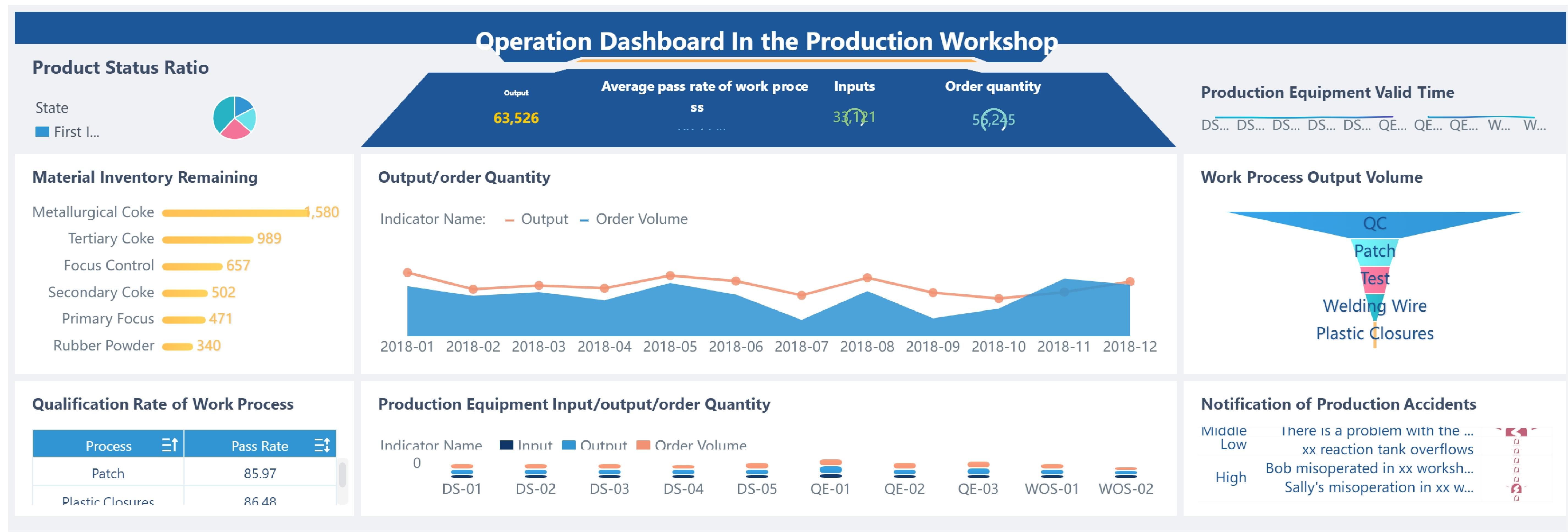
Manufacturing dashboards for operations and quality control
Manufacturing dashboards differ from commercial dashboards because they must represent process stability, throughput, equipment performance, and quality outcomes. The best bi dashboard examples in this area reduce the gap between operational events and management response.
A Manufacturing BI Dashboard Example created by FineBI (Click to Engage)
The strongest version uses a layered layout. At the top, managers see overall plant status and shift-level performance. In the middle, they can compare lines, machines, or facilities. At the bottom, they drill into detailed event logs and root causes.
Real-time monitoring is particularly important here. When downtime increases or throughput drops below target, plant managers need immediate visibility. Visual formats often include:
Trend lines for output and downtime by shift
Stacked bars for downtime reasons
Gauges or KPI cards for OEE and schedule attainment
Conditional formatting in tables for problem lines or late orders
This dashboard supports not only plant managers but also continuous improvement teams, who need to identify recurring bottlenecks and quantify improvement opportunities over time.
6. Manufacturing quality and delivery dashboard
A second manufacturing example focuses on quality control and fulfillment reliability. Typical KPIs include:
Defect rate
First-pass yield
Scrap and rework
Supplier quality
Customer returns
On-time delivery
Order backlog risk
This dashboard helps quality leaders and operations teams understand whether output performance is being achieved at the cost of quality. It also reveals whether delivery issues begin upstream in production, sourcing, or scheduling.
A useful design pattern is to combine lagging indicators such as final defect rate with leading operational signals such as rising machine stoppages, material delays, or line instability. That combination improves response speed.
For manufacturers with multiple factories or business units, FineBI can be used to standardize KPIs across ERP, MES, and quality systems, making cross-site comparisons more trustworthy and easier to adopt at scale.
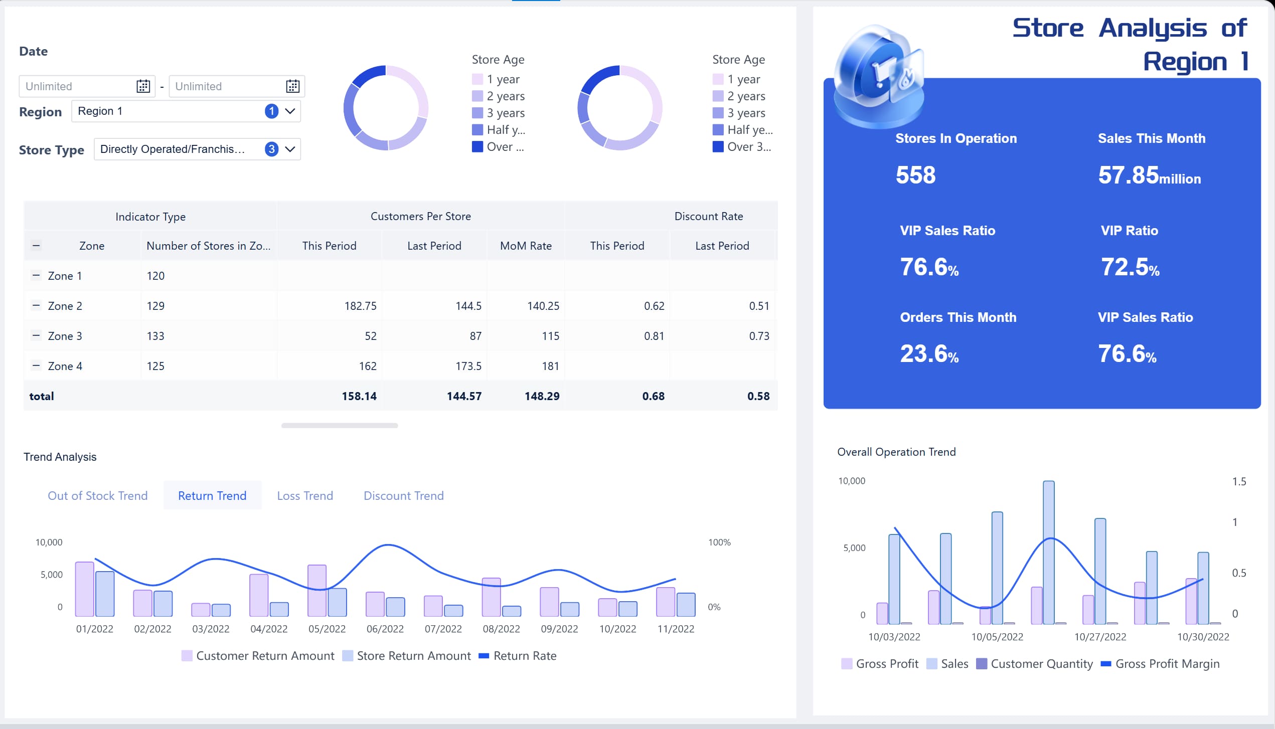
Healthcare dashboards for capacity, outcomes, and compliance
Healthcare dashboards must balance operational flow with patient outcomes and compliance requirements. In this sector, dashboard design is not only about visibility but also about governance, privacy, and controlled access.
This type of dashboard is often used by operations leadership, unit managers, and hospital administrators. The immediate objective is to reduce congestion, improve throughput, and support safer care delivery.
A well-designed view may include:
Hourly or daily patient arrival trends
Bed occupancy by unit or facility
Wait time distributions rather than averages alone
Discharge planning indicators
Alerts for capacity thresholds
This dashboard becomes especially valuable during demand surges, where small delays in one part of the care pathway can create system-wide strain. Rather than showing only historical summaries, strong dashboards expose near-real-time pressure points and likely bottlenecks.
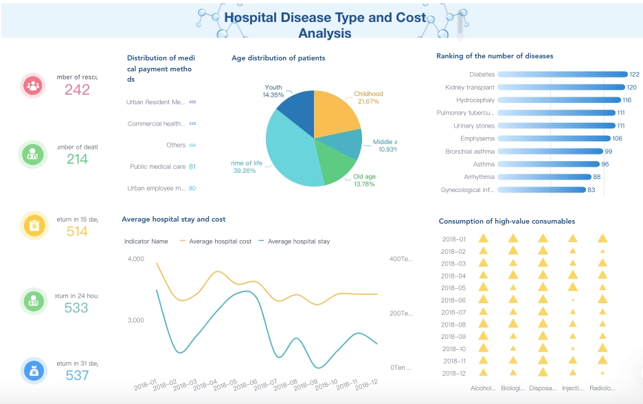
8. Healthcare quality and compliance dashboard
A second healthcare example focuses on clinical quality and regulatory accountability. Common measures include:
Readmission rate
Hospital-acquired condition rates
Care quality indicators
Medication or safety incidents
Documentation completeness
Compliance status
Performance by service line
This dashboard should be designed with strict attention to:
Data governance
Privacy controls
Role-based access
Metric definition consistency
Unlike many commercial dashboards, healthcare dashboards often require different views for executives, department heads, clinical managers, and compliance teams. A senior executive may need organization-wide quality summaries, while a unit leader requires patient-safe operational detail within authorized access boundaries.
The best approach is not to overload one screen with every metric. Instead, use a high-level summary dashboard that links to service-line or unit-level views with appropriate permissions. FineBI can support this style of governed access by allowing organizations to manage metric consistency while tailoring visibility to different user roles.
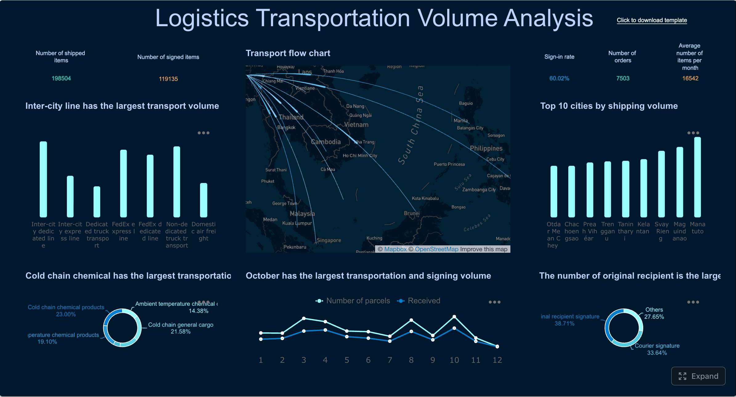
Logistics dashboards for fleet, delivery, and fulfillment performance
Logistics dashboards sit at the intersection of transportation, warehouse operations, and customer service. Because these activities are highly time-sensitive, strong dashboards must combine monitoring and diagnosis in the same experience.
A Logistics Dashboard Example created by FineBI (Click to Engage)
This dashboard is particularly useful for dispatch teams and transport managers. Maps play an important role because geographic context matters. However, maps should not dominate the design at the expense of trend clarity and exception handling.
A practical layout often includes:
KPI cards for current on-time rate and cost per delivery
A map for active route or region performance
Trend charts for delays and cost movement over time
Exception tables for late, failed, or high-risk deliveries
The value of this dashboard lies in shared visibility. Dispatchers can act on exceptions in the moment, while leadership can review route efficiency patterns and carrier performance over longer periods.
10. Logistics warehouse and fulfillment dashboard
A second logistics example focuses on warehouse throughput and fulfillment efficiency. Core KPIs include:
Warehouse throughput
Order cycle time
Pick and pack accuracy
Shipping cost per order
Exception rate
Inventory movement
Dock-to-stock time
This dashboard helps warehouse managers, fulfillment leads, and executives align around common service goals. Shared metrics matter because fulfillment problems often span teams. A spike in late shipments may relate to picking delays, replenishment gaps, labor imbalance, or outbound carrier constraints.
An effective warehouse dashboard should therefore show both performance outcomes and operational drivers. For instance:
Throughput trend by shift
Order backlog by priority level
Accuracy rates by zone or team
Cost and exception distribution by carrier or warehouse
Drill-down tables for delayed or failed orders
When logistics organizations unify fleet, warehouse, and service metrics within one analytics framework, decision-making becomes more coordinated and less reactive.
How to match BI dashboard examples to industry use cases
Studying bi dashboard examples is useful only if those examples translate into sound design choices for your own operating model. The most common mistake is copying dashboard layouts without understanding the business decisions behind them.
Choose KPIs based on operational decisions, not just available data
It is easy to fill a dashboard with metrics that are already easy to extract. It is harder, and more valuable, to choose metrics based on what teams can actually influence.
A better approach is to ask:
What decision will this metric support
Who owns that decision
How often does the decision occur
What action follows if the metric changes
This immediately improves dashboard relevance. For example:
A SaaS customer success manager needs churn risk and adoption drivers, not only ARR totals
A manufacturing supervisor needs downtime reasons and output by shift, not just monthly plant summaries
A logistics dispatcher needs current delivery exceptions, not only end-of-month service averages
It also helps to separate views by decision horizon:
Strategic dashboards for executives and long-term planning
Tactical dashboards for managers optimizing teams or functions
Frontline dashboards for immediate operational response
This separation reduces clutter and makes dashboards more usable.
Pick visual formats that fit the question being asked
The best chart is the one that answers the business question with the least friction.
A simple rule set works well:
Use trend charts for change over time
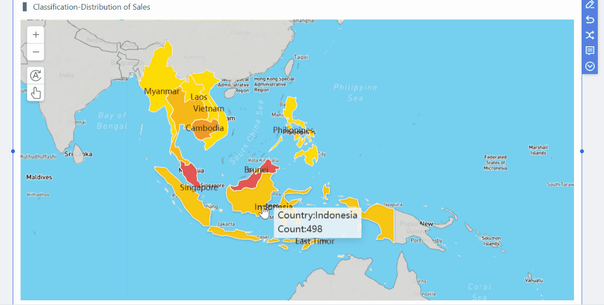
Use maps for location-based performance
Use tables when detailed drill-down is required
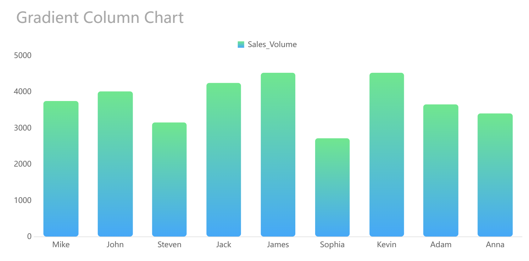
Use bar or column charts for category comparison
Use funnel views for stage conversion analysis
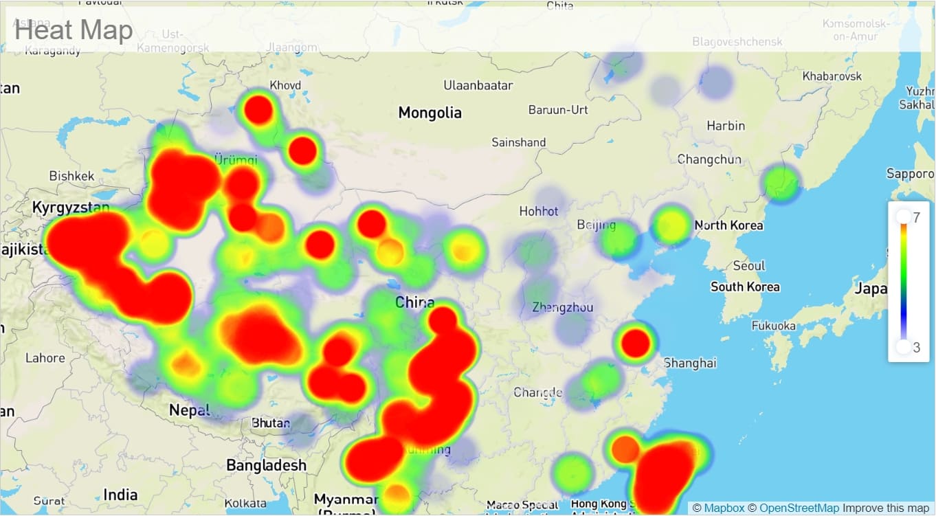
Use heatmaps for density, variance, or cohort scanning
The key is to balance executive summaries with the ability to investigate underlying causes. A leadership dashboard should not force users into another report every time they need context. At the same time, it should not overwhelm them with granular detail at first glance.
A well-structured dashboard often works in three layers:
Summary: what is happening
Diagnosis: where the issue or opportunity sits
Detail: what caused it and who should act
Build for trust, adoption, and regular use
Even visually polished dashboards fail if users do not trust the numbers. Trust depends on governance as much as design.
This is particularly important when the same metric appears in multiple contexts. If one team calculates churn differently from another, the dashboard will create confusion rather than alignment.
Ease of use matters as well. Filters, alerts, and annotations should be intuitive for non-technical users. People should understand what a filter changes, what an alert means, and how to interpret notes around promotions, outages, policy changes, or operational events.
This is one reason many organizations invest in governed self-service BI platforms. With FineBI, teams can access interactive dashboards while maintaining centralized control over core definitions and data logic, helping adoption grow without sacrificing consistency.
Common patterns across the best BI dashboard examples
When comparing high-performing dashboards across industries, several recurring design principles stand out.
First, the best dashboards start with business goals and then work backward to data sources and model design. They are not built by simply listing available fields and turning them into charts. Instead, they reflect target outcomes such as improving retention, reducing downtime, increasing on-time delivery, or optimizing patient flow.
Second, effective dashboards combine lagging indicators with leading signals. Revenue, margin, and readmission rates are important, but they describe outcomes that have already happened. Teams also need signals that anticipate those outcomes:
Feature adoption before churn
Cart abandonment before lost revenue
Machine stoppages before missed production targets
Bed occupancy pressure before patient flow bottlenecks
Delivery exceptions before SLA failure
Third, strong dashboards keep layouts focused so users can scan, diagnose, and act without switching across disconnected reports. This principle is especially important for executives and frontline managers, both of whom work under time pressure.
Finally, the best dashboard teams understand that dashboards are not static. They review dashboards regularly as roles, processes, systems, and data maturity evolve. A dashboard that was ideal at one stage of growth can become noisy, incomplete, or misleading later on.
How to use these BI dashboard examples to plan your own dashboard
The practical value of these bi dashboard examples lies in how they inform requirements. Rather than replicating visuals, use them to define purpose, audience, and action paths.
Questions to ask before building
Before designing a dashboard, ask the following:
Who is the primary user
What decisions does that user make
How often will they check the dashboard
Which KPIs require daily visibility
Which KPIs are better reviewed weekly or monthly
What business actions should follow when a metric moves out of range
What filters are essential for segmentation
What level of drill-down is necessary
These questions prevent overdesign. Not every dashboard needs real-time refresh, advanced interactivity, or a large number of visual elements. A useful dashboard is one that fits the rhythm of the business.
A simple framework for turning examples into requirements
A practical planning framework can be summarized in four steps.
1. List business objectives
Start with specific outcomes, such as:
Reduce SaaS churn
Improve ecommerce conversion
Lower manufacturing downtime
Improve hospital bed utilization
Increase on-time delivery
2. Map objectives to measures
For each objective, identify the core KPIs and supporting signals. For example, reducing churn may require not only churn rate but also product usage depth, support activity, onboarding completion, and customer health indicators.
3. Define data sources and ownership
Document where each metric comes from and who owns its definition. This is where many dashboard projects succeed or fail. If data sources are fragmented and definitions are unclear, the visual layer cannot solve the problem.
4. Sketch the first dashboard view
Create an initial layout with three priorities:
A clear summary area
Diagnostic visuals that explain movement
Detailed drill-down paths for investigation
Then test the dashboard with real users. Observe what they notice first, what they ignore, and what they misunderstand. The most useful feedback often comes not from requested features but from moments of hesitation. If users pause because they cannot interpret a chart or trust a number, the design still needs refinement.
A platform such as FineBI can be helpful during this stage because it supports rapid dashboard iteration, interactive analysis, and governed metric management, which are all important when moving from example-inspired concepts to production-ready reporting.
The most valuable bi dashboard examples are not the most visually complex. They are the ones that reflect real decisions, real workflows, and real accountability. Across SaaS, ecommerce, manufacturing, healthcare, and logistics, the common principle is consistent: dashboards should help people detect change, understand causes, and respond with confidence.
If you are planning your own dashboard, begin with the business question rather than the chart type. Define the user, the decision, the timing, and the action. Then build a focused view that supports those needs with trusted metrics and intuitive exploration.
When done well, a BI dashboard becomes more than a reporting layer. It becomes an operating tool that improves speed, alignment, and performance across the business.
FAQs
A useful BI dashboard helps users spot trends, identify exceptions, and take action quickly. The best examples are clear at a glance and aligned to how a real team works.
The right KPIs depend on the industry, role, and decision cadence. SaaS teams may focus on ARR, churn, and expansion revenue, while logistics or manufacturing teams may prioritize uptime, delivery performance, or backlog.
Update frequency should match the speed of the decisions it supports. Some operational dashboards need near real-time data, while executive dashboards are often refreshed daily, weekly, or monthly.
Start with the decisions users need to make, then choose KPIs, visuals, filters, and refresh timing that fit that workflow. A good dashboard for healthcare, ecommerce, or manufacturing will look different because the risks and priorities are different.
Yes, if it uses consistent metric definitions and allows drill-downs for different roles. For example, executives may need a high-level view while product, finance, or operations teams need deeper detail from the same source of truth.
Product Trial
FineReport
Pixel-perfect reports · Interactive dashboards · Easy data entry · Digital twins
 A Healthcare Dashboard Example created by