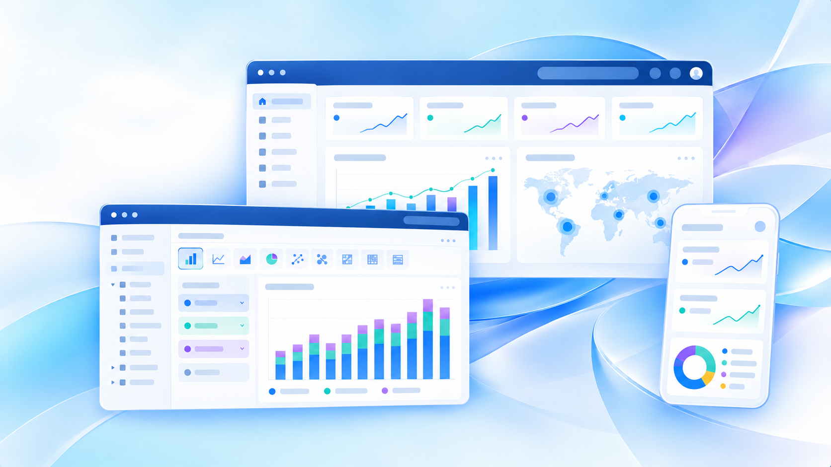
If you are searching for a powerbi dashboard tutorial, you are probably trying to answer a basic but important question: what exactly is a Power BI dashboard, and when should you use one instead of a report? That confusion is common for beginners because Power BI includes several content types—dashboards, reports, semantic models, apps, and workspaces—and they do not serve the same purpose.
In simple terms, a Power BI dashboard is a single-page view of key metrics and visuals designed for fast monitoring. It helps users check business status at a glance. A dashboard is not where most deep analysis happens. Instead, it works best as a summary layer that points users toward more detailed reports when they need answers.
For new users, this matters because many first projects go wrong for a simple reason: they try to make a dashboard do the job of a report.
Quick Comparison Table
Before getting into the tutorial, here is the fastest way to understand the topic.
| Criteria | Power BI Dashboard | Power BI Report |
|---|---|---|
| Main purpose | High-level monitoring | Detailed analysis |
| Structure | Single page | One or more pages |
| Best for | KPI tracking, status snapshots, executive visibility | Drill-down, filtering, investigation, decision support |
| Data view | Can bring together tiles from multiple sources | Typically built on a single semantic model |
| Interactivity | More limited | Much richer |
| Where beginners use it | Quick summary homepage | Main analysis workspace |
| Typical audience | Executives, managers, operational leads | Analysts, managers, business users |
| Best question it answers | “What is happening now?” | “Why is this happening?” |
Power BI dashboard tutorial for beginners: what a dashboard is and why it matters
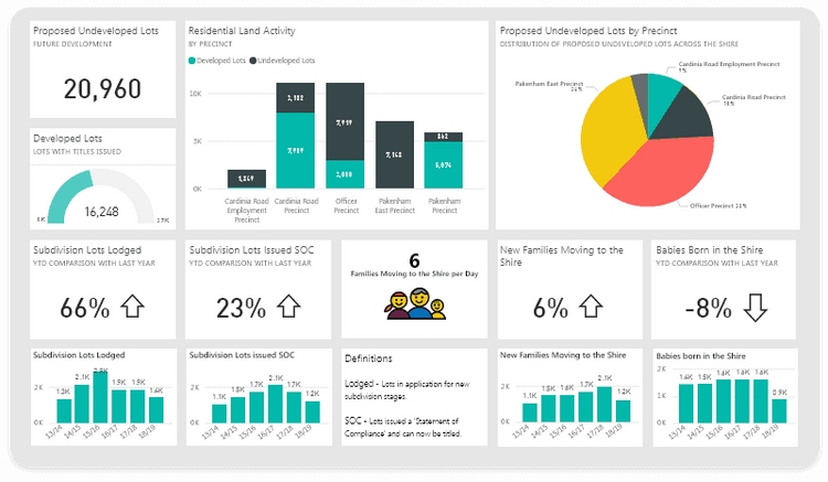
A Power BI dashboard is a one-screen canvas in the Power BI service that displays important business information through tiles. Those tiles may include KPI cards, charts, maps, gauges, text blocks, or images. The goal is to make key signals visible immediately.
Beginners often expect a dashboard to be the main place where they explore data. In practice, it is usually the opposite. A dashboard is more like a monitoring layer or entry point. It gives users a quick status check and, in many cases, allows them to click into a report for more detail.
What a Power BI dashboard is in simple terms
Think of a dashboard as the business equivalent of a control panel. You open it to see whether performance is on track:
- Revenue vs target
- Open support cases
- Inventory risk
- Conversion rate
- Daily sales trend
- Regional performance snapshot
A good dashboard answers the question: “What should I notice right now?”
Why beginners confuse dashboards, reports, datasets, and apps
Power BI can be confusing at first because several objects work together:
- Dashboard: a single-page summary in the Power BI service
- Report: a multi-page analytical asset with richer filtering and exploration
- Semantic model / dataset: the data foundation behind reports
- App: a packaged way to distribute content to end users
- Workspace: the collaboration area where content is built and managed
New users often assume these are interchangeable. They are not. The simplest way to remember it is:
- Data lives in the model
- Analysis lives in reports
- Monitoring lives in dashboards
- Distribution often happens through apps
What you can and cannot build with a dashboard
A Power BI dashboard can do a few things very well:
- Show KPIs on one screen
- Combine summary visuals from different reports or sources
- Support quick executive review
- Highlight thresholds and status changes
- Link users to deeper reports
But it also has clear limits. A dashboard is not the best place for:
- Detailed multi-step analysis
- Heavy use of slicers and filters
- Page-by-page storytelling
- Root-cause investigation
- Deep self-service exploration
That is where reports do better.
Dashboard vs report: the difference beginners need to understand first
This is the first distinction every beginner should learn. If you understand this well, you will avoid many common design mistakes.
What a dashboard does best
A dashboard works best when your audience needs high-level visibility without spending time exploring many pages.
Typical strengths include:
- Showing high-level KPIs
- Combining snapshots from one or more sources
- Supporting quick status checks
- Providing executive-style visibility
- Surfacing alerts or exceptions
For example, a sales leader may want to open one screen and instantly see:
- Total revenue this month
- Achievement vs target
- Top-performing region
- Pipeline coverage
- Weekly trend
That is a dashboard use case.
What a report does best
A report is better when the user needs to explore, question, compare, and investigate.
Reports are stronger for:
- Detailed filtering
- Drill-down and drill-through
- Multi-page analysis
- Comparing dimensions and segments
- Answering follow-up questions
- Supporting analyst workflows
For example, if sales dropped in one region, the dashboard may show the problem, but the report helps answer:
- Which products declined?
- Which sales reps were affected?
- Did the drop begin in one channel?
- Was it caused by fewer orders or smaller deal size?
That is a report use case.
A simple rule for choosing between them
Use this beginner rule:
- Use a dashboard when the goal is fast monitoring
- Use a report when the goal is investigation and decision support
If users need to ask “why,” “which segment,” or “what changed,” you probably need a report.
If users only need a fast visual pulse check, a dashboard may be enough.
How dashboards are created and shared in Power BI
A beginner-friendly tutorial should also explain the workflow. Many users build visuals in Power BI Desktop and then wonder why they cannot immediately create a dashboard there.
Where dashboards live and how users access them
A key point: Power BI dashboards live in the Power BI service, not in Power BI Desktop.
That means the usual flow looks like this:
- Build data models and report pages in Power BI Desktop
- Publish the report to the Power BI service
- Open the published report in a workspace
- Pin visuals from the report to a dashboard
- Share access with the right users
So if you are just starting, expect to need:
- A Power BI account
- Access to the Power BI service
- Permission to view shared content
- In some cases, the right license or workspace role depending on how content is managed
For viewers, the experience is usually straightforward: sign in, open the workspace or shared app, and view the available dashboard or report.
How tiles, pins, and visuals work together
A dashboard is made up of tiles. A tile is usually a visual pinned from a report, though other tile types may also be added.
The workflow is simple:
- Build a visual in a report
- Publish the report
- Pin that visual to a dashboard
- Arrange tiles to form a one-page executive view
This is why dashboards often reflect report design choices. The underlying report is still doing much of the analytical work.
However, tiles are not the same as full report visuals. They are more limited. Beginners sometimes expect dashboard tiles to behave like fully interactive report charts, and that leads to frustration.
Why designers should think about audience first
The best dashboard design starts with the audience, not the tool.
Ask these questions before placing a single tile:
- Who will open this dashboard?
- What 3 to 5 questions should it answer immediately?
- What decisions will viewers make from it?
- Which metric deserves the most visual prominence?
- What belongs in a report instead?
If the audience is an executive team, the layout should be clean and minimal. If the audience is operations, it may need more real-time status indicators and exception tracking.
Either way, a dashboard should feel instantly readable. If a user must study it for several minutes to understand what matters, the design is probably too dense.
Common mistakes beginners make with Power BI dashboards
Most beginner problems come from misusing the dashboard concept rather than from the software itself.
Treating dashboards like full reports
This is the most common mistake.
Beginners often try to put everything on one page:
- Too many charts
- Too much detail
- Too many dimensions
- Expectations of full report interactivity
But a dashboard is meant for summary, not full exploration.
If a user needs detailed slicers, multiple tabs, extensive drill-down, or side-by-side comparisons across many dimensions, build a report first and use the dashboard only as the front door.
Overloading the screen with too many visuals
A crowded powerbi dashboard becomes hard to read very quickly. When everything looks important, nothing stands out.
Common signs of overload include:
- More than a few competing KPIs
- Too many chart types in a small area
- Small labels that are hard to scan
- Weak spacing and alignment
- No obvious visual hierarchy
A stronger beginner approach is to focus on:
- One main business goal
- Three to five key KPIs
- One or two supporting trends
- One or two exception indicators
This keeps the screen useful instead of decorative.
Choosing dashboards when a report or template would work better
Sometimes a dashboard is simply the wrong starting point.
If your team needs reusable analytical layouts, filters by many business dimensions, or repeated departmental analysis, a report template or standard report design may be smarter.
Beginners also make the mistake of copying flashy examples from galleries without asking whether the layout matches the actual business question. A beautiful dashboard can still fail if it does not help someone make a decision.
So before copying any example, ask:
- What business problem does this layout solve?
- Is this for monitoring or analysis?
- Will my users understand it immediately?
- Could a simpler report do the job better?
Best uses, examples, and beginner-friendly next steps
Once you understand the dashboard vs report distinction, it becomes much easier to use Power BI more effectively.
When a dashboard is the right choice
A dashboard is a strong fit when one-screen visibility matters more than detailed analysis.
Good beginner use cases include:
- Executive KPI tracking
- Operational monitoring
- Sales snapshots
- Daily status checks
- Service performance monitoring
- Inventory or fulfillment overview
In each case, the viewer wants fast awareness rather than deep exploration.
For example, a sales snapshot dashboard might include:
- Monthly revenue
- Quota attainment
- Top region
- Pipeline trend
- Deals at risk
An operations dashboard might include:
- Open incidents
- SLA status
- Backlog volume
- Daily throughput
- Exception alerts
When a report is the better choice
A report is better when users need to investigate patterns and ask follow-up questions.
Use reports for:
- Trend analysis
- Root-cause investigation
- Customer or product segmentation
- Detailed financial review
- Self-service exploration
- Multi-page storytelling
If users need slicers, drill-through, detail tables, or multiple perspectives on the same issue, a report is usually the right format.

How to learn from examples without copying blindly
Studying examples is useful, but only if you learn the logic behind them.
When reviewing beginner-friendly dashboard examples, pay attention to:
- Where the main KPI is placed
- How many visuals appear on one screen
- Which charts support action vs decoration
- How color is used to show status
- Whether the dashboard is truly for monitoring
A better learning method is to compare a few simple use cases:
- Sales overview
- Finance summary
- Operations status
- HR headcount snapshot
Then build your own first version around a real question, not around a trendy layout.
Practical recommendations before you build your first dashboard
Here are five practical guidelines I would give any beginner team evaluating or building a powerbi dashboard.
1. Define one business purpose only
Do not try to track sales, finance, HR, and operations on the same dashboard unless the audience truly needs that. One dashboard should support one viewing context.
2. Limit the screen to essential KPIs
Start with the smallest useful set. If a metric does not trigger attention or action, it may not belong on the dashboard.
3. Design for scanning, not studying
The viewer should understand the situation in seconds. Use clear labels, logical grouping, and visual hierarchy.
4. Build the report first if analysis is required
If you are unsure whether to start with a dashboard or a report, build the report first. Then pin the most important visuals to a dashboard.
5. Validate with real users early
Ask actual viewers what they check first, what confuses them, and what actions they take after viewing the page. A useful dashboard is shaped by behavior, not just design preference.
When to consider alternatives for business-friendly dashboarding
Power BI is widely used and is a solid choice for many organizations, especially those already working in the Microsoft ecosystem. It supports strong reporting, broad data connectivity, and familiar sharing patterns for many teams.
That said, some organizations find that business adoption becomes harder when too much dashboarding and analysis work stays dependent on technical specialists. In those cases, teams may also consider platforms designed around broader self-service use.
Tools like Power BI are widely used in the BI market, but teams that need a more business-user-friendly, self-service BI platform may also consider FineBI.
Where FineBI fits for dashboard and self-service BI needs
FineBI is positioned around self-service BI, interactive dashboards, and business-user-oriented analysis. For teams that want more people outside the analyst group to explore data, build views, and iterate quickly, that can be a meaningful advantage.
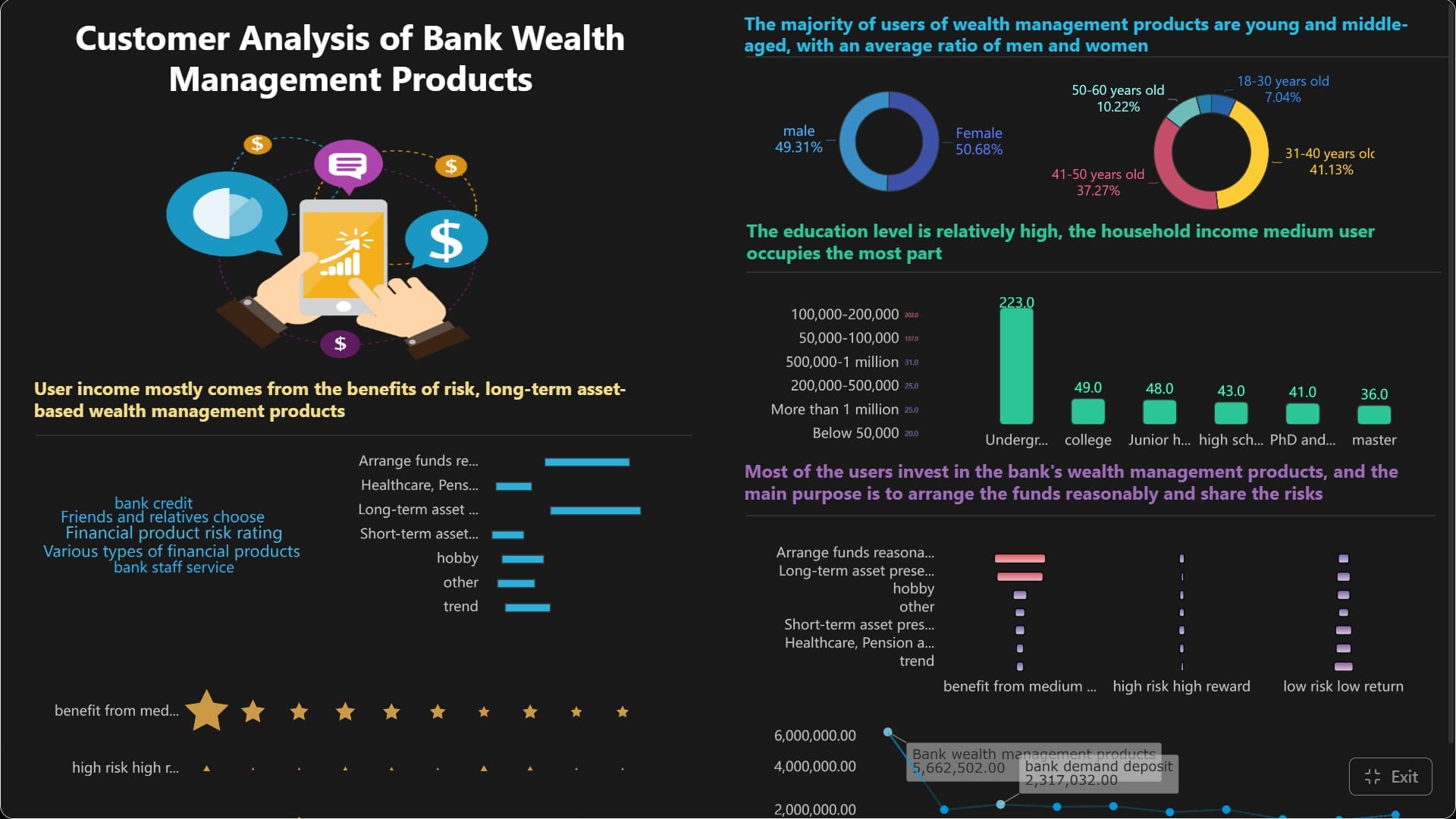
Relevant strengths include:
- Drag-and-drop dashboard creation
- Interactive analysis and drill-down
- Enterprise data connectivity
- Dashboard sharing and collaboration
- Faster iteration for business teams
- Support for both managed and self-service analytics scenarios
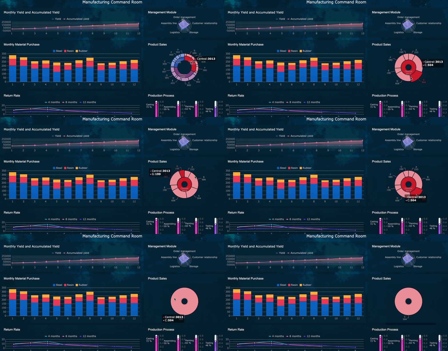 An Interactive Dashboard created by FineBI
This makes FineBI a practical option when the goal is not only to publish dashboards, but to help more departments participate in data analysis directly.
How Dora extends dashboards into Agentic BI
For organizations moving beyond static dashboard consumption, Dora adds an enterprise Data Agent layer on top of trusted data assets.
FineBI builds the trusted dashboard, metric, and semantic foundation. Dora then turns that foundation into a scenario-specific AI assistant or AI digital employee that helps people ask questions, generate summaries, analyze issues, and follow up through governed workflows.
This is useful for teams that want to move from:
- people opening dashboards manually
to - AI helping people ask, analyze, generate, push, alert, and follow up
Dora should not be viewed as a replacement for FineBI. It works with trusted BI assets and governed data logic to support Agentic BI scenarios such as:
- Data Analyst digital employee
- Report Researcher
- Daily Briefing Secretary
- Risk Alert Officer
In practical terms, this means a business team can build trusted dashboards in FineBI, then use Dora as an enterprise Data Agent to help turn metrics into monitored workflows, summaries, and guided next steps.
Get Ready-to-Use Dashboard Templates in Fine Gallery
Final thoughts on learning Power BI dashboards as a beginner
If you remember only one lesson from this tutorial, let it be this:
A dashboard is for monitoring. A report is for analysis.
That one distinction will help you design better, choose the right format faster, and avoid most beginner mistakes.
Power BI dashboards are useful when you need one-screen visibility for KPIs, status, and summary signals. Reports are better when users need filters, drill-down, and deeper answers. Once you stop treating them as the same thing, Power BI becomes much easier to use well.
If your organization is also evaluating broader self-service BI adoption, interactive dashboards for business users, or an AI-powered path from dashboards to governed Agentic BI workflows, FineBI + Dora is worth considering alongside traditional BI options.
FAQs
A Power BI dashboard is a single-page view in the Power BI service that shows important metrics and visuals in one place. It is mainly used for quick monitoring rather than deep analysis.