You walk into a grocery store and spot a recipe that uses grams, but your kitchen scale only shows ounces. In moments like this, a metric conversion chart saves the day. You quickly find the numbers you need and keep cooking stress-free. Using a chart for conversions feels practical and boosts your confidence. With digital tools likeFanRuan’sFineBI, you can make data-driven choices and handle conversions with ease. Anyone can master a metric conversion chart and use it every day.
A metric conversion chart is a simple tool that helps you switch between different metric measurements. You use it as a quick reference when you need to convert one metric unit to another. The chart lists the most common metric units for length, capacity, and weight. Each unit connects to a base unit in the metric system. For example, you see meters for length, liters for capacity, and grams for weight. Prefixes like kilo-, centi-, and milli- show you how much bigger or smaller each unit is compared to the base unit.
Here is a table that shows the most common metric units you will find on a standard metric conversion chart:
Unit Type
Base Unit
Common Metric Units
Length
meter (m)
kilometer (km), meter (m), centimeter (cm), millimeter (mm), nanometer (nm)
Capacity
liter (L)
kiloliter, liter, centiliter, milliliter
Weight
gram (g)
kilogram, gram, centigram, milligram
You can use this chart to move between metric measurements by shifting the decimal point. This makes the metric system easy to use for everyone.
Why Use a Metric Conversion Chart
You use a metric conversion chart because it saves time and reduces mistakes. When you work with metric measurements, you often need to convert between units. The metric system uses powers of ten, so you can make conversions quickly. In daily life, you might use the chart for cooking, shopping, or travel. In business, especially in manufacturing or analytics, you need accurate metric conversions to keep your data correct.
A metric conversion chart helps you avoid confusion. It gives you a clear reference for all your metric needs. You can trust the chart to guide you through any metric measurement challenge, whether you are at home or at work.
How to Use a Metric Conversion Chart
Using a metric conversion chart is easy when you follow clear steps. You can solve most measurement problems in daily life or business by following these instructions. Here is a simple guide to help you get accurate results every time.
Identify Units
Start by figuring out which units you want to convert. Look at your starting measurement and decide what unit you have. Then, choose the unit you want to end up with. For example, you might have a length in meters and need the answer in centimeters. This step is important because it sets the direction for your conversion.
Find the Conversion Factor
Next, check your metric conversion chart for the right conversion factor. The chart lists how each metric unit relates to others. For example, 1 meter equals 100 centimeters. Reliable sources, such as the National Institute of Standards and Technology (NIST), provide accurate conversion factors. Here is a table showing some trusted resources:
NIST Publication / Resource
Description
NIST SP 811 – Appendix B
Provides scientifically expressed conversion factors with guidance on their use and rounding rules.
NIST SP 1038
Lists recommended SI units and conversion factors for general use in trade and commerce.
NIST HB 44 – Appendix C
Contains conversion tables for length, area, volume, and mass between SI and U.S. customary units.
NIST HB 133 – Appendix E
Offers conversion factor tables for verifying net contents of packaged goods.
NIST Office of Weights and Measures & Metric (SI) Program
Offers comprehensive resources including software guidance, best practices, and educational materials on unit conversions.
You can trust these sources for the most up-to-date and accurate metric information.
Calculate the Conversion
Now, use the conversion factor to do the math. Here is a step-by-step process you can follow:
Identify the units you want to convert from and to.
Locate the correct conversion factor on your metric conversion chart.
Decide if you need to multiply or divide:
Multiply when you go from a larger unit to a smaller unit (for example, meters to centimeters).
Divide when you go from a smaller unit to a larger unit (for example, centimeters to meters).
Apply the calculation to your original measurement.
Double-check your answer to make sure the units and the result make sense.
Tip: Always check your work. If the answer seems too big or too small, review your steps and the conversion factor.
For example, if you have 2 meters and want to know how many centimeters that is, you multiply 2 by 100. The answer is 200 centimeters.
If you work with business data, you can use digital tools likeFineBI by FanRuan. FineBI helps you automate and visualize conversions. You can connect your data, set up conversion rules, and see the results in real time. This makes it easy to handle large amounts of metric data without manual calculations. FineBI also helps you avoid mistakes and saves you time, especially when you need to process many conversions at once.
By following these steps, you can use a metric conversion chart with confidence. Whether you are cooking, shopping, or analyzing business data, you will get accurate results every time.
Metric Conversion Chart Process
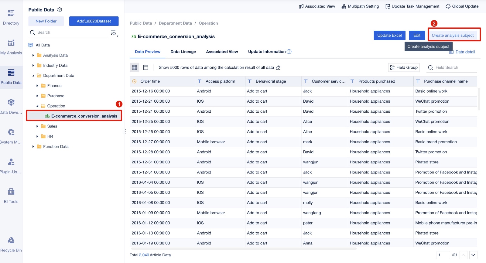
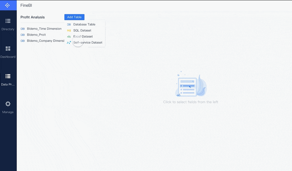
Creating a Self-service Dataset
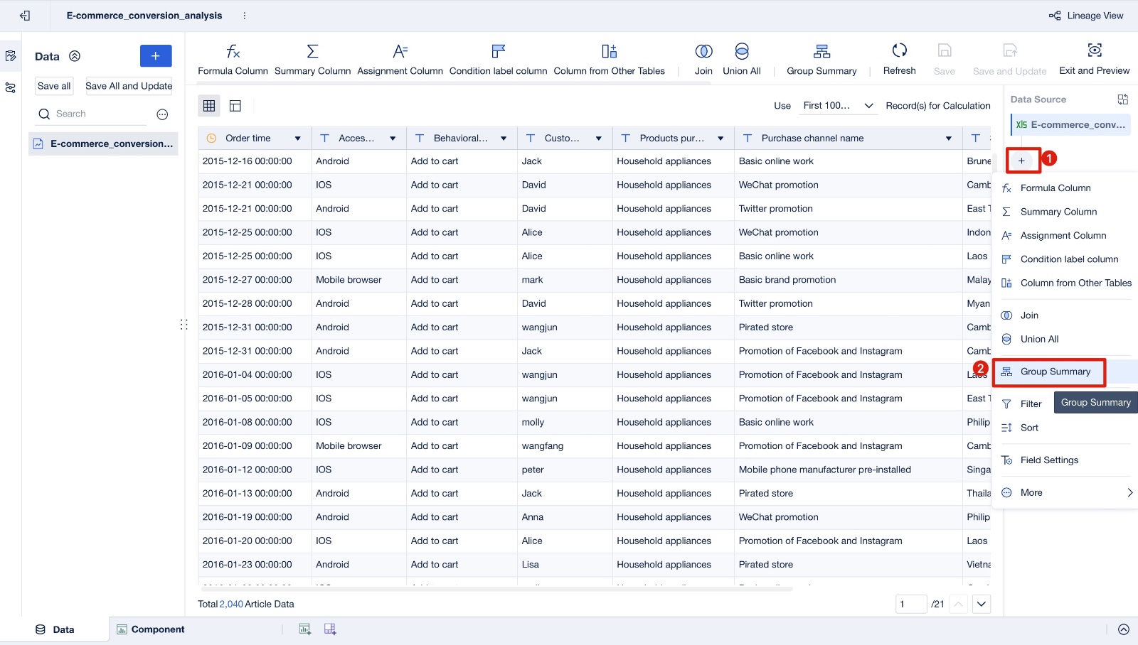
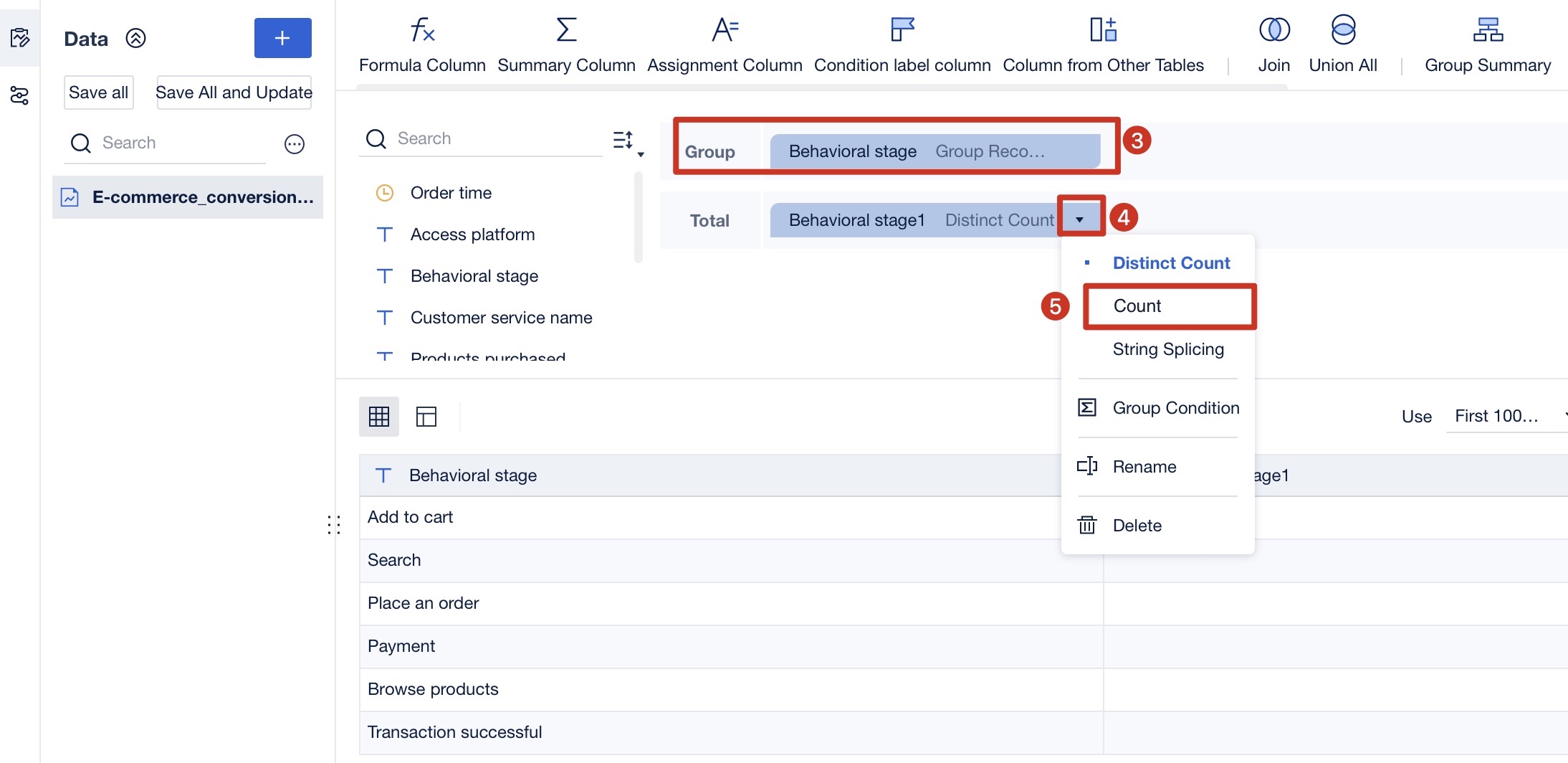
You start by building a self-service dataset. This process lets you organize your data for easy analysis. First, join your base event table, such as VISITS, with your conversion event table, like BUYS. Match user identifiers and filter conversions that happen within a set time window, such as seven days after a visit. Next, use window functions to link each conversion event to the closest visit. Remove duplicates by selecting only unique pairs. Finally, aggregate your data to count total conversions and opportunities, then join these results to calculateconversion rates. You can also customize your metrics by handling null values or defining specific join conditions.
Counting Users in Different Behavior Stages
Counting users at each stage of their journey helps you understand how they interact with your product. Accurate metric conversions make this possible. The table below shows how this approach benefits your analysis:
Benefit/Use Case
Explanation
Pinpointing Nth user action
Identify if a user acts for the first time or repeatedly
Identifying friction points
Detect where users drop off or face issues
Segmenting users by behavior
Classify users based on action frequency
Funnel and retention analysis
Analyze user progression and optimize funnels
Improving overall metrics
Address stage-specific issues to boost conversion rates and retention
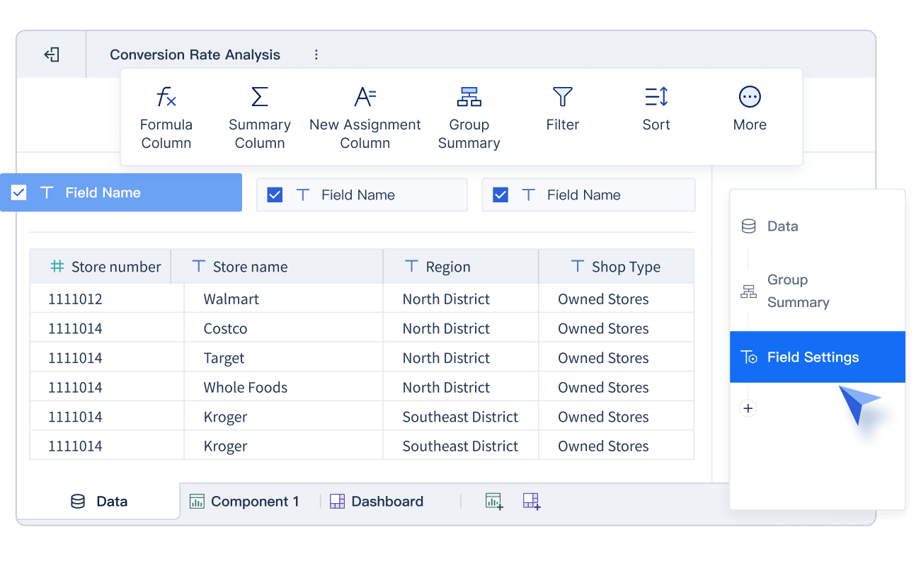
Sorting
Sorting your data helps you see trends and patterns. You can arrange users by the time of their actions or by the number of conversions they complete. This step makes it easier to spot where users move forward or drop off in the process.
Joining
Joining datasets brings all your important information together. When you combine data from different sources, you get a complete view of yourconversion metrics. This centralization allows you to track and analyze conversions more effectively, leading to better decisions.
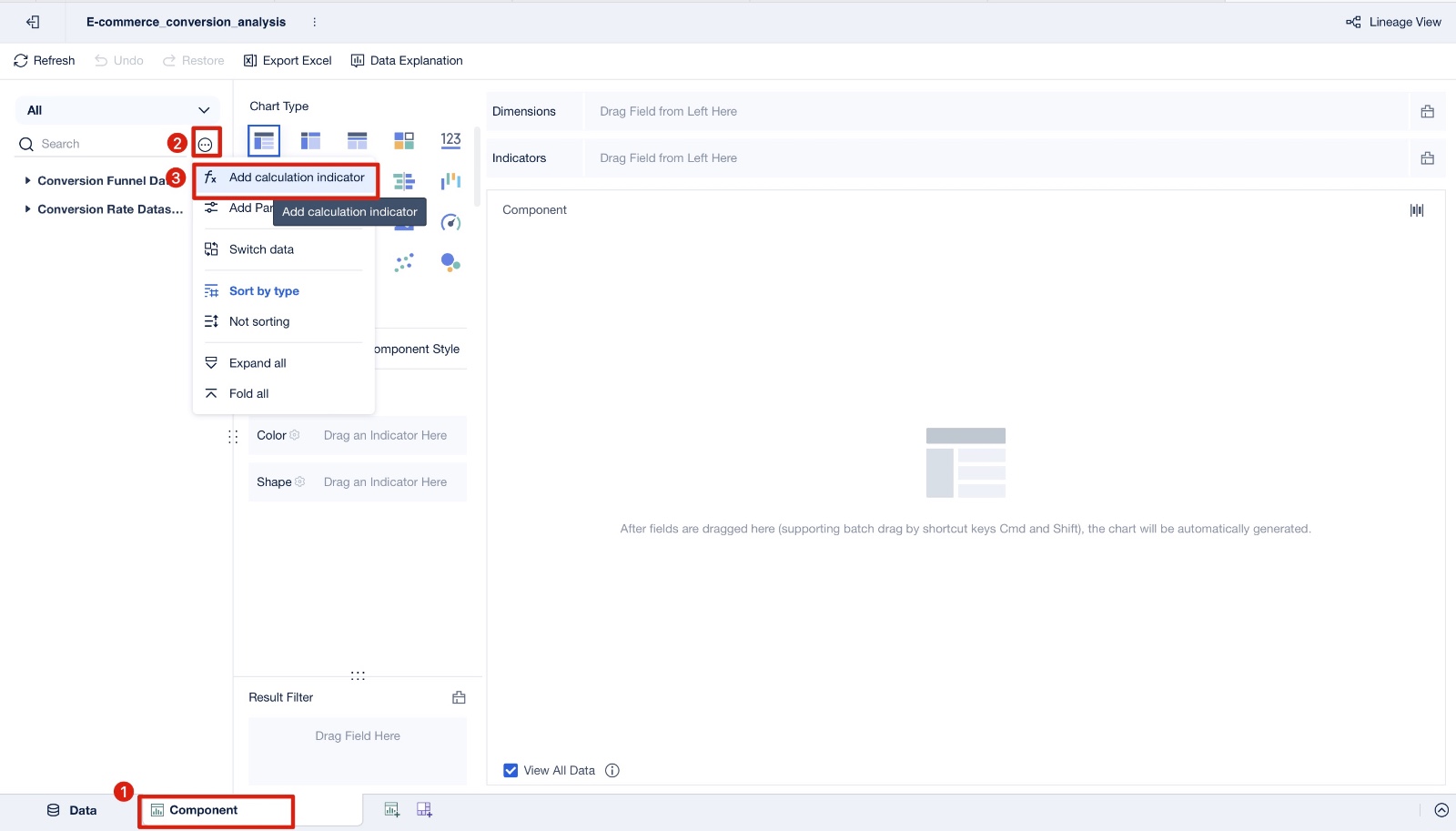
Creating a Calculation Indicator
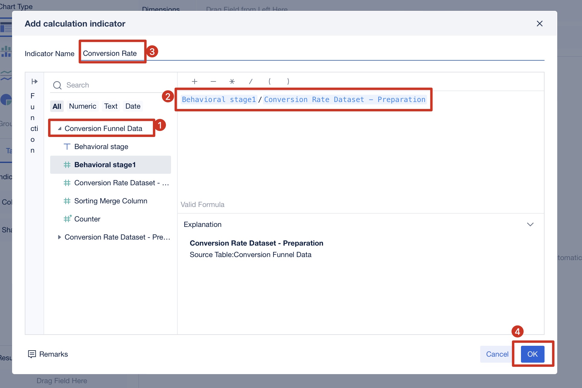
Click Component, click to add a calculation indicator, select Conversion Funnel Data, and enter the formula Behavioral stage 1 / Conversion Dataset - Preparation - Stage 1.
Name the indicator Conversion Rate, and click OK, as shown in the figure below:
You create calculation indicators to measure conversion rates at each stage. These indicators show you how many users move from one step to the next. By tracking these numbers, you can see which parts of your process work well and which need improvement.
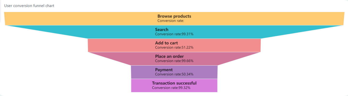
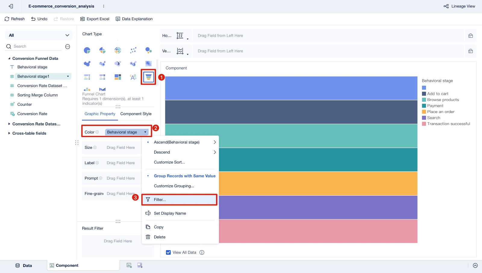
Creating a Funnel Chart
Funnel charts help you visualize the conversion process. You see each step of the user journey and the rate at which users move forward. These charts highlight where users drop off, making it easy to identify friction points. You can also compare different user paths or channels to find the most effective strategies. Funnel charts make your data clear and actionable, so you can focus on improving conversions.
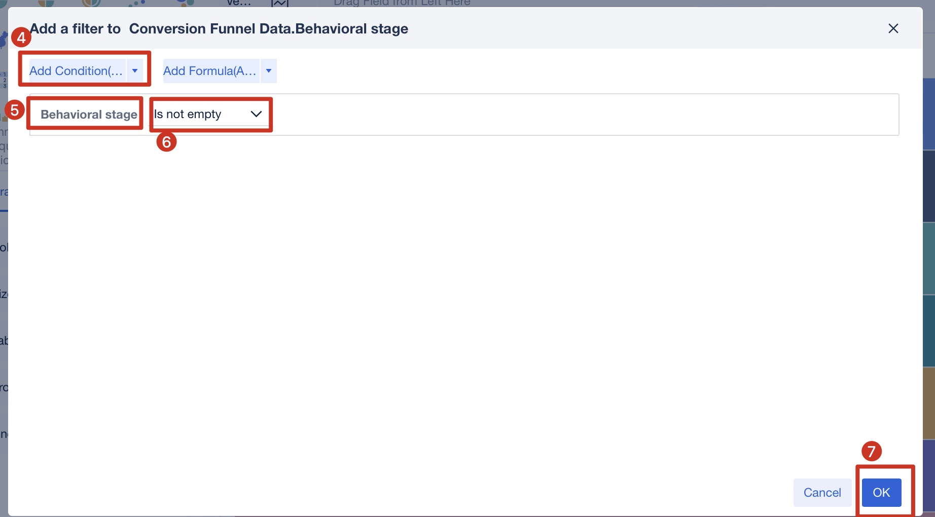
Choose the chart type as funnel chart, drag Behavioral stage into Color (you can also customize the color), and set the filter condition to Is not empty, click OK, as shown in the following image:
Drag Behavioral stage 1 into Size, and rename it Number. Drag Behavioral stage, Conversion Rate, and Behavioral Stage 1 into Label. Rename Behavioral stage as Final behavior stage and set the color and font. Drag Behavioral stage into Fine-grained and sort in descending order by Number, as shown in the following figure:
You often use a metric conversion chart in your kitchen. Many people keep these charts on the fridge or inside a cupboard for quick access. When you follow a recipe from another country, you may need to convert grams to ounces or Celsius to Fahrenheit. Baking requires precise measurements, so you rely on the chart to convert between cups, tablespoons, teaspoons, ounces, and grams. This helps you avoid mistakes and ensures your cake or bread turns out right.
You can quickly check how many grams are in a stick of butter or how many milliliters are in a cup.
The chart helps you adjust recipes for different pan sizes by converting batter volumes.
When shopping, you use the chart to understand package weights and compare prices.
You save time because you do not need to search online for every conversion.
A metric conversion chart makes practical measurements easy and accurate, especially when you adapt recipes from online sources or different countries.
Travel and Fitness
Travelers and athletes use metric charts every day. When you plan a trip, you may need to convert kilometers to miles or liters to gallons. If you run or bike, you track your distance using the metric system. You use the chart to convert your running distance from kilometers to miles or check your pace per kilometer.
Measuring length is important when you read road signs or plan routes in countries that use the metric system.
You might convert your body weight from pounds to kilograms for fitness tracking.
Fitness apps often use metric units, so a chart helps you understand your progress.
Metric conversion charts help you stay on track with your goals and make sense of measurements in new places.
Manufacturing and Business with FineBI
In manufacturing and business, you need accurate metric conversions for data analysis. FineBI by FanRuan helps you automate these conversions and visualize results. You can connect your business data, set up conversion rules, and see real-time analytics. This is useful for measuring length, measuring mass, and tracking production metrics.
Tips and Common Mistakes of Metric Conversion Chart Making
Quick Tips
You can make metric conversions easier by using a few simple tricks. First, remember that the metric system works in powers of ten. This means you often just move the decimal point to convert between units. For example, to go from meters to centimeters, move the decimal two places to the right because there are 100 centimeters in a meter.
Tip: Use the phrase “King Henry Died By Drinking Chocolate Milk” to remember the order of metric prefixes: kilo-, hecto-, deca-, base, deci-, centi-, milli-. Each step left or right means multiplying or dividing by ten.
When you work with measurements, always write down the unit. This helps you avoid confusion, especially if you switch between metric and other systems. Double-check your calculations by reversing the conversion. If you convert 2 meters to 200 centimeters, try converting 200 centimeters back to meters to see if you get the original number.
In business or data analysis, use digital tools like FineBI to automate metric conversions. These tools help you keep your measurements accurate and consistent across large datasets.
Many people make the same mistakes when working with metric conversion charts. Here are some common errors and how you can avoid them:
Not defining your goal: If you do not know what you want to measure, your chart or graph can become confusing. Always decide what you want to show before you start.
Overcrowding data:Putting too many measurements or data points in one chart makes it hard to read. Split complex data into smaller, clearer charts.
Choosing the wrong chart type:Using a line graph for counts or percentages can mislead you. Pick the chart that matches your metric data.
Incorrect aggregation: Summing measurements like percentages or times can give you the wrong answer. Use averages or percentiles when needed.
Forgetting time context: Counts need a time window. Use bar graphs to show counts over time, not line graphs.
Skipping double-checks: Always review your results. Double-checking helps you catch errors, keep your data complete, and ensure your metric measurements stay consistent.
Note: Regularly check your data for duplicates or missing values. This keeps your metric conversions reliable and your business decisions sound.
By following these tips and watching out for common mistakes, you can handle metric measurements with confidence in daily life and business.
Using a metric conversion chart makes your daily tasks and business decisions easier. You can track conversion rates, spot drop-off points, and measure customer value with confidence. FineBI by FanRuan streamlines your conversions and analytics, helping you make smarter choices.
Practice with worksheets, games, and interactive tools to build your skills.
Explore guides, training kits, and real-life examples to boost your confidence. Regular practice helps you master metric conversions and apply them in any situation.
Click the banner below to try FineBI for free and empower your enterprise to transform data into productivity!
Smarter product, pricing, and inventory management across retail sectors.
FAQ
How do you choose the right conversion factor on a metric chart?
You look for the units you want to convert between. Find the row or column that matches your starting unit and target unit. The chart shows you the correct conversion factor.
Can you use FineBI for metric conversions in business data?
Yes, you can. FineBI lets you automate metric conversions. You connect your data, set up conversion rules, and see results in real time. This saves you time and reduces errors.
What should you do if you get a strange conversion result?
Double-check your units and the conversion factor. Make sure you multiply or divide correctly. If the answer still looks wrong, try reversing the conversion to see if you get your original number.
Why is it important to double-check metric conversions in business?
You avoid costly mistakes by double-checking. Accurate conversions keep your reports and analytics correct. This helps you make better decisions and keeps your business running smoothly.
Where can you find reliable metric conversion charts?
You can find reliable charts from trusted sources like the National Institute of Standards and Technology (NIST). Many educational websites and business tools, such as FineBI, also provide accurate conversion resources.