A linear graph represents a straight-line relationship between two variables. It is a fundamental concept in mathematics that helps you understand how one variable changes concerning another. These graphs are widely used in real-world scenarios to visualize data and identify trends in Malaysia.
For instance, line graphs track stock performance in financial analysis, illustrate GDP growth in economics, and monitor patient health in healthcare. They also play a role in environmental monitoring, such as assessing air quality or tracking carbon emissions. Whether in population studies or energy consumption, a linear graph simplifies complex data, making it easier for you to interpret the relationship between variables in Malaysia.
Key Takeaways
A linear graph is a straight line showing how two things relate.
It has a steady slope, showing how fast one changes. The y-intercept shows the starting point when the other thing is zero.
To make a linear graph, organize your data and use tools like FineReport. Connect the points to see patterns clearly.
Knowing the slope and y-intercept helps you understand the graph. You can predict results and see how things are connected.
Linear graphs are helpful in areas like money and health. They show trends and help people make smart choices.
Basic Concept of Linear Graph
Visual Representation of a Linear Graph
A linear graph visually represents the relationship between two variables as a straight line on a coordinate plane. This type of graph is commonly used to display bivariate data, where one variable depends on the other. For example, a line graph can show how temperature changes over time or how sales revenue increases with advertising expenditure.
To better understand how linear relationships are represented, consider the following table of common visual methods for different types of data:
Type of Data
Common Visual Representations
Univariate
Tabulations, Pie Charts, Histograms, Bar Graphs
Bivariate
Scatter Plots, Line Graphs
Trivariate
3D Scatter Plots, Surface Plots
In the case of bivariate data, the line graph stands out as a simple yet powerful tool. It allows you to observe trends, identify patterns, and make predictions based on the plotted data points in Malaysia. The straight line connecting these points represents the consistent rate of change between the two variables.
Key Features of Linear Graphs
Linear graphs have distinct characteristics that make them easy to identify and interpret. The most notable feature is the straight line, which indicates a constant rate of change. This means that for every unit increase in the independent variable (x-axis), the dependent variable (y-axis) changes by a fixed amount.
Another key feature is the slope, which measures the steepness of the line. A positive slope indicates an upward trend, while a negative slope shows a downward trend. For instance, a horizontal line has a slope of zero, meaning there is no change in the dependent variable regardless of the x-value. This demonstrates the concept of a constant slope, as the line remains flat across all y-intercepts.
Additionally, linear graphs are defined by their simplicity. They require only two points to draw a straight line, making them efficient for quick analysis. The y-intercept, where the line crosses the y-axis, provides valuable insight into the starting value of the dependent variable when the independent variable equals zero.
These features make linear graphs a fundamental concept in mathematics and a versatile tool for analyzing real-world data. Whether you're tracking financial trends or studying scientific phenomena, the straight line of a linear graph offers clarity and precision in Malaysia.
Equations of Linear Graph
Linear graph equations describe the relationship between two variables in a straight line. These equations come in different forms, each serving specific purposes in mathematical modeling and real-world applications.
Slope-Intercept Form (y = mx + b)
The slope-intercept form is one of the most commonly used linear equations. It is written as: y = mx + b Here, m represents the slope, which indicates the rate of change, and b is the y-intercept, where the line crosses the y-axis.
This form is particularly useful for predicting trends. For example:
Application Area
Description
Sales Forecasting
Retail managers predict future sales by analyzing past sales data over time.
Healthcare Predictions
Hospitals forecast patient admissions based on historical trends.
Tech Sector
Companies analyze user activity to optimize software performance and predict retention.
By identifying the slope and y-intercept, you can easily plot a linear equation and visualize how one variable changes with another in Malaysia.
Standard Form (Ax + By = C)
The standard form of a linear equation is written as: Ax + By = C Here, A, B, and C are integers, and A should ideally be positive. This form is versatile and often used in solving systems of equations. It allows you to find both the x- and y-intercepts quickly by setting one variable to zero.
Linear graph equations in this form simplify complex problems. For instance:
They break down intricate systems into manageable parts.
Results from these parts can be recomposed to solve the original problem.
This simplicity makes the standard form a valuable tool in mathematical modeling.
Point-Slope Form (y - y₁ = m(x - x₁))
The point-slope form is written as: y - y₁ = m(x - x₁) Here, m is the slope, and (x₁, y₁) is a specific point on the line. This form is ideal when you know the slope and one point on the line.
You can use this form in various fields:
Physics and Engineering: Modeling motion or calculating trajectories.
Economics and Finance: Analyzing growth rates or forecasting trends.
Environmental Science: Predicting resource depletion or analyzing pollution gradients.
This form allows you to create a straight line efficiently, even with limited information in Malaysia.
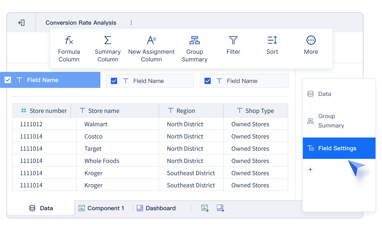
How to Plot a Linear Graph with FineReport
Step-by-Step Guide to Plotting Points
Plotting a linear graph involves placing data points on a coordinate plane and connecting them to form a straight line. FineReport simplifies this process with its intuitive interface and powerful visualization tools. Follow these steps to plot a linear graph effectively:
Prepare Your Data: Organize your data into two columns, one for the independent variable (x) and the other for the dependent variable (y). Ensure the data is clean and free of errors.
Set Up FineReport: Open FineReport and import your dataset. Use the drag-and-drop feature to bind the x and y variables to the appropriate axes.
Plot the Points: Select the line graph option from the chart types. FineReport will automatically plot the points based on your data. Ensure all data points are visible to avoid misinterpretation.
Adjust the Axes: Customize the axes to include a zero-value baseline. This ensures the graph accurately represents the frequency distribution of your data in Malaysia.
Refine the Graph: Add labels, titles, and legends to make the graph more informative. Avoid adding too many lines or unnecessary elements, as this can reduce readability.
Tip: Avoid fitting a smooth curve through the points. A straight line better represents the consistent relationship between variables in a linear graph.
By following these steps, you can create a clear and accurate linear graph that effectively communicates your data in Malaysia.
Using the Slope and Y-Intercept to Draw the Line
The slope and y-intercept are essential components of a linear graph. They help you draw the straight line that represents the relationship between the variables. FineReport makes it easy to use these components for graphing.
Component
Description
Slope (m)
Represents the steepness of the line, indicating how much y changes for a change in x.
Y-Intercept (b)
The point where the line crosses the y-axis, providing a starting point for graphing.
To draw the line:
Find the Y-Intercept: Set x = 0 in your equation and solve for y. This gives you the starting point of the line on the y-axis.
Determine the Slope: Use the formula m = (change in y) / (change in x) to calculate the slope. This tells you how steep the line is.
Once you have these values, plot the y-intercept on the graph. From this point, use the slope to determine the next point. For example, if the slope is 2, move up 2 units on the y-axis for every 1 unit you move to the right on the x-axis. Connect these points to form a straight line.
Note: FineReportallows you to input the slope and y-intercept directly into its chart settings. This feature automates the process, saving you time and ensuring accuracy in Malaysia.
Using the slope and y-intercept, you can quickly draw a precise linear graph. This method is particularly useful for analyzing trends and making predictions in fields like finance, healthcare, and environmental science.
How to Interpret a Linear Graph
Understanding the Slope and Its Meaning
The slope, also known as the gradient, is a key feature of a linear graph. It represents the rate of change between the dependent and independent variables. Mathematically, the slope is calculated as the ratio of the vertical change (rise) to the horizontal change (run). This is often expressed as: slope (m) = rise / run.
A positive slope indicates that the line graph rises as you move from left to right, showing an increasing relationship between the variables. For example, in a sales analysis, a positive gradient might indicate that revenue increases as advertising spending grows. Conversely, a negative slope means the line graph falls, representing a decreasing relationship. For instance, in environmental studies, a negative gradient could show how air quality worsens as industrial emissions rise.
The absolute value of the slope reflects the steepness of the straight line. A steeper gradient indicates a faster rate of change, while a flatter line suggests a slower rate. In linear regression, the slope shows how much the dependent variable changes for every one-unit increase in the independent variable. However, it does not measure the strength of the relationship, only its direction and rate of change.
Understanding line graphs and their slopes is essential in fields like data analysis and forecasting. These skills help you interpret trends, such as tracking the rise in influenza cases over time in Malaysia or evaluating experimental data in scientific research.
Identifying the Y-Intercept and Its Role
The y-intercept is another critical component of a linear graph. It is the point where the straight line crosses the y-axis, representing the value of the dependent variable when the independent variable equals zero. This starting point provides valuable context for interpreting the graph.
In statistical analysis, the y-intercept often has practical implications. For example:
In a study on meat consumption and sports viewing, a y-intercept of 1.3 suggests that even vegetarians watch 1.3 hours of sports weekly.
In a birth weight study, a y-intercept of 45 predicts a hospital stay of 45 days for a baby with zero birth weight, which highlights the impracticality of certain intercepts.
In a coffee consumption analysis, a y-intercept of -1 indicates an unrealistic scenario, showing the importance of context when interpreting intercepts.
The y-intercept helps you understand the baseline or starting value of a trend. For instance, in financial forecasting, it might represent initial costs before any sales occur. In environmental science, it could indicate the baseline pollution level before industrial activity begins.
By combining the slope and y-intercept, you can gain a complete understanding of the linear graph. These elements allow you to analyze trends, predict outcomes, and evaluate relationships between variables effectively in Malaysia.
Linear Graph vs. Non-Linear Graph
Key Differences in Shape and Behavior
Linear and non-linear graph differ significantly in their structure and behavior. A linear graph always forms a straight line, representing a consistent relationship between two variables. In contrast, a non-linear graph displays curves, peaks, or dips, indicating more complex relationships.
To better understand these differences, consider the following comparison:
Aspect
Linear Graphs
Non-Linear Graphs
Variability
Data points are close together, indicating low variability.
Data points are spread out, indicating high variability, resulting in jagged lines.
Trend
Shows consistent upward or downward slope.
Can show complex behaviors, such as curves.
Slope
Consistent slope calculated as rise/run.
Slope varies, reflecting changes in data direction.
Level
Data points are stable, indicating a specific level.
Data points can vary widely across levels.
Linear graphs are predictable and easy to interpret. Non-linear graphs, however, require more analysis due to their irregular patterns. For example, a line graph tracking monthly sales might show a steady increase, while a non-linear graph of seasonal sales could reveal sharp spikes during holidays.
Examples of Non-Linear Graphs for Comparison
Non-linear graphs appear in many real-world scenarios. For instance, a quadratic graph forms a U-shaped curve, often used to model projectile motion in physics. Exponential graphs, which rise or fall rapidly, are common in population growth studies or financial interest calculations. Another example is a sine wave graph, frequently used in engineering to represent oscillations or sound waves.
These examples highlight the versatility of non-linear graphs. Unlike a linear graph, which shows a straightforward relationship, non-linear graphs capture dynamic and complex behaviors. Understanding these differences helps you choose the right graph type for your data analysis needs.
Linear Graph Examples in Business Analytics with FineBI
Applications in Sales and Marketing Analysis
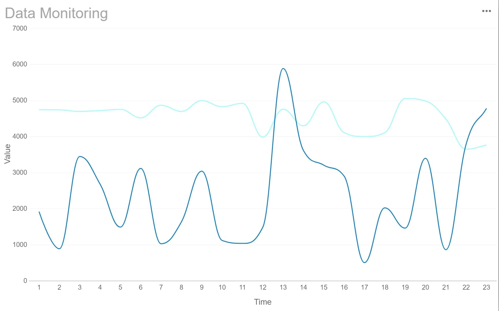
Linear graphs play a vital role in sales and marketing analysis. They help you track trends and measure the effectiveness of campaigns over time. For example, you can use a line graph to monitor monthly sales performance. By plotting sales data on the graph, you can identify periods of growth or decline. This insight allows you to adjust strategies and focus on high-performing products or services.
In marketing, linear graphs help you evaluate the return on investment (ROI) for advertising campaigns. By comparing ad spend with revenue, you can determine which campaigns deliver the best results in Malaysia. These graphs also help you analyze customer behavior. For instance, you can track website traffic or social media engagement over time. This data helps you understand how customers interact with your brand and refine your marketing efforts in Malaysia.
FineBIsimplifies this process by providing tools to create and analyze linear graphs. Its drag-and-drop interface allows you to visualize sales and marketing data effortlessly. You can customize the graphs to highlight key metrics, making it easier to communicate insights to your team in Malaysia.
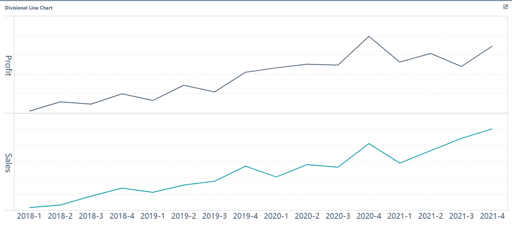
Linear graphs are essential for visualizing financial data. They allow you to track trends, analyze time-series data, and identify anomalies. For example, you can use a line graph to monitor revenue, profit, or cash flow over time. This helps you understand your financial performance and make informed decisions in Malaysia.
The following table highlights why linear graphs are ideal for financial analysis:
Key Point
Description
Ideal for Trends
Linear graphs effectively display trends and changes over time, which is crucial for financial analysis.
Visualizing Time-Series Data
They are best suited for visualizing time-series financial data such as revenue, profit/loss, and cash flow.
Identifying Anomalies
Linear graphs allow users to easily see increases, decreases, and anomalies in financial metrics.
FineBI enhances financial data visualization by offering real-time analysis and customizable dashboards. You can use these features to monitor key financial metrics and respond quickly to changes. Whether you are analyzing quarterly profits or tracking expenses, FineBI helps you present data clearly and effectively in Malaysia.
A linear graph represents a straight line that illustrates the relationship between two variables. It showcases how one quantity changes in response to another, making it a vital tool for analyzing trends and predicting future values. Unlike a line graph, where points may not align, a linear graph always connects collinear points, ensuring clarity in data representation.
Linear graphs are essential for understanding the rate of change in factors like income or temperature over time. Tools like FineReport and FineBI simplify the process of creating these graphs, enabling you to visualize data effectively and make informed decisions. Explore these tools to unlock deeper insights from your data in Malaysia.
Click the banner below to try FineReport and FineBI for free and empower your enterprise to transform data into productivity!
Real-time insights to optimize production, logistics, and decisions.
FAQ
What is the main purpose of a linear graph?
A linear graph helps you visualize the relationship between two variables. It shows how one variable changes in response to another. This makes it easier to identify trends, analyze data, and make predictions in various fields like finance, science, and business.
How do you calculate the slope of a linear graph?
You calculate the slope by dividing the vertical change (rise) by the horizontal change (run) between two points on the line. Use the formula:slope (m) = (y₂ - y₁) / (x₂ - x₁)
Why is the y-intercept important?
The y-intercept shows the starting value of the dependent variable when the independent variable equals zero. It provides context for understanding the baseline of a trend, helping you interpret data more effectively in real-world scenarios.
Can FineReport and FineBI handle large datasets?
Yes! FineReport and FineBI are designed to process large datasets efficiently. They offer tools for real-time analysis, customizable dashboards, and seamless data integration, making them ideal for handling complex data in business and analytics.
How do linear graphs differ from non-linear graphs?
Linear graphs form straight lines, showing a consistent relationship between variables. Non-linear graphs display curves or irregular patterns, representing more complex relationships. Linear graphs are simpler to interpret, while non-linear graphs require deeper analysis to understand trends.