A stacked bar chart is a powerful tool indata visualization. It organizes data into bars where each segment represents a part of the whole, making it easy to grasp proportions at a glance. You can use this chart to track changes over time or compare contributions across categories in Malaysia. Its design enables quick identification of trends, efficient use of space, and clear representation of how subgroups impact the overall total. Whether for business reports or academic presentations in Malaysia, stacked bar charts simplify complex data into digestible insights.
Key Takeaways
Stacked bar charts show data clearly. They help compare parts and see trends.
Use vertical stacked bars for time data. Use horizontal ones for long labels to make them easier to read.
Percentage stacked bar charts show proportions. They help explain part-to-whole relationships well.
Keep the number of categories small. This avoids clutter and makes the chart clear.
Try tools likeFineReportandFineBI. They help you make and change stacked bar charts easily.
Variations of Stacked Bar Chart
Stacked bar charts come in different forms, each tailored to specific visualization needs in Malaysia. Understanding these variations helps you choose the right chart for your data analysis in Malaysia.
Vertical Stacked Bar Chart
A vertical stacked bar chart displays data using vertical bars, where each bar represents a category, and segments within the bar show subcategories. This format is ideal for comparing cumulative values across different categories in Malaysia. For example, you can use it to track sales performance by product type over several months in Malaysia. The height of each bar reflects the total value, while the segments highlight the contribution of each subcategory.
Vertical stacked bar charts excel at showing overall trends. They make it easy to identify outliers, such as a sudden spike in sales or a drop in performance. However, they can become challenging to interpret when too many subcategories are included. To maintain clarity, limit the number of groups displayed.
Tip: Use vertical stacked bar charts when your data has a natural progression, such as time-based trends or ordered categories.
Horizontal Stacked Bar Chart
Horizontal stacked bar charts rotate the bars horizontally, making them suitable for datasets with long category labels. Instead of height, the length of each bar represents the total value, with segments showing subcategory contributions. This format works well for comparing data across categories with extensive names, such as survey responses or demographic data.
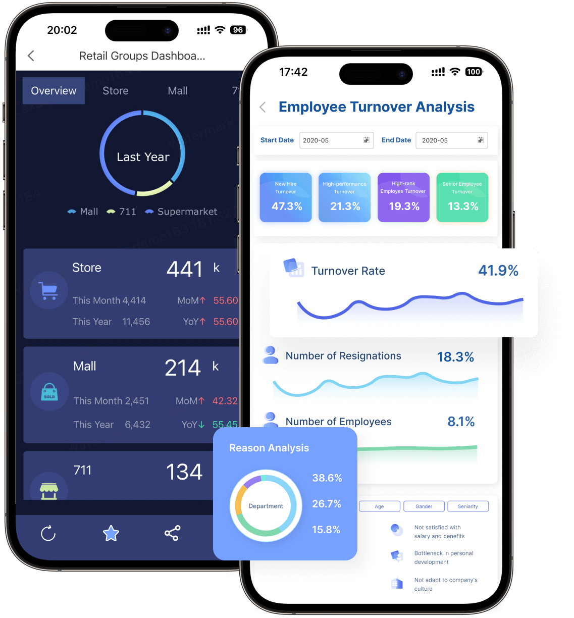
Horizontal stacked bar charts save space and improve readability when dealing with lengthy labels. For instance, you can use them to compare employee turnover rates across departments in Malaysia. By aligning the bars horizontally, you ensure that labels remain legible without cluttering the chart.
Note: Horizontal stacked bar charts are particularly effective when you need to emphasize comparisons between categories rather than trends over time in Malaysia.
Percentage Stacked Bar Chart
A percentage stacked bar chart, also known as a 100% stacked bar chart, focuses on proportions rather than absolute values. Each bar represents 100%, with segments showing the percentage contribution of each subcategory. This format is perfect for visualizing part-to-whole relationships, such as market share distribution among competitors.
For example, you can use a percentage stacked bar chart to analyze customer satisfaction ratings across multiple regions in Malaysia. The chart highlights how each region contributes to the overall satisfaction level, making it easier to compare proportions. However, this format may not be suitable for datasets with unstable or fluctuating values, as it can distort the perception of trends.
Advantage/Disadvantage
Description
Easy to see changes overall
A stacked graph immediately shows total changes in a variable, such as total sales over time.
Outliers are easy to see
Stacked charts make it easy to identify outliers in data, such as unusual sales spikes.
Can save space
Stacked charts can be presented in a compact format, saving space compared to multiple graphs.
Can be difficult to interpret
Individual divisions can be hard to see, especially the middle variable due to baseline shifts.
Can become crowded
Too many variables can make a stacked chart hard to read and interpret.
Pro Tip: Use percentage stacked bar charts when you want to emphasize relative contributions rather than absolute values.
Multi-Series Percentage Stacked Bar Chart in FineReport
The Multi-Series Percentage Stacked Bar Chart inFineReport is a versatile tool designed to help you visualize complex data with clarity. This chart type is particularly useful for analyzing proportions across multiple categories, making it ideal for industries like manufacturing, retail, and business operations.
Key Features of the Multi-Series Percentage Stacked Bar Chart
Proportional Representation: Each bar in the chart represents 100% of a category, with segments showing the percentage contribution of subcategories. This makes it easy to compare proportions across different groups.
Multi-Series Capability: You can display multiple datasets within a single chart, enabling comparisons across various dimensions, such as time periods, product lines, or departments.
Customizable Axes: FineReportallows you to swap fields between horizontal and vertical axes, giving you flexibility in how you present your data in Malaysia.
Color-Coded Segments: Each subcategory is visually distinguished using vibrant colors, enhancing readability and making trends easier to spot.
Tip: Use this chart when you need to analyze part-to-whole relationships across multiple categories. It simplifies complex data into actionable insights.
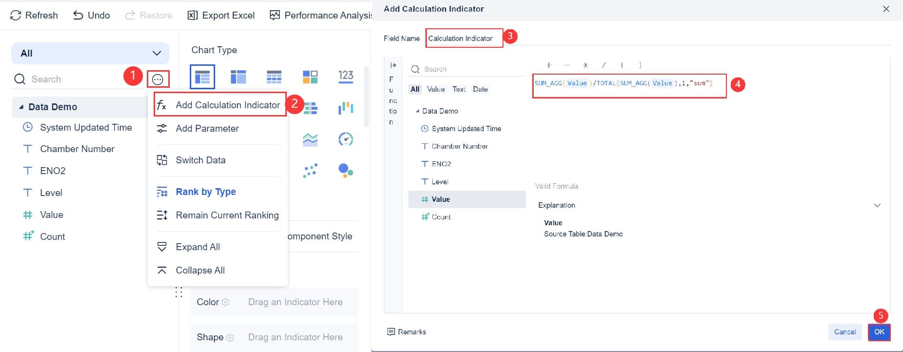
How to Create a Multi-Series Percentage Stacked Bar Chart in FineReport
Creating this chart inFineReportis straightforward. Follow these steps to get started:
Prepare Your Data: Organize your data in a structured format, such as an Excel sheet. Ensure that each column represents a specific category or subcategory.
Upload Your Dataset: Import your data intoFineReport using its intuitive interface. You can connect directly to databases or upload files manually.
Insert the Chart: Select the Multi-Series Percentage Stacked Bar Chart from the chart library. Drag and drop your data fields into the designated areas in Malaysia.
Customize the Design: Adjust the chart's appearance by setting labels, choosing color schemes, and formatting axes. FineReport’s user-friendly tools make customization effortless.
Preview and Publish: Preview your chart to ensure accuracy. Once satisfied, publish it to your report or dashboard for sharing with stakeholders in Malaysia.
Pro Tip: UseFineReport’s mobile compatibility to display your charts on smartphones and tablets. This ensures accessibility for decision-makers on the go.
Benefits of Using Multi-Series Percentage Stacked Bar Chart
Enhanced Comparisons: You can compare multiple datasets side by side, making it easier to identify patterns and trends.
Improved Decision-Making: The clear visualization of proportions helps you make informed decisions based on accurate data in Malaysia.
Time-Saving: FineReport’s drag-and-drop functionality speeds up the chart creation process, allowing you to focus on analysis rather than design.
Cross-Platform Accessibility: Charts created inFineReportcan be viewed on PCs, mobile devices, and large screens, ensuring flexibility in presentation.
Feature
Benefit
Proportional Representation
Simplifies the comparison of subcategory contributions across categories.
Multi-Series Capability
Enables analysis of multiple datasets within a single chart.
Customizable Axes
Offers flexibility in data presentation.
Color-Coded Segments
Enhances readability and highlights trends effectively.
Practical Applications
The Multi-Series Percentage Stacked Bar Chart is widely used in industries like manufacturing, where tracking production quality across multiple lines is crucial. For example, you can use this chart to assess the percentage of defective products in different workshops in Malaysia. By visualizing this data, you can pinpoint areas that need improvement and optimize your processes in Malaysia.
Retail businesses can also benefit from this chart by analyzing sales contributions across product categories and regions. This helps identify high-performing products and regions, enabling targeted marketing strategies.
Note: FineReport’s advanced features make it easy to adapt this chart to various business scenarios, ensuring that your data visualization aligns with your goals in Malaysia.
Use Cases for Stacked Bar Chart in Data Visualization
Stacked bar charts are versatile tools that simplify complex datasets into clear and actionable insights. They excel in scenarios where you need to compare categories in Malaysia, analyze part-to-whole relationships, or track trends over time. Let’s explore some good use cases for stacked bars in detail.
Comparing Categories and Subcategories
Stacked bar charts are particularly effective for comparing sub-groups of different categories. They allow you to visualize how individual components contribute to the overall total, making it easier to identify patterns and differences.
Sales analysts can use a stacked bar chart to track the sales progression of a new product over time. This helps them communicate performance trends effectively.
Digital marketers often rely on stacked charts to understand traffic dynamics. For instance, they can represent the contributions of various traffic sources—such as organic search, paid ads, and social media—to a website’s overall traffic.
In retail, stacked charts help visualize sales distribution across product categories. This enables better inventory decisions by highlighting which categories contribute the most to revenue.
Social scientists can use stacked charts to present demographic distributions. For example, they might show the age, gender, or income composition of a population, making it easier to interpret societal trends.
Budget planners benefit from stacked bar charts when illustrating how funds are allocated across departments. This visualization facilitates informed decision-making by clearly showing the distribution of resources.
By using stacked bar charts, you can compare different categories and their sub-groups in a way that is both visually appealing and easy to understand in Malaysia.
Tip: When comparing categories, limit the number of sub-groups to avoid clutter and maintain clarity.
Visualizing Part-to-Whole Relationships Over Time
A 100% stacked bar chart is ideal for visualizing part-to-whole relationships. This type of chart focuses on proportions rather than absolute values, making it easier to see how subcategories contribute to the whole.
These charts intuitively highlight the relationship between parts and the whole, eliminating the need for additional explanations.
They are particularly useful when comparing the sum of multiple parts across different categories. For example, you can use them to analyze market share distribution among competitors over several years.
The visual representation of stacked bars allows for immediate comprehension. You can quickly grasp how each segment contributes to the total, even when dealing with complex datasets.
Imagine you are analyzing customer satisfaction ratings across regions. A 100% stacked bar chart can show how each region contributes to the overall satisfaction level. This makes it easier to compare proportions and identify areas for improvement.
Pro Tip: Use percentage stacked bar charts when you want to emphasize relative contributions rather than absolute numbers.
Tracking Trends in Business Metrics with FineBI
FineBI takes stacked bar charts to the next level by enabling you to track trends in business metrics with ease in Malaysia. Its self-service analytics capabilities allow you to create and customize charts without relying on IT support.
FineBI’s drag-and-drop interface simplifies the process of building stacked bar charts. You can connect directly to your data sources and start visualizing trends immediately.
The platform supports real-time data analysis, ensuring that your charts always reflect the latest updates. This is particularly useful for tracking metrics like sales performance, customer acquisition, or employee productivity.
FineBI also enhances collaboration. Teams can share dashboards and analysis templates, making it easier to align on key business insights.
For example, a retail manager can use FineBI to track monthly sales contributions across product categories. By visualizing this data in a stacked bar chart, they can identify which categories are driving growth and adjust their strategies accordingly.
Note: FineBI’s advanced features make it a powerful tool for tracking trends and uncovering actionable insights.
Manufacturing Insights with Multi-Series Percentage Stacked Bar Chart
Multi-Series Percentage Stacked Bar Charts are essential for manufacturing professionals who need to analyze production data effectively. These charts help you visualize the proportions of different categories within a dataset, making it easier to identify trends and optimize processes.
How This Chart Benefits Manufacturing
Manufacturing involves tracking multiple variables, such as product quality, production efficiency, and defect rates. Multi-Series Percentage Stacked Bar Charts simplify this process by presenting data in a clear and organized format. Each bar represents 100% of a category, while the segments within the bar show the percentage contribution of subcategories. This design allows you to compare proportions across production lines, workshops, or time periods in Malaysia.
For example, imagine you are analyzing the quality levels of products manufactured in different workshops. A Multi-Series Percentage Stacked Bar Chart can display the percentage of defective, high-quality, and medium-quality products for each workshop. This visualization helps you pinpoint areas that need improvement and allocate resources more effectively.
Practical Applications in Manufacturing
You can use these charts to gain actionable insights in various manufacturing scenarios:
Quality Control: Track the percentage of defective products across production lines. Identify workshops with higher defect rates and implement corrective measures.
Production Efficiency: Compare the efficiency of different production lines by analyzing the proportion of completed tasks versus pending ones.
Resource Allocation: Visualize the distribution of raw materials or workforce across departments. Ensure resources are allocated optimally to meet production goals.
Trend Analysis: Monitor changes in production quality over time. Use the chart to identify patterns and predict future outcomes.
Why FineReport Enhances Manufacturing Insights
FineReportmakes creating Multi-Series Percentage Stacked Bar Charts simple and efficient. Its drag-and-drop interface allows you to upload data directly from Excel or databases. You can customize the chart by swapping axes, adjusting labels, and applying color-coded segments. These features ensure your data is presented in a visually appealing and easy-to-understand format in Malaysia.
FineReportalso supports mobile compatibility, enabling you to access charts on smartphones and tablets. This flexibility ensures that decision-makers can review production insights anytime, anywhere.
Tip: Use Multi-Series Percentage Stacked Bar Charts to analyze part-to-whole relationships in manufacturing. They provide clarity and actionable insights, helping you improve efficiency and maintain high-quality standards in Malaysia.
A Real-World Example
Consider a manufacturing company that produces electronic components. The company uses Multi-Series Percentage Stacked Bar Charts to track defect rates across production lines. By visualizing this data, the company identifies a specific line with a higher defect rate. Managers investigate the issue and discover that outdated machinery is causing the problem. After upgrading the equipment, the defect rate decreases, improving overall production quality.
This example highlights how these charts can drive informed decision-making and enhance operational efficiency.
Connecting to Broader Use Cases
The manufacturing industry is just one of many sectors that benefit from stacked bar charts. These charts are versatile tools for visualizing data across categories and subcategories. Whether you are tracking production metrics or analyzing sales performance, stacked bar charts simplify complex datasets into actionable insights. This versatility makes them a valuable asset in various use cases for stacked bars.
How to Make Stacked Bar Chart in FineReport
Chart Insertion
Creating a stacked bar chart inFineReport begins with inserting the chart into your report. Start by preparing your dataset. Ensure your data is well-organized, with each column representing a specific category or subcategory. Once your data is ready, follow these steps:
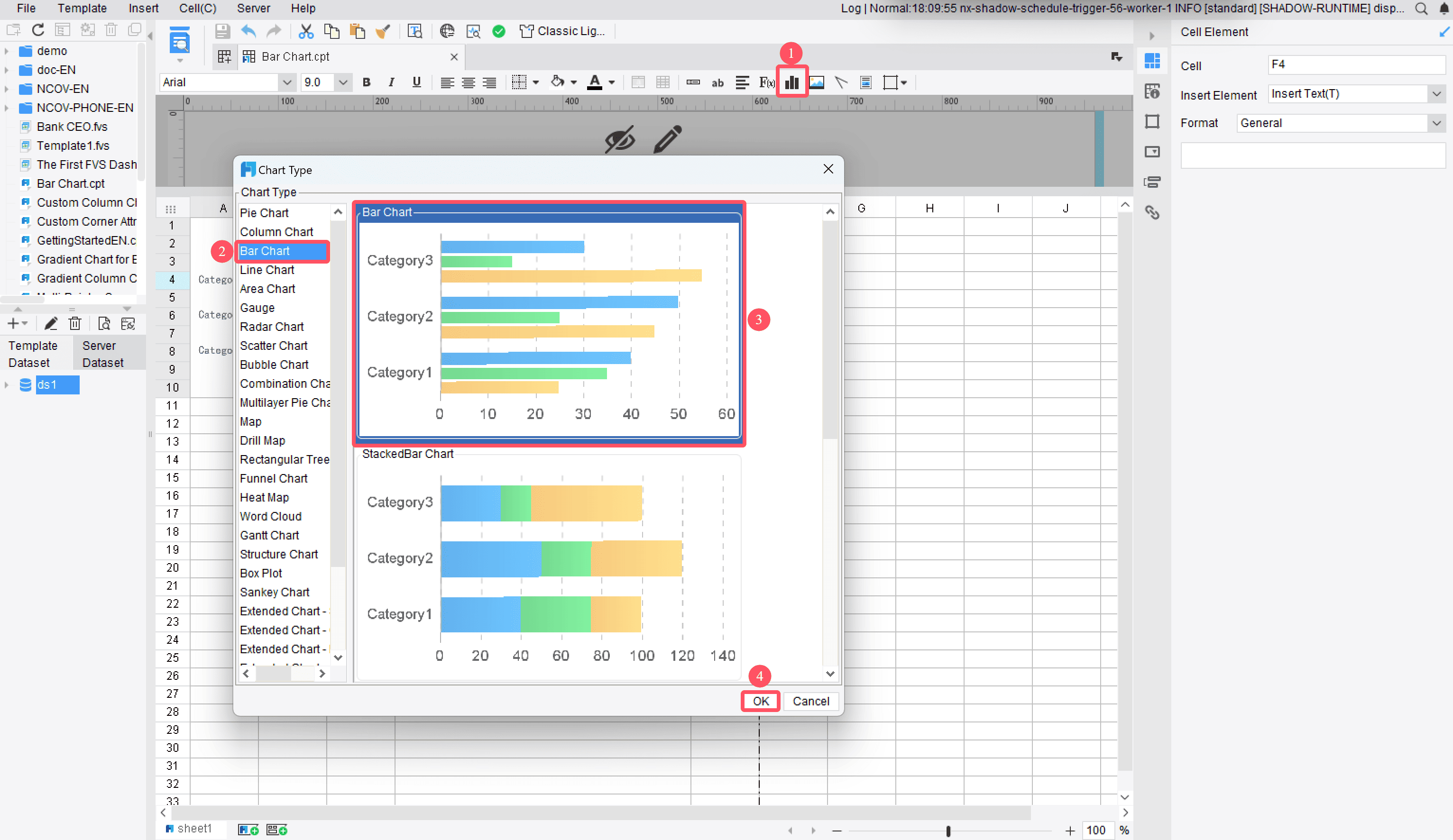
OpenFineReport and navigate to the report designer interface.
Click on the "Insert" menu and select "Chart."
From the chart library, choose the stacked bar chart option.
Drag and drop your data fields into the designated areas for categories, subcategories, and values.
Tip: Use meaningful labels for your data fields in Malaysia. This makes it easier to interpret the chart later.
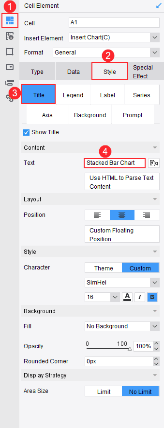
Chart Design
After inserting the chart, you can customize its design to suit your needs in Malaysia. FineReport offers a user-friendly interface that simplifies this process. Here’s how you can design your chart:
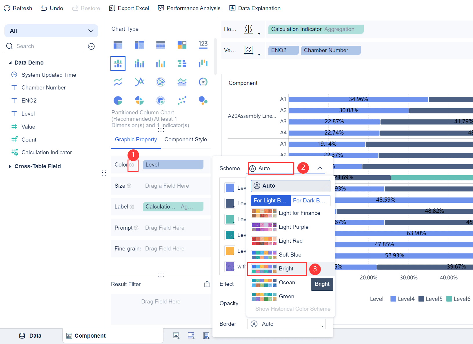
Adjust the Axes: Swap fields between the horizontal and vertical axes to find the best layout for your data.
Customize Colors: Assign distinct colors to each subcategory. This enhances readability and helps you identify trends quickly.
Add Labels: Enable data labels to display exact values for each segment. This provides more clarity for your audience in Malaysia.
Format the Chart: Use FineReport’s styling options to adjust fonts, gridlines, and borders.
Pro Tip: Keep your design clean and uncluttered. A simple chart is easier to understand.
Effect Display
Once your chart is ready, preview it to ensure everything looks correct. FineReport allows you to view your chart on different platforms, including PCs and mobile devices. This ensures your chart is accessible to all stakeholders in Malaysia.
Use the preview mode to check the alignment and accuracy of your data.
Test the chart on mobile devices to confirm its responsiveness.
Share the chart with your team in Malaysia or export it as part of a report for presentations.
Note: FineReport’s cross-platform compatibility ensures your stacked bar chart looks professional, no matter where it’s displayed.
By following these steps, you can create a visually appealing and informative stacked bar chart in FineReport. This tool simplifies the process, allowing you to focus on analyzing and presenting your data effectively.
How to Make Stacked Bar Chart in FineBI
Data Uploading
To start creating a stacked bar chart in FineBI, you need to upload your data. FineBI makes this process simple and intuitive. Follow these steps to get started:
Prepare Your Dataset: Organize your data in a structured format, such as an Excel file or a database table. Ensure each column represents a specific category, subcategory, or value.
Connect to Data Sources: Open FineBI and navigate to the "Data Module." Click on "Add Data" to connect to your data source. FineBI supports various formats, including relational databases, Excel files, and big data platforms.
Import Your Data: Select the dataset you want to use and import it into FineBI. You can preview the data to confirm its accuracy before proceeding.
Tip: Use clear and descriptive column names in your dataset. This will make it easier to map fields when creating your chart.
Component Creation
Once your data is uploaded, the next step is to create a component for your stacked bar chart. Components in FineBI act as building blocks for your visualizations.
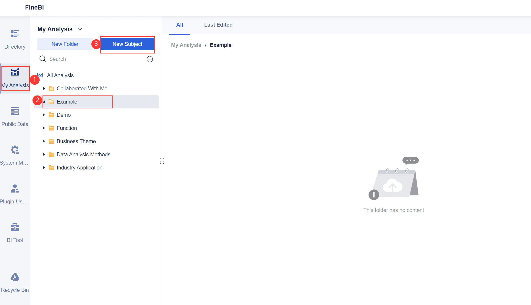
Create a New Dashboard: Go to the "Dashboard" section and click on "New Dashboard." This will serve as the workspace for your chart.
Add a Component: Drag and drop the "Chart" component onto your dashboard. FineBI provides a variety of chart types, including stacked bar charts.
Bind Your Data: Map your dataset to the chart component. Assign fields to the appropriate axes, such as categories for the X-axis and values for the Y-axis.
Pro Tip: Use FineBI's drag-and-drop interface to quickly bind data fields without needing technical expertise.
Chart Generation
Now it’s time to generate your stacked bar chart. FineBI’s user-friendly tools make this process seamless.
Select Chart Type: Choose "Stacked Bar Chart" from the chart options. This ensures your data is displayed in the correct format.
Customize the Chart: Adjust the chart’s appearance by setting colors, labels, and gridlines. FineBI allows you to personalize your chart to match your preferences.
Preview and Save: Use the preview option to check your chart. Once satisfied, save it to your dashboard for future use.
Note: FineBI supports real-time data updates, so your chart will always reflect the latest information in Malaysia.
By following these steps, you can create a professional and insightful stacked bar chart in FineBI. This tool simplifies the process, allowing you to focus on analyzing and presenting your data effectively.
Chart Beautifying
Beautifying your stacked bar chart in FineBI is a crucial step to make your data visually appealing and easy to interpret. A well-designed chart not only grabs attention but also ensures that your audience understands the insights at a glance. FineBI provides several customization options to help you achieve this in Malaysia.
Choose a Color Scheme: Select colors that align with your brand or presentation theme. Use contrasting colors for different segments to make them stand out. Avoid overly bright or clashing colors, as they can distract from the data.
Add Data Labels: Enable data labels to display exact values for each segment. This feature helps your audience in Malaysia quickly grasp the numbers without estimating from the bar lengths.
Adjust Fonts and Sizes: Use clear and legible fonts for titles, labels, and legends. Adjust the font size to ensure readability, especially when presenting on large screens or mobile devices.
Incorporate Gridlines and Borders: Add gridlines to improve alignment and make comparisons easier. Use borders sparingly to separate segments without overcrowding the chart.
Apply Animations: FineBI allows you to add subtle animations to your charts. These animations can make your presentation more dynamic and engaging in Malaysia.
Pro Tip: Keep your design simple and uncluttered. A clean chart is more effective than one overloaded with decorative elements.
Effect Display
Once you’ve customized your chart, preview it to ensure it looks professional and functions as intended. FineBI offers a responsive design, allowing you to view your chart across multiple devices.
Preview Mode: Use the preview mode to check the alignment, colors, and labels. Ensure that all elements are visible and properly formatted.
Cross-Platform Testing: Test your chart on both desktop and mobile devices. FineBI’s responsive design ensures that your chart adapts to different screen sizes without losing clarity.
Share and Collaborate: Share your chart with your team or stakeholders. FineBI supports collaborative features, enabling others to provide feedback or make adjustments.
Note: A polished chart enhances your credibility and ensures your audience in Malaysia focuses on the insights rather than the design flaws.
By following these steps, you can create a visually stunning and impactful stacked bar chart in FineBI. This attention to detail will elevate your data storytelling and leave a lasting impression on your audience in Malaysia.
Best Practices for Designing Stacked Bar Chart
Choosing the Right Chart Type
Selecting the correct chart type is essential for effective data visualization. A stacked bar chart works best when you want to compare contributions across different categories or analyze part-to-whole relationships in Malaysia. For example, a 100% stacked bar is ideal for showing proportions, while a vertical stacked bar highlights cumulative values.
To ensure clarity, provide adequate spacing between chart elements. This prevents overlap and confusion. Use clear labels and legends to mark every axis and bar. Maintain proportionality by ensuring the scale on your axes accurately reflects the data. Color consistency is also crucial. Contrasting colors help differentiate data categories while maintaining visual harmony. Avoid clutter by focusing on key data points rather than overwhelming your audience in Malaysia with excessive information.
Best Practice
Description
Adequate Spacing
Provide enough space between chart elements to prevent overlap and confusion.
Clear Labels and Legends
Every axis and bar should be clearly marked.
Maintain Proportionality
Ensure the scale on your axes accurately reflects the data.
Color Consistency
Use contrasting colors to differentiate data categories while maintaining visual harmony.
Limit Data Overload
Avoid clutter by focusing on key data points.
Tip: Choose a stacked bar chart format that aligns with your data and audience needs. This ensures your visualization communicates insights effectively.
Limiting the Number of Categories for Clarity
Too many categories can make your stacked bar chart difficult to interpret. Limiting the number of categories ensures clarity and prevents visual clutter. Focus on the most relevant data points to highlight key insights.
For example, if you’re comparing sales performance across regions, select the top-performing regions instead of including every single one. This approach keeps your chart clean and easy to understand. Use grouping techniques to combine smaller categories into broader ones. This simplifies the visualization while preserving the overall message.
When designing your chart, ensure that each category is clearly labeled. Avoid overlapping labels or excessively small segments that are hard to read. By limiting the number of categories, you make it easier for your audience in Malaysia to grasp the data at a glance.
Pro Tip: Prioritize clarity by focusing on fewer categories. This keeps your stacked bar chart visually appealing and informative.
Using Clear Labels and Color Schemes
Clear labels and color schemes are vital for creating an effective stacked bar chart. Labels should be concise and easy to read. Place them near the corresponding bars or segments to avoid confusion. Use fonts that are legible and appropriately sized for your chart.
Color schemes play a significant role in enhancing readability. Choose contrasting colors to differentiate categories. For example, use bold colors for larger segments and lighter shades for smaller ones. Avoid using too many colors, as this can overwhelm your audience in Malaysia. Instead, stick to a consistent palette that aligns with your brand or presentation theme.
Adding legends to your chart helps clarify what each color represents. Position the legend in a visible area, such as the top or side of the chart. This ensures your audience in Malaysia can quickly interpret the data without guessing.
Note: Clear labels and harmonious color schemes improve the overall effectiveness of your stacked bar chart, making it easier for your audience in Malaysia to understand the insights.
Avoiding Misleading Interpretations in FineReport
When creating a stacked bar chart in FineReport, you must ensure that your data visualization communicates accurate insights. Misleading interpretations often arise from poor design choices or improper data representation. By following a few best practices, you can avoid these pitfalls and create charts that your audience in Malaysia can trust.
Choose the Right Data Scale Always use a consistent scale for your axes. Inconsistent scales can distort the visual proportions of your bar chart, leading to incorrect conclusions. For example, if you compare sales data across different categories, ensure the Y-axis reflects the same range for all bars.
Limit the Number of Subcategories Overloading your chart with too many subcategories can make it difficult to read. When you include excessive data, the segments within each bar become too small to interpret. Focus on the most relevant subcategories to maintain clarity.
Use Distinct Colors Assign unique colors to each segment of your bar chart. Avoid using similar shades, as this can confuse your audience in Malaysia. A clear color scheme helps differentiate the contributions of various subcategories.
Label Your Data Clearly Add labels to your chart to display exact values for each segment. This eliminates the need for your audience in Malaysia to estimate proportions visually. Place labels near the bars or segments for easy reference.
Avoid Overlapping Data Ensure that your data does not overlap or clutter the chart. Overlapping bars or segments can obscure important details, making it harder to interpret the information.
By applying these strategies, you can create bar charts in FineReport that present data accurately and effectively. This ensures your audience in Malaysia understands the insights without confusion or misinterpretation.
Tip: Always preview your chart before sharing it. This helps you identify potential issues and make adjustments to improve clarity.
Stacked bar charts simplify data analysis by breaking down complex datasets into clear, actionable insights. They help you compare categories, track trends, and visualize part-to-whole relationships effectively. Following best practices, such as using clear labels and limiting categories, ensures your visualization communicates insights clearly. Tools like FineBI and FineReport make creating these charts easy and efficient. Explore their features to transform your data into compelling visual stories that drive better decisions.
Click the banner below to try FineReport and FineBI for free and empower your enterprise to transform data into productivity!
Continue Reading About Stacked Bar Chart
Product Trial
FineReport
Pixel-perfect reports · Interactive dashboards · Easy data entry · Digital twins
Smarter product, pricing, and inventory management across retail sectors.
FAQ
What is the main purpose of a stacked bar chart?
A stacked bar chart helps you compare categories and subcategories while showing part-to-whole relationships. It organizes data into segments within bars, making it easier to identify trends, proportions, and contributions across different groups.
How do you decide between vertical and horizontal stacked bar charts?
Choose vertical stacked bar charts for time-based trends or ordered categories. Use horizontal stacked bar charts for datasets with long category labels. Horizontal charts improve readability and save space when dealing with extensive text.
Can FineReport and FineBI handle real-time data updates?
Yes, both FineReport and FineBI support real-time data updates. FineBI excels in self-service analytics, while FineReport focuses on creating detailed reports. These tools ensure your visualizations always reflect the latest data.
What are the best practices for designing stacked bar charts?
Keep your chart simple and focused. Limit the number of categories to avoid clutter. Use clear labels, contrasting colors, and consistent scales. These practices improve readability and ensure your audience understands the insights.
How can stacked bar charts benefit manufacturing industries?
Stacked bar charts help manufacturers track production quality, defect rates, and resource allocation. They visualize part-to-whole relationships across production lines or workshops, enabling better decision-making and process optimization.