A kpi report template is not just a reporting format. It is a decision tool that helps leaders see whether teams are moving toward targets, where performance is slipping, and what actions need to happen next. For marketing managers, sales directors, operations leaders, and finance teams, the wrong template creates noise, slows decision-making, and hides risk. The right one makes performance visible in minutes and turns review meetings into action meetings.
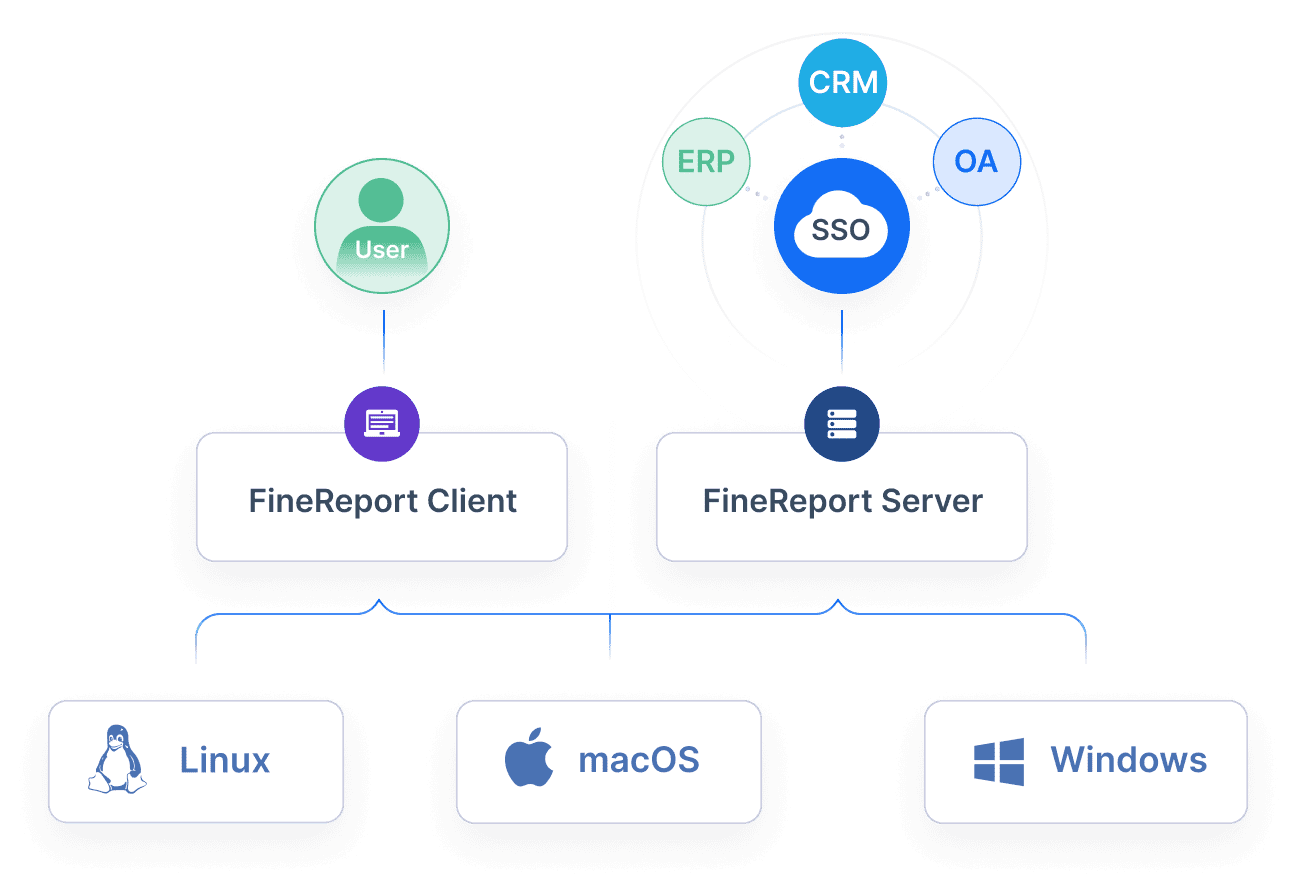
All reports in this article are built with FineReport.
A strong kpi report template starts with business intent. Before choosing charts, tables, or layouts, define what decision the report must support. Is the goal to monitor campaign efficiency, review pipeline health, flag service bottlenecks, or compare budget versus actuals? If that question is unclear, the report will become a passive dashboard instead of a management tool.
The next factor is fit. A weekly department review needs a different format than a monthly executive summary. A frontline manager may need exception alerts and task ownership, while a CFO may want high-level variance analysis with drill-down options. The best template aligns with three things:
Audience: who reads the report and what level of detail they need
Cadence: daily, weekly, monthly, or quarterly review cycle
A useful KPI report should also emphasize clarity over quantity. Too many metrics make it harder to identify what matters. Good templates show a small group of priority indicators, compare them to targets, and make trends visible without forcing users to hunt for meaning.
Key Metrics (KPIs) a Good KPI Report Template Should Surface
Current value: the latest performance level for each KPI
Target value: the expected result or goal
Variance: the gap between actual and target
Trend: movement over time, such as week-over-week or month-over-month
Benchmark: internal historical comparison or external standard
Owner: the person accountable for monitoring or improving the metric
Status: visual signal such as on track, at risk, or off track
Action required: next step triggered by the KPI result
A high-performing kpi report template makes these elements visible at a glance. It should tell the reader not only what happened, but whether it matters and who needs to respond.
How to Choose the Right KPI Report Template by Department
Different departments operate on different rhythms, data structures, and accountability models. That is why one standard layout rarely works across the entire business.
Marketing
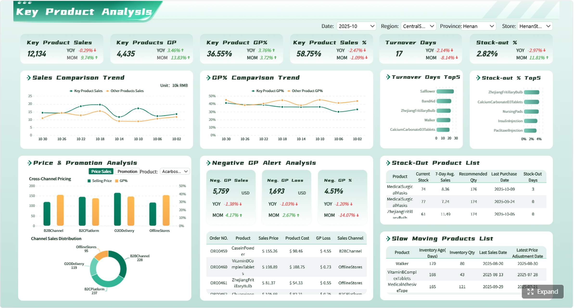
Marketing teams need templates that connect activity to outcomes. A report that only shows traffic or impressions is rarely enough. Leaders need to see how channel performance drives leads, conversions, and return on spend.
A marketing KPI template should prioritize:
Campaign performance
Channel attribution
Lead quality
Conversion rate
Cost per lead
Return on ad spend
Engagement trends over time
The best layouts compare channels side by side and show performance trends by campaign, source, and audience segment. If leadership is asking which programs deserve more budget, the template should answer that in seconds.
For marketing, visual comparison matters. Use line charts for trend movement, bar charts for channel comparison, and summary tiles for spend efficiency. If the team reviews performance weekly, include pacing against target and short commentary explaining what changed.
Sales
Sales reporting needs speed, accountability, and trend visibility. A sales leader does not just want to know booked revenue. They need to know whether pipeline coverage is healthy, which reps are behind, and where deals are stalling.
A sales-oriented kpi report template should track:
Pipeline value
Win rate
Quota attainment
Deal velocity
Average deal size
Stage conversion rates
Rep performance
Look for templates that support both weekly pipeline reviews and monthly performance reviews. Weekly formats should focus on movement, bottlenecks, and at-risk deals. Monthly formats should add attainment, forecast confidence, and performance by team or territory.
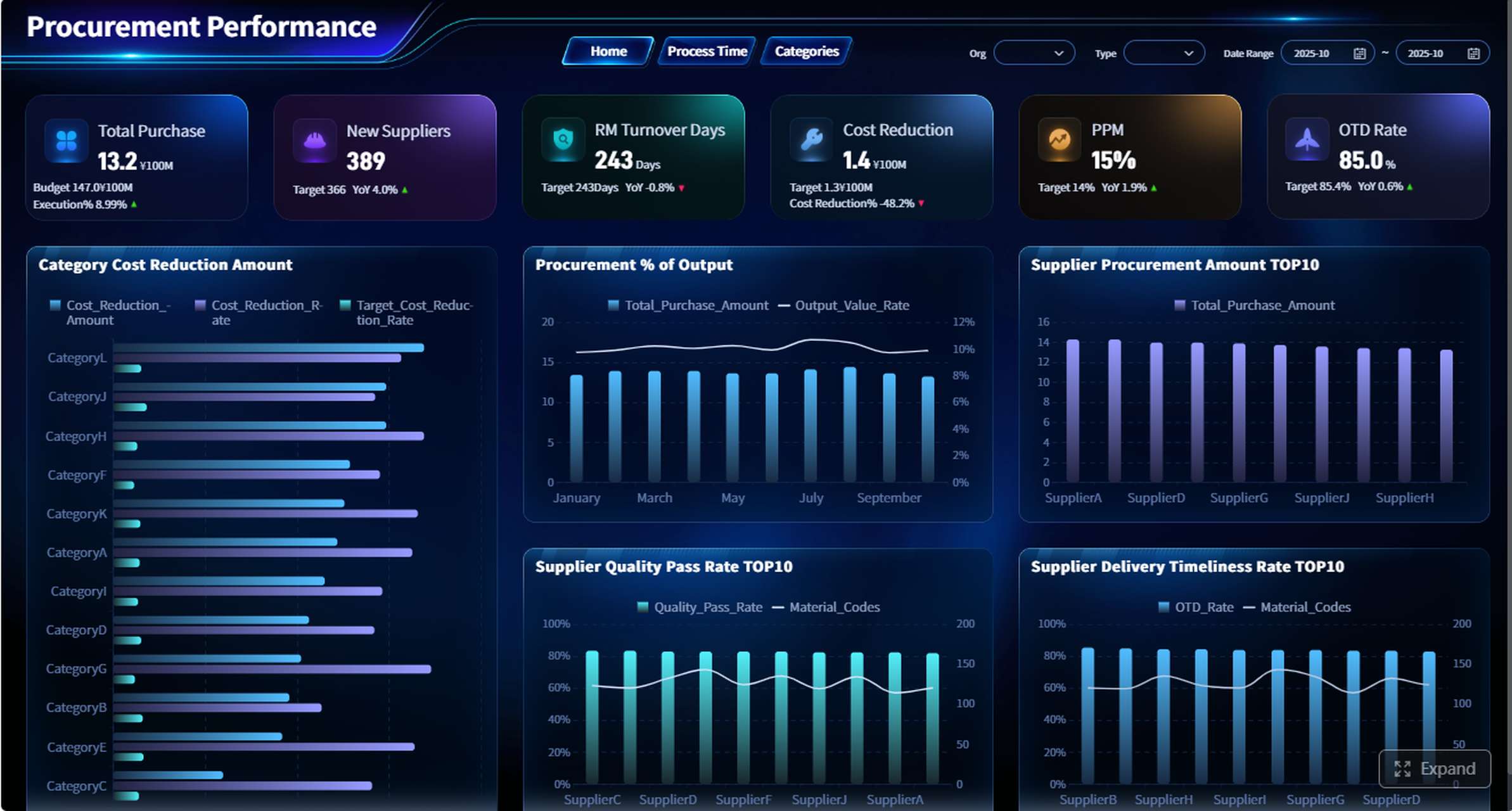
Operations
Operations teams need reports that surface exceptions early. The purpose is not just to summarize throughput; it is to detect delays, quality issues, capacity gaps, and service-level failures before they escalate.
An operations KPI template should emphasize:
Throughput
Cycle time
Capacity utilization
Service levels
Error or defect rates
On-time completion
Bottlenecks and exceptions
The most effective operations templates use threshold indicators and exception views. Instead of requiring managers to scan every line item, the report should highlight where intervention is needed now. That makes follow-up faster and more disciplined.
Finance
Finance reports must balance precision with business context. Financial leaders need more than raw totals. They need to connect revenue, margin, cash position, and forecast accuracy to broader business performance.
Strong finance templates help executives understand both the numbers and the business drivers behind them. That means including variance commentary, trend analysis, and clear links between financial outcomes and operational performance.
Core Elements Every KPI Report Template Should Include
Regardless of department, every report template should include a common structure. This ensures the report is repeatable, comparable, and actionable.
KPIs, targets, and benchmarks
At a minimum, every KPI should show current performance, target performance, and comparison points. That might mean historical values, prior periods, or peer benchmarks. Without comparison, numbers are hard to interpret.
Essential fields include:
KPI name
Actual result
Target
Variance
Prior period
Benchmark
Status indicator
This structure helps stakeholders quickly answer three questions:
Are we on target?
Are we improving or declining?
How do we compare to expectations?
Data sources and reporting frequency
A template is only as trustworthy as its data. If users do not know where numbers come from or how current they are, confidence drops fast. Every KPI report should make data lineage and refresh timing obvious.
For enterprise teams, this is where standardized reporting tools become especially valuable. FineReport can unify data from multiple business systems and automate recurring updates, reducing manual spreadsheet work and improving consistency across departments.
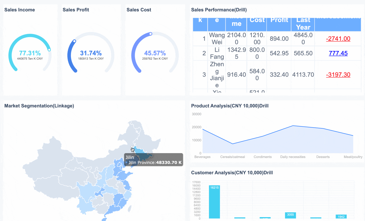
Good visuals reduce analysis time. Great visuals guide interpretation. A strong kpi report template uses charts, summary cards, and compact tables to direct attention to what changed and why it matters.
Use:
Summary cards for top KPIs
Trend lines for movement over time
Bar charts for comparisons
Tables for detailed variance review
Short commentary for context
Commentary is often overlooked, but it matters. Numbers explain what happened. Commentary explains why and what to do next.
Action items and accountability
Reports should drive action, not just observation. Each KPI review should lead to decisions, owners, and follow-up dates.
A complete action section should include:
Issue or opportunity identified
Assigned owner
Next step
Due date
Review status
This is one of the most important differences between a basic dashboard and a management-grade KPI report.
KPI Report Template Examples for Different Use Cases
The best template depends on how the report will be used. Below are four common formats and when each one works best.
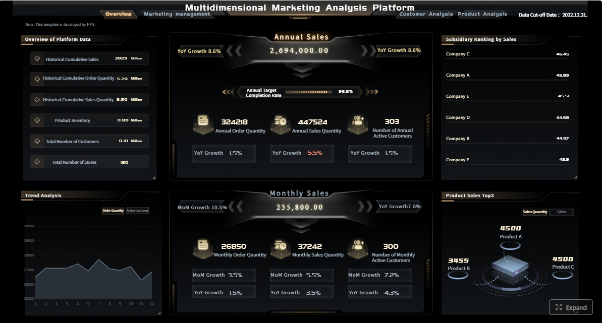
Executive summary template
An executive summary template is ideal for leadership teams that need a quick snapshot of overall business or department performance. It should be concise, visual, and focused on a limited set of strategic KPIs.
Best for:
Monthly executive reviews
Board updates
Cross-functional leadership meetings
Strategic planning checkpoints
Typical structure:
Top KPI summary cards
Department scorecards
Major variances
Key risks
Action priorities
This format works when time is limited and decisions need to happen quickly.
Daily or weekly performance template
This template is designed for faster-moving teams. It prioritizes operational visibility, short-term trend tracking, and exception management.
Best for:
Sales pipeline reviews
Marketing campaign pacing
Service center monitoring
Production or logistics performance
Typical structure:
Daily or weekly trend lines
Exceptions or alerts
Team or segment breakdowns
Immediate action items
The key here is speed. Users should be able to open the report and know within minutes where attention is needed.
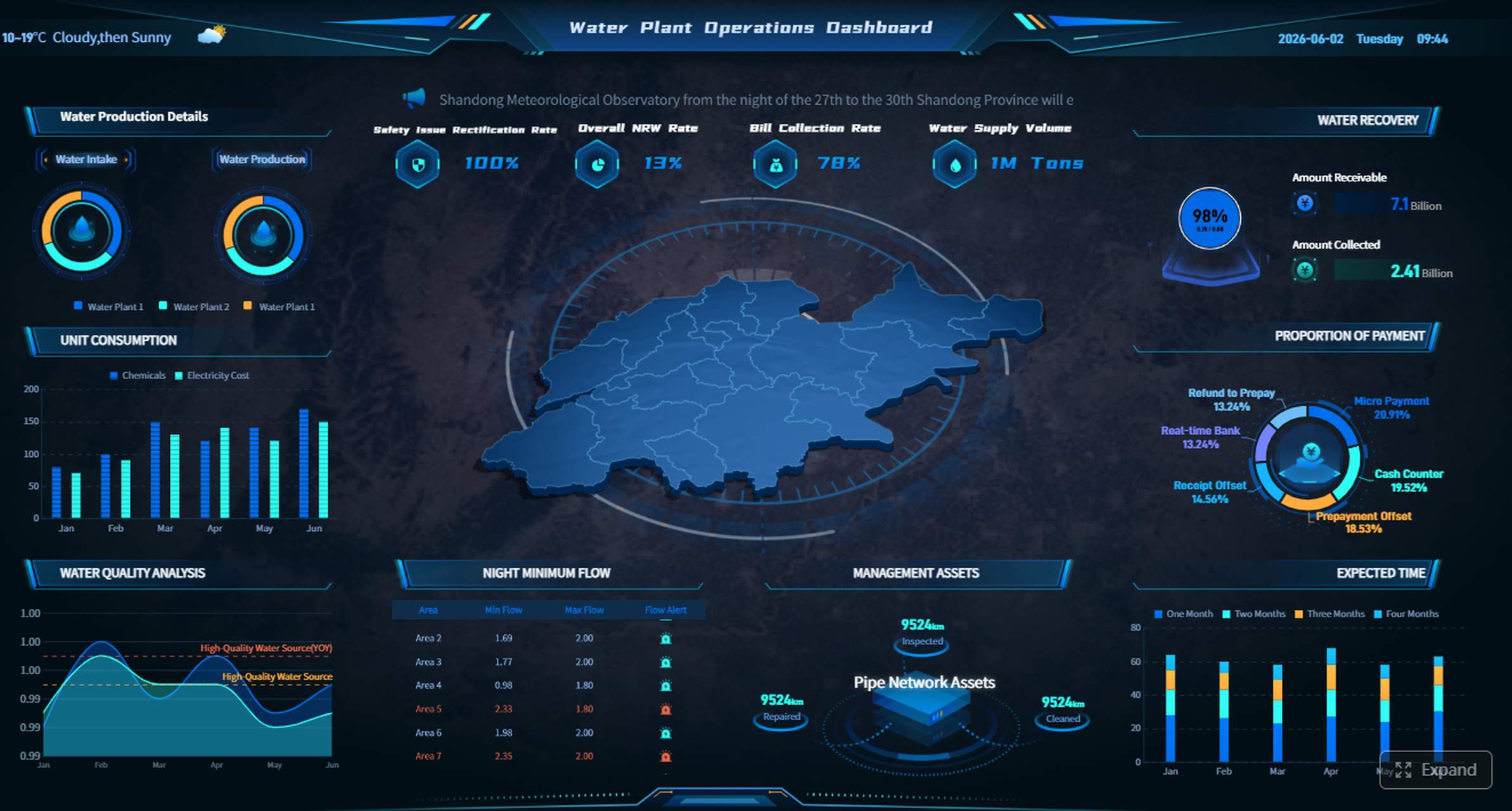
Dashboard-style template
A dashboard-style kpi report template works best when stakeholders need ongoing access to live performance data. It is especially effective in environments where leaders monitor changes continuously rather than waiting for scheduled reports.
Interactive dashboards are particularly powerful when built in a platform that supports role-based views, drill-through analysis, and data integration across business systems. That is where FineReport fits naturally for enterprise reporting teams that need more than static spreadsheets.
A basic report template is often the right choice for smaller teams or organizations early in their reporting maturity. It keeps structure simple without losing visibility.
Best for:
Small teams
New reporting processes
Early KPI programs
Manual or semi-automated review cycles
Typical structure:
Element
Purpose
KPI list
Shows the most important metrics
Target column
Clarifies expected performance
Actual column
Displays current result
Variance column
Highlights gaps
Notes section
Adds quick context
Owner field
Assigns accountability
Simple does not mean weak. A basic template can still drive strong decisions if the metrics are relevant and ownership is clear.
Common Mistakes to Avoid When Selecting a KPI Report Template
Many organizations choose a template based on appearance rather than use case. That leads to attractive reports that do not improve decisions.
The most common mistakes include:
Choosing a design before defining business questions
Including too many vanity metrics
Using the same format for every department
Failing to explain context behind the numbers
Presenting KPIs without assigning actions or owners
Another frequent issue is overloading stakeholders with detail. Senior leaders want insight, not raw data dumps. Frontline teams want operational clarity, not abstract summaries. The template should match the review conversation it is meant to support.
How to Build and Improve Your KPI Report Template
The best KPI templates are not created once and left alone. They evolve with business priorities, system maturity, and stakeholder expectations.
Start with a manageable set of KPIs tied directly to strategic goals. In most cases, five to seven high-value indicators are more effective than twenty loosely related ones. Then test the template with real users. Watch how they interact with it. Ask what they ignore, what they cannot interpret quickly, and what decisions they still cannot make.
Step-by-Step Best Practices for Implementation
1. Start with business questions, not charts
Identify the decisions the report must support. Examples include:
Which campaigns should receive more budget?
Which sales teams are likely to miss quota?
Which processes are causing service delays?
Where is budget variance creating financial risk?
When the business question is clear, the KPI set becomes easier to define.
2. Standardize metric definitions early
Make sure every KPI has a shared definition, formula, owner, and reporting frequency. This prevents cross-team confusion and keeps reviews focused on action rather than debating the numbers.
3. Prototype the layout with actual stakeholders
Build a first version and test it in a live review setting. See whether users can interpret trends, find exceptions, and identify next actions quickly. Refine the layout based on how people actually consume the report.
4. Automate data collection wherever possible
Manual reporting creates delays, version issues, and trust problems. Automating refreshes and data integration improves both speed and reliability. For teams scaling beyond spreadsheets, FineReport is a practical choice for building standardized KPI dashboards and reports that stay current without heavy manual effort.
5. Review and update the template regularly
Business priorities change. Reporting should change with them. Revisit KPI relevance, layout effectiveness, and ownership every quarter or at major planning cycles.
[Insert Dashboard Demo Here: KPI template improvement workflow with design, stakeholder review, automation, and quarterly optimization]
After the best practices phase, it often makes sense to validate the design in a live environment with your own data and review workflow.
Final Thoughts: Choose a KPI Report Template That Drives Decisions
The right kpi report template should make performance easier to understand, easier to compare, and easier to act on. It should reflect the needs of the audience, the pace of the department, and the decisions leadership needs to make. Marketing needs attribution and spend efficiency. Sales needs pipeline and quota visibility. Operations needs exception management. Finance needs variance and business context.
If you want better reporting outcomes, do not start with design preferences. Start with the review conversation you need to enable. Then build a template that makes the answer obvious.
For organizations ready to move from static spreadsheets to scalable, enterprise-grade KPI reporting, FineReport can help unify data, standardize templates, and deliver dashboards that support real operational and executive decision-making.
Get Ready-to-Use Dashboard Templates in Fine Gallery
A useful KPI report template should show the current value, target, variance, trend, status, and owner for each metric. It should also make clear what action is needed when performance is off track.
Start with the decision the report needs to support, then match the template to the audience, review cadence, and level of detail required. Marketing, sales, operations, and finance teams usually need different layouts because they track different risks and outcomes.
Most teams should focus on a small set of priority KPIs rather than trying to track everything at once. Too many metrics reduce clarity and make it harder to spot issues quickly.
A KPI report template is the structure used to organize and present performance data consistently. A KPI dashboard is often the live visual version of that report, usually with charts, filters, and real-time updates.
The right review schedule depends on how fast the business changes and what decisions the team needs to make. Operational teams may review daily or weekly, while executive and finance summaries are often reviewed monthly or quarterly.
Product Trial
FineReport
Pixel-perfect reports · Interactive dashboards · Easy data entry · Digital twins